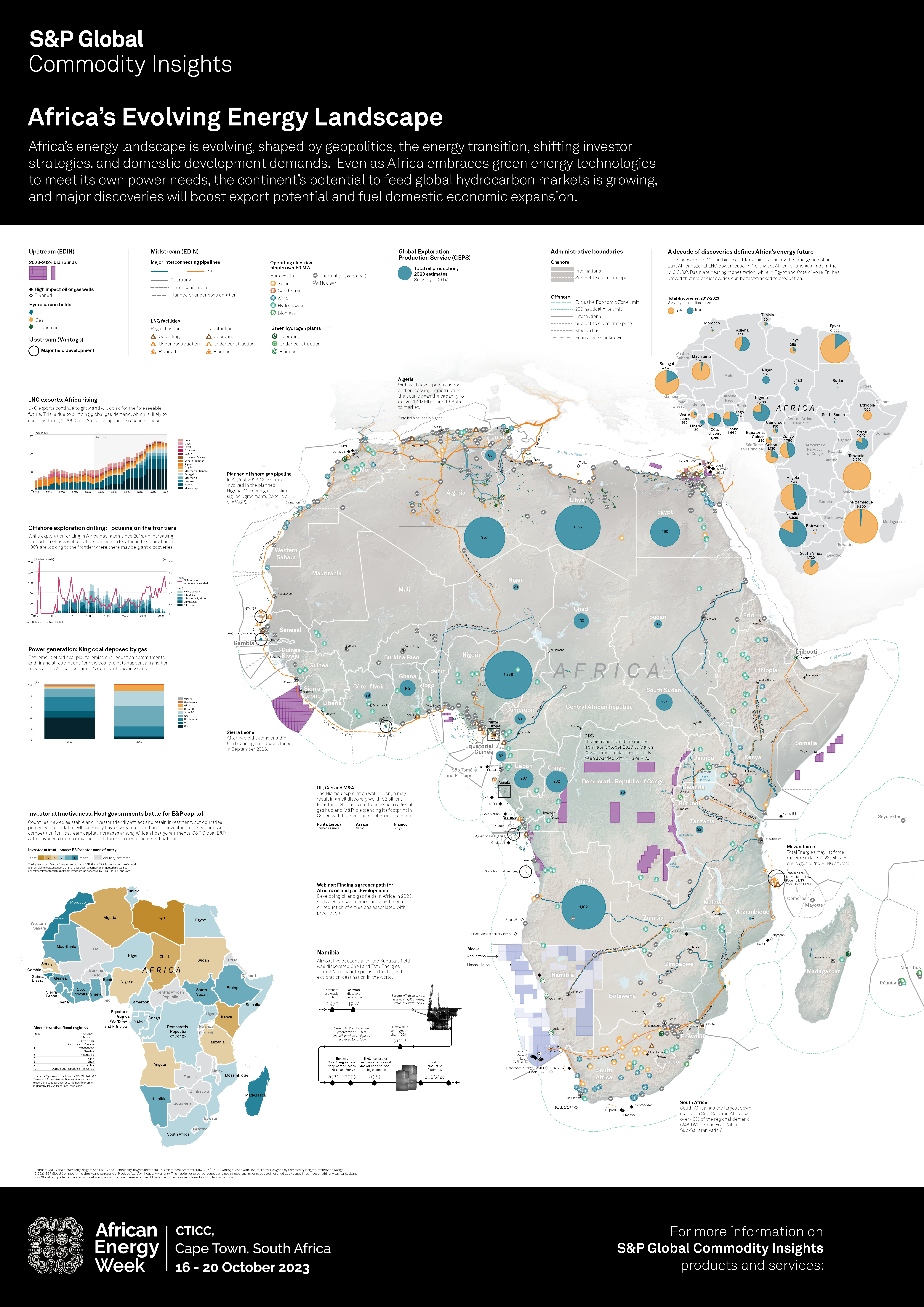
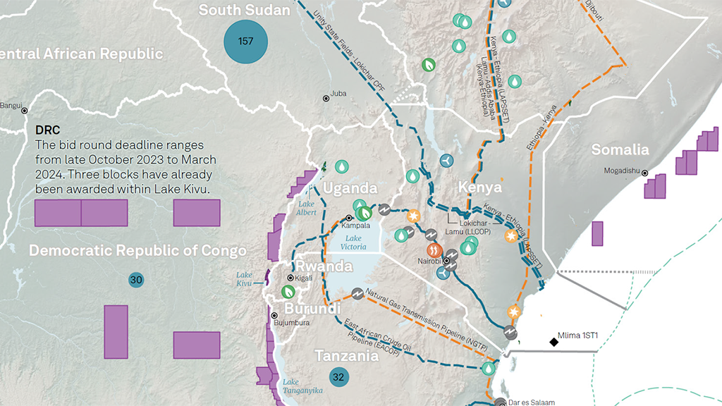
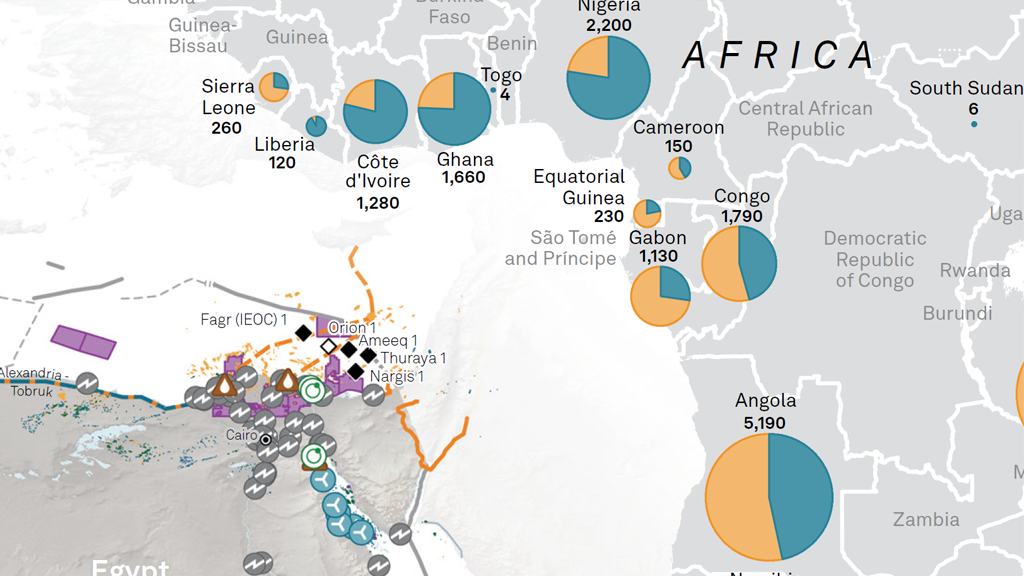
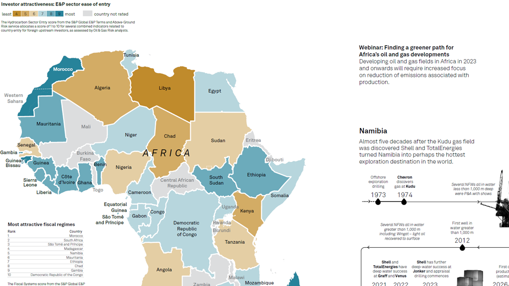
This Map Spotlight highlights the second runner-up of the 2023 Avenza Map Contest: Africa’s Evolving Energy Landscape by Ginny Mason with extra contributions from her team at S&P Global Commodity Insights including Melenie Yuen, Justin Cochrane, Roderick Bruce, Josephine Sajbel, Jennifer Tschopp, and Enrico Pedica. This infographic was shown at the African Energy Week conference, which took place in Cape Town, South Africa from October 16th to 20th in 2023. It was created with the versatility that it could function as a small handout as well as a large, wall-mounted map. The handout versions of the map also included a QR code which linked to an interactive online PDF. According to Ginny, this map is “the culmination of Commodity Insights’ midstream and upstream geospatial data, and several other products that we provide to decision makers in this field.”
Select the images below to see a detailed look at Ginny’s map
Making the Map
All map elements of Ginny’s infographic were created with the help of MAPublisher tools. After pre-processing her data using other software, she imported it into MAPublisher and then re-projected it as required. The Copy MAP Objects From tool was also used to quickly grab elements from other maps Ginny had already created.
Since there are several different map elements to this infographic showing various types of energy data, the MAP Attributes panel came in particularly handy for Ginny, allowing her to easily calculate, edit and append data to her attribute tables. Once her data was prepared, she could use the Merge Layers tool and the Split Layers tool to further organize her spatial data layers systematically according to their attributes.
Ginny used the Find Places tool to search for and plot relevant point data on her maps, such as energy plants, gas wells, and oil fields. The MAPublisher LabelPro add-on was used to easily generate labels for all of her data as required. She also used the Simplify Art tool to smooth the edges of excessively detailed lines and area data. Ginny added finishing touches to her map by adding supplemental elements such as a Scale Bar.
See the winners announcement for the 2023 Avenza Map Contest here, and check out our other Map Spotlight blogs here!
In this edition of Cartographer Chronicles, we interviewed Christina Shintani, the creator behind the winning map of the 2023 Avenza Map Contest! Christina is a talented cartographer with particular experience in creating maps that highlight environmental issues. Her interest in cartography began while studying fluvial geomorphology in graduate school and has been growing ever since. Christina uses cartography to make a difference in the world and raise awareness about how climate change is affecting it, with her maps appearing in National Geographic, Rolling Stone, and the Atlas of Design. In this edition, Christina is sharing her cartographic journey with us in her own words.
***
Career Journey in Cartography
My journey in cartography started with a string of lucky choices and following my interests. As a freshman at William and Mary, I signed up for an Introduction to Physical Geography class to fulfill a general science requirement. I found myself fascinated with every topic and lecture. Eventually, I realized I wanted to keep learning about geography, so I created my own major because my college didn’t offer it. After graduating, I continued on to get my master’s in geography at the University of Oregon. I started grad school with the intention of studying fluvial geomorphology, and while I did continue to study rivers, I left grad school wanting to become a cartographer. This changed when I signed up for the advanced cartography course for no reason other than liking maps, and it changed what I wanted to do in my career.
After graduating with my MS, I moved to Portland, Oregon. After a string of short-term jobs, I got a job as a cartographer and data analyst at a public transit consulting firm, where I made transit maps for cities across the country. After a few years there building my portfolio, I was offered a position at National Geographic, where I made maps for the magazine and website, covering a range of topics from conservation and animals to climate change. This is where I was first introduced to Avenza products, MAPublisher and Geographic Imager. Every map I made (while at NatGeo and since) has been made using Avenza products, and it’s hard to imagine going back.
After a few more years, I joined Woodwell Climate Research Center as a cartographer, where I still work today. I make maps to communicate climate science for research papers, communities wanting to understand how climate change currently impacts them and how it will impact them in the future, policymakers in Congress and the Senate, and the general public.
Cartographic Highlights
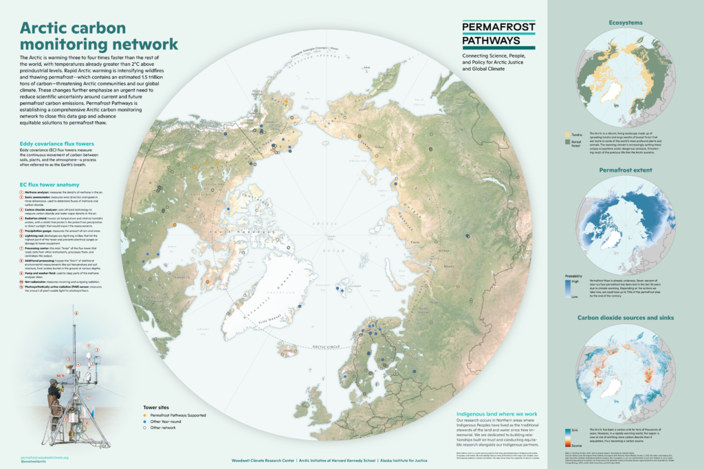
One important map project is the Arctic carbon monitoring network map which I won the Avenza award for. This map highlights how Woodwell’s tower network is critical to understanding how carbon feedbacks are accelerating warming in the Arctic and impacting global weather. We often use maps to communicate climate science in order to change policy. Most recently, it was brought to the Conference of the Parties (COP) and used to communicate our work to Senators Murkowski and Markey.
A large mapping project I worked on this past summer at Woodwell was in collaboration with the Center for Climate and Security. I created two story maps detailing how worsening climate change will contribute to security challenges in Iran and Türkiye. These maps were presented to politicians on Capitol Hill, where it was attended by congressional staffers across the political spectrum.
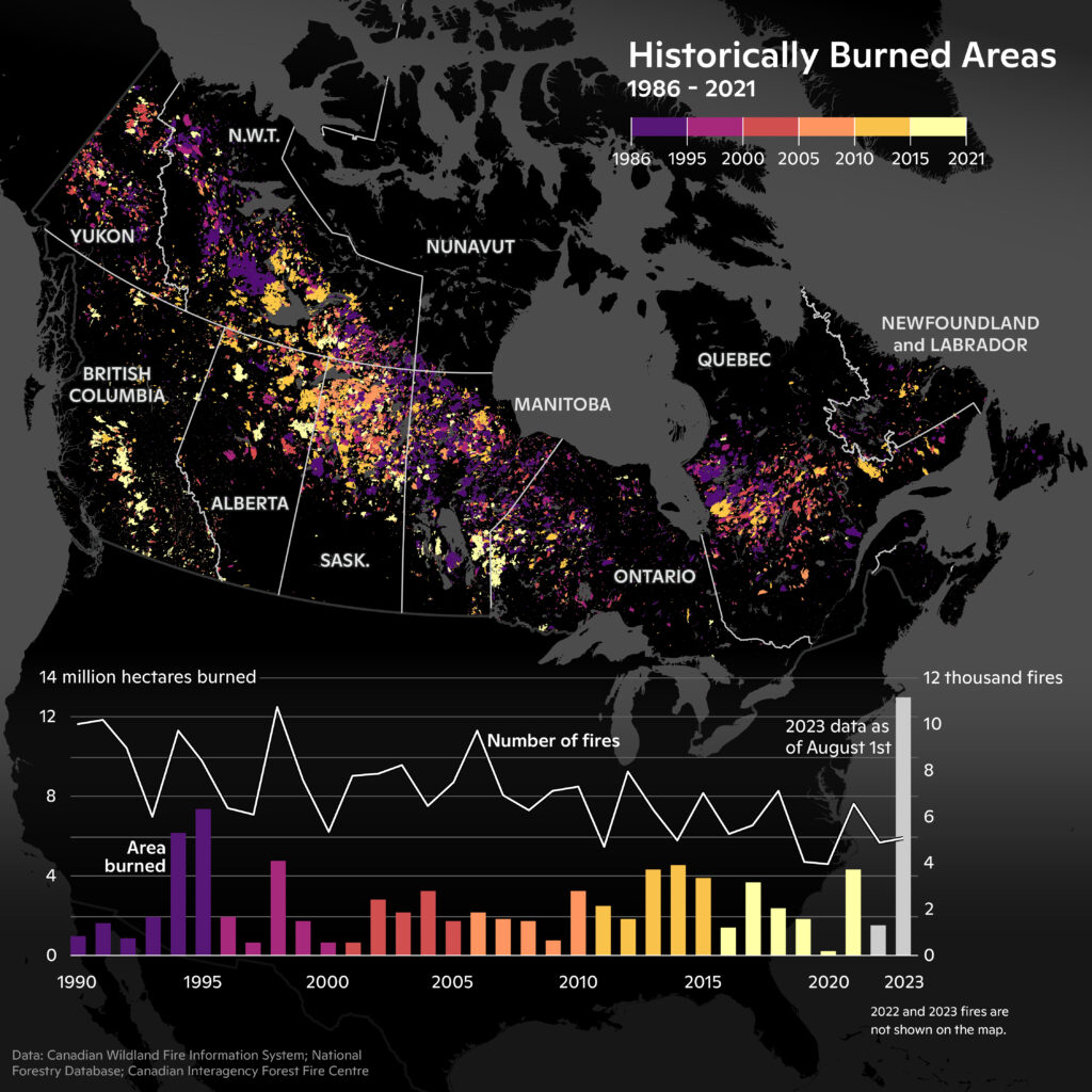
While we don’t always have the capacity to respond to current climate events, the wildfires in Canada this past summer were historic. I worked quickly to analyze, map, and chart the historically burned areas in Canada to illustrate how this summer’s wildfires were exponentially larger and occurred very early in the wildfire season in comparison to previous years.
I make maps with Adobe Illustrator and Photoshop every day and therefore use MAPublisher and Geographic Imager daily. MAPublisher makes it so easy to start a map, and later completely change everything about it without starting over or going back to GIS. The features I use most often are the import tool (sometimes with spatial or layer filter), applying Map Themes, scale bar, and label features. I often have to convert a map from print to digital or vice versa, so I use the Map Views to change the scale of the map.
Advice to Aspiring Cartographers
My advice to early career folks/people wanting to get into cartography: even if your current job doesn’t include map making, build your portfolio in your free time with maps that interest you and that you feel excited about making, and create a website to showcase them.
Check out our Map Spotlight on Christina’s winning entry of the 2023 Avenza Map Contest here!
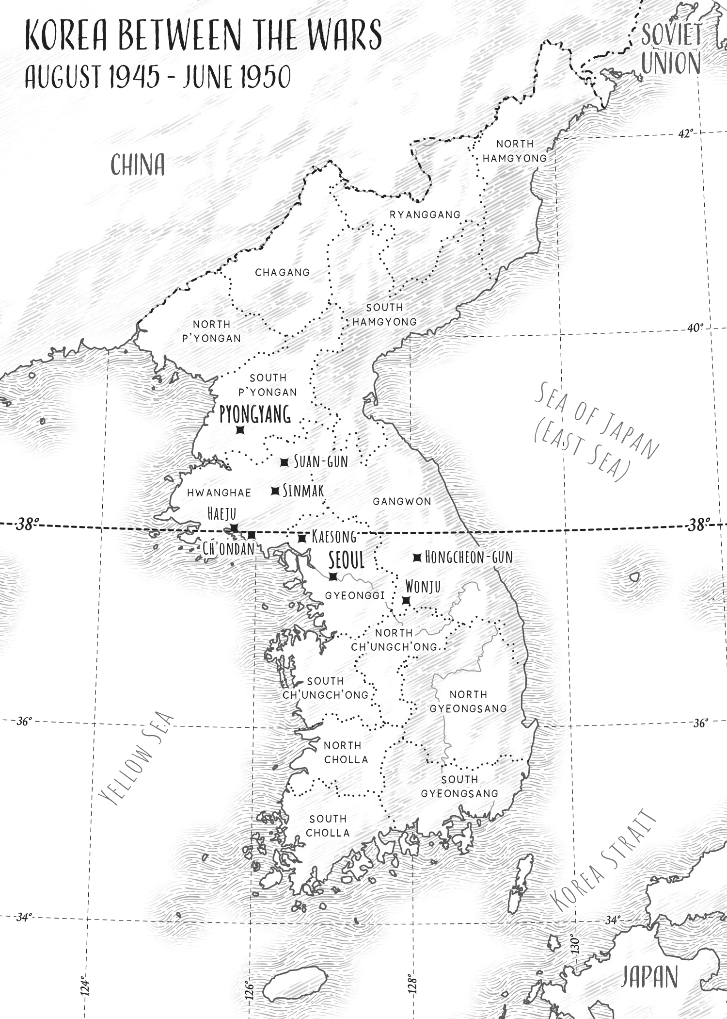
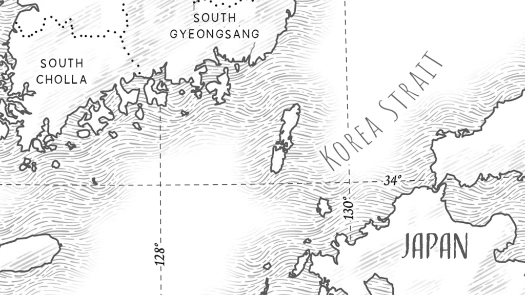
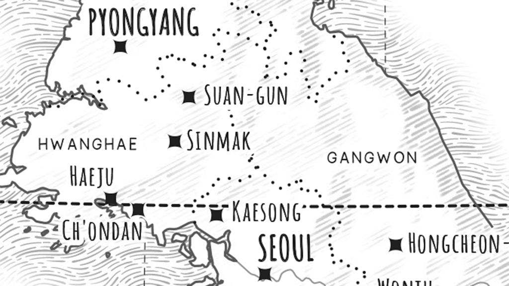
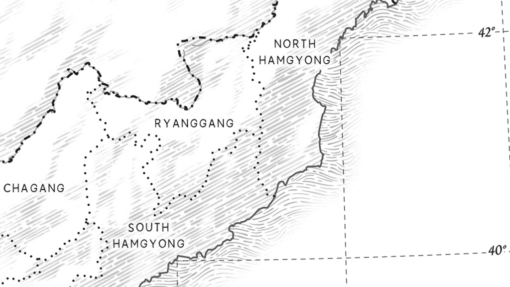
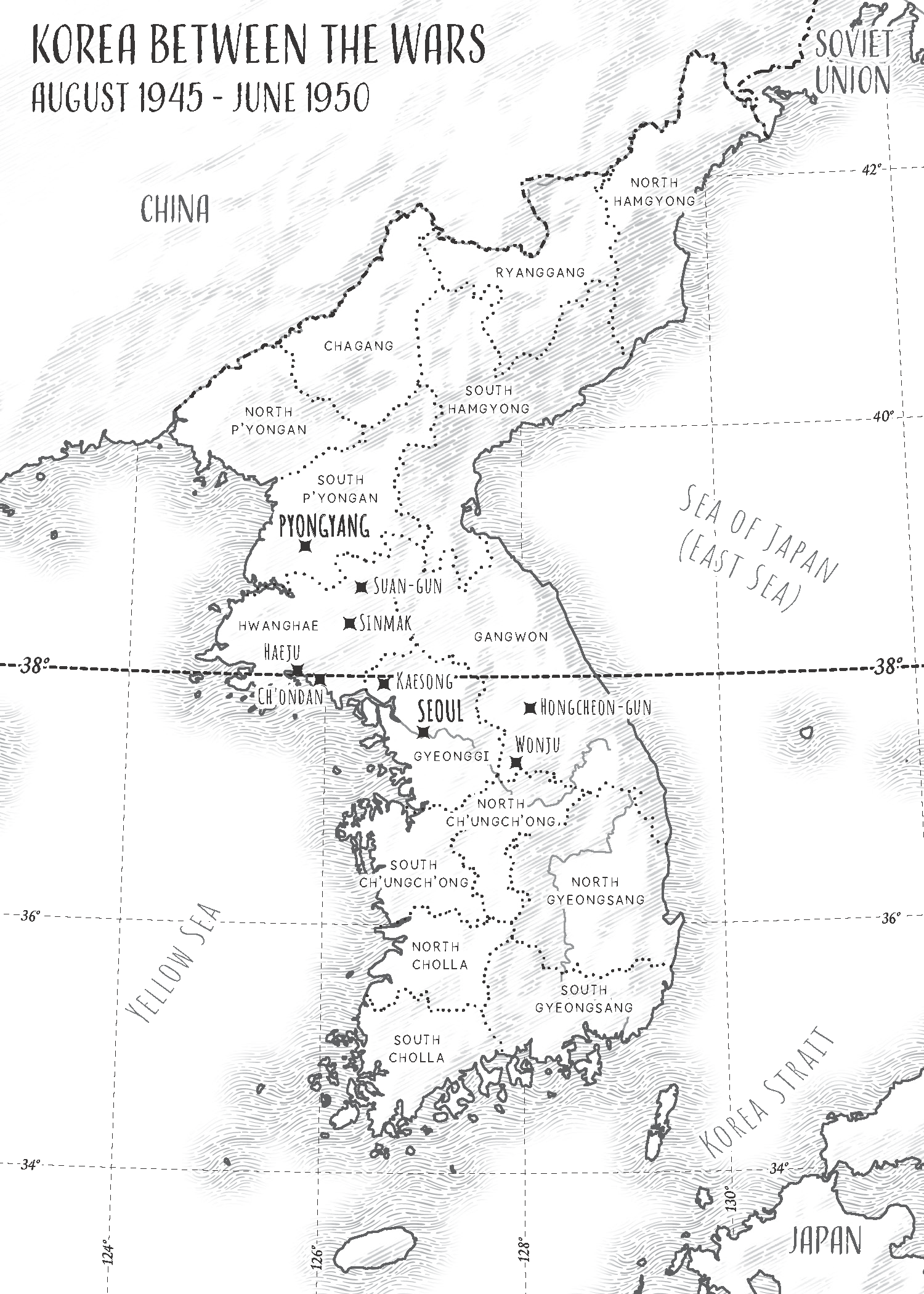
This Map Spotlight will be showcasing the runner-up of the 2023 Avenza Map Contest: Korea Between the Wars by Nat Case. This map was part of a series of five maps created by Nat to be published in the memoir Beyond the Border: A Korean’s Journey Between the North and South by Tae-hyok Kim and Nicole Kim Rogers, which follows Tae-hyok’s life in war-ridden mid-century Korea. This particular map is used to set the stage for the beginning of his story when North and South Korea were divided by the 38th parallel post-World War II. Hand-drawn map elements and handwriting-style labels are used to highlight relevant cities, provinces and other features of the Korean peninsula and surrounding regions.
Check out the other maps in the series on Nat’s website, and find Beyond the Border: A Korean’s Journey Between the North and Southhere.
Select the images below to see a detailed look at Nat’s map
Making the Map
Nat used both MAPublisher and Geographic Imager tools in the creation of this map. In MAPublisher, coastline and political boundaries as well as points were imported and then projected and rescaled. Transforming the projection of the data upon import allowed him to set up the map scale and projection of the document without needing to use the MAP View Editor after import. The coastline data was then exported as a TIFF to be used in the process of creating the textured shaded relief.
In Geographic Imager, a Prisma shaded relief was imported and transformed to the desired projection. It was then cropped and exported to a TIFF as well, to also be used in the process of creating the textured shaded relief.
Both TIFF files were then imported into the Illustrator map file. Nat used the grayscale of the Prisma relief as a mask in Illustrator to create the textured relief around the coastlines and land formations. The hand-drawn texture were created using textures from the Adobe Stock library.
Nat selected handwriting fonts when creating the labels using the Label tool to place them initially. He then adjusted the labels manually as desired.
See the winners announcement for the 2023 Avenza Map Contest here, and check out our other Map Spotlight blogs here!
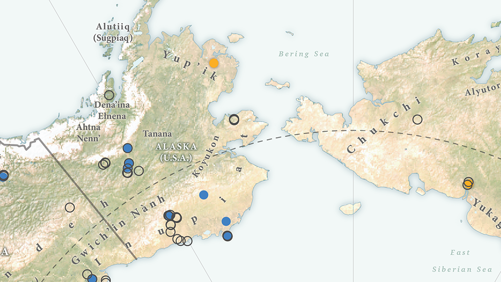
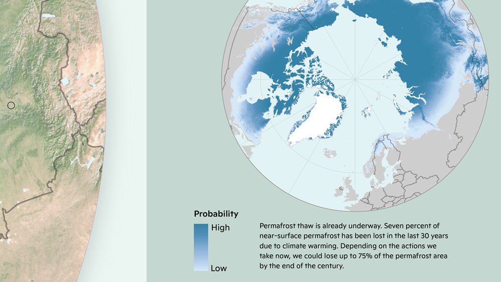
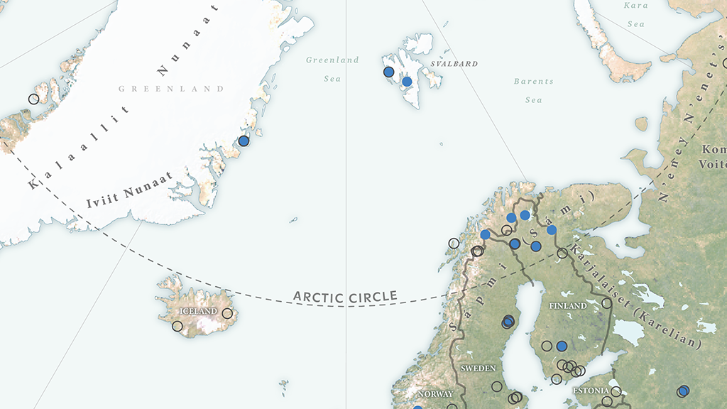
In our first Map Spotlight of the year, we are showcasing the winner of the 2023 Avenza Map Contest: Arctic Carbon Monitoring Network by Christina Shintani, with additional contributions from Jessica Howard (text content) and Julianne Waite (illustration). This map shows eddy covariance flux tower locations in the Arctic that measure the continuous movement of carbon between soils, plants, and the atmosphere. This process is often intriguingly referred to as the Earth’s breath. These towers collect data that is crucial to establishing a comprehensive carbon monitoring network in the Arctic region, which will assist efforts in advancing plausible solutions to curbing permafrost thaw.
A warming Arctic contributes to intensifying wildfires and permafrost thaw, both of which in turn contribute to increased carbon emissions, which is a serious environmental concern. The supporting maps explore the various implications of what is at stake as the Arctic warms three to four times faster than the rest of the world: the Arctic ecosystems at risk, the extent of permafrost thaw, and the shifting of the Arctic from a carbon sink to a new source. Maps like Christina’s are helpful in allowing people to visualize and further understand the progressive impacts of climate change.
Check out more of Christina’s maps on her website, and learn more about the work of Permafrost Pathways here.
Select the images below to see a detailed look at Christina’s map
Making the Map
Christina used both MAPublisher and Geographic Imager tools in the creation of this map. Christina used the Import tool to import the data files she processed in another program, such as QGIS. Following import, she used the MAP Views panel to set up the map scale and projection of the document. Since this map required a polar map projection, the MAP View Editor was also used to reproject data layers from different coordinate systems.
Christina also employed MAP Themes in the creation of her map. Stylesheet Themes were used to symbolize the data on both the main map and supporting maps. These stylesheets could then be used to create legends for the respective maps.
In Geographic Imager, Christina opened her raster data using the Advanced Import, which contains several geoprocessing tools to adjust, crop or transform her imagery before importing it. This can be especially helpful when working with large datasets that may slow the program down if they are not cropped or downsized in some way. She also used the Transform feature to reproject images where necessary.
See the winner announcement for the 2023 Avenza Map Contest here, and check out our other Map Spotlight blogs here!
We are excited to announce that the 2023 Avenza Map Contest has now concluded. This year we saw cartographers from all over the world submit their best maps, with some truly impressive displays of cartographic design. Our entrants demonstrated how they utilize Avenza software to create visually appealing and meaningful cartographic products. Now that we have concluded the judging, discussing, and reviewing process, the Avenza team would like to congratulate this year’s prize winners!
Over the next few months, keep an eye out for Map Spotlight blogs detailing our winning entries and some other honourable mentions from the 2023 Avenza Map Contest. Each article will provide a closer look at the winning map entries, with insights from their creators, and an overview of tools and techniques used to develop their prize-winning maps.
Grand Prize Winner
Arctic Carbon Monitoring Network Christina Shintani Woodwell Climate Research Center
Check out more of Christina’s maps on her website. Additional contributors to the text content and illustration on this map are Jessica Howard and Julianne Waite, respectively.
Africa’s Evolving Energy Landscape Ginny Mason S&P Global Commodity Insights
Several members of the team at S&P Global Commodity Insights contributed to this map: Melenie Yuen, Justin Cochrane, Roderick Bruce, Josephine Sajbel, Jennifer Tschopp, Enrico Pedica.
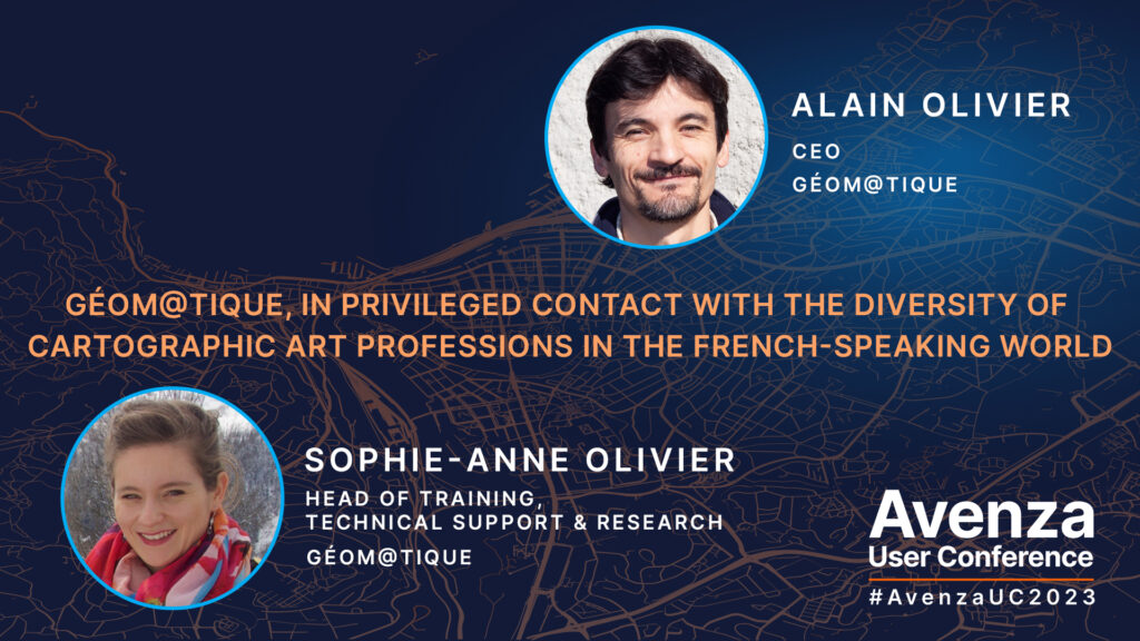
Géom@tique was founded at the end of the 1990s by introducing, for France and French-speaking countries, the distribution of MAPublisher for Adobe Illustrator. Through its position as a Value Added Reseller of Avenza products, Géom@tique is in contact, on a daily basis, with a wide variety of users who all have the desire to produce beautiful maps. With their vast knowledge of geomatics, they distribute our software, provide technical support, as well as certified training for Francophone users (one of their French MAPublisher trainings is coming up very soon). At this year’s Avenza User Conference, our friends Sophie-Anne and Alain presented with us an overview of how Géom@tique operates in France and, most importantly, highlighted the cartographic productions of some of the loyal and talented French-speaking users of MAPublisher and Geographic Imager they communicate with frequently.
The Avenza User Conference is an annual free virtual conference for map makers, GIS enthusiasts, and geospatial professionals worldwide who share a common interest in Avenza mapping technology. The conference includes a combination of virtual sessions led by experts who will share their experiences with Avenza mapping products.
The Avenza User Conference is an annual event that grows each year with incredible speakers and participants. Get inspired by mapping and industry professionals by joining us for #AvenzaUC2024. Register here for next year’s conference taking place on May 9th, 2024.
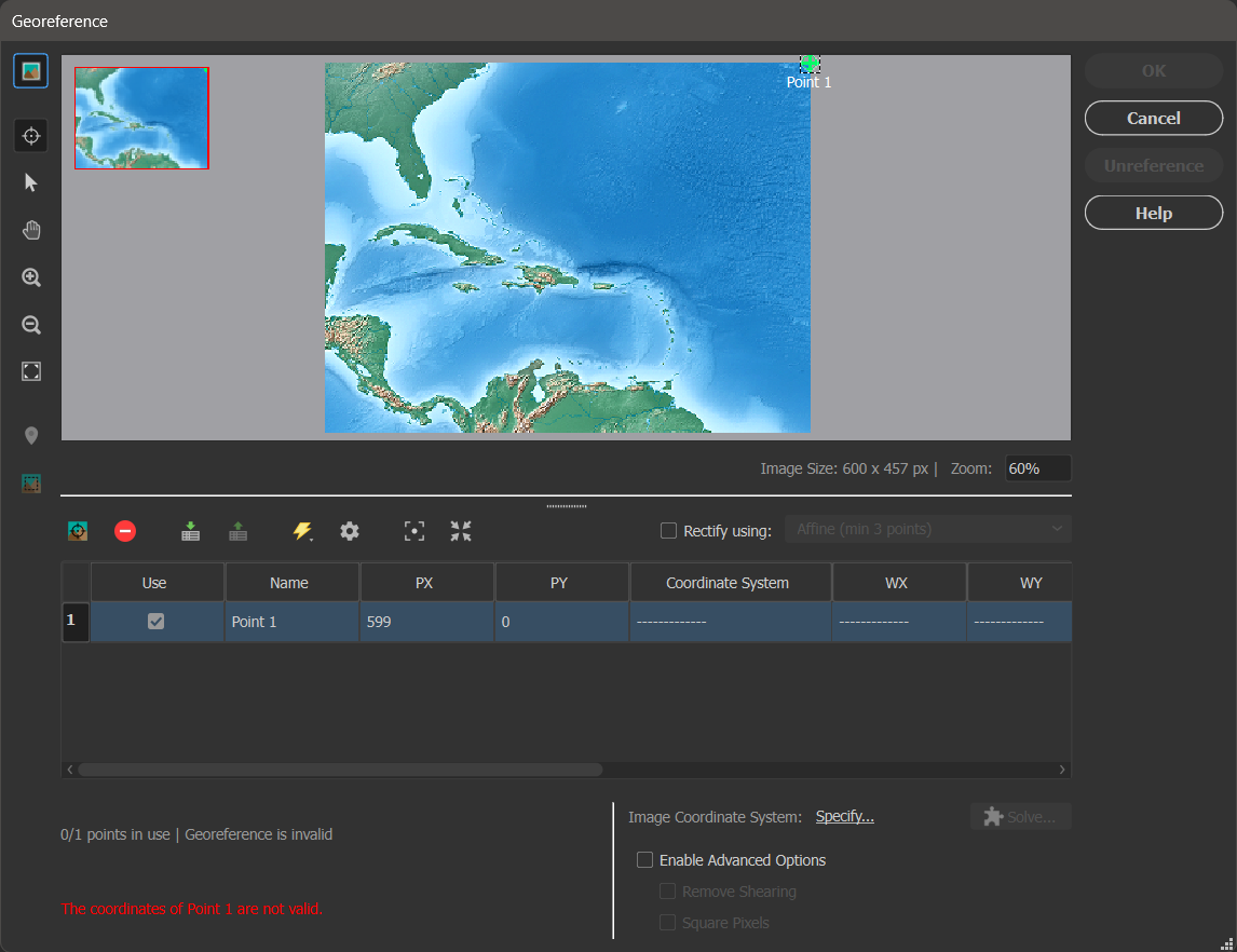
Sometimes we know enough about an image to georeference it in a faster manner than other images. In Geographic Imager, we call this type of georeferencing a Quick Georeference.
Quick Georeference is a method of georeferencing images that requires two conditions to be met:
The image is not rotated; in other words, true north is oriented at the top of the page
Two control points on the image are known, however these points cannot be aligned on either the X or Y axis
This article will show an example of quick georeferencing. The image used in this demonstration is called Americas_4.tif, and can be found in the Tutorial Data folder which is included with every installation of Geographic Imager.
After opening the image in Geographic Imager, you can confirm that it is aligned with true north. Then click the Georeference button on the Geographic Imager panel.
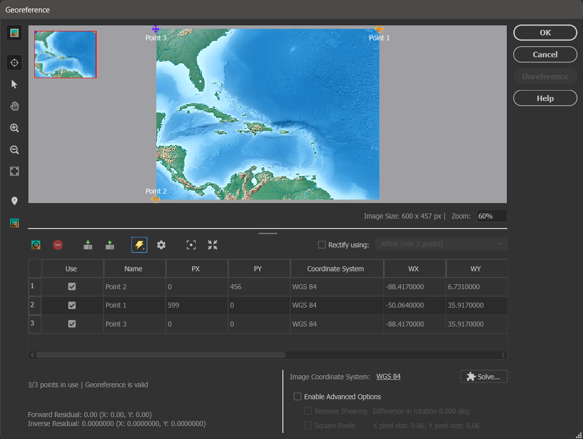
In the Georeference dialog box, you can click the Add Control Point button to do as such. Click anywhere on the image viewer to add a point. Point 1 will be added to the control point list. You can then adjust the pixel coordinates (PX and PY); these are the coordinates for the points on the image. Type 599 in the PX box and 0 in the PY box.
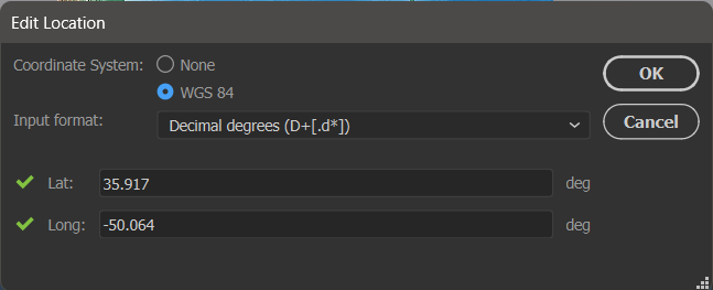
Next, you want to set the world coordinates that correspond to the pixel coordinates you just entered. You can double-click in the WX, WY or Coordinate System boxes to open the Edit Location dialog box. Here you want to select the WGS 84 coordinate system, and enter a Lat value of 35.917 and Long value of -50.064. After clicking OK, you will see that the world coordinates have been updated in the control point list.
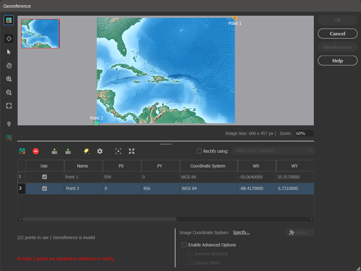
You now want to add your second control point at the location with pixel coordinates of PX = 0 and PY = 456. Following the above steps again, give this point the world coordinates of Lat = 6.731 and Long = -88.417.
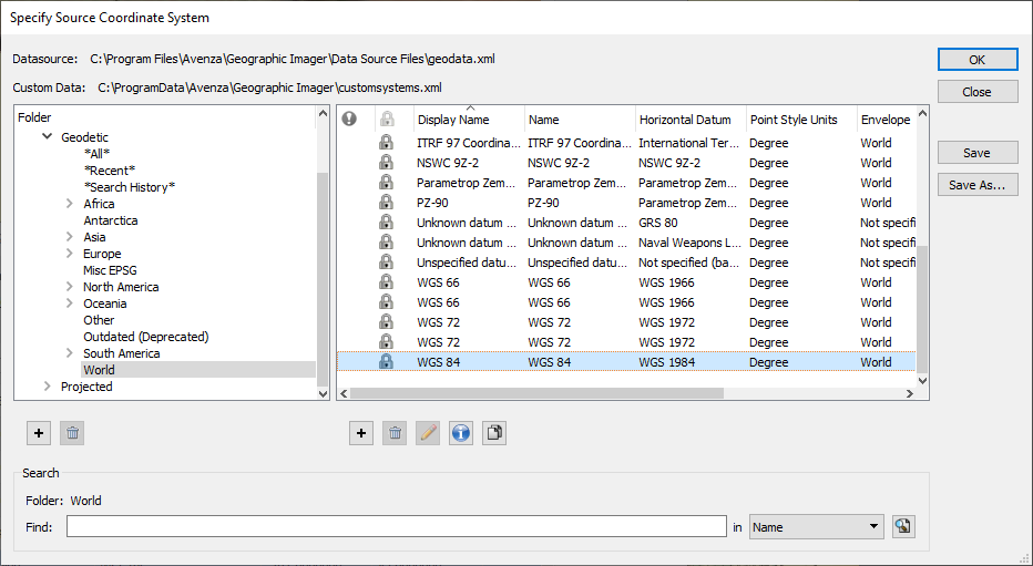
Now that you have added your two necessary control points to the image, you are ready to Quick Georeference your image. Next to the Image Coordinate System label, select the Specify… link. In the Choose Coordinate System dialog box, select the [No Coordinate System Specified] link. This opens the Specify Coordinate System dialog box, where you can select the Geodetic > World category, select the “WGS 84” coordinate system and click OK.
Back in the Georeference dialog box, select the Quick Georeference button (lightning bolt icon), and select By Two Reference Points (North/South aligned). You will notice that an additional control point is automatically added to the control point list and image view. Its world coordinates were calculated based on the existing two control point pairs. This occurs because a minimum of three control points are required to reference an image. It is also why the two control points you selected must not align.
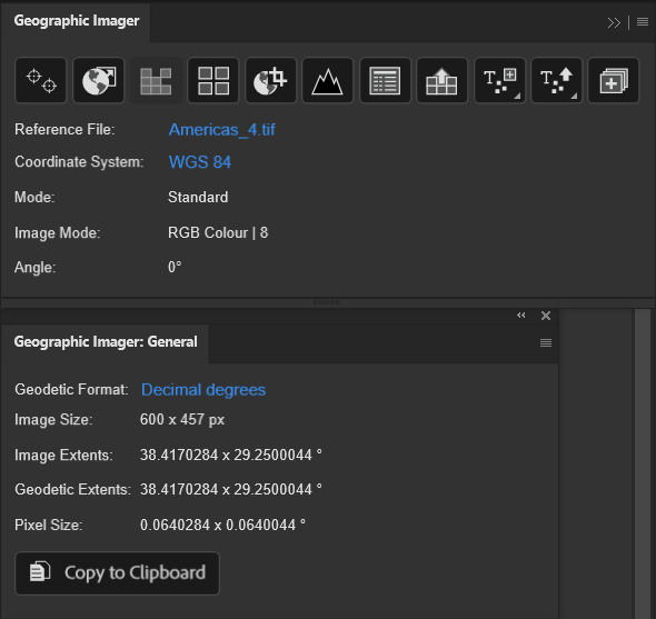
To complete your Quick Georeference, simply click OK. Voilà! You will see the reference information appear in the Geographic Imager panel, and further details can be found in the Geographic Imager: General panel.
You can also check out our video tutorial for Quick Georeferencing on YouTube:
To view the step-by-step instructions that constituted the material in this blog post, check out the Quick Georeference tutorial in our Support Centre!
We are very excited to announce the release of MAPublisher version 11.3, the latest version of our MAPublisher® extension for Adobe Illustrator®.
With MAPublisher v11.3, we are introducing several compatibility updates! It also includes numerous performance enhancements and bug fixes.
Here’s what you can expect with the latest MAPublisher v11.3 release:
Compatibility with Adobe Creative Cloud 2024 and macOS Sonoma
We have committed ourselves to providing our users with a MAPublisher update that supports new Adobe releases as quickly as possible. We are happy to announce that MAPublisher v11.3 is fully compatible with the recently released Adobe Illustrator 2024 (also known as version 28.0).
In addition to Adobe CC 2024, MAPublisher is also fully compatible with the new macOS Sonoma (version 14).
FME Auto Update with FME 2023 Support
MAPublisher FME Auto is a Windows-only powerful add-on that connects the GIS data processing environment of FME Form to the cartographic design and publishing environment of MAPublisher and Adobe Illustrator. MAPublisher v11.3 is the first version of MAPublisher to provide support for the recent FME 2023.1 update.
MAPublisher 11.3 is Available Now!
If you would like to learn more about the new MAPublisher v11.3 update or have any questions, please check out our Support Centre.
MAPublisher v11.3 is immediately available today, free of charge to all current MAPublisher users with active maintenance subscriptions and as an upgrade for non-maintenance users.
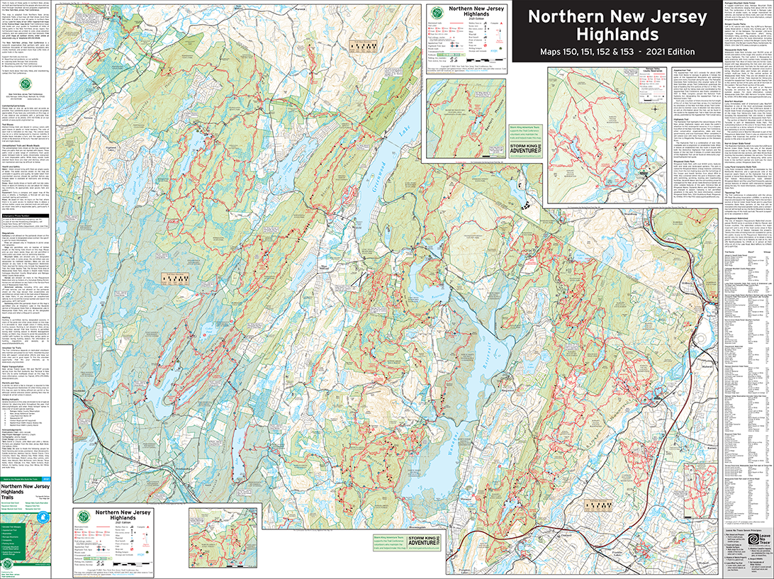
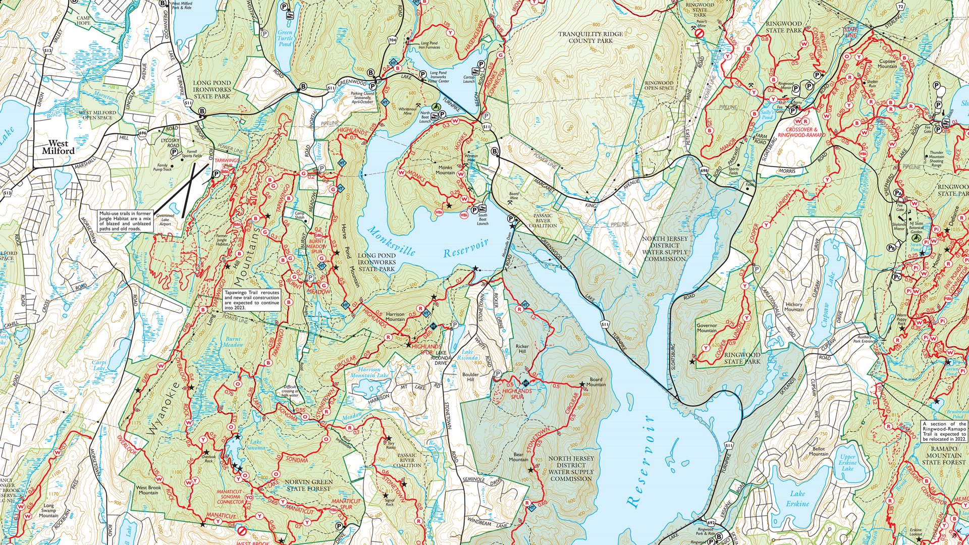
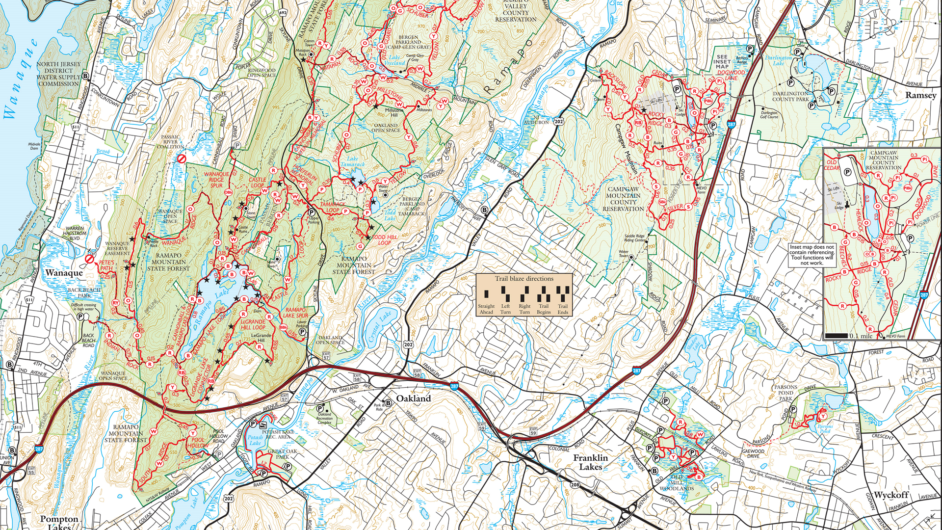
In this Map Spotlight, we are highlighting a submission from the 2021 Avenza Map Contest: Northern New Jersey Highlands Trails by Jeremy Apgar, with additional contributions from Daniel Chazin. This map features more than 360 miles of marked trails and over 40 parks and preserves in the northern Highlands regions of New Jersey. As the region is located less than a one-hour drive or transit ride from New York City, these trails are very popular. Recent changes and additions to the trails have required accurately updated maps to be created, with this particular map being recreated from scratch and scaled up by 33% from the original.
The map now includes many new features absent in the previous versions, including junction-to-junction trail mileage numbers, a completely rebuilt basemap with new detailed contour lines, revised park boundaries, and more than 5,000 manually-placed text labels and symbols. It also includes several inset maps to cover complex areas, a complete trail index, and park contact information, history, and regulations. On the importance of these maps, Jeremy stated: “During a time when there is a wealth of ‘free but largely unreliable’ trail information online and in popular apps, it is even more important than ever that we provide comprehensive, accurate, and up-to-date trail maps for the parks and trails in our region in a variety of formats.”
This map is available to be purchased from the Avenza Map Store for use in the Avenza Maps mobile app. Physical copies can also be purchased on the New York-New Jersey Trail Conference website, or found at the trailhead kiosks located throughout the region.
Select the images below to see a detailed look at Jeremy’s map
Making the Map
Several MAPublisher tools and functions were used to create this map. Jeremy used the Multiple Data Import tool to aggregate several data formats at once, such as GDB, SHP, and GPX files. Following import, he used the MAP Views panel and editor for setting up the map scale and projection of the document, and also reprojecting data layers in different coordinate systems. The MAP Attributes panel as well as the MAP Selections tool were used to further filter and easily organize imported data.
Jeremy also utilized some of MAPublisher’s Geoprocessing tools in the creation of this very detailed map. The Flip Lines tool was used for some finer linework styling, and the Simplify Art tool was helpful for creating visually appealing contour lines. Finally, Jeremy used the MAP Vector Crop tool to remove any art that was beyond the boundaries of the map.
Jeremy additionally used the Label Features tool, and Layout Tools to create preliminary labels and a scale bar, which were later replaced by manually placed labels and custom graphics.
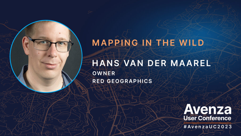
Getting started with MAPublisher can be a daunting task, especially if you don’t have a background in cartography. Unfortunately, that’s exactly what the staff at SafariBookings, the largest marketplace for African safaris, was facing. But with the help of Red Geographics they were able to quickly learn how to use MAPublisher to create their own maps. At the Avenza User Conference in May of this year, Hans van der Maarel, the owner of Red Geographics presented to us how this amazing feat was achieved. Hans is a long-time partner of Avenza and user of MAPublisher and Geographic Imager. He uses the products for a wide range of cartographic projects for international clients and offers training courses and consultancy projects aimed at developing workflows for clients. In addition to that, he is currently a board member of NACIS.
By using MAPublisher together with open data, Hans and his team were able to swiftly get SafariBookings up and running and producing their very own maps. They worked with two members of the SafariBookings team, both of whom had previous graphic design and Adobe Creative Cloud experience, but were not experienced with GIS or cartography. Red Geographics offered them a personal training plan and helped them source data allowing them to start producing high-quality maps in less than a month.
The Avenza User Conference is an annual free virtual conference for map makers, GIS enthusiasts, and geospatial professionals worldwide who share a common interest in Avenza mapping technology. The conference includes a combination of virtual sessions led by experts who will share their experiences with Avenza mapping products.
The Avenza User Conference is an annual event that grows each year with incredible speakers and participants. Get inspired by mapping and industry professionals by joining us for #AvenzaUC2024. Register here for next year’s conference taking place on May 9th, 2024.