My Account     Contact Us     Cart

Day 30 – Reflecting on the #30DayMapChallenge

What is the #30DayMapChallenge?

Since 2019, each November has been host to the annual #30DayMapChallenge. The challenge was started by Topi Tjukanov as a way to get the cartography and GIS communities to come together and share maps, exchange ideas, and start conversations about mapping and spatial data. Since then, this friendly competition has grown, with thousands of maps being made and shared by map-makers from all over the world, and from a wide range of experience levels. 

Kate B created this map entirely out of lego pieces (1500 total!) She shared this map on Day 15 – “Map made without using a computer”. See if you can spot the different shapes, symbols, and even video game characters that are hidden in the ocean sections of the piece.

The rules are simple: A specific theme is assigned to each day of November and the goal is to create a map each day that matches that day’s specific theme. Most important of all, this is a friendly challenge! The idea is to have fun, share maps with the carto-community, and hopefully learn something in the process! Here at Avenza, the challenge meant an opportunity to get together as a team and challenge ourselves to try something new. We have map-makers from all experience levels try their hand at making some maps, and we shared our favorites on the Avenza Twitter feed.

Erik shared this beautiful map of Mountains and parks he plans to visit on an upcoming trip to the Canadian Rockies. He shared this map for Day 21 – “Elevation”

Today marks Day 30, and the end of this year’s challenge. The theme for today is “Metamapping”, with the objective being to reflect on the overall experience and discuss what we mapped, what we enjoyed, and most importantly, what we learned. We’ve collected some thoughts from a few Avenza Team members who participated by asking them a simple question: “What did the #30DayMapChallenge mean to you?”

***

“An opportunity to get creative” – Rebecca B

I love making maps, and when the #30DayMapChallenge came around this year. I knew I had to participate in some way. I’ve spent a lot of time making maps with Avenza software, and some of my favorites were turned into tutorial articles on the Avenza Resources blog. You can see a handful of them here and here

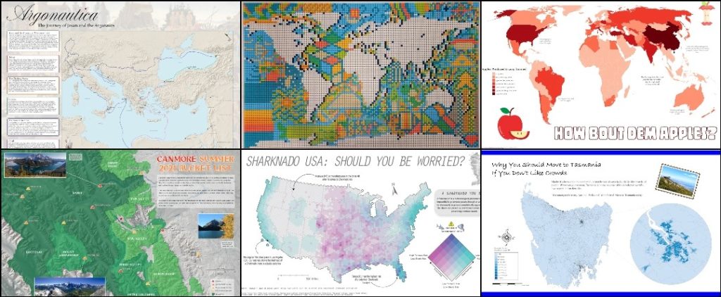
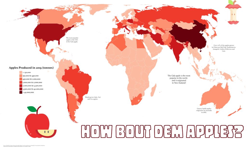
My first challenge was to create a map that fit the “red” theme. Of the three color-based themes in this year’s challenge, red spoke to me the most. Perhaps it’s because it’s a color not prevalent in nature (blue and green make me think of water and vegetation), meaning I could create something that stands out a bit more. For me at least, red immediately makes me think of apples, so I set out to create a map showing apple production worldwide. As is so common with map-making projects, oftentimes the hardest part is finding good-quality data. Luckily for me, the UN Food and Agriculture Organization houses some fantastic datasets on global food production. Using the Join Table tool in MAPublisher, I could link this tabular data to a polygon layer of countries I had imported into Adobe Illustrator. Finally, I used MAP Themes to create an appropriate red stylesheet to visualize my data, and just like that, I was done! 

Rebecca B created this fantastic map showing global apple production for Day 6 – “Red”

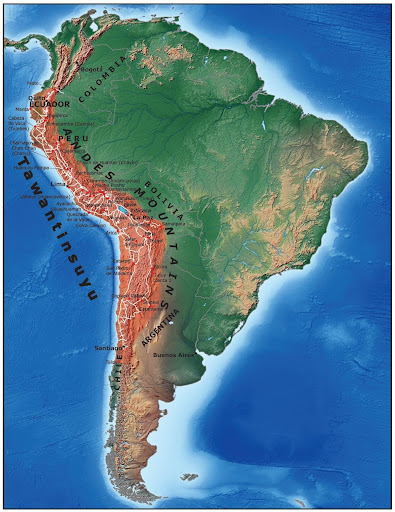
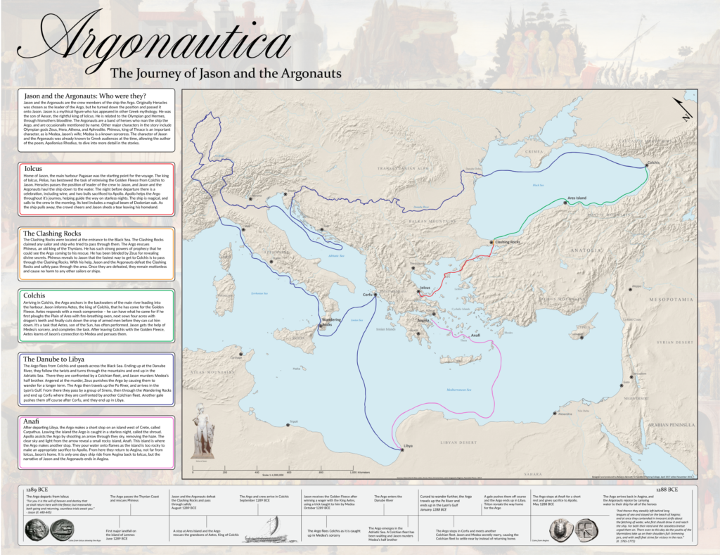
Next up, I took a shot at making a historical-themed map for Day 24 of the challenge. Now as a self-proclaimed history buff, I’ll never turn down an opportunity to do some research on the ancient world. For this theme, I chose to map out the mythical route of Jason and the Argonauts. If you’re from Toronto and you think “Argos” you probably think about the football team, but these are the original Argos. I actually started this map long ago for another project, but the #30DayMapChallenge got me inspired to revisit it and see it to completion. The route was all hand-drawn in Adobe Illustrator after meticulously cataloging and plotting the different locations in the legend. I was able to easily create map labels using MAPublisher LabelPro and overlaid the map layers onto a Natural Earth shaded relief base layer. While the map is physically the biggest part of the artboard, the story is what really drove me to create the map.

Looking back on this challenge, it’s a wonderful opportunity to get back into map-making. The #30DayMapChallenge is a great outlet to reignite that spark of love for cartography.

Rebecca B manually digitized the path of Jason and the Argonauts for her Day 24 – “Historical” map

***

“A chance to learn a new skill” – Chelsey

Not all of us at Avenza are experienced map-makers! In fact, even though I often use maps in my everyday life, I haven’t had many opportunities to make a map myself. For me, the #30DayMapChallenge was an opportunity to learn, try new things, and (hopefully) create my first map!

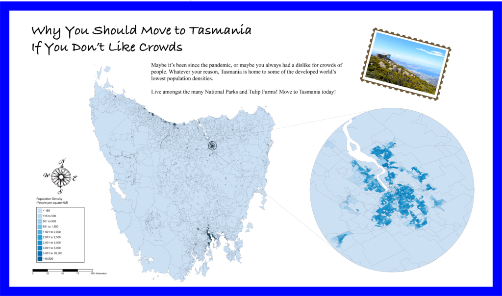
I was fortunate that the Avenza team included several experienced map-makers who were willing to sit down with me and teach me the basics of cartography. After a short crash course on “projections”, “coordinate systems” and the “fundamentals of working with spatial data”, I felt confident I could take my first steps in the world of cartography. Using some of the great tutorial workflows in the Avenza support center, I was able to get my first map dataset imported with MAPublisher. With a bit of help from my Avenza teammates, I was able to get a population dataset showing population counts for Tasmania. Something I quickly learned is that population data needs to be adjusted to account for variation in the size of each area of measure. I used the attribute expressions tutorial to create an expression that calculated the population density for each region rather than the raw population value. Finally, apply a MAP Theme to give the map some color, and add a few remaining stylistic elements with the native Adobe tools, and voila! My very first map is complete!

For me, the #30dayMapChallenge offered me a chance to learn some great new tools, and take a crack at making my very first map. I learned that making maps doesn’t have to be hard, and in fact can be quite fun! Being able to go from never made a map to “I made a real map!” in a matter of hours was incredible, and I can’t wait to try out these newfound skills on some other map projects!

Chelsey got a crash course in beginner map-making with MAPublisher, allowing her to create this neat map of population density in Tasmania for Day 12 – Population

***

“Not all maps have to be serious” – Spencer

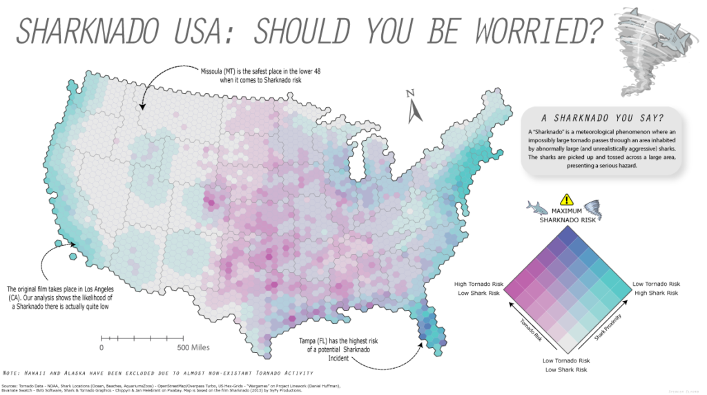
This year was my second time participating in the #30DayMapChallenge and once again, it was incredible to see the map-making community come together to share some really cool maps. I enjoy these types of challenges because they encourage new and experienced map-makers alike to try out new tools, learn some new techniques, and work on maps in a friendly, non-intimidating environment. For me at least, it was an opportunity to just have fun and try out some maps that were less serious in nature. Too often maps are only the result of intensive analytical processes or a product of complex data visualization. While these types of rigid workflows are still quite interesting to work on, it’s also good to step back and just have fun with the process instead of focusing on every detail in the workflow. For Day 4 – “Hexagons”, I did just that and put together a simple map documenting the “Sharknado Risk” across the US. I even wrote a tutorial blog about how I did it!

Spencer made this not-so-serious map of Sharknado risk by creating a custom Bivariate-risk index in MAPublisher. He shared this map for Day 4 – “Hexagons”

What I enjoy most about open-ended map challenges like #30DayMapChallenge is that they allow one to explore topics or datasets that they might not use in their normal day-to-day work. As many cartography and GIS folks know, the most challenging part of ‘making a map” often comes from deciding on a theme, and finding good data. This is especially true when you are restricted to a very specific mapping result or must adhere to strict design considerations. The #30DayMapChallenge removes some of these obstacles and provides an environment that encourages creativity and gets back to the real reason so many of us got into the industry – because we enjoy making maps.

***

Some of the Map created by the Avenza Team for #30DayMapChallenge

Cartographer Chronicles: Dan Cole

When it comes to map-making, Dan Cole is a true master. A passionate academic, Dan has designed maps for research and academia for over 40 years. As the GIS Coordinator and Chief Cartographer of the Smithsonian Institution in Washington, DC., Dan has created maps and cartographic pieces for museum exhibits enjoyed by hundreds of thousands of visitors every year. As a researcher, Dan has authored scholarly publications in several renowned academic journals, and co-edited the book “Mapping Native America: Cartographic Interactions between Indigenous Peoples, Government, and Academia.”  

For Dan, his interest in maps began when he was a child. He often enjoyed being the “navigator” on family vacations and building off a natural fondness for exploration he developed hiking trails as a Boy Scout. In his freshman year at the University at Albany – State University of New York, Dan first became interested in a career in cartography while studying under esteemed cartographer Dr. Michael Dobson. The opportunity to turn a genuine interest into a full-fledged career was too good to pass up, and Dan soon found himself enrolling in every cartography, geography, and remote sensing course he could. In the final year of his Bachelor of Geography degree, Dan became a cartography teaching assistant, providing him his first opportunity to act in a teaching role. 

Immediately after graduating, Dan was recruited to an assistantship position at Michigan State University (MSU). Here he published his first research paper, which was co-authored alongside Richard Groop, now a professor emeritus in Geography at MSU. Completing a Masters degree in Geography in 1979, Dan moved to Oregon State University (OSU) and began collaborating with cartography professor Jon Kimerling, first as a TA, and later to run the Cartographic Lab there.

“Were there Dinosaurs in your backyard?” – One of Dan’s maps on display in the Deep Time Hall at the Smithsonian National Museum of Natural History

Leaving OSU in 1981, Dan took on a variety of roles at several recognizable institutions across the country. Some of these roles included; leading the Cartographic Lab at the University of Maryland, working as a cartographic technician for the National Oceanic and Atmospheric Administration (NOAA), contract cartography work for the Woods Hole Oceanographic Institute, and taking on a course instructor position at Montgomery College. In 1986, Dan began working at the Smithsonian Institution (SI) and was able to pursue his passion for research full-time. Some of his earliest mapping pieces with SI became an integral part of the “Handbook of North American Indians”, a series of scholarly reference volumes documenting the culture, language, and history of all indigenous peoples in North America. Through a cooperative arrangement, he was also responsible for researching the changes to the Bureau of Indian Affair’s “Indian Land Areas” map in 1987 and 1989.

“My first five years there mostly involved cartographic research, doing both manual and computer-based mapping for the Handbook of North American Indians—at the time we used Adobe Illustrator 88!”

Later, Dan moved to a role as the GIS Coordinator with the Smithsonian’s IT Department. There, he was exposed to the entire breadth of cartographic projects spanning the Smithsonian’s impressive list of research disciplines. He worked on projects related to biodiversity and species ranges, created maps documenting climate change, and contributed to interactive map exhibits showing the impacts humans have on the environment. From volcanology and mineralogy to prehistoric studies and even the study of dinosaurs, Dan became involved in most of the Smithsonian’s major subject areas. Several of Dan’s map creations even feature in the permanent exhibits at the Smithsonian National Museum of Natural History.

Pathways and origins of invasive marine species, one of 40 maps created for the Ocean Hall exhibit at the Smithsonian National Museum of Natural History

Although each unique exhibit and area of study came with its own specific objectives, from a cartographic standpoint, he found that most still shared a few key concerns. He noted that one of the biggest challenges for almost all museum researchers is to geo-reference the vast number of artifacts and biological specimens that are contained in the museum’s collections. Such a process is crucial to analyze where specimens were found in the past and to provide insights on where they could be found in the future based on changes to the environment.

“Collections for nearly all museums around the world, including the Smithsonian, have environmental characteristics documented with the collection site. But most, by far, do not have coordinate locations for artifacts and specimens collected before the GPS era; rather, the majority of their collections have descriptive locations. So we must use Natural Language Processing—a computer science-based technique—to process coordinates from the written descriptions.”

By the mid-1990s, digital mapping processes had become an integral component of map creation. Dan became one of the first adopters of MAPublisher, using the first version of the software to work with maps and geographic data in the Adobe Illustrator environment. Today, MAPublisher continues to play a crucial role in map production at SI, and Dan still uses MAPublisher to produce maps for some of the museum’s most popular exhibits.

Since obtaining MAPublisher in the 1990s, I have been involved with over 20 different exhibits and multiple publications. All of these required importing shapefiles to Adobe Illustrator, PDF, or EPS formats so that publishers or exhibit staff could work with them. While other digital mapping software has improved over the years, I find the placement of typography is still handled more elegantly with MAPublisher.”

One of five maps that form part of the “Narwhals: Revealing an Arctic Legend” exhibit at the Smithsonian National Museum of Natural History (now a travelling exhibit!)

The museum environment presents some unique challenges for a cartographer. In a museum setting, maps need to be designed to communicate with the general public, synthesizing and presenting complex information for an audience that may be unfamiliar with the subject matter. This differs from research-focused work, which typically requires static printed maps that adhere to the strict guidelines of academic journal and book publications, and is typically viewed by experts in that particular field of study. For museum exhibits, cartographers need to employ careful design techniques to make maps informative and engaging to diverse audiences of all ages. These techniques result in maps that vary widely in format, from traditional static poster maps to animated and interactive maps that tell dramatic stories or serve as learning tools. Commenting on some of the unique challenges in today’s “pandemic era”, Dan notes that virtual online exhibits have made the use of web-mapping and interactive maps more commonplace.

“For the immediate and long-range future, I see greater use of static, animated and interactive maps online for public education on a variety of topics, with less interactivity in-person.”

Dan continues to oversee GIS support and teaching for staff at SI. He greatly enjoys the opportunity to work on diverse projects from a variety of interesting areas of study. As the GIS Coordinator at SI, he now covers over 400 GIS and satellite image processing users, plus over 500 story map writers and developers, including staff with very little knowledge of geography, cartography, or GIS. His passion for map-making remains to this day, and his maps continue to be enjoyed by visitors from around the world. An educator at heart, Dan has some parting advice for any students or young professionals seeking to break into the wonderful world of cartography;

“The advice that I give to nearly everyone interested in a cartography or GIS career is: while you’re still in school, plan to get a minor or double major in the field that interests you. Get a broad-based education that enables you to serve your clients in any field and join professional and academic organizations to expose yourself to others’ work. Most importantly, even once you are employed, never stop learning!”

“The Great Inka Roads” – One of 15 maps created for the exhibit at the Smithsonian National Museum of the American Indian

News Archive