My Account     Contact Us     Cart

Day 30 – Reflecting on the #30DayMapChallenge

What is the #30DayMapChallenge?

Since 2019, each November has been host to the annual #30DayMapChallenge. The challenge was started by Topi Tjukanov as a way to get the cartography and GIS communities to come together and share maps, exchange ideas, and start conversations about mapping and spatial data. Since then, this friendly competition has grown, with thousands of maps being made and shared by map-makers from all over the world, and from a wide range of experience levels. 
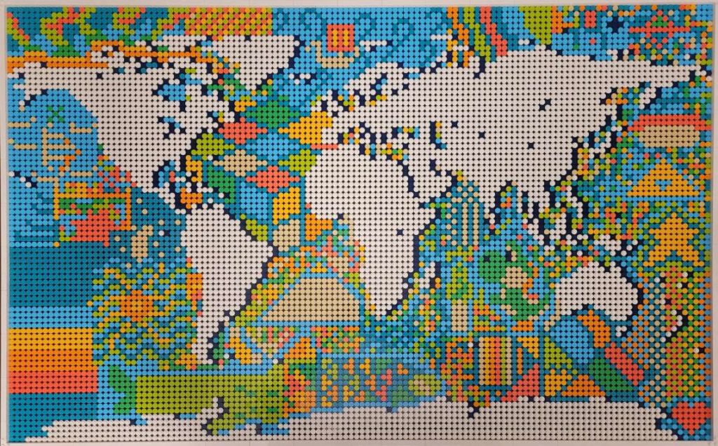
Kate B created this map entirely out of lego pieces (1500 total!) She shared this map on Day 15 – “Map made without using a computer”. See if you can spot the different shapes, symbols, and even video game characters that are hidden in the ocean sections of the piece.

The rules are simple: A specific theme is assigned to each day of November and the goal is to create a map each day that matches that day’s specific theme. Most important of all, this is a friendly challenge! The idea is to have fun, share maps with the carto-community, and hopefully learn something in the process! Here at Avenza, the challenge meant an opportunity to get together as a team and challenge ourselves to try something new. We have map-makers from all experience levels try their hand at making some maps, and we shared our favorites on the Avenza Twitter feed.
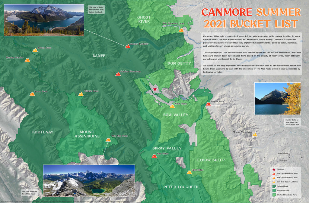
Erik shared this beautiful map of Mountains and parks he plans to visit on an upcoming trip to the Canadian Rockies. He shared this map for Day 21 – “Elevation”

Today marks Day 30, and the end of this year’s challenge. The theme for today is “Metamapping”, with the objective being to reflect on the overall experience and discuss what we mapped, what we enjoyed, and most importantly, what we learned. We’ve collected some thoughts from a few Avenza Team members who participated by asking them a simple question: “What did the #30DayMapChallenge mean to you?”

***

“An opportunity to get creative” – Rebecca B

I love making maps, and when the #30DayMapChallenge came around this year. I knew I had to participate in some way. I’ve spent a lot of time making maps with Avenza software, and some of my favorites were turned into tutorial articles on the Avenza Resources blog. You can see a handful of them here and here

My first challenge was to create a map that fit the “red” theme. Of the three color-based themes in this year’s challenge, red spoke to me the most. Perhaps it’s because it’s a color not prevalent in nature (blue and green make me think of water and vegetation), meaning I could create something that stands out a bit more. For me at least, red immediately makes me think of apples, so I set out to create a map showing apple production worldwide. As is so common with map-making projects, oftentimes the hardest part is finding good-quality data. Luckily for me, the UN Food and Agriculture Organization houses some fantastic datasets on global food production. Using the Join Table tool in MAPublisher, I could link this tabular data to a polygon layer of countries I had imported into Adobe Illustrator. Finally, I used MAP Themes to create an appropriate red stylesheet to visualize my data, and just like that, I was done! 
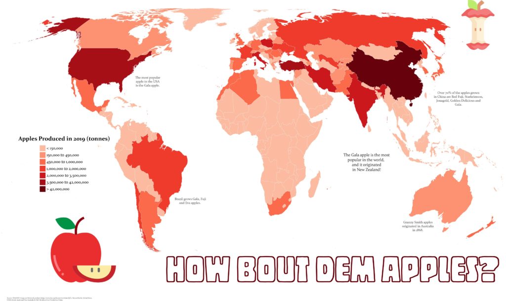
Rebecca B created this fantastic map showing global apple production for Day 6 – “Red”

Next up, I took a shot at making a historical-themed map for Day 24 of the challenge. Now as a self-proclaimed history buff, I’ll never turn down an opportunity to do some research on the ancient world. For this theme, I chose to map out the mythical route of Jason and the Argonauts. If you’re from Toronto and you think “Argos” you probably think about the football team, but these are the original Argos. I actually started this map long ago for another project, but the #30DayMapChallenge got me inspired to revisit it and see it to completion. The route was all hand-drawn in Adobe Illustrator after meticulously cataloging and plotting the different locations in the legend. I was able to easily create map labels using MAPublisher LabelPro and overlaid the map layers onto a Natural Earth shaded relief base layer. While the map is physically the biggest part of the artboard, the story is what really drove me to create the map.

Looking back on this challenge, it’s a wonderful opportunity to get back into map-making. The #30DayMapChallenge is a great outlet to reignite that spark of love for cartography.
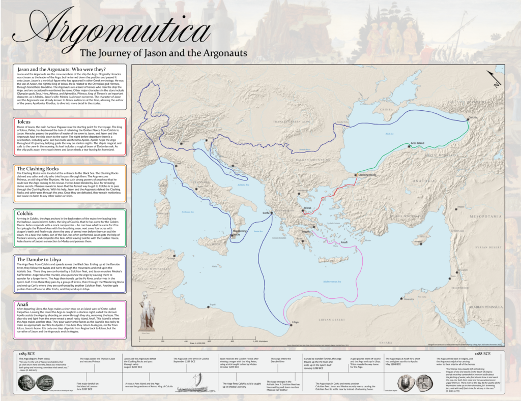
Rebecca B manually digitized the path of Jason and the Argonauts for her Day 24 – “Historical” map

***

“A chance to learn a new skill” – Chelsey

Not all of us at Avenza are experienced map-makers! In fact, even though I often use maps in my everyday life, I haven’t had many opportunities to make a map myself. For me, the #30DayMapChallenge was an opportunity to learn, try new things, and (hopefully) create my first map!

I was fortunate that the Avenza team included several experienced map-makers who were willing to sit down with me and teach me the basics of cartography. After a short crash course on “projections”, “coordinate systems” and the “fundamentals of working with spatial data”, I felt confident I could take my first steps in the world of cartography. Using some of the great tutorial workflows in the Avenza support center, I was able to get my first map dataset imported with MAPublisher. With a bit of help from my Avenza teammates, I was able to get a population dataset showing population counts for Tasmania. Something I quickly learned is that population data needs to be adjusted to account for variation in the size of each area of measure. I used the attribute expressions tutorial to create an expression that calculated the population density for each region rather than the raw population value. Finally, apply a MAP Theme to give the map some color, and add a few remaining stylistic elements with the native Adobe tools, and voila! My very first map is complete!

For me, the #30dayMapChallenge offered me a chance to learn some great new tools, and take a crack at making my very first map. I learned that making maps doesn’t have to be hard, and in fact can be quite fun! Being able to go from never made a map to “I made a real map!” in a matter of hours was incredible, and I can’t wait to try out these newfound skills on some other map projects!
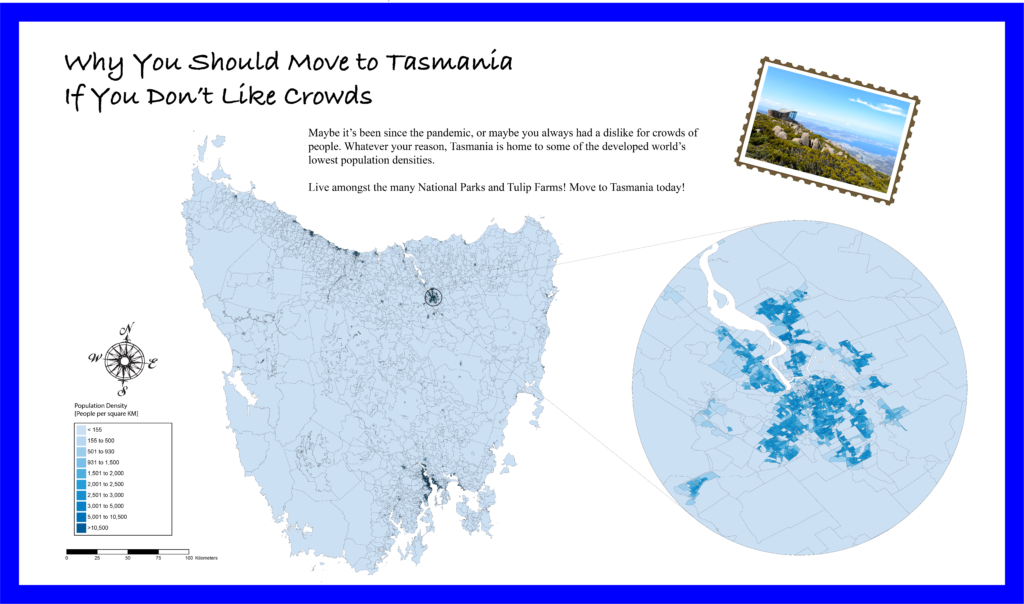
Chelsey got a crash course in beginner map-making with MAPublisher, allowing her to create this neat map of population density in Tasmania for Day 12 – Population

***

“Not all maps have to be serious” – Spencer

This year was my second time participating in the #30DayMapChallenge and once again, it was incredible to see the map-making community come together to share some really cool maps. I enjoy these types of challenges because they encourage new and experienced map-makers alike to try out new tools, learn some new techniques, and work on maps in a friendly, non-intimidating environment. For me at least, it was an opportunity to just have fun and try out some maps that were less serious in nature. Too often maps are only the result of intensive analytical processes or a product of complex data visualization. While these types of rigid workflows are still quite interesting to work on, it’s also good to step back and just have fun with the process instead of focusing on every detail in the workflow. For Day 4 – “Hexagons”, I did just that and put together a simple map documenting the “Sharknado Risk” across the US. I even wrote a tutorial blog about how I did it!
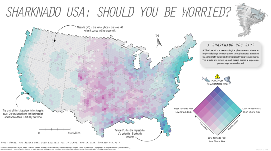
Spencer made this not-so-serious map of Sharknado risk by creating a custom Bivariate-risk index in MAPublisher. He shared this map for Day 4 – “Hexagons”

What I enjoy most about open-ended map challenges like #30DayMapChallenge is that they allow one to explore topics or datasets that they might not use in their normal day-to-day work. As many cartography and GIS folks know, the most challenging part of ‘making a map” often comes from deciding on a theme, and finding good data. This is especially true when you are restricted to a very specific mapping result or must adhere to strict design considerations. The #30DayMapChallenge removes some of these obstacles and provides an environment that encourages creativity and gets back to the real reason so many of us got into the industry – because we enjoy making maps.

***
Some of the Map created by the Avenza Team for #30DayMapChallenge

Map-making for the #30DayMapChallenge: Day 4 – Hexagons

Yesterday was Day 4 of the #30DayMapChallenge, with the goal being to create a map using “Hexagons”. In the spirit of the challenge, we took a not-so-serious approach to create a fun map of “Sharknado Risk” based on the 2013 film “Sharknado” using MAPublisher tools and a really neat hexbin dataset for the United States. This map was in part created for NACIS 2021, and you can see how we created the map by watching the full video presentation included below. This blog also includes a few supplementary notes if you wish to follow along.

What exactly is a Sharknado?

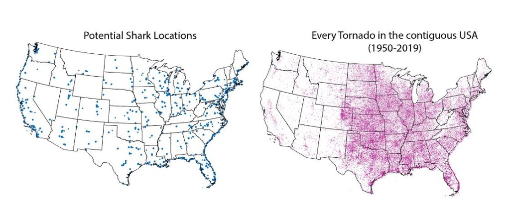
A sharknado is a fictional meteorological phenomenon that occurs when a large tornado scoops up some sharks, transports them some distance, and finally disperses across a populated area. Generally speaking, if a given area is close to potential shark habitats (be it an aquarium, a zoo, or even the ocean) and has a high frequency of tornadoes, the area is more “at-risk” of experiencing a sharknado. To that end, we gathered some great open datasets to help us map this risk. We collected a shapefile documenting point locations for every single tornado in the country dating back to 1950. With this dataset, we can determine the relative frequency of tornadoes for a given area. From OpenStreetMap, we estimated potential locations for sharks by collecting point coordinates for every aquarium, marine park, aquatic zoo, and ocean-facing beach. We used Overpass Turbo to query and extract these points to a spatial dataset and imported them into Illustrator using MAPublisher. Check out this great tutorial (produced by Steve Spindler!) that covers techniques for importing Overpass Turbo data into MAPublisher. The tutorial was part of our ongoing Mapping Class series, a video-focused series that provides helpful tips, techniques, and workflows from real-world cartographers.

Aggregate data with Spatial Join

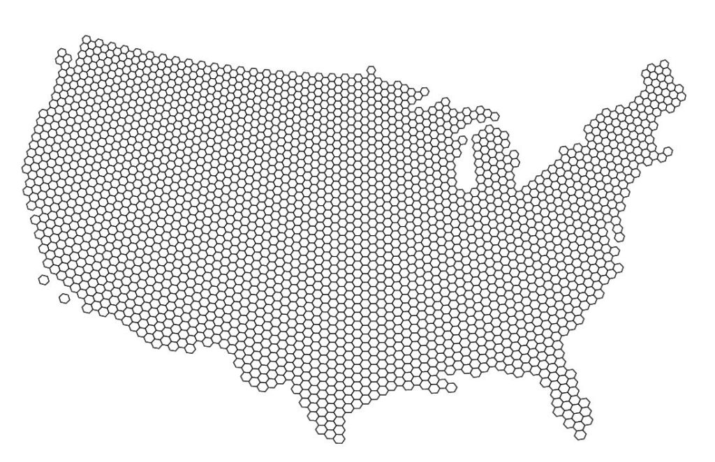
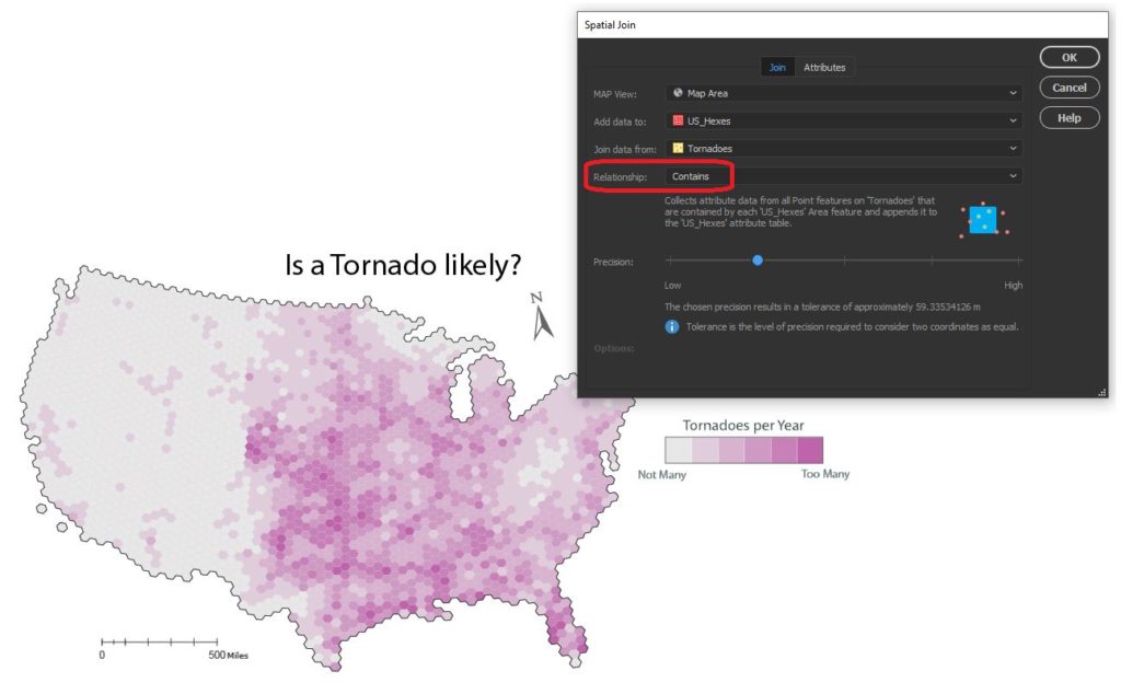
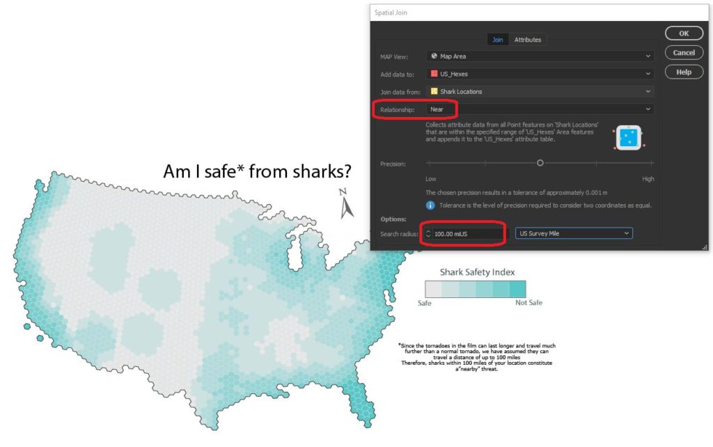
Since the challenge of the day is hexagons, we needed a way to get our messy point data into our clean “hexbin” format. The Spatial Join tool allows us to aggregate our point data (Tornado and Shark Locations) into a single hex-grid polygon dataset.

Credits to Daniel Huffman’s projectlinework.org for making this dataset available!

The Spatial Join tool includes several different options for “spatial relationships” that will determine how our point data is joined to the new hex-grid. We can also specify how the tool will aggregate the attribute information for our joined data. In this case, we join our Tornado point data based on a “contains”  spatial relationship. This will aggregate all tornado points that are “contained” within a given hexbin. We also specify that the tool should aggregate the attribute information for all “contained” tornados by tallying up the number of tornado points within each hex. Since we know the dataset spans a 69-yr period, we can easily calculate the average annual tornado frequency for each hexagon.

We apply a similar technique to our shark location data, this time specifying a “near” spatial relationship. We used some back-of-the-envelope math to estimate that a Sharknado (as it appears in the film) lasts substantially longer and travels farther than a normal tornado, meaning sharks as far away as 150 miles still present a potential risk. We can specify a search range of 150 miles and this will be applied to our spatial relationship as a cut-off distance. 


Edit attributes with expressions

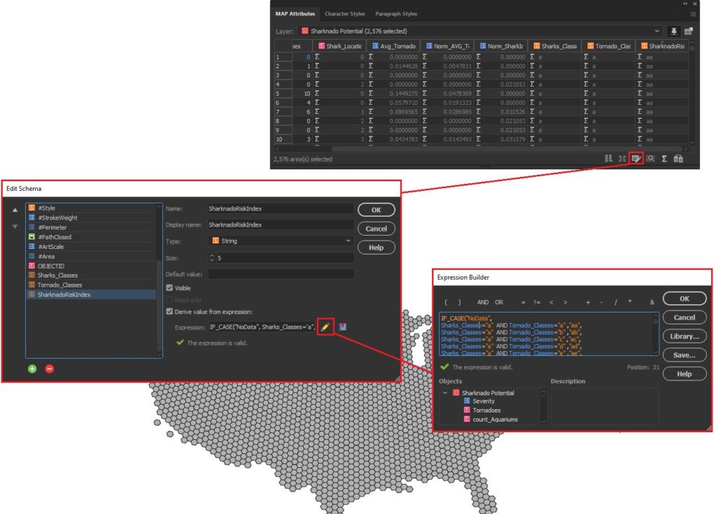
We assumed that Sharknado risk is highest when a given area is prone to tornadoes and also has a high concentration of potential shark locations. Given this, we came up with a basic equally-weighted, bi-variate risk index to assign a “Sharknado Risk” score based on these two variables. To calculate this score for each hexagon in our hexbin grid, we applied some custom expressions using MAP Attributes. First, we assigned a Tornado risk score from 1 to 6 based on the low to high frequency of tornadoes. We assigned a similar score for “Shark proximity” based on the concentration of potential shark locations. Finally, we combined these values into 36 unique scores to evaluate sharknado risk.

Stylize maps easily with MAP Themes

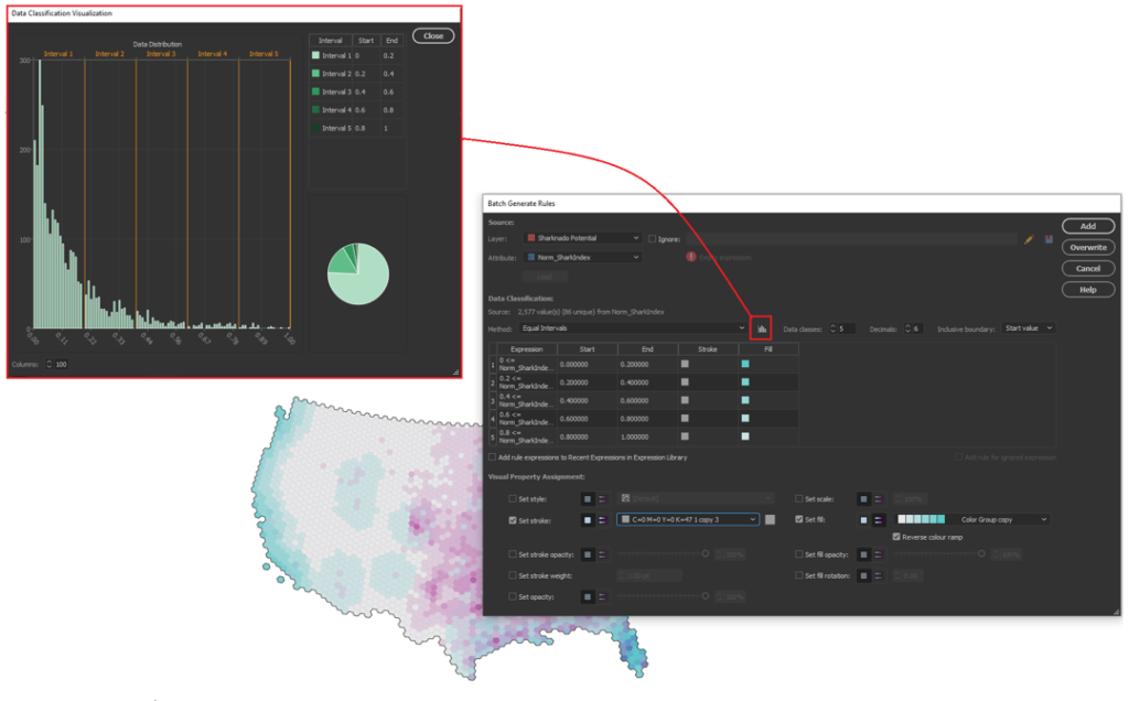
The final step is to stylize our map and create a layout. With MAP Themes, we can create rules-based stylesheets to easily stylize our map data in no time. MAPublisher comes with a great selection of built-in MAP Swatches, including several color brewer-based swatches that work great for choropleth-style maps like this. We used these swatches to create a custom, bi-variate swatch group to visualize each score of our “Sharknado Risk Index”. The MAP Themes tool also provided a neat data distribution viewer, which also allows us to inspect a histogram of our dataset. Although we used discrete categories for each of our risk scores, the data distribution viewer is very useful when working with continuous datasets since it allows you to see how your bin-widths will affect the display of colour on your choropleth.

The final touches

With stylization complete, Day 4 of the #30DayMapChallenge is almost in the bag. We can create a north arrow, and a scale bar and create a custom legend to facilitate easy interpretation. Since we are still within an Illustrator environment, we can use all the powerful native illustrator tools to add graphical design elements, text, and artwork to create a fun, infographic-style map. Although we were happy to call the map finished at this point, the great thing about making maps is there is also room to add more. For example, we might try using LabelPro to create custom labels that mark high and low-risk areas, or we could create insets to highlight specific regions of interest. The possibilities are endless!

We had a great time putting together this fun map for the #30DayMapChallenge, and we are excited to see what we can do for the remaining themes on the calendar! For those of you who are also making maps for the challenge, a reminder that the Avenza Map Competition is still accepting submissions. Share your map, compete with other map-makers in the community, and win some great prizes!

See a PDF version of the map here.

Mapping Class: Efficient Map-making using Templates and Stylesheets, with Steve Spindler

Welcome back to another edition of Mapping Class! The Mapping Class tutorial series curates demonstrations and workflows created by professional cartographers and expert Avenza software users. Today we have Steve Spindler, a longtime MAPublisher user, and expert cartographer. Steve has put together a 15-minute masterclass on creating maps from start to finish using templates and stylesheets. This video is jam-packed with useful tips and tricks that show how Steve uses templates, stylesheets, and a host of MAPublisher tools to design a beautiful map in minutes.

Steve has produced a video to show the complete, un-cut, map-making process. The Avenza team has produced video notes (below) to help you follow along.

***

Efficient Map-making using Templates and Stylesheets
by Steve Spindler (video notes by the Avenza team)

Readers of the Avenza resources blog will recognize Steve Spindler as a recent feature of our Cartographer Chronicles spotlight article. Steve has also been a frequent contributor to the Mapping Class blog series, where he has shared his tips for using MAPublisher to make eye-catching maps. Some of his recent contributions cover his techniques for using attribute expressions to edit street labels and working with OSM data in MAPublisher

Today, Steve is doing something a little different. Instead of focusing on a specific tool or technique, he has put together a complete 15-minute masterclass showing how he creates a map from start to finish. In this uncut demonstration, Steve discusses his tips for importing data, using MAP views, applying stylesheets, and even labelling. Steve shows how using templates and preconfigured MAP themes can make map creation a breeze.

Using a Template

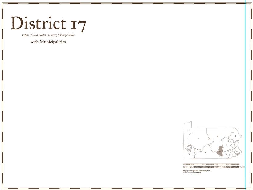
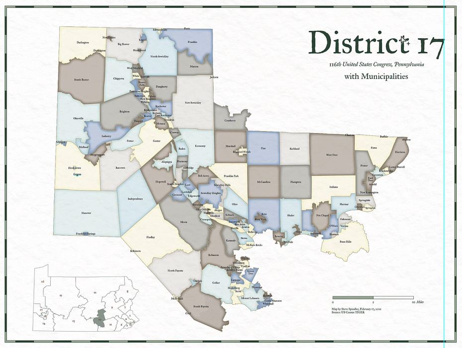
In this demonstration, Steve will be creating a congressional district map showing the municipalities of Pennsylvania District 17. Steve discusses how using a template to create your map can significantly improve the speed of map creation. Templates can be used to configure standardized design elements that can be recycled across several different map projects. Templates are especially useful in situations where different maps form part of a series with shared design components and colour schemes.

For this tutorial, Steve uses a template that includes some basic stylistic elements he typically includes in all his congressional district maps. The template comes preloaded with custom borders, Titles, subtitles, an inset map, and a scale bar. His template is already configured with custom fonts and colours that will give some uniformity across his different map projects.

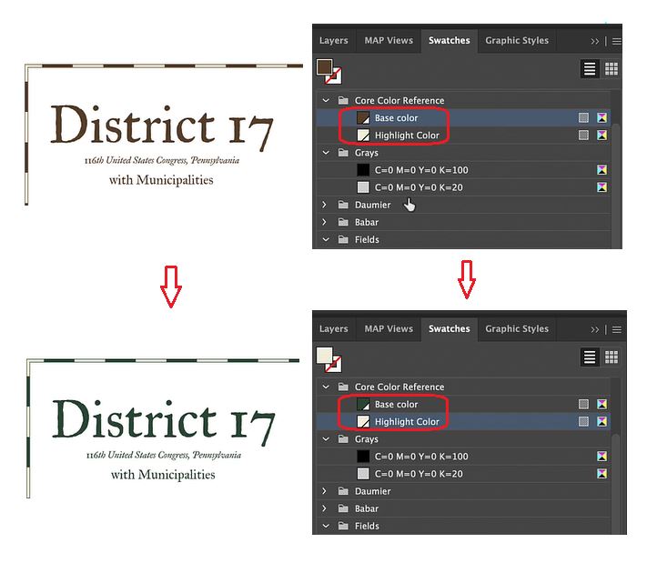
Steve has also set up swatch groups for his template. This ensures each map created with the template uses the same colour groups. Setting up swatches in the template also makes it easy to swap out or change the colour of different map elements. As an example, Steve uses the drag and drop functionality of the swatch panel to automatically adjust the “core colours” of his map template (text, border, and scale bar colours) from brown to green. 

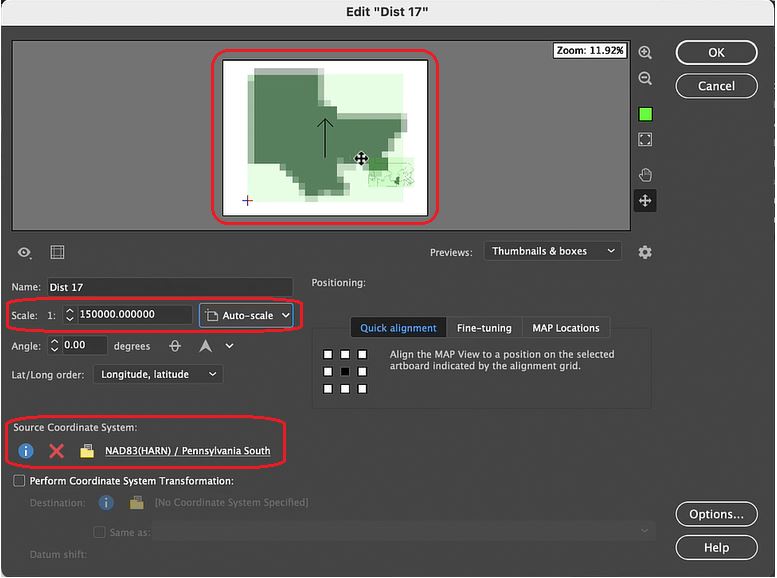
Steve’s template comes preloaded with an inset map containing all the congressional district boundaries for Pennsylvania. Using the drag-and-drop functionality of MAP Views, he can place a “District 17” data layer into a new MAP View that will contain the main body of his map project. Using the MAP View editor, Steve can assign a custom scale and choose an appropriate projection. This will ensure any new data layers he brings into the MAP view will be correctly aligned and accurately projected. 

Import and Prepare the Map Data

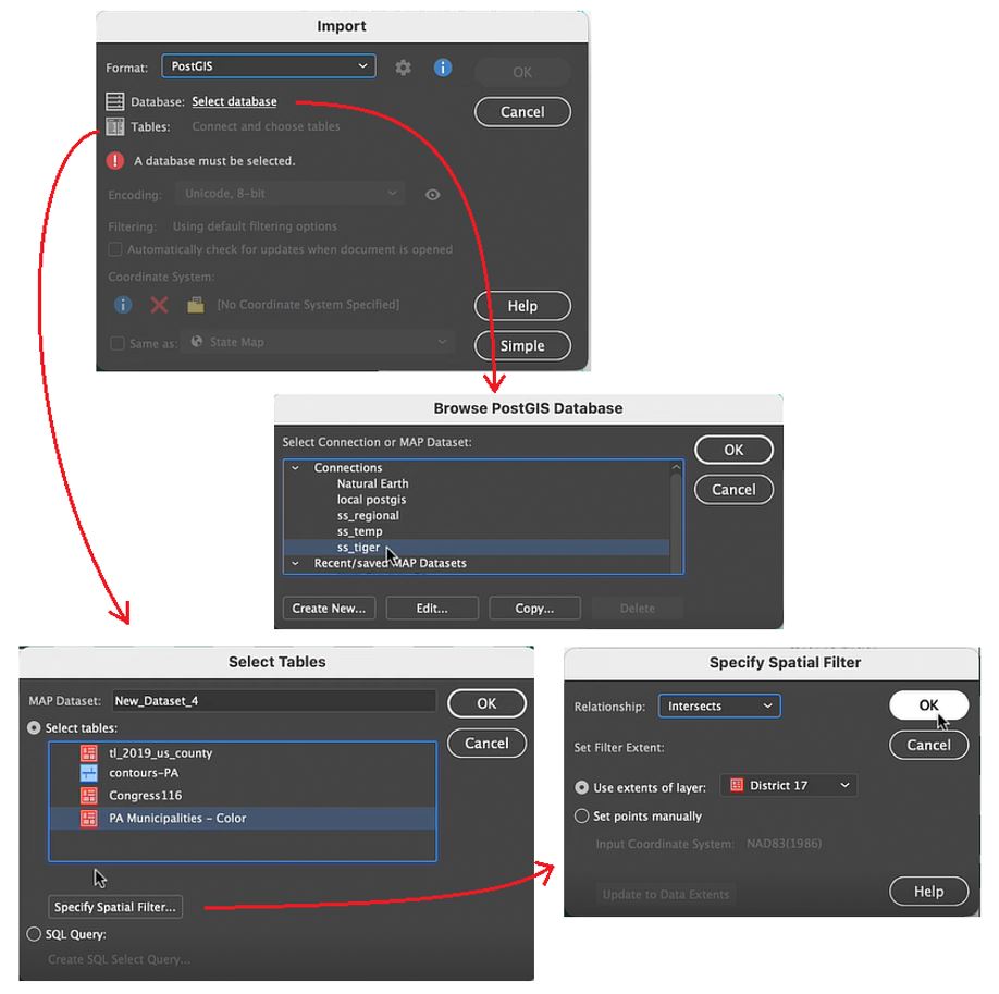
With his template configured, Steve now brings in some new data. He wants to access municipal boundary polygon data found on a PostGIS database stored locally. You can specify the specific data table within the database he wishes to add using the Import tool. More importantly, shows how he uses spatial filtering options to specify the region of interest. The spatial filter means that only the data relevant to the map extent is loaded in (very useful when using large datasets).

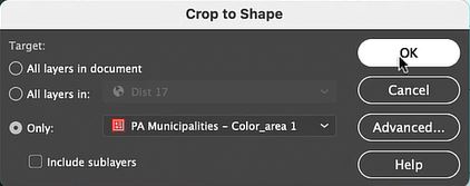
Using the Crop to Shape tool, Steve cleans up the imported data layer by removing any polygons that fall outside his district boundaries. Next, he uses the Simplify tool to remove extraneous vertices, with that his data is ready for stylization!

Apply Styles with MAP Themes

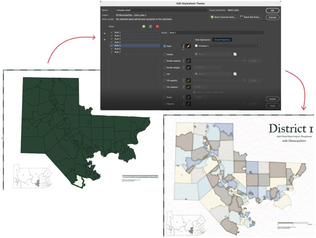
MAP themes are one of the most powerful tools in the MAPublisher toolset. MAP Themes allow you to configure rules-based stylesheets that work with attribute information stored in map data layers. Using pre-coded attribute values in his municipal boundary layer, Steve can assign colour fills to each municipality. Using colour in this way is a bit more eye-catching than using generic boundary lines, and makes it easy to see the shapes of each municipality.

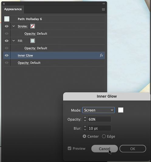
MAP Themes can not only set the stroke and fill for each polygon, but also apply graphic style effects such as “inner glow” to give each shape a more defined appearance. Since MAP Themes are entirely rules-based, it’s easy to modify and apply styles across the entire map without needing to adjust appearance settings for each vector layer individually. 

Labels and Details

With his MAP Themes applied, Steve needs to finalize the scale bar that appears in the bottom right corner of the map. Since the template he uses comes pre-configured with a MAPublisher cale bar, it’s only a matter of dragging and dropping the scale bar layer into the appropriate MAP View. If you recall from earlier, Steve set up this new map-view with its own map scale and projection, meaning the scale bar will automatically be adjusted to fit the map data once it is placed in the new MAP view, creating an accurate and informative scale for viewers.

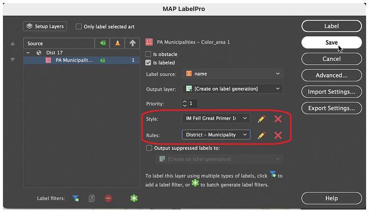
Lastly, Steve uses the MAPublisher LabelPro add-on to apply labels to each of the municipalities in his map. Similar to MAP Themes, the LabelPro tool allows Steve to configure rules-based label layers that manage label placement and style. The labelling engine ensures that labels are placed to avoid collisions, eliminate label overlap, and reduce label clutter. Finishing the map with a few minor touch-ups and voila!, Steve has finished his Pennsylvania District 17 Map in less than 15 minutes!

***

About the Author

Steve Spindler has been designing compelling cartographic pieces for over 20 years. His company, Steve Spindler Cartography, has developed map products for governments, city planning organizations, and non-profits from across the country. He also manages wikimapping.com, a public engagement tool that allows city planners to connect and receive input from their community using maps. To learn more about Steve Spindler’s spectacular cartography work, visit his personal website. To view Steve’s other mapping demonstrations, visit cartographyclass.com

Cartographer Chronicles: Steve Spindler

Cartographer Chronicles Steve Spindler Banner

Steve Spindler has cultivated a passion for cartography that has continued for more than 25 years. He operates Steve Spindler Cartography, which develops custom-designed cartographic pieces that can be seen in map products utilized by governments, city planning organizations, and nonprofits from across the country. He also manages wikimapping.com, a public engagement tool that allows city planners to connect and receive input from their community using digital maps. A passionate cartographer at heart, Steve considers map-making both a hobby and career. He strives to share his ideas, techniques, and truly captivating cartographic style with others, either through his previous teaching at Temple University or through his tutorials hosted on his personal website cartographyclass.com

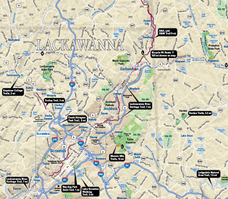
Steve first began designing maps in the early 1990’s while at Temple University for graduate school. Pursuing a Master’s degree in Urban Studies, Steve found that the cartography lab at Temple was his favourite place to be. Before the widespread accessibility of digital maps, Steve recalls spending time at the Philadelphia Library, exploring map catalogues and manually tracing topographic maps before faxing them to his own computer. Later into his graduate studies, Steve joined a mailing list for digital cartography enthusiasts, and this is where he first learned about Avenza and MAPublisher for Adobe Illustrator. He quickly adopted the software into his map-making process, leveraging its suite of cartography tools to easily create maps within a design-focused environment. He continues to use MAPublisher for much of his work, and some examples, such as the Northeastern Pennsylvania trail system map shown below, are even available digitally on the Avenza Map Store for use in the Avenza Maps app.

Steves Spindlers map of NEPA trails

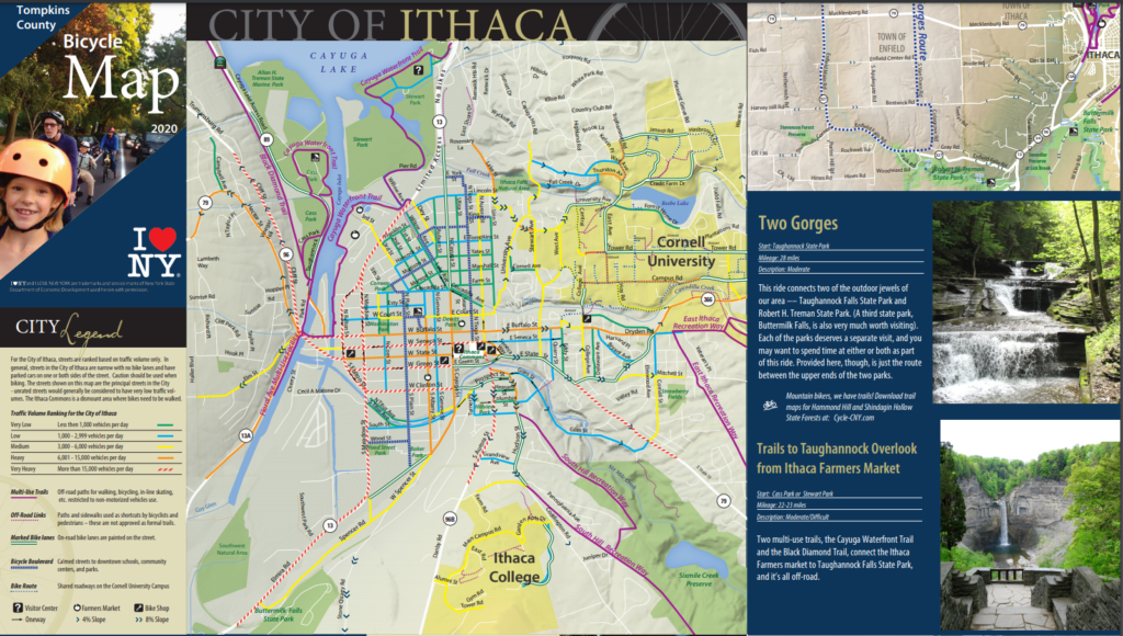
After graduating, Steve combined his passion for cycling with his love of map-making. He started designing maps that promoted bicycle transportation. His list of clients grew, and so too did his reputation in the cartography community. Soon his maps were published and shared over a wide range of platforms across the country.

“It was nice to see my maps posted in public places – in office cubicles, in a Congressional office, being waved around by a US Secretary of Transportation, in a Mac OS X keynote, in the subway, on TV shows, in newspapers – I was using MAPublisher to help create them all.”

After several years of high-paced freelance cartography work, Steve chose to revise his business approach to allow him to be more selective in how he engaged with potential projects. “I created an archetype that I wanted to serve, and put energy into solutions that would help this archetype”. Steve mentioned how he prefers to let a client place a value on what they want, first spending time with the client to conceptualize a problem and then delivering a proposed solution, only sending an invoice once it is appropriate. In his words, this requires a knowledgeable client that really understands what they need.

Steve Spindler's City of Ithaca bike map

Some years later, he returned to Temple University, this time as an instructor. He taught cartography to students within Temple’s Professional Masters of GIS program and stressed the importance of creating a balance between teaching concepts and teaching software. 

“Cartography is really about communicating with an audience, it’s not just about specific software. I think that teaching cartography using a single program (Illustrator with MAPublisher) would allow me to focus more on design concepts and communication. MAPublisher can still access large data sets, and the data is ultimately contained within the Illustrator file.”

His passion for teaching has continued beyond the classroom as well. In the last year, he has taken up a mentorship role for an up-and-coming cartographer. He provides direction and feedback on real-world map projects in what he describes as “learning with purpose”.

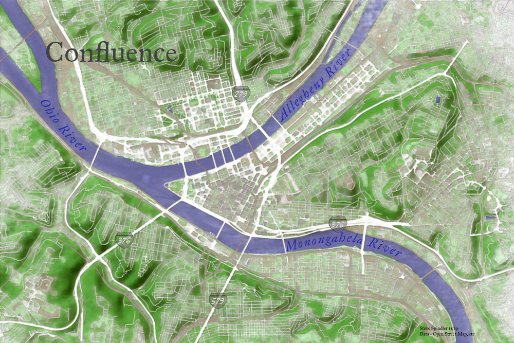
Steve Spindlers watercolour style map of rivers

Steve also believes it is important to take learning into one’s own hands. To help him evaluate and improve his mapping processes, he often records his work sessions, carefully documenting and annotating many hours of recorded work such that he can revisit and recall specific mapping steps later on. Many of these sessions are edited down into videos that Steve posts on cartographyclass.com, a personal website for sharing his thoughts, ideas, and techniques on creating maps. He regularly shares maps that he creates for fun in his spare time, drawing inspiration from nature, photography, and artwork to create elegant visually engaging map pieces that exemplify the balance of art and science that is cartography. His recent work has explored the use of graphic styles and MAP Themes to create artistic map pieces that mimic the effect of watercolour paintings. Other posts show his use of the elevation profile tool to create unique maps of recent cycling trips.

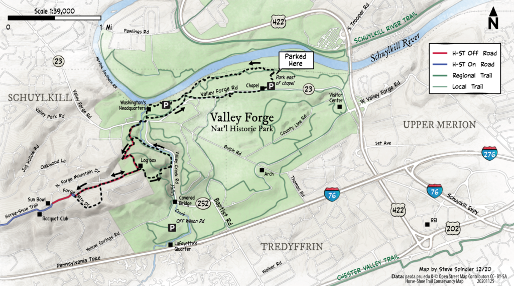
Steve Spindler's trail map of Valley forge

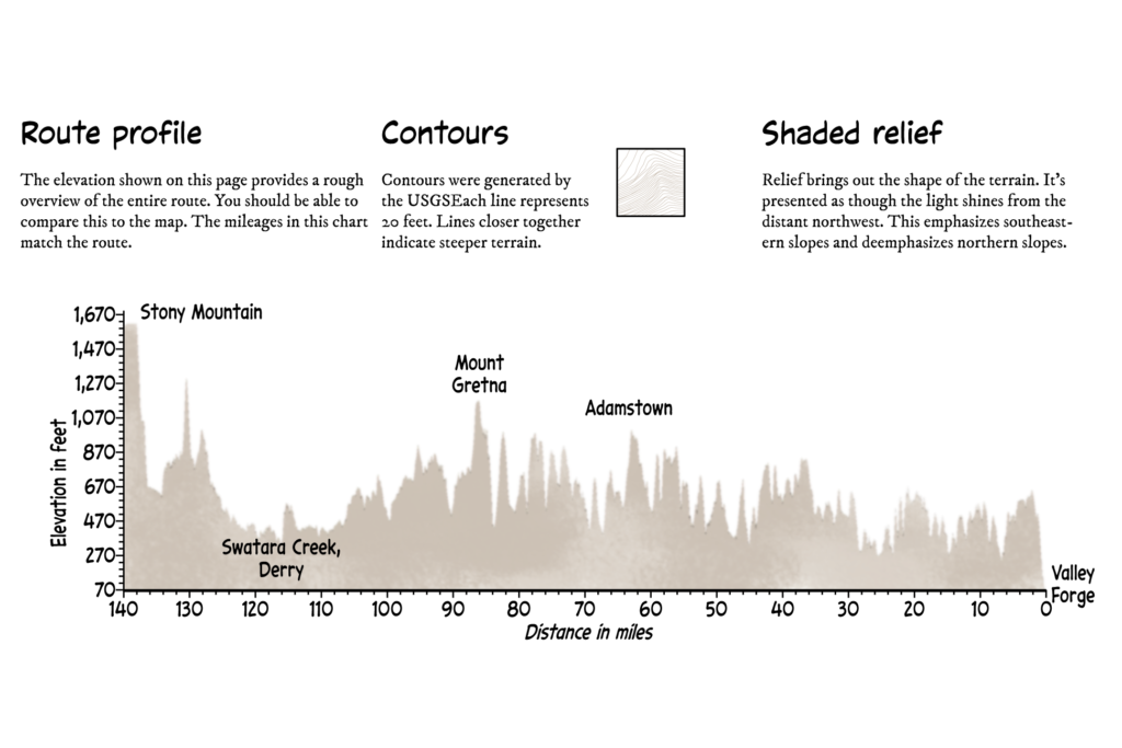
Steve Spindler's Valley forge elevation profile

In addition to the many MAPublisher focused tutorials hosted on his personal website, Steve is also an active contributor to the Mapping Class tutorial video series hosted on the Avenza Resource Blog. His contributions demonstrate unique and innovative workflows that leverage a wide range of MAPublisher tools. 

These days Steve continues to take on map-related projects. His approach has allowed him to develop a career that leverages a personal passion and directs it into a successful business. He continues to learn and explore new techniques in cartography in his free time, sharing his thoughts and processes with readers of his blog. After more than 25 years of freelance cartography work, Steve feels his perspective on mapping and business has changed, “Cartography and business are not the same things for me. I want to make maps and don’t need a contract to do this.  It’s just a matter of practicing daily. When the right client comes along, I can help out. I like to be helpful.” 

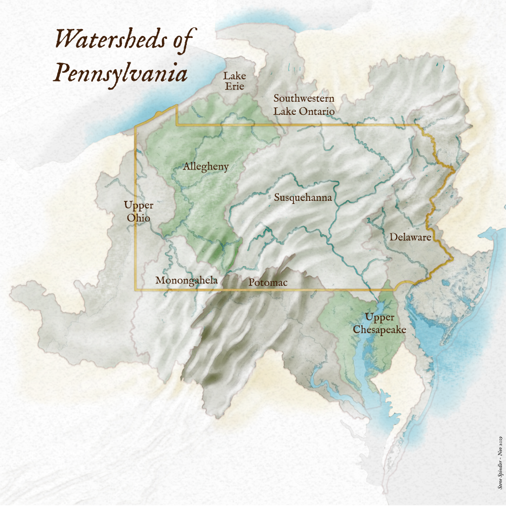
Steve Spindler's watercolour map of Pennsylvania watershed

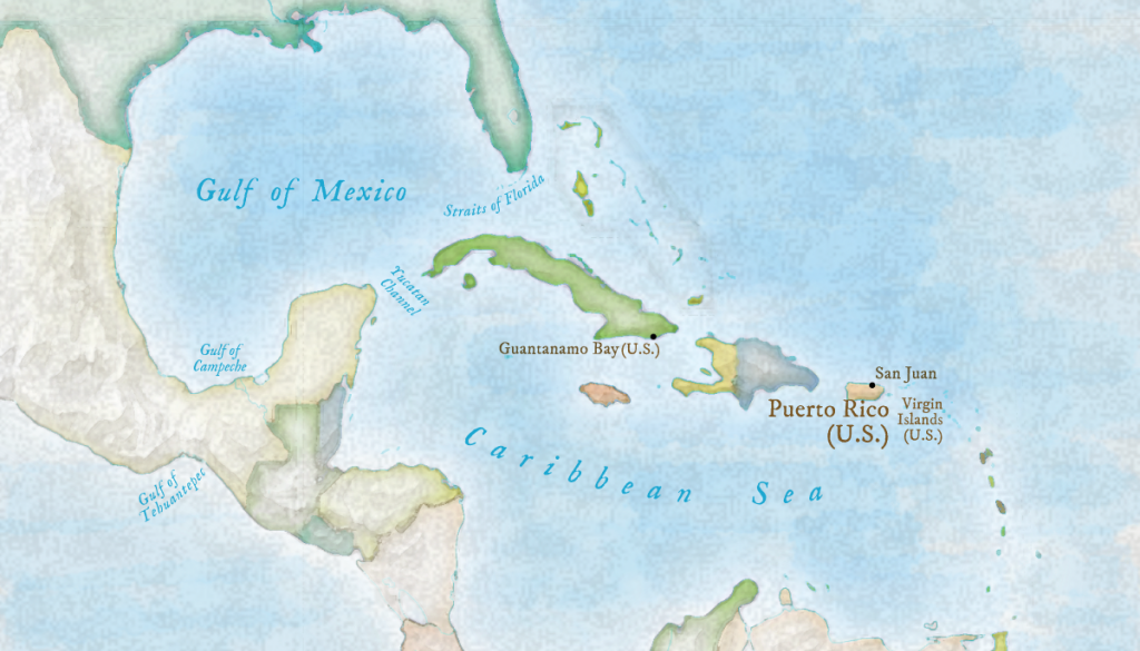
Steve Spindler's map of U.S. territories in the Caribbean

What’s New in MAPublisher 10.8

What’s New? MAPublisher 10.8

We are happy to announce that MAPublisher 10.8, the latest update to the MAPublisher plug-in for Adobe Illustrator, is now available. With this release, we are excited to bring forward new usability enhancements for several MAPublisher tools. We are also thrilled to confirm that MAPublisher now supports raster files in the enhanced compression wavelet (ECW) format. Alongside these enhancements, we have also implemented improvements and added expanded support to our coordinate system library.

Here is what you can expect with the latest MAPublisher 10.8 release:

Usability Improvements for MAPublisher Tools

The Avenza team is always working to improve the capabilities of our vast suite of cartography tools. We work with our users to implement improvements to our tool catalog that truly meet the needs of actual mapping professionals. In this release we are introducing several enhancements to some of our existing tools:

Multi-Column selections in the Attribute Table Editing Schema

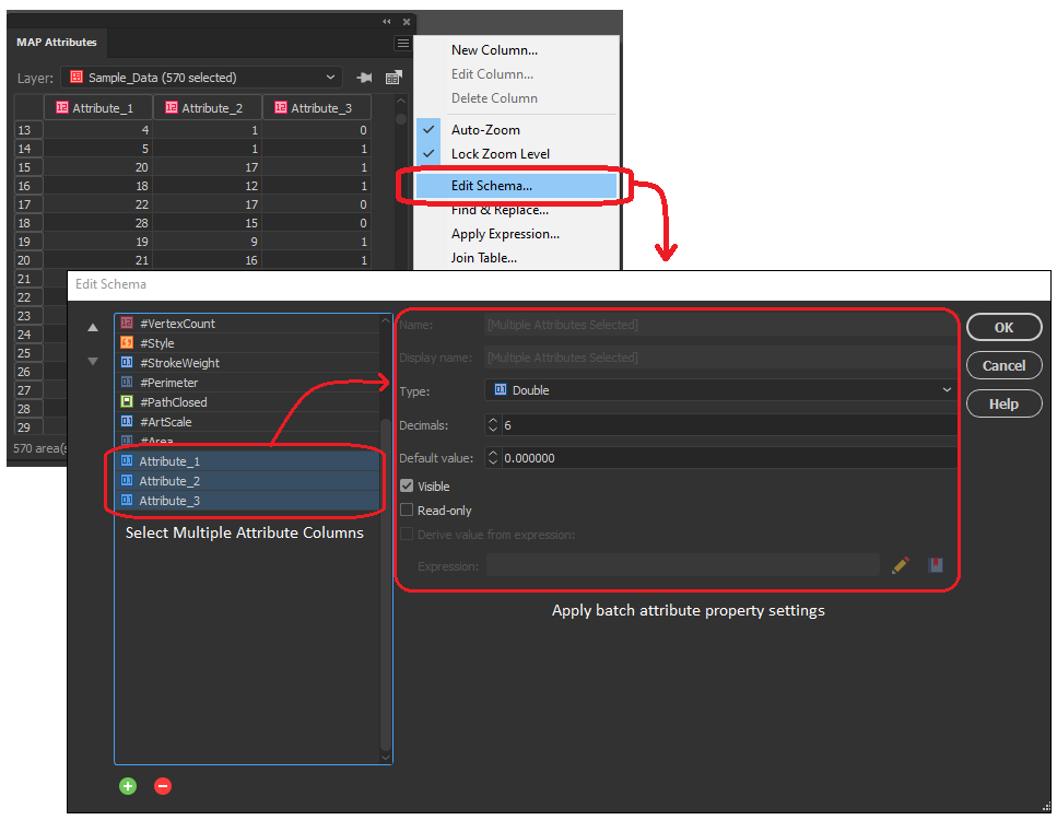
In the early versions of MAPublisher 10, we added the ability to select multiple columns within the Edit Schema window of the MAP attributes panel, allowing users to toggle visibility settings on multiple attribute columns at the same time. Now with 10.8, we are delighted to build on this by implementing the ability to configure data properties across multiple selected attribute columns. Users can not only toggle visibility or remove multiple attribute columns at once, but can now also edit default values, attribute size, and read-only settings for all selected values. Additionally, users can now change the data type (i.e string, integer, boolean, etc) for multiple selected attribute columns all at once, as long as each column shares the same starting data type. 

Select and add multiple MAP Locations in Line Plotter

We continue to bring improvements to the Line Plotter tool, this time by introducing the ability to select multiple MAP locations and add them to the line vertices (node) list. For users familiar with the Point-by-point plotting method in Line Plotter, this will be especially useful for adding a large collection of sequential MAP locations, as previously each point needed to be entered one at a time. 

Document Summary Panel now includes “Last Saved with” Version Info

For users working with MAPublisher projects across different versions of the software, you will be delighted to know that the document summary dialogue now includes information indicating the version of MAPublisher the project was last saved with. This information will help users that frequently share MAPublisher projects with colleagues, allowing them to better establish version standards across collaborative projects. 

Overprint Options in MAP Themes

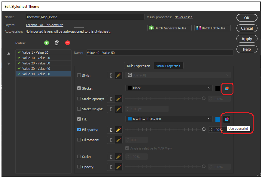
Previous versions of MAPublisher required a user to navigate the Illustrator attributes panel to configure overprint options for each map element individually and refer to these options separately using MAP Themes. Now with MAPublisher 10.8, an overprint option has been implemented directly within the MAP Themes panel, allowing users to configure overprint settings for fills and strokes within each stylesheet in the MAP Themes tool.

Scale bar, Create Legend, and Elevation Profile tool previews with Background Colours

We have added a small improvement to the scale bar, create legend, and elevation profile tool panel. The preview window for these tools, which allows users to adjust and edit their visual properties before adding them to the map, now has the option to configure a preview background colour. This option is helpful when configuring light, or white-coloured map elements which were previously difficult to see against the default white preview background. 

Support for Raster ECW file formats

New to MAPublisher 10.8, we now include Enhanced Compression Wavelet raster files to our growing lists of supported data formats. Users can now import and work with ECW files directly within the MAPublisher environment of Adobe Illustrator, all while retaining necessary spatial integrity, and without needing to convert your data. 

Engine Improvements and Updated Coordinate system catalogue

We are working continuously to improve the back-end MAPublisher engine to ensure our users can continue their work in an optimized, seamless,  design-focused cartographic environment. Along with improvements to our engine and bug fixes, we have built on our current coordinate system catalogue with updates to the coordinate system and projection library. This means our list of supported projections has grown, with new additions including the Natural Earth and Natural Earth 2 Projections created by Tom Patterson. For a full list of our expanded coordinate systems library please check the projections guide in the Avenza Support center.

MAPublisher 10.8 is immediately available today, free of charge to all current MAPublisher users with active maintenance subscriptions and as an upgrade for non-maintenance users. 

Find out more at the Avenza User Conference!

Want to learn more about MAPublisher? Want to see how industry professionals are using Avenza Products in their organizations? Join us on May 12th, 11am – 5pm (EST) for the first-ever Avenza User Conference. Registration is Free!

The event will feature a full day of speaker presentations from the Mapping and Geospatial communities. The Avenza Product teams will also be on hand to answer questions and give you a sneak peek of upcoming developments to the Avenza Platform. Sign up for free at avenza.com/user-conference

Avenza User Conference 2021


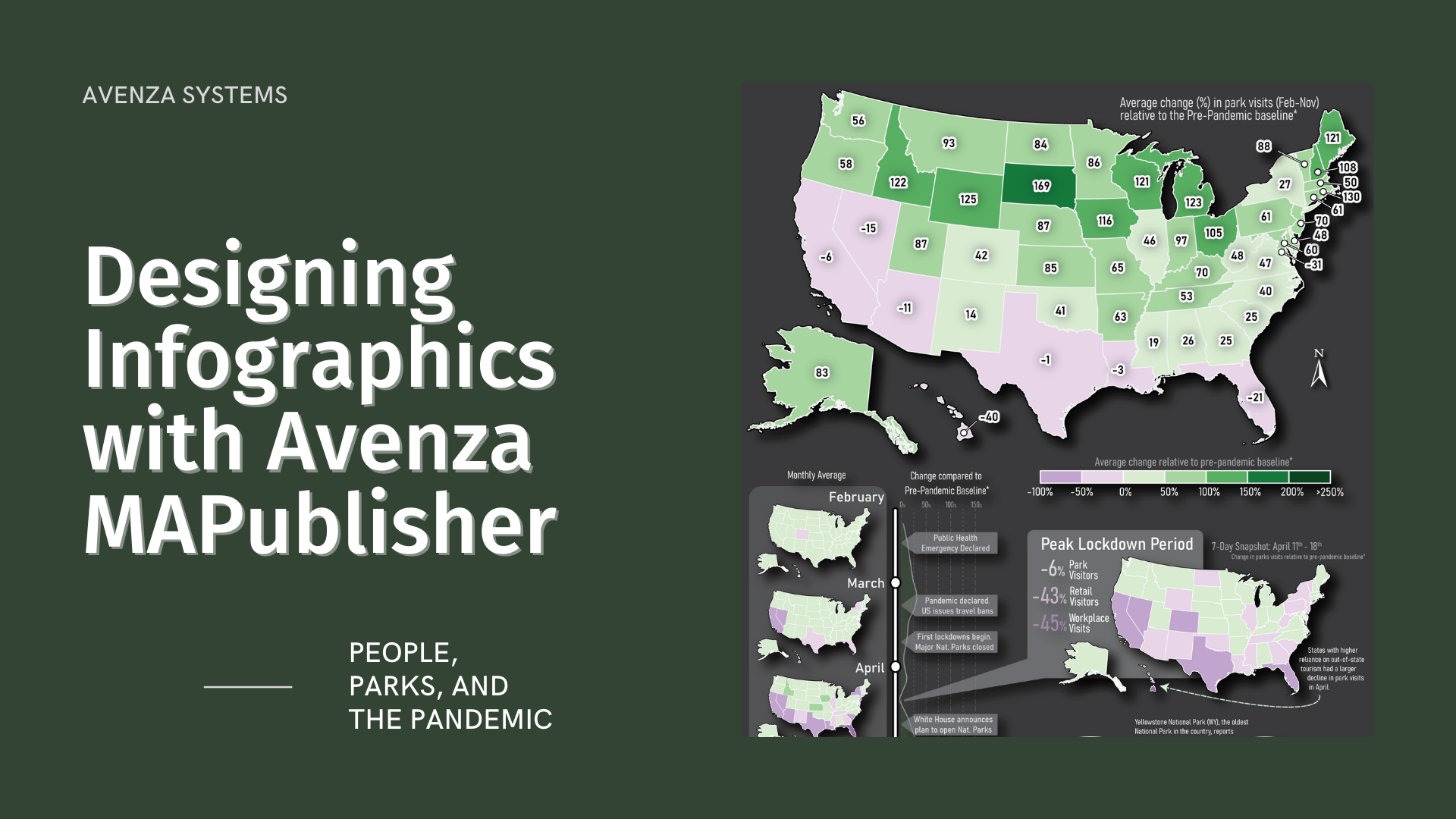
People, Parks, and the Pandemic: Designing Infographics with Avenza MAPublisher

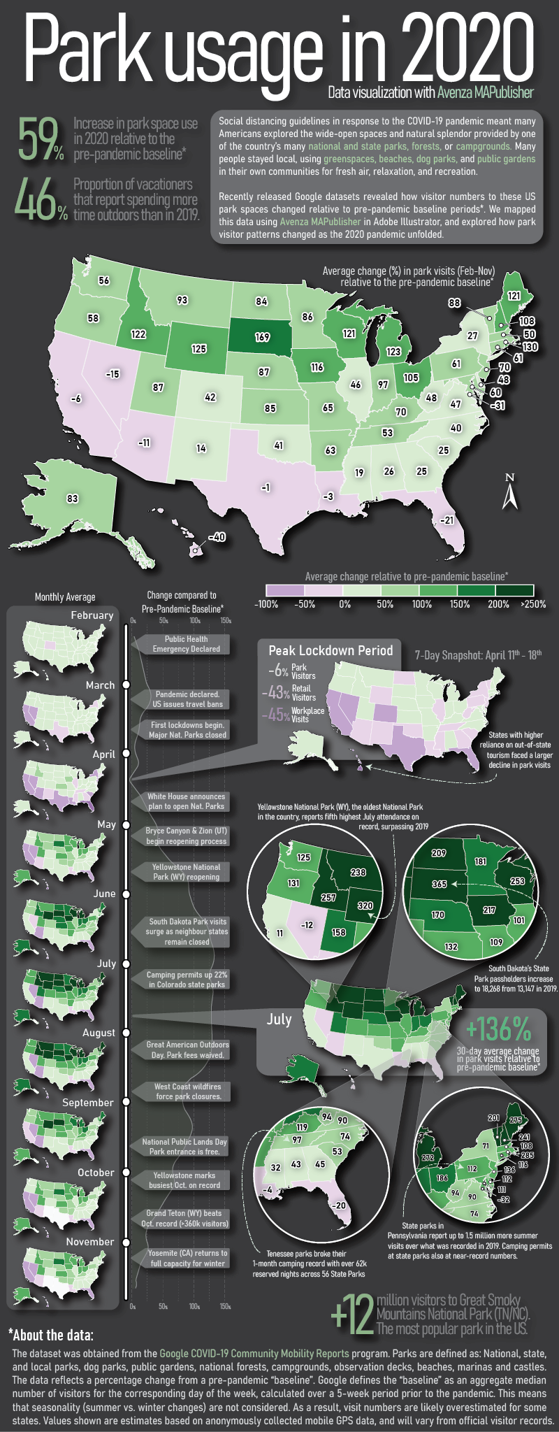
Here at Avenza, we love finding interesting data and using it to create engaging maps. In this blog, we show you how we used the powerful spatial data manipulation and cartographic styling tools found in MAPublisher for Adobe Illustrator to create an infographic exploring how park visitor patterns changed in the United States in 2020 using a truly interesting openly available dataset.

Recently, Google made its COVID-19 Community Mobility Reports public. These reports use aggregated anonymous mobile GPS data to explore how global human activity patterns in specific location categories (parks, retail, transit, residential, workplaces, and grocery) changed as a result of the ongoing pandemic. The U.S. dataset is massive, containing estimates of daily visitor activity for each location category in every county. Each data point provides an estimate of that day’s percentage increase or decrease in visitors relative to a pre-pandemic baseline period, meaning the data reflects how pandemic restrictions on that day may have impacted park space usage in that specific location.  Below shows a sample of the raw dataset, listing five data points covering Feb 15-19th activity patterns in a single Colorado county.

We downloaded the complete dataset (February to November 2020) from Google’s mobility reports data portal. The dataset contains nearly 900,000 records of all 3,143 counties in the U.S.  We wanted our infographic to focus on the parks category, which includes every national, state, and local park, as well as public forests, campgrounds, beaches, marinas, dog parks, and gardens. Using the open-source statistical programming language R, we were able to aggregate the dataset into a more manageable size. Below, you can see how some basic filtering of these “cleaned” datasets already shows evidence of some interesting patterns, but we felt that mapping the dataset would be much more engaging.

Maps are powerful story-telling tools, and we felt this data would be more interesting if you could see how park visitor patterns changed not only with time but also with geography. To make working with map data in Adobe Illustrator easier, we used the MAPublisher Import tool to load in a shapefile of U.S. state boundaries. The tool allows us to treat our dataset as a fully functional graphic element in Illustrator while still retaining all geographic properties integral to spatial data (attributes, topology, and coordinate systems). 

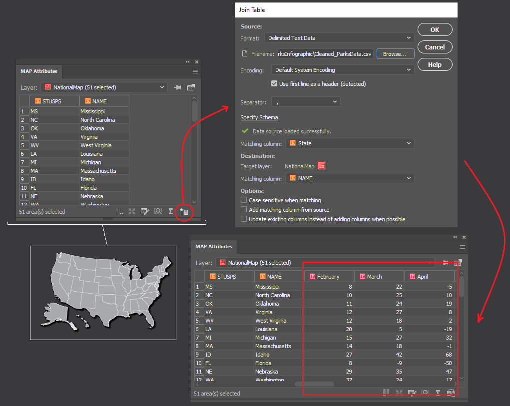
To visualize the data as a map, we needed a way to associate each record in our tabular dataset to a specific location (in this case, a State). To do this, we used the Join tool, which takes our “cleaned” tabular parks dataset (stored as a CSV file), and links it to our mapped states shapefile using the shared State names column. 

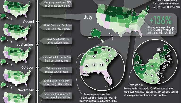
We started to think about how to design the layout of the infographic (this is where having a mapping environment in Illustrator really shines). We wanted it to consist of three main parts: a large labelled map showing the average change in park visits over the entire year; a vertical series of maps showing how park visits varied month to month; and a handful of pop-out maps with insets highlighting specific points in the year and specific regions of the country.

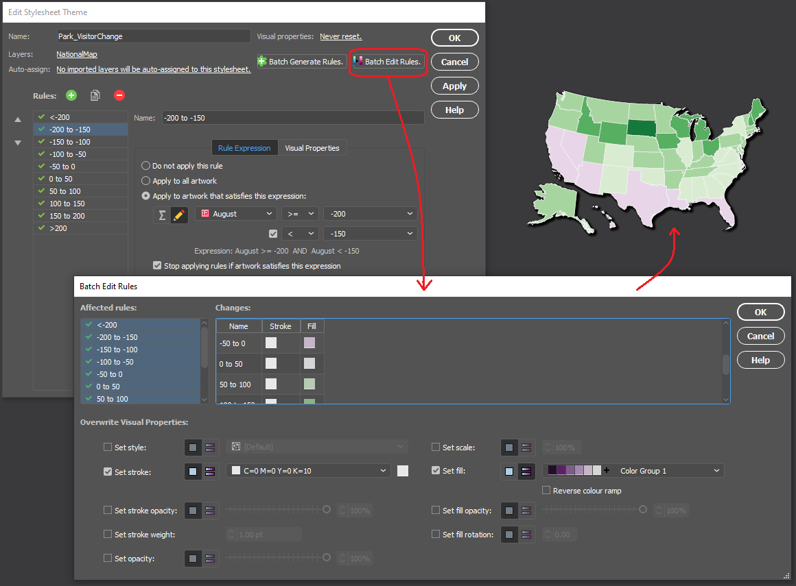
We chose to stylize the data into thematic maps, which use colour to represent specific values in the data at different locations. Instead of tediously configuring individual colour fills, we used MAP Themes to establish a rules-based stylesheet that applies a colour automatically to each State based on the monthly park visitor columns stored in the map layer’s attribute table. We chose a “thematic map” colour group from the included ColorBrewer 2 swatch library to best show positive and negative changes in park usage. 

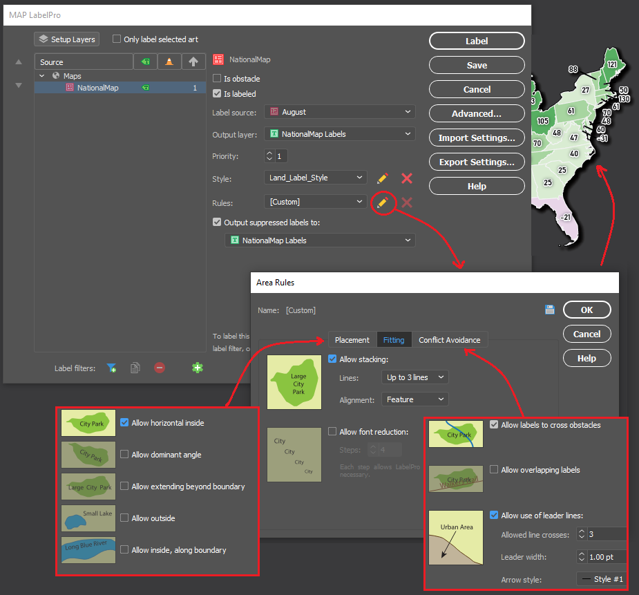
Next, we populated our main map with labels showing the percentage change in park use for each state. As many cartographers know, placing and configuring labels can be a significant time sink. Fortunately, we could use the MAPublisher LabelPro add-on to provide collision-free, rules-based label placement. We could configure the label rules to automatically handle collisions, alignment, and placement of labels for each state. Using the leader lines option in the LabelPro Rules panel, we were even able to create offset labels that prevent crowding the map.

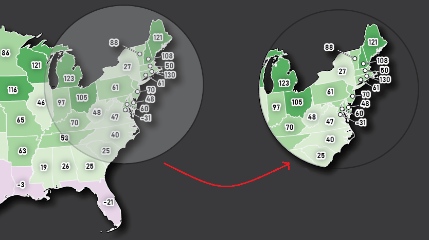
Finally, we decided that to create some insets to highlight specific parts of the country.  From a “master” map,  we used the Crop to Shape tool to crop the map data to our desired inset extents. Using Crop to Shape is quick, and also retains the styling elements (colours, labels, strokes), topology, and attribute integrity of the cropped map layers. 

With most of the maps completed, all that was left was to populate the infographic with text and graphics. Using the MAPublisher layout tools, we added a functional North Arrow and customized the automatically generated legend layer to suit our infographic’s design. Lastly, we used an Illustrator graph tool to create a vertical line graph of park activity along the left side of the infographic.

Presenting the dataset in this way makes it much easier to extract insights and craft a story from the data. Some patterns are immediately noticeable, such as the overall increase in park space usage that is observed for most of the US during the pandemic period. This isn’t exactly unexpected, as parks were one of the most accessible forms of leisure activity and recreation amid widespread social distancing and retail/entertainment closures. We also see how state-specific factors may have affected park usage in different regions of the country at different times. Some states, such as South Dakota, had eased restrictions on out-of-state visitors to their park systems, resulting in a spring season surge in park usage earlier than their neighbours. Conversely, states which typically draw a high proportion of international tourists, such as California, Hawaii, and Florida, saw more of a decrease in average park usage as a result of global air travel decline. These patterns and stories are one of many that can be identified, providing compelling examples of why maps are such powerful tools for visualizing data.

The beauty of working with MAPublisher to create this map-heavy infographic is that we were able to implement the powerful mapping and data manipulation tools of a dedicated GIS while seamlessly integrating the advanced art and design tools offered by the Adobe Illustrator graphical environment. Together, these tools turned what would have been a complex workflow of importing and exporting data between different software, and allowed us to create the entire infographic in a single mapping and design-focused fully integrated workspace.

See the Full infographic below:


References:

Data – https://www.google.com/covid19/mobility/
Pandemic Timeline – https://www.ajmc.com/view/a-timeline-of-covid19-developments-in-2020
Raw Park Visitor Stats – https://irma.nps.gov/STATS/
Camping Stats – https://koa.com/north-american-camping-report/

News Reports and Park/State-Specific Articles

“Camping in Tennessee’s State Parks Increase during Pandemic.” Wreg, AP, 9 Dec. 2020, wreg.com/news/camping-in-tennessees-state-parks-increase-during-pandemic.

Marcus Schneck. “Camping at Pennsylvania State Parks ‘Going through the Roof’ as Coronavirus Restrictions Ease.” Pennlive, 1 July 2020, www.pennlive.com/coronavirus/2020/07/camping-at-pennsylvania-state-parks-going-through-the-roof-as-coronavirus-restrictions-ease.html.

Anderson, Patrick. “National Parks in South Dakota Remain Open as Others Close across the Country.” Argus Leader, 17 Apr. 2020, eu.argusleader.com/story/news/business-journal/2020/04/17/coronavirus-south-dakota-national-parks-remain-open-others-close/2981675001.

Henderson, Catherine. “Having a Hard Time Finding a Campsite in Colorado This Summer? You’re Not Alone.” The Know Outdoors, 15 July 2020, theknow.denverpost.com/2020/07/15/colorado-camping-covid-national-parks-state-parks/241704.

Wiley, Melissa. “What the 10 Most Visited National Parks in the US Have Said about Their Plans to Reopen, from Opening in Phases to Implementing Social Distancing Guidelines.” Business Insider, 21 May 2020, www.businessinsider.nl/are-national-parks-open-covid-19-coronavirus-united-states-nps-2020-5?international=true&r=US.

How It’s Done in MAPublisher – Batch Generate Rules

MAP Themes are a great tool for stylizing your data quickly and easily. Since we all love to make our workload easier, did you know that you can batch generate rules for your MAP Theme Stylesheets instead of creating them all individually? Batch generate rules allows you to easily categorize your data and stylize it as you see fit.

Check out this short video that demonstrates how to use the batch generate rules tool in MAP Theme Stylesheets in MAPublisher!

For more How It’s Done in MAPublisher videos, check out our YouTube channel!

MAP Chart Themes: Doing More with Your Data

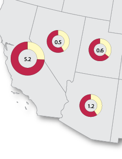
We all love a good choropleth map, but sometimes we need our map to display more than just different shades of colour to communicate more detailed information. MAP Chart Themes are the perfect way to distribute that extra bit of information that you want your readers to know. You can display the data in a bar chart format, or pie chart format. There’s even the option to have the charts change scale according to the data.

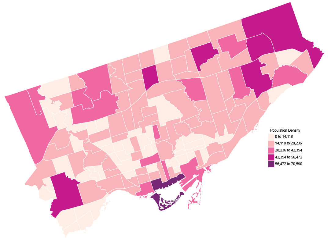
Say you have a map showing the population density of Toronto, like this map below.

MAP Theme Density Map

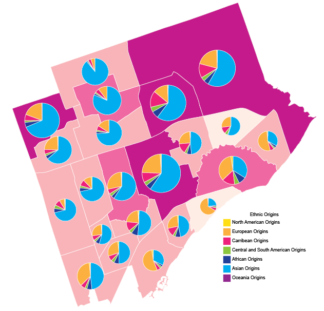
But, while this shows just the density of the population, you want to go more in-depth. For example, you want to look at all the ethnic origins of the residents of each neighbourhood. This is the perfect opportunity to use MAP Chart Themes.

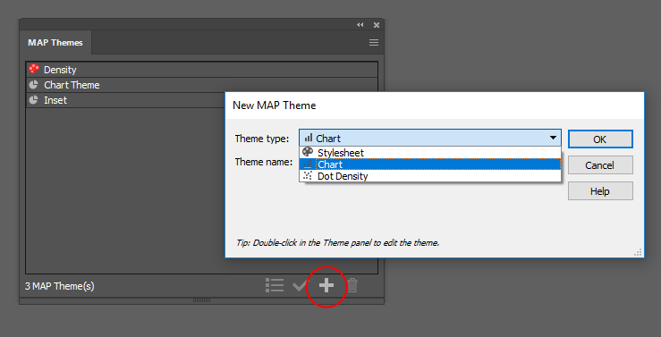
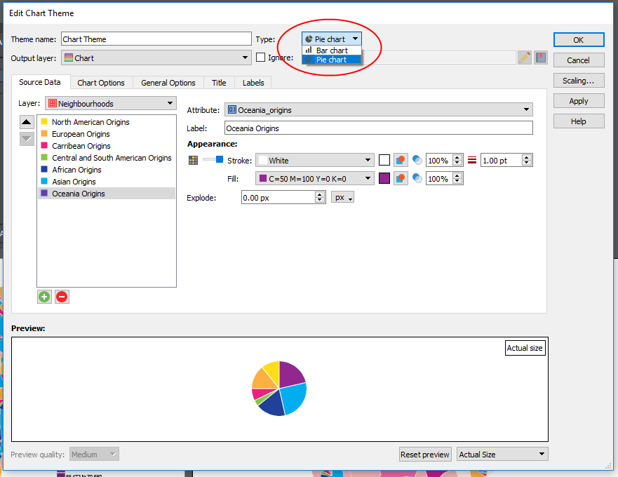
To create a MAP Chart Theme, open the MAP Themes panel (Window > MAPublisher > MAP Themes) and click the + button to create a new Theme. Then choose Chart as the Theme type.

Create MAP Chart Theme
Once you’ve created your theme, now you can get to making your charts! You can use either bar charts or pie charts, choose whichever will show your data best. To show the variety of ethnic origins for the neighbourhoods in Toronto, I chose a pie chart.

MAP Chart Themes Settings

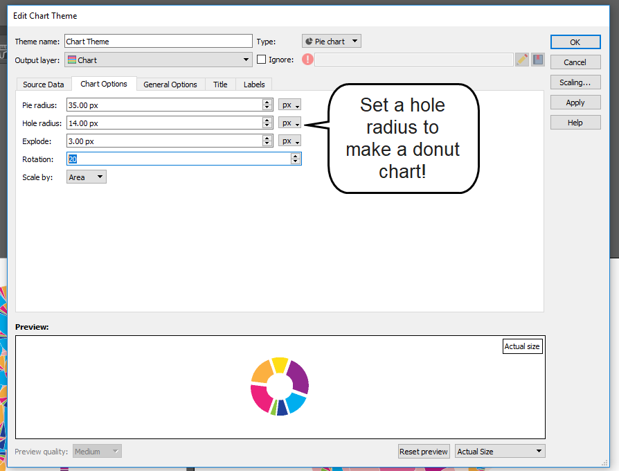
Select a layer, then click the Add Attribute button (the green plus icon) to add your attributes. Select the attribute you want to include in the chart, and style it as you see fit. The preview at the bottom will update as you make changes to the components of your chart. There are options to change the size of the chart, and even turn it into a donut chart!

MAP Chart Themes Donut Chart

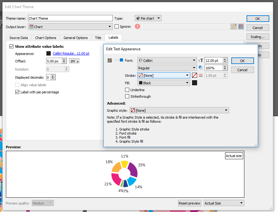
If you want to include a title for your charts you can, but because my map contains so many charts in a relatively small area, I chose not too. Labels for the sections of the charts can also be added as well. Edit the test if necessary, and even label your pie charts with percentages if that helps to better communicate your data.

MAP Chart Themes Labels

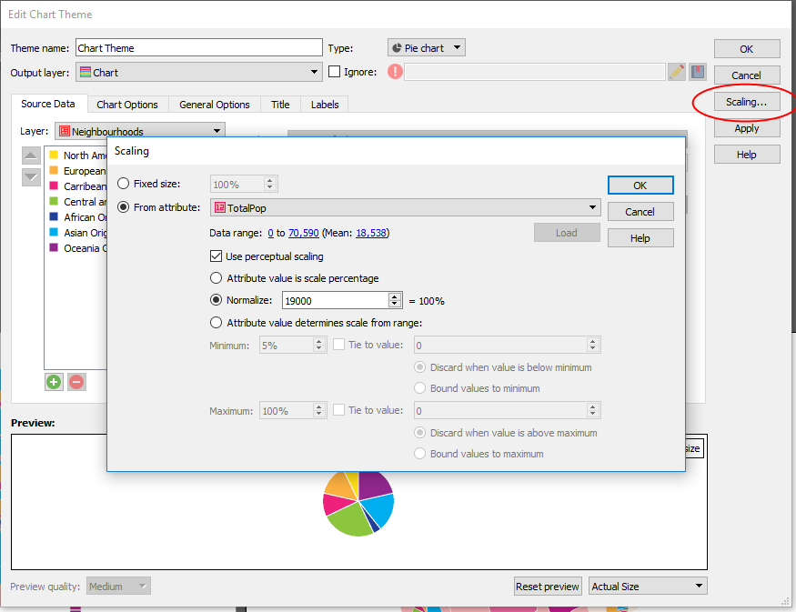
My favourite feature is the Scaling option (button is on the right). This allows you to automatically scale the size of your charts based on attributes. You can set the scale by defining the value that represents 100%, then select an attribute, click Load and watch the magic happen. This feature is super handy especially if you’re creating a map with tight boundaries or not a lot of extra space because you can easily adjust the size of all charts at the same time.

MAP Chart Themes Scaling

Back to my example map, I set the scaling and applied the MAP Chart Theme. Since there are 140 neighbourhoods in Toronto, I chose an inset of the larger map to show how the scaling appears. You’ll see neighbourhoods with a higher population have a larger pie chart, while neighbourhoods with a lower population have a smaller chart.

MAP Chart Themes

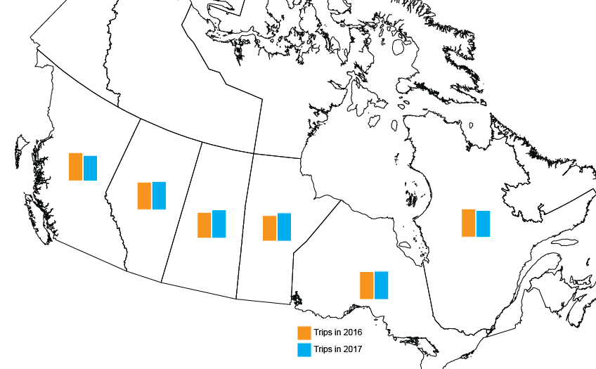
The scaling feature works for bar charts as well. I created another map with data showing the total number of inter-province visits for each Canadian province in 2016 vs 2017. In this case, I chose not to change the scale of the charts (by total number of visits per province) so it’s easier to see the comparison.

MAP Chart Themes Bar Charts

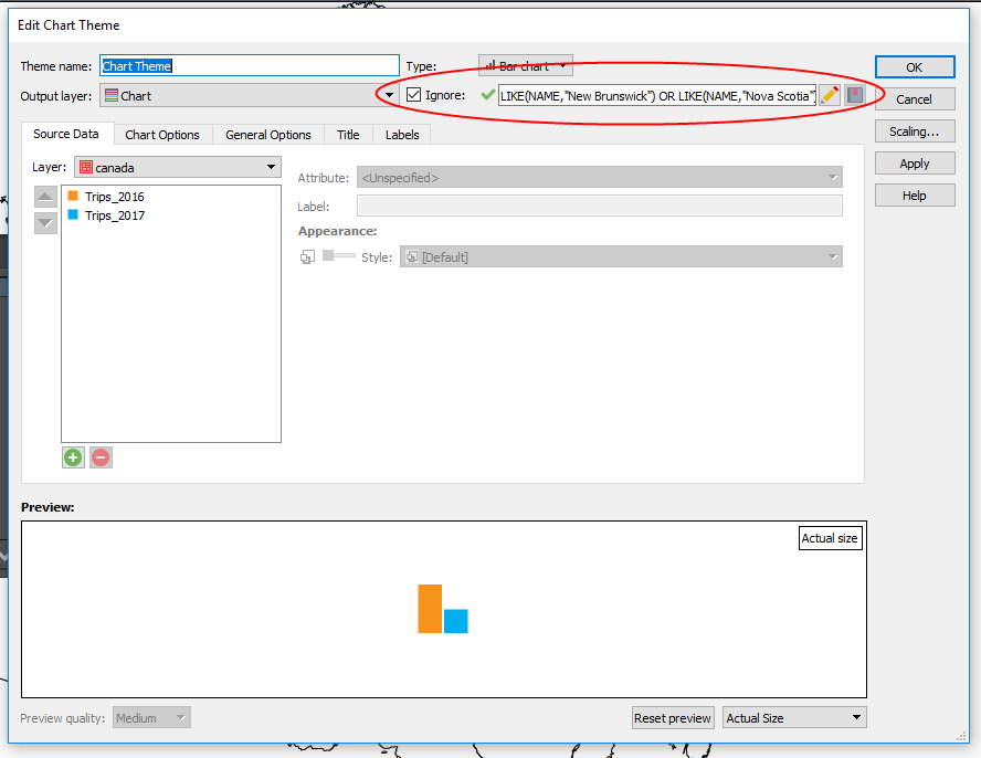
If you’ve made it this far in the post, and have eagle-eyes you’ll notice that there are no charts for the Territories or the Maritime provinces. Since I only wanted to visualize the data for some of the provinces, I used the Ignore option in the MAP Chart Themes box. It’s handy when you want to exclude certain data, for any reason.

MAP Chart Themes Settings

There you have it! An easy way to visualize that extra data that your readers want to know, and you want to share without making your map overly complicated. Looking for more details on Chart Themes? Find it in the MAPublisher Documentation available on our website. 

More MAPublisher Features We Love

Last year we wrote a blog post about some of our team’s favourite MAPublisher features. Not surprisingly for software that has been around for over 20 years, everyone had a different favourite and we had to be selective for the blog post. This year, with new team members coming on board and new MAPublisher releases it’s a good time for a new list of favourites. Check out some of these features that you might not know about, and find out how they can make your workflow easier!

Create Elevation Plot

Jeff C. – Quality Assurance

Prior to MAPublisher 10.3, “Create Elevation Plot” was a feature of Path Utilities I seldom used because, to be honest, it had a few limitations. MAPublisher 10.3 introduced a completely new way of creating elevation profiles, and the difference is astounding. The available customization options are endless – not only can you select whether your axes will use metric or imperial units, but you can also set the Line Colour, Line Width, Fill Colour, Background Colour, Axis Intervals, Axis Labels, Graph Size and much more. Another aspect of this updated tool that I love is the ability to save and re-use ‘styles’. These styles remember specific elements of an elevation profile (e.g. appearance, units, size, etc.) and can be applied to other profiles made in the future, saving the user a lot of time.

Elevation Plot Created in MAPublisher

Text Utilities

Keith  S.- Quality Assurance

In my opinion, the Text Utilities tool is one that is underutilized in MAPublisher. The tool allows you to perform actions on text within a document, including Curve Text to Latitude, Draw Shape Around Text, Merge Text, Create Line From Text on a Path, and many more. The actions can be performed on selected text only, text on specific layers, or all text in the document. The tool even allows the user to preview most actions before committing the changes.

If you have ever seen text along a path with a red plus symbol at the end of it after performing a transformation or manual adjustment it is an indication that the text path is not long enough to contain all of the text. No problem for my favourite action in the Text Utilities tool—Extend Overflowing Text. This utility solves the issue by extending the text path to a length which will accommodate the full length of the text.

Join Lines

Oliver N. – Customer Support

One of my favourite tools to use in MAPublisher is the Join Lines tool. If you are working with a road or rail network and sections of the same track or street connect to each other but are broken into different line features, you can easily join them into single features with a common attribute like Street Name or Track Number. You can target a line layer and then in the Destination options, choose either to perform the join on the original target layer or specify a name for a new line layer that will contain the joined lines. You can also use a proximity value to determine how close the lines must be in order to be joined. I find that this tool allows subsequent styling to be done easily and saves a lot of time in arranging the data to your needs. It also reduces the size of your file by compiling data into fewer features.

Copy MAP Objects From

Keith S. – Quality Assurance

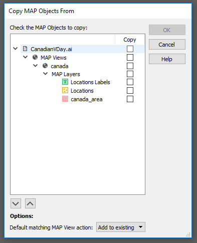
This feature allows users to copy MAP objects (including MAP Views, MAP Layers, MAP Themes, MAP Selections, and MAP Locations) from one open document to another. MAP Views can be copied by themselves or with their associated MAP Layers. The best part is, that any artwork which is copied to the destination document will retain its styling provided that the custom colour swatches used in copied artwork are set as “Global” in the Adobe Swatch Options dialog. It works like this: With the destination document open, launch the Copy MAP Object From tool. Select the object(s) you want to copy to the destination document by checking the checkbox beside each object, then click “OK” to perform the copy. Copy MAP Objects From is one of my favourite features because it saves so much time when styling maps!

Copy MAP Objects From in MAPublisher

MAP Themes Scaling Charts

Bob P. – Business Development Associate

My favourite way of making infographic maps is using our MAP Chart themes. Within Chart Themes, you can add a bar or pie chart to any point layer, based on any set of attributes from the point layer. For an added level of information, each of the charts can be scaled based on the value from another attribute. This helps when you want to show the proportion of values, but also give an indication of the total population size for each point too. The best part is MAPublisher allows you to pick between Area and Radial scaling for pie charts. If the population of one point is twice the size of the smallest point, it can either have twice the area, or twice the radius length. This is my favourite tool in MAPublisher, because it shows that our team thinks of everything to make sure cartographers can make the exact map they want, right down to the smallest details.

Creating Chart Themes using MAP Themes in MAPublisher


About the Authors

Jeff, Keith, Bob and Oliver are all members of the Avenza Systems Team and their passion for maps shows through in the work that they do with our clients and in developing MAPublisher.

Mapping Love: Celebrating Valentine’s Day by Creating Infographics

Happy Valentine’s Day! What better way to celebrate than with new maps (and creating infographics) about love? This year we’ve hunted for romantic data for Canada and the United States and visualized it all for you using MAPublisher 10.3 and Adobe Illustrator.

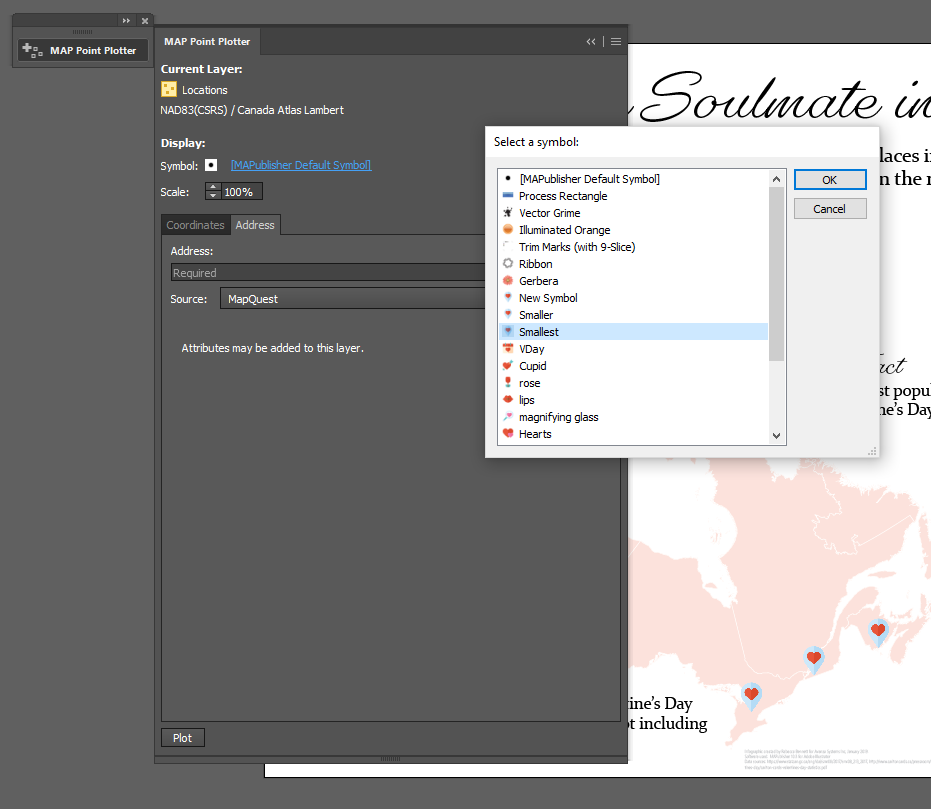
The first map shows all the most romantic locations (at least as their names suggest) in Canada. This information was provided by Stats Canada. Using the MAPublisher Point Plotter, it was easy to plot all of the locations!

The best part about using the Point Plotter is you can choose any symbol available in your symbol library to mark the points. I chose the symbol that I wanted (a Valentine’s map marker–how adorable!) and then plotted each location simply by using the town’s name and province.

Canadian Point Plotter - MAPublisher

After adding some text and symbols in keeping with the theme, the map was ready to go! You can check out the PDF below, or, you can download the georeferenced version from the Avenza Map Store, for use in the Avenza Maps app

Romantic Places Map made with MAPublisher


Moving on to my infographic – which is a popular and engaging way to illustrate statistics and small amounts of data that might otherwise be overlooked. I found data from the United States covering a variety of Valentine’s Day topics. The plan is for my infographic to include two maps and two additional charts. The first map illustrates the average wedding cost by state, and the second map shows popular proposal locations.

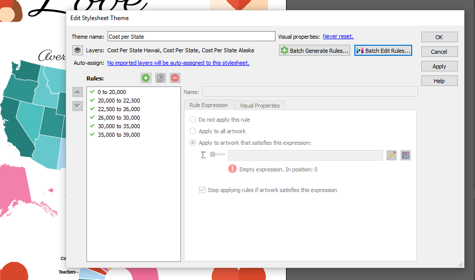
For the average wedding cost per state map, I used a MAP Theme to colour all the states appropriately (and quickly!). The benefit of using a MAP Theme is that you can apply a theme to multiple layers at once. Since Hawaii and Alaska were projected separately from the mainland of the United States, they exist in different layers on the artboard. Using a MAP Theme made it easy to include them in the colour scheme of the map.

MAP Themes - MAPublisher

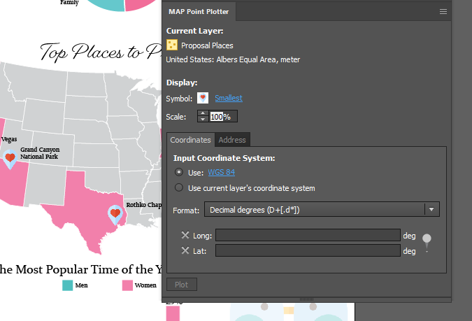
On the second map, I want to map the most popular proposal locations in the country. I used the MAP Point Plotter tool again, but, this time, I used the latitude and longitude to plot the points because some of the locations could not be plotted by name alone. It’s very beneficial to be able to swap between the two options!

USA Point Plotter - MAPublisher

My maps are complete, and after adding two graphs (made using the graphing tools in Illustrator) containing even more fun Valentine’s day data, and some love-ly symbols, the entire infographic was finished. You can check out the completed infographic below!

Valentine's Day Infographic made with MAPublisher


About the Author

Rebecca Bennett is a member of the Marketing Team at Avenza Systems and loves making creative and visually appealing maps.

News Archive