We’re excited to announce that the 2023 Avenza Student Map Contest has now concluded. Submissions for the contest were accepted from December 1st, 2022 to April 30th, 2023. Over the last month we have selected the winner. As such, congratulations are in order for the grand prize winner!
Grand Prize Winner
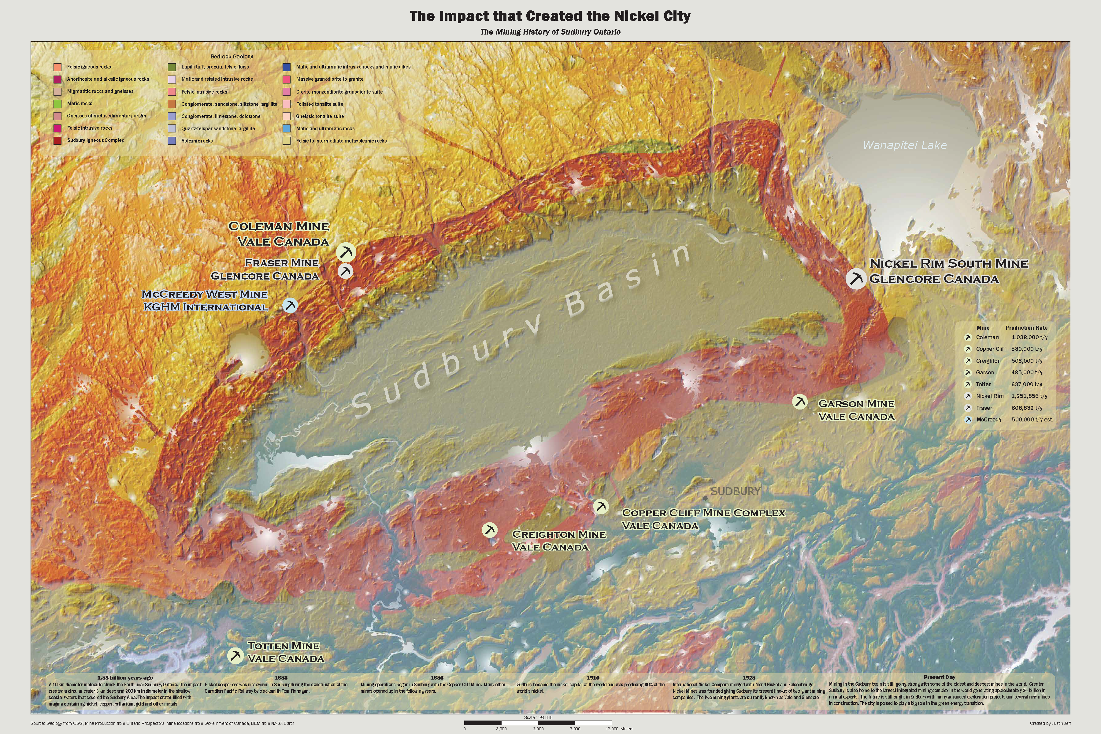
The Impact that Created the Nickel City Justin Jeff Fleming College
From the creator: “My map displays the terrain and geology around the Sudbury Basin that was created by a meteorite impact. Furthermore, it shows the active mines around the Sudbury Basin using a proportional dot technique based on the mines production. Also it shows a timeline of the mining history in the Sudbury area. It will be used to gain insight and understand the significance of the Sudbury Basin.”
Justin used the MAPublisher import tools to import prepared data from other sources for the terrain and mine locations. The MAP Themes tool was used to create proportional dot symbols for the active mines and the MAP LabelPro add-on was used to label and style the active mines. Finally, Justin used the Layout tools to add and style the scale bar.
Congratulations again to Justin! Stayed tuned for the open version of the Avenza Map Contest starting soon…
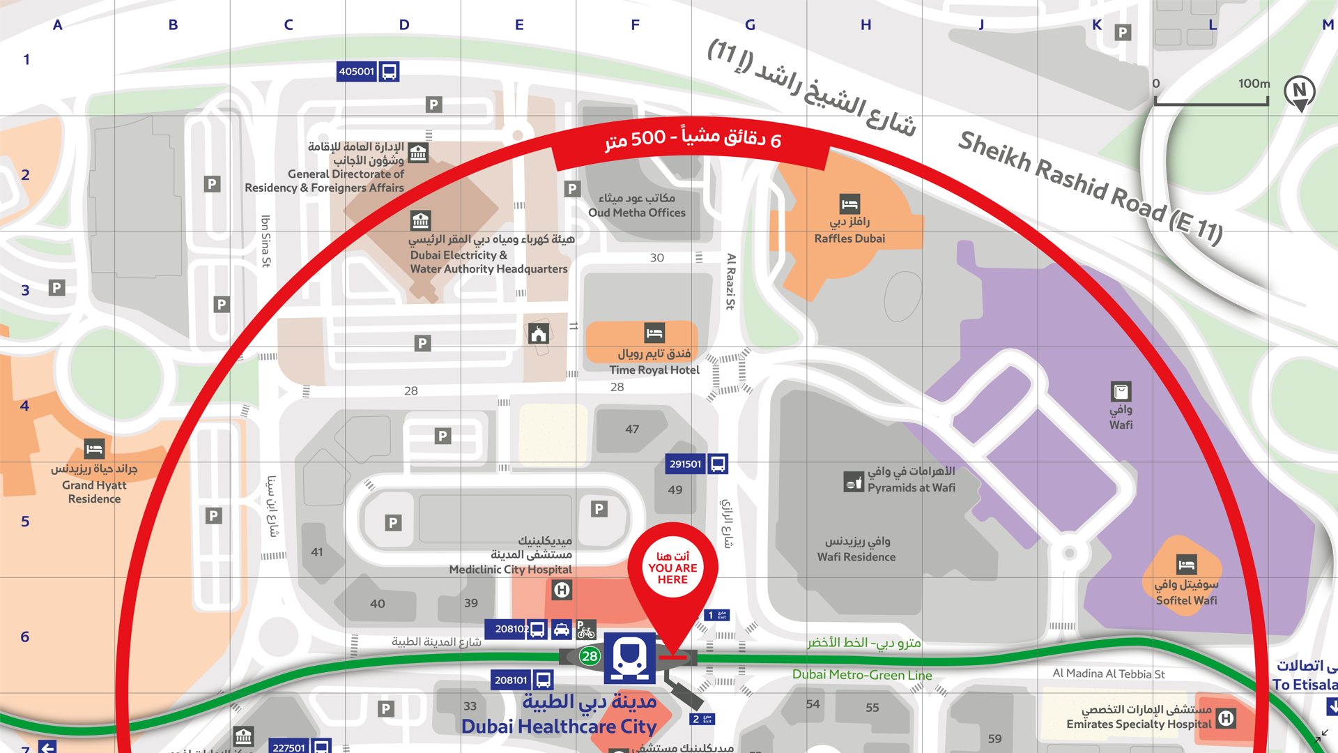
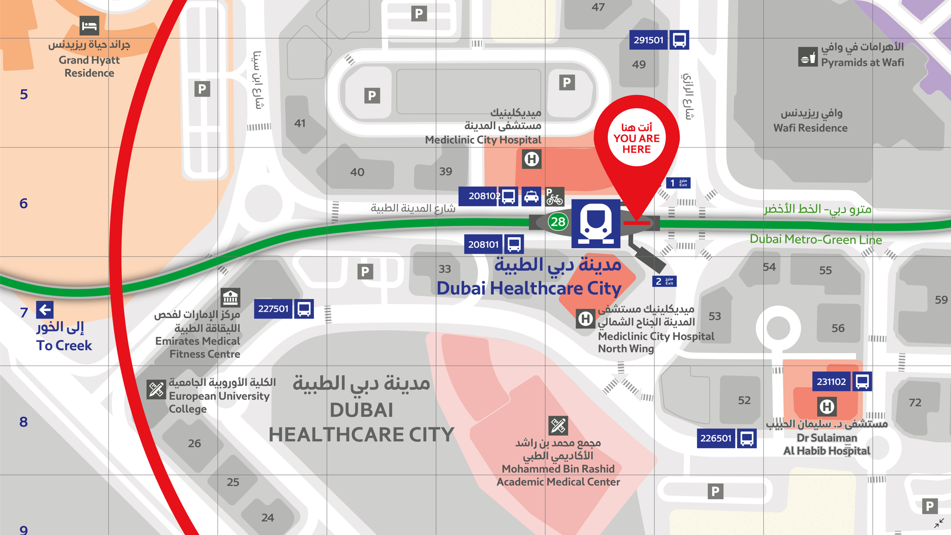
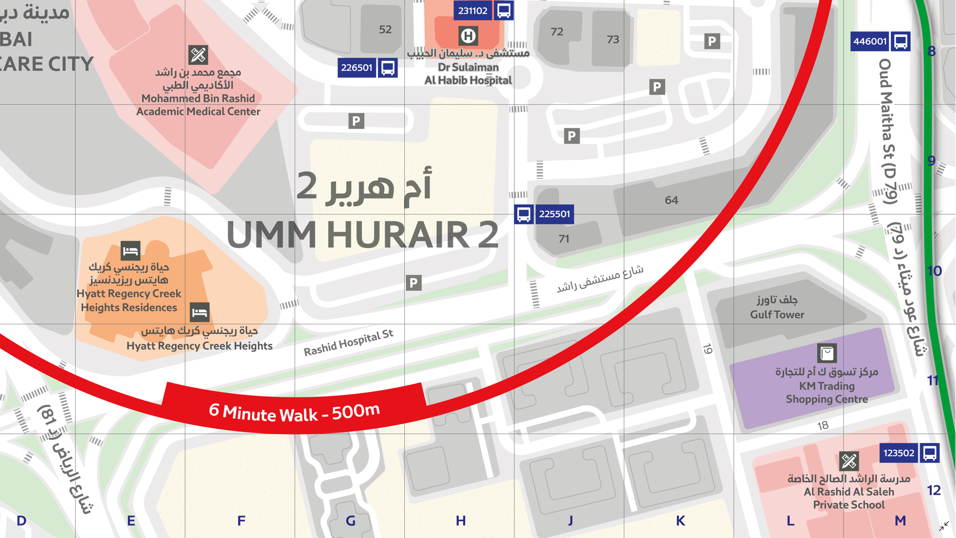
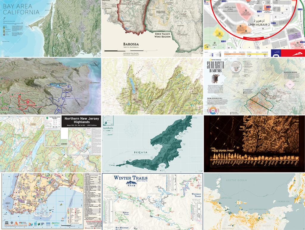
In this Map Gallery Spotlight, we are highlighting another submission from the 2021 Avenza Map Competition. This bilingual map of the area around the Dubai Healthcare City Metro Station was created by Zain Madathil for Explorer Publishing. It is one of nearly 4,000 individual maps he has created for the Dubai Public Transport Map project.
The map is easy-to-use and informative, providing information in both English and Arabic, and is accompanied by a detailed map index to categorize and highlight important points of interest and nearby attractions surrounding the station. The map utilizes careful design elements to make interpretation easy, including colour-coded icons and building footprints, platform-based direction markers, and a 500m radius walking distance indicator.
Select the images below to see a detailed look at Zain’s map
Making the Map
Madathil received data from his client in the form of points, lines, and polygons, and used the Avenza MAPublisher plugin for Adobe Illustrator to design the map. He used the Multiple Data Import tool to easily get all of his data into MAPublisher with a single import process. MAPublisher maintains the georeferencing of the data imported from almost any source, which allowed Madathil to focus on customization rather than data placement.
With nearly 4,000 maps in the series, the MAP Themes tool was important for Madathil to maintain consistent labelling across all maps in the series. After creating a custom branding MAP Theme stylization, Madathil was able to apply this to each map in the series as necessary. He also used the Map Attributes Panel to aid with customization of the attribute data associated with his map features.
Madathil simplified his labelling process by using our MAPublisher LabelPro add-on, which also allowed him to ensure consistency across the map series. LabelPro allowed Madathil to customize the style of his labels and apply rules to ensure they did not overlap important features or other labels. It also eased his application of both Arabic and English labels on the map.Finally, Adrain added an Index Grid and created an index and legend to complete the reference guide for the map using the Layout Tools.
For more information on using the MAPublisher LabelPro add-on, please visit our Support Centre section for this tool.Check out our other Map Gallery Spotlight blogs here!
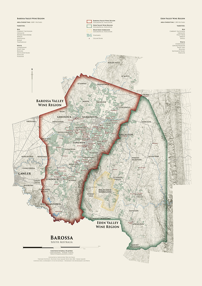
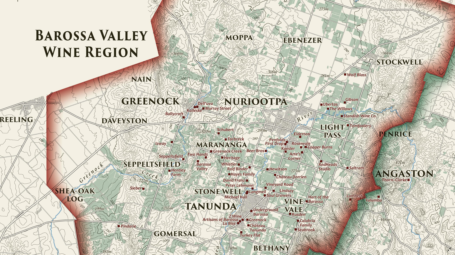
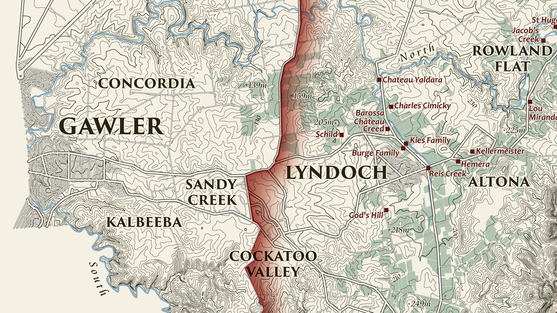
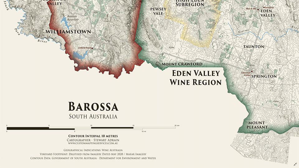
We are showcasing another great submission from the 2021 Avenza Map Competition. This heritage-style decorative map of the Barossa Region of South Australia was created by Stewart Adrain of Custom Mapping Services. The map shows the wine regions, vineyards, cellar doors, and topography of the area. It is the final map in a series of heritage-style cellar wall maps Adrain has created of the wine-growing regions of South Australia. The Barossa Valley wine region is particularly notable for its Shiraz variety.
Adrain’s map uses 10-meter contours to display the topography of the Barossa region. Regional wineries are named and indicated on the map, with their locations shown by a point representing their cellar doors. The various localities of the Barossa region are also labelled, and the two main wine regions as well as the High Eden Subregion are displayed using colourful borders. The supplemental text of the map features the total area of vineyards in each wine region, as well as the wine varieties they produce. This map as well as the others in Adrain’s Cellar Wall map series can be purchased for print from Meridian Maps.
Select the images below to see a detailed look at Stewart’s map
Making the Map
Adrain completed his data processing with QGIS and then used the Avenza MAPublisher plugin for Adobe Illustrator as a finishing tool to design the final map product. He used the Multiple Data Import tool to easily get all of his data into MAPublisher with a single import process. MAPublisher maintains the georeferencing of the data imported from other GIS software, so he could quickly turn his focus to the map’s stylization rather than data placement. Adrain used MAP Themes to easily achieve his stylization, which allowed him to automate much of the design process of the map, keeping the theme of this map in line with the other maps in the series.
Adrain simplified his labelling process by using our MAPublisher LabelPro add-on. This allowed him to create label themes based on the layer they were being applied to. Since this map was the last in the series, these themes were already created so he could simply import his settings from his previous maps to save time. The LabelPro feature is convenient for both time-saving purposes and ensuring consistency across maps in a series.
Finally, Adrain added a scale bar using MAPublisher and completed the finishing touches to his map with native Adobe Illustrator tools.
For more information on using the MAPublisher LabelPro add-on, please visit our Support Centre section for this tool.Check out our other Map Gallery Spotlight blogs here!
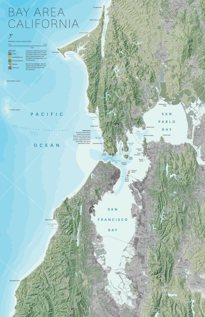
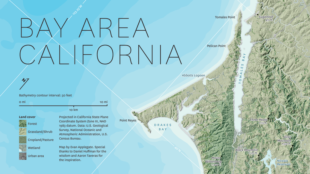
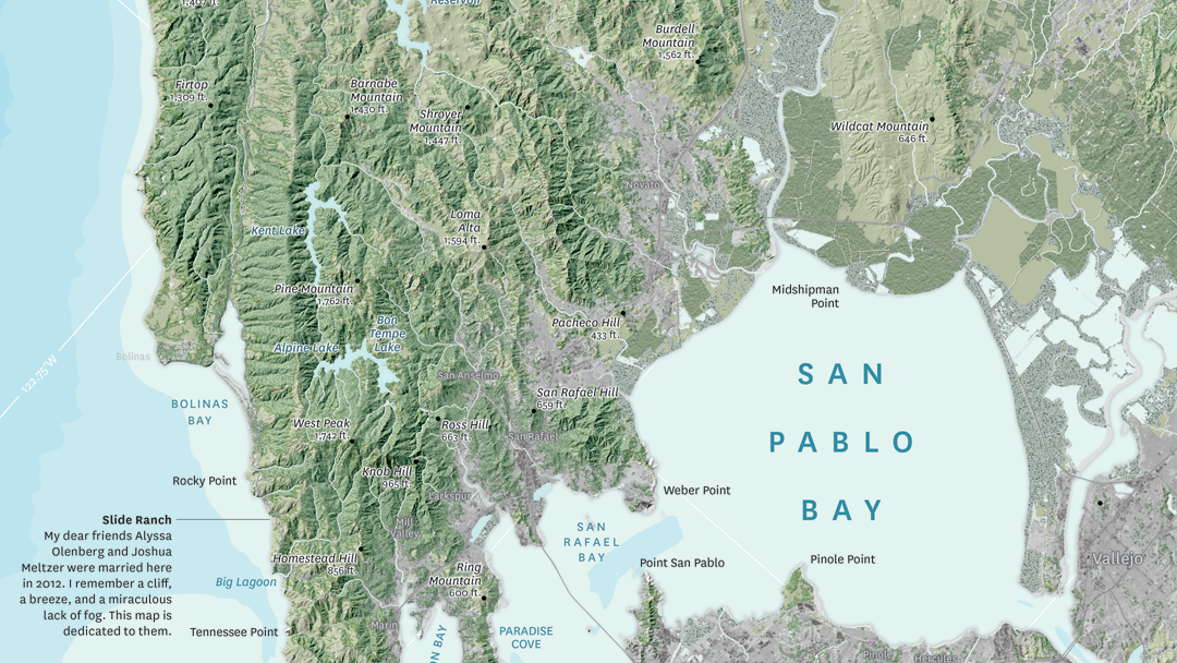
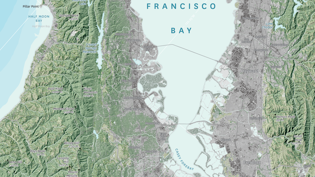
In this month’s Map Gallery Spotlight, we are showcasing an honourable mention of the 2021 Avenza Map Competition. This relief and land cover map of the San Francisco Bay Area was created by Evan Applegate of The Map Consultancy. The map shows the lakes, rivers, forests, grasslands, croplands, wetlands, and urban areas of the Bay Area. Applegate created the map as a dedication for two of his friends who were married on a beautiful cliffside north of the city. The North Bay Area is known for being the least urbanized part of the Bay Area, and housing the Napa and Sonoma wine regions.
The map highlights various natural features throughout the San Francisco Bay Area, such as elevation peaks, water features, and some landmarks. It also includes 50-meter bathymetry contours. The shaded relief details the varying elevation of the region, colour-coded to display the borders between forests, grassland, farmland, and urban land. The location of Applegate’s friends’ wedding, Slide Ranch, is identified on the map.
Select the images below to see a detailed look at Evan’s map
Making the Map
Applegate pre-processed his data in QGIS, GDAL, and Adobe Photoshop, and then used the Avenza MAPublisher plugin for Adobe Illustrator to composite it all together. This is made easy by the way MAPublisher retains the georeferencing of the data imported from other GIS software. Data that does not have any georeferencing when it is imported, can also easily be georeferenced using MAPublisher’s Georeferencer tool.
The finishing touches were also added to the map using MAPublisher. The Label Features tool was heavily used in the placement of labels, saving Applegate several hours of manual labeling. Using this tool, label settings can be applied and multiple layers of data can be labeled at once if desired. Finally, labels are added to the map under one Text layer, to ensure organization.
Stylistic elements of the map were touched up using native Adobe Illustrator tools, MAP Layout tools, and a graticule was added.
Check out our other Map Gallery Spotlight blogs here!
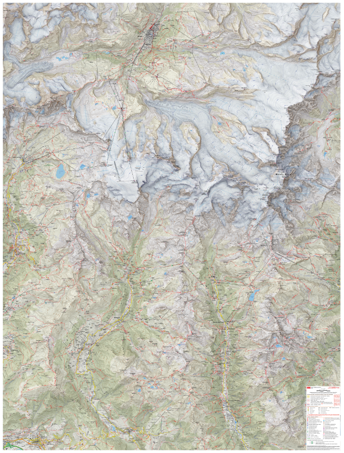
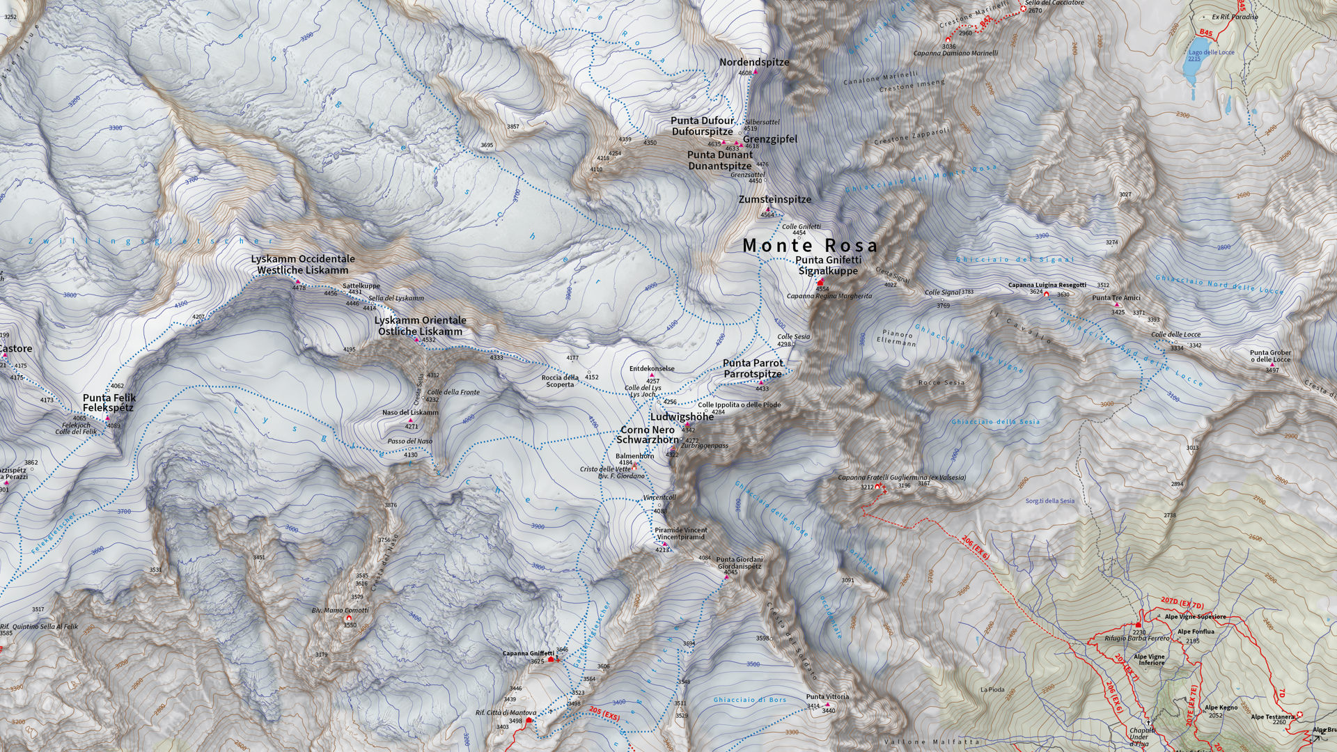
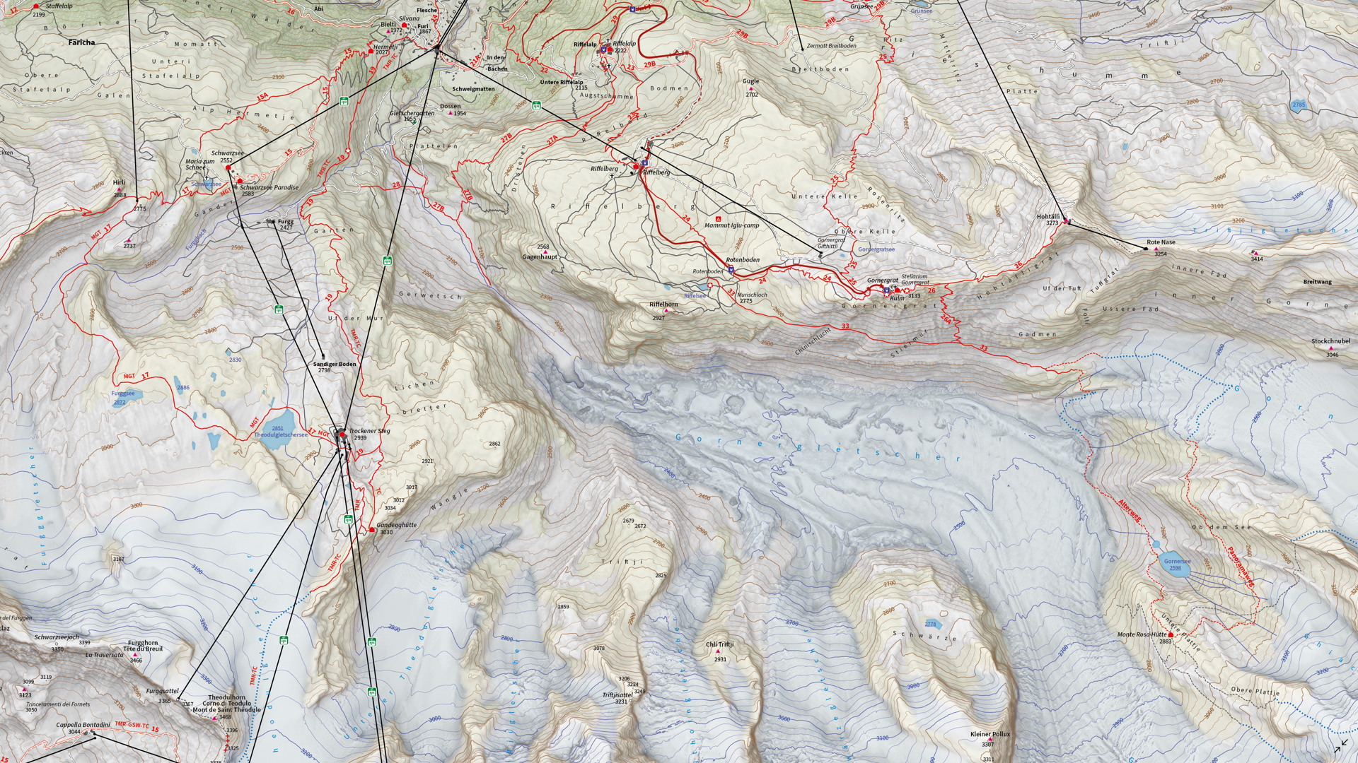
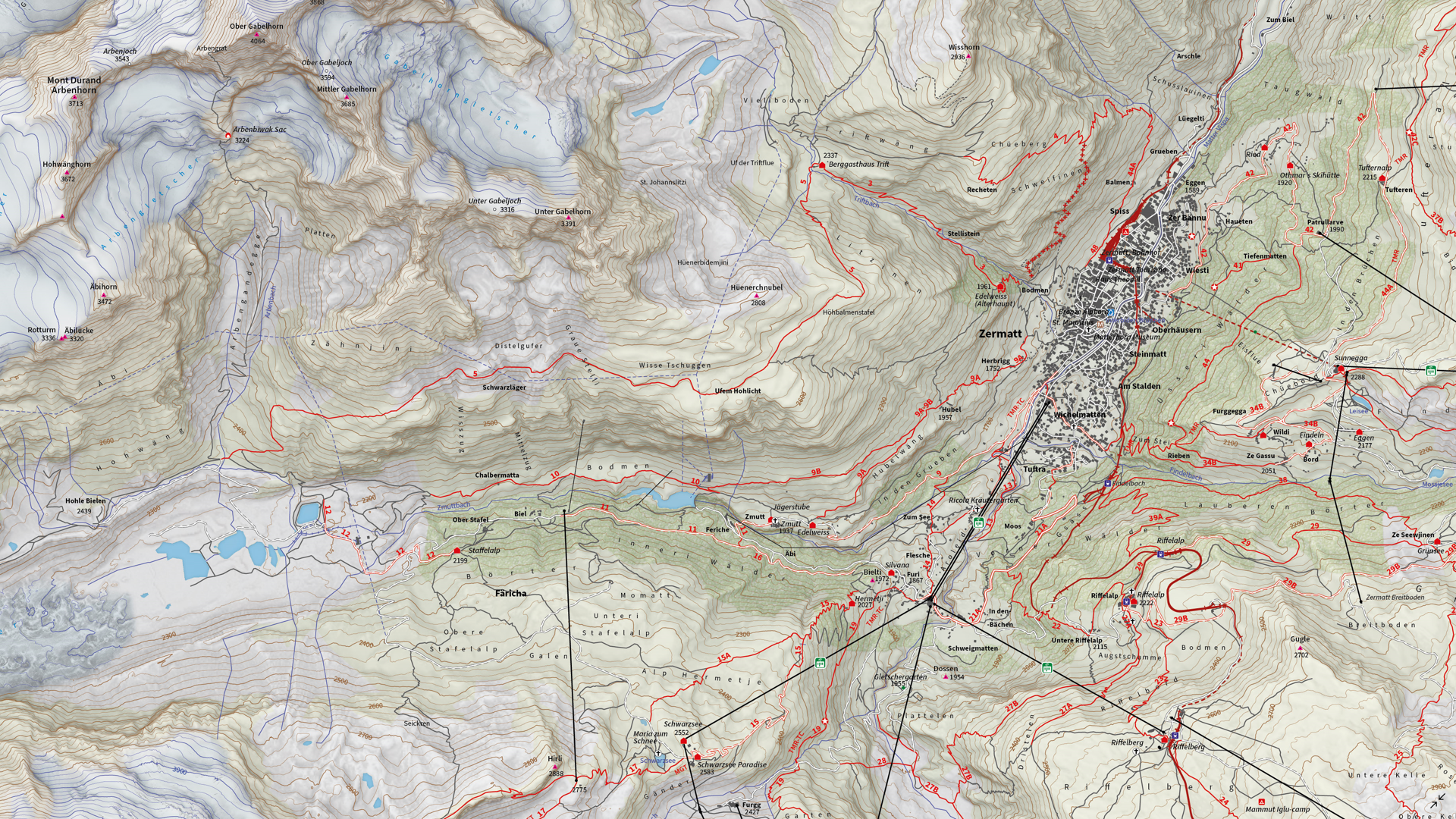
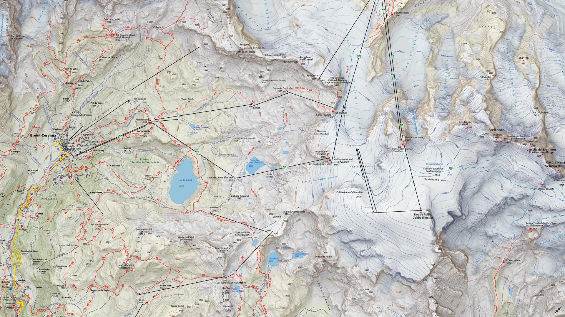
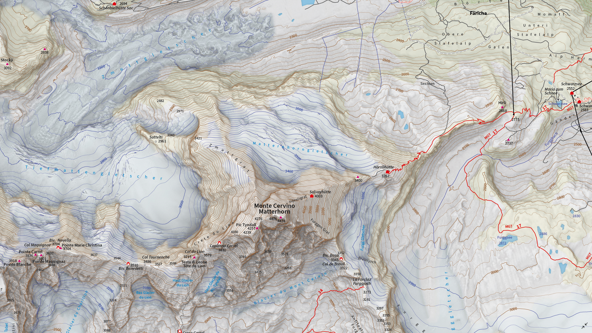
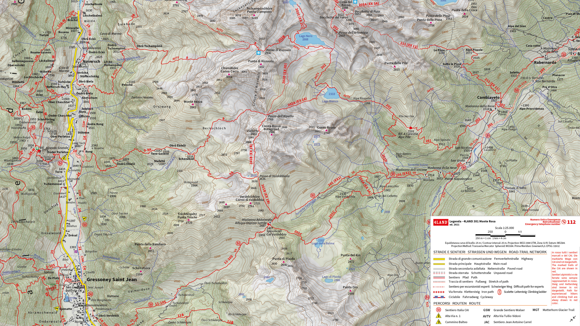
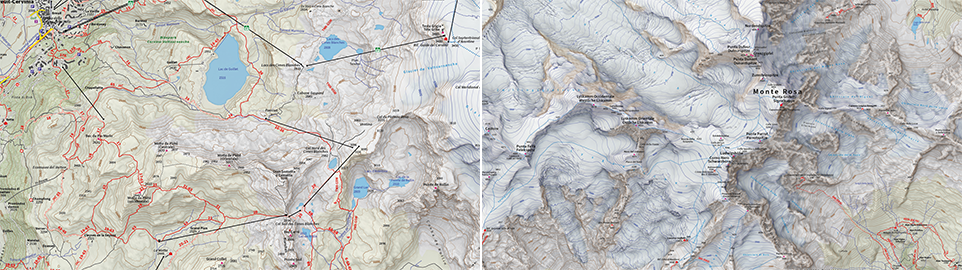
We are showcasing the Runner-Up of the 2021 Avenza Map Competition. This impressive topographic reference map of the Monte Rosa area was a collaborative effort between Remo Nardini, Founder and Chief Technical Officer, and the whole 4LAND team. The map is centered on two of the most renowned mountains of the Alps: Monte Rosa and Monte Cervino (commonly referred to as the Matterhorn). The map encompasses a massive and diverse area. From the glaciers and valleys crossed by the Alta Via n.1 highway in the Aosta valley to the panoramic snow-capped peaks that the Alps are known for. The high valleys of the Monte Rosa area emanate a particular charm, with its woods and pastures making it stand out among other areas in the Aosta Valley.
Remo and his team manually collected trail information and point-of-interest data directly in the field with the Avenza Maps App and combined this with carefully crafted shaded relief techniques to bring the mountainous terrain of this rugged area to life. The map itself is designed for print at 1:25000 scale and is meant to offer a high-quality, waterproof, and tearproof map for use on the trails. The map provides an abundance of useful information for hiking, camping, mountain biking, and a host of other summer and winter outdoor activities. Smart label placement means this map is not only impressive to look at but highly functional when out on the trails.
Select the images below to see a detailed look at 4LAND’s map
Making the Map
The 4LAND team is known for ground-truthing and manually collecting the data that goes into their map products. Trails, placemarks, and other important data were collected directly on the ground using the Avenza Maps App. Supplementing this with pre-existing and custom-developed cartographic datasets meant the map could provide a substantial amount of valuable information to its users.
Using the Geographic Imager Plugin for Adobe Photoshop, the team could elaborate on a custom elevation product to create the enhanced shaded relief basemap that gives the map its gorgeous look. They then crafted the details of the map in Illustrator using MAPublisher. After importing all map datasets, the team used MAP views to align, scale, and project map data layers onto an Illustrator artboard. The team made use of the Vector Crop and MAP Selection tools to filter and process the data down to their specific area of interest.
The 4LAND team applied a custom stylesheet using MAP Themes to create the beautiful textures and colours that make each part of the map stand out. MAP Themes applies rule-based styles that are based on MAP Attribute data contained in each map data layer. This careful work ensures each region is distinct and eye-catching. Every glacier crevasse and serac is carefully shaded to create depth, and woodlands are textured to reflect the irregular patterns of foliage.
One of the most impressive features of this map is the wonderfully detailed labels. This was achieved using the LabelPro add-on, and enabled Remo and his team to perform rules-based, collision-free label placement using a comprehensive suite of user-defined labelling parameters. With LabelPro, they could specify how each label should be stylized (to give each label type a unique look and feel) and also define how the labeling engine would handle label placement to avoid overlap, crowding, or mislabelling.
Lastly, stylistic elements of the map were touched up using native Illustrator tools, MAP Layout tools, and grids and graticules. The map itself is available in digital form for use with the Avenza Maps app. Visit the Avenza Map Store to see other fantastic maps by 4LAND or check out their website to learn more about their other high-quality mapping products.
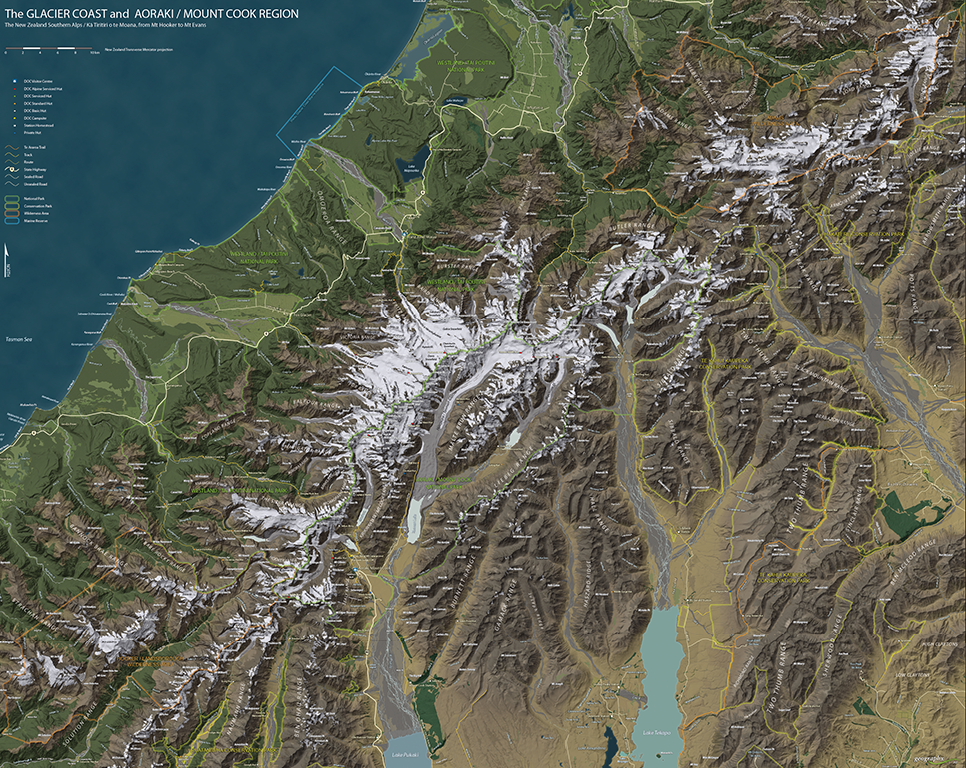
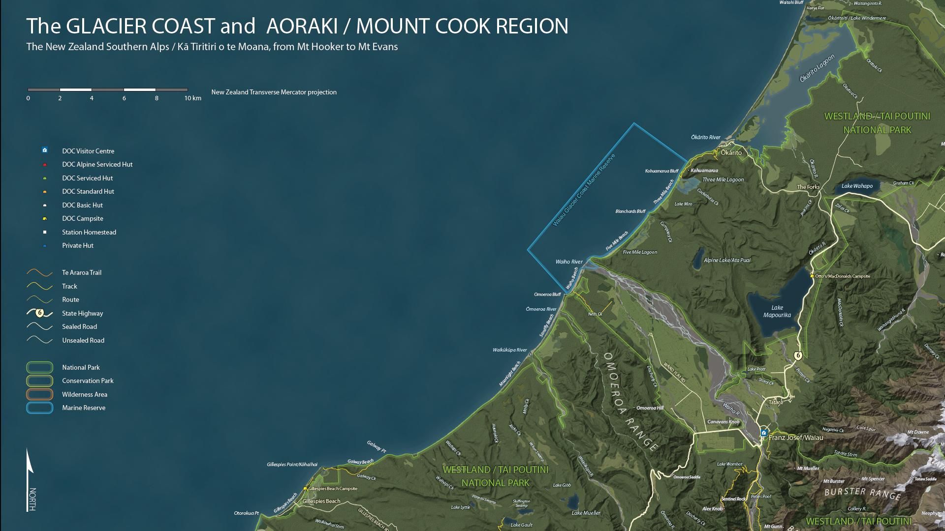
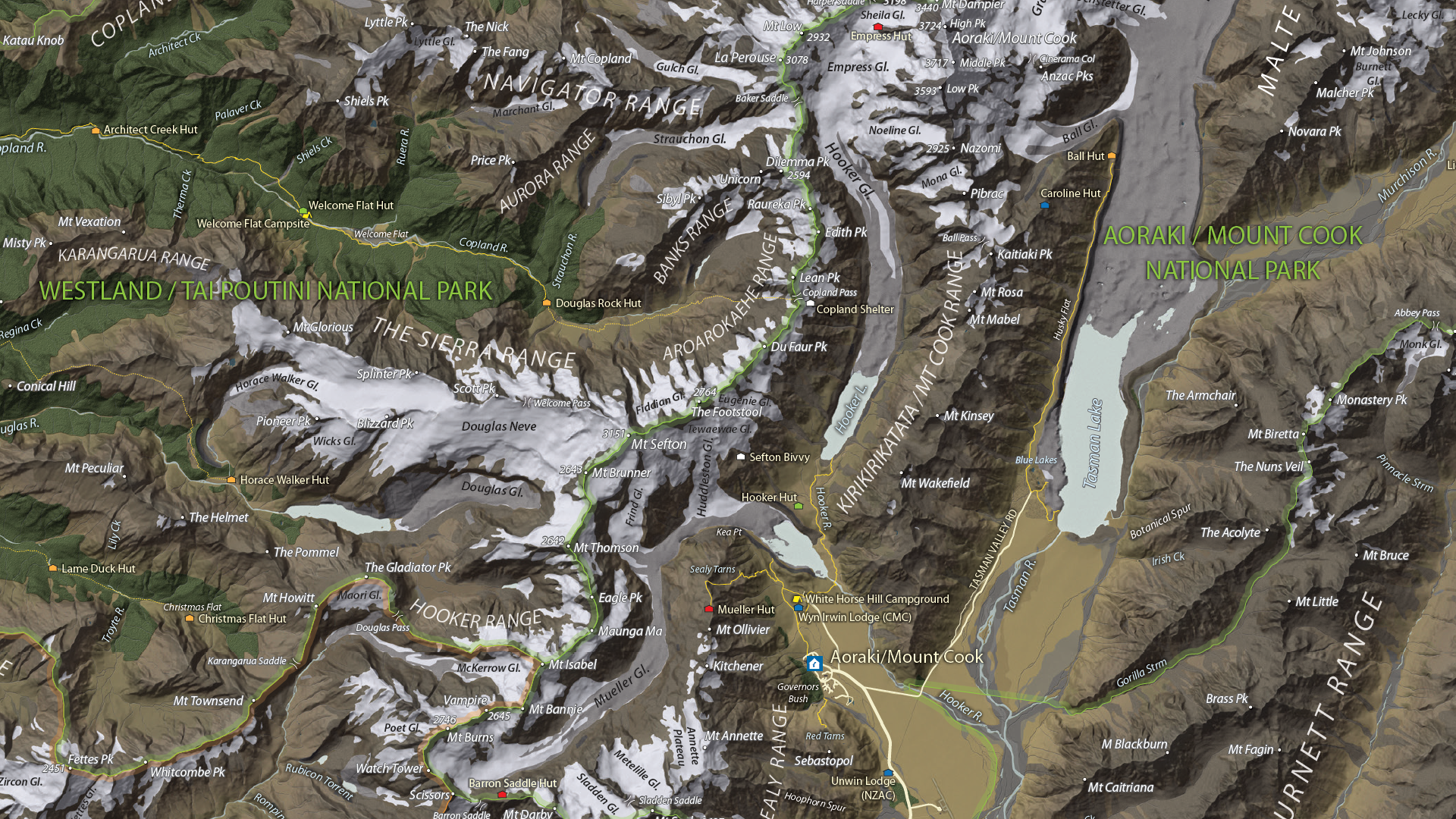
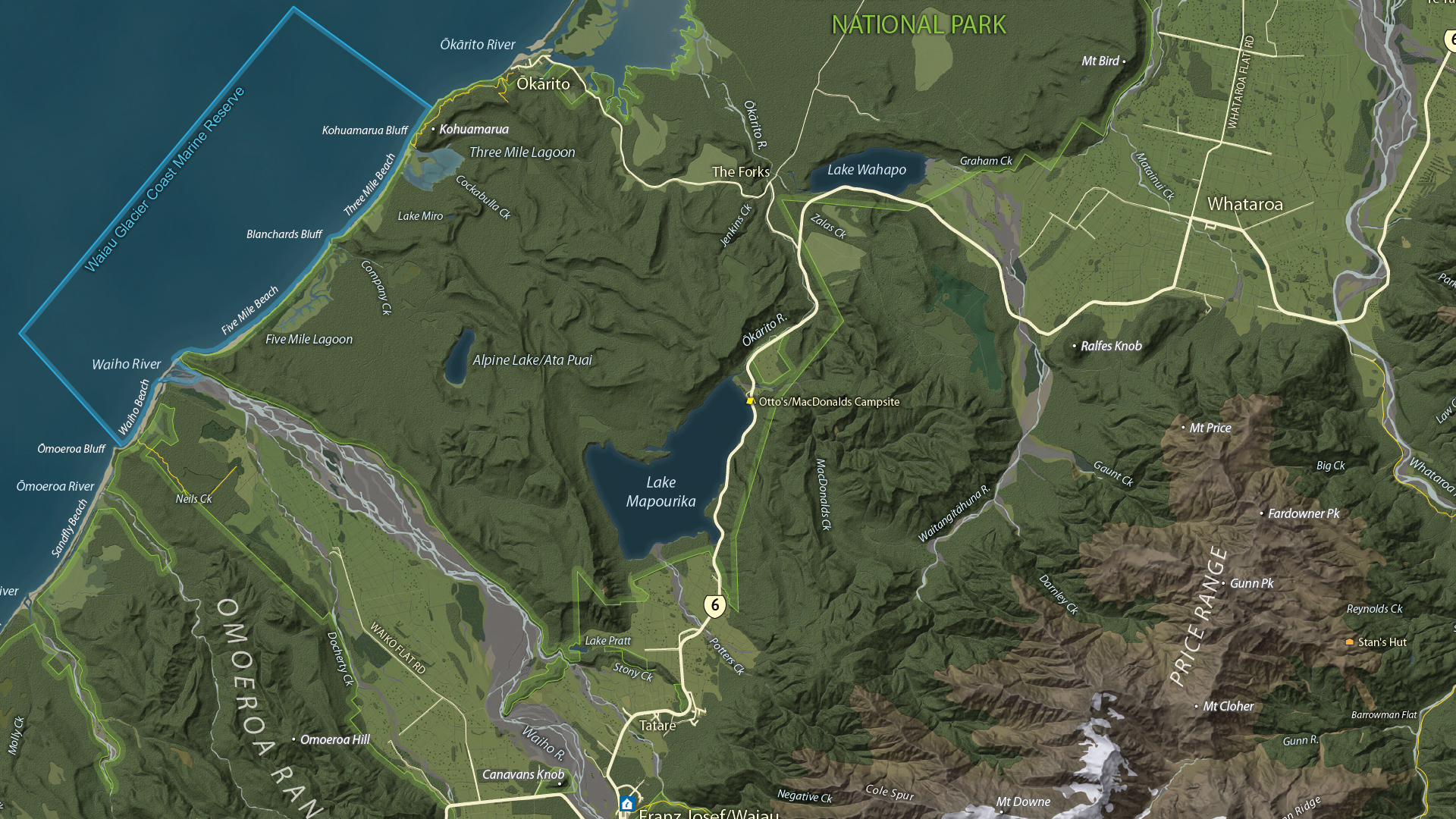
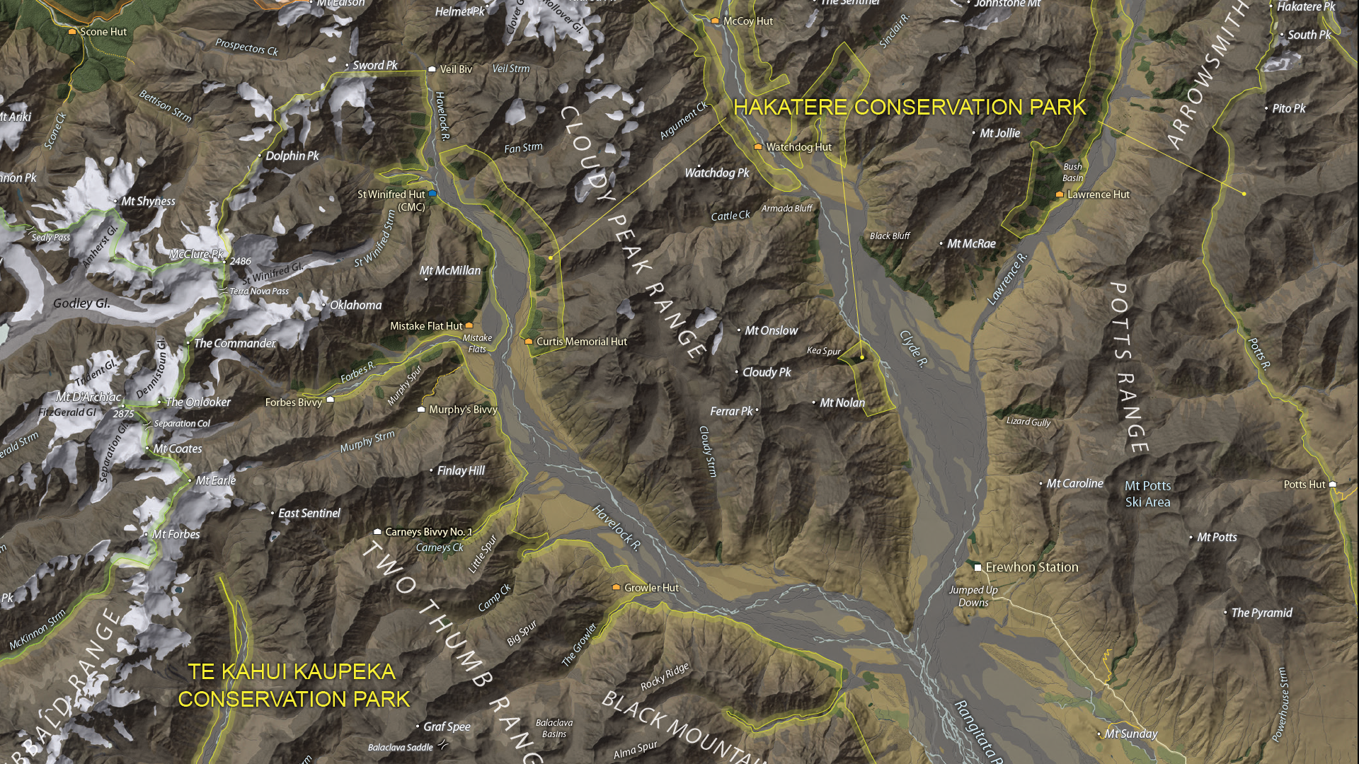
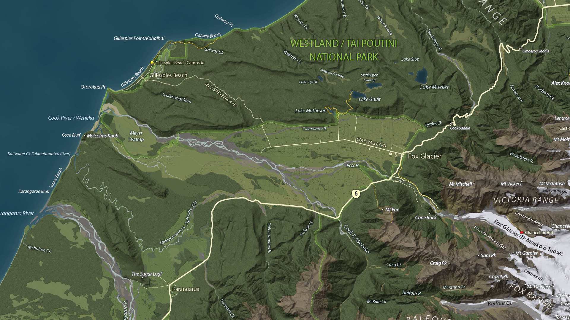
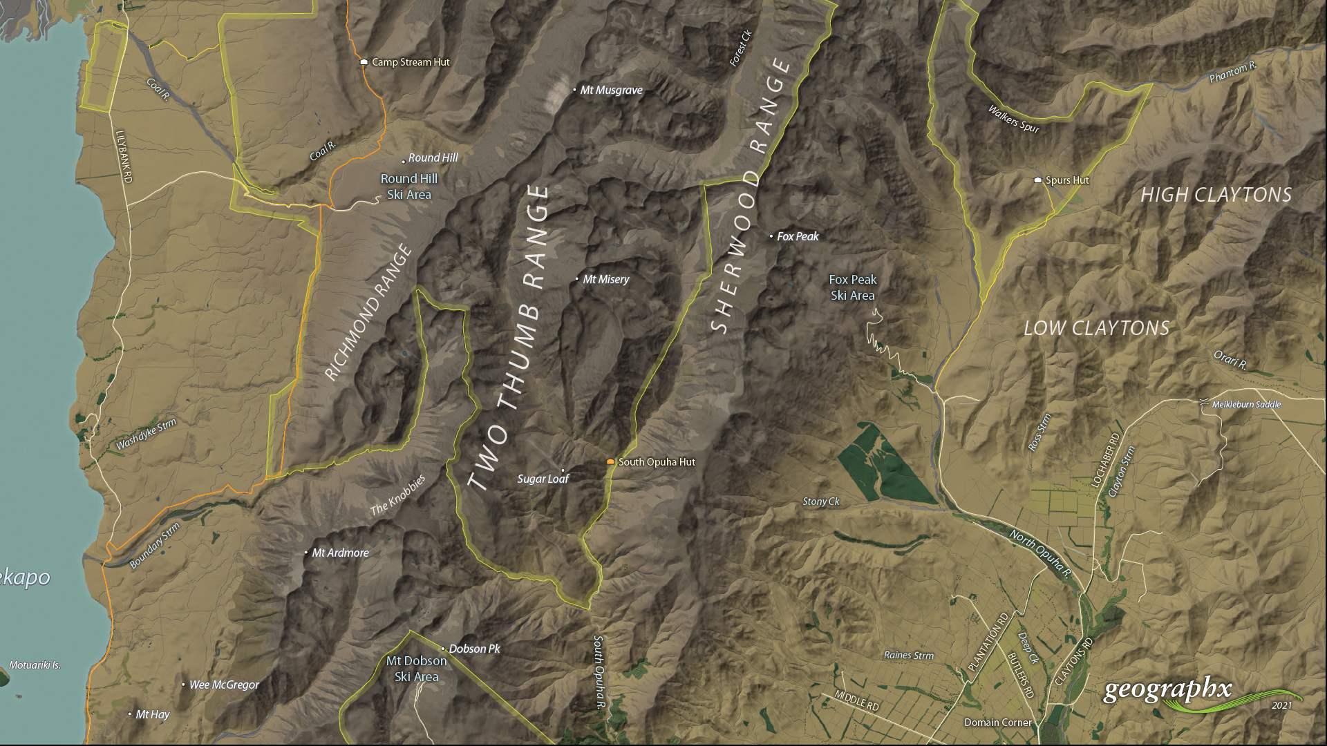
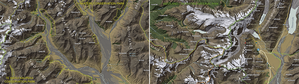
We are showcasing the Open-category winner of the 2021 Avenza Map Competition. This fantastic entry was created by Roger Smith, expert cartographer and owner of Geographx in Wellington, New Zealand. Roger’s grand-prize winning entry is a truly remarkable display of map craftsmanship. The map provides a detailed look at the topography and trail coverage surrounding one of New Zealand’s most beautiful wilderness areas. His expert usage of natural colour basemaps and shaded relief creates a truly stunning result.
This topographic map focuses on the area covered by Westland Tai Poutini National Park, Aoraki/Mount Cook National Park, and the adjacent conservation parks and designated wilderness areas. It presents park boundaries, back-country walking trails, and the many camping shelters that are scattered throughout the area. The map itself is designed for print as a wall map and utilizes a natural colour basemap to create an eye-catching visual guide for the region.
The map can be used to familiarize park visitors with the area and assist recreational visitors with trip-planning in the rugged back-country trails of the area. The natural colour basemap is designed to maximize viewer understanding and appreciation of the physical environment while providing a pleasing backdrop that highlights important points, trails and places on the map.
Select the images below to see a detailed look at Roger’s map
Making the Map
The cartographic design elements and vector art creation utilized a wide range of tools in MAPublisher. Some of the vector data that went into the map were obtained through the New Zealand Department of Conservation, and the Land Information Department, while others were custom-crafted by Roger and his team at Geographx. Notably, the Geographx team custom-built the natural colour basemap and DEM-derived hillshade that gives the map its unique look and feel.
MAPublisher allowed Roger to import his data layers into an Adobe Illustrator environment that was conducive to flexible cartographic design work. Using the MAP Views panel, he could easily adjust and modify the projection and scaling of his map. Where necessary, Roger leveraged the many MAPublisher Geoprocessing and Data Editing tools to manipulate or simplify vector art layers for better representation on the final map.
As MAPublisher maintains spatial referencing for each data layer, he could place and register his custom natural colour, and raster hillshade layers to create his basemap. Fine-tuning would ensure his vector layers (including roads, campsites, trails, and place markers) would all be accurately placed and aligned with their real-world locations.
Roger created unique labels for the hundreds of different placemarks and trail lines on the maps. Using MAP Attribute data that are retained for each data layer, Roger used the Label Features tool to efficiently create and place labels for each layer. With Label Features, Roger could define custom rules that ensure each label stands apart from the other. For important place markers and points of interest, Roger used the Create Halos tool to make certain labels stand out more prominently.
Needless to say, this spectacular piece of work represents the culmination of countless hours of design effort and dedication. Roger has added this map to the impressive collection of cartographic works produced by Geographx. To learn more about other fantastic map products available from Geographx, visit their website.
We’re excited to announce that the 2021 Avenza Map Competition has now concluded. This past year’s competition saw map-makers and cartographers from around the world submit their best and most impressive work. We had some truly impressive displays of cartographic design this year, with competitors demonstrating how they use Avenza mapping software to make eye-catching and impactful cartographic products. After multiple rounds of judging, discussions, and time spent reviewing our scorecards, the Avenza team would like to congratulate this year’s prize winners!
Over the next few weeks, keep an eye out for our Winner’s Spotlight articles. Each article will provide an in-depth look at the winning map entries, with insights from their creators, and an overview of tools and techniques used to develop their prize-winning maps.
The winner’s maps and a selection of honourable mentions will also be showcased in the new Map Gallery, coming soon!
Grand Prize Winner (Open Category)
The Glacier Coast and Aoraki/Mount Cook Region Roger Smith Geographx Wellington, New Zealand
The judges would also like to offer special recognition to a number of other incredible entries. A selection of winners, honourable mentions, and notable map entries will be showcased on the upcoming Map Gallery page.
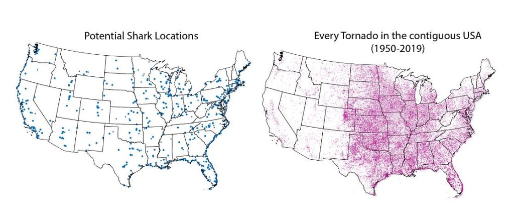
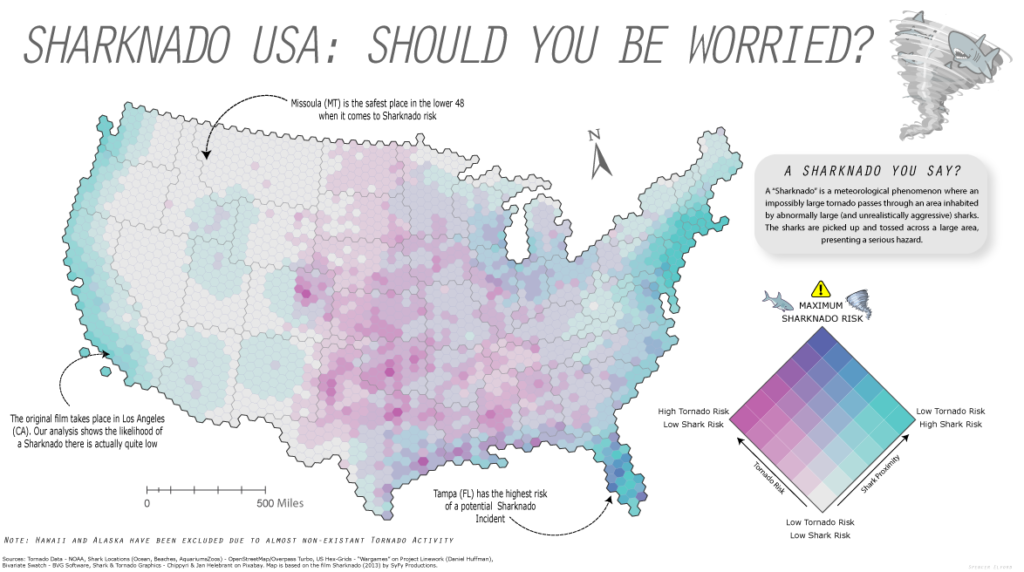
Yesterday was Day 4 of the #30DayMapChallenge, with the goal being to create a map using “Hexagons”. In the spirit of the challenge, we took a not-so-serious approach to create a fun map of “Sharknado Risk” based on the 2013 film “Sharknado” using MAPublisher tools and a really neat hexbin dataset for the United States. This map was in part created for NACIS 2021, and you can see how we created the map by watching the full video presentation included below. This blog also includes a few supplementary notes if you wish to follow along.
What exactly is a Sharknado?
A sharknado is a fictional meteorological phenomenon that occurs when a large tornado scoops up some sharks, transports them some distance, and finally disperses across a populated area. Generally speaking, if a given area is close to potential shark habitats (be it an aquarium, a zoo, or even the ocean) and has a high frequency of tornadoes, the area is more “at-risk” of experiencing a sharknado. To that end, we gathered some great open datasets to help us map this risk. We collected a shapefile documenting point locations for every single tornado in the country dating back to 1950. With this dataset, we can determine the relative frequency of tornadoes for a given area. From OpenStreetMap, we estimated potential locations for sharks by collecting point coordinates for every aquarium, marine park, aquatic zoo, and ocean-facing beach. We used Overpass Turbo to query and extract these points to a spatial dataset and imported them into Illustrator using MAPublisher. Check out this great tutorial (produced by Steve Spindler!) that covers techniques for importing Overpass Turbo data into MAPublisher. The tutorial was part of our ongoing Mapping Class series, a video-focused series that provides helpful tips, techniques, and workflows from real-world cartographers.
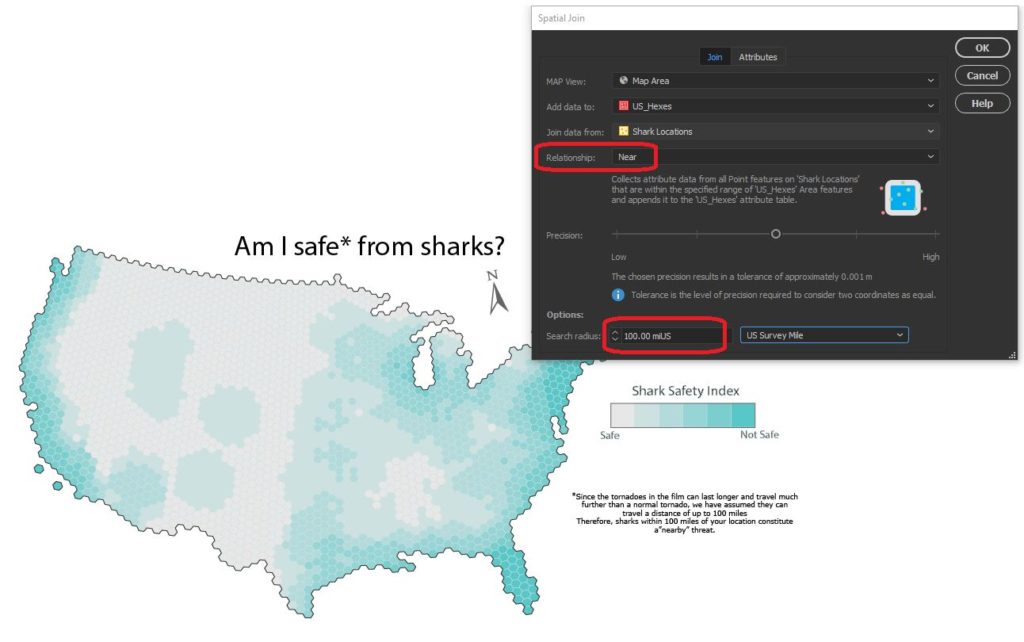
Aggregate data with Spatial Join
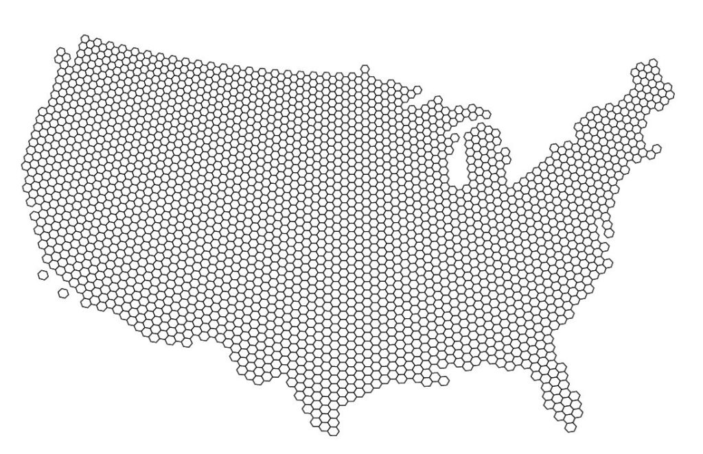
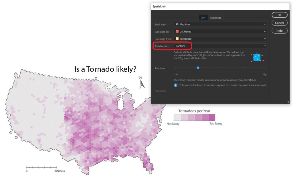
Since the challenge of the day is hexagons, we needed a way to get our messy point data into our clean “hexbin” format. The Spatial Join tool allows us to aggregate our point data (Tornado and Shark Locations) into a single hex-grid polygon dataset.
Credits to Daniel Huffman’s projectlinework.org for making this dataset available!
The Spatial Join tool includes several different options for “spatial relationships” that will determine how our point data is joined to the new hex-grid. We can also specify how the tool will aggregate the attribute information for our joined data. In this case, we join our Tornado point data based on a “contains” spatial relationship. This will aggregate all tornado points that are “contained” within a given hexbin. We also specify that the tool should aggregate the attribute information for all “contained” tornados by tallying up the number of tornado points within each hex. Since we know the dataset spans a 69-yr period, we can easily calculate the average annual tornado frequency for each hexagon.
We apply a similar technique to our shark location data, this time specifying a “near” spatial relationship. We used some back-of-the-envelope math to estimate that a Sharknado (as it appears in the film) lasts substantially longer and travels farther than a normal tornado, meaning sharks as far away as 150 miles still present a potential risk. We can specify a search range of 150 miles and this will be applied to our spatial relationship as a cut-off distance.
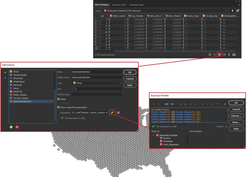
Edit attributes with expressions
We assumed that Sharknado risk is highest when a given area is prone to tornadoes and also has a high concentration of potential shark locations. Given this, we came up with a basic equally-weighted, bi-variate risk index to assign a “Sharknado Risk” score based on these two variables. To calculate this score for each hexagon in our hexbin grid, we applied some custom expressions using MAP Attributes. First, we assigned a Tornado risk score from 1 to 6 based on the low to high frequency of tornadoes. We assigned a similar score for “Shark proximity” based on the concentration of potential shark locations. Finally, we combined these values into 36 unique scores to evaluate sharknado risk.
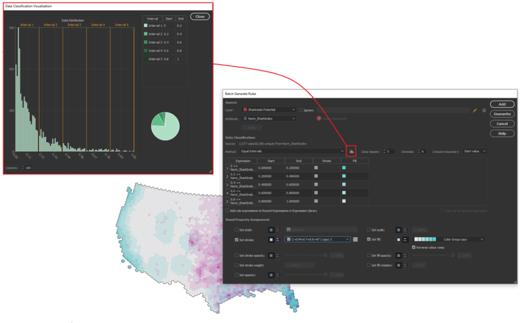
Stylize maps easily with MAP Themes
The final step is to stylize our map and create a layout. With MAP Themes, we can create rules-based stylesheets to easily stylize our map data in no time. MAPublisher comes with a great selection of built-in MAP Swatches, including several color brewer-based swatches that work great for choropleth-style maps like this. We used these swatches to create a custom, bi-variate swatch group to visualize each score of our “Sharknado Risk Index”. The MAP Themes tool also provided a neat data distribution viewer, which also allows us to inspect a histogram of our dataset. Although we used discrete categories for each of our risk scores, the data distribution viewer is very useful when working with continuous datasets since it allows you to see how your bin-widths will affect the display of colour on your choropleth.
The final touches
With stylization complete, Day 4 of the #30DayMapChallenge is almost in the bag. We can create a north arrow, and a scale bar and create a custom legend to facilitate easy interpretation. Since we are still within an Illustrator environment, we can use all the powerful native illustrator tools to add graphical design elements, text, and artwork to create a fun, infographic-style map. Although we were happy to call the map finished at this point, the great thing about making maps is there is also room to add more. For example, we might try using LabelPro to create custom labels that mark high and low-risk areas, or we could create insets to highlight specific regions of interest. The possibilities are endless!
We had a great time putting together this fun map for the #30DayMapChallenge, and we are excited to see what we can do for the remaining themes on the calendar! For those of you who are also making maps for the challenge, a reminder that the Avenza Map Competition is still accepting submissions. Share your map, compete with other map-makers in the community, and win some great prizes!