My Account     Contact Us     Cart

Map-making for the #30DayMapChallenge: Day 4 – Hexagons

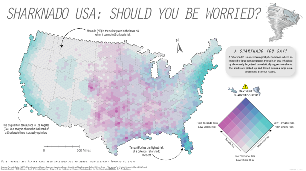
Yesterday was Day 4 of the #30DayMapChallenge, with the goal being to create a map using “Hexagons”. In the spirit of the challenge, we took a not-so-serious approach to create a fun map of “Sharknado Risk” based on the 2013 film “Sharknado” using MAPublisher tools and a really neat hexbin dataset for the United States. This map was in part created for NACIS 2021, and you can see how we created the map by watching the full video presentation included below. This blog also includes a few supplementary notes if you wish to follow along.

What exactly is a Sharknado?

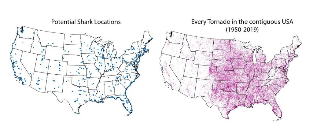
A sharknado is a fictional meteorological phenomenon that occurs when a large tornado scoops up some sharks, transports them some distance, and finally disperses across a populated area. Generally speaking, if a given area is close to potential shark habitats (be it an aquarium, a zoo, or even the ocean) and has a high frequency of tornadoes, the area is more “at-risk” of experiencing a sharknado. To that end, we gathered some great open datasets to help us map this risk. We collected a shapefile documenting point locations for every single tornado in the country dating back to 1950. With this dataset, we can determine the relative frequency of tornadoes for a given area. From OpenStreetMap, we estimated potential locations for sharks by collecting point coordinates for every aquarium, marine park, aquatic zoo, and ocean-facing beach. We used Overpass Turbo to query and extract these points to a spatial dataset and imported them into Illustrator using MAPublisher. Check out this great tutorial (produced by Steve Spindler!) that covers techniques for importing Overpass Turbo data into MAPublisher. The tutorial was part of our ongoing Mapping Class series, a video-focused series that provides helpful tips, techniques, and workflows from real-world cartographers.

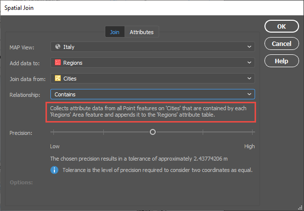
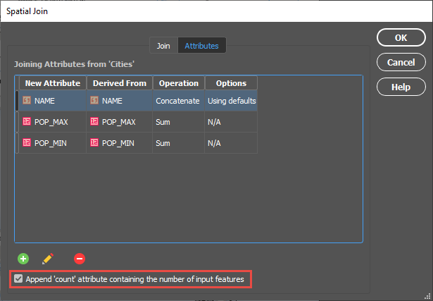
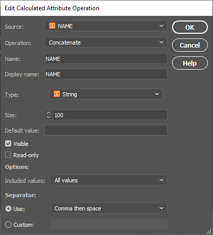
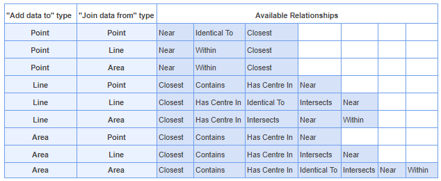
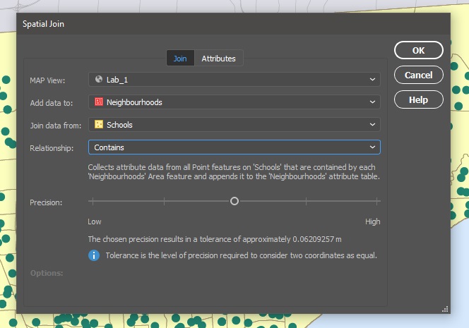
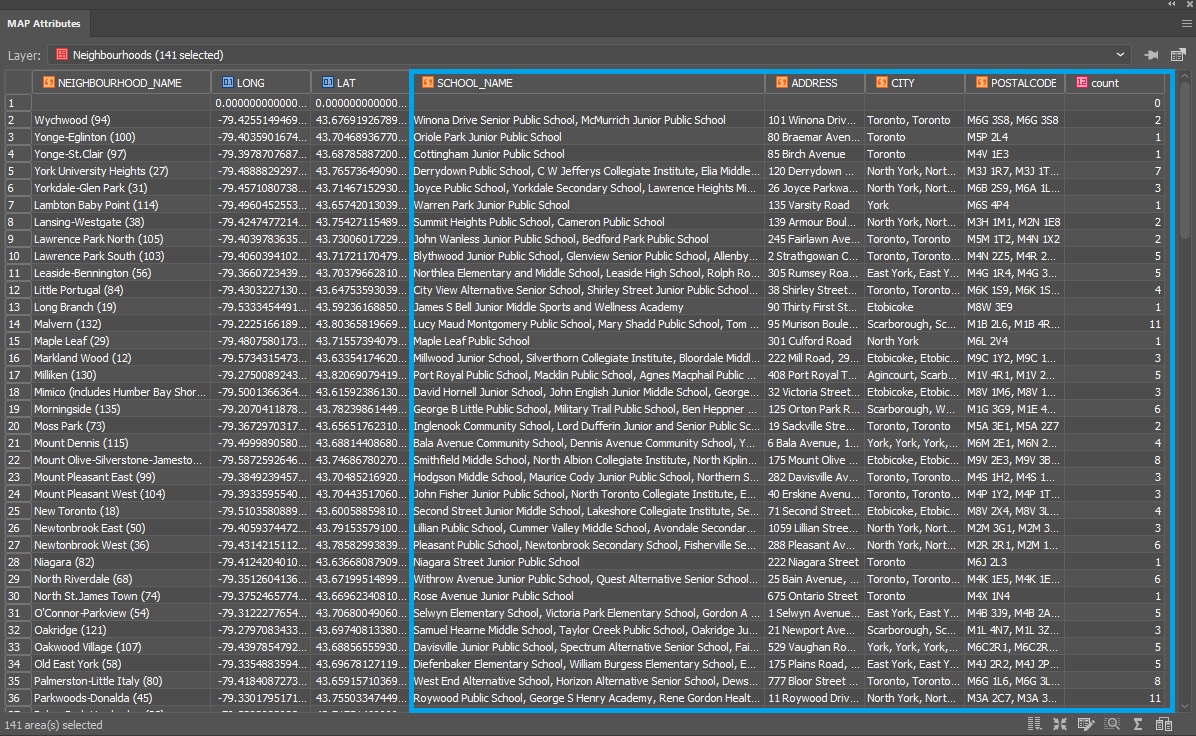
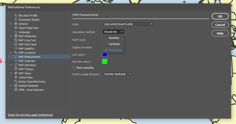
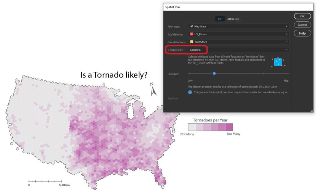
Aggregate data with Spatial Join

Since the challenge of the day is hexagons, we needed a way to get our messy point data into our clean “hexbin” format. The Spatial Join tool allows us to aggregate our point data (Tornado and Shark Locations) into a single hex-grid polygon dataset.

Credits to Daniel Huffman’s projectlinework.org for making this dataset available!

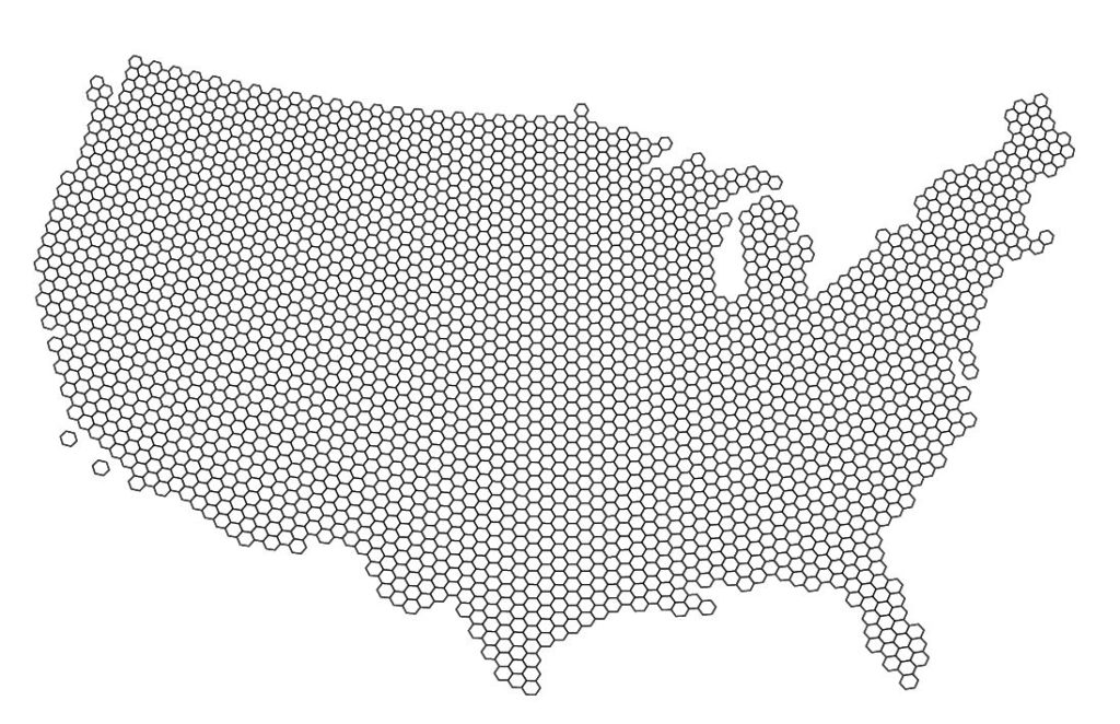
The Spatial Join tool includes several different options for “spatial relationships” that will determine how our point data is joined to the new hex-grid. We can also specify how the tool will aggregate the attribute information for our joined data. In this case, we join our Tornado point data based on a “contains”  spatial relationship. This will aggregate all tornado points that are “contained” within a given hexbin. We also specify that the tool should aggregate the attribute information for all “contained” tornados by tallying up the number of tornado points within each hex. Since we know the dataset spans a 69-yr period, we can easily calculate the average annual tornado frequency for each hexagon.

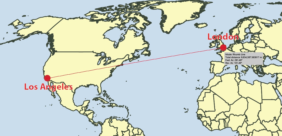
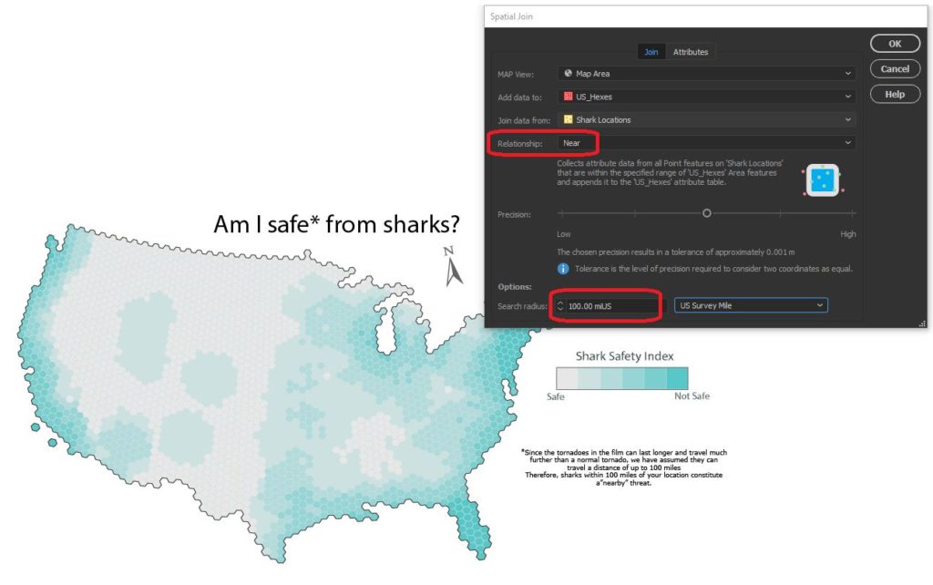
We apply a similar technique to our shark location data, this time specifying a “near” spatial relationship. We used some back-of-the-envelope math to estimate that a Sharknado (as it appears in the film) lasts substantially longer and travels farther than a normal tornado, meaning sharks as far away as 150 miles still present a potential risk. We can specify a search range of 150 miles and this will be applied to our spatial relationship as a cut-off distance. 


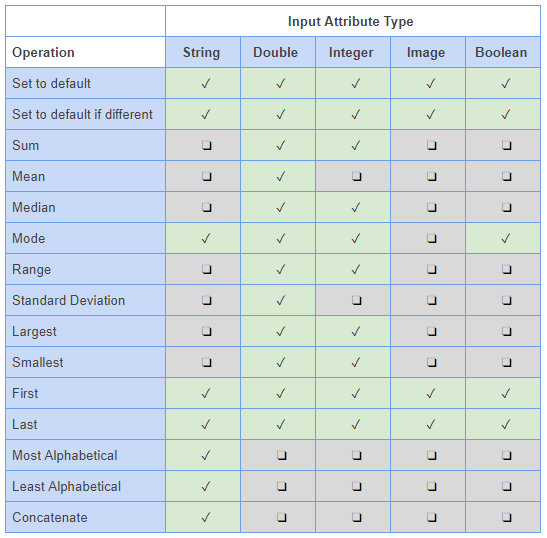
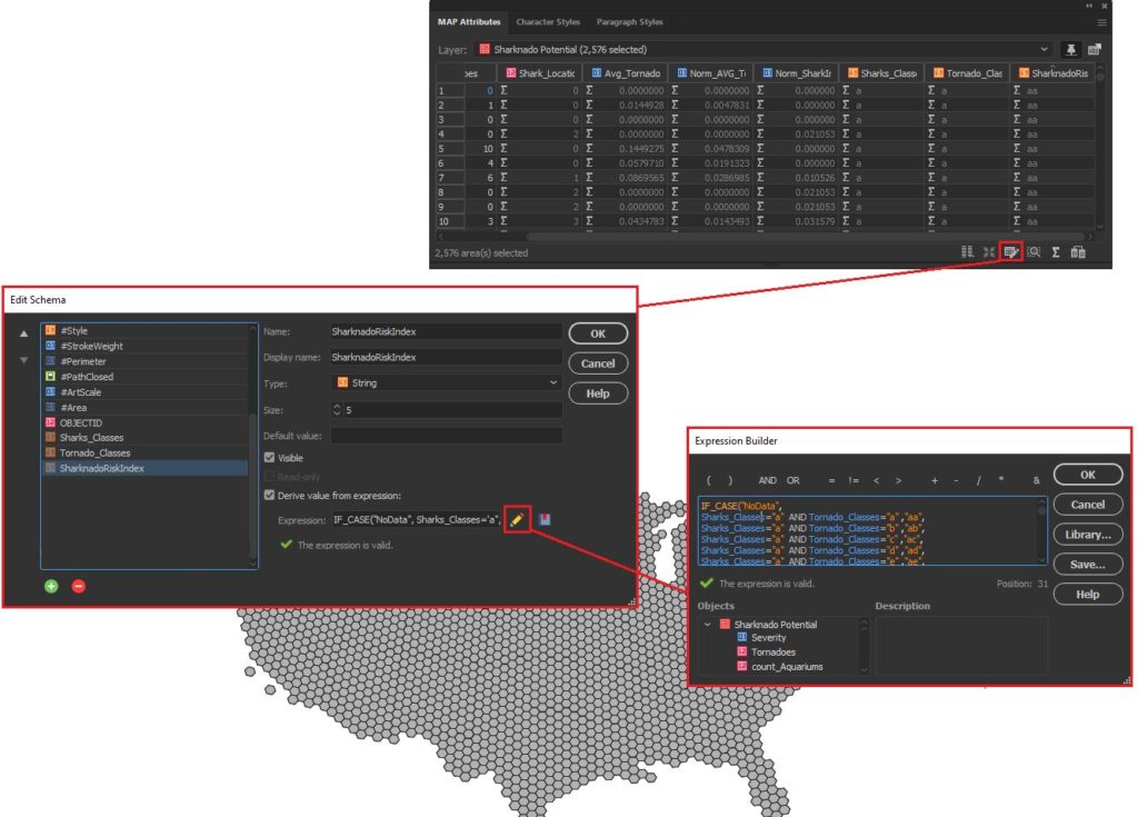
Edit attributes with expressions

We assumed that Sharknado risk is highest when a given area is prone to tornadoes and also has a high concentration of potential shark locations. Given this, we came up with a basic equally-weighted, bi-variate risk index to assign a “Sharknado Risk” score based on these two variables. To calculate this score for each hexagon in our hexbin grid, we applied some custom expressions using MAP Attributes. First, we assigned a Tornado risk score from 1 to 6 based on the low to high frequency of tornadoes. We assigned a similar score for “Shark proximity” based on the concentration of potential shark locations. Finally, we combined these values into 36 unique scores to evaluate sharknado risk.

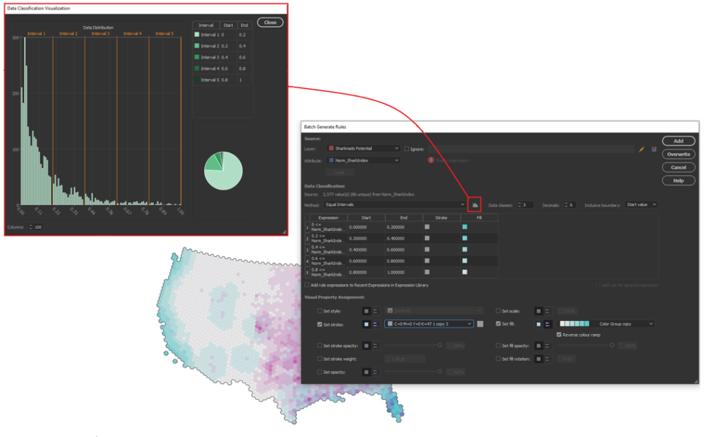
Stylize maps easily with MAP Themes

The final step is to stylize our map and create a layout. With MAP Themes, we can create rules-based stylesheets to easily stylize our map data in no time. MAPublisher comes with a great selection of built-in MAP Swatches, including several color brewer-based swatches that work great for choropleth-style maps like this. We used these swatches to create a custom, bi-variate swatch group to visualize each score of our “Sharknado Risk Index”. The MAP Themes tool also provided a neat data distribution viewer, which also allows us to inspect a histogram of our dataset. Although we used discrete categories for each of our risk scores, the data distribution viewer is very useful when working with continuous datasets since it allows you to see how your bin-widths will affect the display of colour on your choropleth.

The final touches

With stylization complete, Day 4 of the #30DayMapChallenge is almost in the bag. We can create a north arrow, and a scale bar and create a custom legend to facilitate easy interpretation. Since we are still within an Illustrator environment, we can use all the powerful native illustrator tools to add graphical design elements, text, and artwork to create a fun, infographic-style map. Although we were happy to call the map finished at this point, the great thing about making maps is there is also room to add more. For example, we might try using LabelPro to create custom labels that mark high and low-risk areas, or we could create insets to highlight specific regions of interest. The possibilities are endless!

We had a great time putting together this fun map for the #30DayMapChallenge, and we are excited to see what we can do for the remaining themes on the calendar! For those of you who are also making maps for the challenge, a reminder that the Avenza Map Competition is still accepting submissions. Share your map, compete with other map-makers in the community, and win some great prizes!

See a PDF version of the map here.

Explore all that you can do with the latest ‘Spatial Join’

By Olly Normanton, QA Specialist


This is one feature we have all been waiting for. Spatial Join is a very useful tool to be included in the MAPublisher roster as of version 10.6 and I would like to share a little bit about the tool with you in this feature blog. 

The Spatial Join tool inserts the columns and attributes from one feature table to another based on location or proximity. Currently, we support several Spatial Join types including:

  • Intersects: If any part of two features touch at any location
  • Identical To: Both features match identically
  • Contains: When one feature intersects with the interior or boundary of another
  • Near: If a line can be drawn from any part of A to any part of B that is less than the specified minimum distance
  • Closest: If a line can be drawn from any part of A to any part of B that is less than any other such line between B & any other feature
  • Has Centre In: When one features centroid lies Within another feature
  • Within: If all of one feature lies within the interior boundary of another


Here is a wonderful map of Italy created by Hans van der Maarel of Red Geographics available through the One Stop Map service. It will provide a great way to show you some examples of the Spatial Join tool in action. It contains a Cities layer and a Regions layer and I would like to see which cities fall into each region by using Spatial Join.

Cities and Region Layer using MAPublisher 10.6

You can see below that the Cities attribute table contains the name of each city and there are 70 in total. 

MAP Attributes on MAPublisher 10.6

There are 20 different regions that these cities lie within. To figure out which cities belong to which region, we have the ability to spatially join attribute information from the Cities point layer to the Regions area layer. In addition, we’ll use the Concatenate operation on the NAME attribute to list all the cities that belong to a region in one field.

To do this, click the new Spatial Join button on the MAPublisher toolbar or access the Spatial Join dialog box via Object > MAPublisher > Spatial Join. 

Spatial Join Button on MAPublisher 10.6

The Spatial Join tool will always open on the Join tab seen below. I will be adding data to my Regions area layer and joining data from my Cities point layer. The relationship is set to Contains—in other words, when one feature intersects with the interior or boundary of another. A description of the operation is always provided beneath the relationship. 

Spatial Join Tool on MAPublisher 10.6

The Precision slider alters the tolerance that is used to determine when two values are equivalent (or approaching equivalent). Depending on your data, this may need to be altered in some cases but for this example, I will be leaving it in the default position. 

On the Attributes tab, I am going to concatenate the NAME field. By double-clicking on the attribute, I can access the Edit Calculated Attribute Operation dialog box. In addition, I am going to sum both the POP_MAX and POP_MIN attributes. I’m also going to append a Count attribute to the table so I can quickly verify how many cities are in each region.

Spatial Join Tool on MAPublisher 10.6

Within the Edit Calculated Attribute Operation dialog box, I am going to set the Operation drop-down to Concatenate and leave the separator as default as Comma then space. 

Spatial Join Tool on MAPublisher 10.6

After confirming the Spatial Join with the OK button, we’ll open the MAP Attribute table for the Regions area layer and take a look at the results.

Spatial Join Result

You can see that the cities have been concatenated by region and the POP_MAX and POP_MIN attributes have been summed for the regions based on the cities contained within them. The count attribute was also added to the attribute table and as only 56 of our 70 cities were within the Italian Regions area layer, that is the total value of our count. 

For the eagle-eyed readers who may have noticed that there are only 12 cities that surround Italy in the full map displayed at the beginning of this article and 70 – 56 = 14, the difference can be explained by San Marino and Vatican City, both of which are autonomous countries and not part of Italy. You can see that they are in fact separate polygons. 

City Map

For a full list of the relationships that are available based on the different layer types, and also the input attribute types, please see the tables below. 

Layer Attributes
Input Attribute Table

This post was made using the incredibly beautiful map data provided by our good friends over at One Stop Map. Stay tuned as MAPublisher Aware Maps are coming very soon to the One Stop Map Store, which will allow you to directly purchase the Adobe Illustrator files and put your own style on the maps! If you’re interested in seeing more of their work, take a look at these One Stop Map Country Maps.


What’s New in MAPublisher 10.6

Continued Compatibility with Adobe 2020

Both Windows (64-bit) and Mac users can explore the exciting new and improved features MAPublisher 10.6 offers with the latest version of Adobe Illustrator. Talk about a power duo — upgrade today (it’s free for maintenance users)!

Spatial Join

In our line of work, spatial relationships are really important and can be complicated, but working with them shouldn’t be. MAPublisher 10.6 delivers the brand-new Spatial Join feature and we’re ecstatic to be sharing it with you. With Spatial Join, you can:

  • copy attributes from one layer to another based on their spatial relationship
  • use relationships including Near, Closest, Identical To, Contains, Within, Has Centre In, and Intersects
  • adjust the Precision and Tolerance


Spatial Join Tool

Spatial Join Tool MAPublisher 10.6

Spatial Join tool

Spatial Join for MAPublisher 10.6

Features joined based on spatial relationship

Improved Line Plotter

The Earth isn’t flat, and your plotted lines shouldn’t be either! The improved Line Plotter tool will accurately plot lines with the Geodesic and Rhumb line methods, taking your projection into consideration (or calculation if we’re getting technical) and is available for both Point by Point and Course & Distance plotting styles.

The Rhumb line method will create either straight or curved lines, depending on the projection used. Still want to plot straight lines? The Cartesian method is sticking around and will work just as you remember it. A preview option is now available, so you can take a look at the three different methods on your map before plotting the line (or simply turn it off if your line has too many points).

Line Plotter Settings MAPublisher 10.6

geodesic_lineplotter MAPublisher 10.6

Geodesic Method: Shortest distance between points

Rhumbline Line Plotter MAPublisher 10.6

Rhumb lines: Constant bearing, curved or straight depending on the map projection.

cartesian_lineplotter MAPublisher 10.6

Cartesian lines: straight lines from destination to destination.

Improved Map Measurement Tool

linemeasurement Settings MAPublisher 10.6


With the addition of the Geodesic and Rhumb methods for plotting lines, we’ve made sure you can accurately measure the distance between points with these methods as well, whether they’re curved or straight lines.

  • Measure distances between points using Geodesic, Cartesian and Rhumb line methods
  • Like the Line Plotter, Geodesic and Rhumb measurement lines can be curved or straight, depending on the map projection
  • A combination of keyboard presses (Shift + Click) will add the measurement line as an object on your layer

Rhumbline Measurement MAPublisher 10.6

Rhumb Measurement Line

Geodesic Measurement Line MAPublisher 10.6

Geodesic measurement line

cartesian_measurement MAPublisher 10.6

Cartesian Measurement Line

Installer Will Uninstall Previous Versions

We’ve made some improvements to the installer. You’ll notice that the MAPublisher 10.6 installer will prompt you to uninstall previous versions of MAPublisher. We’ve designed the installer to guide you through this process. You can also uninstall older versions through the Control Panel (Windows) or as usually on macOS.

Export Document to Image

Colours on a map can make important information pop or sometimes they just make the map look nice. Whichever way, we’ve made sure your colour profiles stick around when exporting your document to an image. ICC profiles (the data that characterizes a coloured input or output device) will be embedded when documents are exported as TIFF files. If an Adobe Illustrator document is in the CMYK colour space, its colour profile will be embedded in the TIFF if the exported TIFF’s colour mode is also set to CMYK.

Map Data Links

We’ve made it easier to keep your workspace clean. Previously, when a layer is deleted, data links were not removed. In MAPublisher 10.6, data links are now removed when a layer is deleted and is the new default behaviour.

Stay safe out there and happy Spring cleaning!