My Account     Contact Us     Cart

Never Trace Map Borders Again with MAPublisher

Never trace map borders again with MAPublisher

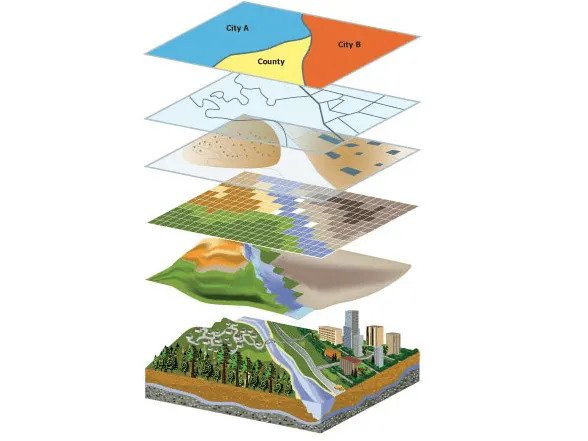
Making maps is a fairly common request made of graphic designers. After all, graphic design is about storytelling and visualization, and maps are about the same things. However, maps are some of the most difficult projects that designers can take on. Whether the goal of the project is to improve the aesthetic of an existing map or to create a new one from scratch, you know it is going to entail a lot of detailed and technical work such as composing layer hierarchies, setting appropriate map scales, and determining feature strokes and colours. Meanwhile your client’s last request of making a map required tracing things like country borders, following and drawing boundary lines and features. All tedious tasks that you don’t actually want to do ever again.

Handy Tools to Have in Your Graphic Design Toolkit

In a nutshell, designing maps can be frustrating for even some of the best graphic designers who know the tools of the trade inside and out. The problem is, the de facto tool of the trade, Adobe Illustrator, isn’t equipped to handle creating maps with data. Luckily, there is a plug-in that adds additional tools to Illustrator to help with making maps, while still allowing you to design in the platform that you are most comfortable with. These are good tools to know about and have in your kit so that when the next map project comes along, you are prepared to crush it while still maintaining productivity.

We May Be Biased But…

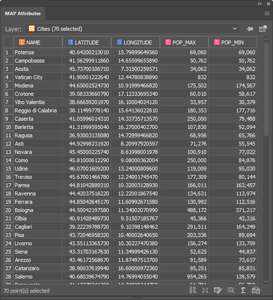
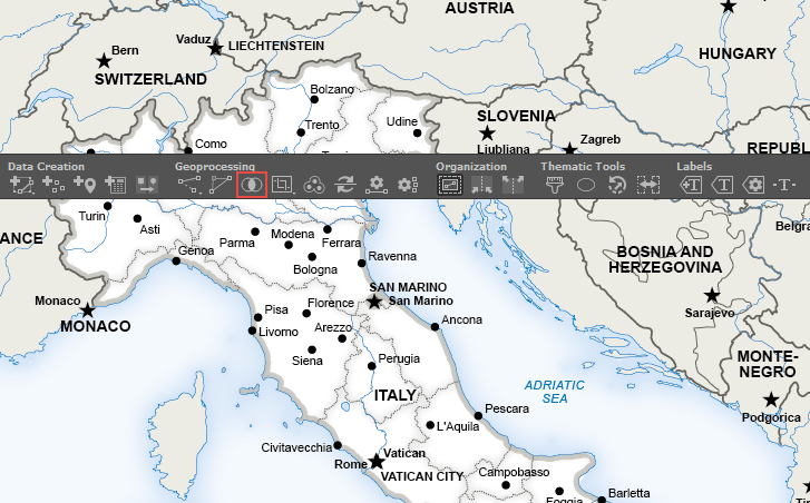
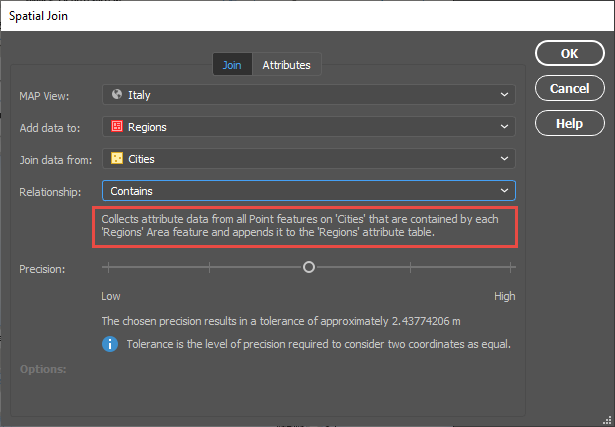
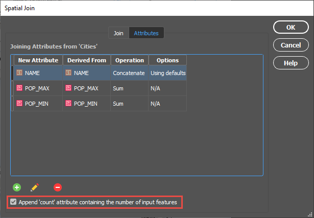
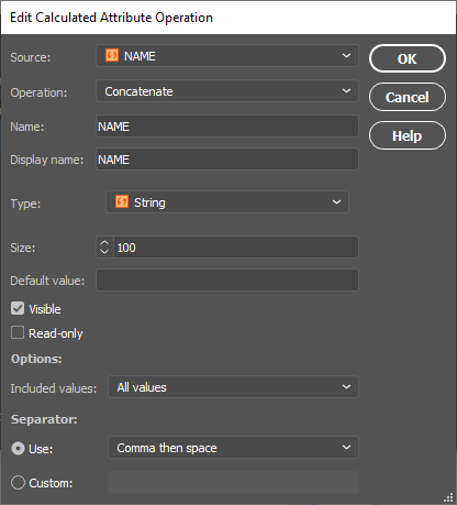
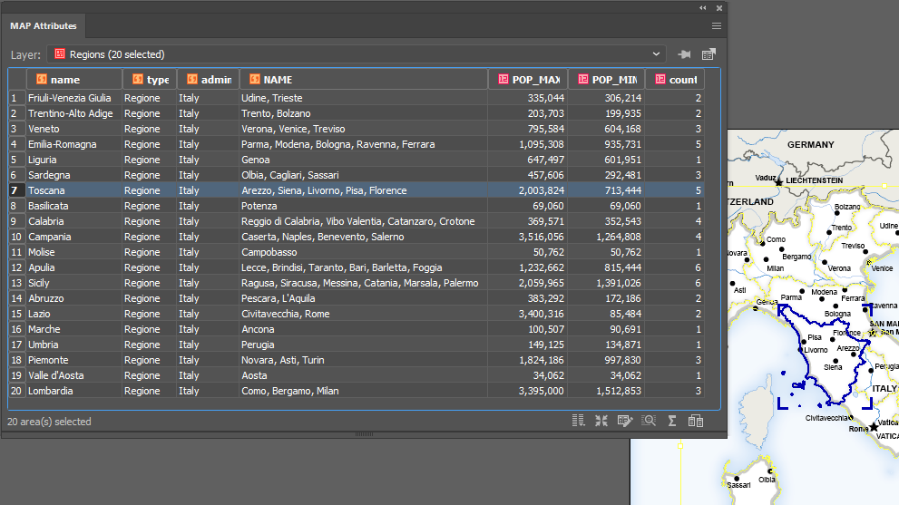
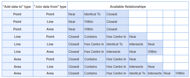
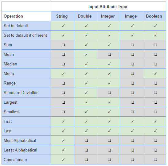
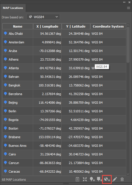
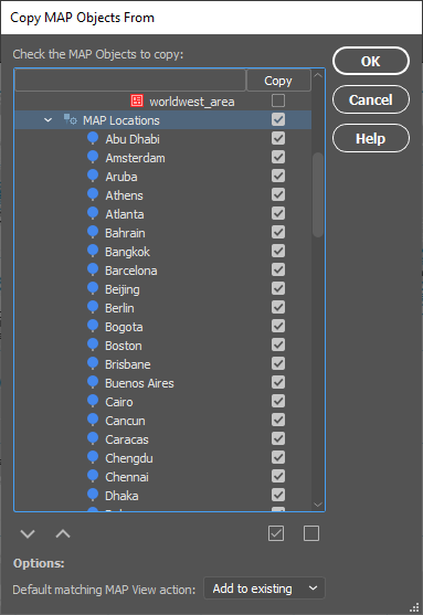
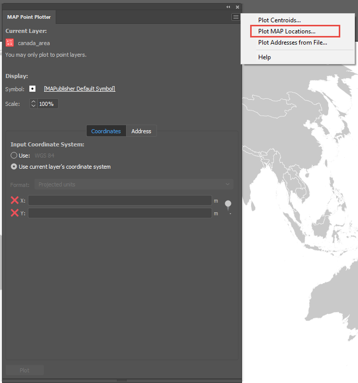
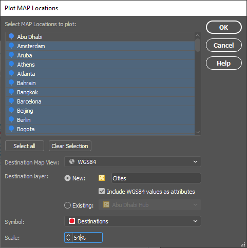
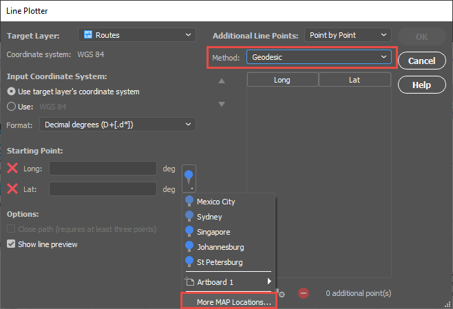
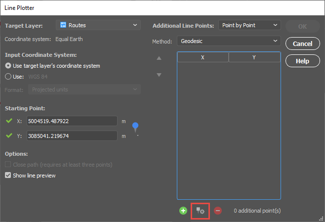
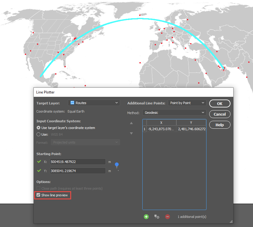
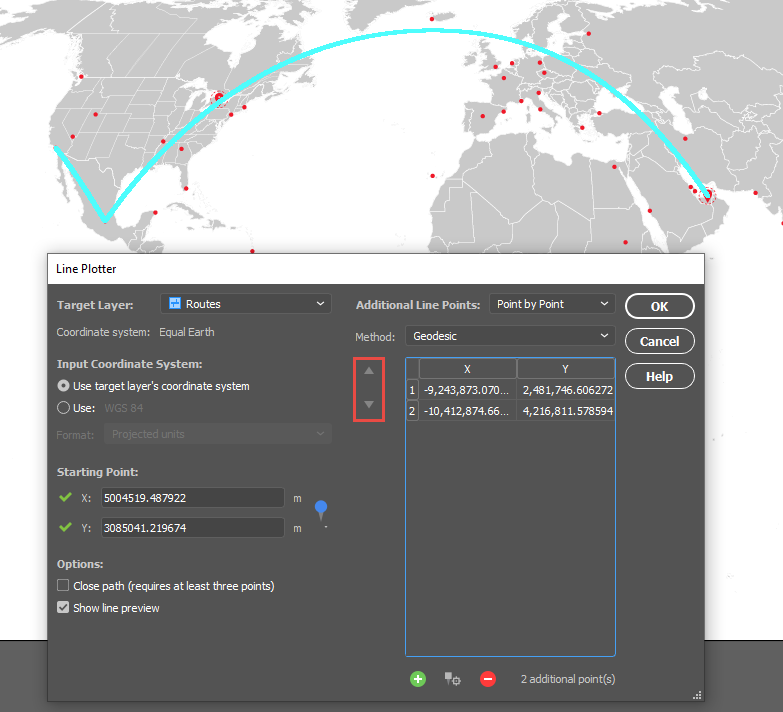
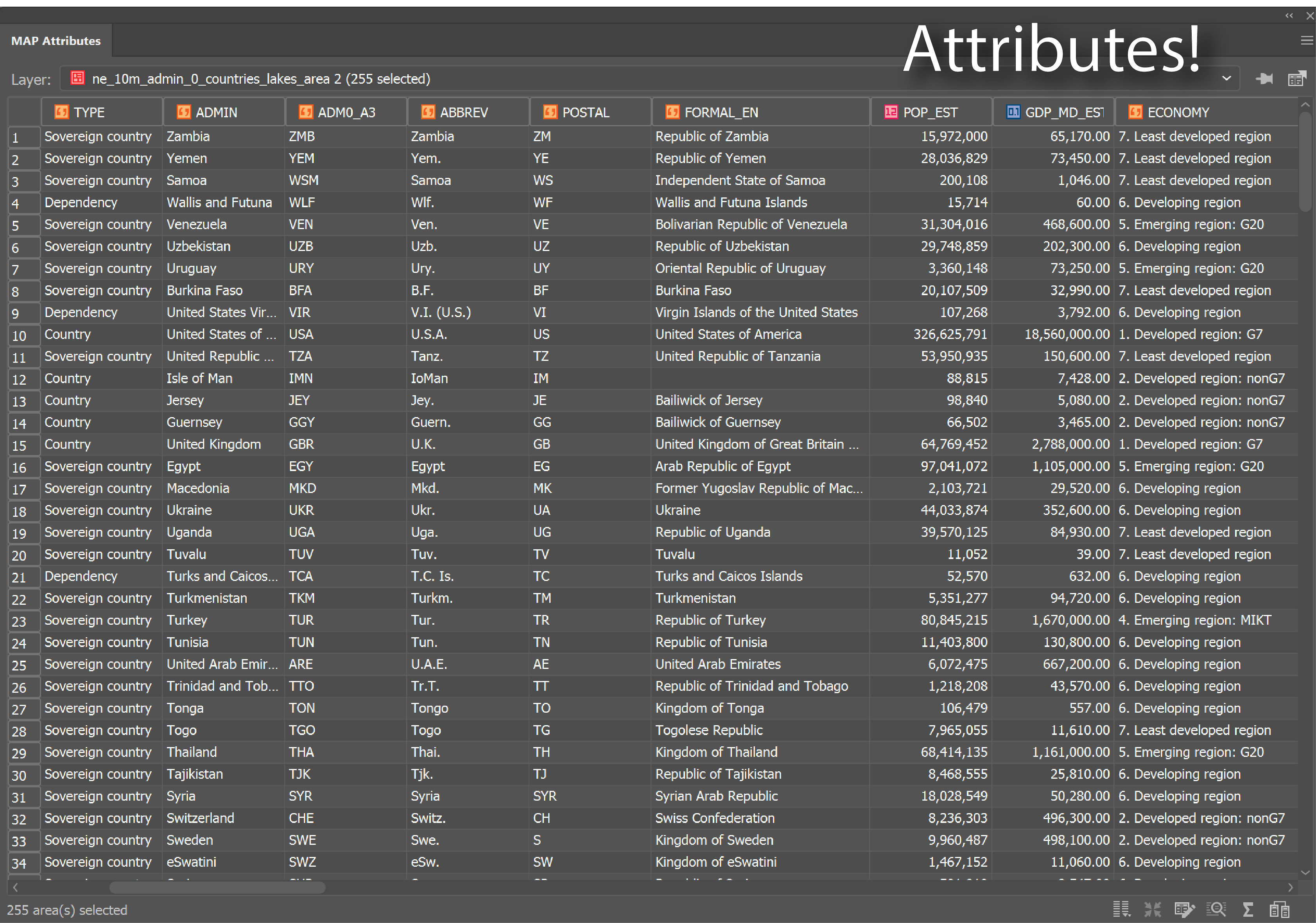
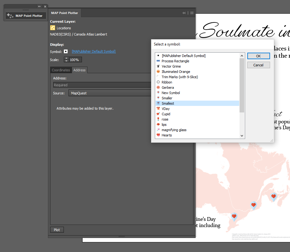
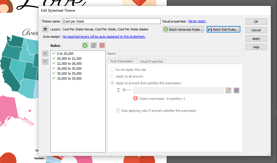
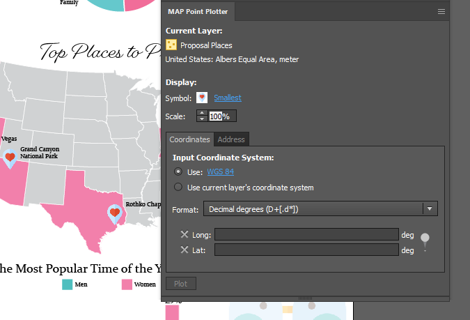
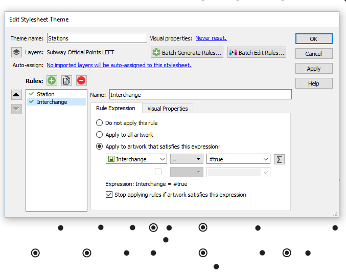
One such solution is our MAPublisher cartography plug-in for Adobe Illustrator. MAPublisher enables a variety of basic and advanced cartographic tools in Illustrator that enhance its ability to handle geospatial information, also known as map data. Imagine being able to crop, move, reshape, add, and remove pieces of the map data without losing other important features or geographic accuracy. MAPublisher also ensures that the relationships between map features and their attributes are held together by organizing everything into tables and layers. This allows you to design maps by adding labels and icons, changing colours, and editing other map elements (like north arrows or map scales) automatically, using attribute-based rules rather than having to manually create and place all of these elements.

Design Maps With Data

Focus on What You Do Best

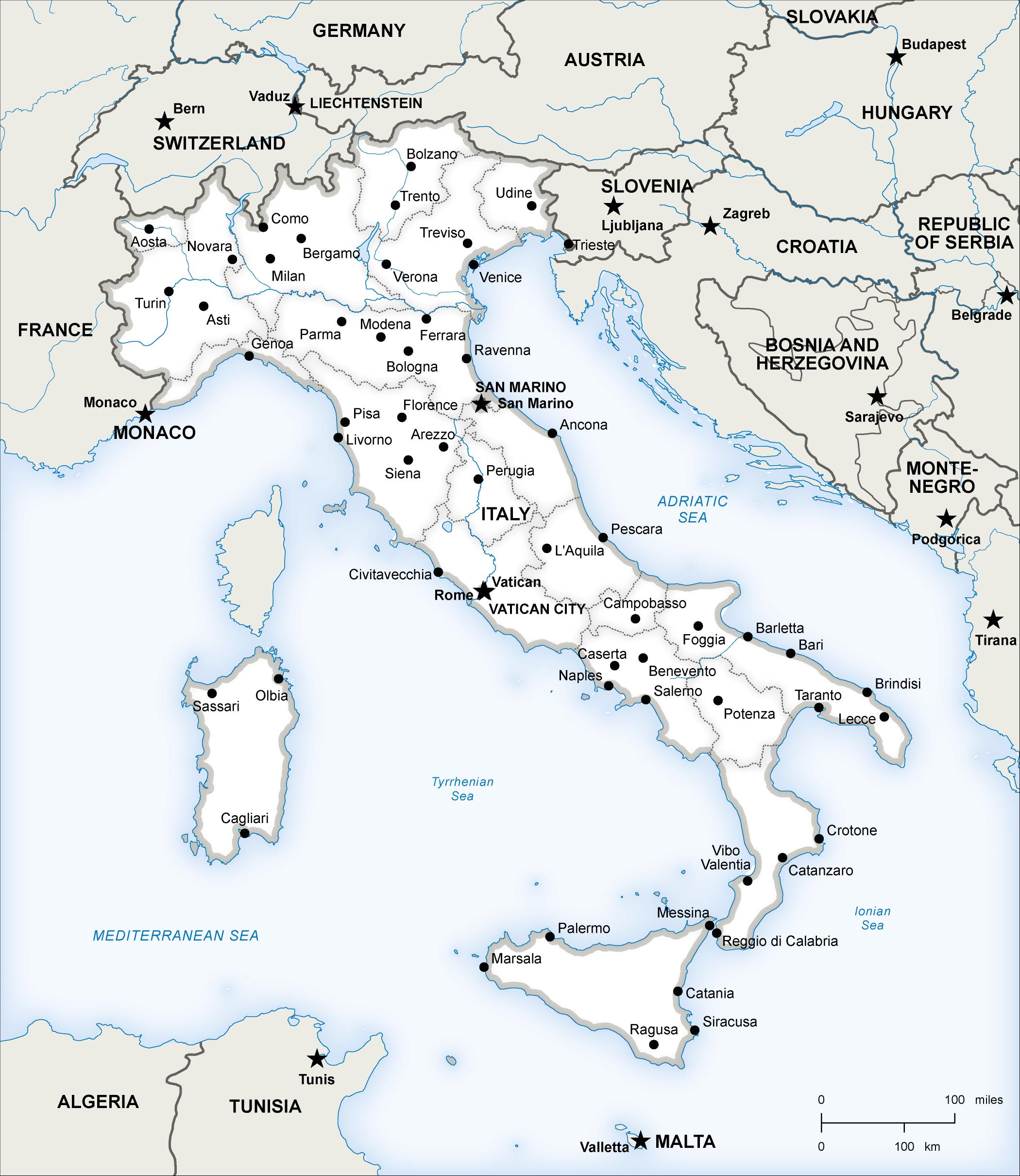
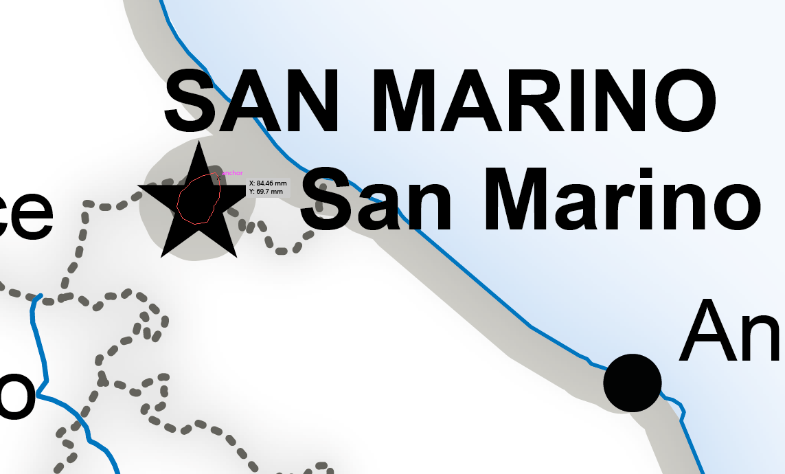
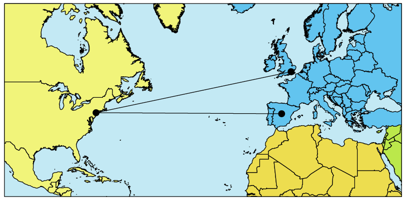
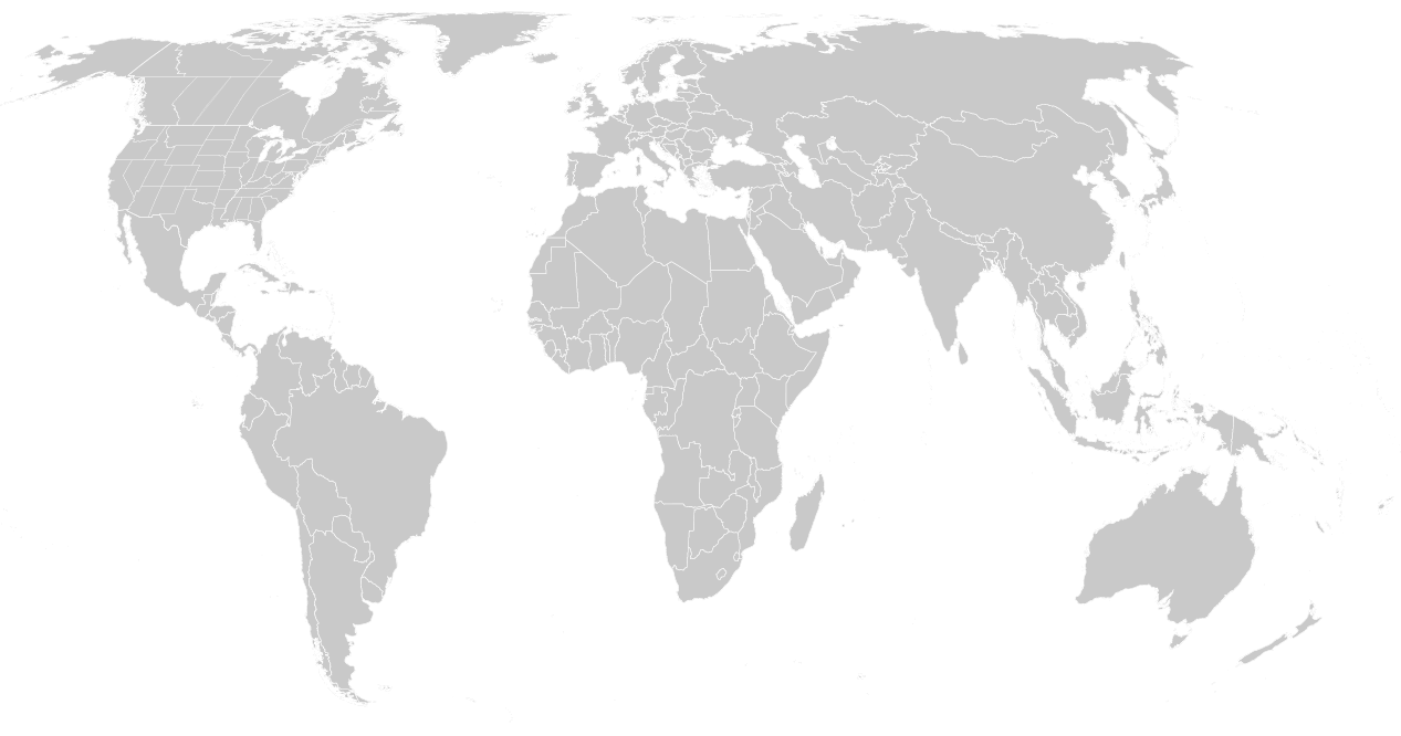
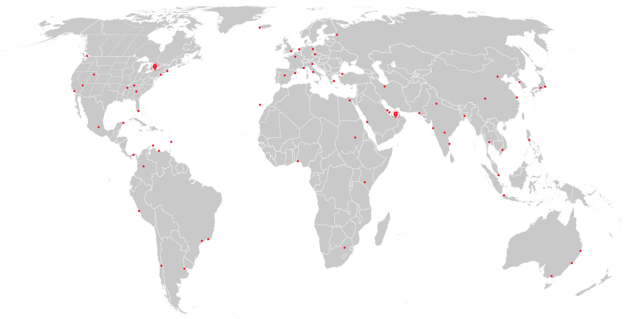
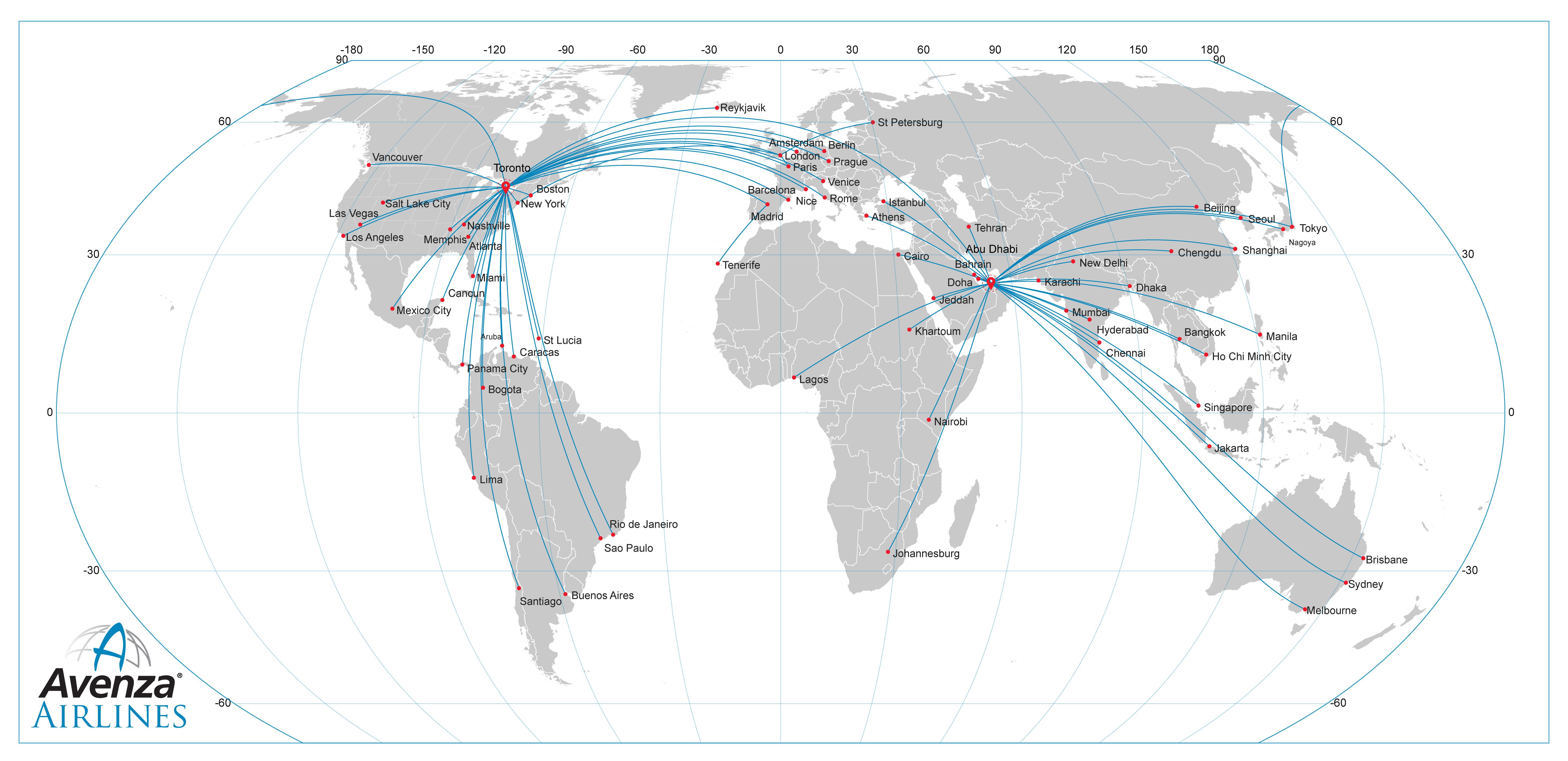
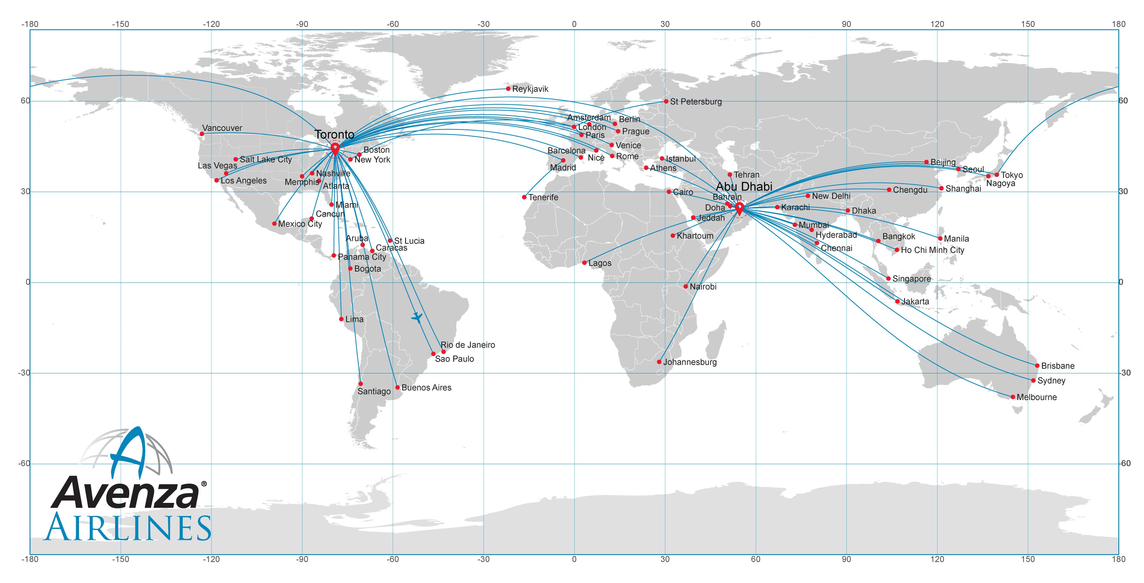
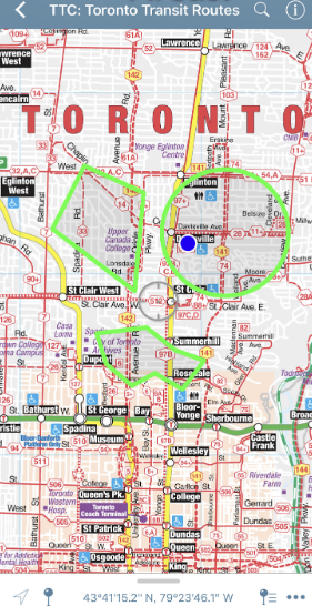
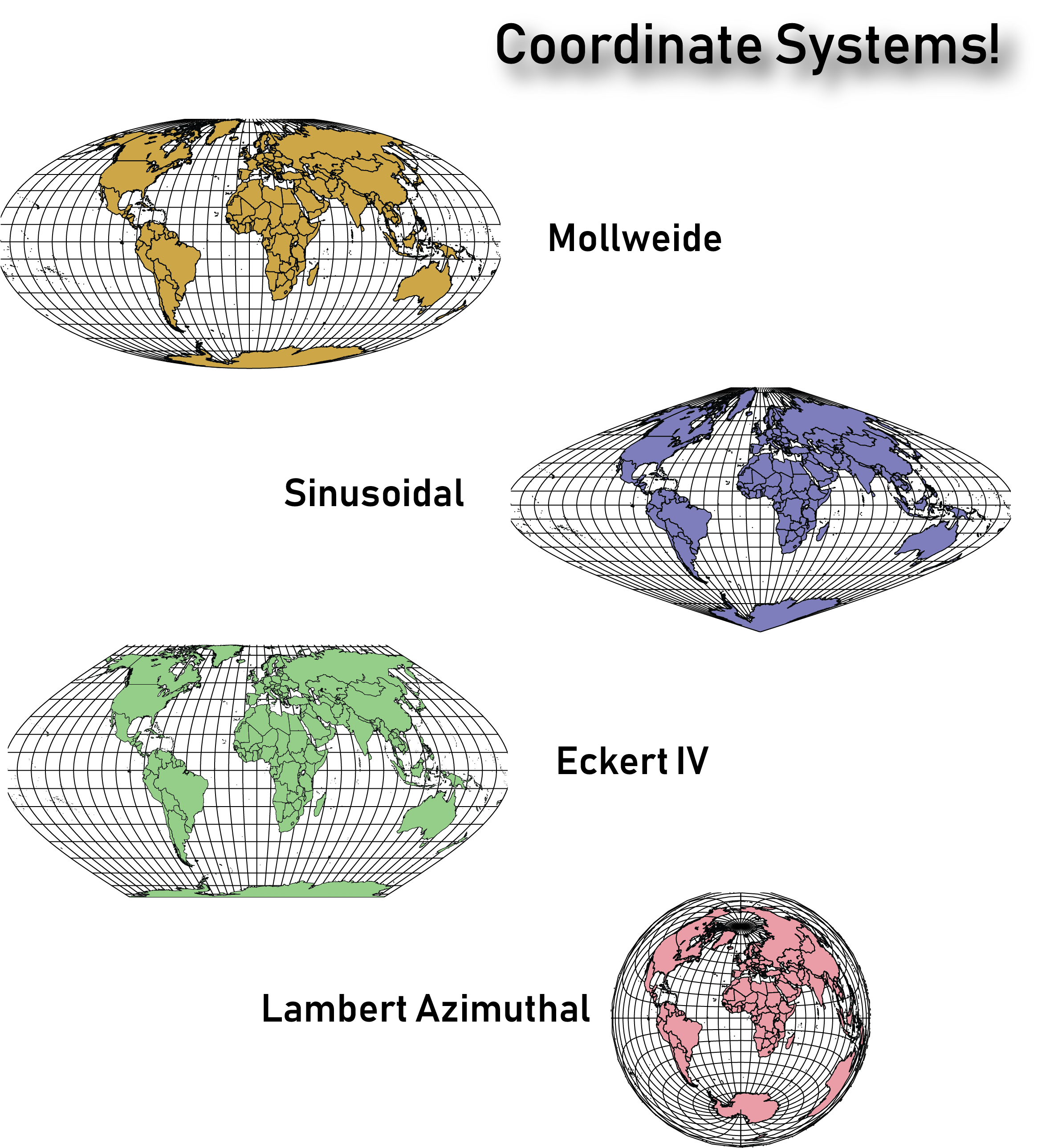
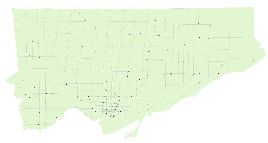
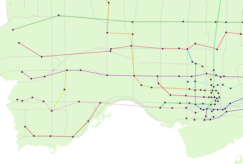
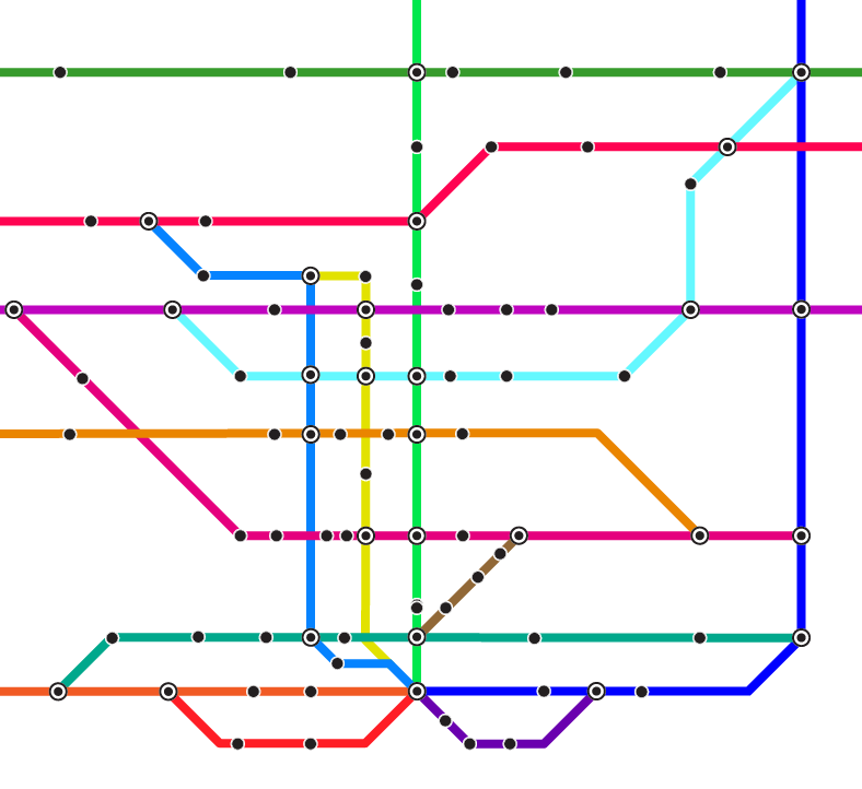
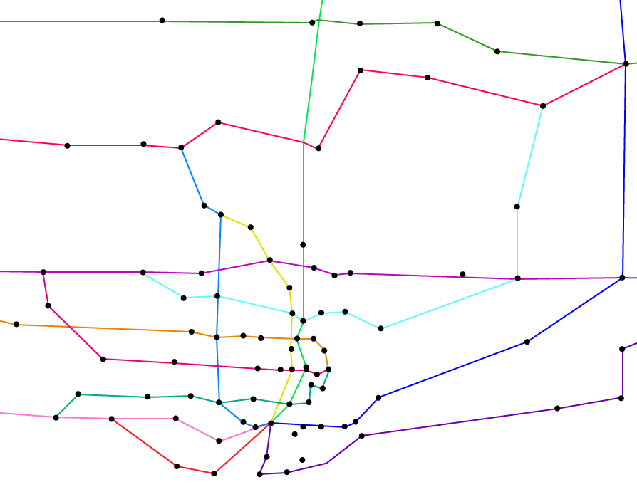
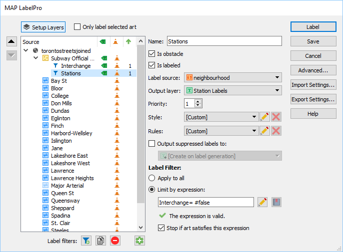
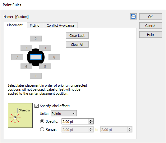
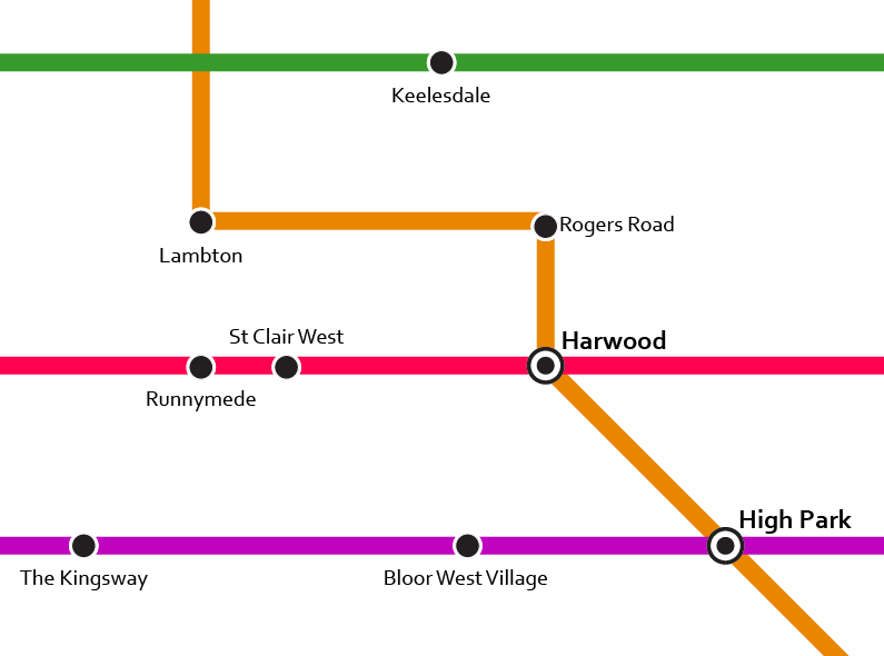
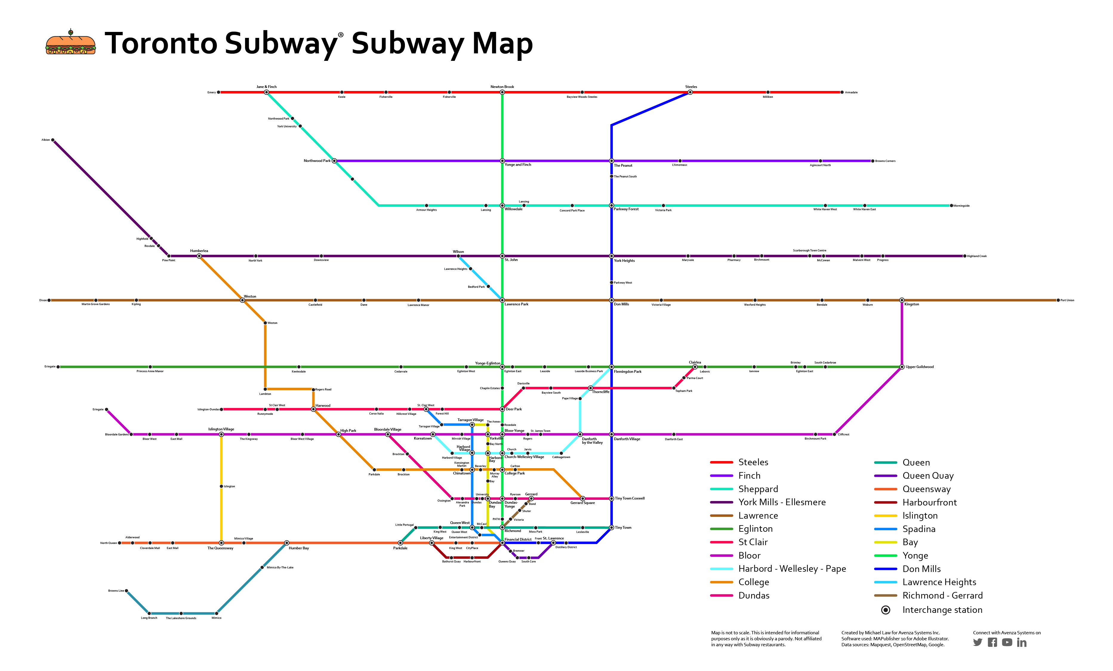
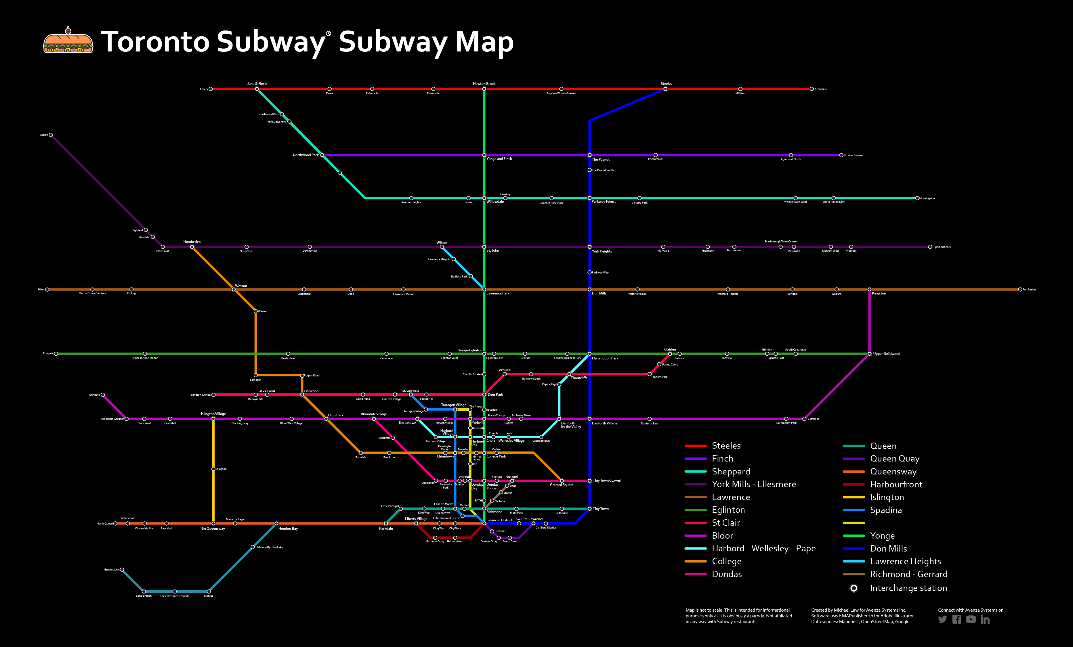
With the right tools, creating a map in Adobe Illustrator won’t cost you days and your sanity. Instead, simply import map data from a free source or purchase MAPublisher-ready maps, manipulate geographic areas (by changing the map projection) if you need to and begin styling the elements the way you want them to be. Whether your map is thematic, like this transit system type map, an infographic like this one, where colours are automatically applied according to the feature attributes, or this one which uses custom-designed symbols. Adding other elements, such as labels can be accomplished with just a few clicks, without the anguish of having to place and re-place labels to avoid crowding and overlapping. 

Knowing how to use basic cartography tools is a good skill set for graphic designers to have in their back pocket. It puts you ahead of the curve in your ability to make beautiful, well-designed, and geographically accurate maps with a reasonable amount of time and effort.

Download a free trial of MAPublisher and find out how easy it can be to make maps with additional cartography functionality in Adobe Illustrator. Or, try our Geographic Imager plug-in for Adobe Photoshop to easily edit geospatial imagery such as satellite and drone images.


Explore all that you can do with the latest ‘Spatial Join’

By Olly Normanton, QA Specialist


This is one feature we have all been waiting for. Spatial Join is a very useful tool to be included in the MAPublisher roster as of version 10.6 and I would like to share a little bit about the tool with you in this feature blog. 

The Spatial Join tool inserts the columns and attributes from one feature table to another based on location or proximity. Currently, we support several Spatial Join types including:

  • Intersects: If any part of two features touch at any location
  • Identical To: Both features match identically
  • Contains: When one feature intersects with the interior or boundary of another
  • Near: If a line can be drawn from any part of A to any part of B that is less than the specified minimum distance
  • Closest: If a line can be drawn from any part of A to any part of B that is less than any other such line between B & any other feature
  • Has Centre In: When one features centroid lies Within another feature
  • Within: If all of one feature lies within the interior boundary of another


Here is a wonderful map of Italy created by Hans van der Maarel of Red Geographics available through the One Stop Map service. It will provide a great way to show you some examples of the Spatial Join tool in action. It contains a Cities layer and a Regions layer and I would like to see which cities fall into each region by using Spatial Join.

Cities and Region Layer using MAPublisher 10.6

You can see below that the Cities attribute table contains the name of each city and there are 70 in total. 

MAP Attributes on MAPublisher 10.6

There are 20 different regions that these cities lie within. To figure out which cities belong to which region, we have the ability to spatially join attribute information from the Cities point layer to the Regions area layer. In addition, we’ll use the Concatenate operation on the NAME attribute to list all the cities that belong to a region in one field.

To do this, click the new Spatial Join button on the MAPublisher toolbar or access the Spatial Join dialog box via Object > MAPublisher > Spatial Join. 

Spatial Join Button on MAPublisher 10.6

The Spatial Join tool will always open on the Join tab seen below. I will be adding data to my Regions area layer and joining data from my Cities point layer. The relationship is set to Contains—in other words, when one feature intersects with the interior or boundary of another. A description of the operation is always provided beneath the relationship. 

Spatial Join Tool on MAPublisher 10.6

The Precision slider alters the tolerance that is used to determine when two values are equivalent (or approaching equivalent). Depending on your data, this may need to be altered in some cases but for this example, I will be leaving it in the default position. 

On the Attributes tab, I am going to concatenate the NAME field. By double-clicking on the attribute, I can access the Edit Calculated Attribute Operation dialog box. In addition, I am going to sum both the POP_MAX and POP_MIN attributes. I’m also going to append a Count attribute to the table so I can quickly verify how many cities are in each region.

Spatial Join Tool on MAPublisher 10.6

Within the Edit Calculated Attribute Operation dialog box, I am going to set the Operation drop-down to Concatenate and leave the separator as default as Comma then space. 

Spatial Join Tool on MAPublisher 10.6

After confirming the Spatial Join with the OK button, we’ll open the MAP Attribute table for the Regions area layer and take a look at the results.

Spatial Join Result

You can see that the cities have been concatenated by region and the POP_MAX and POP_MIN attributes have been summed for the regions based on the cities contained within them. The count attribute was also added to the attribute table and as only 56 of our 70 cities were within the Italian Regions area layer, that is the total value of our count. 

For the eagle-eyed readers who may have noticed that there are only 12 cities that surround Italy in the full map displayed at the beginning of this article and 70 – 56 = 14, the difference can be explained by San Marino and Vatican City, both of which are autonomous countries and not part of Italy. You can see that they are in fact separate polygons. 

City Map

For a full list of the relationships that are available based on the different layer types, and also the input attribute types, please see the tables below. 

Layer Attributes
Input Attribute Table

This post was made using the incredibly beautiful map data provided by our good friends over at One Stop Map. Stay tuned as MAPublisher Aware Maps are coming very soon to the One Stop Map Store, which will allow you to directly purchase the Adobe Illustrator files and put your own style on the maps! If you’re interested in seeing more of their work, take a look at these One Stop Map Country Maps.


Plotting Curved Lines in MAPublisher: It’s Here!

MAPublisher 10.6 has now been released and we are very excited to share these powerful new features with you. If you’re new to MAPublisher, you can get a rundown of the full feature set here, and even try it free for 14 days. In this feature highlight blog, I will be providing a brief overview of the ability to Plot Curved Lines with the Line Plotter tool. 

When plotting a line from point to point, you now have the option of selecting whether that line is Geodesic (also known as a Great Circle), Cartesian (planar), or a Rhumb Line (also known as Loxodromic). To provide a brief definition of each type:

Geodesic line: the shortest line between two points on a mathematically defined surface (as a straight line on a plane or an arc of a great circle on a sphere or ellipsoid like the Earth’s surface). On a geodesic line, the bearing to the destination point does not remain constant. This would be the type of line you would want to use when determining a flight path between two cities, for example. 

Rhumb line: this is a path with constant bearing as measured relative to true or magnetic north and is rarely the shortest line between two points. A rhumb line on a Mercator projection is a straight line which made the projection incredibly useful to navigators from as early as the 16th century.


Rhum Line Mercator - MAPublisher 10.6

Rhumb Lines on a Mercator Projection

Cartesian line: can simply be defined as a straight line connecting points.

To view this feature in action, we are going to be using curved geodesic lines to create an Airline Route Map. The reason why we are using geodesic lines for this type of map is because they provide the most economical route in terms of distance. Following the rhumb line would waste time and fuel for all but the most brief routes. 

I began by importing some data that provided my backdrop for the routes I am planning to map. My flights will span the entire globe so I required world coverage. You can also test out this feature and use the World.mif file or the WorldEast.shp and WorldWest.shp files provided in the MAPublisher tutorial data. 

I decided to use the Equal Earth Projected coordinate system.

Adding Locations

The next step was to establish the hubs from which our aircraft would fly and the destinations that we would offer as an airline company. For this, I needed points and coordinates. Instead of searching for and importing a hefty list of airports and then trying to filter down to ones of interest to me with selections, I opted to use the MAP Locations tool. 

MAP locations - MAPublisher 10.6

By utilizing the “Add Map Locations from web” feature highlighted at the bottom of the MAP Locations panel, adding each destination and its corresponding coordinates was as easy as typing in the city’s name. It can take a while to establish all of your locations but the best thing is that you only need to do this process once as the MAP Locations can easily be brought to other documents using the Copy MAP Objects From feature.

Copy MAP Objects - MAPublisher 10.6

Plotting Points

Now that I had all of my locations of interest and their coordinates, I could plot these onto my map as points. For this I used the MAP Point Plotter. 

Plotting Points - MAPublisher 10.6

By accessing the panel options menu in the top right-hand corner, you can select Plot MAP Locations. In the dialog that opens, select all of the city MAP Locations. In my example, I selected all and then de-selected Abu Dhabi and Toronto as these will be my main hubs and will be plotted with a different custom symbol to other destinations.

Plot MAP Locations - MAPublisher 10.6

I chose to plot them to a new Point layer that I named “Cities” and I included WGS84 values as attributes. I created a custom red main hub symbol using Adobe Illustrator tools to use for my destinations. You may need to play with the scaling of the symbol to get your desired look. 

Location Symbol on Avenza Maps

To create a custom symbol in Adobe Illustrator, draw out your design like the main hub symbol above, highlight the art, and drag the art to the Symbol window that can be accessed by going to Window > Symbols. You can then give it a name and select the static symbol option. 

Plotting the Routes

With the cities and main hubs now plotted, it was time to add the routes. 

plotting the routes - MAPublisher 10.6

Line Plotter - MAPublisher 10.6

I targeted a new Line layer called “Routes” and set my start point using the MAP Locations selector. I was sure to change the Method to Geodesic. 

Line Plotter - MAPublisher 10.6
I started adding cities using the “Add Point from MAP Location” control shown here. Once you select your point, a preview will be drawn onto the artboard if your “Show line preview” option is checked.

Line Plotter - MAPublisher 10.6

The route above is from Abu Dhabi to Mexico City. You can select multiple destinations to account for layovers. You can also change the order of the points once they are in the list using the arrows highlighted below. 

Line Plotter - MAPublisher 10.6

Once all of the routes have been plotted, the points were labelled with MAP Label Pro and a customized graticule was added. Here’s the final map in two projection styles to show how a map projection can change the look of the routes and the overall look of the map.

Airline Route Map - Avenza Systems

Projected Coordinate System: Equal Earth

Geodetic Route Map - Avenza Systems

Geodetic Coordinate System: WGS84

_______________

By Olly Normanton, QA Specialist 

7 GIS terms To Know: Map Making for Designers

Many of our MAPublisher clients are cartographers and GIS professionals, but a growing number are graphic designers who are tired of the tedious work of making maps without specialized tools. Making a map is part art and part science and while we help bridge the gap between Geographic Information Systems (the science) and graphic design (the art), as a graphic designer, you may not be familiar with the wonderful world of GIS.

So on this GIS Day, we have compiled the definitions to a few common GIS terms that you may encounter; GIS Day, celebrated each year, in November to help educate non-GIS professionals about the importance of geospatial information systems and the benefits that GIS brings to our lives.

1. Spatial Analysis

Any good and useful design involves analysis. This process of stacking layers, inspecting and interpreting model results seeks to solve complex location-oriented problems. This can be used for predictive analysis, estimating the level of suitability and for further understanding of the geographic location. 

spatial analysis

2. Layer 

Maps contain several layers, each representing a set of spatial features. Layers are laid atop one another for viewing or spatial analysis. This lends itself to working with the map layers in Illustrator, as they can be treated similarly to a layer containing artwork.  

3. Attributes

Attributes denote a geographic feature on a map. The information is typically stored in a tabular format that is linked to the feature. For instance, the attributes of a well-represented point along a river may include the name, the course of the river/ length, sediment load, etc. 

When you are familiar with the attributes associated with the map data, you can do things like applying rules to style your map according to attributes in the table.

4. Geocoding

Geocoding

The process identifies a location by its geographic coordinates (latitude and longitude). This is used to position places and features on a map as well as to reference the map itself. 

5. Buffers

Buffer

A buffer is a zone around a specific map feature, that is measured in units of time or distance. A buffer is useful for proximity analysis or visualizing the areas that are within a certain distance from another feature (i.e. within school zones, or floodplains) 

6. Polygons/Areas

Areas / Polygons on a map

Enclosed Polygons on a map are often referred to as areas. Polygons can have attributes associated with them to represent a particular real-world entity such as postal code, economic identifiers, population demographics, environmental factors, or social behaviors.

The image above depicts areas on a map.

7. Coordinate systems

The planet is not flat, however, we routinely try to represent it in 2 dimensions on paper and screens. The Coordinate systems act as a reference framework that helps position features in order to make a map more useful for the purpose desired.

Coordinate Systems

It is important to note that there are thousands of coordinate systems, so it’s important to take the time to figure out which would work best for the type of map you intend on creating. Sometimes you’ll need to change the coordinate system from the one defined in the underlying map data, to help the map make more sense to the end-user. 

They say an artist is one who gives people something they didn’t know they were missing. If you happen to be an artist or know an artist (graphic designer) who seeks to give people direction – literally ‘direction’ – you’ve landed in the right place. Go ahead and share this article with like-minded map enthusiasts to begin learning and delivering high-quality maps the easy way. 

Sources:

https://researchguides.dartmouth.edu/gis/spatialanalysis

https://en.wikipedia.org/wiki/Buffer_(GIS)

Mapping Love: Celebrating Valentine’s Day by Creating Infographics

Happy Valentine’s Day! What better way to celebrate than with new maps (and creating infographics) about love? This year we’ve hunted for romantic data for Canada and the United States and visualized it all for you using MAPublisher 10.3 and Adobe Illustrator.

The first map shows all the most romantic locations (at least as their names suggest) in Canada. This information was provided by Stats Canada. Using the MAPublisher Point Plotter, it was easy to plot all of the locations!

The best part about using the Point Plotter is you can choose any symbol available in your symbol library to mark the points. I chose the symbol that I wanted (a Valentine’s map marker–how adorable!) and then plotted each location simply by using the town’s name and province.

Canadian Point Plotter - MAPublisher

After adding some text and symbols in keeping with the theme, the map was ready to go! You can check out the PDF below, or, you can download the georeferenced version from the Avenza Map Store, for use in the Avenza Maps app

Romantic Places Map made with MAPublisher


Moving on to my infographic – which is a popular and engaging way to illustrate statistics and small amounts of data that might otherwise be overlooked. I found data from the United States covering a variety of Valentine’s Day topics. The plan is for my infographic to include two maps and two additional charts. The first map illustrates the average wedding cost by state, and the second map shows popular proposal locations.

For the average wedding cost per state map, I used a MAP Theme to colour all the states appropriately (and quickly!). The benefit of using a MAP Theme is that you can apply a theme to multiple layers at once. Since Hawaii and Alaska were projected separately from the mainland of the United States, they exist in different layers on the artboard. Using a MAP Theme made it easy to include them in the colour scheme of the map.

MAP Themes - MAPublisher

On the second map, I want to map the most popular proposal locations in the country. I used the MAP Point Plotter tool again, but, this time, I used the latitude and longitude to plot the points because some of the locations could not be plotted by name alone. It’s very beneficial to be able to swap between the two options!

USA Point Plotter - MAPublisher

My maps are complete, and after adding two graphs (made using the graphing tools in Illustrator) containing even more fun Valentine’s day data, and some love-ly symbols, the entire infographic was finished. You can check out the completed infographic below!

Valentine's Day Infographic made with MAPublisher


About the Author

Rebecca Bennett is a member of the Marketing Team at Avenza Systems and loves making creative and visually appealing maps.

It’s #NationalColdCutDay, So Here’s a Subway Subway Map of Toronto

March 3rd is National Cold Cut Day… so happy #NationalColdCutDay to you! Cold cuts have been around for more than 2,000 years and today, it is so ubiquitous that any populated place with a market or grocery store stocks it. Even more so, the up-rise of fast food provides the convenience of someone making a cold cut sandwich for you (even better!). Recently, we came across a subreddit called /r/subwaysubway – a collection of subway-style maps of Subway® sandwich restaurants. While most cities boast several dozen Subway locations, Toronto, ON has the density and population to support more than 200. So in honour of National Cold Cut Day, we’re going to create a Subway subway map of Toronto with some of our favourite mapping tools. While this is only meant to be a light-hearted project and not an authoritative source of all Subway locations, please forgive us if we missed a few locations. That said, we used some available web tools in combination with MAPublisher to create a mapping workflow that might inspire you to create your own Subway subway map.

Finding Subway locations

Finding all (most) of the Subway shops was easier said than done. A combination of several sources were used to achieve this. We used the MAPublisher feature called Find Places to scan areas of Toronto to search and import the Subway location point data. This task was performed several times, simply because of the high density of Subway locations in Toronto. In addition, the source provides useful attribute data including name, address, and neighbourhood fields that will be useful for labeling (more on that below).

MAPublisher Find Places - Subway locations

To verify these locations, we also used a web tool called overpass turbo that has some handy tools to build a query that searches OpenStreetMap and filters data that can be easily exported. We simply exported the queried locations as a KML file and used MAPublisher to import it. Unfortunately, these locations did not include any attribute data, however, there were several points included that the MAPublisher Find Places tool missed. We then searched Google Maps and the Subway website to verify several addresses that were missing in the attribute data. Again, we probably missed some locations, but this is supposed to be fun, right?

Overpass Turbo Subway query

With most of the sourcing completed, we end up with a map that looks like the one below. All the Subway restaurant locations can now be considered subway stations. We also used a Toronto boundary layer and streets layer from Open Data Toronto that was transformed to use a projection of NAD 83 / UTM Zone 17N with a -18 degree rotation at approximately 1:65,000 scale. The boundary and streets layer won’t be used in the final map, but helps when navigating the map, especially if you’re (un)familiar with the city.

Subway location imported into MAPublisher

Converting to a subway style map

Using a very liberal amount of cartographic license, we created MAP line layers and used the Adobe Illustrator pen tool to connect Subway locations to what felt natural based on knowledge of the city including following major roads, existing transit corridors, geography, and neighbourhoods. The downtown core was the most difficult to connect as it was densely populated with Subway shops (almost one at every major intersection — impressive), although it loosely represents the grid layout that the downtown core is actually based on.

After some quick connections, we created a MAP Theme to style for the Subway points layer. We created two styles: one for regular stations and one for interchange stations – where our fictional subway riders (eaters?) can transfer to another line. To mark stations as an interchange, we created a new boolean attribute that designates it as true or false. If the rule is true, then it uses a Interchange symbol to denote it as an interchange.

Station stylesheet

Once we felt like we had a solid coverage with interconnecting lines, we copied the Adobe Illustrator document to a new one, hid the boundary and street layers, and began the task of converting it into a styled subway map. For simplicity, we used a typical orthogonal method that employs lines at any multiple of 45 degrees. Needless to say, this took some time and patience as there are many points to align, nudge and decipher. This is where having the geographically accurate map, some of the online maps, and other sources to refer to was very handy.

Styled Subway Map

Compare it to the geographic version (some lines and points may have been moved or redone during the conversion to follow the orthogonal method).

Geographic station map

Labeling shouldn’t be tough, right?

We decided to use MAPublisher LabelPro, an intelligent and obstacle-detecting labeling engine, to label the subway stations because there are so many of them. With a little bit of setup, it can label the entire map in just a few seconds. Using the same rule used to designate stations as an interchange, we created two styles for the labels using the label filter. Interchange stations are slightly larger and have a bold font. We designated the label source to use the attributes from the Subway point layer, in this case, a neighbourhood name. Lastly, we designated the lines as obstacles so that LabelPro can detect whether a label will interfere with them or not.

Using MAP LabelPro to label stations

We also configured placement rules so that the stations have a preference to be labeled at bottom and top, and then at positions around the point if the first two aren’t possible. In addition, we specified a label offset so that the labels are placed more evenly without too much fine-tuning afterwards.

Station point rules

After LabelPro placement and some manual tweaking, the result is a cleanly labeled map. Here’s a detailed view.

Detailed station labels

While the neighbourhood attribute was unique in most cases, some dense areas such as downtown Toronto had station names repeat itself. In these instances, we relabeled them with its street name, a nearby landmark or park. This may not be the most accurate, but it was fun to come across neighbourhoods or areas we’ve never heard of and it allowed us to learn more about our own city.  Another great source to use was this Toronto neighbourhood map that allowed us to quickly verify which neighbourhood a particular Subway sandwich was in.

While we’re sure there are probably many more tweaks to make to this map and more stations to add, here’s our take on the Subway subway Map of Toronto. Make sure to click the links below to see the high-res PDF versions.

Toronto Subway subway map

Click to see the high-resolution PDF version

And in the spirit of traditional Toronto Transit Commission (TTC) maps, here’s one with a black background.

Toronto Subway subway map TTC style

Click to see the high-resolution PDF version

Additional resources

News Archive