MAPublisher 10.6 has now been released and we are very excited to share these powerful new features with you. If you’re new to MAPublisher, you can get a rundown of the full feature set here, and even try it free for 14 days. In this feature highlight blog, I will be providing a brief overview of the ability to Plot Curved Lines with the Line Plotter tool.
When plotting a line from point to point, you now have the option of selecting whether that line is Geodesic (also known as a Great Circle), Cartesian (planar), or a Rhumb Line (also known as Loxodromic). To provide a brief definition of each type:
Geodesic line: the shortest line between two points on a mathematically defined surface (as a straight line on a plane or an arc of a great circle on a sphere or ellipsoid like the Earth’s surface). On a geodesic line, the bearing to the destination point does not remain constant. This would be the type of line you would want to use when determining a flight path between two cities, for example.
Rhumb line: this is a path with constant bearing as measured relative to true or magnetic north and is rarely the shortest line between two points. A rhumb line on a Mercator projection is a straight line which made the projection incredibly useful to navigators from as early as the 16th century.
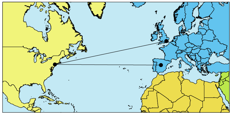
Rhumb Lines on a Mercator Projection
Cartesian line: can simply be defined as a straight line connecting points.
To view this feature in action, we are going to be using curved geodesic lines to create an Airline Route Map. The reason why we are using geodesic lines for this type of map is because they provide the most economical route in terms of distance. Following the rhumb line would waste time and fuel for all but the most brief routes.
I began by importing some data that provided my backdrop for the routes I am planning to map. My flights will span the entire globe so I required world coverage. You can also test out this feature and use the World.mif file or the WorldEast.shp and WorldWest.shp files provided in the MAPublisher tutorial data.
I decided to use the Equal Earth Projected coordinate system.
Adding Locations
The next step was to establish the hubs from which our aircraft would fly and the destinations that we would offer as an airline company. For this, I needed points and coordinates. Instead of searching for and importing a hefty list of airports and then trying to filter down to ones of interest to me with selections, I opted to use the MAP Locations tool.
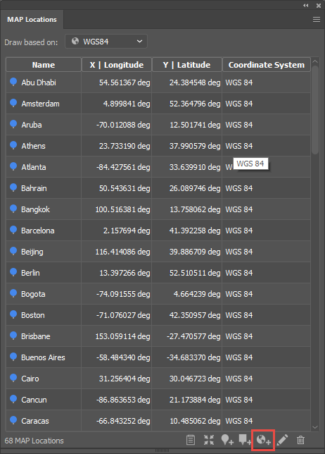
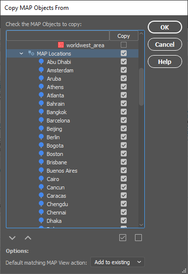
By utilizing the “Add Map Locations from web” feature highlighted at the bottom of the MAP Locations panel, adding each destination and its corresponding coordinates was as easy as typing in the city’s name. It can take a while to establish all of your locations but the best thing is that you only need to do this process once as the MAP Locations can easily be brought to other documents using the Copy MAP Objects From feature.
Plotting Points
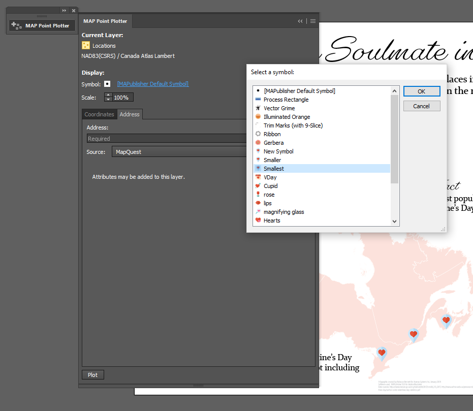
Now that I had all of my locations of interest and their coordinates, I could plot these onto my map as points. For this I used the MAP Point Plotter.
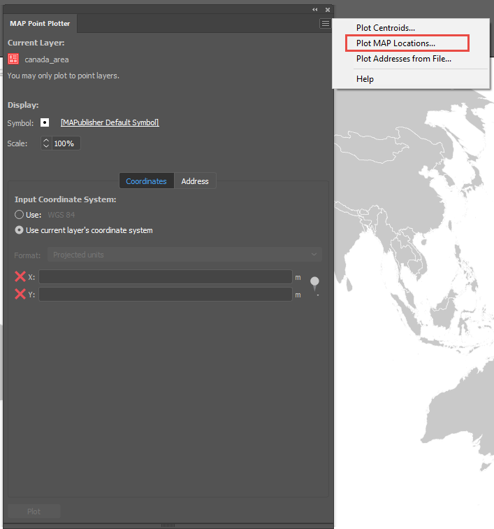
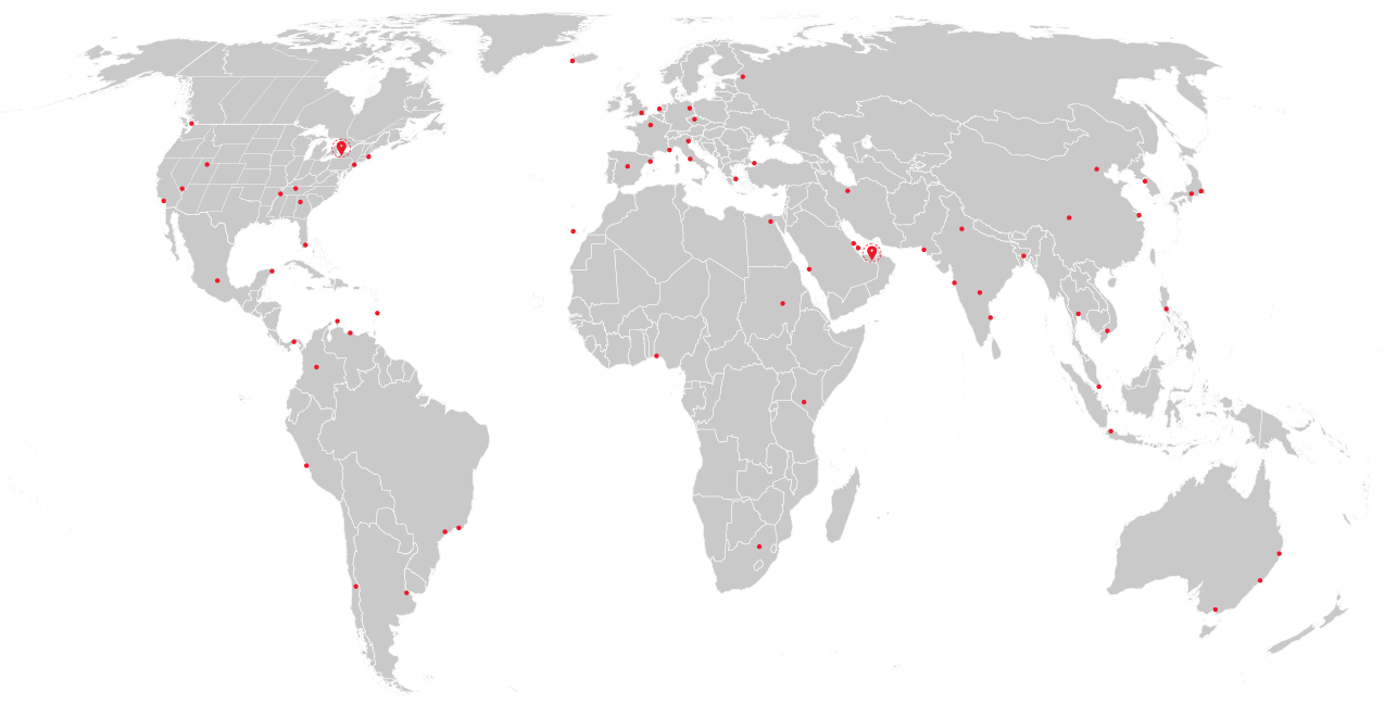
By accessing the panel options menu in the top right-hand corner, you can select Plot MAP Locations. In the dialog that opens, select all of the city MAP Locations. In my example, I selected all and then de-selected Abu Dhabi and Toronto as these will be my main hubs and will be plotted with a different custom symbol to other destinations.
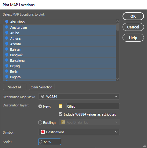
I chose to plot them to a new Point layer that I named “Cities” and I included WGS84 values as attributes. I created a custom red main hub symbol using Adobe Illustrator tools to use for my destinations. You may need to play with the scaling of the symbol to get your desired look.

To create a custom symbol in Adobe Illustrator, draw out your design like the main hub symbol above, highlight the art, and drag the art to the Symbol window that can be accessed by going to Window > Symbols. You can then give it a name and select the static symbol option.
Plotting the Routes
With the cities and main hubs now plotted, it was time to add the routes.
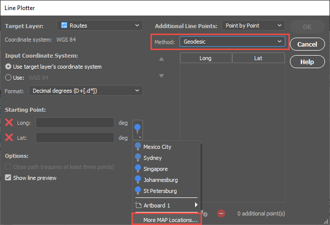
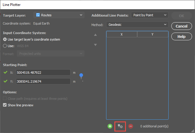
I targeted a new Line layer called “Routes” and set my start point using the MAP Locations selector. I was sure to change the Method to Geodesic.
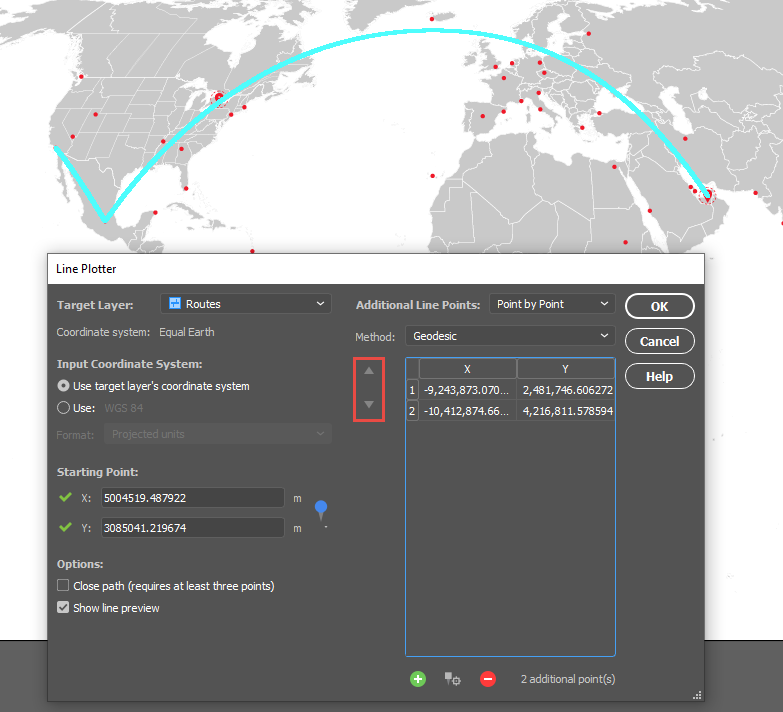
I started adding cities using the “Add Point from MAP Location” control shown here. Once you select your point, a preview will be drawn onto the artboard if your “Show line preview” option is checked.
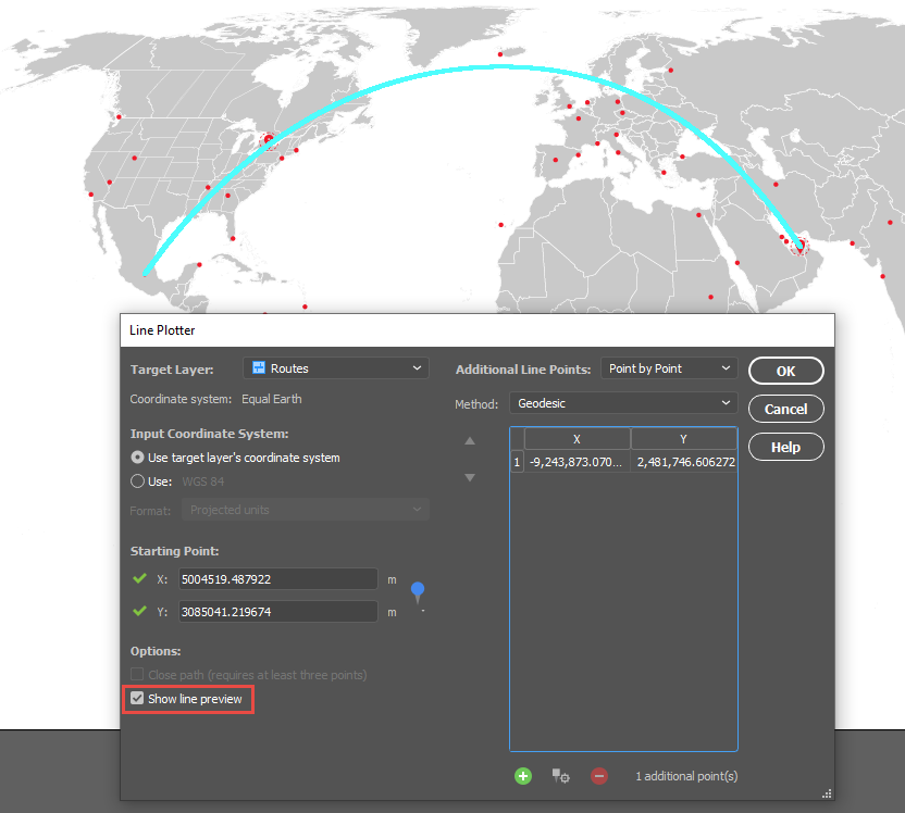
The route above is from Abu Dhabi to Mexico City. You can select multiple destinations to account for layovers. You can also change the order of the points once they are in the list using the arrows highlighted below.
Once all of the routes have been plotted, the points were labelled with MAP Label Pro and a customized graticule was added. Here’s the final map in two projection styles to show how a map projection can change the look of the routes and the overall look of the map.
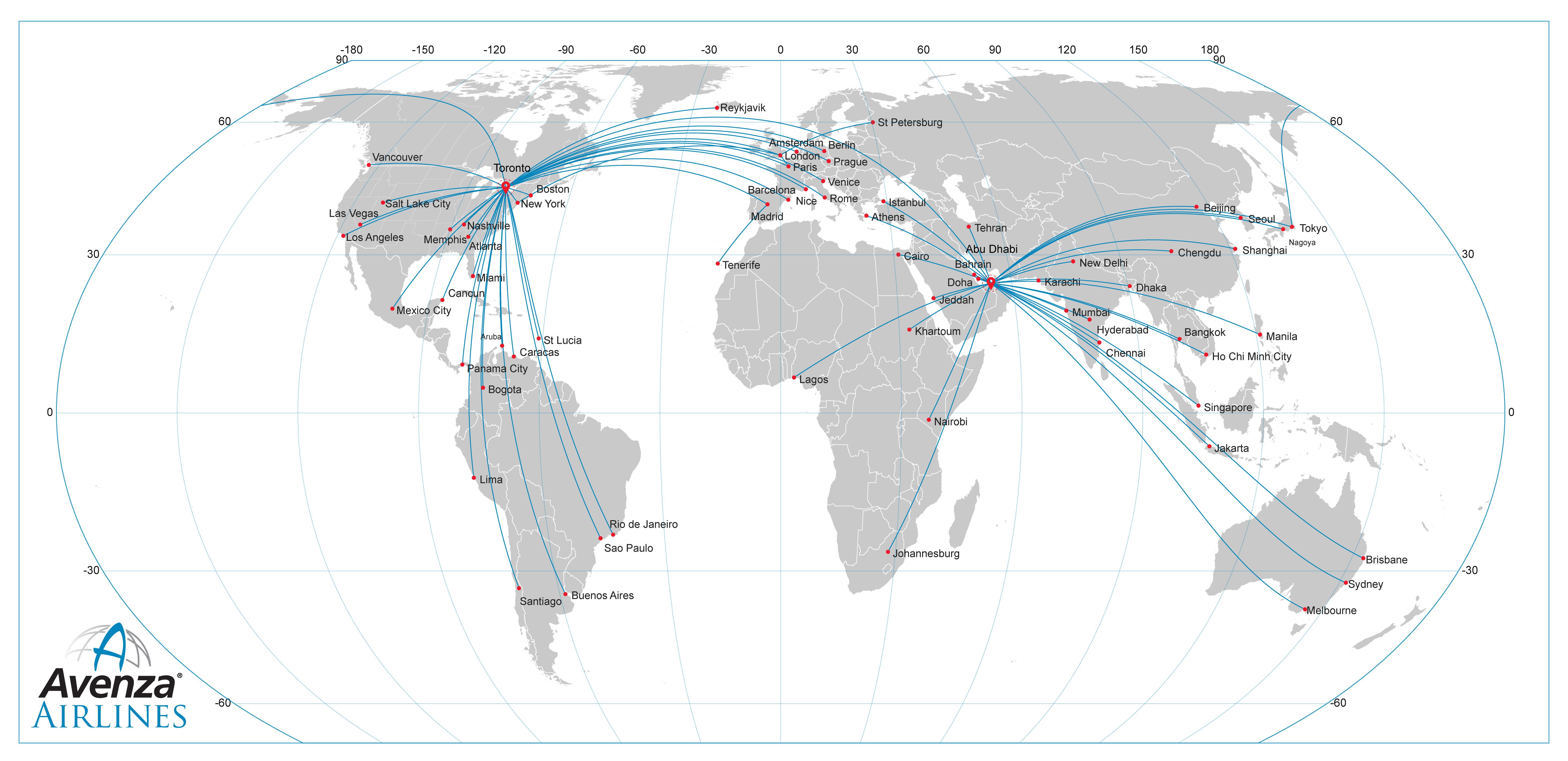
Projected Coordinate System: Equal Earth
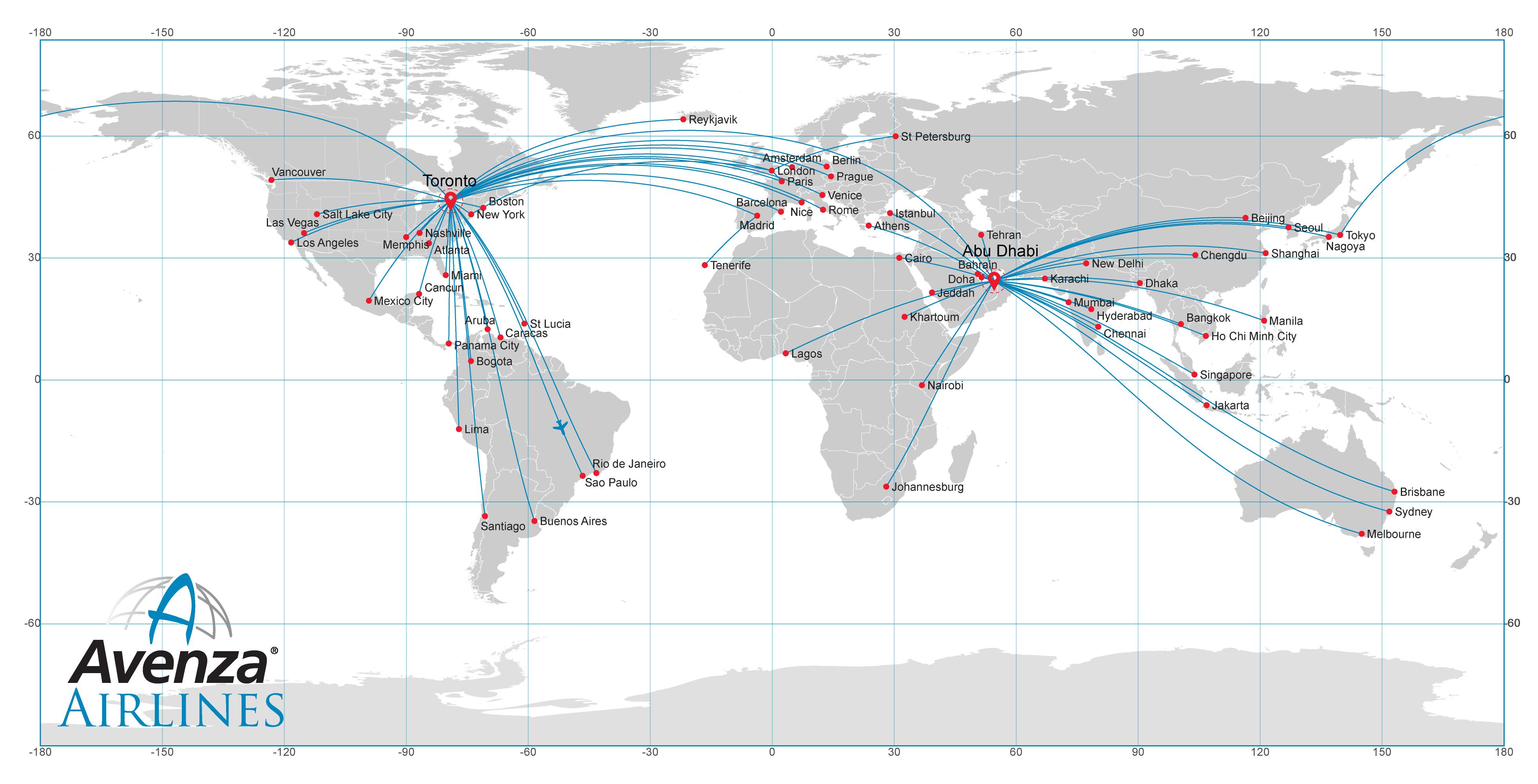
Geodetic Coordinate System: WGS84
_______________