


To tell the complete story, we added insets of the major urban areas around the country, to make the additional detail there more readily accessible. Making the insets was easy using MAPublisher’s Copy Map Objects tool in Adobe Illustrator.
Maps are powerful story-telling tools that can provide additional context and a deeper understanding of an issue. In a highly visual way, they can summarize complex data in an engaging presentation. Maps can sometimes contain very large amounts of data, compressing it into an easy to read the overview. Maps can also drill down into the data to offer more depth, and sometimes a very different story than the overarching one.
One way to do that is by using insets. Insets on a map can be used to bring faraway places closer together, erasing expanses of water or land that aren’t relevant to the map. They are also a way to focus on map data that cannot be easily distinguished at a different scale. For example, after the most recent Federal Election in Canada, we made a map showing the election results in each of the ridings across the country.
If you’re not familiar with the Canadian system, the country is divided into geographic areas, called ridings, based at least in part on population density, so that each riding represents a certain number of voters. In each riding, a representative is elected to hold a seat in Parliament. In the 2019 election, there was a total of 338 seats. The government is formed by the political party that wins in the majority of ridings.
So the morning after election day the political map of Canada, at the federal level looked like this. We made map importing publicly available data on the riding boundaries and election results.
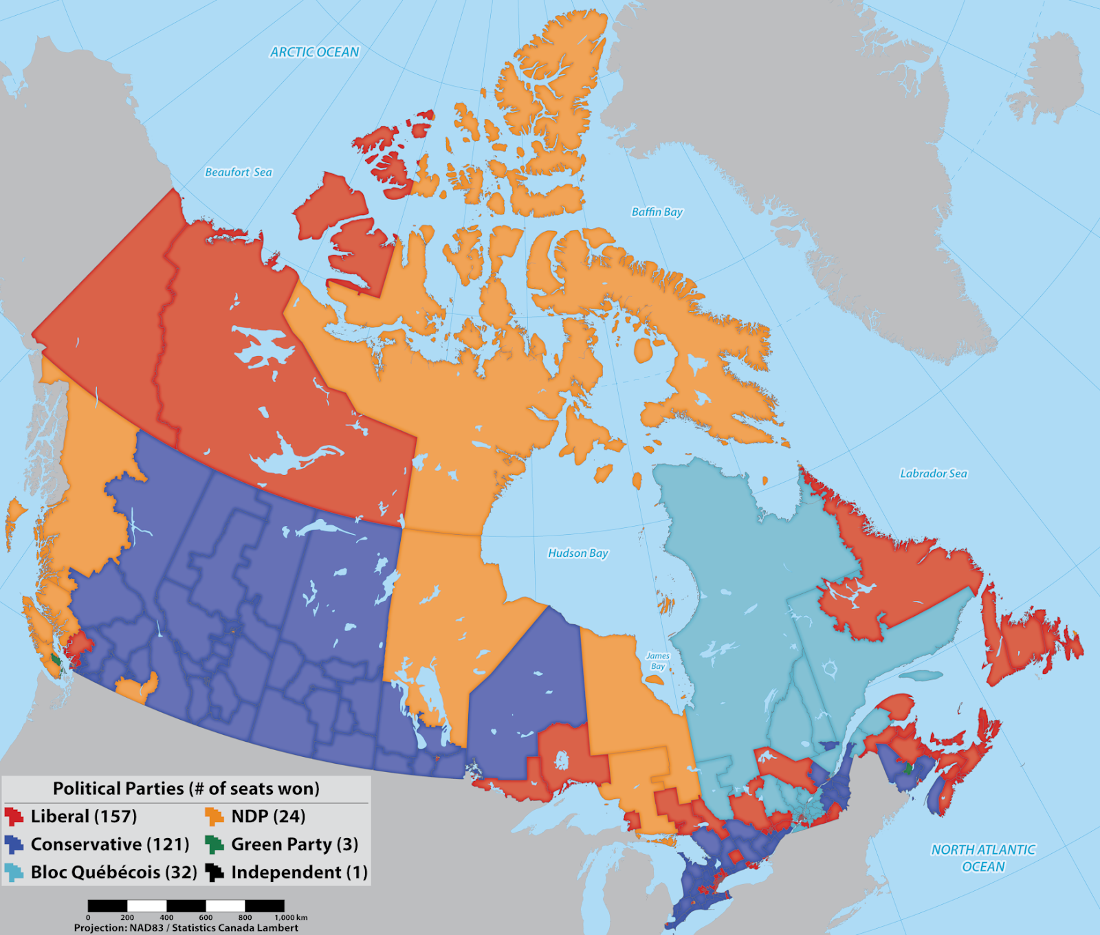
Clearly, our political leanings (at the federal level, at least) are influenced by our geography. Or are they? There is, in fact much more data on the map than can be seen at this scale.
Canada is the second-largest country in the world, by landmass, with a relatively small population of just under 38 Million people. Combine that with the fact that 80 percent of the population lives in urban areas. That means that in order to fairly represent the population with representatives in Parliament, urban areas will contain many, smaller electoral ridings while the rural ones will be much larger in area. Does the map at this scale then really tell us what’s really going on with politics in Canada? Can you tell which party was the victor with this view?
To tell the complete story, we added insets of the major urban areas around the country, to make the additional detail there more readily accessible. Making the insets was easy using MAPublisher’s Copy Map Objects tool in Adobe Illustrator.
First, create a new document, which will be used as a temporary working space. Using the Copy MAP Objects tool, copy the required data layers from the original document into the new one. Zoom in to an area of interest and draw a box around it. With the box selected, use the Crop to Shape tool to remove data outside of the area of interest. In the original document, create a new artboard where you want the inset to be located. Then use the Copy Map Objects tool once again to bring the cropped data back into the original document and scale it to the new inset artboard. Draw a box around the pasted bits to indicate the inset, and add labels. Return to the temporary document, undo the data crop and repeat the process for as many insets as you need. Easy!
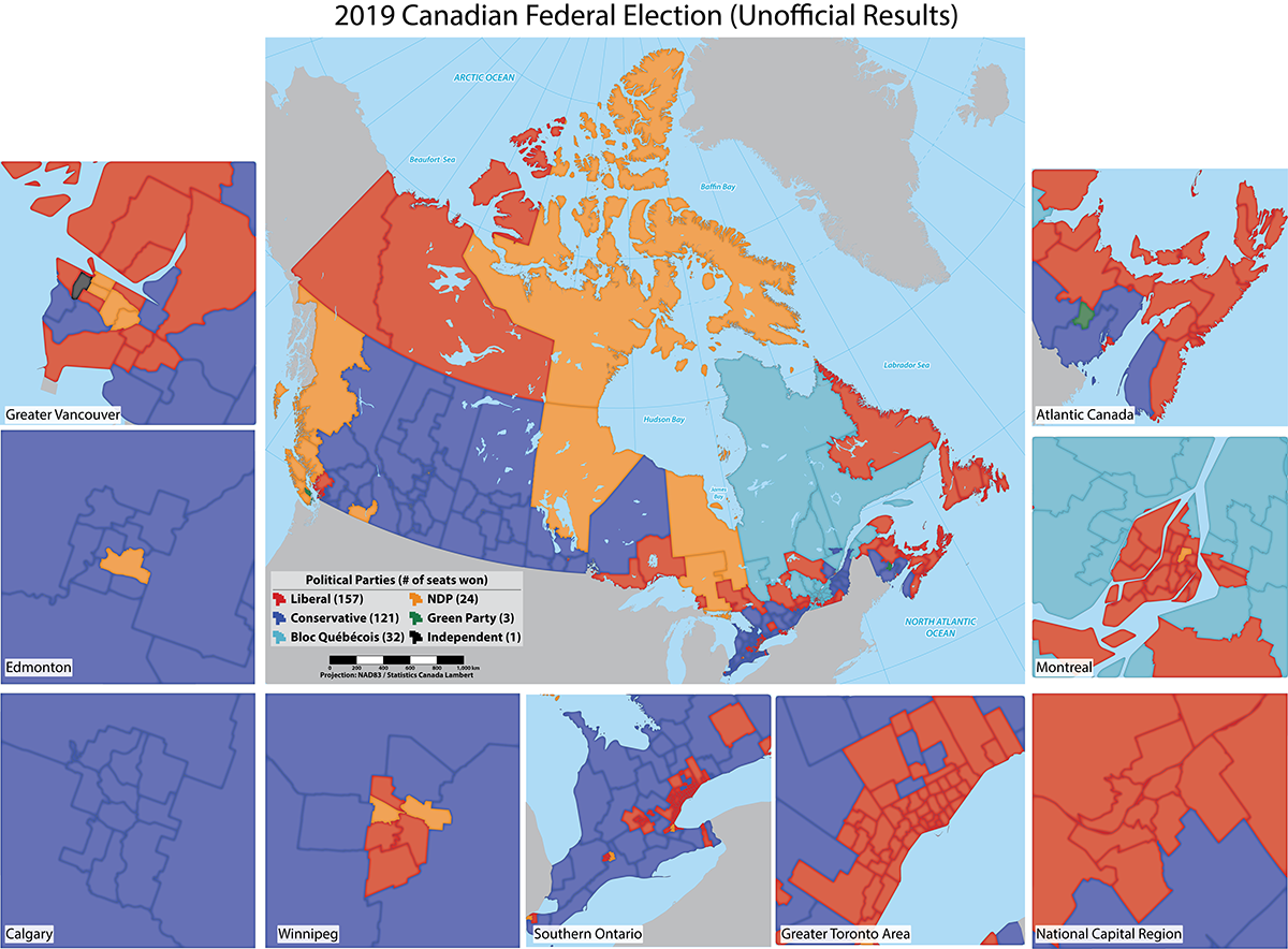
With the insets added we get the full extent of the election picture, and a better sense of what the results actually were. The map together with the insets also highlights the impact of population density and regional population distribution on political representation. It’s valuable information for future campaigns, but also raises interesting questions about the fairness of the current electoral system. For now, we’ll leave election reform to the experts and stick to making maps. ^_^
You can find a video on how to use this tool and others on our YouTube channel.
_______________
By Jeff Cable, Desktop QA Lead