My Account     Contact Us     Cart

Mapping Class: Importing OpenStreetMap data using Overpass Turbo with Steve Spindler

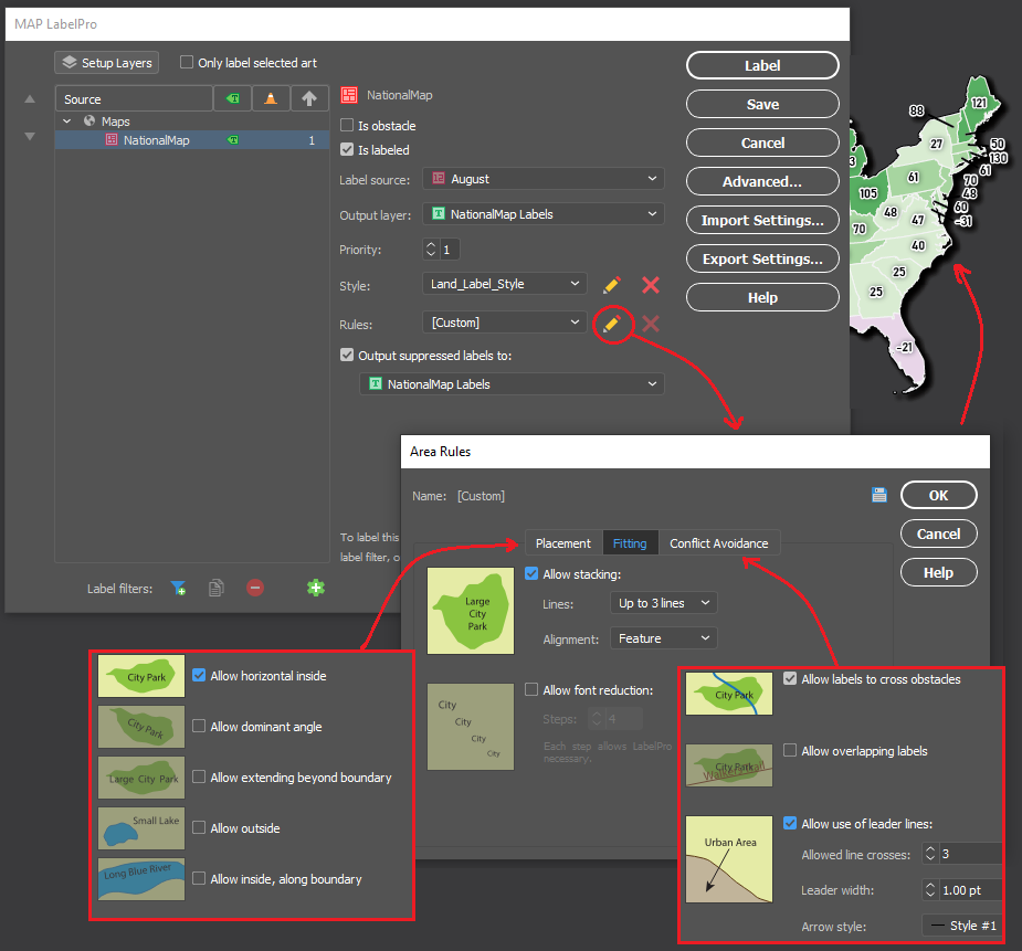
We are back with another exciting addition to our Mapping Class tutorial series. The Mapping Class tutorial series curates demonstrations and workflows created by cartographers and Avenza software users. For this article, we are welcoming back Steve Spindler, a longtime MAPublisher user, and expert cartographer. He has shared with us an excellent tutorial on creating a map from scratch using openly available geographic data from OpenStreetMap, and accessed through Overpass turbo. Steve shows how you can create query statements to filter and export the data, and demonstrates how you can import the data into MAPublisher before using a selection of cartographic styling tools to create a visually appealing map.

Steve has produced a short video walkthrough detailing his map-making process. The Avenza team has produced video notes (below) to help you follow along.

***

Importing OpenStreetMap data using Overpass Turbo
by Steve Spindler (video notes by the Avenza team)

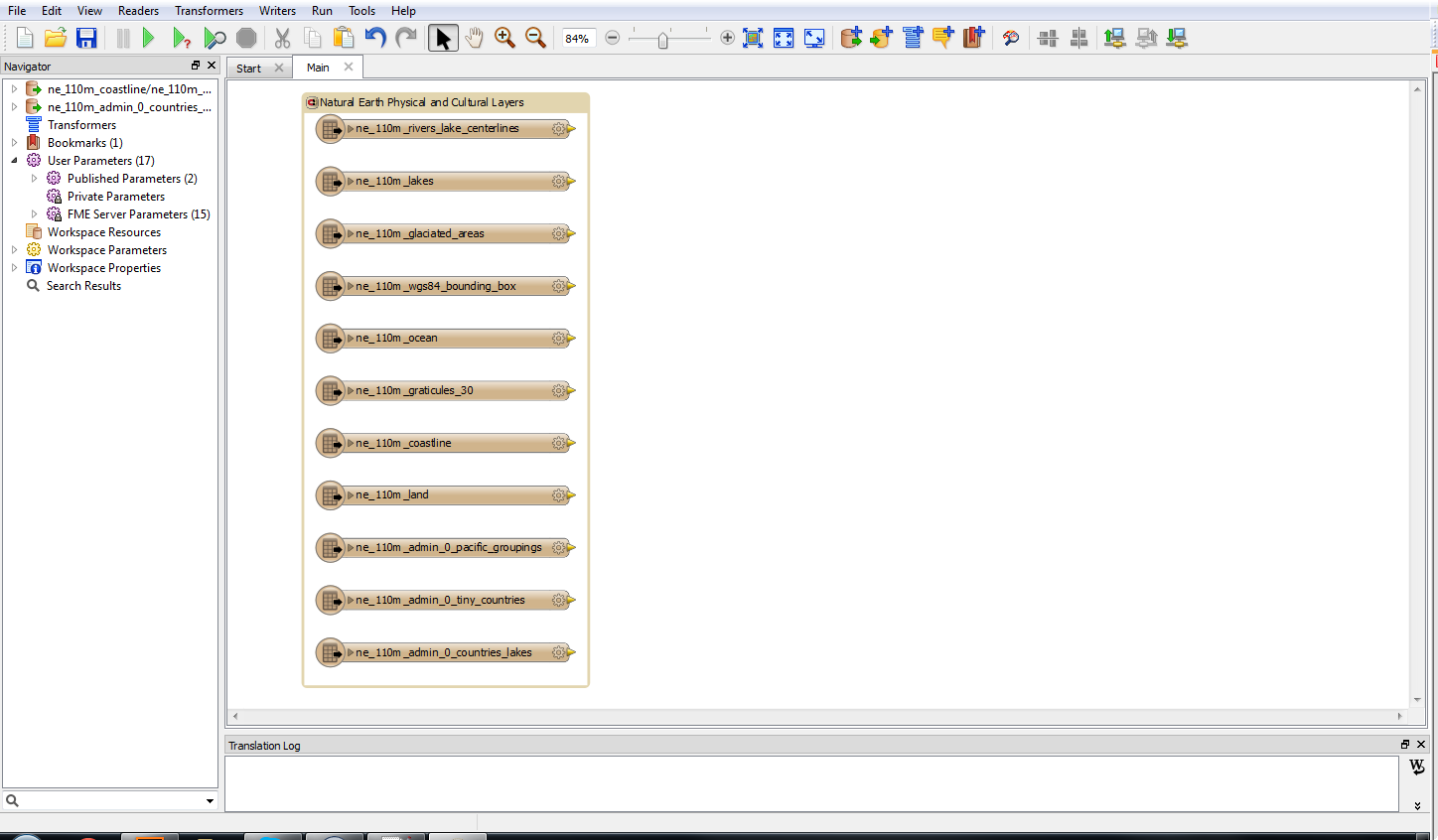
Finding and accessing good quality data is often the first challenge for any cartography project. OpenStreetMap (OSM) can be an excellent source of open vector data describing land cover features (roads, parks, rivers, buildings, trails, infrastructure, boundaries). Once collected, cartographers can use OSM data to create highly detailed maps using the MAPublisher plug-in for Adobe Illustrator. Steve will demonstrate his process of collecting raw data from OSM and using it to craft a beautiful map of the Niagara Falls Area. The following video notes summarize Steve’s approach. 

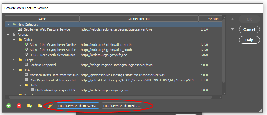
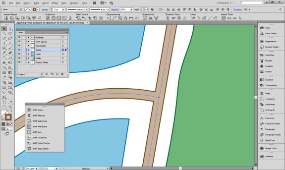
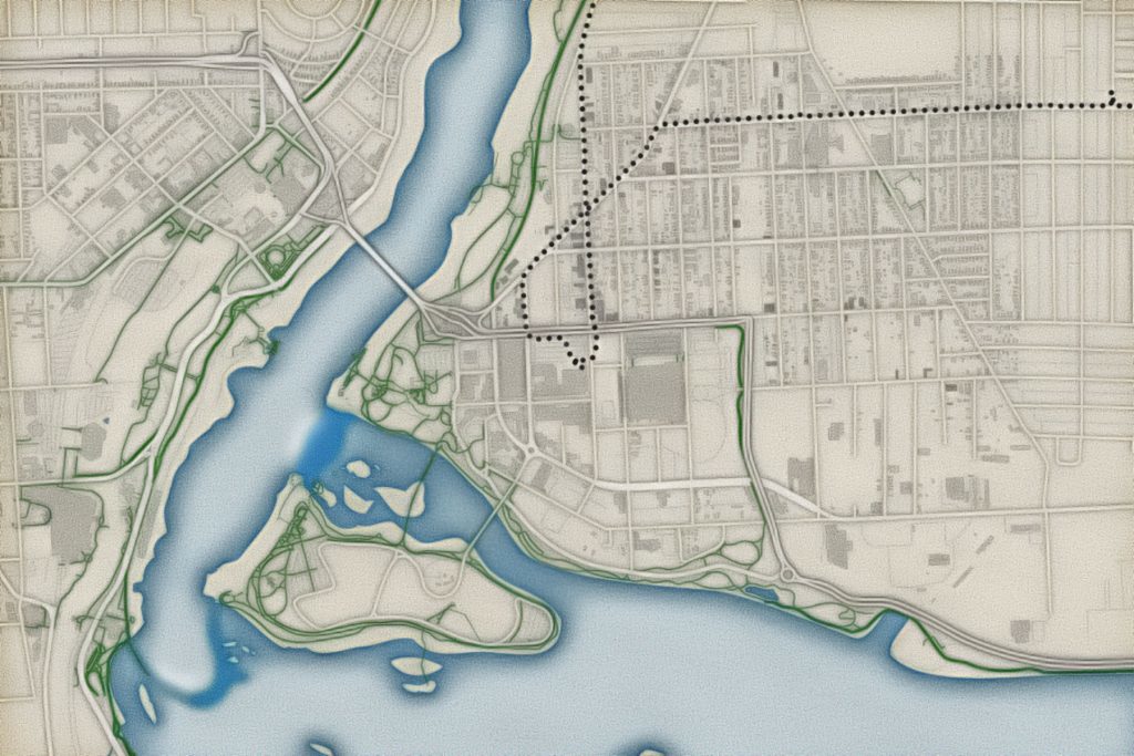
First, you will need to extract some data from the OSM database. Since OSM is a massive repository of geographic data, you’ll need a way to filter through and extract only the data needed for your specific map project. Overpass turbo is a web-based data mining tool that can make querying and exporting OpenStreetMap datasets easy. The tool allows users to apply query statements that filter the OSM database based on attribute and location information. Using the Overpass turbo “Wizard”, a user can enter simple queries (i.e. “water”) and automatically filter and select all features that match the query statement, making it easy to export specific data for your map.

Steve uses a simple query to obtain all map features that are considered “water”. This includes both natural and man-made features

The tool allows the user to export the filtered datasets into geoJSON format, an open standard format for storing and representing geographic data and attributes.

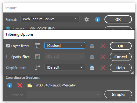
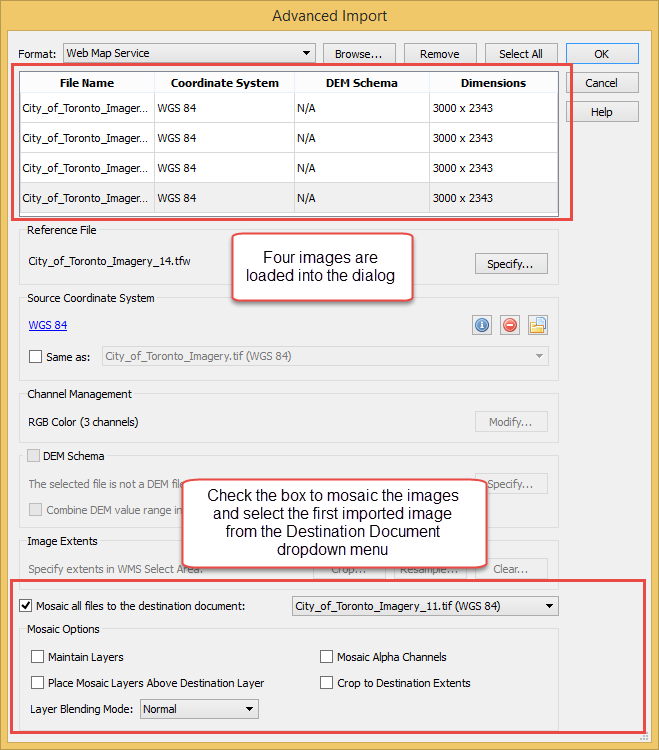
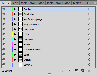
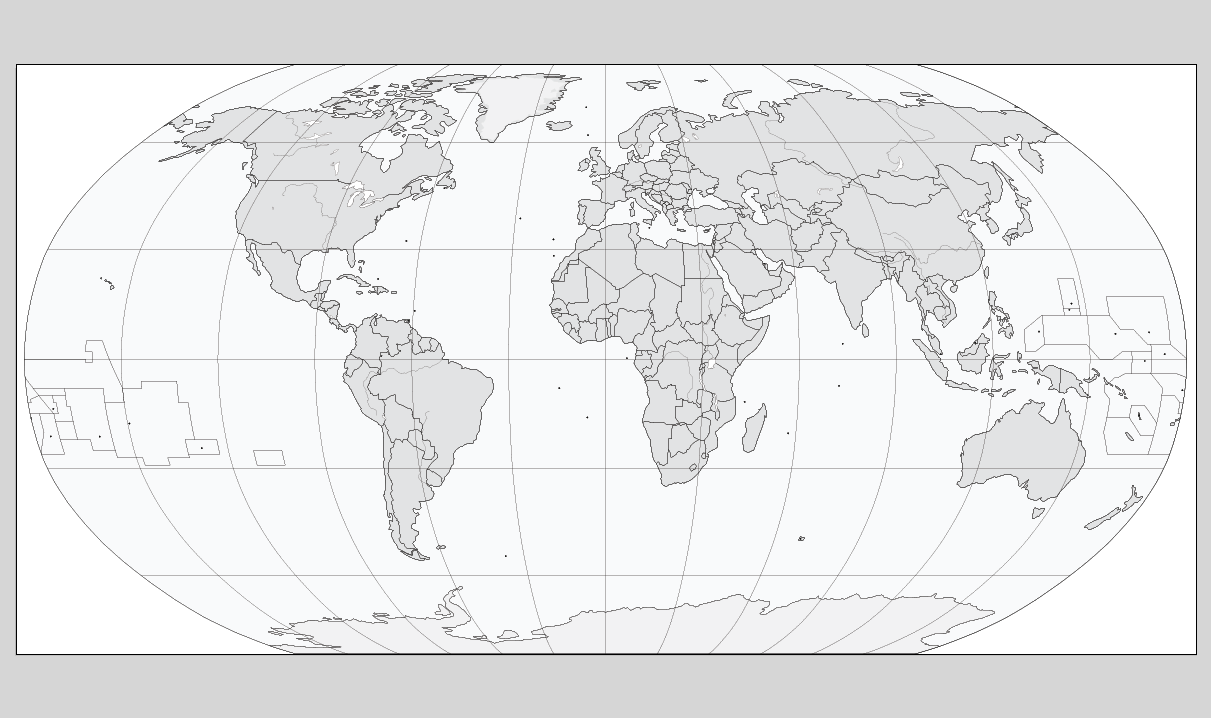
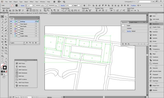
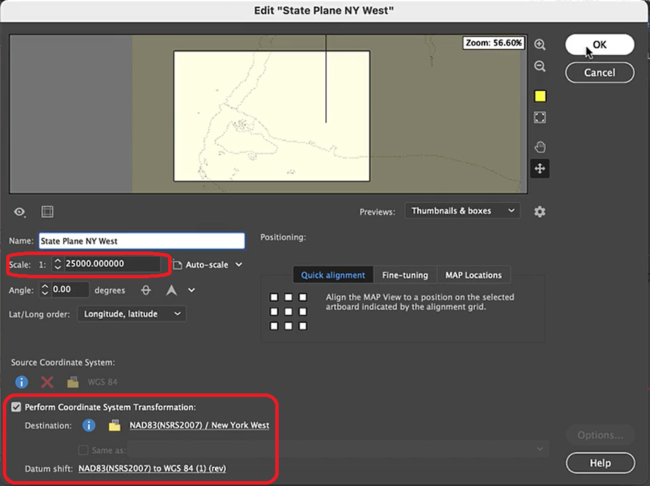
The geoJSON datasets collected from Overpass turbo can then be imported directly into MAPublisher for styling into a finished map. Use the Import tool to load the data onto an Adobe Illustrator artboard. From here, you can open the MAP View editor to adjust the scale and projection information for each map data layer. For this map, reproject the data into State Plane NAD 83 to preserve an accurate spatial scale. Set the scale option to 25,000 and customize the position of the map data on the artboard.

If needed, use the Vector Crop tool to trim the map data down to a specific area of interest, and simplify the layer to create smoother lines by removing excess vertices.

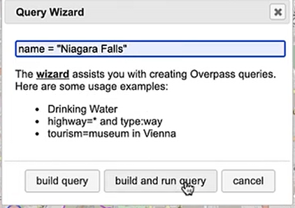
Back in Overpass turbo, you can build more specific query statements to extract individual features from larger data categories. Use the statement: name = “Niagara Falls”, to select polygon features specific to the waterfalls in that area.

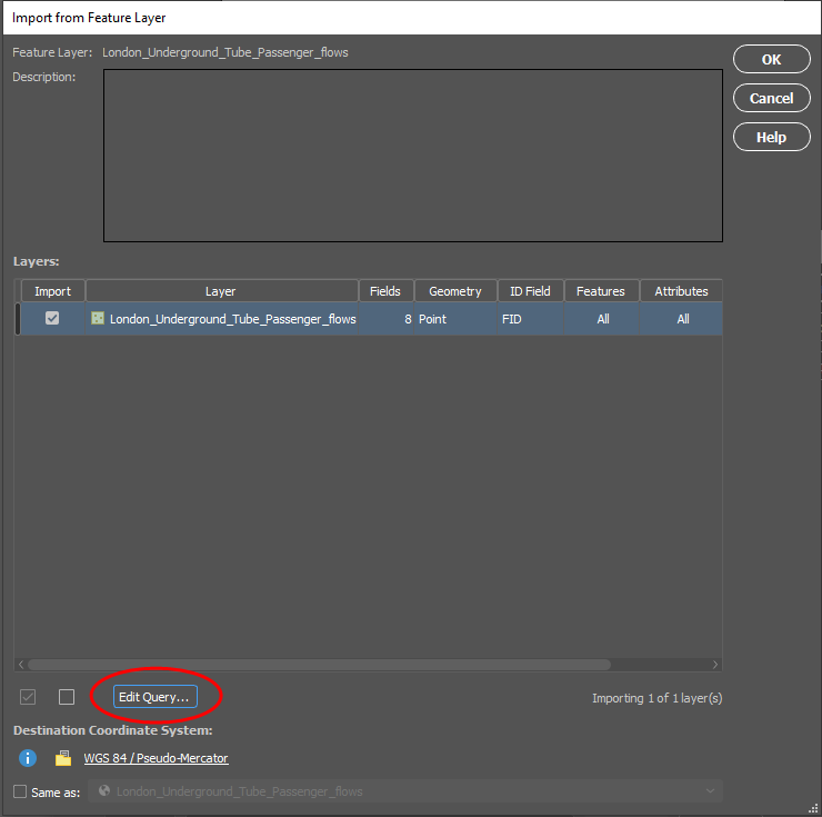
Import this new data into MAPublisher, and drag and drop it into the same MAP View as the water layer. The data will be automatically scaled and projected to align with the water layer. Apply a graphic style fill for the water bodies and waterfall area.

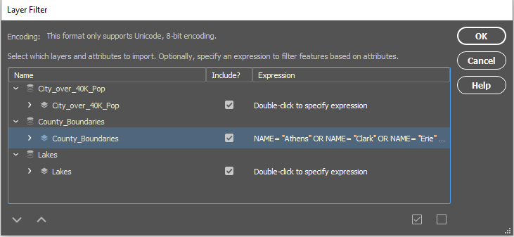
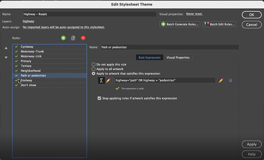
Next, we can go back to Overpass Turbo and extract road and highway data. You can build out more complex query statements using basic database operators (i.e. and/or). For longer, complex query statements it helps to create saved queries that you can re-use. This map uses a saved query statement called “selected roads with residential” to extract line features covering most road types:

(highway=primary or highway=secondary or highway=cycleway or highway=path or
 highway=motorway or highway=trunk or highway=tertiary or
 highway=neighborhood or highway=footway or highway=service)


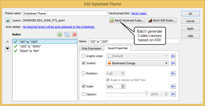
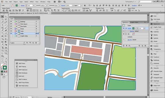
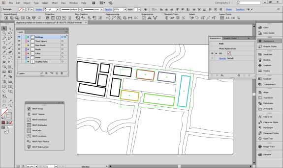
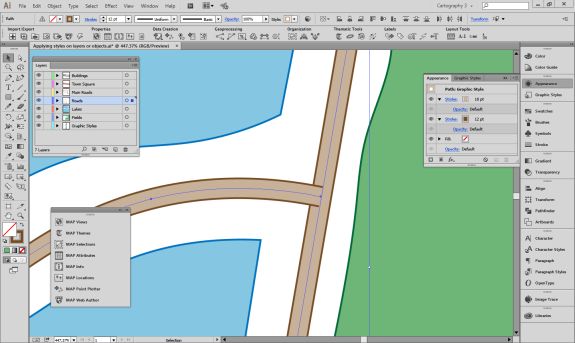
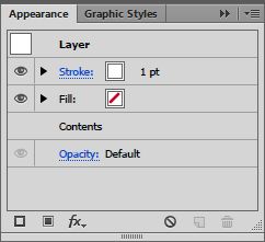
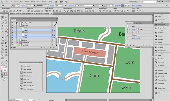
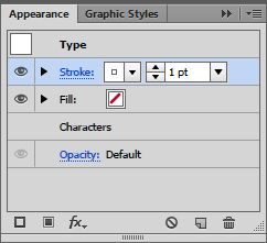
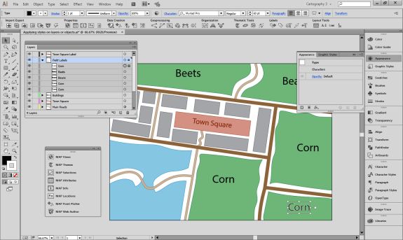
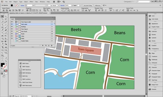
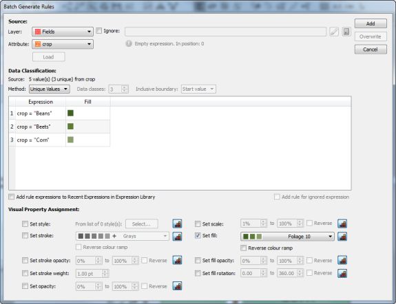
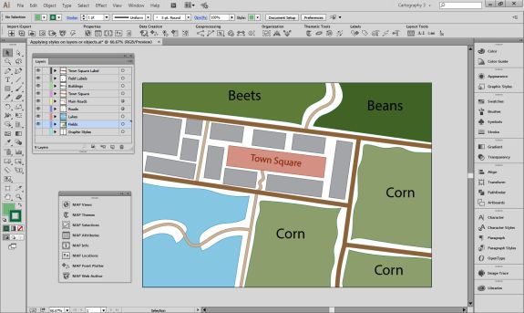
Import the roads data into the same MAP View as the other datasets. If you look at the MAP attributes you can see the road data is split into several different types. Steve use’s MAP Themes to create rules-based stylesheets to visualize the different road lines based on their road-type attributes. Steve designed a rule-set that made minor roads more subtle in appearance, while major roads and highways became more prominent. He also used colour to distinguish between pedestrian and vehicle network links.

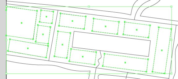
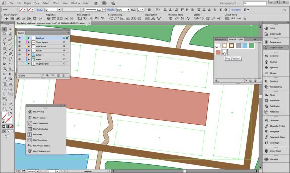
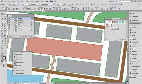
Repeat this process with a building footprint layer and crop all layers in the final map to the artboard extent. The finished product is shown below (top). Some final touch-ups in photo editing software can be used to create a more stylized appearance (bottom).

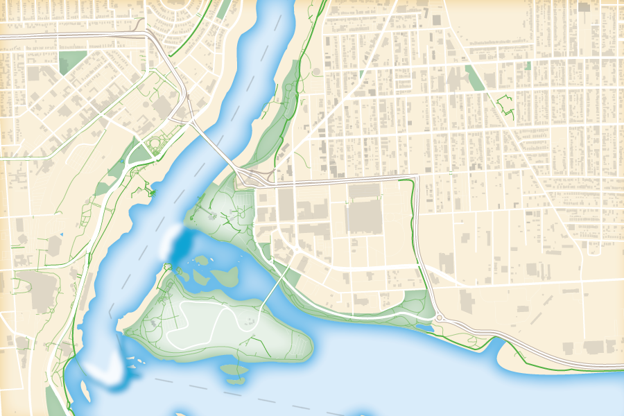
Exported map from Illustrator

Stylized version modified with Photo editing software

***

About the Author

Steve Spindler has been designing compelling cartographic pieces for over 20 years. His company, Steve Spindler Cartography, has developed map products for governments, city planning organizations, and non-profits from across the country. He also manages wikimapping.com, a public engagement tool that allows city planners to connect and receive input from their community using maps. To learn more about Steve Spindler’s spectacular cartography work, visit his personal website. To view Steve’s other mapping demonstrations, visit cartographyclass.com

People, Parks, and the Pandemic: Designing Infographics with Avenza MAPublisher

Here at Avenza, we love finding interesting data and using it to create engaging maps. In this blog, we show you how we used the powerful spatial data manipulation and cartographic styling tools found in MAPublisher for Adobe Illustrator to create an infographic exploring how park visitor patterns changed in the United States in 2020 using a truly interesting openly available dataset.

Recently, Google made its COVID-19 Community Mobility Reports public. These reports use aggregated anonymous mobile GPS data to explore how global human activity patterns in specific location categories (parks, retail, transit, residential, workplaces, and grocery) changed as a result of the ongoing pandemic. The U.S. dataset is massive, containing estimates of daily visitor activity for each location category in every county. Each data point provides an estimate of that day’s percentage increase or decrease in visitors relative to a pre-pandemic baseline period, meaning the data reflects how pandemic restrictions on that day may have impacted park space usage in that specific location.  Below shows a sample of the raw dataset, listing five data points covering Feb 15-19th activity patterns in a single Colorado county.

We downloaded the complete dataset (February to November 2020) from Google’s mobility reports data portal. The dataset contains nearly 900,000 records of all 3,143 counties in the U.S.  We wanted our infographic to focus on the parks category, which includes every national, state, and local park, as well as public forests, campgrounds, beaches, marinas, dog parks, and gardens. Using the open-source statistical programming language R, we were able to aggregate the dataset into a more manageable size. Below, you can see how some basic filtering of these “cleaned” datasets already shows evidence of some interesting patterns, but we felt that mapping the dataset would be much more engaging.

Maps are powerful story-telling tools, and we felt this data would be more interesting if you could see how park visitor patterns changed not only with time but also with geography. To make working with map data in Adobe Illustrator easier, we used the MAPublisher Import tool to load in a shapefile of U.S. state boundaries. The tool allows us to treat our dataset as a fully functional graphic element in Illustrator while still retaining all geographic properties integral to spatial data (attributes, topology, and coordinate systems). 

To visualize the data as a map, we needed a way to associate each record in our tabular dataset to a specific location (in this case, a State). To do this, we used the Join tool, which takes our “cleaned” tabular parks dataset (stored as a CSV file), and links it to our mapped states shapefile using the shared State names column. 

We started to think about how to design the layout of the infographic (this is where having a mapping environment in Illustrator really shines). We wanted it to consist of three main parts: a large labelled map showing the average change in park visits over the entire year; a vertical series of maps showing how park visits varied month to month; and a handful of pop-out maps with insets highlighting specific points in the year and specific regions of the country.

We chose to stylize the data into thematic maps, which use colour to represent specific values in the data at different locations. Instead of tediously configuring individual colour fills, we used MAP Themes to establish a rules-based stylesheet that applies a colour automatically to each State based on the monthly park visitor columns stored in the map layer’s attribute table. We chose a “thematic map” colour group from the included ColorBrewer 2 swatch library to best show positive and negative changes in park usage. 

Next, we populated our main map with labels showing the percentage change in park use for each state. As many cartographers know, placing and configuring labels can be a significant time sink. Fortunately, we could use the MAPublisher LabelPro add-on to provide collision-free, rules-based label placement. We could configure the label rules to automatically handle collisions, alignment, and placement of labels for each state. Using the leader lines option in the LabelPro Rules panel, we were even able to create offset labels that prevent crowding the map.

Finally, we decided that to create some insets to highlight specific parts of the country.  From a “master” map,  we used the Crop to Shape tool to crop the map data to our desired inset extents. Using Crop to Shape is quick, and also retains the styling elements (colours, labels, strokes), topology, and attribute integrity of the cropped map layers. 

With most of the maps completed, all that was left was to populate the infographic with text and graphics. Using the MAPublisher layout tools, we added a functional North Arrow and customized the automatically generated legend layer to suit our infographic’s design. Lastly, we used an Illustrator graph tool to create a vertical line graph of park activity along the left side of the infographic.

Presenting the dataset in this way makes it much easier to extract insights and craft a story from the data. Some patterns are immediately noticeable, such as the overall increase in park space usage that is observed for most of the US during the pandemic period. This isn’t exactly unexpected, as parks were one of the most accessible forms of leisure activity and recreation amid widespread social distancing and retail/entertainment closures. We also see how state-specific factors may have affected park usage in different regions of the country at different times. Some states, such as South Dakota, had eased restrictions on out-of-state visitors to their park systems, resulting in a spring season surge in park usage earlier than their neighbours. Conversely, states which typically draw a high proportion of international tourists, such as California, Hawaii, and Florida, saw more of a decrease in average park usage as a result of global air travel decline. These patterns and stories are one of many that can be identified, providing compelling examples of why maps are such powerful tools for visualizing data.

The beauty of working with MAPublisher to create this map-heavy infographic is that we were able to implement the powerful mapping and data manipulation tools of a dedicated GIS while seamlessly integrating the advanced art and design tools offered by the Adobe Illustrator graphical environment. Together, these tools turned what would have been a complex workflow of importing and exporting data between different software, and allowed us to create the entire infographic in a single mapping and design-focused fully integrated workspace.

See the Full infographic below:


References:

Data – https://www.google.com/covid19/mobility/
Pandemic Timeline – https://www.ajmc.com/view/a-timeline-of-covid19-developments-in-2020
Raw Park Visitor Stats – https://irma.nps.gov/STATS/
Camping Stats – https://koa.com/north-american-camping-report/

News Reports and Park/State-Specific Articles

“Camping in Tennessee’s State Parks Increase during Pandemic.” Wreg, AP, 9 Dec. 2020, wreg.com/news/camping-in-tennessees-state-parks-increase-during-pandemic.

Marcus Schneck. “Camping at Pennsylvania State Parks ‘Going through the Roof’ as Coronavirus Restrictions Ease.” Pennlive, 1 July 2020, www.pennlive.com/coronavirus/2020/07/camping-at-pennsylvania-state-parks-going-through-the-roof-as-coronavirus-restrictions-ease.html.

Anderson, Patrick. “National Parks in South Dakota Remain Open as Others Close across the Country.” Argus Leader, 17 Apr. 2020, eu.argusleader.com/story/news/business-journal/2020/04/17/coronavirus-south-dakota-national-parks-remain-open-others-close/2981675001.

Henderson, Catherine. “Having a Hard Time Finding a Campsite in Colorado This Summer? You’re Not Alone.” The Know Outdoors, 15 July 2020, theknow.denverpost.com/2020/07/15/colorado-camping-covid-national-parks-state-parks/241704.

Wiley, Melissa. “What the 10 Most Visited National Parks in the US Have Said about Their Plans to Reopen, from Opening in Phases to Implementing Social Distancing Guidelines.” Business Insider, 21 May 2020, www.businessinsider.nl/are-national-parks-open-covid-19-coronavirus-united-states-nps-2020-5?international=true&r=US.

Importing Data from Servers in MAPublisher

Sometimes when you’re on the hunt for geospatial data, all the data you need isn’t available in common file formats. Luckily for us, lots of data is available on Web Map Services (WMS), Web Feature Services (WFS), ArcGIS Online, ArcGIS Web Services, and PostGIS.

Data can be imported into MAPublisher from all of these services. Importing from a server connection always retains the attributes and referencing that exists in the original data. In order to import from a server, an internet connection is required.

WMS and WFS services can be part of open data portals, or for private use. Both services allow you to add layers of data to your map in MAPublisher, but have different functionalities. WMS allows you to import raster data in a variety of formats, while WFS allows you to import vector data.

To import from WMS or WFS, go to Import or Multi Data Import, and choose Web Map Service, or Web Feature Service from the Format listbox. Once you’ve selected the source you’d like to use, load services from Avenza (pre-loaded services) or, import your own from a file.

Import from WFS

Once you’ve selected your specific service, you can select the layers you’d like to import. Information such as layer name and description is included. There is also the option to use the spatial filter directly in the layer selection box, to use the extents of another layer to specify, or specify exact coordinates to limit the area being imported.

When importing data from WMS or WFS, you have the option to use the spatial filters, layer filters (attribute expressions included!) and simplification. These options allow you to filter the data to better suit your needs.

Filtering WFS

Filtering WMS

If you’re importing from ArcGIS Online, you’ll need an ArcGIS Online account, and an internet connection. Once you’re logged in, you’ll be able to select data to import. When importing data, you can choose Feature Layers, Map Image Layers, and Tile Layers to import.

When importing Feature Layers, you’re able to filter the data as well. Once you select the Feature Layer that you’d like to import, you can choose to ‘Edit Query’ and write a SQL statement to narrow down the features or attributes you’d like to import.

Edit Query

Importing from ArcGIS Features

Once your query is made, your data can be imported.

If you want to import Map Image Layers or Tile layers, you’re able to choose a specific area to import, very similar to the Spatial filters available when importing other files. Using the ‘Select Area’ option can help reduce the size of the image you’re importing and helps crop data before you import it, so you’re not importing large amounts of data you’re not going to use.

Importing from ArcGIS Map Tiles

In order to import from ArcGIS Web Service, you’ll need an ArcGIS Web Service URL. Previously imported services are saved in the Service URL drop-down list.

Lastly, if you’re importing data using the PostGIS option, you also have the ability to filter your data. You can specify a Spatial Filter, and manually set the coordinates for points 1 and 2.

PostGIS Filtering

PostGIS Filtering

This will allow you to import only the data you need! You can also filter your data using a SQL query, which will help reduce the number of features or attributes you need to import.

Importing from different servers can be a great way to get different data. The best part about importing from servers is that MAPublisher allows you to filter as you import, just as you can when importing other file types. Crop or query the data as you see fit, regardless of where the data came from!

Getting the Best Resolution when Importing an Image from a WMS

Using a Web Map Service (WMS) is a great way to easily get up-to-date imagery for your project. An issue you may run into, however, is that a server may not allow you to download images over a certain size (in pixels). The image resolution provided on most servers is usually high enough for most projects but there may be some instances where a higher resolution is needed (e.g. a poster-sized map or a web map that covers a large area).

One possible workaround for this issue is to get several small-area, high-resolution images from a WMS and then mosaic them together to make one large-area, high-resolution image. Here, we will use the City of Toronto Web Map Service to:

  1. Get an image of downtown Toronto
  2. Tile the image to split it into four smaller images
  3. Use the extents of the four tiled images to get four high-resolution images
  4. Mosaic the images to one large high-resolution image


Download an Image from the Web Map Service

First we will get an image of downtown Toronto from the City of Toronto WMS. Click the Advanced Import button on the Geographic Imager panel. Select Web Map Service from the Format drop-down and click Browse. Click Load services from Avenza and select City of Toronto WMS from the list.


Download an Image from the Web Map Service
(Click for larger version)


Select City of Toronto Imagery from the list of layers. Click Select Area then drag a box to zoom in on an area of downtown. Click OK to return to the previous window. There is no need to change the image size because we will use this image to get the extents of a higher resolution image. Leave the other options as default and click OK to load the image, and click OK again on the Advanced Import dialog box. The selected image will now open in Adobe Photoshop.


Tile the Image

Next, let’s tile the image to split it into four separate images. Open the Tile dialog box from the Geographic Imager panel. Choose By Number of Tiles as the Tiling Schema and change Horizontal and Vertical to 2. Change the Horizontal and Vertical Overlap to 3 percent. It’s important to have overlap between the images so they will mosaic properly when the data is transformed.


Tile the Image
(Click for larger version)


Click the Keep Images Open check box to enable it. Choose a name and location to save the tiles. You can save them to a temporary location because they will not be part of the final product. The four image tiles will open in separate tabs.


Estimate a Web Map Service’s Maximum Image Size

Open the City of Toronto Imagery WMS again and select an area. In this service, as with many other services, the maximum resolution is not provided. We can, however, use trial and error to find the largest image that the service will allow us to download. A WMS has a maximum allowed width and height set for an image request. The maximum width is usually the same as the maximum height.

Set the resolution of the image by adjusting the width of the image in pixels under Output Options. First, try setting Image Size to a pixel width of 5000. Height will update automatically based on the image’s dimensions. Click OK and you will see an error that says “Parameter ‘width’ contains unacceptable value” (or height if the images higher than it is wide). OK the error to close it.


Estimate a Web Map Service’s Maximum Image Size
(Click for larger version)


To estimate the maximum width and height allowed by a web service, you can adjust the image size to see when the server returns an error. The maximum width and height for the City of Toronto WMS is about 4000 pixels.


Downloading and Mosaicking Large Images

Next we will use the geographic extents of the four tiled images to download four higher resolution images with matching extents then mosaic the images together. Import an image again from the City of Toronto WMS using Advanced Import. Select an area, click Select Area by Another Document’s Extents and choose the first tiled image from the dropdown menu. The Select Area dialog will display an area matching that image’s area. Click OK to return to the previous screen.


Downloading large images
(Click for larger version)


Enter 3000 as the Image Size. Click OK to add the image to the Advanced Import dialog box. Repeat the above steps for each of the remaining three tiled images.

Creating a mosaic of four images (two by two) makes a single image just under 6000 pixels wide because of the overlap between the tiles (the height will vary depending on the area you selected). This is larger than the maximum size allowed by the WMS. Check the box Mosaic All Files to the Destination Document and select one of the images currently loaded in the dialog window from the drop-down menu. Leave the other options unchecked and select Normal as the Layer Blending Mode. This will merge the four images into a single document.


Mosaicking large images
(Click for larger version)


Avoid Downloading Images Greater than the Maximum Image Resolution

One further consideration when getting imagery from a service is to avoid requesting an image that is higher resolution than the full resolution of the image on the service. In this case, the number of pixels in the image and, therefore, the image size will increase without any increase in the actual resolution of the image.

To see an example of this, get an image from a WMS by zooming in on a small area and downloading images of varying resolution. The pictures below show two images of the same area side by side at different resolutions. The image on the left is 1024 by 870 pixels and the one on the right is 2500 by 2124 pixels but there is no noticeable difference between them. This is because the image exceeds the resolution of the image on the server so the WMS resamples the image to a higher resolution, creating duplicate pixels.


Avoid Downloading Images Greater than the Maximum Image Resolution
(Click for larger version)


Use Geographic Imager to Import Imagery from ArcGIS Online Directly Into Adobe Photoshop

With the latest release of Geographic Imager 5.2, it’s now possible to easily import images directly from an ArcGIS Online account or an ArcGIS web service. This will allow you to use shared data within your ArcGIS Online organizational account and connect to publicly available map servers from various online sources.


ArcGIS Online is a collaborative web GIS that allows you to store and share GIS data using Esri’s secure cloud. Before, you may have had to download raster layers to your local machine and then import them into Adobe Photoshop using Geographic Imager. Now, Geographic Imager has a much-improved workflow to get ArcGIS Online image layers into Adobe Photoshop with full georeferencing.

Currently, the types of datasets allowed are Map Image Layers and Tile Layers. To load a layer, open Advanced Import and select ArcGIS Online from the Format drop-down list. Enter the credentials for your ArcGIS Online account and select an image layer from your user portal.

Images can be resized and transformed on import. To extract a specific area from the image, click Select Area. The interface is the same as the one used for WMS Import.

In addition to using your own organization’s data, you can connect to publicly available data from a wide variety of organizations by connecting to an ArcGIS Web Service. To connect to a web service, use Advanced Import and select ArcGIS Web Service from the Format drop-down menu. Click Browse and enter the URL for the service. This is a great option when searching for data from open data portals created by government agencies.

Best Practices for Processing and Importing Maps into the Avenza Maps App

Avenza Maps is capable of importing and displaying georeferenced maps in several different formats. The app processes a map by rasterizing and tiling it on import. The speed and result of processing will vary depending on the type of file used and the size and dimensions. We’ll discuss the types of files allowed and the advantages of each.

Usually larger files take longer to process than smaller ones with some exceptions. An image may have a very high resolution but a small disk size due to image compression. It is recommended that images be less than 100 megapixels for upload to the app. A geospatial PDF file with many vector features may also take a long time to process. In this case, you should convert the file to an image to avoid having to rasterize vector data in the app.

Maps can be loaded into the app faster by processing them before import. Maps can also be preprocessed by uploading them to the Avenza Maps Store or using the Export to Avenza Maps tool in Geographic Imager or MAPublisher.

Comparison of Allowed File Types

GeoTIFF

A GeoTIFF is a TIFF file (Tagged Image File Format) with spatial information embedded in the file. This format is typically the preferred format for uploading directly to Avenza Maps without preprocessing. Since this is an image format, the app doesn’t need to rasterize the file on import meaning processing times will generally be faster compared to PDF’s, and it will maintain the native resolution.

It is also possible to import a normal TIFF file by zipping it with a TIFF World File (TFW) and either a WKT or PRJ file which contains projection information. It is best not to do this for the sake of simplicity. Usually, any GIS software that can produce a world file will also be able to save to GeoTIFF.

Geospatial PDF

A Geospatial PDF stores spatial data in either raster or vector format as well as associated attributes and layer information. Files should comply with the Adobe Acrobat PDF 1.7 specification which has been standard since 2006.

Avenza Maps rasterizes geospatial PDF files on import which discards layer and attribute information. PDF files typically take longer to process than image files. There is also a chance that the file may process incorrectly (e.g. discarding labels).

Despite this, there are some instances when it may be preferable to use a geospatial PDF file. For example, the map may already be in this format and isn’t worthwhile to convert to another format. Geospatial PDF files tend to be smaller than image files so they would be a good solution if device storage space or download speed is an issue. Also, occasionally converting from PDF to TIFF degrades the image quality and may make maps illegible.

To ensure a geospatial PDF file has a good balance between size and quality, open the file in Adobe Acrobat and go to Advanced > PDF Optimizer. This is especially helpful if the map contains large raster images.

JPEG

JPEG is an image format like TIFF but it does not have the ability to store spatial information. To load a JPEG into Avenza Maps, it must be zipped with a JPEG World File (JGW) and either WKT or PRJ file. JPEG files are compressed so this may be an option to consider if file size is a consideration, however, a better alternative would be to compress a GeoTIFF file.

Processing Maps with MAPublisher, Geographic Imager, and the Map Store

It is best to process maps before loading them into the app because desktop computers are more powerful than mobile devices. It also avoids having to process the file each time the map is loaded onto a device. Geographic Imager and MAPublisher each have a utility to export to an Avenza Maps package with the capability to upload directly to the Avenza Map Store if you have a vendor account.

Running these utilities produces a folder that contains a ZIP file with a thumbnail to show a preview of the map, a reference file, and a folder called tiles that contains a tiled version of the map in PNG format. This ZIP file can be imported into the app in the same way as other files.

Uploading a map to the Avenza Map Store processes the map the same way. To use the store, register a vendor account on the Avenza Maps website.

Use MAPublisher to Import Layers from ArcGIS Online Directly Into Adobe Illustrator

With the latest release of MAPublisher 9.9, it’s now possible to easily import layers directly from an ArcGIS Online account or an ArcGIS web service. This will allow you to use shared data layers within your ArcGIS Online organizational account and connect to publicly available map servers from various online sources.

ArcGIS Online is a collaborative web GIS that allows you to store and share GIS data using Esri’s secure cloud. Before, you may have had to download layers as shapefiles to your local machine and then import them into Adobe Illustrator using MAPublisher. Now, MAPublisher has a much improved workflow to get ArcGIS Online layers into Adobe Illustrator will full georeferencing, all map features, and attributes.

Currently, the types of datasets allowed are Feature Layers, Map Image Layers and Tile Layers. To load a layer, use MAPublisher Import as you would with any data type and select ArcGIS Online from the Format drop-down menu. Click the login link to enter your ArcGIS Online credentials to access your organization’s web portal.

Import ArcGIS Online dialog box
ArcGIS Online user portal

Feature Layers contain vector data that will import as artwork into Adobe Illustrator. Optionally, you can extract specific features using standard SQL queries. Map Image Layers and Tile Layers are raster data layers that can be added by selecting the geographic extents.

Import Image Map Layer

In addition to using your own organization’s data, you can connect to publicly available data from a wide variety of organizations by connecting to an ArcGIS Web Service. To connect to a web service, use MAPublisher Import and select ArcGIS Web Service from the Format drop-down menu. Click to select the dataset and enter the URL for the service. This is a great option when searching for data from open data portals created by government agencies.

Import ArcGIS Web Service
Valid ArcGIS Web Service

Accessing Esri’s online services through MAPublisher provides a great opportunity to use shared data within your organization and access a wide variety of publicly available data. We’re sure you’ll find it very useful for finding data to make great maps.

Easy Map Creation with WFS and WMS

Online services can be used to create high-quality maps without the need to download and maintain large spatial datasets or spend time designing base maps. In this post, we’ll use two online sources to import data and create a map showing the potential energy generated from existing and proposed wind power projects in the state of Massachusetts.

Wind map

There are two types of online mapping services MAPublisher can use to import layers: Web Map Services (WMS) and Web Feature Services (WFS). WMS is an interface for accessing geo-registered images from an online source. This means that users aren’t able to modify individual elements of a WMS layer and are only able to select an area of the map to import. WMS also allows for transparency so map layers can be overlaid on top of one another.

WFS, on the other hand, is an interface for accessing vector map features in GML format. Features are imported as a MAP Layer which can be further modified using MAPublisher and Illustrator tools. To create this map, we’ll import data from two sources: a topo map from the US Geological Survey (USGS) and the Massachusetts Office of Geographic Information (MassGIS).

To start, open Adobe Illustrator and create a new document in portrait mode. Import a MAP Layer and select Web Feature Service from the Format drop-down. Click the “Click to select services and layer(s)”. link. The MassGIS layers are included with MAPublisher by default. If you do not see this service, click Load Services from Avenza. Select Commonwealth of Massachusetts, USA – MassGIS in the USA folder.

Selecting WFS for import

On the Select Features dialog box, select Wind Power. Note the default SRS – EPSG 26986. On the Import dialog box, click the link to select a coordinate system. Choose Massachusetts Mainland Zone (EPSG 26986). Click OK.

WFS information

The Wind Projects layer has been imported as a MAP Layer. It can be modified using MAPublisher or Illustrator tools to symbolize, label, select, and so forth. To create the style for this layer, add a new Stylesheet MAP Theme of Point feature type, then Batch generate rules for the KW column using three quantiles, and select Set scale so the symbols scale proportionally to the value. For more on how to replicate this style, see the MAPublisher Help article MAP Themes.

Wind point attributes (click to see larger image)
Batch generate rules

The next step is to import a WMS layer to use as a base layer. This map uses the USGS Topo Base Map which was created as part of the National Map program. A list of WMS and WFS services provided by USGS is available at http://viewer.nationalmap.gov/services/.

Go to the USGS web page and open the WMS link under Base Maps (Cached) > USGS Topo Base Map – Primary Tile Cache (Tiled). This is an XML document with the location and metadata of the WMS. Copy the link from the address bar and in Adobe Illustrator, click the MAPublisher Import button and choose Web Map Service from the Format drop-down menu. Click the “Click to select service and image” link. Click Add New Service and paste the URL into the GetCapabilities URL text box. Choose the service from the list and click OK.

Add new service

On the Select Web Map Layer dialog box, choose USGS Topo Base Map from the Layers list. Set the Image Size to 1000 to increase the resolution. To change the extents of the output image click Select Area. This dialog box provides several options for setting the extents of the base map image. Click-and-drag to specify an area to select – the image will automatically crop. The buttons at the top of the panel allow you to enter the coordinate extents manually, match the extents of a MAP View or match the extents of a vector layer. Since we have already added the Wind Power layer to the map, we will set the extents to match this map view by clicking “Select area by MAP View” and choosing Wind_Projects from the drop-down menu. Leave the other options as default and import the base map image.

Select area

For the final step, open the MAP View panel and drag the layer DMARRIER.EEA_WIND_Point to the MAP View USGS_TNM_Toppo_Base_Map. This will transform the points to the same coordinate system as the base map.

There are thousands of freely available WMS and WFS sources available online. For a good starting place see this blog post from the Open Geospatial Consortium for advice on finding services. You could also use a basic web search – for example – “WMS Toronto” or similar. For more help on web services in MAPublisher see the help article Web Map/Feature Service.

Sorting MAPublisher Layers with FME Auto

In this blog post we’ll look at how you can control the order of layers in MAPublisher when using FME Auto.

FME Auto to MAPublisher

FME currently doesn’t provide a way to explicitly define the output order of Feature Types in a workspace. In the Navigator you can reorder Readers and Writers to control the order in which they are run, but unfortunately you cannot do the same with the Feature Types they read and write respectively.

By default when you write layers to MAPublisher from FME using FME Auto, the layers are arranged first by geometry (text first, then Points, Lines, Polygons and lastly Images), then alphabetically by layer name. This behaviour can be changed by unchecking the FME Auto Parameter “Sort Layers by Geometry”. Once this has been turned off, MAPublisher will display layers in the order they are received from FME. Using this behaviour, some FME transformers and a Feature Type fanout (or new to 2015.1, specifying the Feature Type name) we can control the order of the layers in MAPublisher for optimal cartographic output.

The first thing we want to do is to add some input Feature Types.

Natural Earth Shapefiles
(Click for larger version)

We will then create a template AttributeCreator Transformer to give each layer two attributes: MP_LayerName and MP_Order. MP_LayerName will define the name of the layer in MAPublisher and MP_Order will determine the order the layer is passed to MAPublisher; hence the order in which it is displayed.

AttributeCreator Transformer to add MAPublisher Specific attributes

Each Feature Type will be connected to a copy of the AttributeCreator Transformer and the values will be populated for that layer. The layer with an order of 1 will be on top with larger numbers descending below.

Layer Name Order
Border 1
Graticules 2
Pacific Groupings 3
Tiny Countries 4
Coastline 5
Lakes 6
Countries 7
Rivers 8
Glaciated Areas 9
Land 10
Ocean 11
AttributeCreator Transformers connected to input Feature types
(Click for larger version)

Once this is done, all the inputs can be connected to a Sorter Transformer. The Sorter will be set to numeric and ascending.

Sorter Transformer
(Click for larger version)

Finally, the MAPublisher writer is added. The Sort by Geometry parameter needs to be set to No and the Feature Type name should be set by the MP_LayerName attribute we created earlier. This replaces Feature Type fanouts and has slightly new behaviour at FME 2015.1. It is explained more fully (here).

MAPublisher writer added with Sort by Geometry Set to No
(Click for larger version)
Output Feature Types are defined by the LayerName attribute

Once we run the workspace, we’ll see the layers in the Adobe Illustrator Layers panel in the exact order we specified.

Layers in Adobe Illustrator are in the correct order
The final map after some cartographic styling
(Click for larger version)

Styling Your Map in Adobe Illustrator: Objects vs Layers

One of Adobe Illustrator’s powerful yet occasionally confusing features is the ability to apply fills, strokes and Graphic Styles to art at either the Object level or the Layer level. This is extremely useful because you can effectively use Layers to set up symbology templates so that any art that is drawn on a Layer inherits its appearance from that Layer. Confusion often arises when users combine art styles at both the Layer and Object levels, and cannot figure out why their map does not look how they expect it to look. Most of the examples here are going to be based around using the Appearance panel to apply strokes and fills.


Selecting Objects or Selecting Layers

The first decision you have to make is how you select your art. You can either select the layer that the art is on or directly select the art itself. This determines where the changes you make get applied. In order to select the layer, click the circle to the right of a layer name in the Layers panel. You will see that the layer is selected (also known as targeted) by the addition of another circle around the first circle.

Selected Layer.

To select all the art on a layer you can either click in the space to the right of the circle, or Alt-click the layer name.

Selected Art.

If you expand the layer you can see that the art is targeted rather than the layer.

Targeted Art.

Whichever method you use, you will see the art on the canvas appear as selected.

Selected Buildings.

Of course you can select individual art using the Selection tool or clicking to the right of the circle next to the object name in the Layer panel.


Changing Strokes and Fills

One advantage of selecting art at the layer level over selecting art directly is the access to the strokes and fills in the Appearance panel.

Selected Layer’s Stroke and Fill are unavailable.

If you select the layer, you do not get direct access to the art’s strokes or fills, however if you select the art you do.

Selected Art’s Stroke and Fill are available.

You can add more strokes or fills in the Appearance panel, but if you want to add strokes or fills at the layer level, they are additional to the strokes or fills that are defined at the object level. We can see this if we style the fields individually with different fills, perhaps representing different crop types. We could also add a stroke to each object, or we can add the stroke to the layer. Adding strokes or fills like this is useful when you want to ensure that all art on that layer shares the same symbology.

Object level Fill and Layer level Stroke.

Directly changing the appearance of objects is reflected both in the Appearance panel and the object thumbnails in the Layers panel.

Object appearance is shown in thumbnails.

However, if you add extra strokes or fills at the layer level, these are not shown in the objects thumbnails.

Layer appearance is not shown in thumbnails.

One important consideration is that it is not possible to use the Appearance panel to adjust several pieces of art with different fills or strokes that are applied at the object level. For example, suppose we have changed the colours of several building outlines, and now want to change them back to black. If we select them all, we will see that the stroke option is not available in the Appearance panel, rather it says Mixed Appearances. The fill is still available to be changed as it is the same for all objects.

Objects with mixed appearances.

Altering appearances can have different results if applied to objects or layers. A good example is a street style that is created with two strokes. If this is applied at the object level, each object is considered separate and you end up with overlapping paths.

Overlapping stroke styles.

However, if this style is applied at the layer level, the paths are styled at the same time and appear to be merged.

Merged stroke styles.


Applying Graphic Styles

Graphic Styles are great to easily add combinations of strokes, fills and effects to art, and these can also act differently when applied to objects or layers. In the Graphic Styles panel we have a Graphic Style with null fill and stroke, but a drop shadow added. If we try to add this directly to the building art, the null fill and stroke will cause the buildings to disappear.

Object disappears when this style is applied.

However we can add it to the Buildings layer and the effect is successfully combined with the object level appearance.

Graphic style applied to the layer.


Resolving Appearance Confusion

As mentioned earlier, it is possible to combine object level and layer level appearances. This can get complicated if you have different objects on the same layer with different appearances as well as appearance modifications at the layer level. Trying to work out why you cannot adjust the style of your paths because you are getting Mixed Appearance in the Appearance panel can be frustrating.

The easiest method to fix this is to use the Clear appearance button in the Appearance panel. Keep in mind that this will totally remove any appearance formatting that you have applied to your layers or objects, so it is worth creating Graphic Styles of the appearances you want to retain. Just like changing appearances, this button works at both the object and layer levels.

The Clear appearance button is a useful way to remove appearance properties.

An example of how layer and object appearances can get confused is multiple white strokes applied to different text objects in different ways. The user has created several text objects labelling fields and added strokes to them in various different ways. However, he’d like to remove the strokes from all the text now. You can see that the different labels all have black fills and white strokes, but are subtly different.

The first thing to do is check the Layers panel. We can see that the target indicator for the Field Labels layer is raised. This indicates that an appearance has been applied to this layer.

The embossed circle (or meatball) shows an appearance has been added.

Once we click on this we can use the Appearance panel to remove it with the “Clear Appearance” button.

The Clear appearance button is a useful way to remove appearance properties.

That has removed the stroke from the layer and one of the text objects now has no stroke, but some of them still do.

The layer strokes have been removed.

If you expand the Field Labels layer in the layers panel you will see that some of the objects on the layer also have appearances applied directly to them.

Some of the text objects have modified appearances.

You can select these objects and use the Appearance panel to remove its strokes as well by clicking the Clear Appearance button.

Clicking on the clear appearance button will remove the stroke.

This leaves us with one final label down in the bottom right corner that still has a stroke, but has not had its appearance modified via the Appearance panel.

Some of the text objects have modified appearances.

The easiest way to remove the stroke from this object is just to make sure the stroke is in front of the fill at the bottom of the main toolbar and click on the “None” option. Now all our field labels have a simple style.

All of the text objects have a simple appearance.

How MAPublisher works

MAPublisher styling tools all work on an object level. This is because MAPublisher has the ability to independently style objects by attributes they possess. For example you can create a new MAP Theme for the Fields layer based on an attribute called “crop”. This will style each field differently using depending upon its crop type.

Area Stylesheet theme.

Objects will be styled using standard fills and strokes, rather than using the Appearance panel.

Applied theme.

News Archive