Articles
In a previous post, we shared ideas about key elements that make great maps according to our friends at Map the Xperience. They presented a webinar on the subject, so we poached their ideas for Part 1 of this blog discussing the importance of map quality and connecting with the user. In Part 2 we’ll expand on the other two elements, Presentation & Design, and Accuracy.
After identifying the target audience and deciding on the level of detail required, putting all of the relevant data on a map while keeping it readable is a challenge. Good maps document what the reader needs to know at a basic level to prevent getting lost. Great maps highlights what the reader needs to know to fully experience the mapped area. It all starts with map accuracy and the readability imparted by the presentation and design of the information.
Presentation & Design
A map quickly becomes cluttered as additional layers of data are added so how do you present all of that in a way that doesn’t make people’s eye’s pop out? It pays to have some knowledge of design, or get some advice from someone who does. Can you use colour to convey any of the information on the map, and is the colour scheme pleasing to look at? Do the symbols make sense to anyone but you? Are they simple and not open to interpretation? Can shading or patterns be used to highlight map features? Map The Xperience takes the design process very seriously and highlights their 3D hillshading as one of the features that make their maps unique.
An equally important part of the discussion about presentation includes thinking about how and where readers will use the map. Is it in paper format or digital? Will they be reading it thousands of feet in the air in a hot air balloon, at a table studying the map with a group, or on a tablet in the middle of a forest? Anticipating how a map will be used helps to make design decisions such font and symbol sizes, label placement, and the use of legends.
Accuracy
What’s the point of a map that isn’t accurate? This is obvious and yet still worth mentioning. While lots of lovely art is made by taking liberties with the accuracy of map elements (that’s another blog post) maps for specific activities need to be accurate – spatially and in the supporting information. This can mean field testing maps in the way that Mapsynergy tests its ski resort maps by actually skiing the hills, and New York-New Jersey Trail Conference constantly updates maps according to data collected by its members and staff. It can also mean augmenting physical data with local knowledge. Rhonda Lerner visits each of the businesses listed on her tourist map to verify that the the are tourist-friendly and current. Pixmap Cartografia Digital researches the local names for locations on their maps of Argentina and Chile, because in the end, who can knows a place better than the people who live there.
In summary, good maps are functional while great maps add to the experience of visiting a place by being, all at once, informative, accurate, easy-to-use and pretty to look at. It’s no easy feat to meet all of those criteria. Perhaps the pursuit of the perfect map is the reason why cartographers are so passionate and dedicated to their craft.
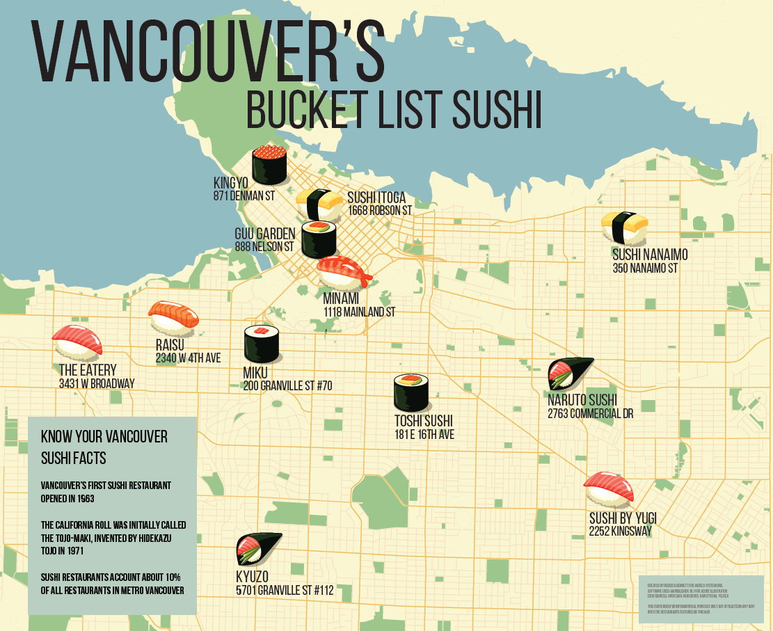
June 18th is #InternationalSushiDay, and as they say “You can’t buy happiness, but you can buy sushi, which is kind of the same thing.” Sushi has become so mainstream that you can find a sushi restaurant almost anywhere. With the wide variety of ingredients and flavours available in maki rolls, sashimi and sushi, no wonder it’s such a popular meal. To celebrate, we made a map! Instead of focusing on Toronto this time, we went to the west coast to highlight some restaurants in Vancouver that have ‘Bucket List’ sushi. These restaurants were chosen from this Narcity article. While not all of them are featured on the map, the 12 restaurants shown are still serving bucket list sushi items! If you try any of these, please leave a comment! Interested in how we made our sushi map? Keep reading!
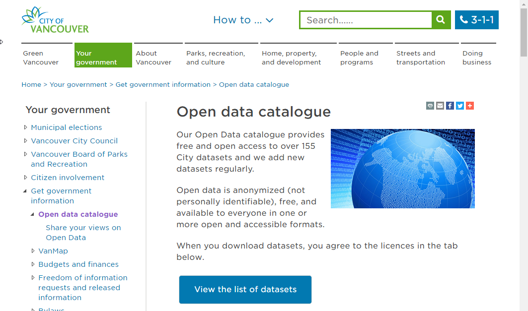
The City of Vancouver has a great open data portal, which is where we pulled the part of our data.

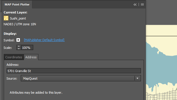
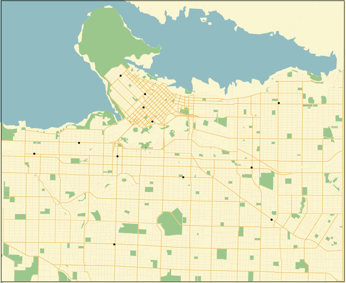
We got our street and park files from the portal, and created the sushi points using the MAP Point Plotter (one of my favourite tools!). Using the restaurant addresses provided in the article, we plotted each of the points on the map.

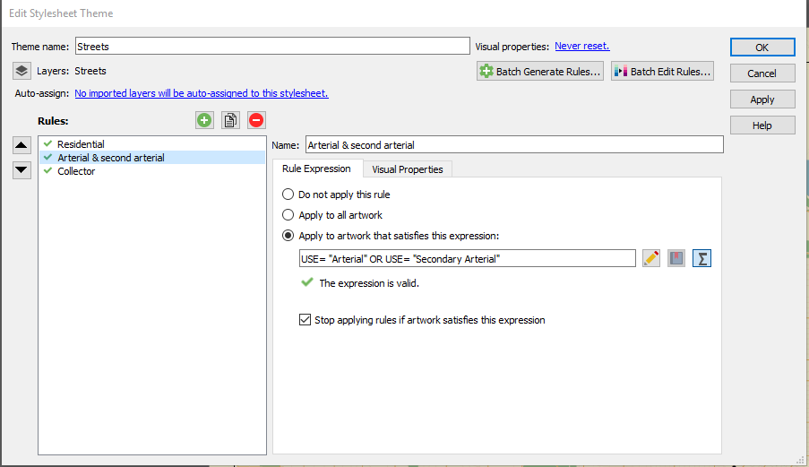
Once all of our points were in, we used a MAP Theme to style the streets. Ours looked like this:

Once the streets were styled, and colours were chosen it was time to style the rest of the map. We put a land mass file in to give boundaries, and show the coast line.

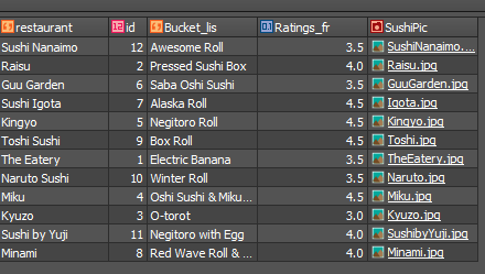
We styled the restaurants with different pieces of sushi, and included their addresses for easy reading. But, the most important feature and point of this map, were the bucket list sushi items that each of these restaurants serve. To show those featured menu items, we added them to the MAP Attributes (and included their Yelp rating, along with a photo of food from their restaurant).

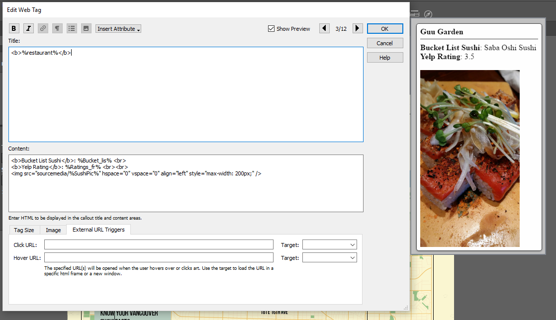
Once those were in, we used the MAP Web Author tool to make the map interactive! When you view the map and click on the sushi icon for each of the restaurants, you’ll see the restaurant name, the bucket list sushi item, the Yelp rating, and a picture of their food. Here’s what our Web Tags look like.

Here’s what the final map looks like! If you click on the sushi pieces, you’ll see the tags we created in MAP Web Author. Interested in the PDF? It’s also linked below. We’ve put the Adobe Illustrator file up as well, if you’d like to take a look or play with the map itself! Happy #InternationalSushiDay!

Download this map so that you can play with it in MAPublisher.
View it as a PDF here.
The field of cartography is filled with jargon and terminology that can pose a challenge for newcomers learning to use mapping software such as MAPublisher to make beautiful maps, and those who don’t have a formal background in cartography. It also doesn’t make it easier when different software packages have their own variations on certain terms. To help the cause, we have compiled a short list of common cartography terms or “carto-jargon” that you may encounter while using MAPublisher or Geographic Imager.
Basemap
A basemap is a background image which can include aerial imagery, topography, terrain and streets and other fundamental layers and is used as a starting point to create a new map. The basemap is georeferenced and is usually the most accurate source of spatial information within the data system that makes up the finished map. Additional layers of data such as labels, symbols and paths are then added to the basemap to create the final product.
Feature
Any real-world object that is represented on a map is a feature. Features can encompass large areas of a map, such as bodies of water and mountain ranges, or they can be discreet objects like parking areas, public washrooms or fire hydrants.
Attribute
Attribute data is information about spatial features and is stored in tables. It is also the information that specifies the appearance and labeling of features on a map. For example, the graphic attributes of a river might include the thickness of the line, line length, color, and the name used for labeling.
Control Point
A control point is a location on the map with known pixel (x,y) coordinates. Control points are used in georeferencing to allow for extrapolation of the relative location of other points whose exact coordinates may not be known.
Coordinate System
A coordinate system is a reference system used to represent the locations of geographic features on a map. It provides the basis for identifying locations on the earth’s surface. There are thousands of different coordinate systems, most of which are limited in use to highly specialized purposes.
Projection
The earth is not flat and so imagining that it is for the purpose of putting it on a 2-dimensional map results in some distortion. A projection is a method by which the curved surface of the earth is portrayed on a flat surface and is based on a mathematical transformation of the earth’s lines of longitude and latitude onto a plane. There are many different projections, each of which distorts distance, area, shape, and direction is some way, therefore no projection can result in a perfectly accurate flat map. Check out the Avenza Projections Guide for a more detailed information.
Georeferencing
Georeferencing involves aligning geographic data to a known coordinate system so it can be viewed, queried, and analyzed relative to other geographic data on the same map. Georeferencing may involve shifting, rotating, scaling, skewing, and in some cases warping, rubber sheeting, or orthorectifying the data to improve accuracy.
Graticules and grids
Graticules are the network of longitude and latitude lines on a map or chart that relates points on a map to their true locations on the earth. You can think of this a grid system – in fact, the terms are sometimes used interchangeably, but there is a subtle difference. Graticules are derived from 3-dimensional ellipsoidal shape of the earth and are formed by the the lines of latitude (parallel lines circling the earth), and lines of longitude (non-parallel lines converging at the earth’s poles). A grid system is comprised of a set of parallel and perpendicular lines that are superimposed on a flat projection of the earth, creating an x,y coordinate system. An example of a grid system is the Universal Transverse Mercator (UTM) system.
Themes
In MAPublisher, MAP Themes are a collection of thematic cartography tools designed to automate how styles and symbols are applied, charts are produced, and data is plotted. There are three themes which you can be customized to suit your needs: Stylesheet, Chart, and Dot Density. MAP Themes offer a lot of flexibility as they can be edited, applied, duplicated, automated, exported, and cleared without affecting the spatial referencing of map features.
This is just a small sampling of the more robust glossary of terms available in the our MAPublisher and Geographic Imager documentation packages.
Sources
https://avenza.com/help/mapublisher/10.1/index.html?whats_new_in_mapublisher.htm
https://avenza.com/help/geographic-imager/5.3/index.html?glossary.htm
https://www.gislounge.com/gis-dictionary/
http://geography.name/gridgraticule/
MAPublisher has been simplifying the process of making maps beautiful for cartographers for more than 20 years. We are always adding new features and improving others, some of which have impacted the overall workflow and affect a majority of users. Other are more ‘niche’ in their application and the functions they perform. Here are a few favourite features that you may, or may not be aware of, as identified by the people who helped design and build them.
MAP Tagger Tool Michael L. – Product Marketing
I like the MAP Tagger Tool because it’s incredibly fast to create labels by clicking features on the artboard. Labels are created using attribute data as a source for the labels. In dense areas, the Map Tagger has flexibility to style and attach leader lines according to placement rules.
MAP Web Author Will H. – Sales
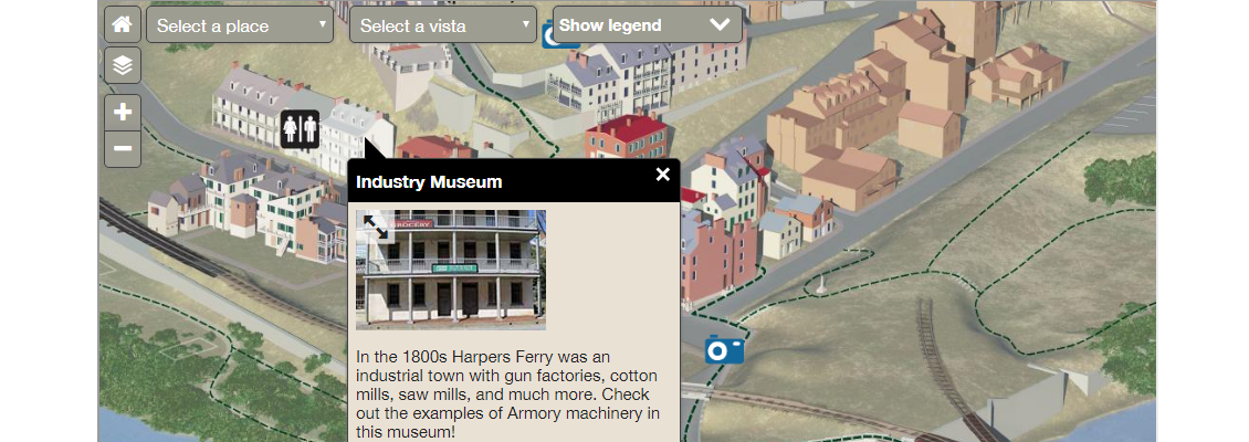
The MAPublisher users I speak with are usually impressed with Web Author and are surprised that it is included in the MAPublisher package. MAP Web Author lets Adobe Illustrator documents with GIS attributes be exported to interactive HTML5 web maps complete with callouts, rollovers, layer control, search, pan and zoom controls. With a little bit of knowledge of CSS (Cascading Style Sheets) and JavaScript you can embed interactive maps into any web page. The map below was created by the National Park Service.

Scale and Rotate by Attribute Andrew P. – Software Architect
We added this for a customer who had an interesting use case involving a pattern fill for lava flow. The map broke down an area into sub-areas by lava flow (direction, intensity, etc.). He wanted a way to use the attribute data he had in his map to automatically do a bunch of things he would otherwise have to do by hand, very carefully. In particular, he used the feature’s ability to rotate the pattern of area to match the lava flow direction, which sounded very cool (no pun intended) to us!
MAP Locations Tool Michael L. – Product Marketing
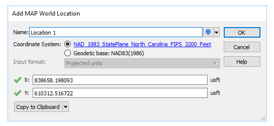
Most users don’t know what MAP Locations does (allows you to define real world coordinates for a location in a document) and how it’s actually useful. It sounds complicated, but it’s actually simple and far reaching throughout the product. MAP Locations can be used in several MAPublisher tools as references for georeferencing, for corners, for locations to draw lines, and locations to plot points. They can also be used to identify map and page anchors.

Add Calculated Data Andrew P. – Software Architect
Add Calculated Data is essentially a tool to update or add attribute data, but it allows users to feed in things that a user would find difficult to calculate themselves such as centroids, north angles, and art bounds. It also lets you pull in and store data like stroke or fill colours, in case you need to export them to a format that doesn’t support colours natively. You can even have it pull in elevation data!

The Avenza Resources Blog regularly published tips on how to use various MAPublisher tools. Detailed documentation is also available on our website.
For the majority of Avenza Maps users, layers are indispensable. Not only are layers a repository where placemarks, tracks, and photos are stored, but they also enable you to both manage and share map feature data.
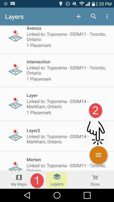
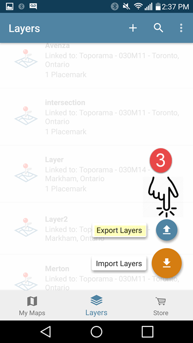
With the release of Avenza Maps 3.5, Android users will be introduced to a feature that was previously only available on the iOS platform, the Layers tab. The Layers tab is an invaluable resource which provides a complete listing of all layers in the app database, including their existing map associations. But what is most exciting about the Layers tab is it’s new ability to export layers. Exporting layers from the Layers tab will streamline data archiving. From the Layers tab, you now have the ability to export an individual layer, multiple, or all existing layers in one fell swoop.
Let’s see just how easy it is now to archive your map feature data.
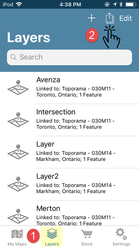
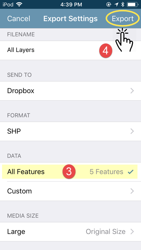
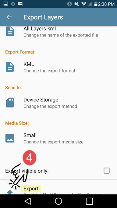
Say we had two topographic maps. One map contains two layers while the other has three separate layers. Below is an example of how all five layers can be exported from the Layers tab at once.
iOS


Android


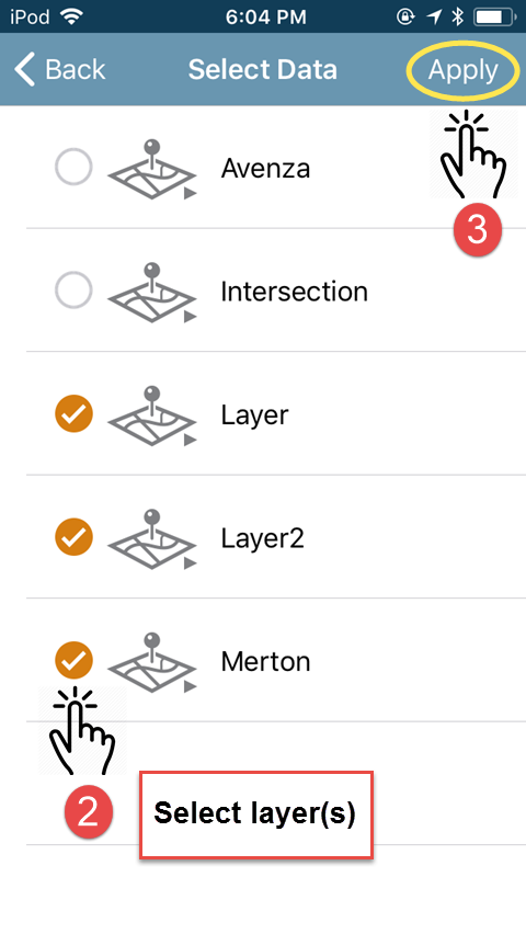
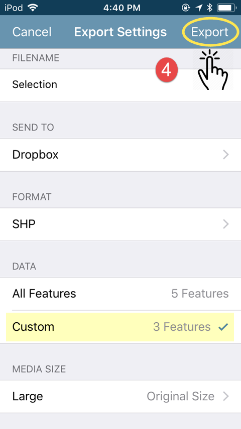
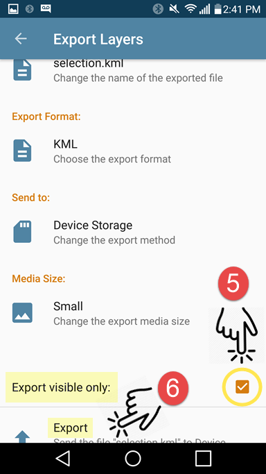
If you plan on importing your exported data back into the app, it is important that you export to either the KML or Shapefile (requires a Pro subscription) formats. Once you have tapped on Export, navigate to the storage location and tap Upload (iOS) or tap the check-mark icon (Android) to export. All of your layers will be exported to a single file for archiving. If you wish to restore these layers at a later date, you can simply import them back into the Layers tab and all layers will appear in the layers tab as they did prior to export.
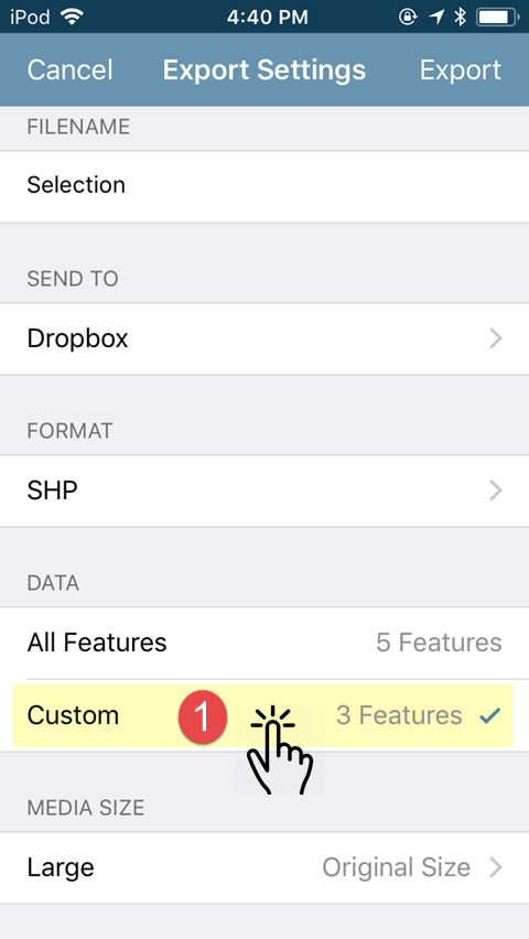
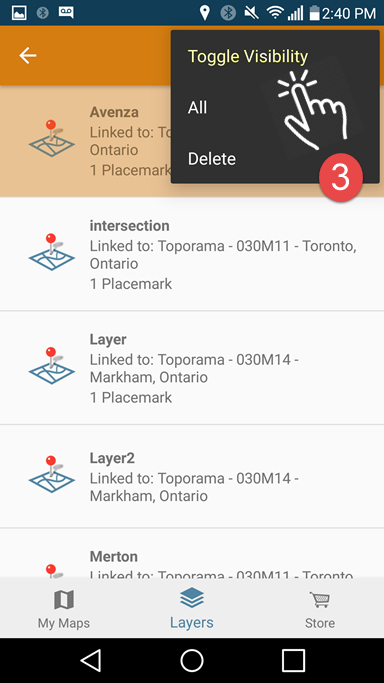
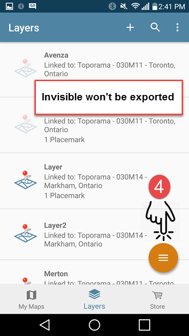
The following example is very similar but this time we are only exporting a selection of layers from the Layers tab.
iOS


Android


When it comes to exporting map feature data from multiple maps, the Layers tab is now clearly the most efficient method. A word of caution, if you are exporting large amounts of map feature data, it is advised that you break your export up into separate files as opposed to saving all of your layers to a single file. If you are exporting to email, there are restrictions to the size allowed for file attachments. Additionally, when exporting large files, there are resource limitations that may come into play and which vary by device and work environment.
Your data is a valuable resource. Countless hours can be devoted to data collection and the resulting map features are vital to the completion of your work projects. For most, it is extremely important to regularly export data for backup or archiving. Exporting layers from the Layers tab has just made this process that much easier.


