


We all love a good choropleth map, but sometimes we need our map to display more than just different shades of colour to communicate more detailed information. MAP Chart Themes are the perfect way to distribute that extra bit of information that you want your readers to know. You can display the data in a bar chart format, or pie chart format. There’s even the option to have the charts change scale according to the data.
Say you have a map showing the population density of Toronto, like this map below.
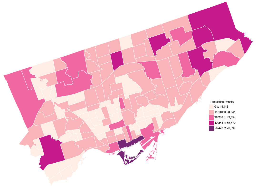
But, while this shows just the density of the population, you want to go more in-depth. For example, you want to look at all the ethnic origins of the residents of each neighbourhood. This is the perfect opportunity to use MAP Chart Themes.
To create a MAP Chart Theme, open the MAP Themes panel (Window > MAPublisher > MAP Themes) and click the + button to create a new Theme. Then choose Chart as the Theme type.

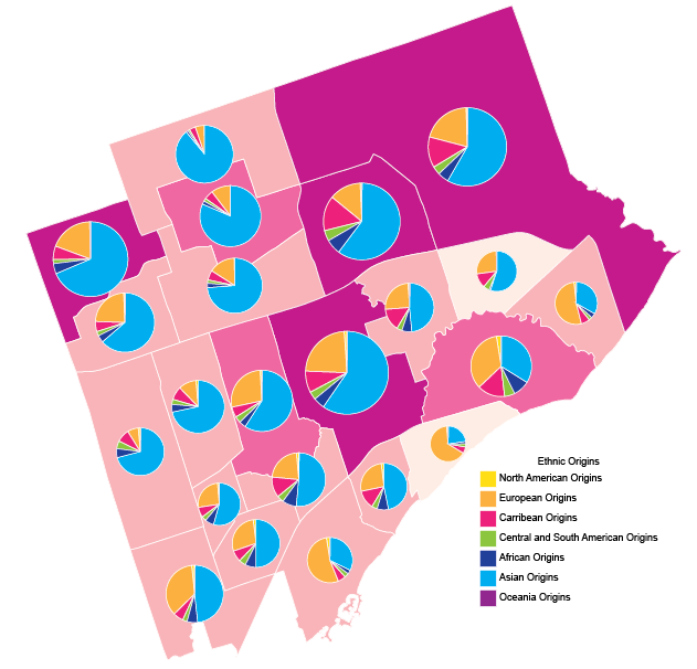
Once you’ve created your theme, now you can get to making your charts! You can use either bar charts or pie charts, choose whichever will show your data best. To show the variety of ethnic origins for the neighbourhoods in Toronto, I chose a pie chart.
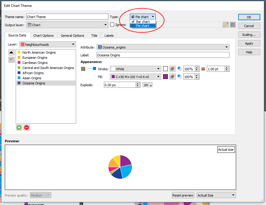
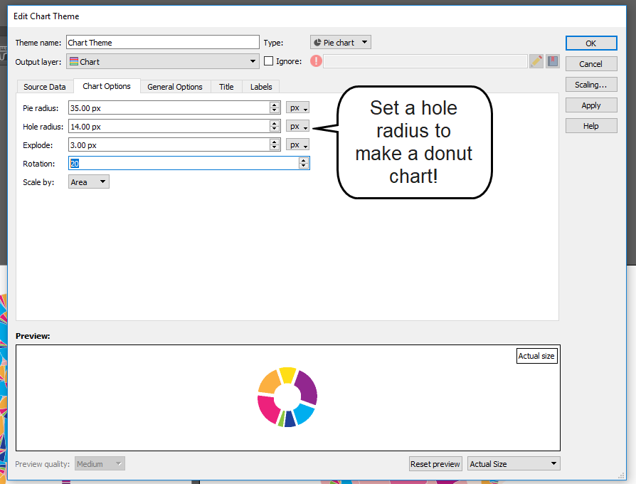
Select a layer, then click the Add Attribute button (the green plus icon) to add your attributes. Select the attribute you want to include in the chart, and style it as you see fit. The preview at the bottom will update as you make changes to the components of your chart. There are options to change the size of the chart, and even turn it into a donut chart!
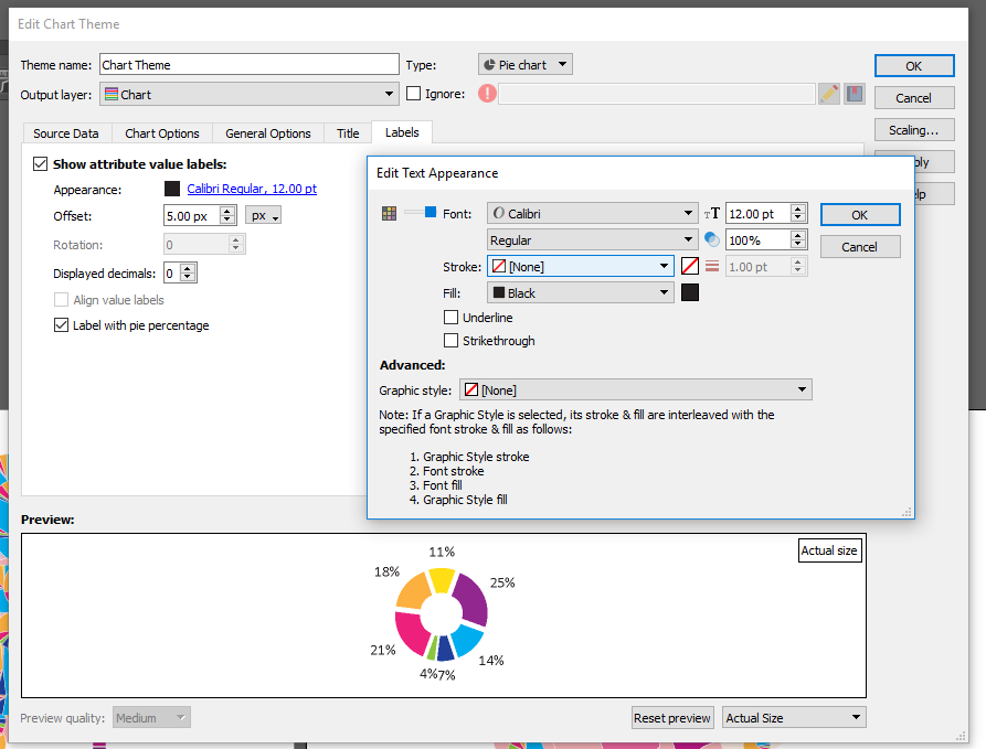
If you want to include a title for your charts you can, but because my map contains so many charts in a relatively small area, I chose not too. Labels for the sections of the charts can also be added as well. Edit the test if necessary, and even label your pie charts with percentages if that helps to better communicate your data.
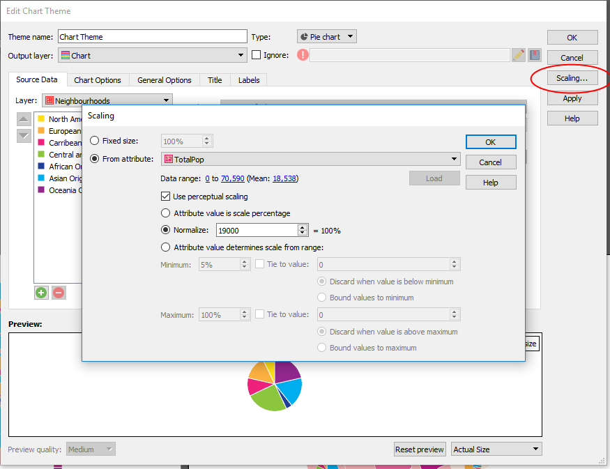
My favourite feature is the Scaling option (button is on the right). This allows you to automatically scale the size of your charts based on attributes. You can set the scale by defining the value that represents 100%, then select an attribute, click Load and watch the magic happen. This feature is super handy especially if you’re creating a map with tight boundaries or not a lot of extra space because you can easily adjust the size of all charts at the same time.
Back to my example map, I set the scaling and applied the MAP Chart Theme. Since there are 140 neighbourhoods in Toronto, I chose an inset of the larger map to show how the scaling appears. You’ll see neighbourhoods with a higher population have a larger pie chart, while neighbourhoods with a lower population have a smaller chart.
The scaling feature works for bar charts as well. I created another map with data showing the total number of inter-province visits for each Canadian province in 2016 vs 2017. In this case, I chose not to change the scale of the charts (by total number of visits per province) so it’s easier to see the comparison.
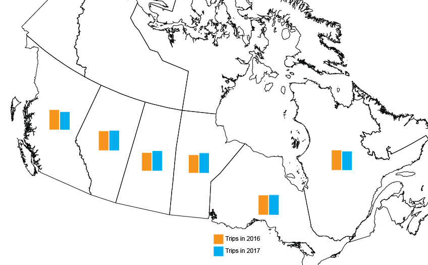
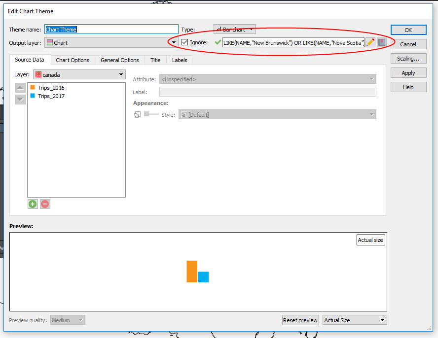
If you’ve made it this far in the post, and have eagle-eyes you’ll notice that there are no charts for the Territories or the Maritime provinces. Since I only wanted to visualize the data for some of the provinces, I used the Ignore option in the MAP Chart Themes box. It’s handy when you want to exclude certain data, for any reason.
There you have it! An easy way to visualize that extra data that your readers want to know, and you want to share without making your map overly complicated. Looking for more details on Chart Themes? Find it in the MAPublisher Documentation available on our website.