My Account     Contact Us     Cart

Cartographer Chronicles: Thorfinn Tait

Cartographer Chronicles Thorfinn Tait

A teacher by day and a cartographer by night, Thorfinn Tait (a native of Scotland) has been teaching high school in Japan for almost 20 years while making maps of fantasy lands in his spare time.

Mapping is a hobby for Tait, and his deep love of atlases, along with fantasy role-playing games (known as RPGs), helped drive him towards creating his own maps of fantasy worlds. He started in 2005, making maps in Adobe Illustrator. His goal was to create an atlas of a fantasy world, that included the same variety of maps that you’d find in any traditional world atlas — topographical, political, thematic — along with all the tables of data typically found in an atlas. He chose to map the world of Mystara, a popular Dungeons & Dragons (D&D) campaign setting from the 80s and 90s.

Tait set out to compile all of the original maps of Mystara (more than 250 of them) into a cohesive whole. “One of my biggest struggles was trying to work out what projection Mystara’s maps used. But there was a fundamental disconnect for me in that Illustrator alone did not have the functions I needed,” says Tait. “For example, to change the projection of a map, I tried to use it in tandem with other GIS software, but it was very troublesome having to constantly import and export elements between programs.”

Map of Caldwen

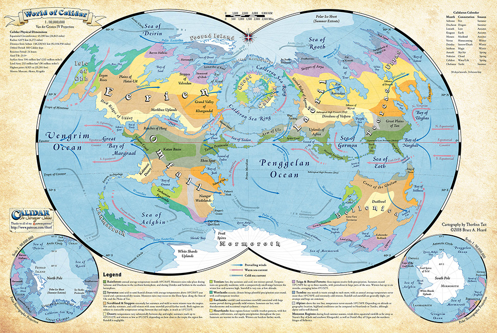
©2019 Bruce A. Heard. World of Calidar™ Fantasy Setting.

While working on the Atlas of Mystara project, an original Mystara author made a return to the industry, and Tait volunteered to remake his maps in Illustrator. The year after, that same author commissioned Tait to map a new RPG world, the World of Calidar. Determined to avoid the same problems he’d encountered with Mystara, he began establishing dimensions of the new world and creating custom projections based on them. But, working between Adobe Illustrator, Adobe Photoshop and GIS software was still very complicated.

World of Calidar

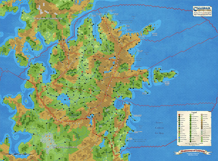
©2018 Bruce A. Heard. World of Calidar™ Fantasy Setting.

I managed to complete the first assignment with just those tools, but as soon as I got my first commission, I invested it right back into my maps by purchasing MAPublisher and Geographic Imager.” With MAPublisher, a plug-in for Adobe Illustrator and Geographic Imager, a plug-in for Adobe Photoshop, Tait could work natively in both Illustrator and Photoshop.

“My favourite aspect of MAPublisher is without a doubt the custom coordinate system. It allows me to create resources for fantasy worlds just like they already exist for the real world, and then repurpose them across all of my maps,” says Tait. He also uses MAP Attributes and adds data to the world’s geography. “For example, it’s easy for me to track things like road and river lengths, land areas, dimensions of coastlines and political borders, and so on — MAPublisher calculates all of these things for me automatically.”

MAPublisher has allowed Tait to take his previous work and convert it to the newly established custom coordinate systems, without losing any of the GIS attributes he’d created over previous years. Tait also uses Geographic Imager to create Digital Elevation Models (DEMs) for the World of Calidar. DEMs can help bring maps to life, adding an intricate level of detail and depth.

World of Calidar

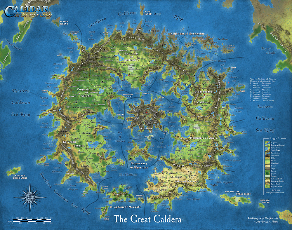
©2014 Bruce A. Heard. World of Calidar™ Fantasy Setting.

Tait’s tagline for his freelance business is “Mapping fantastic worlds with real-world accuracy”. “I couldn’t do this without MAPublisher and Geographic Imager,” he says. “The software allows me to create and work with data for a fantasy world just like other people map the real world, the only difference is that I am creating all the data myself!”

“MAPublisher has truly expanded my horizons as a cartographer and has also changed the course of my projects. Without it, my current work would simply not be practical — in fact, probably not possible at all.”

Tait is currently working on georeferencing existing Mystara maps and tagging elements with their original sources. Check out more of his mapping projects on his website!

MAP Chart Themes: Doing More with Your Data

We all love a good choropleth map, but sometimes we need our map to display more than just different shades of colour to communicate more detailed information. MAP Chart Themes are the perfect way to distribute that extra bit of information that you want your readers to know. You can display the data in a bar chart format, or pie chart format. There’s even the option to have the charts change scale according to the data.

Say you have a map showing the population density of Toronto, like this map below.

MAP Theme Density Map

But, while this shows just the density of the population, you want to go more in-depth. For example, you want to look at all the ethnic origins of the residents of each neighbourhood. This is the perfect opportunity to use MAP Chart Themes.

To create a MAP Chart Theme, open the MAP Themes panel (Window > MAPublisher > MAP Themes) and click the + button to create a new Theme. Then choose Chart as the Theme type.

Create MAP Chart Theme
Once you’ve created your theme, now you can get to making your charts! You can use either bar charts or pie charts, choose whichever will show your data best. To show the variety of ethnic origins for the neighbourhoods in Toronto, I chose a pie chart.

MAP Chart Themes Settings

Select a layer, then click the Add Attribute button (the green plus icon) to add your attributes. Select the attribute you want to include in the chart, and style it as you see fit. The preview at the bottom will update as you make changes to the components of your chart. There are options to change the size of the chart, and even turn it into a donut chart!

MAP Chart Themes Donut Chart

If you want to include a title for your charts you can, but because my map contains so many charts in a relatively small area, I chose not too. Labels for the sections of the charts can also be added as well. Edit the test if necessary, and even label your pie charts with percentages if that helps to better communicate your data.

MAP Chart Themes Labels

My favourite feature is the Scaling option (button is on the right). This allows you to automatically scale the size of your charts based on attributes. You can set the scale by defining the value that represents 100%, then select an attribute, click Load and watch the magic happen. This feature is super handy especially if you’re creating a map with tight boundaries or not a lot of extra space because you can easily adjust the size of all charts at the same time.

MAP Chart Themes Scaling

Back to my example map, I set the scaling and applied the MAP Chart Theme. Since there are 140 neighbourhoods in Toronto, I chose an inset of the larger map to show how the scaling appears. You’ll see neighbourhoods with a higher population have a larger pie chart, while neighbourhoods with a lower population have a smaller chart.

MAP Chart Themes

The scaling feature works for bar charts as well. I created another map with data showing the total number of inter-province visits for each Canadian province in 2016 vs 2017. In this case, I chose not to change the scale of the charts (by total number of visits per province) so it’s easier to see the comparison.

MAP Chart Themes Bar Charts

If you’ve made it this far in the post, and have eagle-eyes you’ll notice that there are no charts for the Territories or the Maritime provinces. Since I only wanted to visualize the data for some of the provinces, I used the Ignore option in the MAP Chart Themes box. It’s handy when you want to exclude certain data, for any reason.

MAP Chart Themes Settings

There you have it! An easy way to visualize that extra data that your readers want to know, and you want to share without making your map overly complicated. Looking for more details on Chart Themes? Find it in the MAPublisher Documentation available on our website. 

News Archive

Privacy Preference Center