Captured largely by satellites, planes, or unmanned aerial vehicles (i.e., drones), imagery data reveals interesting patterns and important information on Earth’s surface processes. This information can tell us not only about the natural world around us but also how we are changing it. From deforestation, snowmelt, desertification, and water resources management, to urban development, agriculture, forestry, and national defence, the stories we can tell with imagery data have become more important than ever. With hundreds of active earth observation satellites orbiting the Earth, never before has there been more data available to work with, and entire professions have been developed to learn from the vast troves of imagery data now available.
Although the world of imagery analysis is full of complex techniques and analytical workflows, learning the basics doesn’t have to be intimidating. We’ll show you in today’s blog, where we are looking at one of the simplest, yet most effective techniques for examining imagery data: using band-combinations to create false colour composites. With the Geographic Imager plugin for Adobe Photoshop, we will explore how you can access, import, and process multispectral imagery data to visualize some interesting patterns on Earth’s surface.
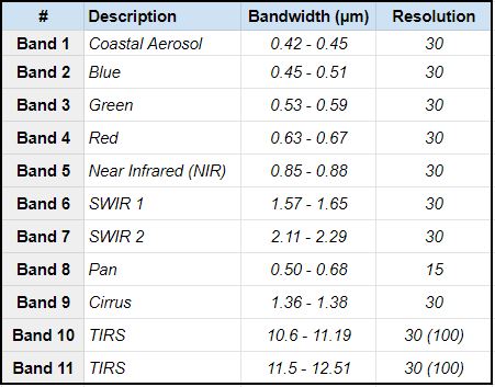
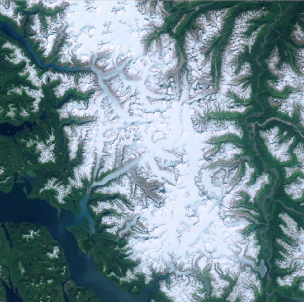
When we think of satellite imagery data, we often imagine something similar to the view out the window of a plane. To our eyes from high above, the Earth’s surface is very much dominated by “natural” colours such as blue and green. This is due to our eyes having evolved to observe what we call the “visible” part of the electromagnetic spectrum. This visible component is in fact only a small part of the greater spectrum as a whole, and many satellites are designed to capture wavelengths far beyond what we can see with the unaided eye. This so-called “invisible” part of the spectrum includes ultraviolet, infrared, and near-infrared wavelengths that can be extremely important for scientists studying Earth’s surface processes. Satellites will often capture individual images at a wide range of different wavelengths and combine these in something called “multispectral imagery”. Landsat 8 is an Earth observation satellite active since 2013 and is one of the best sources of high-quality multispectral imagery data available to date. Better yet, through USGS Earth Explorer web app, users can download high-quality Landsat 8 imagery for almost anywhere on Earth.
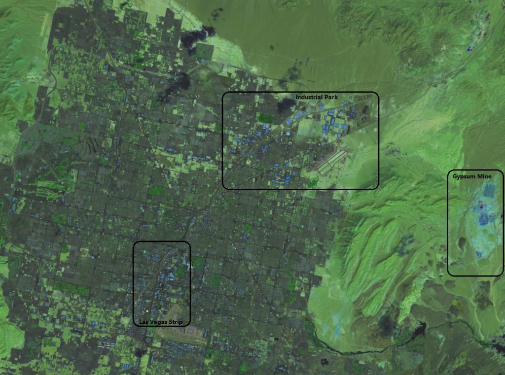
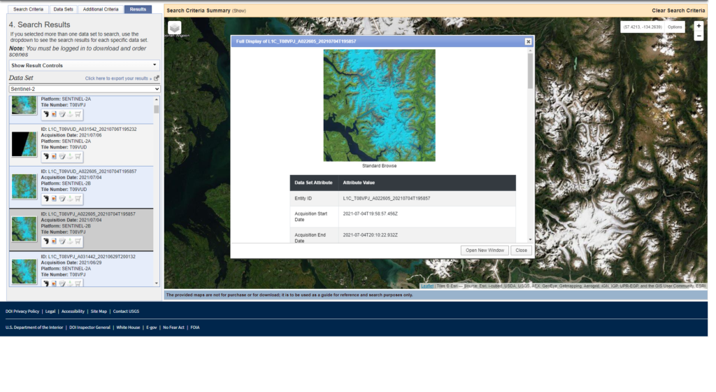
After creating a free account on Earth Explorer, we can start looking for some data. Use the search criteria panel to specify a region of interest (you can also manually draw a search area using the map panel). In this section, we can also specify a date range, which is very useful if you wish to view a particular region at a specific date or want to see how a region may have changed over time. For this example, we are going to be looking at the area of Las Vegas, Nevada. Often referred to as an “oasis”, we want to take a look at vegetation growth in this desert city, and see just how accurate this term may be.
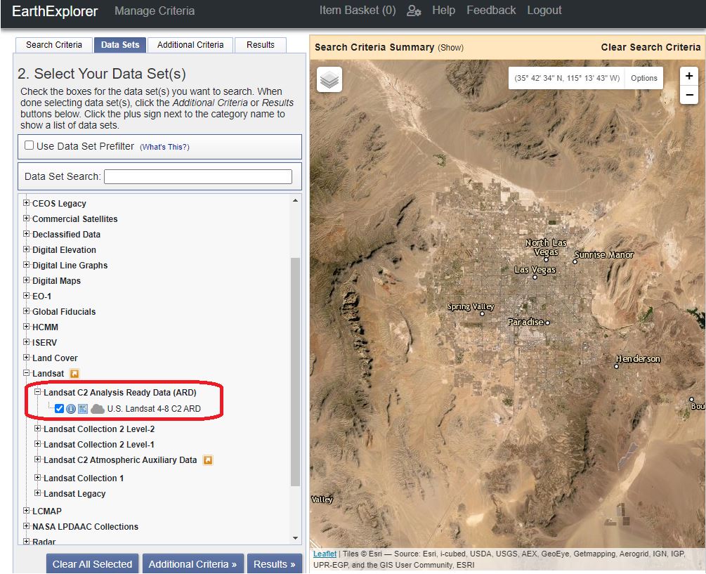
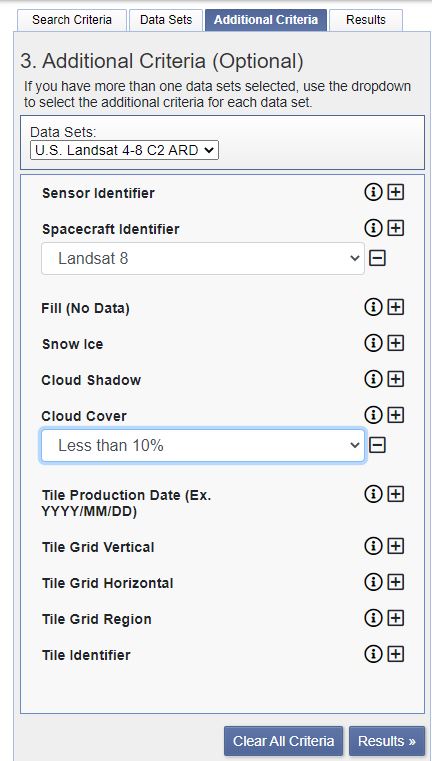
In the Datasets window, we can access different data providers for our imagery. For our needs, we want to select the Landsat C2 Analysis Ready Data (ARD). This will contain the prepared multispectral imagery we need to create a false colour composite. In the “additional criteria” section, we can specify the spacecraft (Landsat 8) and Cloud cover tolerance for our imagery data. For false colour composites, it is important to get a clear unobstructed view of the Earth’s surface, so we should aim for as little cloud cover as possible (<10%).
The Results panel now presents us with a great selection of imagery datasets for our area. We recommend examining the available datasets, and ensuring the data covers the area of interest by using the footprint icon next to each data product. With the right dataset selected, we can download the dataset we will import in Geographic Imager (choose the “Surface Reflectance Bundle” option from the download options).
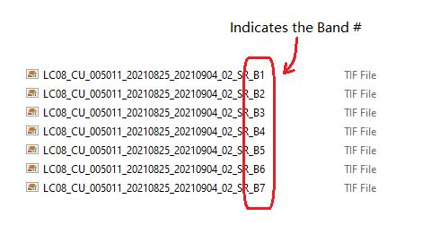
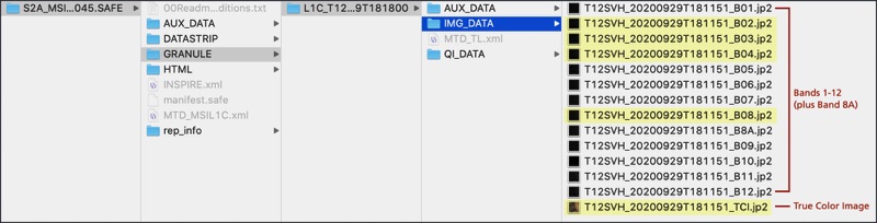
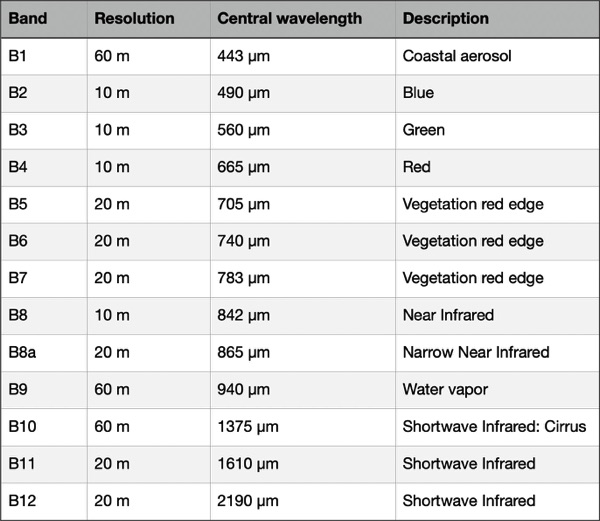
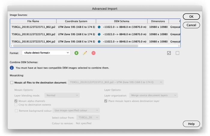
Looking at the downloaded files, you will see that several files end in a suffix indicating the “band” captured in that image (i.e suffix “_B1”, “_B2”, “_B3”, etc). These bands correspond to the specific ranges of wavelengths we discussed earlier. We will be combining several of these different images to create our composite.
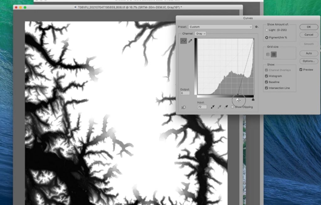
Now that we have the data, Geographic Imager will make it easy to import, and edit multispectral imagery data, all while retaining accurate spatial referencing. In addition, being seamlessly integrated into Adobe Photoshop, it gives us access to powerful Photoshop tools such as adjustment layers and curves (check out this great Mapping Class tutorial by Tom Patterson on using adjustment layers to improve imagery data). We start by opening the image files corresponding to Bands 1 through 7 (files ending in suffixes “_B1” to “_B7”).
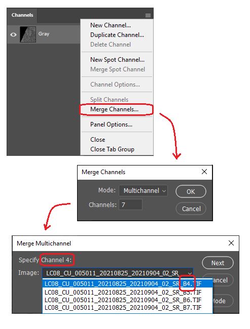
Go to Window > Channel to open the Channels panel From the Channel panel options menu, select “Merge channels” to combine the separate images into a single composite with different bands. Set the Merge Mode to “Multichannel” and specify each channel by assigning it to its corresponding image (i.e., Channel 2> Band 2, Channel 3> Band 3, etc.). Complete this for all channels.
To work with our new multi-channel image, ensure the Image mode is set to Grayscale (Image> Mode> Grayscale). You may also want to rename the channels to match their spectrum component (i.e., rename “Alpha Channel 2” to “Band 2 – Blue” and so on.)
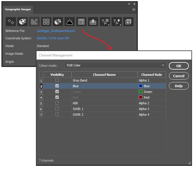
Next, open the Channel Management tool on the Geographic Imager Panel. Here we can easily modify channels to create different colour composites that match our needs. Specify the colour mode at the top of the panel to be “RGB Colour”. Next, specify the channel roles that will be used to display the image. To start, let’s go with the obvious choice. For “Band 4 – Red”, select the “Red” channel role. For “Band 3 – Green”, specify the “Green” channel role, and for “Band 2 – Blue”, select the “Blue” colour role. We call this band combination 4-3-2, referring to the bands we assign to Red, Green, and Blue respectively. This is also what is called the “natural colour” image, and will show us a view of the Las Vegas area as it would appear to our eyes (we’ve used some adjustment layers to brighten the image before displaying it).
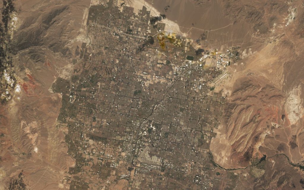
Being in the middle of the desert, it’s unsurprising that our image is a mix of drab browns and greys, reflecting the mix of concrete structures, sandstone, and small shrubbery that permeate the landscape. If you look very closely, you might notice a few dark green patches, which indicate some of the many golf courses and parks that are interspersed throughout the city. In the natural colour band combination, however, only the larger areas of vegetation are easily visible, and others are generally washed out by their surroundings. If we want to get a better idea of the vegetation that persists in this desert “oasis”, we will need to apply some modifications to our imagery to create a false colour composite.
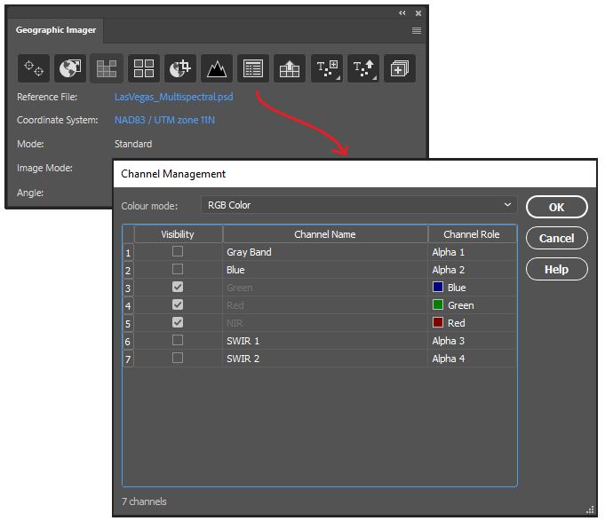
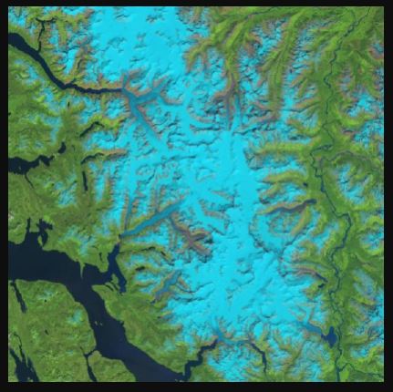
Opening the channel management tool again, this time we are going to create the band combination 5-4-3. This combination is one example of a “false colour” image and will help us to highlight the presence of vegetation in the area.
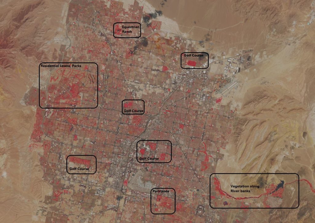
Looking at this new image, you might see how vegetation stands out clearly as bright red in colour. Irrigated vegetation, such as that found on golf courses, parks, lawns, and crop fields stands out even more prominently. Compared to the natural colour settings, this image makes it much easier to identify vegetated areas, even small ones. Presenting the image in this way is not only more informative but also tells a story of how human intervention affects our environment. The highly structured shape and location of most of these vegetated areas indicate a high level of human involvement, especially when compared to the more “natural” areas outside the city. This provides strong hints at the massive role water management and irrigation have in overcoming an otherwise arid, harsh, growing environment.
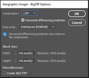
ou may want to save the file as a Photoshop document (PSD/PSB) in order to work with the image again later or explore different band combinations on another machine. Starting with Geographic Imager 6.4, internal georeferencing is now embedded directly within a saved Photoshop document. This reduces the need to retain an external spatial referencing file when the project is re-opened at a later date. Alternatively, we can also Export to one of several different spatial image formats. To demonstrate, we’ve exported to a GeoTIFF format, which will also retain internal georeferencing. When selecting “Save As.. -> “Geographic Imager – BigTIFF”, a dialogue window will open that allows us to configure compression, pixel order and block size for our exported image. Note that GeoTIFF formats allow us to retain our Image Channels if we wish (but this will increase the file size). Click OK and the image is now exported for future use.
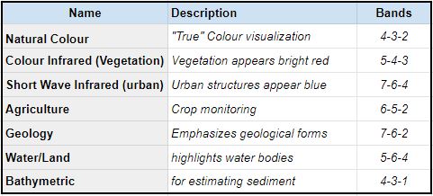
There are many different band combinations you can use to explore and analyze different patterns on Earth’s surface. We only examined two very specific types in this demonstration, but below we have provided a list of several other common Landsat 8 band combinations, as well as their use-cases.
Try out a few combinations and see what types of interesting patterns you can observe. With the Channel Management tool in the Geographic Imager plugin for Adobe Photoshop, exploring band combinations and false-colour composites with imagery data is a breeze!