Toronto, ON, February 22, 2021 – Avenza Systems Inc., producers of the Avenza Maps® app for mobile devices and geospatial plugins for Adobe Creative Cloud®, including MAPublisher® for Adobe Illustrator®, is pleased to announce the release of Geographic Imager® 6.3. This latest version provides full compatibility with macOS 11 Big Sur, and introduces a new cloud licensing system to efficiently access and manage floating licenses across an organization without the need to set-up, deploy and manage a local server.
“Geographic Imager has built a reputation for providing a powerful suite of tools that seamlessly integrate into spatial imagery workflows built around Adobe Photoshop,” said Ted Florence, President of Avenza Systems. “By offering improved cloud licensing features and full compatibility with the latest macOS 11 release, Geographic imager continues to provide the productive, reliable user experience our customers have come to trust and rely upon”
Powering the Geospatial Imagery Editing Process
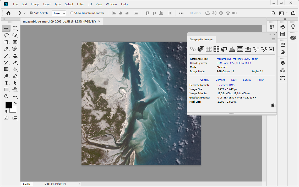
Geographic Imager for Adobe Photoshop® delivers an all-encompassing solution to import, edit, and export geospatial images such as aerial and satellite imagery. Work with digital elevation models, GeoTIFFs, and other popular GIS image formats while using Adobe Photoshop® features such as transparencies, filters, cropping, and image adjustments; all while maintaining georeferencing and support for hundreds of coordinate systems and projections.
New features of the Geographic Imager 6.3 plugin for Adobe Photoshop® include:
macOS 11 compatibility: Fully compatible with macOS 11 Big Sur
Cloud-based floating licenses: Access floating licenses easily with RLM Cloud
Chinese UXP update: Geographic imager 6.3 (Chinese Version) now uses Adobe’s new Unified Extensibility Platform (UXP)
Geographic Imager 6.3 is immediately available and free of charge to all current Geographic Imager Maintenance Program members and starts at US$349 for non-maintenance upgrades. New fixed licenses start at US$749. Geographic Imager Basic Edition licenses start at US$99. Academic, floating, and volume license pricing is also available. For more information, visit www.avenza.com/geographic-imager.
More about Avenza Systems Inc.
Avenza Systems Inc. is an award-winning, privately held corporation that provides cartographers and GIS professionals with powerful software tools to make better maps. In addition to desktop mapping software, Avenza offers the mobile Avenza Maps app to sell, purchase, distribute, and use maps on iOS and Android devices. For more information, visit www.avenza.com.
We are happy to announce that Geographic Imager 6.3 is now available. This release brings continued improvements to compatibility with Adobe Photoshop 2021, and now offers full compatibility with the latest Mac OS 11 Big Sur release. We are also excited to introduce a brand new and easy way to access floating licenses directly from the cloud!
Here is what you can expect with the latest Geographic Imager 6.3 release:
macOS 11 Big Sur Compatibility
Users will be delighted to see that Geographic Imager 6.3 is now fully compatible with macOS 11 Big Sur. This means new and existing users can transition to the latest macOS without any interruption in their Geographic Imager capabilities.
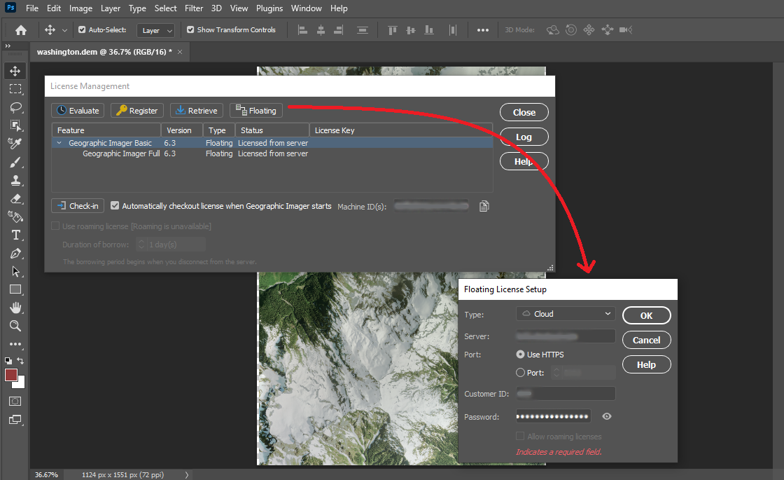
Cloud Floating Licenses: A Better Way to Manage and Checkout Licenses
We have worked hard to deliver a newly improved floating license management system as part of Geographic Imager 6.3. This new license management system greatly improves on previous versions and allows users and administrators within an organization to efficiently and seamlessly access floating licenses directly from the cloud. The new licensing system is built on the RLM Cloud platform and means floating licenses can be implemented without the challenges of setting up, deploying, and managing a local server. Contact our Sales team to learn how you can set up your cloud floating licensing.
See the new cloud licensing options by accessing the license management panel within Geographic Imager 6.3
UXP Implementation for Chinese Versions of Geographic Imager 6.3
The Chinese version of Geographic Imager 6.3 now implements Adobe’s new powerful Unified Extensibility Platform. Which provides user interface improvements and flexibility to develop new tools in the future.
Geographic Imager Available Now
All active maintenance subscribers can upgrade to Geographic Imager 6.3 today for free. Users without an active maintenance subscription or on a previous Geographic Imager version can still upgrade.
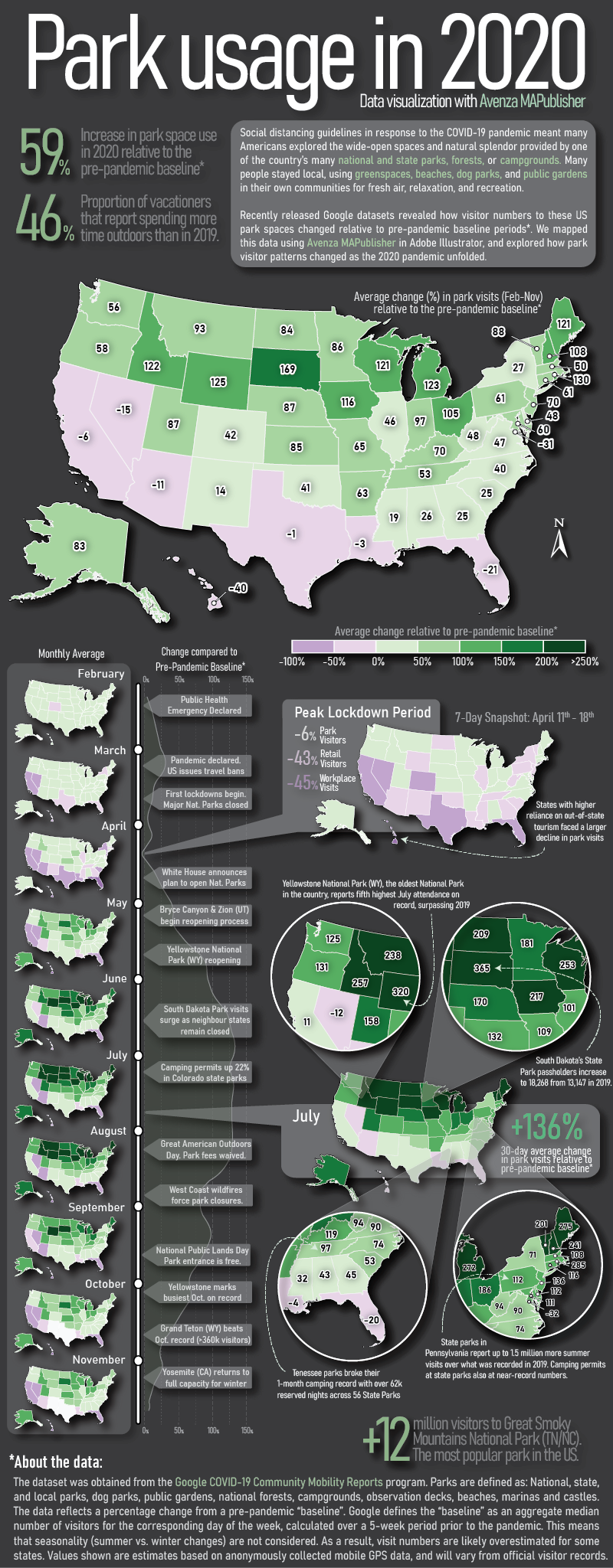
Here at Avenza, we love finding interesting data and using it to create engaging maps. In this blog, we show you how we used the powerful spatial data manipulation and cartographic styling tools found in MAPublisher for Adobe Illustrator to create an infographic exploring how park visitor patterns changed in the United States in 2020 using a truly interesting openly available dataset.
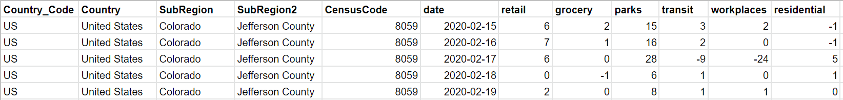
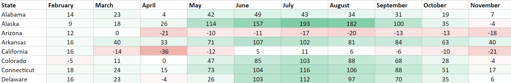
Recently, Google made its COVID-19 Community Mobility Reports public. These reports use aggregated anonymous mobile GPS data to explore how global human activity patterns in specific location categories (parks, retail, transit, residential, workplaces, and grocery) changed as a result of the ongoing pandemic. The U.S. dataset is massive, containing estimates of daily visitor activity for each location category in every county. Each data point provides an estimate of that day’s percentage increase or decrease in visitors relative to a pre-pandemic baseline period, meaning the data reflects how pandemic restrictions on that day may have impacted park space usage in that specific location. Below shows a sample of the raw dataset, listing five data points covering Feb 15-19th activity patterns in a single Colorado county.
We downloaded the complete dataset (February to November 2020) from Google’s mobility reports data portal. The dataset contains nearly 900,000 records of all 3,143 counties in the U.S. We wanted our infographic to focus on the parks category, which includes every national, state, and local park, as well as public forests, campgrounds, beaches, marinas, dog parks, and gardens. Using the open-source statistical programming language R, we were able to aggregate the dataset into a more manageable size. Below, you can see how some basic filtering of these “cleaned” datasets already shows evidence of some interesting patterns, but we felt that mapping the dataset would be much more engaging.
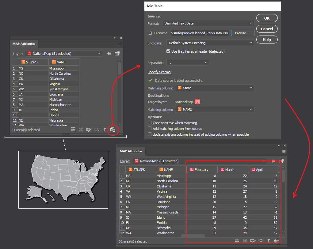
Maps are powerful story-telling tools, and we felt this data would be more interesting if you could see how park visitor patterns changed not only with time but also with geography. To make working with map data in Adobe Illustrator easier, we used the MAPublisher Import tool to load in a shapefile of U.S. state boundaries. The tool allows us to treat our dataset as a fully functional graphic element in Illustrator while still retaining all geographic properties integral to spatial data (attributes, topology, and coordinate systems).
To visualize the data as a map, we needed a way to associate each record in our tabular dataset to a specific location (in this case, a State). To do this, we used the Join tool, which takes our “cleaned” tabular parks dataset (stored as a CSV file), and links it to our mapped states shapefile using the shared State names column.
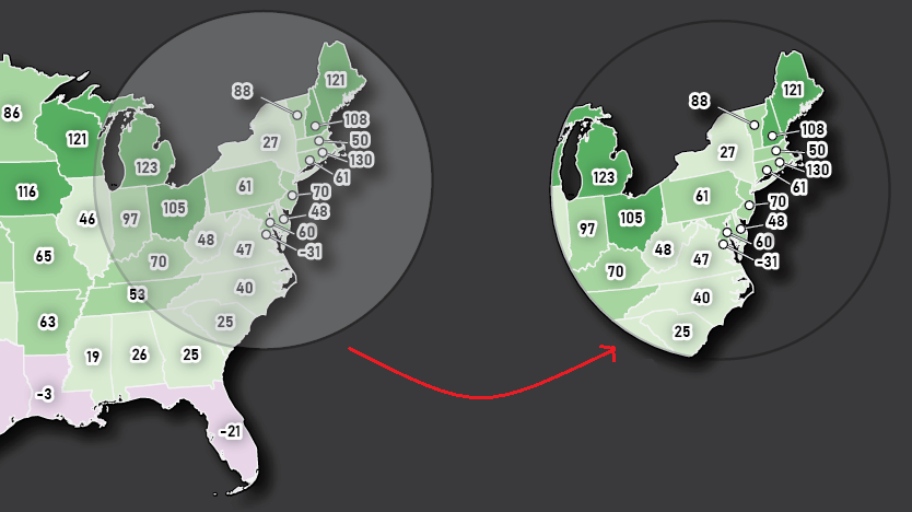
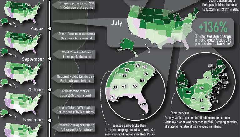
We started to think about how to design the layout of the infographic (this is where having a mapping environment in Illustrator really shines). We wanted it to consist of three main parts: a large labelled map showing the average change in park visits over the entire year; a vertical series of maps showing how park visits varied month to month; and a handful of pop-out maps with insets highlighting specific points in the year and specific regions of the country.
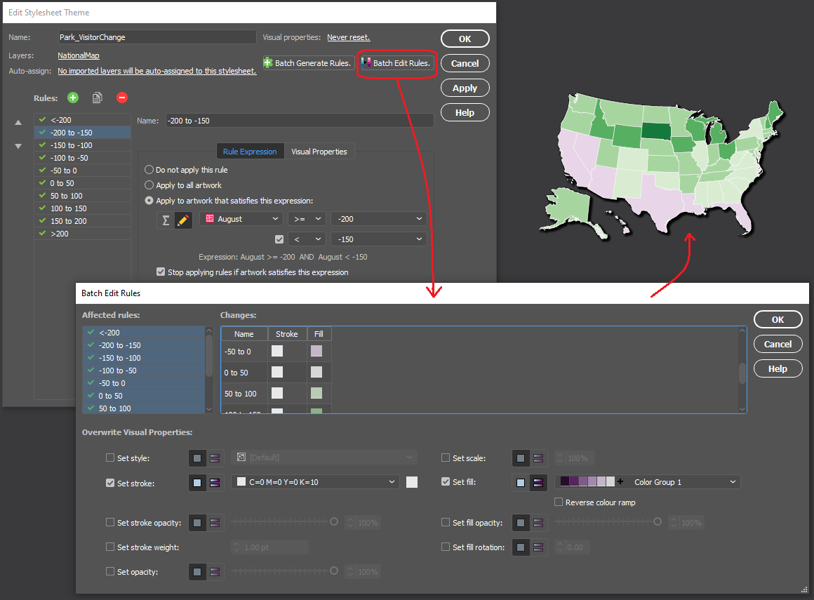
We chose to stylize the data into thematic maps, which use colour to represent specific values in the data at different locations. Instead of tediously configuring individual colour fills, we used MAP Themes to establish a rules-based stylesheet that applies a colour automatically to each State based on the monthly park visitor columns stored in the map layer’s attribute table. We chose a “thematic map” colour group from the included ColorBrewer 2 swatch library to best show positive and negative changes in park usage.
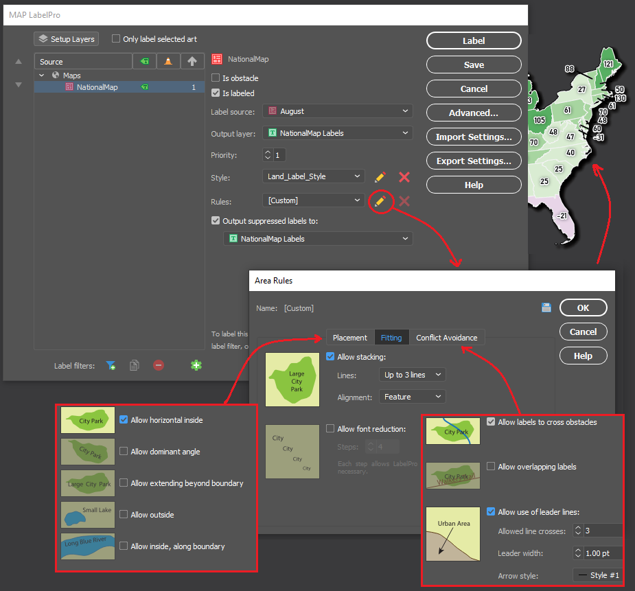
Next, we populated our main map with labels showing the percentage change in park use for each state. As many cartographers know, placing and configuring labels can be a significant time sink. Fortunately, we could use the MAPublisher LabelPro add-on to provide collision-free, rules-based label placement. We could configure the label rules to automatically handle collisions, alignment, and placement of labels for each state. Using the leader lines option in the LabelPro Rules panel, we were even able to create offset labels that prevent crowding the map.
Finally, we decided that to create some insets to highlight specific parts of the country. From a “master” map, we used the Crop to Shape tool to crop the map data to our desired inset extents. Using Crop to Shape is quick, and also retains the styling elements (colours, labels, strokes), topology, and attribute integrity of the cropped map layers.
With most of the maps completed, all that was left was to populate the infographic with text and graphics. Using the MAPublisher layout tools, we added a functional North Arrow and customized the automatically generated legend layer to suit our infographic’s design. Lastly, we used an Illustrator graph tool to create a vertical line graph of park activity along the left side of the infographic.
Presenting the dataset in this way makes it much easier to extract insights and craft a story from the data. Some patterns are immediately noticeable, such as the overall increase in park space usage that is observed for most of the US during the pandemic period. This isn’t exactly unexpected, as parks were one of the most accessible forms of leisure activity and recreation amid widespread social distancing and retail/entertainment closures. We also see how state-specific factors may have affected park usage in different regions of the country at different times. Some states, such as South Dakota, had eased restrictions on out-of-state visitors to their park systems, resulting in a spring season surge in park usage earlier than their neighbours. Conversely, states which typically draw a high proportion of international tourists, such as California, Hawaii, and Florida, saw more of a decrease in average park usage as a result of global air travel decline. These patterns and stories are one of many that can be identified, providing compelling examples of why maps are such powerful tools for visualizing data.
The beauty of working with MAPublisher to create this map-heavy infographic is that we were able to implement the powerful mapping and data manipulation tools of a dedicated GIS while seamlessly integrating the advanced art and design tools offered by the Adobe Illustrator graphical environment. Together, these tools turned what would have been a complex workflow of importing and exporting data between different software, and allowed us to create the entire infographic in a single mapping and design-focused fully integrated workspace.
Toronto, ON, December 14, 2020 – Avenza Systems Inc., producers of the Avenza Maps® app for mobile devices and geospatial plug-ins for Adobe Creative Cloud, including Geographic Imager® for Adobe Photoshop®, is pleased to announce the release of MAPublisher® 10.7 for Adobe Illustrator®.
This MAPublisher release improves on continued compatibility with Adobe Illustrator 2021 and macOS Big Sur. Product licensing improvements include a new Cloud floating license for easier setup for both admin and end-users. “Over the past several quarters, we have geared ourselves up for some major enhancements and have been working closely with our product partners at Adobe,” said Ted Florence, President of Avenza. “We’ve learned a lot and are continuously exploring more product features in the latest Adobe releases to bring them to our community of mapping professionals.”
Enhancements and new features of MAPublisher 10.7
Compatible with Adobe Illustrator 2021 on Mac and Windows
Compatible with macOS 11 Big Sur
Access Floating licenses from the Cloud
User interface and usability enhancements
MAPublisher 10.7 is immediately available free of charge to all current MAPublisher users with active maintenance and as an upgrade for non-maintenance users starting at US$599. New licenses are available from US$1399. MAPublisher FME Auto and MAPublisher LabelPro are also available as add-ons starting at US$399. Academic, floating, and volume licences are also available. Prices include one year of full maintenance. Visit www.avenza.com/mapublisher for more details.
More about Avenza Systems Inc.
Avenza Systems Inc. is an award-winning, privately held corporation that provides cartographers and GIS professionals with powerful software tools to make better maps. In addition to desktop mapping software, Avenza offers the mobile Avenza Maps app to sell, purchase, distribute, and use maps on iOS and Android devices. For more information, visit www.avenza.com.
The visual portrayal of quantitative and qualitative data is a process that requires the right tools. You want your audience to be able to make sense of the data you are sharing and be able to weave that data into a compelling and inspiring story. Here is how Avenza MAPublisher and Geographic Imager assisted Robert Simmon, Senior Data Visualization Engineer at Planet.
Robert isn’t your typical data visualization engineer who had formal training in scientific graphic design or cartography. His passion and interest in computer graphics and a master’s degree in materials science gave him the technical skills to start turning numbers into pictures that eventually helped him communicate with research scientists in his professional career.
Robert’s stepping stone into the fields of cartography, design, and data visualization happened during his work at NASA, where one of his first projects was creating a CD-ROM that would allow students and the interested public to explore a global ozone dataset. During his work there, he began to realize that the graphics published and used by NASA were made more for other scientists than for a broad audience. He also realized that good design was a powerful tool to improve communication. So, he tried to re-create scientific graphics in a more user-friendly form, with mixed success. “It wasn’t until I attended a talk by a popular lecturer on visualization that I learned there was a theory behind good design, and a big lightbulb went off in my head,” says Robert. “I began to read everything I could get my hands on about design, data visualization, and cartography—particularly map projections and the use of colour to encode information, since so much visualization at NASA revolved around satellite remote sensing data, which is quantitative and inherently geospatial.”
Eventually, Robert went on to found the Earth Observatory to share the breadth of NASA’s Earth science research with the interested public. After more than a decade with NASA, he received the chance to join the exciting startup—Planet—and work with an unprecedented, high-resolution, global dataset.
Robert developed a fairly unconventional workflow centred around Adobe design tools rather than GIS or scientific visualization software. This is where the Geographic Imager plugin for Adobe Photoshop and MAPublisher plugin for Adobe Illustrator proved invaluable to bridge the gap between data and visualization.
Today, Robert’s day-to-day work largely revolves around processing visible and near-infrared imagery. Every image he works with gets imported into Photoshop with Geographic Imager. Creating maps in Adobe has proven to be effective and highly efficient as software like Adobe Photoshop possess powerful colour-correction tools, fast previews, layers, high bit-depth support, and undo history options.
This aids highly competent visualizers to work seamlessly and flexibly until an image is made perfect. Robert uses Geographic Imager to merge multiple adjacent image scenes or align a time series to make an animation (even if they’re in different projections), all with a single “import” step. He then exports the file as a GeoTIFF, so the image can later be combined with other, complementary data.
Although Robert enjoys working with imagery, he has had the most fun combining multiple data sources, especially raster and vector. Delving into his design workflow a bit deeper, he involves both Adobe Photoshop and Illustrator together. In Adobe Photoshop/Geographic Imager he works on the initial colour work and crops his desired map extents, then imports it into Illustrator/MAPublisher to overlay with vector data and create masks. “It’s particularly useful to be able to crop the imported vector data to match the area of interest, rather than having to manually select and delete objects that lie outside the Illustrator artboard,” says Robert. After setting up his vector layers, he then exports them as a layered Photoshop file and re-combines them with the original raster imagery, to ensure pixel-perfect accuracy.
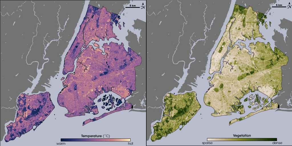
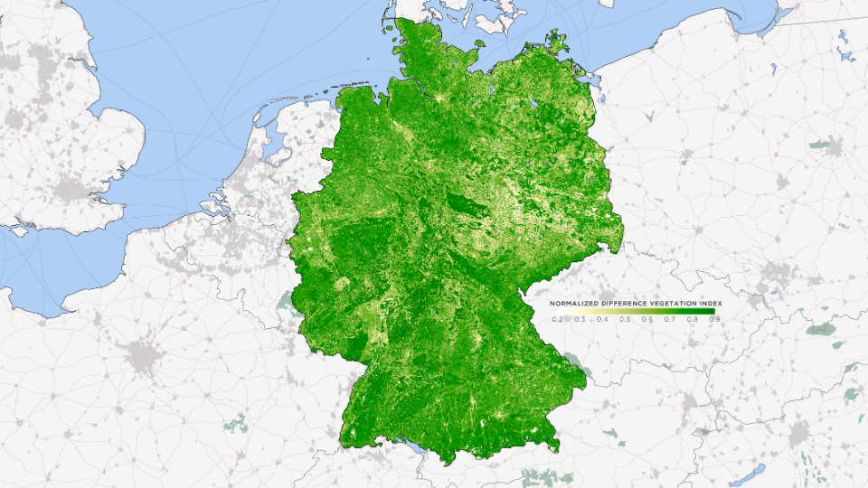
Robert’s love for MAPublisher goes back to 2006 when he first used it to make maps with Landsat data. He used MAPublisher to create a water mask with ZIP code data, which was the only data source he could find with high enough resolution to accurately capture the jutting piers of lower Manhattan. Robert also used MAPublisher to create a map of Amazonia (one of his personal favourites from his portfolio) with the help of MAPublisher’s powerful attribute tools, which allowed him to select and merge data vector data of Amazon biome, distinct from the Political Amazon, for which data is readily available. He continued to create variations on this theme at Planet, including a map of the vegetation of Germany. It was derived from a Planet Surface Reflectance Basemap and given context with Natural Earth boundary, urban area, and transportation data.
Robert continues to tweak his colour palette for his vegetation maps since just being ‘good enough’ has never really been his forte.
_______
In collaboration with Robert Simmon, Senior Data Visualization Engineer at Planet.
Toronto, ON, October 21, 2020 – Avenza Systems Inc., producers of the Avenza Maps® app for mobile devices and geospatial plugins for Adobe Creative Cloud®, including MAPublisher® for Adobe Illustrator®, is pleased to announce the release of Geographic Imager® 6.2. This latest version is powered by Adobe’s new Unified Extensibility Platform (UXP), which provides tremendous performance and user interface improvements to the Geographic Imager plugin for Adobe Photoshop.
“Geographic Imager has become a product many organizations trust and depend on to quickly edit and process spatial imagery,” said Ted Florence, President of Avenza Systems. “With increased performance and even more opportunities to develop new tools and experiences with UXP, the possibilities are endless.”
Powering the Geospatial Imagery Editing Process
Geographic Imager for Adobe Photoshop® delivers an all-encompassing solution to import, edit, and export geospatial images such as aerial and satellite imagery. Work with digital elevation models, GeoTIFFs, and other popular GIS image formats while using Adobe Photoshop® features such as transparencies, filters, cropping and image adjustments; all while maintaining georeferencing and support for hundreds of coordinate systems and projections.
New features of the Geographic Imager 6.2 plugin for Adobe Photoshop® include:
Compatibility: Fully compatible with Adobe Photoshop® 2021 on both Windows and Mac, powered by Adobe’s new Unified Extensibility Platform (UXP)
Exporting: Vector map data is now able to export to many industry geospatial formats
Advanced Importing: Ability to remove backgrounds from images during import
Geographic Imager is immediately available and free of charge to all current Geographic Imager Maintenance Program members and starts at US$319 for non-maintenance upgrades. New fixed licenses start at US$699. Geographic Imager Basic Edition licenses start at US$99. Academic, floating and volume license pricing is also available.
For more information, visit www.avenza.com/geographic-imager.
More about Avenza Systems Inc.
Avenza Systems Inc. is an award-winning, privately held corporation that provides cartographers and GIS professionals with powerful software tools to make better maps. In addition to desktop mapping software, Avenza offers the mobile Avenza Maps app to sell, purchase, distribute, and use maps on iOS and Android devices. For more information, visit www.avenza.com.
For further information contact: 416-487-5116 – info@avenza.com – www.avenza.com
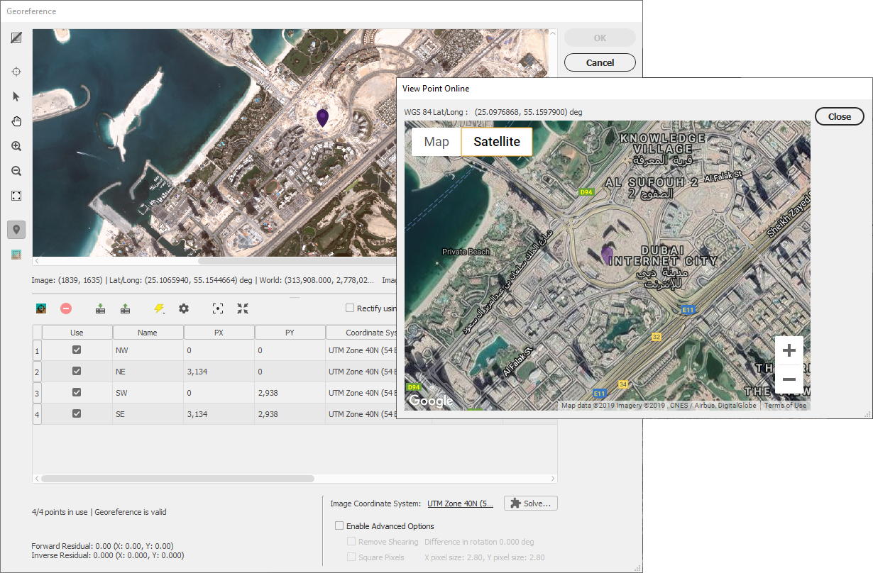
Editing geospatial imagery like aerial photos or images taken from satellites is usually a difficult task and requires a certain level of technical knowledge. However, the Geographic Imager plugin for Adobe Photoshop makes GIS accessible to a growing group of graphics professionals who can quickly and easily edit geospatial images. Cartographers, design-focused users and image editors can combine the geospatial editing tools of Geographic Imager with the Adobe Photoshop design environment.
With the Geographic Imager plugin for Adobe Photoshop, you gain access to all the tools and spatial information related to the image quickly and easily through a seamlessly integrated panel. Easily and quickly import various data formats, transform coordinate systems, and crop, mosaic or tile images. Save images to several industry-standard geospatial formats or export as web tiles to use in web applications.
The latest Geographic Imager plugin release provides tremendous performance and user interface improvements as it was built on Adobe’s Unified Extensibility Platform (UXP) in Photoshop. This platform offers more flexibility and opens up opportunities to develop new tools.
Geographic Imager features include:
Extensive geospatial image support
True spatial-awareness by georeferencing images
Extensive support for thousands of geographic and projected coordinate systems, maintaining accurate map projections during image editing
Mosaic individual images to create a seamless image
Tile an image into multiple images by tile size or count and automatically save them using sequential naming
Import digital elevation models (DEM) and create shaded relief maps using the Terrain Shader tool
Save spatial images to many industry-standard formats, including GeoTIFF
Export to web tiles to generate images that are compatible with Google Maps, OpenStreetMap, MapBox and more
Ability to use Geographic Imager tools with Adobe Photoshop scripting
How to get Geographic Imager for Adobe Photoshop
Geographic Imager for Adobe Photoshop is now available in the Adobe Marketplace for both Mac and Windows. Alternatively, you can try Geographic Imager by registering for a free trial.
Users ready to purchase can use the code AVENZAMAX10 at checkout on www.avenza.com for a 10% discount.
For additional information about the Geographic Imager plugin for Adobe Photoshop, please refer to the following resources:
Unless you are a GIS professional or a professional cartographer, finding the raw data to make a map may seem like a rather large barrier to success. However, there is plenty of publically available free map data out there to be used by graphic designers, and any cartographer that doesn’t have the means to generate their own data. Free map data is a great place to start when making a map, using MAPublisher and Adobe Illustrator to make it your own.
First, You Have to Find It
Depending on what kind of map you want to make, and for what region or country, finding map data can be easy. There are plenty of governments and other agencies that make their geospatial data available for free. You just have to know where to look for it. Here is a list of the five that, in our opinion, are among the most useful.
USGS Earth Explorer
The USGS Earth Explorer is an amazing resource for free satellite and aerial imagery. You can download imagery simply by creating a free account. The available imagery covers most of the globe and is often updated. The Earth Explorer user interface is relatively user-friendly so you can find what you need without too much effort. Among other sources, Earth Explorer includes high-quality Landsat and Sentinel 2 imagery.
FreeGISData
By far the most complete compilation of free map data, FreeGISData contains links to over 500 data sets, categorized for easy browsing by data type and country. The list is maintained by Dr. Robin Wilson, an expert in remote sensing and GIS. This website is a great place to start if you don’t know exactly what you need or want to see what options are available to you in a particular region.
Open Street Maps
Open Street Maps (OSM) is a crowdsourcing platform for GIS data meaning that all of the data is created by the public, so the accuracy can vary based on who created it and how. However, as with most crowdsourcing efforts, the quality is generally pretty good for most use cases, and the amount of data available is impressive.
Natural Earth Data
Natural Earth Data offers vector and raster datasets that are in the public domain so you can modify them, use them and distribute them in any way you want without worrying about infringing copyrights or attribution. This is a great place to look if you simply want a base map to start your project. The available data spans the globe and includes the key cultural and physical data you may need for your map. The raster datasets also provide hillshade relief for aesthetically pleasing maps.
NASA’s Socioeconomic Data and Applications Center (SEDAC)
SEDAC is a data center in NASA’s Earth Observing System Data and Information System (EOSDIS). Its mission is to support the integration of socioeconomic and earth science data and to serve as an ‘Information Gateway’ between earth sciences and social sciences. In addition to the gallery of downloadable maps, which includes a gridded population of the world, SEDAC offers a variety of data sets of socioeconomic data. You can search the available data sets by theme such as agriculture, climate, infrastructure, population, poverty, etc., or choose to data sets that include historical data, reaching back to the 18th century and that look ahead to a century from now. Neat!
Join Data Sets to Make Your Map
Often cartographers and GIS analysts use open-source or publically available map data as a starting point then add some other data or additional insight. For example, you downloaded population data obtained from SEDAC but you want to add in some national sales data generated by your company. It’s possible to do it when all datasets are in the same format. GIS platforms like qGIS or use a conversion tool like this one can do the trick.
Import Data Into Illustrator Using MAPublisher
Once you have your data is in order, it is time to get down to the business of making your map! Import the data into Adobe Illustrator to manipulate the design elements that will make the map interesting and informative. MAPublisher makes it possible to import map data in almost any format into Illustrator, and also enables a plethora of cartography specific tools right in the Illustrator environment. With all of your data arranged in layers in Illustrator, it is easy to work with, turning on and off the data you don’t want.
Pro Tip: MAPublisher uses import filters to limit the amount of data that you bring into Illustrator to a manageable amount before you start working with it.
Design Your Map Without Losing Geospatial Integrity
You now have layers and layers of lovely map data in Adobe Illustrator but it doesn’t yet look the way you want it to. MAPublisher’s cartography tools can change all that!
Reproject or change the coordinate systems to change the appearance of the map
Crop or edit the data on the artboard
Add/remove layers
Style features by creating rules for the attributes
Add more data as new layers
Add labels and symbols based on rules
Create North Arrows and accurate scale bars with just a few clicks.
Each of these could be the subject of its own blog, however, lots of helpful resources on how to use MAPublisher tools including tutorials and how-to videos are available on our website and YouTube channel.
Make Your Vision Come to Life
One of the best things about the MAPublisher plug-in for Adobe Illustrator is that it supports hundreds of data formats, allowing you to import almost any map data you can find into Adobe Illustrator. Happily, there is plenty of publically available, open-source map data available on the internet. Whether you are a professional cartographer, a hobbyist, or a graphic designer under the gun to design a map, you can use free map data as a starting point for your own map. Download a trial of MAPublisher today and find a data set to experiment with and make something amazing!
Making maps is a fairly common request made of graphic designers. After all, graphic design is about storytelling and visualization, and maps are about the same things. However, maps are some of the most difficult projects that designers can take on. Whether the goal of the project is to improve the aesthetic of an existing map or to create a new one from scratch, you know it is going to entail a lot of detailed and technical work such as composing layer hierarchies, setting appropriate map scales, and determining feature strokes and colours. Meanwhile your client’s last request of making a map required tracing things like country borders, following and drawing boundary lines and features. All tedious tasks that you don’t actually want to do ever again.
Handy Tools to Have in Your Graphic Design Toolkit
In a nutshell, designing maps can be frustrating for even some of the best graphic designers who know the tools of the trade inside and out. The problem is, the de facto tool of the trade, Adobe Illustrator, isn’t equipped to handle creating maps with data. Luckily, there is a plug-in that adds additional tools to Illustrator to help with making maps, while still allowing you to design in the platform that you are most comfortable with. These are good tools to know about and have in your kit so that when the next map project comes along, you are prepared to crush it while still maintaining productivity.
We May Be Biased But…
One such solution is our MAPublisher cartography plug-in for Adobe Illustrator. MAPublisher enables a variety of basic and advanced cartographic tools in Illustrator that enhance its ability to handle geospatial information, also known as map data. Imagine being able to crop, move, reshape, add, and remove pieces of the map data without losing other important features or geographic accuracy. MAPublisher also ensures that the relationships between map features and their attributes are held together by organizing everything into tables and layers. This allows you to design maps by adding labels and icons, changing colours, and editing other map elements (like north arrows or map scales) automatically, using attribute-based rules rather than having to manually create and place all of these elements.
Design Maps With Data
Focus on What You Do Best
With the right tools, creating a map in Adobe Illustrator won’t cost you days and your sanity. Instead, simply import map data from a free source or purchase MAPublisher-ready maps, manipulate geographic areas (by changing the map projection) if you need to and begin styling the elements the way you want them to be. Whether your map is thematic, like this transit system type map, an infographic like this one, where colours are automatically applied according to the feature attributes, or this one which uses custom-designed symbols. Adding other elements, such as labels can be accomplished with just a few clicks, without the anguish of having to place and re-place labels to avoid crowding and overlapping.
Knowing how to use basic cartography tools is a good skill set for graphic designers to have in their back pocket. It puts you ahead of the curve in your ability to make beautiful, well-designed, and geographically accurate maps with a reasonable amount of time and effort.
Download a free trial of MAPublisher and find out how easy it can be to make maps with additional cartography functionality in Adobe Illustrator. Or, try our Geographic Imager plug-in for Adobe Photoshop to easily edit geospatial imagery such as satellite and drone images.
Kim Beckmann is a storyteller above all else. As a graphic designer and Associate Professor of Design & Visual Communication at the University of Wisconsin-Milwaukee (UWM), Beckmann
uses visual media to do just that. More recently, she dipped her toes into the world of cartography (another story-telling medium) then fell right into the deep waters.
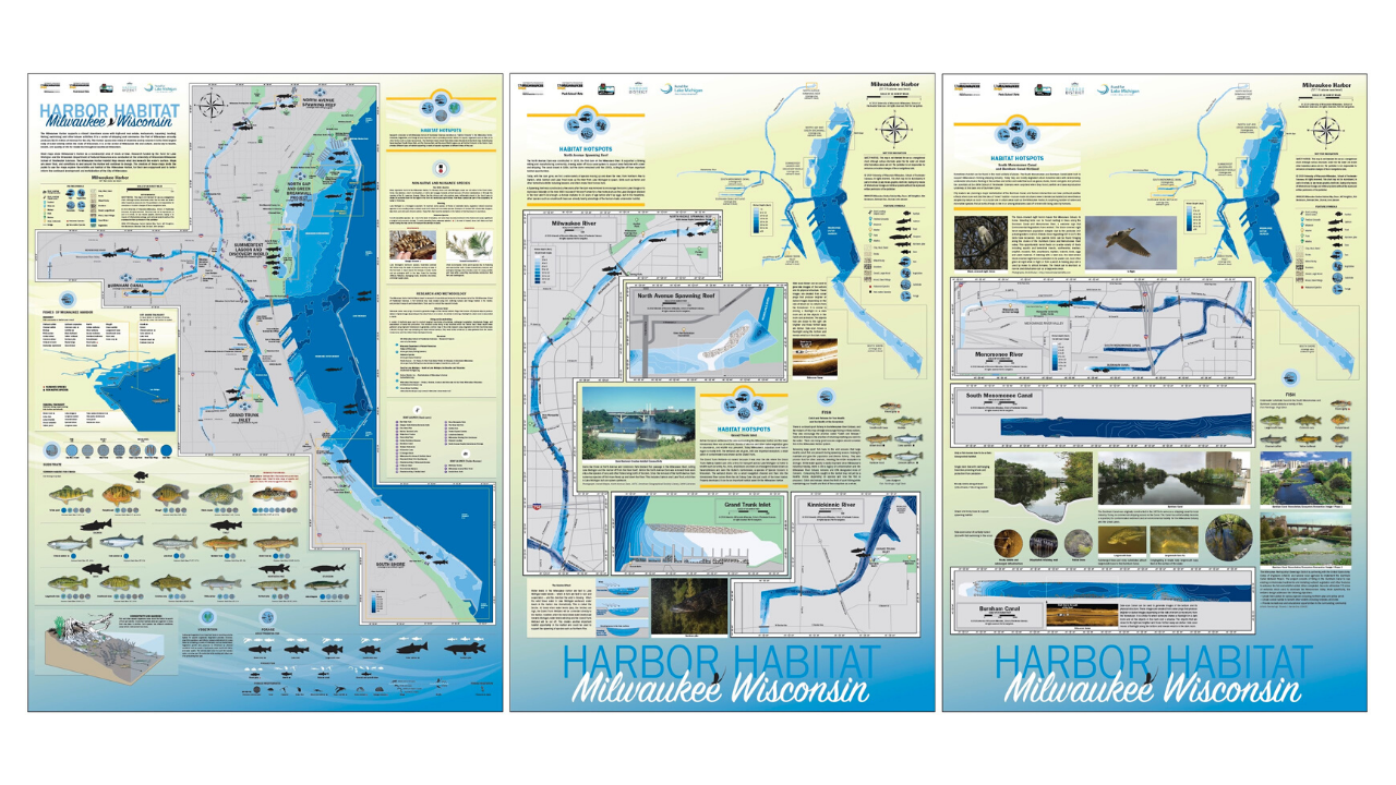
It all started when researchers from the university’s School of Freshwater Science came to her for help with creating supporting materials for a research project. The team’s ambitious project set out to map several miles of the Milwaukee harbor coastline, studying the effects of urban development on the harbor habitats. The research team had already created highly detailed technical maps but reached out to the Peck School of the Arts for a faculty member who could help put together the material in a way that could be more easily digested by the public and told the a story about the impact of people on the habitats that exist in the harbor.
“I also represent a part of the general public who would be interacting with the maps; individuals that want the maps to tell them a story. I recall at the first team meeting where we discussed research findings and what to present on the maps, I had many questions. What type of fish live in the harbor and rivers? What do they eat? Where do they live? Does water temperature effect where and when we might find them? Interestingly, the questions I raised led to incorporating additional habitat information into the maps,” said Beckmann. “What started as a concept for a single map quickly evolved to a set of five maps due to the amount to information we needed to share, the largest being 3 ft by 4 ft!”
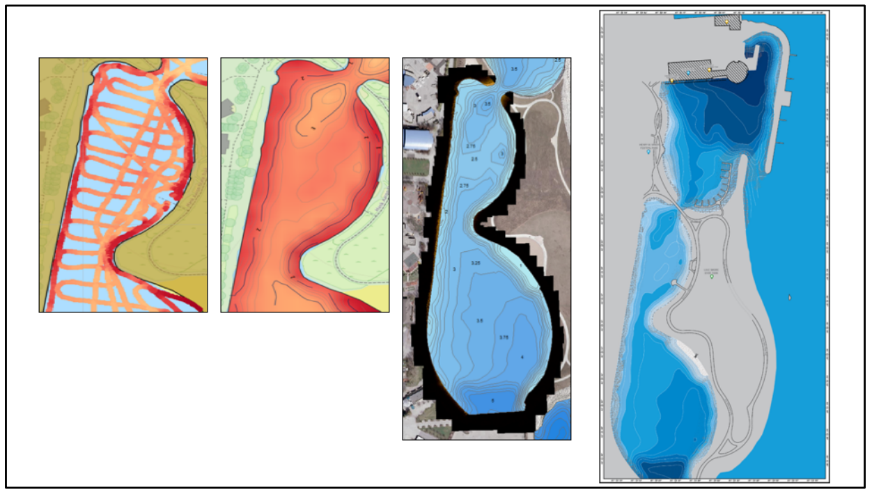
As a graphic designer, Beckmann had made maps before, including simple, vector-based topographic maps, and maps for wayfinding. But this was her first time working on a larger map project and her first time working with raw geospatial data to create bathymetric maps to illustrate water depth. “I am extremely comfortable with Adobe Illustrator so when I discovered that there was a cartography plug-in for it, called MAPublisher, that could be used to manage GIS data to create maps, I knew that it would be faster and easier than learning an independent cartography software tool.”
The School of Freshwater Science research team carried out data collection for the project using side-scan sonar devices. With technical support from the Avenza Systems team, Beckmann was able to get the data into a shapefile format and import it into Adobe Illustrator using MAPublisher. “I registered for a training course offered by Avenza Systems, on how to use MAPublisher with Illustrator,” said Beckmann. “That led to a meeting with Jeff who was able to provide helpful direction on how to transform the raw map data into the maps I wanted to make.”
Jeff Cable is the Desktop Product QA Lead at Avenza Systems. In addition to his work with the MAPublisher development team, he is also responsible for providing training to new MAPublisher users. “I met Kim in 2016 at one of our in-class training sessions in Chicago,” said Cable. “She had a very clear vision of what she wanted to create, but after some more discussion and reviewing the data, I realized that it would require advanced GIS workflows in order to get the data to an appropriate level before it was ready for mapping.” Seeing the value in the research project, he offered to assist Kim rather than have her seek out a GIS professional on her own. Once the data was prepared, she took what she learned from the MAPublisher training course and was able to apply visualization techniques to her maps. Cable corresponded several times as the project progressed and provided guidance. “Kim would ask if MAPublisher could do this or that, and in most cases, my answer was You bet it can!” he added. In addition to providing tips and best practices, he showed her many of the useful tools in MAPublisher that made her workflow more streamlined such as copying MAP Objects, working with MAP Stylesheets, and creating insets. “When I saw the finished product, I was blown away by what Kim had created. It was also gratifying as a training instructor to see how far she had come since our first meeting.”
Beckmann has since spoken about her work on the Milwaukee Harbor habitat maps project to the American Geographical Society, cartography clubs, and presented an artist talk as part of the Peck School of the Arts Artist Now! Lecture Series. The series of five maps have been printed on canvas and distributed to local and regional schools and turned into metal signage to be installed along the shores of the harbor to help share important research conducted by Janssen Labs with the public.
The first of five maps installed at Harbor View Plaza Park.
Two of the maps installed in the active learning classroom as Discovery World.
Disovery World is located in Milwaukee, Wisconsin.
Beckmann’s maps also currently hang in the Avenza Systems offices and we are proud to have them as a reminder of the amazing things visual artists and cartographers can do with the tools we provide.