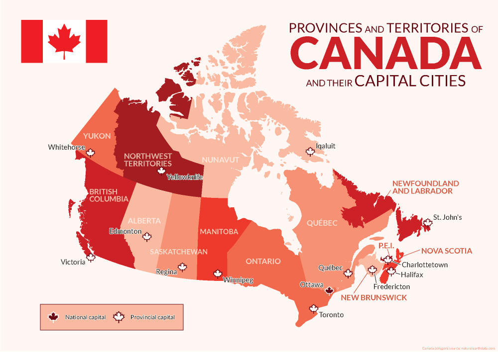
Avenza was founded and headquartered in Toronto, and as such, we pride ourselves on being a Canadian company with a global reach. This year we have celebrated by creating a map highlighting the names and capital cities of each province and territory of Canada using MAPublisher.
Using the MAP Point Plotter Tool to Plot Canadian Capital Cities
This blog will detail how we quickly and easily plotted points to represent the capital cities of Canada and its provinces and territories using the MAP Point Plotter tool. Firstly, a MAP Point layer must be created and selected before opening the MAP Point Plotter tool. This is the only layer type that can be used with this tool, for obvious reasons.
There are several different ways in which addresses and coordinates can be entered into the MAP Point Plotter tool. This blog will highlight a few of the common techniques.
Using a Point’s Address
The simplest way to plot a point is by entering its address, following a specific-to-general granularity format as seen in the examples below. After opening the tool, the Address tab was selected and the following cities were plotted using MapQuest to locate these addresses:
Victoria: 1 Centennial Square, Victoria, BC V8W 1P6
Edmonton: Edmonton, AB T5J 0R2
Regina: 2476 Victoria Ave, Regina, SK
Winnipeg: 510 Main Street, Winnipeg
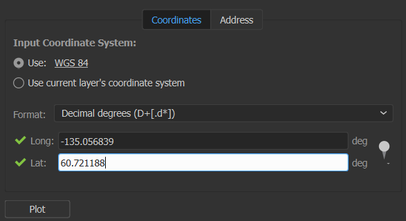
Using a Point’s Coordinates in Decimal Degrees
Another way to plot points is to use coordinates, by selecting the Coordinates tab. There are several different coordinate formats accepted by the MAP Point Plotter tool. We entered simple decimal degrees by selecting Decimal degrees as the format and using these coordinates:
Whitehorse: Long: -135.056839, Lat: 60.721188
Yellowknife: Long: -114.371788, Lat: 62.453972
Iqaluit: Long: -68.519722, Lat: 63.748611
Decimal degrees with a compass direction can be entered similarly to the previous step by using negative or positive numbers to indicate the hemisphere of the point or the compass direction can be indicated by using a letter. The follow cities were added to the map in this manner:
Toronto: 43.6532° N, 79.3832° W → Long: -79.3832, Lat: 43.6532
Québec: 46.8139° N, 71.2080° W → Long: -71.2080, Lat: 46.8139
St. John’s: 47.5615° N, 52.7126° W → Long: 52.7126W, Lat: 47.5615N
Using a Point’s Coordinates in Degrees Minutes Seconds
Coordinates that are formatted as Degrees Minutes Seconds, can be added using various delimiters, such as spaces, dashes, underscores, colons, or d (degree), single quote (minute), double quote (second). We entered the last 3 provincial capital cities using these formats:
Points can also be plotted from previously created MAP Locations (to learn about this tool, visit the MAP Locations page in our Support Centre). This is how we plotted a MAP Location for Ottawa on our map. In the MAP Point Plotter tool window, we selected the hamburger menu and selected Plot MAP Locations. Then we selected our MAP Location for Ottawa and set the Destination Layer to Existing… and added it to the Capitals MAP Point Layer. After clicking OK the point was added to our map!
Finally, we used other MAPublisher finishing tools to stylize and complete our map so it would be ready to post on this blog just in time for Canada Day!
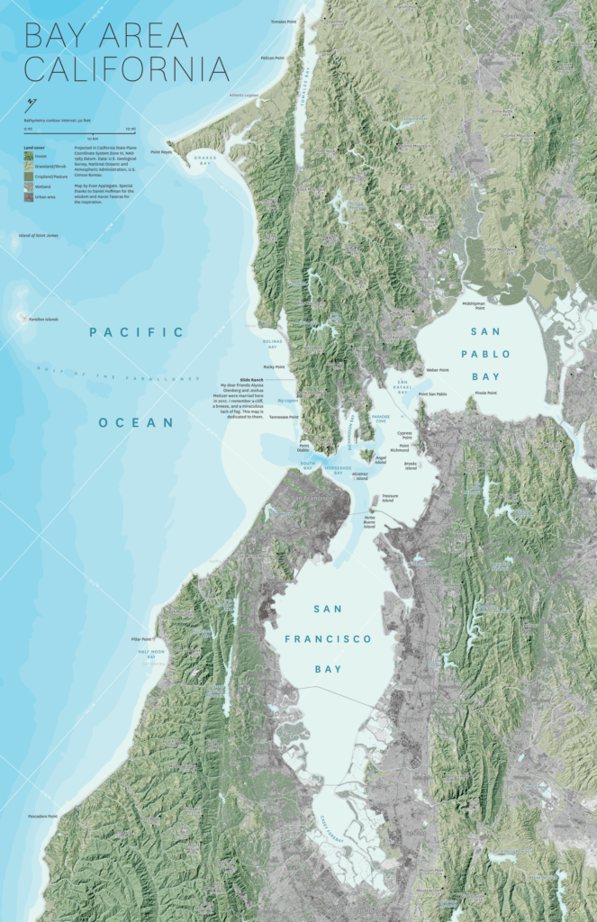
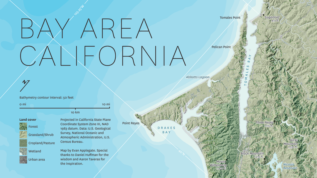
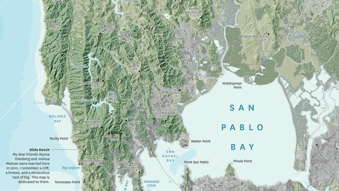
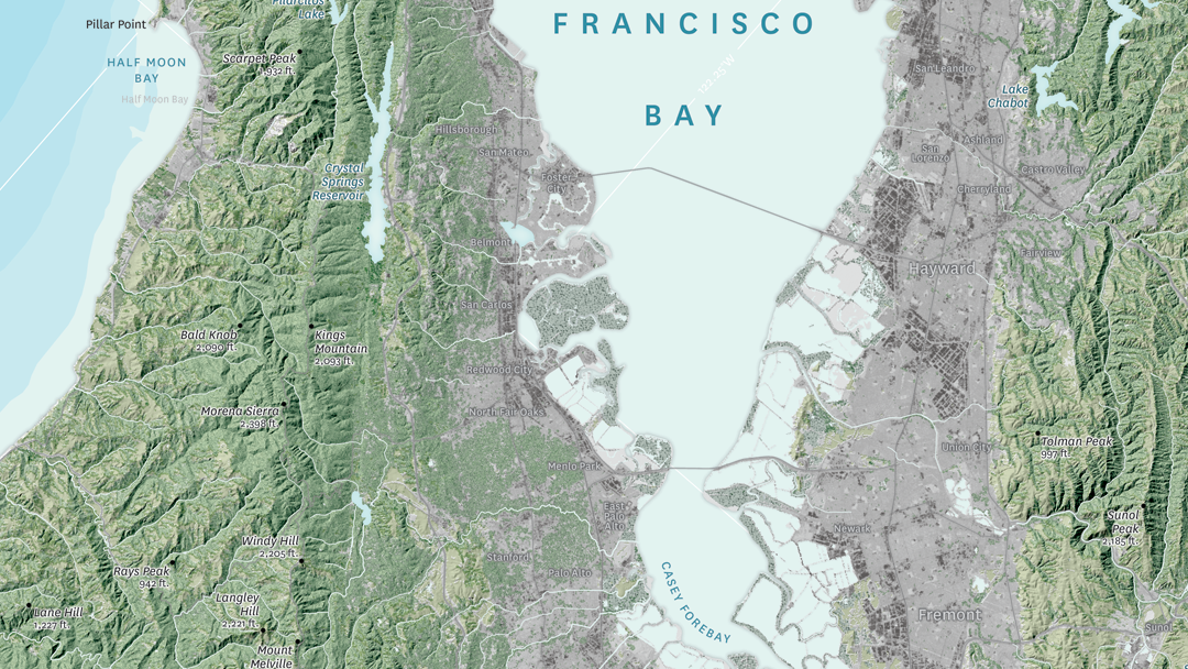
In this month’s Map Gallery Spotlight, we are showcasing an honourable mention of the 2021 Avenza Map Competition. This relief and land cover map of the San Francisco Bay Area was created by Evan Applegate of The Map Consultancy. The map shows the lakes, rivers, forests, grasslands, croplands, wetlands, and urban areas of the Bay Area. Applegate created the map as a dedication for two of his friends who were married on a beautiful cliffside north of the city. The North Bay Area is known for being the least urbanized part of the Bay Area, and housing the Napa and Sonoma wine regions.
The map highlights various natural features throughout the San Francisco Bay Area, such as elevation peaks, water features, and some landmarks. It also includes 50-meter bathymetry contours. The shaded relief details the varying elevation of the region, colour-coded to display the borders between forests, grassland, farmland, and urban land. The location of Applegate’s friends’ wedding, Slide Ranch, is identified on the map.
Select the images below to see a detailed look at Evan’s map
Making the Map
Applegate pre-processed his data in QGIS, GDAL, and Adobe Photoshop, and then used the Avenza MAPublisher plugin for Adobe Illustrator to composite it all together. This is made easy by the way MAPublisher retains the georeferencing of the data imported from other GIS software. Data that does not have any georeferencing when it is imported, can also easily be georeferenced using MAPublisher’s Georeferencer tool.
The finishing touches were also added to the map using MAPublisher. The Label Features tool was heavily used in the placement of labels, saving Applegate several hours of manual labeling. Using this tool, label settings can be applied and multiple layers of data can be labeled at once if desired. Finally, labels are added to the map under one Text layer, to ensure organization.
Stylistic elements of the map were touched up using native Adobe Illustrator tools, MAP Layout tools, and a graticule was added.
Check out our other Map Gallery Spotlight blogs here!
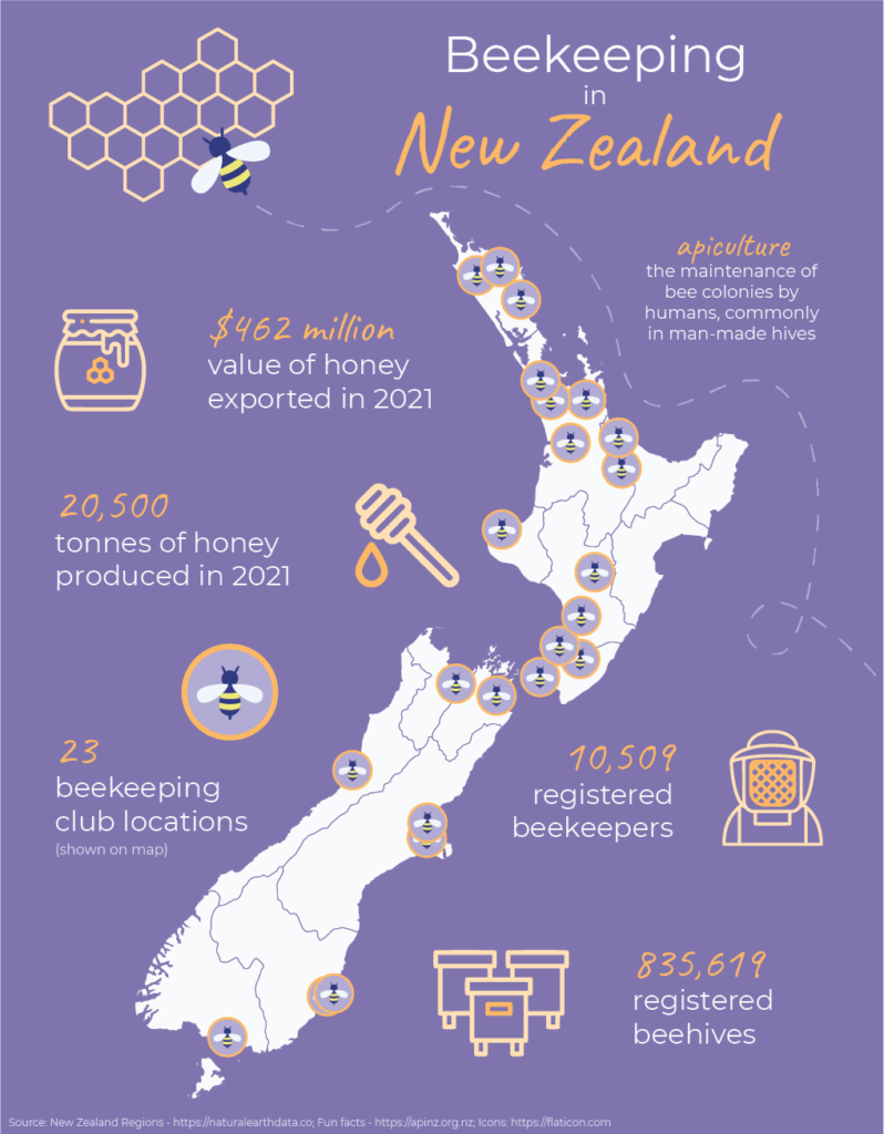
Today is May 20th, which means that it is World Bee Day! This year we will be celebrating with an infographic map detailing the prevalence of beekeeping in the nation of New Zealand. The map has been compiled and designed using the Avenza MAPublisher extension for Adobe Illustrator.
What is Beekeeping?
Beekeeping, also known as apiculture, is the maintenance of bee colonies by humans, commonly in man-made hives. Beekeeping results in the creation of many products in our lives such as beeswax, royal jelly, and many different types of honey.
Why do we celebrate World Bee Day?
World Bee Day was first celebrated in 2018, after being proposed by Slovenia to the United Nations in prior years. May 20th is the birthdate of the pioneer of beekeeping Anton Janša, who was born in Carniola in 1734, which was a region that falls within present-day Slovenia.
The purpose of World Bee Day is to celebrate the importance of bees and other pollinators to many aspects of the world’s ecosystems and economies. They are responsible for the pollination of many crops, with nearly ⅓ of every spoonful of food we eat depending upon pollinators. This makes bees a very important part of the agricultural industries, and therefore the economies of many countries.
With many pesticides and other chemicals negatively contributing to the health of the world bee populations, it is crucial to raise awareness and promote care when creating agricultural and other environmental policies and processes.
Beekeeping in New Zealand
New Zealand is one of the top 20 countries ranked by total number of beehives, with over 835,000 registered beehives. The organization Apiculture New Zealand, or ApiNZ, was created in 2016 to support, advocate for and benefit the apiculture industry of the country. Membership is voluntary and consists of about 2500 beekeepers.
New Zealand produces many different types of honey, including population variations such as mānuka honey. The story map we have created using MAPublisher locates the 23 known beekeeping clubs across New Zealand, as well as highlights some interesting facts about beekeeping in the island nation. All in all, beekeeping is an important part of the New Zealand economy and agriculture industry.
Fun Facts About Bees
Here are a couple fun facts you might not know about bees and how important it is to continue protecting them:
Did you know that nearly 90% of wild plants and 75% of leading global crops depend on pollination from bees and other pollinators? It’s true! Crops that are dependent on pollination are five times more valuable than those that are not.
If you find a bee that appears to be struggling, you can gently place it on a bee-friendly flower. If there are none around, you can provide it with energy by giving it a couple drops of a 1:1 solution of white sugar and water.
India is the country with the most registered beehives, with over 12.2 million beehives as of 2020!
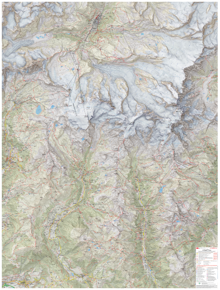
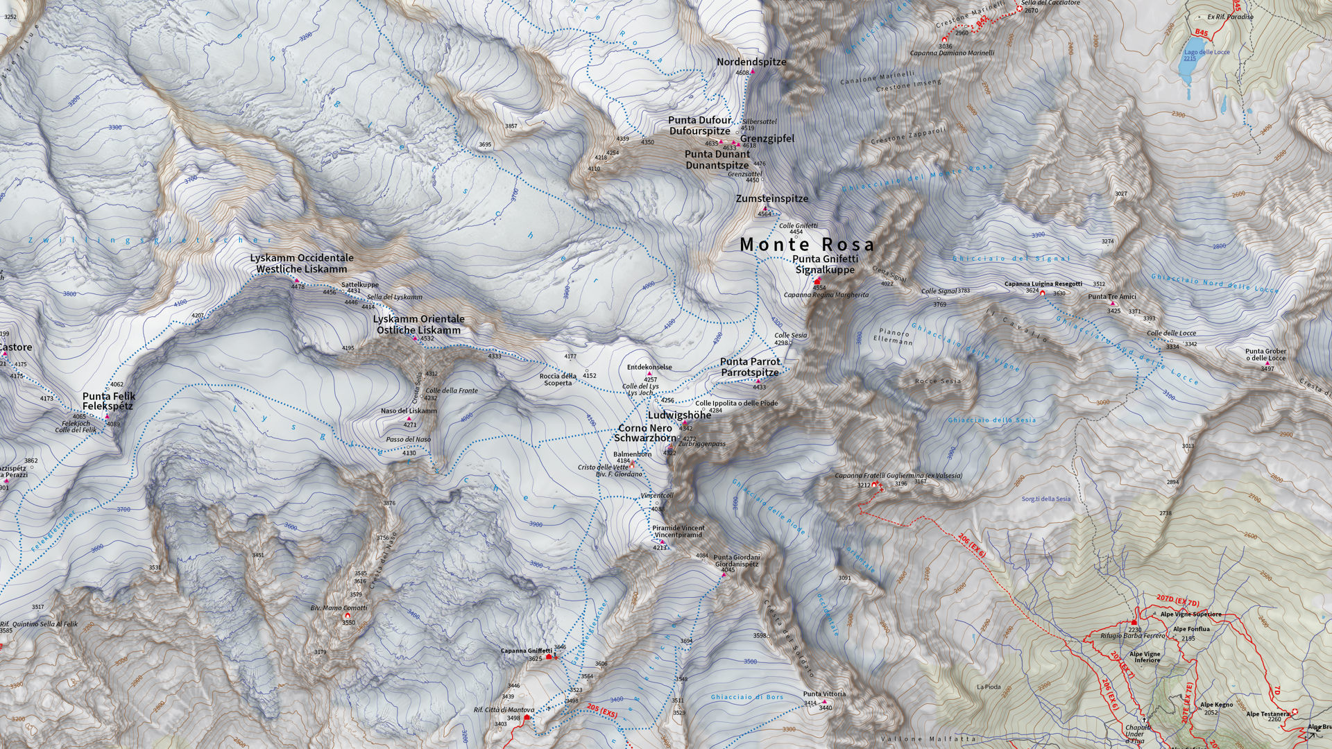
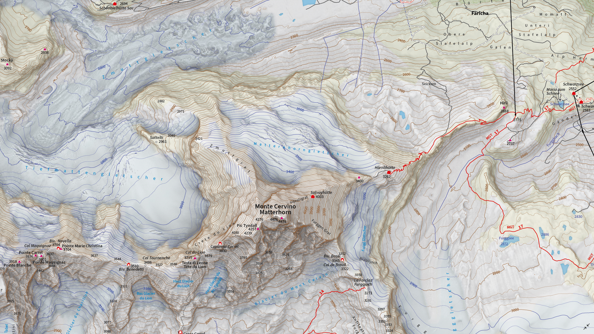
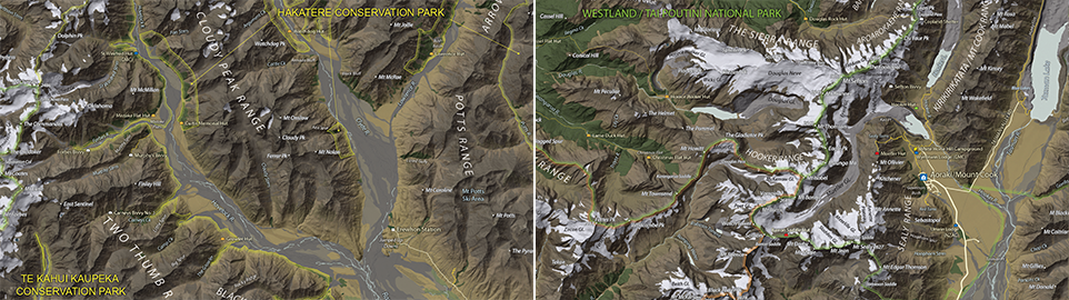
We are showcasing the Runner-Up of the 2021 Avenza Map Competition. This impressive topographic reference map of the Monte Rosa area was a collaborative effort between Remo Nardini, Founder and Chief Technical Officer, and the whole 4LAND team. The map is centered on two of the most renowned mountains of the Alps: Monte Rosa and Monte Cervino (commonly referred to as the Matterhorn). The map encompasses a massive and diverse area. From the glaciers and valleys crossed by the Alta Via n.1 highway in the Aosta valley to the panoramic snow-capped peaks that the Alps are known for. The high valleys of the Monte Rosa area emanate a particular charm, with its woods and pastures making it stand out among other areas in the Aosta Valley.
Remo and his team manually collected trail information and point-of-interest data directly in the field with the Avenza Maps App and combined this with carefully crafted shaded relief techniques to bring the mountainous terrain of this rugged area to life. The map itself is designed for print at 1:25000 scale and is meant to offer a high-quality, waterproof, and tearproof map for use on the trails. The map provides an abundance of useful information for hiking, camping, mountain biking, and a host of other summer and winter outdoor activities. Smart label placement means this map is not only impressive to look at but highly functional when out on the trails.
Select the images below to see a detailed look at 4LAND’s map
Making the Map
The 4LAND team is known for ground-truthing and manually collecting the data that goes into their map products. Trails, placemarks, and other important data were collected directly on the ground using the Avenza Maps App. Supplementing this with pre-existing and custom-developed cartographic datasets meant the map could provide a substantial amount of valuable information to its users.
Using the Geographic Imager Plugin for Adobe Photoshop, the team could elaborate on a custom elevation product to create the enhanced shaded relief basemap that gives the map its gorgeous look. They then crafted the details of the map in Illustrator using MAPublisher. After importing all map datasets, the team used MAP views to align, scale, and project map data layers onto an Illustrator artboard. The team made use of the Vector Crop and MAP Selection tools to filter and process the data down to their specific area of interest.
The 4LAND team applied a custom stylesheet using MAP Themes to create the beautiful textures and colours that make each part of the map stand out. MAP Themes applies rule-based styles that are based on MAP Attribute data contained in each map data layer. This careful work ensures each region is distinct and eye-catching. Every glacier crevasse and serac is carefully shaded to create depth, and woodlands are textured to reflect the irregular patterns of foliage.
One of the most impressive features of this map is the wonderfully detailed labels. This was achieved using the LabelPro add-on, and enabled Remo and his team to perform rules-based, collision-free label placement using a comprehensive suite of user-defined labelling parameters. With LabelPro, they could specify how each label should be stylized (to give each label type a unique look and feel) and also define how the labeling engine would handle label placement to avoid overlap, crowding, or mislabelling.
Lastly, stylistic elements of the map were touched up using native Illustrator tools, MAP Layout tools, and grids and graticules. The map itself is available in digital form for use with the Avenza Maps app. Visit the Avenza Map Store to see other fantastic maps by 4LAND or check out their website to learn more about their other high-quality mapping products.
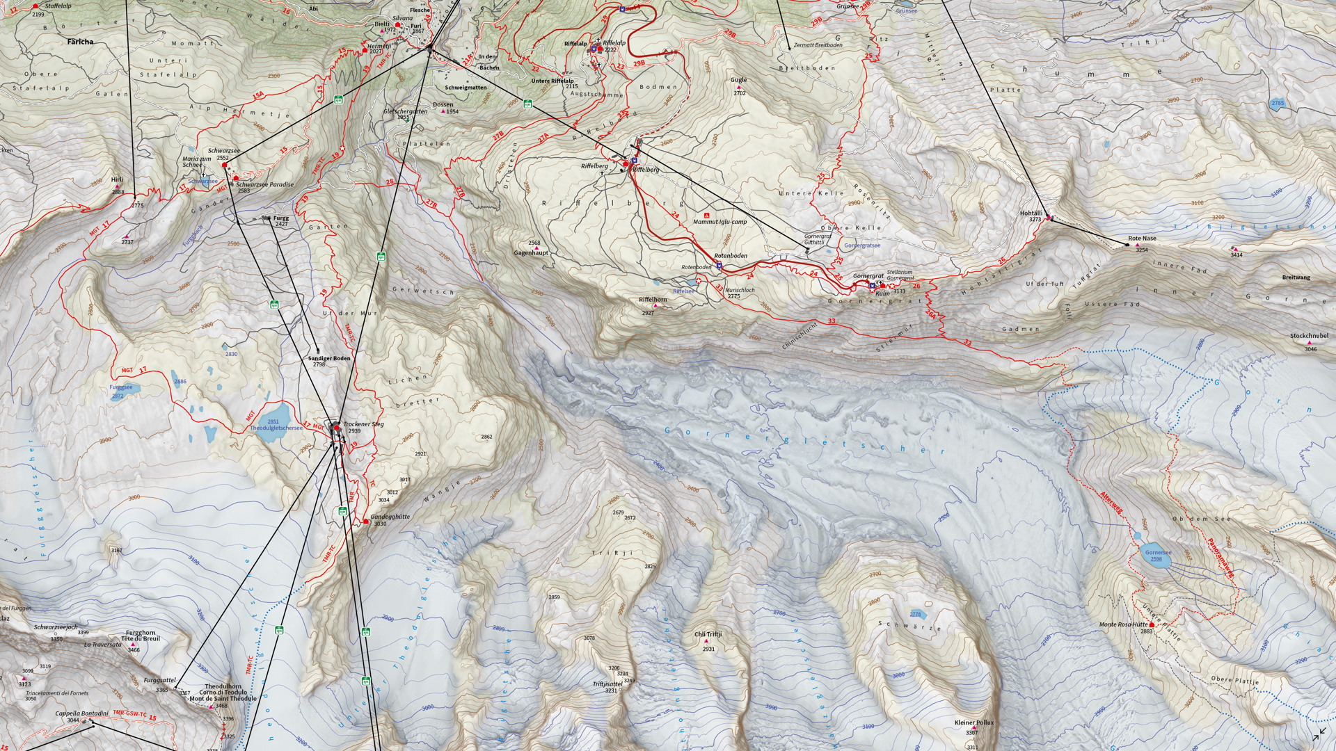
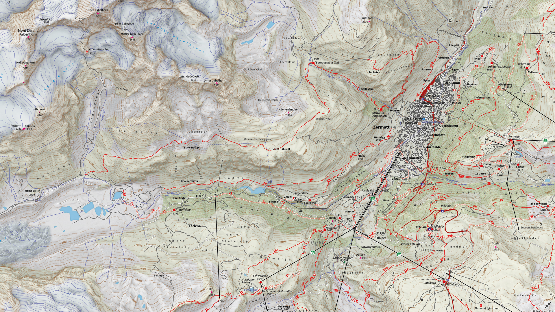
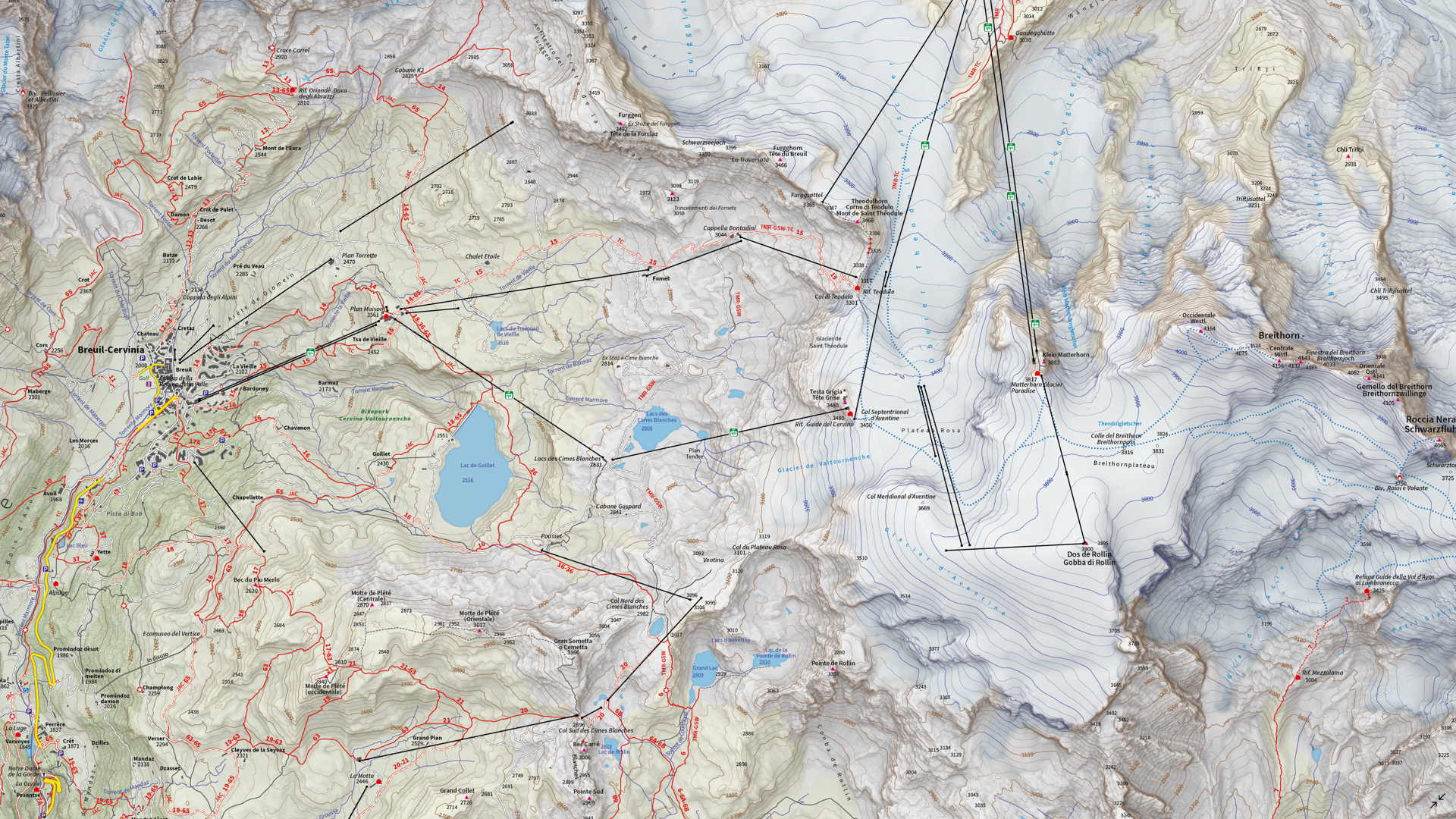
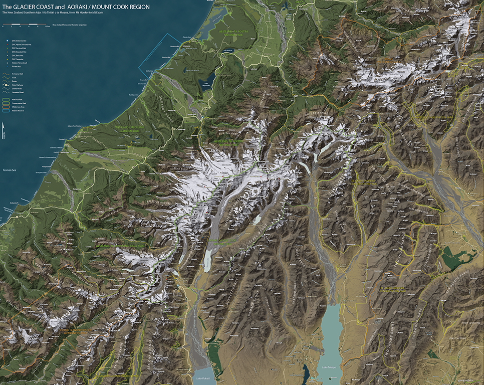
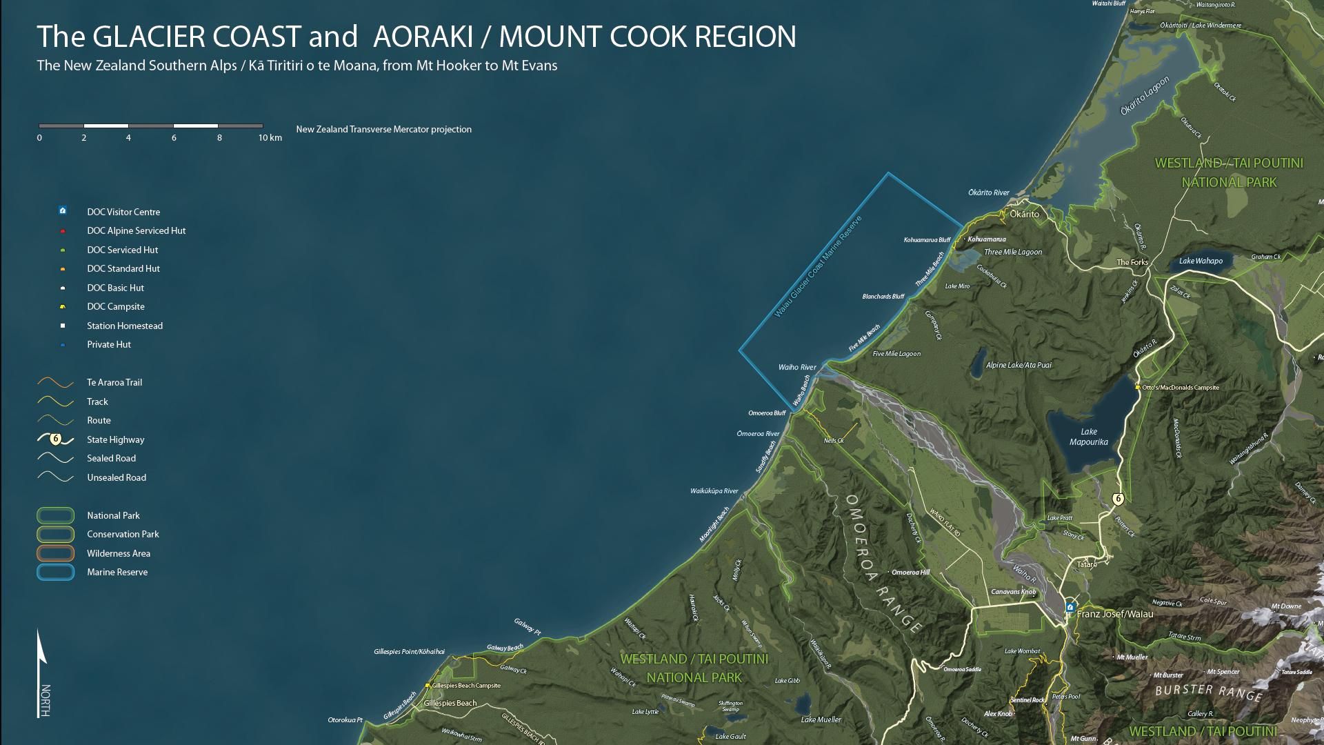
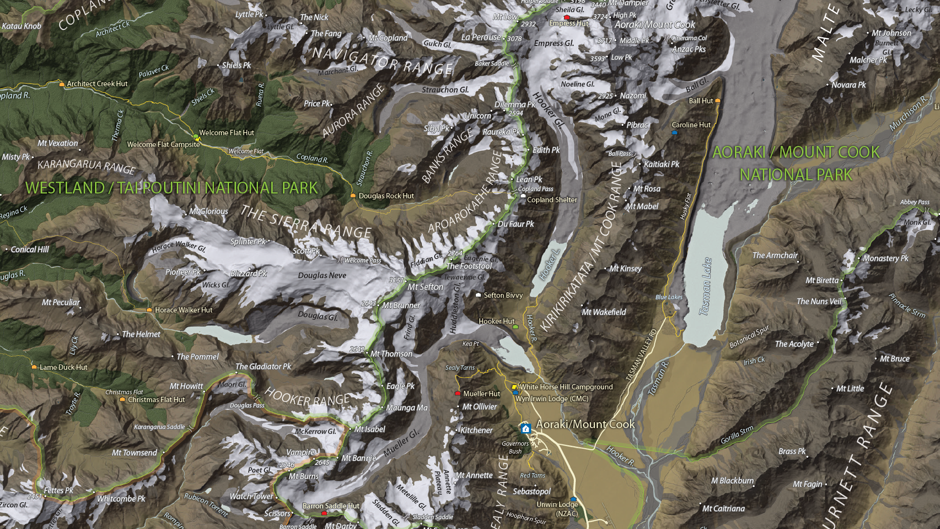
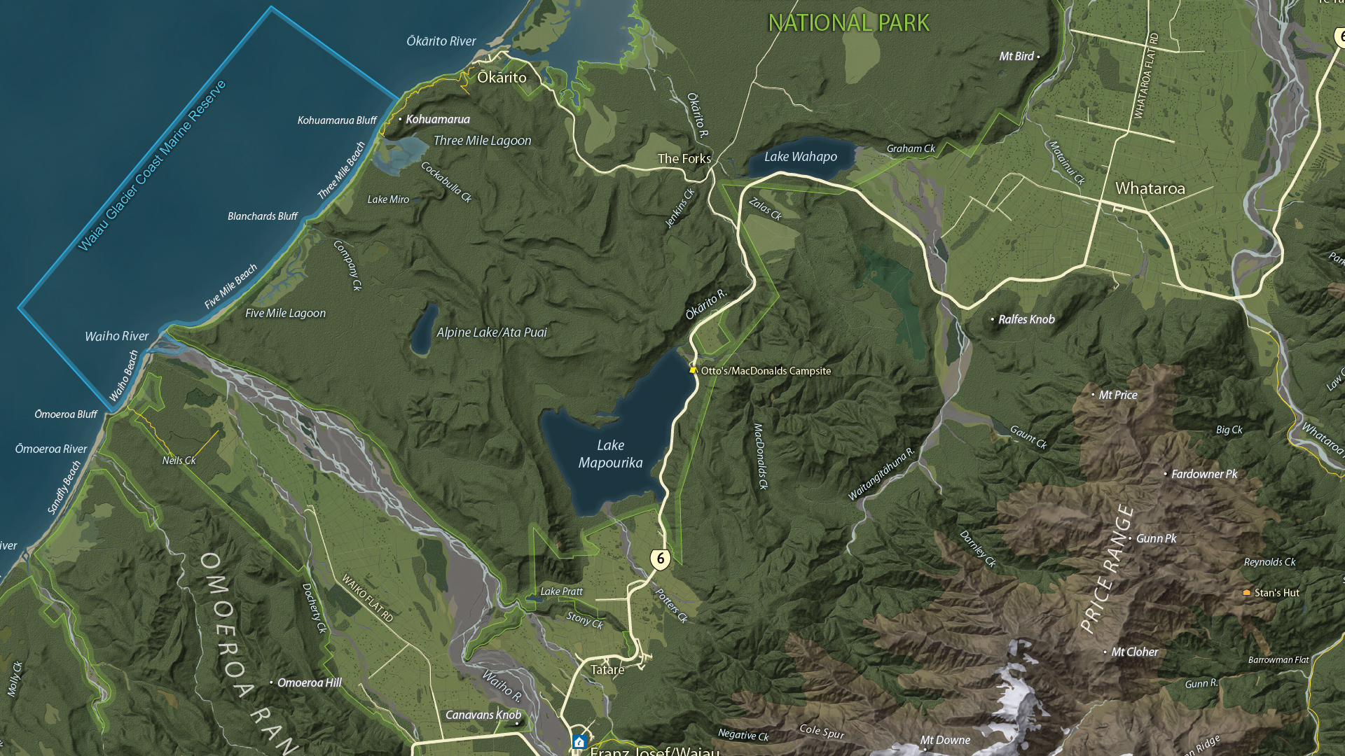
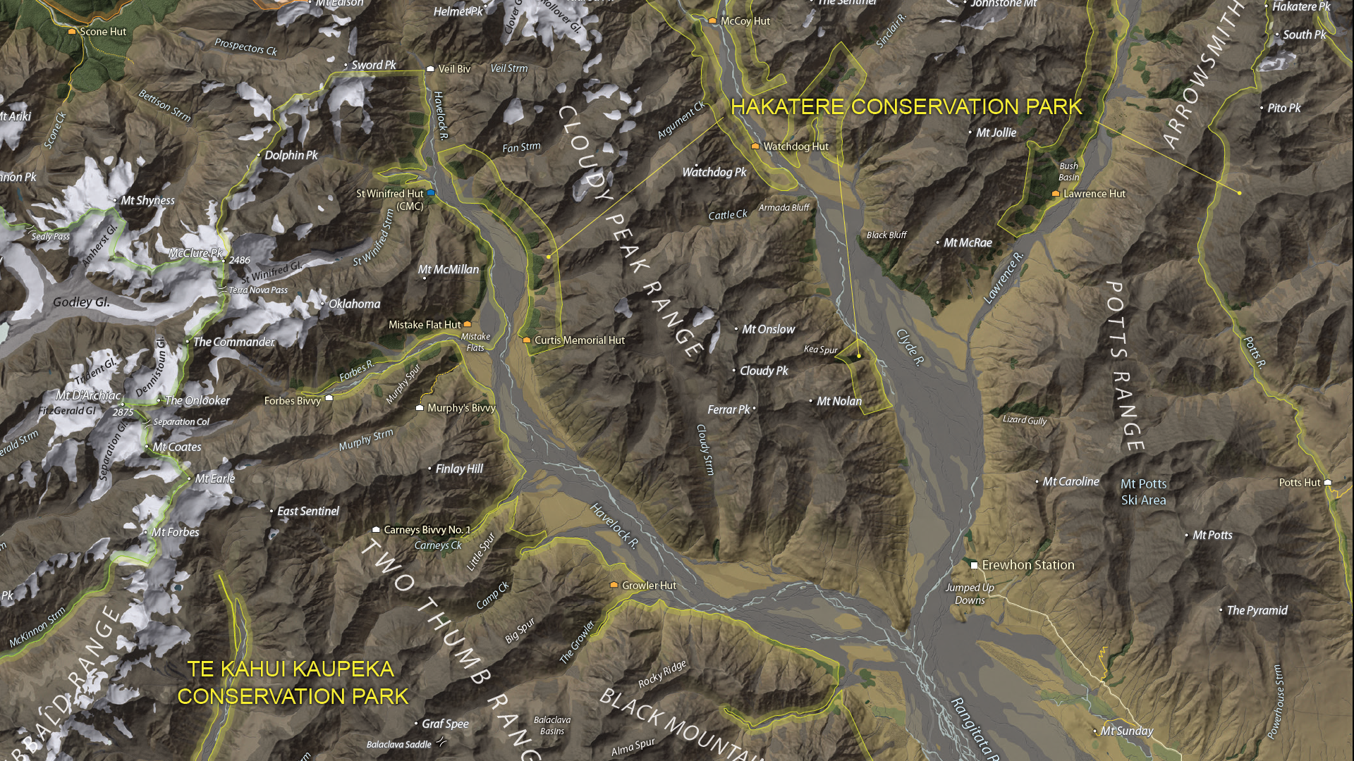
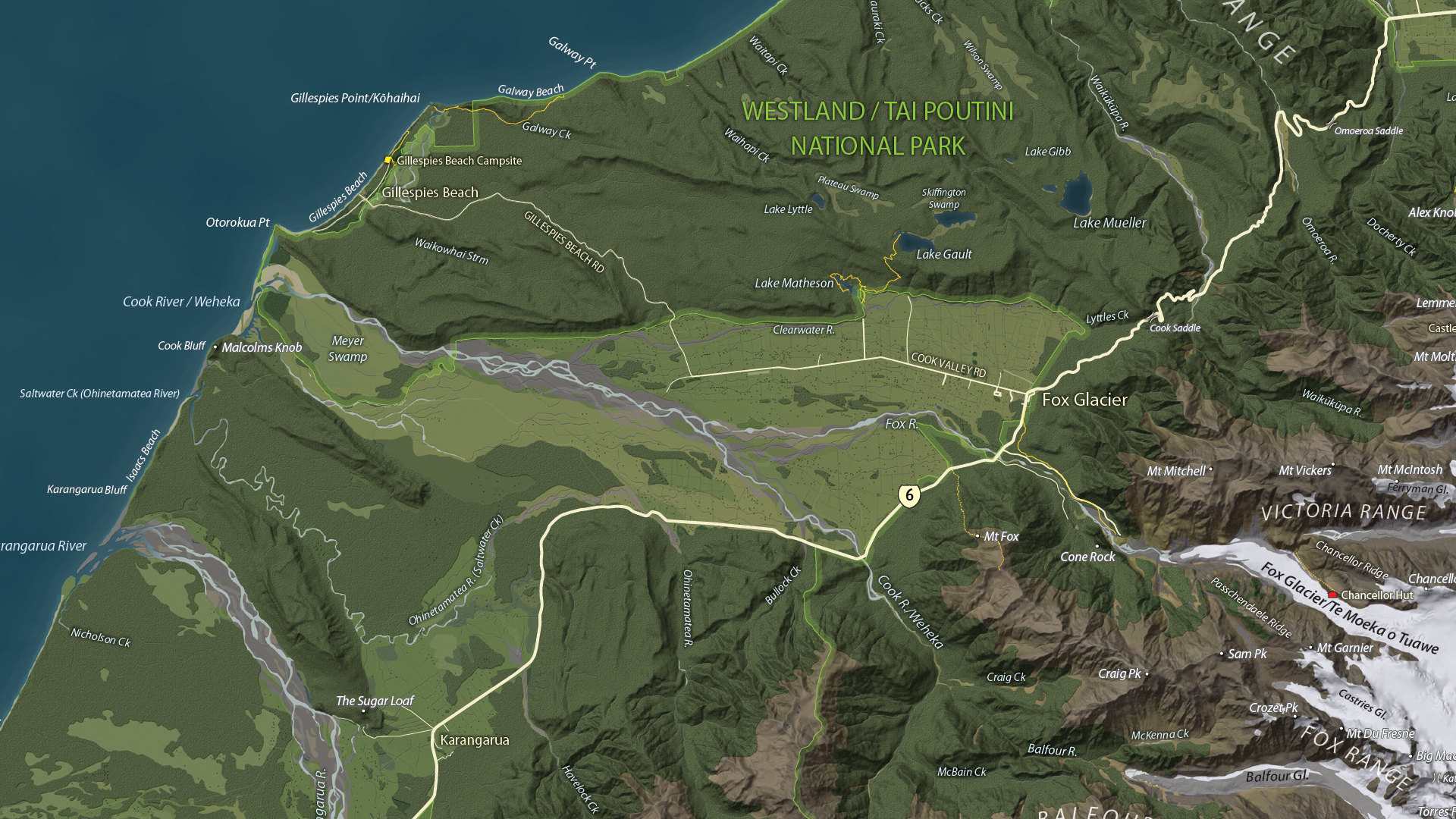
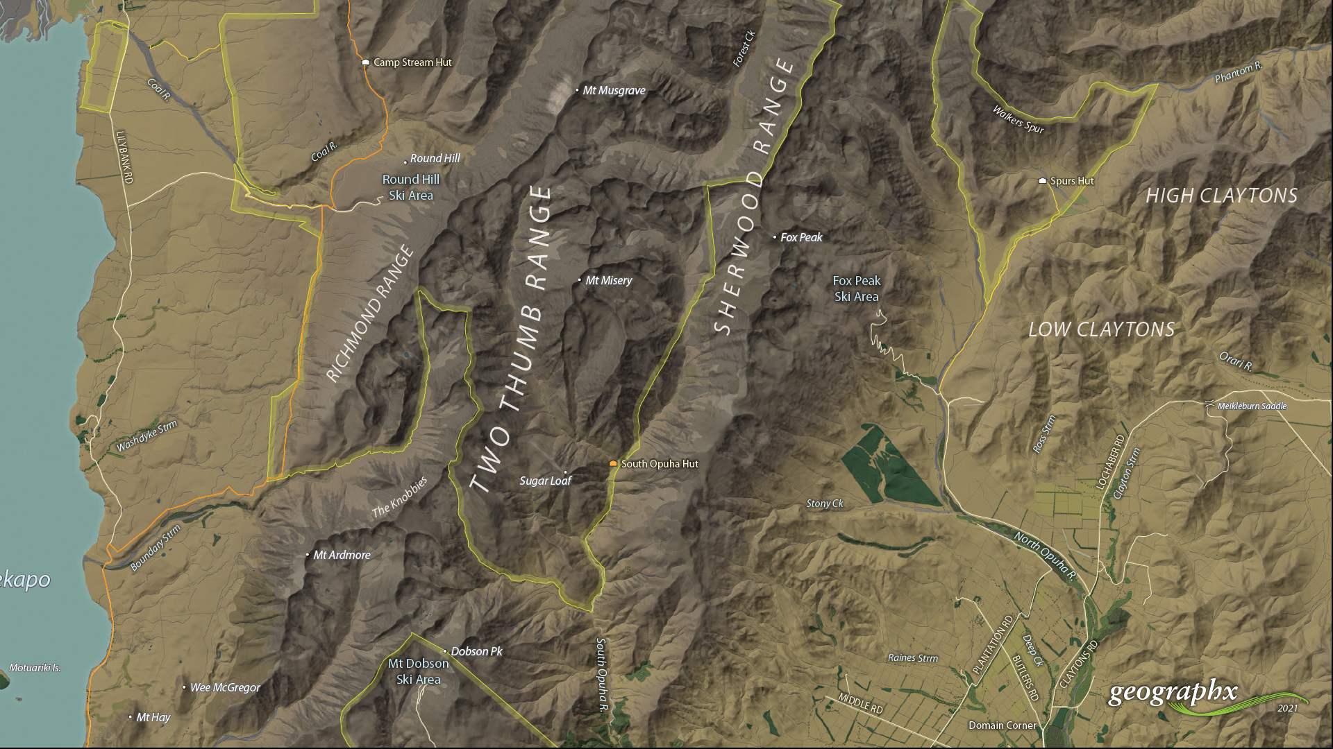
We are showcasing the Open-category winner of the 2021 Avenza Map Competition. This fantastic entry was created by Roger Smith, expert cartographer and owner of Geographx in Wellington, New Zealand. Roger’s grand-prize winning entry is a truly remarkable display of map craftsmanship. The map provides a detailed look at the topography and trail coverage surrounding one of New Zealand’s most beautiful wilderness areas. His expert usage of natural colour basemaps and shaded relief creates a truly stunning result.
This topographic map focuses on the area covered by Westland Tai Poutini National Park, Aoraki/Mount Cook National Park, and the adjacent conservation parks and designated wilderness areas. It presents park boundaries, back-country walking trails, and the many camping shelters that are scattered throughout the area. The map itself is designed for print as a wall map and utilizes a natural colour basemap to create an eye-catching visual guide for the region.
The map can be used to familiarize park visitors with the area and assist recreational visitors with trip-planning in the rugged back-country trails of the area. The natural colour basemap is designed to maximize viewer understanding and appreciation of the physical environment while providing a pleasing backdrop that highlights important points, trails and places on the map.
Select the images below to see a detailed look at Roger’s map
Making the Map
The cartographic design elements and vector art creation utilized a wide range of tools in MAPublisher. Some of the vector data that went into the map were obtained through the New Zealand Department of Conservation, and the Land Information Department, while others were custom-crafted by Roger and his team at Geographx. Notably, the Geographx team custom-built the natural colour basemap and DEM-derived hillshade that gives the map its unique look and feel.
MAPublisher allowed Roger to import his data layers into an Adobe Illustrator environment that was conducive to flexible cartographic design work. Using the MAP Views panel, he could easily adjust and modify the projection and scaling of his map. Where necessary, Roger leveraged the many MAPublisher Geoprocessing and Data Editing tools to manipulate or simplify vector art layers for better representation on the final map.
As MAPublisher maintains spatial referencing for each data layer, he could place and register his custom natural colour, and raster hillshade layers to create his basemap. Fine-tuning would ensure his vector layers (including roads, campsites, trails, and place markers) would all be accurately placed and aligned with their real-world locations.
Roger created unique labels for the hundreds of different placemarks and trail lines on the maps. Using MAP Attribute data that are retained for each data layer, Roger used the Label Features tool to efficiently create and place labels for each layer. With Label Features, Roger could define custom rules that ensure each label stands apart from the other. For important place markers and points of interest, Roger used the Create Halos tool to make certain labels stand out more prominently.
Needless to say, this spectacular piece of work represents the culmination of countless hours of design effort and dedication. Roger has added this map to the impressive collection of cartographic works produced by Geographx. To learn more about other fantastic map products available from Geographx, visit their website.
We’re excited to announce that the 2021 Avenza Map Competition has now concluded. This past year’s competition saw map-makers and cartographers from around the world submit their best and most impressive work. We had some truly impressive displays of cartographic design this year, with competitors demonstrating how they use Avenza mapping software to make eye-catching and impactful cartographic products. After multiple rounds of judging, discussions, and time spent reviewing our scorecards, the Avenza team would like to congratulate this year’s prize winners!
Over the next few weeks, keep an eye out for our Winner’s Spotlight articles. Each article will provide an in-depth look at the winning map entries, with insights from their creators, and an overview of tools and techniques used to develop their prize-winning maps.
The winner’s maps and a selection of honourable mentions will also be showcased in the new Map Gallery, coming soon!
Grand Prize Winner (Open Category)
The Glacier Coast and Aoraki/Mount Cook Region Roger Smith Geographx Wellington, New Zealand
The judges would also like to offer special recognition to a number of other incredible entries. A selection of winners, honourable mentions, and notable map entries will be showcased on the upcoming Map Gallery page.
We are very excited to announce the release of MAPublisher 11, the latest version of our MAPublisher extension for Adobe Illustrator.
With MAPublisher 11, we are bringing forward full compatibility with the Apple Silicon processor, enhancements to the MAP Attributes panel, a revamped welcome screen, the ability to import OpenStreetMap file formats, a brand new set of MAP Erase tools, and several performance and bug fixes.
Here’s what you can expect with the latest MAPublisher 11 release:
Compatibility with the Apple Silicon Processor
We want to ensure our users enjoy a truly seamless experience whether they are using a PC or Mac computer. Our team has worked to ensure that MAPublisher 11 is fully compatible with the Apple Silicon chip, and as such we can declare that MAPublisher is officially supporting this processor.
MAP Attributes Panel Enhancements
An exciting feature for MAPublisher 11 is a number of enhancements made to the MAP Attributes panel. Users are no longer required to select all objects on a layer for them to appear in the MAP Attribute panel. Instead, all features appear by default, and users can toggle between showing all features or just their selected features at the bottom left corner of the panel. When all features are shown, selected features will appear highlighted in the attribute table.
Welcome Screen Revamp
MAPublisher 11 comes with a brand new welcome screen that appears upon opening the program. This window is equipped with visually appealing refreshed graphics, while maintaining access to the License Management window. It also features several new sections that increase discoverability for you, such as new features, help and tutorials, and other Avenza news or events. There is also a Get Inspired section to help inspire you as a mapmaker, which features articles from our website which highlight the excellent maps and stories of some of our most proficient users.
Importing OpenStreetMap File Formats
We are thrilled to announce that importing OpenStreetMap (OSM) file formats is now a possibility with MAPublisher 11! Whether you are importing a single file, or using the Multiple Data Import tool you can now select OSM and PBF file formats from the list of supported formats. The rest of the import process remains unchanged from the other file formats users are familiar working with in MAPublisher.
MAP Erase Tools
Many of our users have requested the ability to quickly erase unwanted or sensitive data from their maps. Thus, we are happy to introduce the new MAP Vector Erase and MAP Erase by Shape tools that come along with MAPublisher 11!
MAP Vector Erase Tool
With the new release of MAPublisher 11 comes a new tool known as the MAP Vector Erase tool. Functioning as an inverse version of the MAP Vector Crop tool, the Erase tool removes all data within a specified rectangle or ellipse shape.
MAP Erase by Shape Tool
The new MAP Erase by Shape tool functions similarly to the MAP Vector Erase tool, but it allows users to easily erase portions of MAP Layers using shapes other than rectangles and ellipses. Users can simply select the shape object they wish to use as the erase boundaries, and then select the MAP Erase by Shape tool from the MAP Toolbar.
Both tools share the same customizable settings and advanced options. Like the MAP Crop tools, the MAP Erase tools can be applied to all layers within the document, all layers within a single MAP View, or just a single layer.
If you would like to learn more about the new MAPublisher 11 features or have any questions, please check out our Support Centre.
MAPublisher 11 is immediately available today, free of charge to all current MAPublisher users with active maintenance subscriptions and as an upgrade for non-maintenance users.
When it comes to map-making for beginners, one of the most challenging aspects is finding the right data in the first place. You start out with this fantastic idea for mapping the annual airplay frequency of Mariah Carey on traditional radio… only to find the data behind a paywall. What’s with that?
Turns out, it’s very common. Data is commonly referred to as the most valuable resource on the planet for a reason. Companies make a lot of money by collecting data and selling it or selling indirect access to it. So, before you get too excited about an idea, take a step back and think about the data.
Where to Find Data
There are a lot of reasons why paying for data may not be an option for you and we’re not here to judge, so moving along.
When you’re not able to pay for data, you’ll need to be less choosy about what you’re creating. This type of data hunting is a more broad search, find some data, then let it speak to you! You may need to be a bit more creative, but free data is out there and if you’re willing to dig you can still create wonderful maps with it!
Think Where
The first thing to consider with how to find data is where in the world are you looking for it. Developed countries often give public access to census data or other government-funded research. This can often be the most reliable data as well. Something to consider when thinking about the data you’re looking for.
Think How Big
The size of your project scope can also have a big impact on where you try and find data. If you’re looking for data only on one country, that will be a lot easier to find (in general) than the same data for every country in the world.
You can often find high-level data (think population) at a national global level, but if you go more granular (think language spoken) it could get more difficult to find. There also would be a lot more variables if you chose language spoken globally, this could affect how you ultimately portray the data.
Think When
Another consideration is from which point in time you want to collect data. Depending on when in history you’re looking, it can be either very difficult or very easy to find data. Keep in mind that this changes when you look at different countries around the world.
In general, anything in the 1900s forward in developed countries should have some data. But depending on when specifically and what you’re looking for there could be a lot of range.
This ultimately goes back to the point made above about letting the data guide you. You may not be able to create the exact map you thought you were going to create when you started thinking about the project. Often you’ll find you come up with something even better!
Helpful Links
Still don’t know where to start? Try some of these helpful links for easily accessible data!
Wherever you find it, Use Avenza Systems to Create It!
Whatever Adobe environment you prefer to work in, Avenza has a solution for you!
Avenza MAPublisher is cartography software that seamlessly integrates more than fifty GIS mapping tools into Adobe Illustrator to help you create beautiful maps. Whereas Avenza Geographic Imager mapping software enhances Adobe Photoshop to make working with spatial imagery quick and efficient.
In this edition of Cartographer Chronicles, we welcome Gene Thorp. Gene is a renowned, award-winning cartographer who has become a staple of the map-making community. Gene displays an expertise in map design honed through nearly 30 years of experience. Gene skillfully applies his craft by using maps to tell fascinating stories and communicate important information about history, geopolitics, and the world around us. In this issue of Cartographer Chronicles, Gene is telling his own story, sharing with us how he came into map-making as a career and his interesting journey through the world of cartography.
***
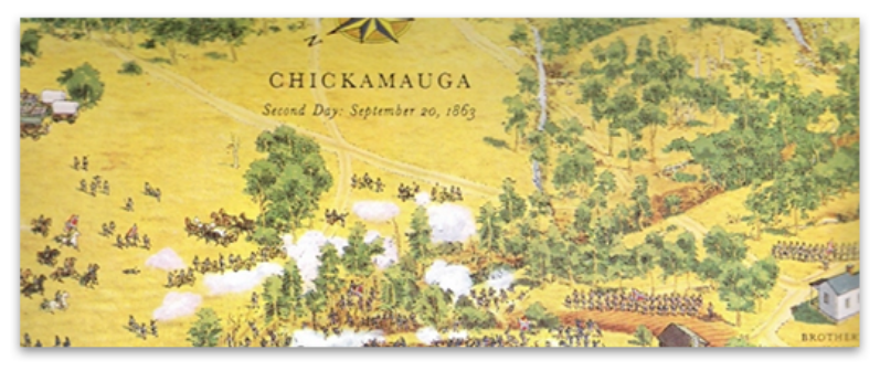
The cartography bug bit me when I was very young, before I could even read. I know this because I was captivated by artist David Greenspan’s illustrated maps, dozens of which I found in my grandfather’s American Heritage Pictorial History of the Civil War. Each map contained hundreds of little hand-drawn soldiers fighting across all types of terrain. I spent hours studying every little detail and harassing my poor older brothers to read what the cryptic numbered captions said. When I got older, I realized many of those battlefields were only a day’s drive from where I lived, so I persuaded my parents to visit one on a family trip. Greenspan’s illustrations were so effective that I was able to easily visualize what had happened there. It was almost like I had already visited the battlefield before. I was hooked on maps, but at that young age, I never dreamed I would have a career-making them.
Fast forward fifteen years, and I was early into college pursuing a history degree at the University of Maryland Baltimore County (UMBC). I had to pay for my school so I worked part-time at a Hechinger hardware store. One of my coworkers there knew I had an interest in maps and told me UMBC had one of the best cartography programs in the country and suggested that I check it out. I took Cartography 101 the next semester and realized this was the career path for me. Under the mentorship of Professors Joe School and Tom Rabenhorst I was part of the last class that was taught photometric techniques using scribe coat and linotype, and the first class to design and produce maps solely using computers. In a school internship program, I was lucky to be chosen as the project editor on what was likely the first-ever digitally produced U.S. atlas for a company called Military Living.
Three years later with a degree in geography, a degree in history, and a much-valued certificate in cartography, I teamed up with a friend from school and we ventured out into the real world to try our hands at commercial mapping. Sadly, our timing was off. Our business was launched immediately after the breakup of the Soviet Union. The once robust defense industry suddenly downsized and the country entered a recession. Our cartography business was essentially shuttered after only one year. Good cartography positions were hard to come by, so I expanded my horizons and jumped into graphic design which at that time had many more job openings.
Starting from the bottom, over the next eight years I worked at prominent graphic design firms in the Washington, D.C. area designing and producing magazines, logos, brochures, websites, and illustrations. It turned out to be a great experience where I learned page layout, cover design, image manipulation, illustration, and other publication techniques from some extremely capable artists and designers. They taught me the importance of typography and that good design did more than make a layout look attractive, more importantly, it effectively communicated information. These were lessons I took with me for the rest of my career.
During that time, I never abandoned cartography. I picked up small mapping freelance projects wherever I could find them hoping maybe one day I could get back into the field full-time. My big break came in 2000 when I was brought onto The Washington Post staff as a cartographer by the talented Art Director Michael Keegan and the extremely gifted Chief Cartographer Richard Furno, a former National Geographic cartographer who was a principal designer of the iconic 1969 moon map. He also developed a custom CAD-based mapping application called Azimuth, which, in conjunction with Macromedia Freehand, Adobe Photoshop, and ArcInfo, were the primary programs we initially used to create maps for the newspaper. Geographic points, lines, polygons, and raster data were brought into Azimuth or ArcInfo to be projected then exported. Raster data was further manipulated in Photoshop. Everything was then imported into Freehand where the map was designed, styled, and labeled. Each type of feature like roads, rivers, and urban areas had been color-coded in Azimuth or ArcInfo so they could be easily selected, stylized, and labeled in Freehand.
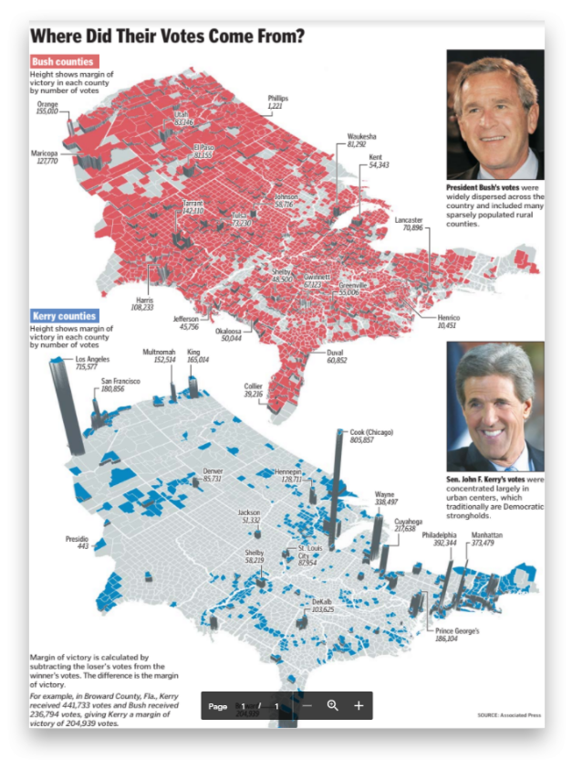
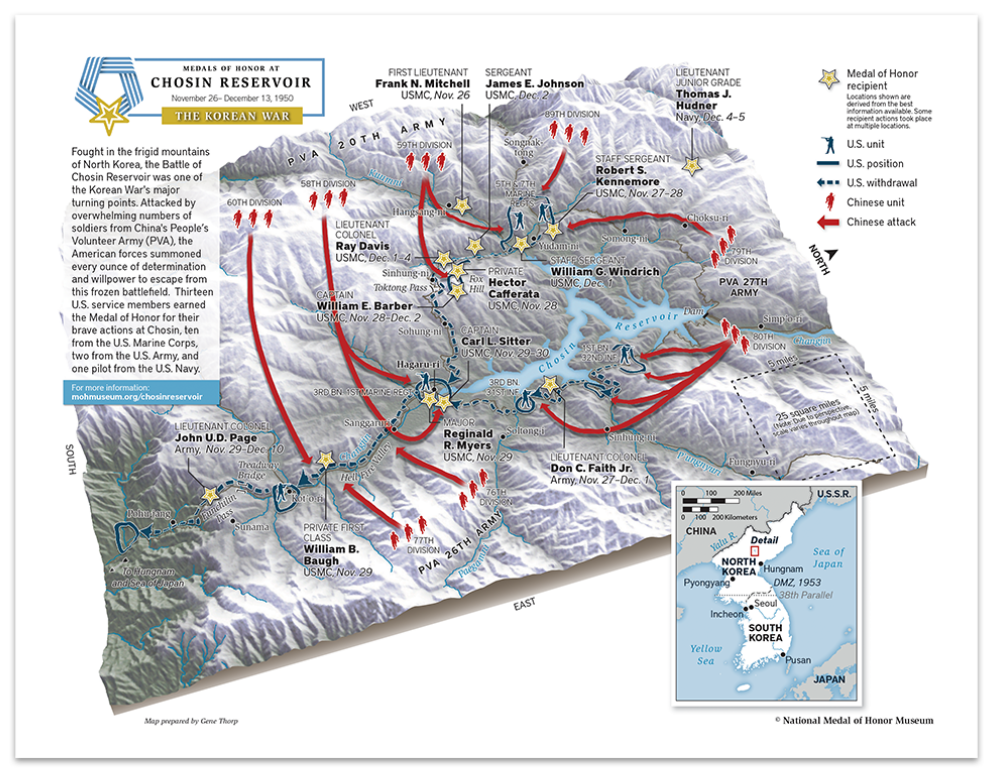
Over the next 15 years, I created thousands of maps, from simple locators to full double-truck spreads on every topic imaginable. One of the map projects I was most proud of was the Presidential election result maps published the day after the election which displayed each candidate’s margin of victory by county.
The maps were designed in perspective to clearly emphasize how much weight small and densely populated counties contributed to the overall election result. Another favorite was the Obama Inauguration map showing attendees the parade route, jumbotrons, vendors, first aid stations, and the all-important locations of portable restrooms! It was fun to walk through the crowd and see so many people using it.
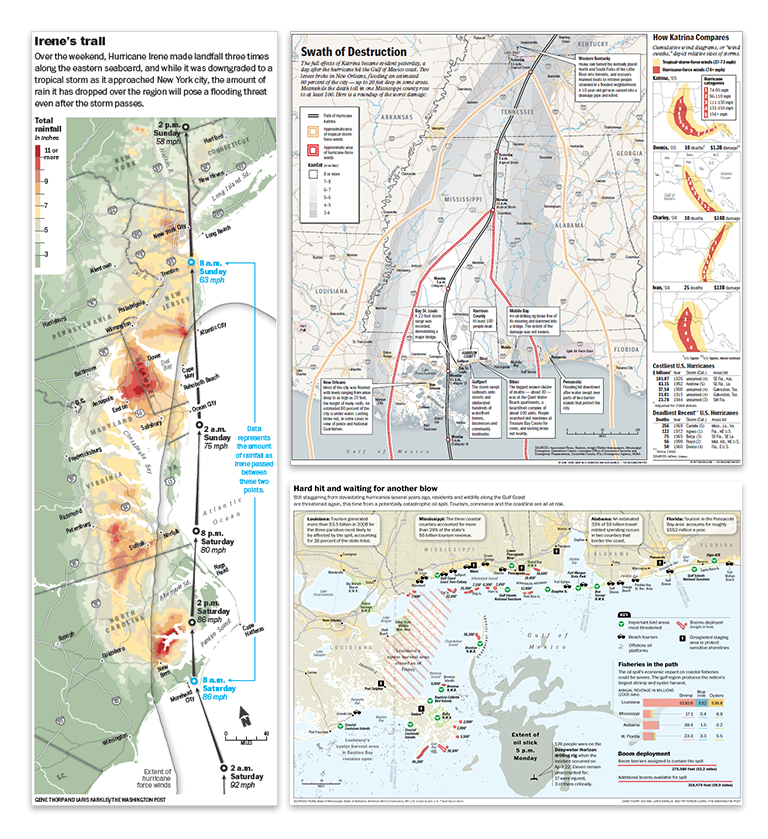
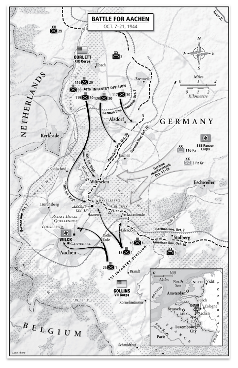
Environmental disasters such as hurricanes, earthquakes, and oil spills were all too common topics to be mapped. When one occurred, all other projects were immediately sidelined to provide weeks-long detailed cartographic coverage. This included hurricanes Katrina, Rita, and Irene, earthquakes like those in Indonesia, Japan, or Haiti, and man-made disasters like the Deepwater Horizon oil spill whose massive oil slick spread for weeks across the Gulf of Mexico.
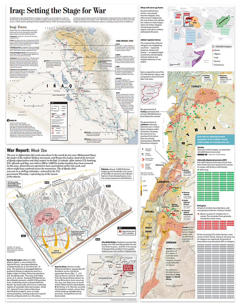
With September 11th happening less than one year after I was hired, covering terrorism and military actions across the globe was another major part of my duties at the newspaper. I made what seems like countless static and interactive maps of the hunt for Osama Bin Laden, the invasions of Afghanistan and Iraq, the rise of ISIS, the civil war in Syria, and the Russia-Ukraine conflict.
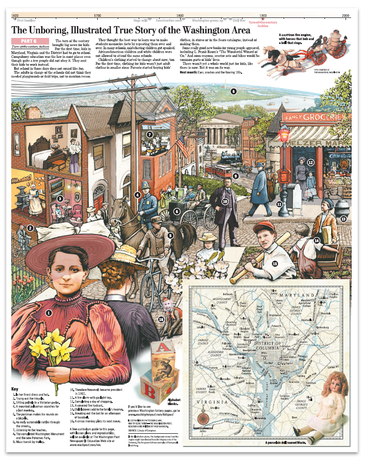
But mapping at the Post wasn’t always serious. I was able to fit in extra time to support travel stories, illustrate a few Kid’s Post graphics, and contribute research and cartography to a 10 part illustrated series on the history of Washington, D.C. (which won gold at the international Malofiej awards).
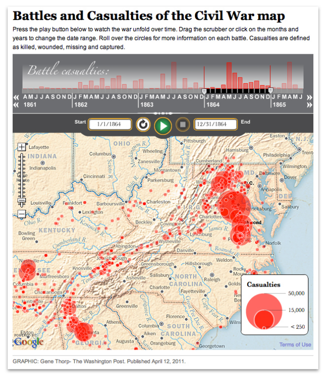
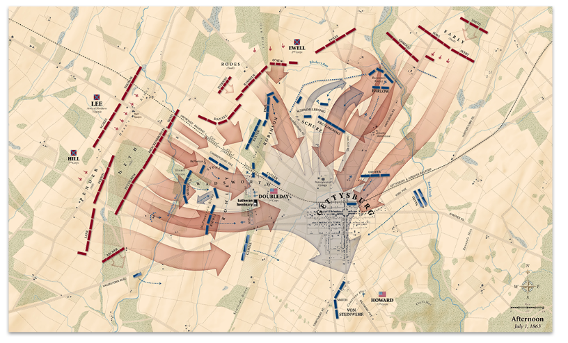
Among my favorite responsibilities was a five-year project of timelines, articles, and interactive maps to commemorate the sesquicentennial of the American Civil War.
All the while, I created custom maps on the side for numerous bestselling books like those in Rick Atkinson’s World War Two Liberation Trilogy series (which won a Pulitzer Prize) and oversize maps for exhibitions at museums like the Smithsonian Institution, the Museum of the Bible, and The Seminary Museum in Gettysburg and many others.
After working 15 years in the news industry, I accepted a job in the federal government as a senior cartographer at the U.S. Department of State, where for the last six years have I operated under the direction of Lee Schwartz in the Office of the Geographer and Global Issues (GGI), within the Bureau of Intelligence and Research (INR).
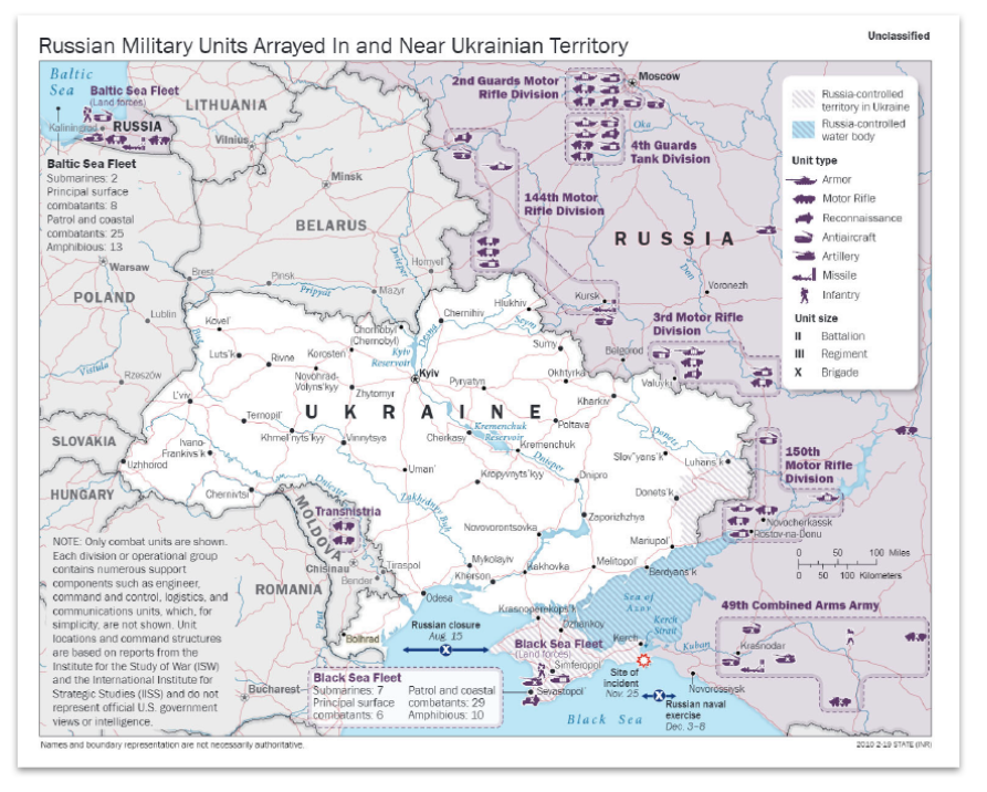
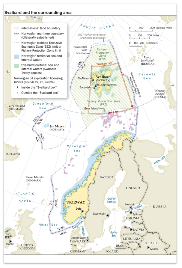
In this capacity, I work with an extremely knowledgeable group of geographers, scientists, and other subject-matter experts to support the full spectrum of the Department’s foreign policy missions. Working closely with my fellow cartographers in the Geographic Information Unit (GIU) and Humanitarian Information Unit (HIU), we produce hundreds of maps each year that help visualize and explain a wide range of topics and issues; such as the Department’s efforts to defeat international terrorist groups; illustrate the maritime claims of countries in places like the South China Sea, the eastern Mediterranean, and the Arctic; map the government’s policy on disputed international boundaries along the China-India border, and highlight the buildup of Russian forces near Ukraine.
I also work on the international boundary and sovereignty team that regularly advises policymakers on the geography and history of territorial disputes and produces the publicly available Large-Scale International Boundaries (LSIB) dataset, a set of digital lines used by cartographers and other geospatial professionals as the source for the world’s international boundaries reflecting the foreign policy of the United States.
I have been very lucky to rub elbows with some of the most amazing cartographers, designers, illustrators, writers, analysts, policymakers, editors, developers, photographers, and programmers of our time. The work has been fast-paced and challenging, but also extremely rewarding. It’s incredible to see how much technology has altered the landscape over the last 30 years. In the old days, I traced government base maps with a scribe tool and used peel coat, or digitized data on the “high-speed” 8MB RAM and 100MB hard drive computers. When I started at The Washington Post the mapping process was all digital, but the data we used was mostly what we created ourselves. When shapefiles or spreadsheets were available, we used Azimuth or other products to select and organize what we needed, before projecting and exporting the data. But when the files were imported into Adobe Illustrator for design and labeling (Illustrator replaced Freehand in 2005), the data lost all its attributes. Mapping expanded rapidly into 3D and I utilized programs such as Bryce 3D and Google Earth to create a vast assortment of perspective maps on tight deadlines.
Cartography also increasingly became accessible on the internet. At first, I made static locator maps and created custom map tiles for interactive traffic applications, but soon advanced to writing the actual applications, one of which was a multipurpose timeline that interfaced with Google maps that could play data ranges overtime on top of zoomable custom tilesets.
Midway through my career at the newspaper, Richard Furno retired, and by 2011 all support for Azimuth ended. I needed an affordable replacement mapping application that could custom project data and still interface with Illustrator. This is when I discovered MAPublisher. I had known about it for many years and had heard good things about it from colleagues, but up to that time Azimuth had always worked for my purposes. When I finally dug into MAPublisher’s capabilities I was instantly impressed. Not only could MAPublisher import and project a large array of data types, it maintained the data georeferencing and attributes within Illustrator, all the while allowing me to still perform analysis on it. I could now add or remove attribute fields, make calculations, join spreadsheets, create proportional circles and custom style points, lines, and polygons, all based on the data attributes. Making last-minute map scale changes was also much easier because labels maintained their size and association with their associated features whenever the map was enlarged or reduced. Creating custom data became easier too. I could register a base map or satellite image on existing data, trace the information I needed, then move it to a MAPublisher layer where it instantly became georeferenced. I could add and fill out custom attribute fields, then export the entire layer of new information to virtually any geospatial format for use in all the mainstream GIS applications. Another useful feature was that I could import only a small section of a large dataset. Had I started using MAPublisher earlier I could very easily be able to pull data from my older projects into the new ones. MAPublisher continues to be my core mapping application.
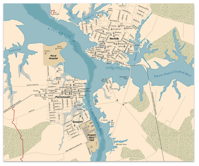
Returning to my roots in history, I’ve recently been using MAPublisher to create a detailed and accurate database of the mid-Atlantic region as it would have appeared during the American Civil War, 1861–1865. First I have stripped away modern features like roads, reservoirs, and manmade shorelines, and, using a variety of historical maps, restored historical features such as long since disappeared roads, rivers, shorelines, fords, railroads, bridges, and towns. An accurate base of geospatial data allows for the correct placement of the plethora of temporal data available from primary sources such as troop movements, refugee movements, weather events, and personal experiences that are tied to a specific historical location. All of this information is either used directly in MAPublisher to create maps, or exported and used in any application that can read geospatial information. I may never be able to mimic the historical map illustrations of David Greenspan that engrossed me as a child so long ago, but perhaps I’ll be able to recreate the world of that time in such a way that will captivate and educate generations of history buffs for years to come.
For those entering or considering the field of cartography and GIS, the future seems brighter and broader than ever before. My experience has been that most people find custom maps greatly enhance their products. The internet is increasingly awash with new data that individuals, companies, non-profits, and governments need to process and visualize to be understood. Even if cartography is not your primary role, adding attractive, accurate, and informative maps can be greatly beneficial to communicating the message of whatever organization you are working for. Good luck mapping!
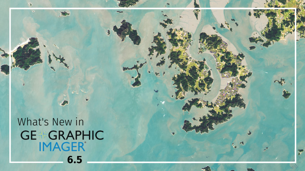
We are very excited to announce the release of Geographic Imager 6.5, our latest version of the Geographic Imager extension for Adobe Photoshop.
With Geographic Imager 6.5, we are bringing forward full compatibility with Adobe Photoshop 2022 (23.0.x), Windows 11 and macOS12, support for vector GeoPackages, improvements to the Terrain Shader tool, and several bug fixes.
Here’s what you can expect with the latest Geographic Imager 6.5 release:
Compatibility with Adobe Photoshop 2022 (23.0.x), Windows 11, and macOS 12
We want Geographic Imager users to experience truly seamless integration with the Adobe Photoshop workspace. We are pleased to announce that Geographic Imager 6.5 is now fully compatible with Adobe Photoshop 2022 (23.0.x).
Geographic Imager 6.5 is also fully compatible with the newly released Windows 11, as well as macOS 12 Monterey.
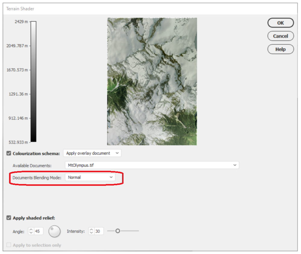
Terrain Shader Improvements
The Terrain Shader tool allows users to create dramatic shaded relief visualizations with elevation data. Combining hillshaded elevation datasets with imagery overlays can create striking topographic representations. With this latest release of Geographic Imager, we are improving the Terrain shader tool to include a document blending mode option. When the “Apply Overlay Image” option is now selected as a colourization schema, users can select from a range of native Photoshop blending modes that improve how imagery layers are overlayed with elevation data.
Import and Export Vector GeoPackages
Several users have requested the ability to import and export vector GeoPackage data. We are happy to announce the full support of vector GeoPackages is now offered with Geographic Imager 6.5. Vector GeoPackages are based on SQLite databases and offer an open-source, compact, lightweight, and flexible data format for easy and efficient storage or geoprocessing of spatial data.
Geographic Imager 6.5 is immediately available today, free of charge to all current Geographic Imager users with active maintenance subscriptions and as an upgrade for non-maintenance users.