Kim Beckmann is a storyteller above all else. As a graphic designer and Associate Professor of Design & Visual Communication at the University of Wisconsin-Milwaukee (UWM), Beckmann
uses visual media to do just that. More recently, she dipped her toes into the world of cartography (another story-telling medium) then fell right into the deep waters.
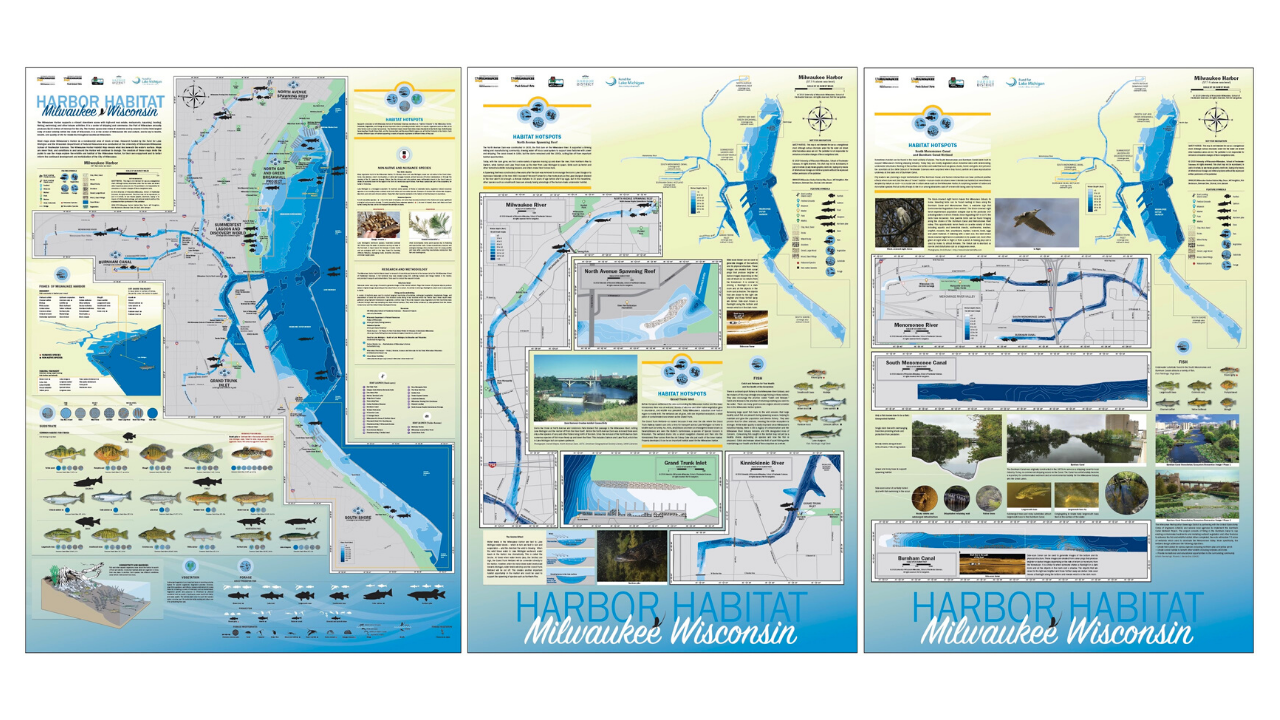
It all started when researchers from the university’s School of Freshwater Science came to her for help with creating supporting materials for a research project. The team’s ambitious project set out to map several miles of the Milwaukee harbor coastline, studying the effects of urban development on the harbor habitats. The research team had already created highly detailed technical maps but reached out to the Peck School of the Arts for a faculty member who could help put together the material in a way that could be more easily digested by the public and told the a story about the impact of people on the habitats that exist in the harbor.
“I also represent a part of the general public who would be interacting with the maps; individuals that want the maps to tell them a story. I recall at the first team meeting where we discussed research findings and what to present on the maps, I had many questions. What type of fish live in the harbor and rivers? What do they eat? Where do they live? Does water temperature effect where and when we might find them? Interestingly, the questions I raised led to incorporating additional habitat information into the maps,” said Beckmann. “What started as a concept for a single map quickly evolved to a set of five maps due to the amount to information we needed to share, the largest being 3 ft by 4 ft!”
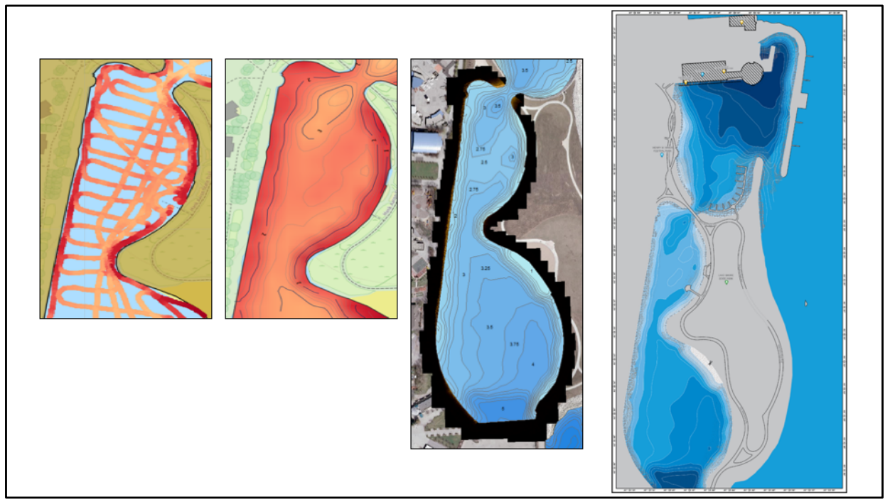
As a graphic designer, Beckmann had made maps before, including simple, vector-based topographic maps, and maps for wayfinding. But this was her first time working on a larger map project and her first time working with raw geospatial data to create bathymetric maps to illustrate water depth. “I am extremely comfortable with Adobe Illustrator so when I discovered that there was a cartography plug-in for it, called MAPublisher, that could be used to manage GIS data to create maps, I knew that it would be faster and easier than learning an independent cartography software tool.”
The School of Freshwater Science research team carried out data collection for the project using side-scan sonar devices. With technical support from the Avenza Systems team, Beckmann was able to get the data into a shapefile format and import it into Adobe Illustrator using MAPublisher. “I registered for a training course offered by Avenza Systems, on how to use MAPublisher with Illustrator,” said Beckmann. “That led to a meeting with Jeff who was able to provide helpful direction on how to transform the raw map data into the maps I wanted to make.”
Jeff Cable is the Desktop Product QA Lead at Avenza Systems. In addition to his work with the MAPublisher development team, he is also responsible for providing training to new MAPublisher users. “I met Kim in 2016 at one of our in-class training sessions in Chicago,” said Cable. “She had a very clear vision of what she wanted to create, but after some more discussion and reviewing the data, I realized that it would require advanced GIS workflows in order to get the data to an appropriate level before it was ready for mapping.” Seeing the value in the research project, he offered to assist Kim rather than have her seek out a GIS professional on her own. Once the data was prepared, she took what she learned from the MAPublisher training course and was able to apply visualization techniques to her maps. Cable corresponded several times as the project progressed and provided guidance. “Kim would ask if MAPublisher could do this or that, and in most cases, my answer was You bet it can!” he added. In addition to providing tips and best practices, he showed her many of the useful tools in MAPublisher that made her workflow more streamlined such as copying MAP Objects, working with MAP Stylesheets, and creating insets. “When I saw the finished product, I was blown away by what Kim had created. It was also gratifying as a training instructor to see how far she had come since our first meeting.”
Beckmann has since spoken about her work on the Milwaukee Harbor habitat maps project to the American Geographical Society, cartography clubs, and presented an artist talk as part of the Peck School of the Arts Artist Now! Lecture Series. The series of five maps have been printed on canvas and distributed to local and regional schools and turned into metal signage to be installed along the shores of the harbor to help share important research conducted by Janssen Labs with the public.
The first of five maps installed at Harbor View Plaza Park.
Two of the maps installed in the active learning classroom as Discovery World.
Disovery World is located in Milwaukee, Wisconsin.
Beckmann’s maps also currently hang in the Avenza Systems offices and we are proud to have them as a reminder of the amazing things visual artists and cartographers can do with the tools we provide.
This is one feature we have all been waiting for. Spatial Join is a very useful tool to be included in the MAPublisher roster as of version 10.6 and I would like to share a little bit about the tool with you in this feature blog.
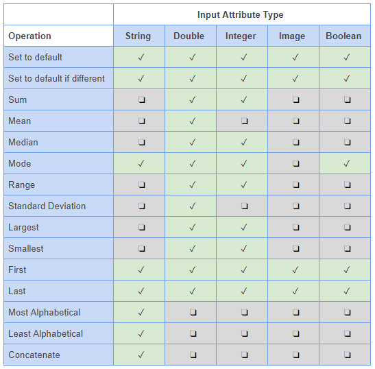
The Spatial Join tool inserts the columns and attributes from one feature table to another based on location or proximity. Currently, we support several Spatial Join types including:
Intersects: If any part of two features touch at any location
Identical To: Both features match identically
Contains: When one feature intersects with the interior or boundary of another
Near: If a line can be drawn from any part of A to any part of B that is less than the specified minimum distance
Closest: If a line can be drawn from any part of A to any part of B that is less than any other such line between B & any other feature
Has Centre In: When one features centroid lies Within another feature
Within: If all of one feature lies within the interior boundary of another
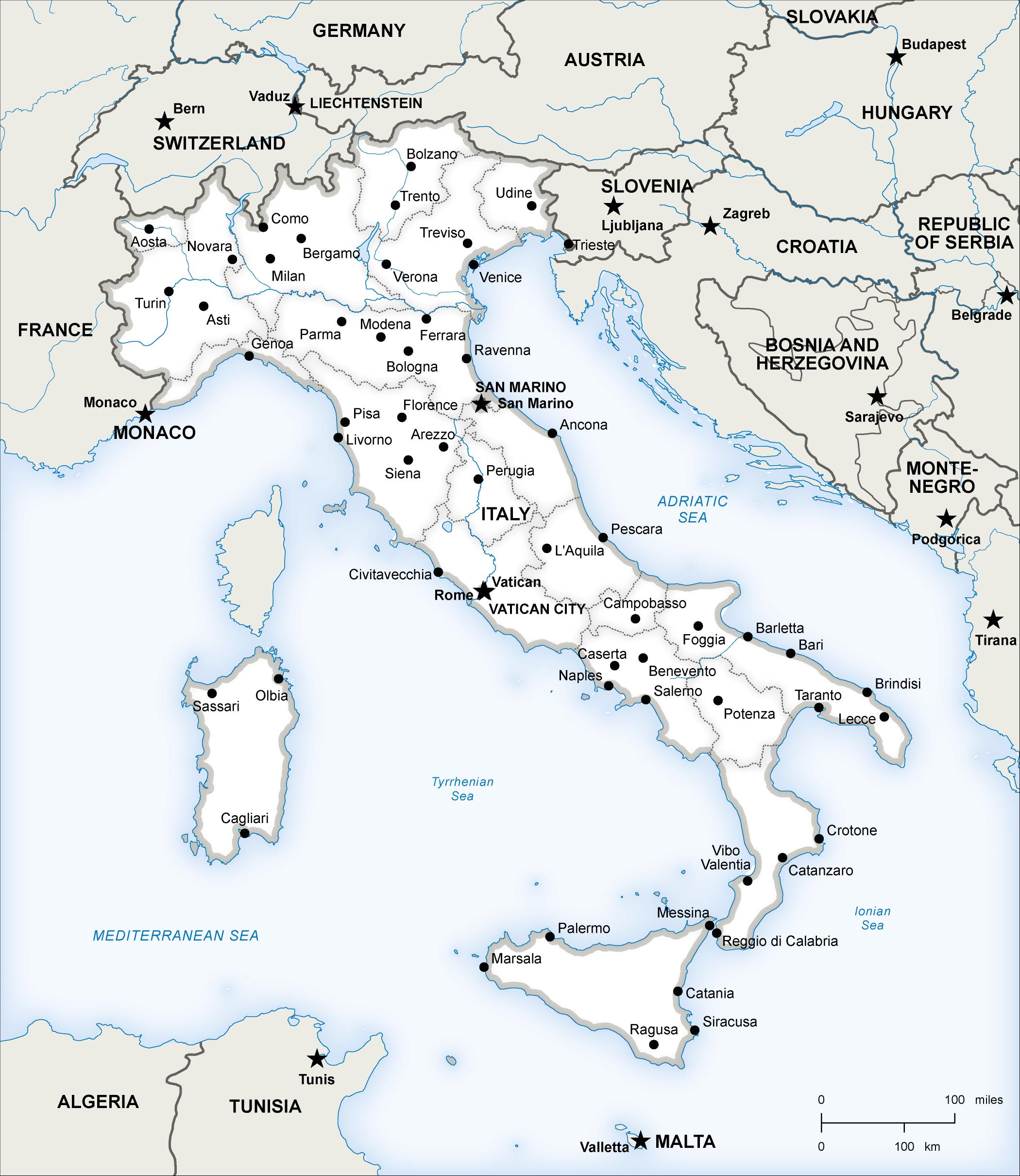
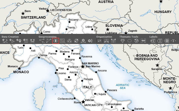
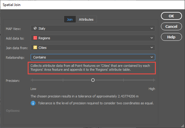
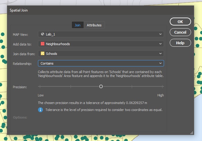
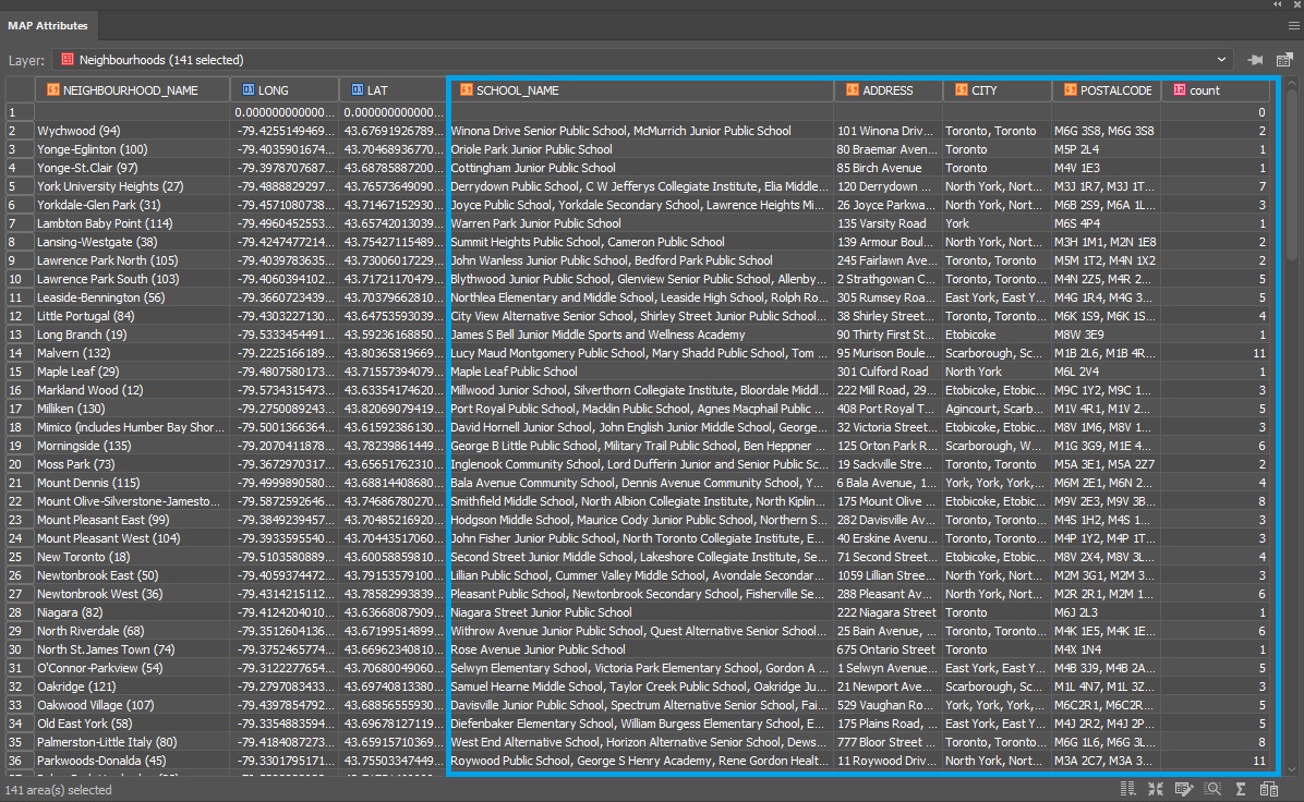
Here is a wonderful map of Italy created by Hans van der Maarel of Red Geographics available through the One Stop Map service. It will provide a great way to show you some examples of the Spatial Join tool in action. It contains a Cities layer and a Regions layer and I would like to see which cities fall into each region by using Spatial Join.
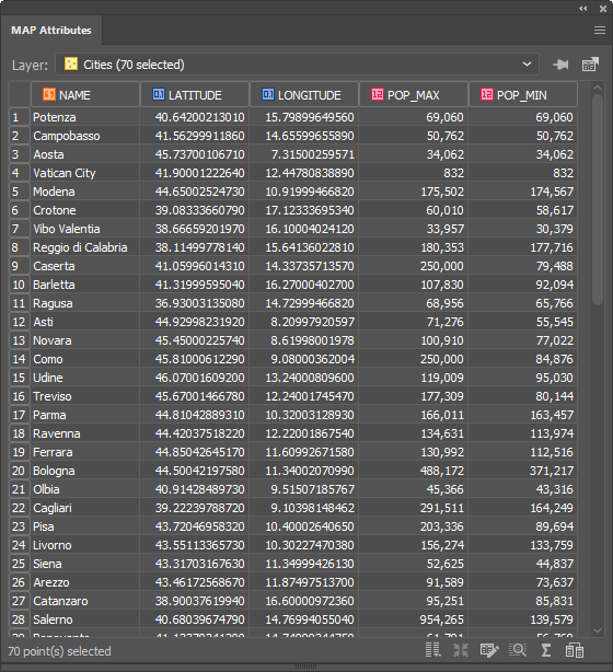
You can see below that the Cities attribute table contains the name of each city and there are 70 in total.
There are 20 different regions that these cities lie within. To figure out which cities belong to which region, we have the ability to spatially join attribute information from the Cities point layer to the Regions area layer. In addition, we’ll use the Concatenate operation on the NAME attribute to list all the cities that belong to a region in one field.
To do this, click the new Spatial Join button on the MAPublisher toolbar or access the Spatial Join dialog box via Object > MAPublisher > Spatial Join.
The Spatial Join tool will always open on the Join tab seen below. I will be adding data to my Regions area layer and joining data from my Cities point layer. The relationship is set to Contains—in other words, when one feature intersects with the interior or boundary of another. A description of the operation is always provided beneath the relationship.
The Precision slider alters the tolerance that is used to determine when two values are equivalent (or approaching equivalent). Depending on your data, this may need to be altered in some cases but for this example, I will be leaving it in the default position.
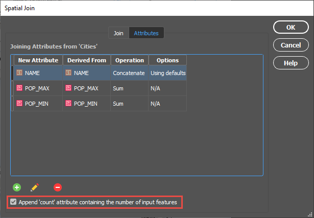
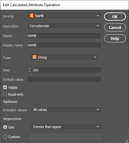
On the Attributes tab, I am going to concatenate the NAME field. By double-clicking on the attribute, I can access the Edit Calculated Attribute Operation dialog box. In addition, I am going to sum both the POP_MAX and POP_MIN attributes. I’m also going to append a Count attribute to the table so I can quickly verify how many cities are in each region.
Within the Edit Calculated Attribute Operation dialog box, I am going to set the Operation drop-down to Concatenate and leave the separator as default as Comma then space.
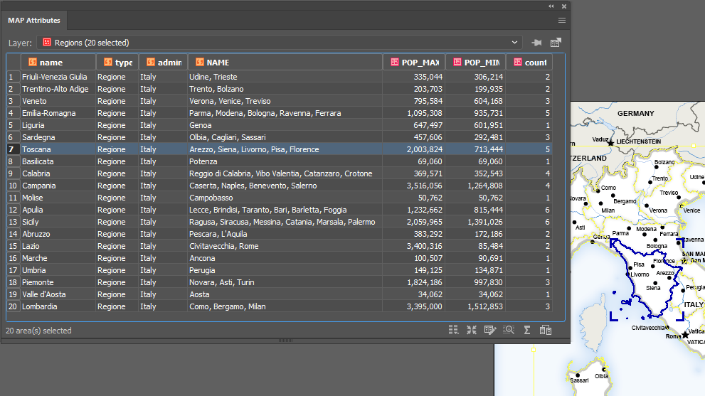
After confirming the Spatial Join with the OK button, we’ll open the MAP Attribute table for the Regions area layer and take a look at the results.
You can see that the cities have been concatenated by region and the POP_MAX and POP_MIN attributes have been summed for the regions based on the cities contained within them. The count attribute was also added to the attribute table and as only 56 of our 70 cities were within the Italian Regions area layer, that is the total value of our count.
For the eagle-eyed readers who may have noticed that there are only 12 cities that surround Italy in the full map displayed at the beginning of this article and 70 – 56 = 14, the difference can be explained by San Marino and Vatican City, both of which are autonomous countries and not part of Italy. You can see that they are in fact separate polygons.
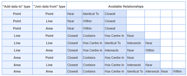
For a full list of the relationships that are available based on the different layer types, and also the input attribute types, please see the tables below.
This post was made using the incredibly beautiful map data provided by our good friends over at One Stop Map. Stay tuned as MAPublisher Aware Maps are coming very soon to the One Stop Map Store, which will allow you to directly purchase the Adobe Illustrator files and put your own style on the maps! If you’re interested in seeing more of their work, take a look at these One Stop Map Country Maps.
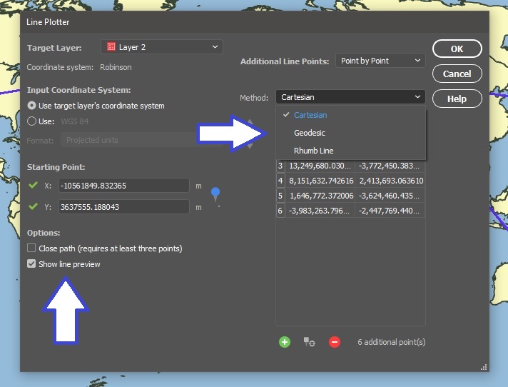
MAPublisher 10.6 has now been released and we are very excited to share these powerful new features with you. If you’re new to MAPublisher, you can get a rundown of the full feature set here, and even try it free for 14 days. In this feature highlight blog, I will be providing a brief overview of the ability to Plot Curved Lines with the Line Plotter tool.
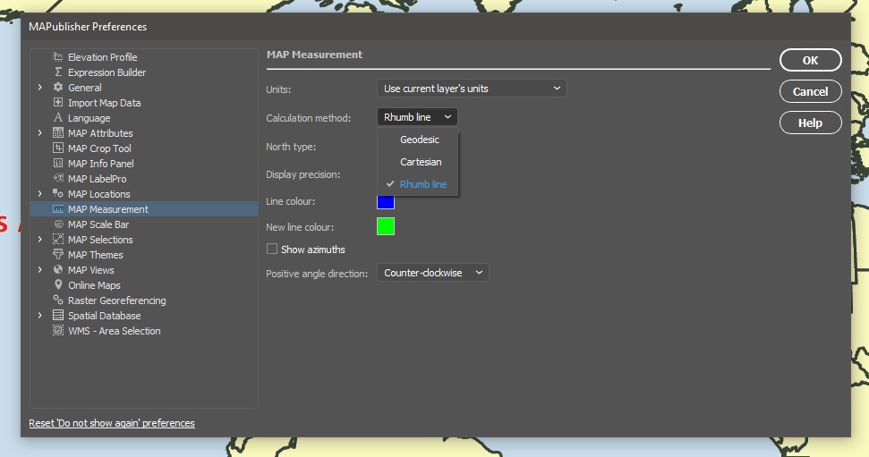
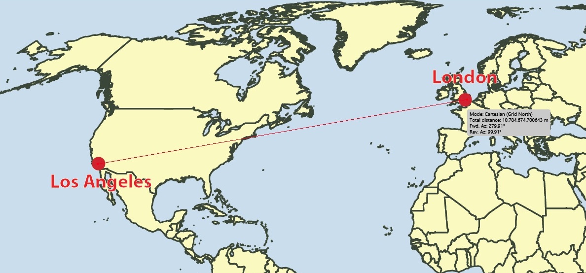
When plotting a line from point to point, you now have the option of selecting whether that line is Geodesic (also known as a Great Circle), Cartesian (planar), or a Rhumb Line (also known as Loxodromic). To provide a brief definition of each type:
Geodesic line: the shortest line between two points on a mathematically defined surface (as a straight line on a plane or an arc of a great circle on a sphere or ellipsoid like the Earth’s surface). On a geodesic line, the bearing to the destination point does not remain constant. This would be the type of line you would want to use when determining a flight path between two cities, for example.
Rhumb line: this is a path with constant bearing as measured relative to true or magnetic north and is rarely the shortest line between two points. A rhumb line on a Mercator projection is a straight line which made the projection incredibly useful to navigators from as early as the 16th century.
Rhumb Lines on a Mercator Projection
Cartesian line: can simply be defined as a straight line connecting points.
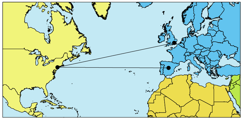
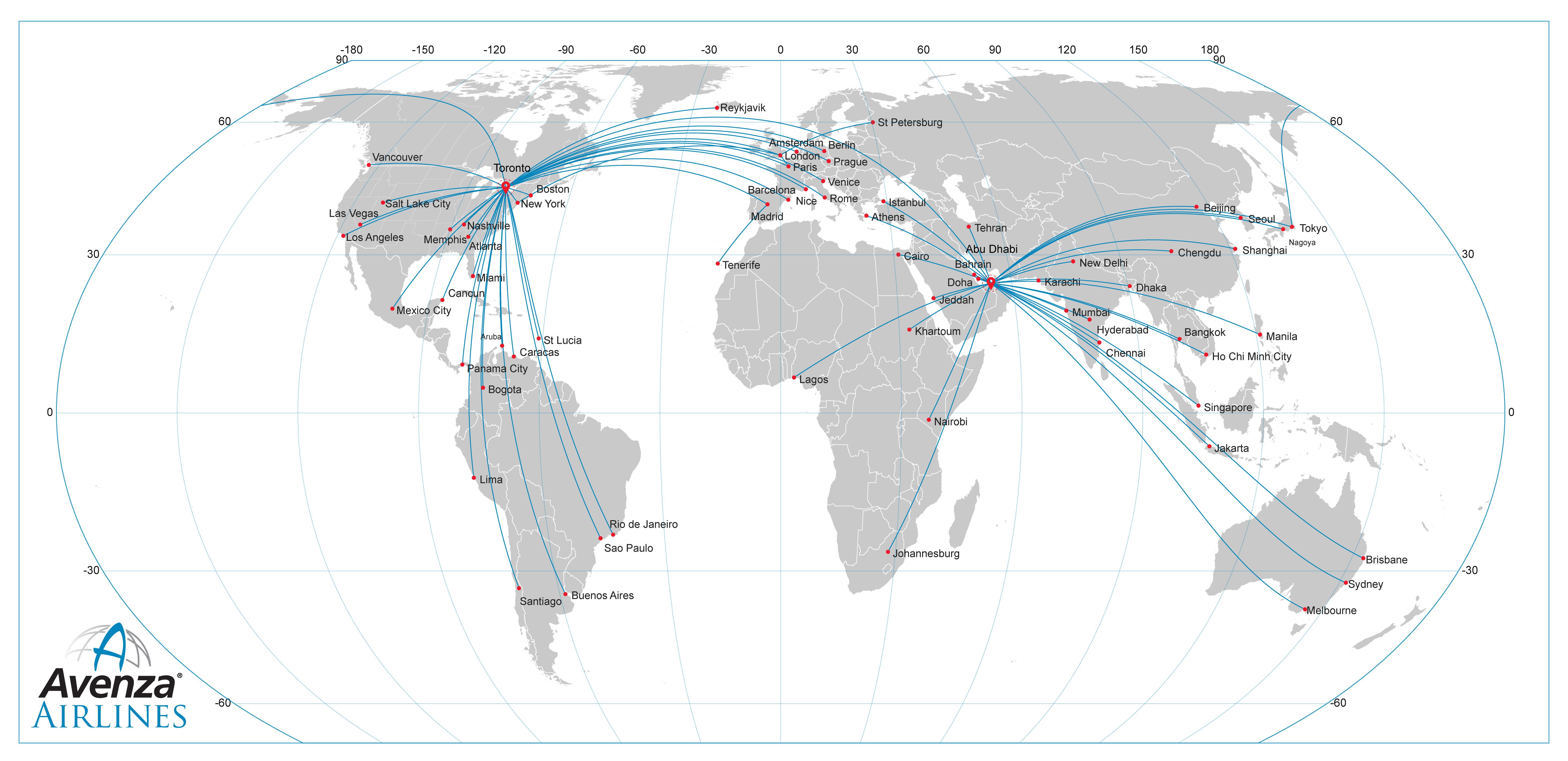
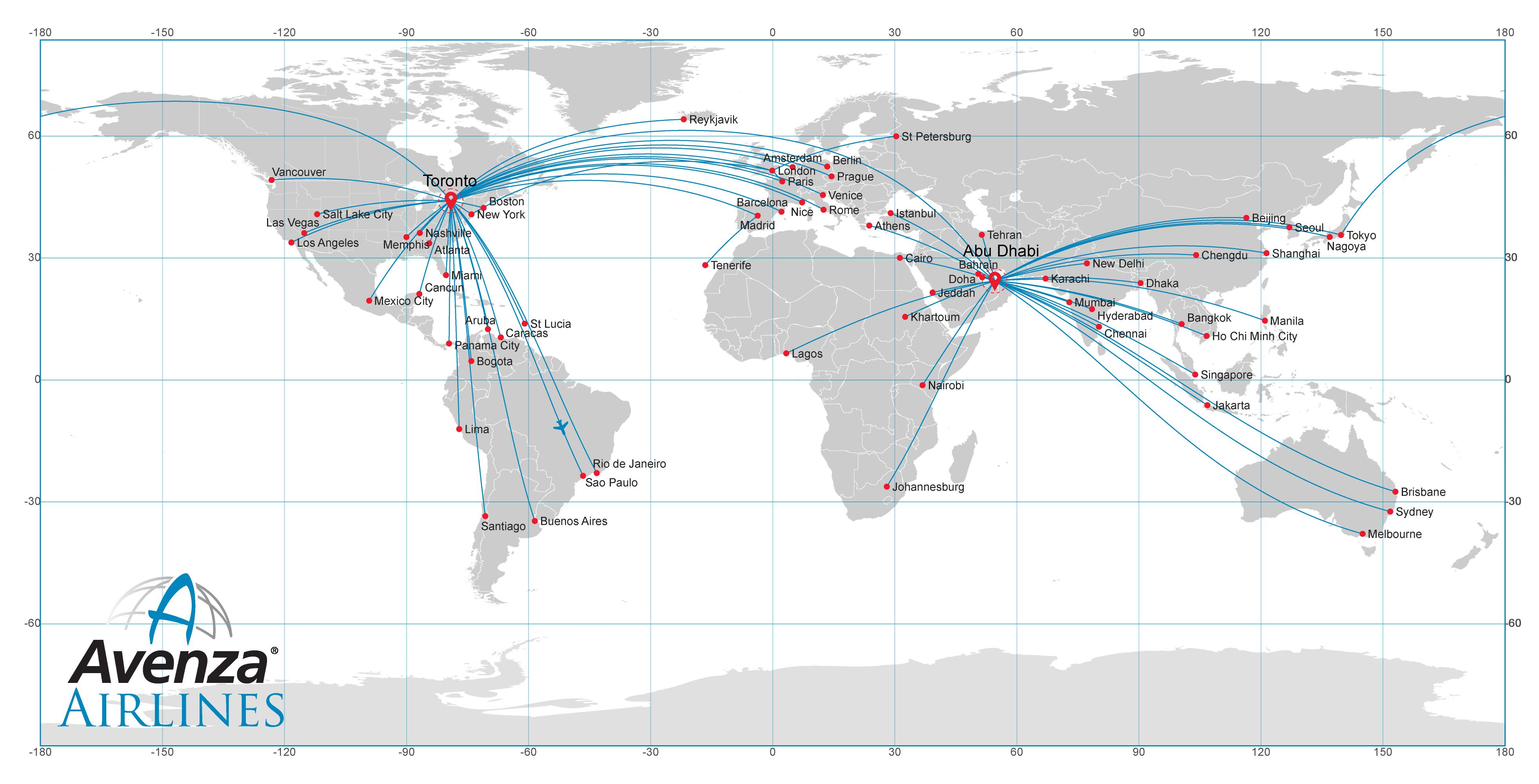
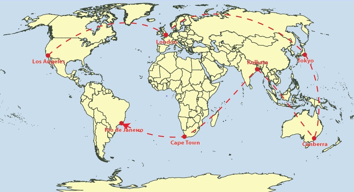
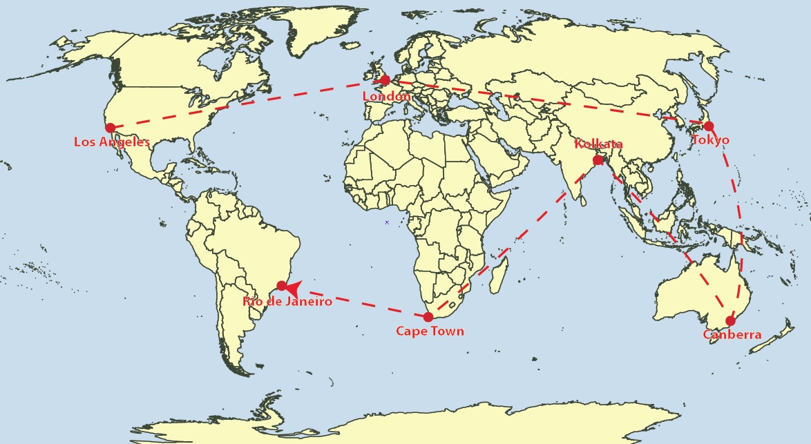
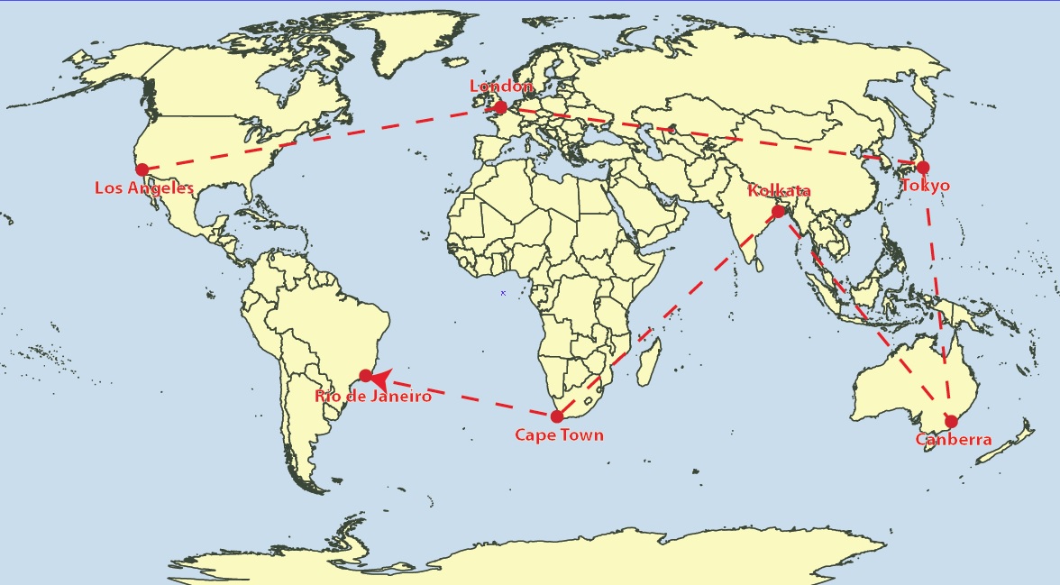
To view this feature in action, we are going to be using curved geodesic lines to create an Airline Route Map. The reason why we are using geodesic lines for this type of map is because they provide the most economical route in terms of distance. Following the rhumb line would waste time and fuel for all but the most brief routes.
I began by importing some data that provided my backdrop for the routes I am planning to map. My flights will span the entire globe so I required world coverage. You can also test out this feature and use the World.mif file or the WorldEast.shp and WorldWest.shp files provided in the MAPublisher tutorial data.
I decided to use the Equal Earth Projected coordinate system.
Adding Locations
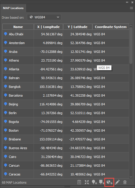
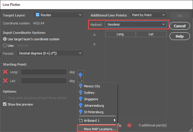
The next step was to establish the hubs from which our aircraft would fly and the destinations that we would offer as an airline company. For this, I needed points and coordinates. Instead of searching for and importing a hefty list of airports and then trying to filter down to ones of interest to me with selections, I opted to use the MAP Locations tool.
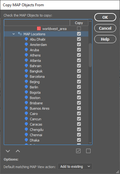
By utilizing the “Add Map Locations from web” feature highlighted at the bottom of the MAP Locations panel, adding each destination and its corresponding coordinates was as easy as typing in the city’s name. It can take a while to establish all of your locations but the best thing is that you only need to do this process once as the MAP Locations can easily be brought to other documents using the Copy MAP Objects From feature.
Plotting Points
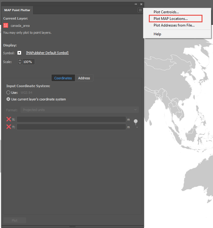
Now that I had all of my locations of interest and their coordinates, I could plot these onto my map as points. For this I used the MAP Point Plotter.
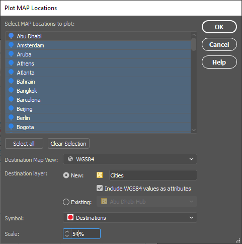
By accessing the panel options menu in the top right-hand corner, you can select Plot MAP Locations. In the dialog that opens, select all of the city MAP Locations. In my example, I selected all and then de-selected Abu Dhabi and Toronto as these will be my main hubs and will be plotted with a different custom symbol to other destinations.
I chose to plot them to a new Point layer that I named “Cities” and I included WGS84 values as attributes. I created a custom red main hub symbol using Adobe Illustrator tools to use for my destinations. You may need to play with the scaling of the symbol to get your desired look.
To create a custom symbol in Adobe Illustrator, draw out your design like the main hub symbol above, highlight the art, and drag the art to the Symbol window that can be accessed by going to Window > Symbols. You can then give it a name and select the static symbol option.
Plotting the Routes
With the cities and main hubs now plotted, it was time to add the routes.
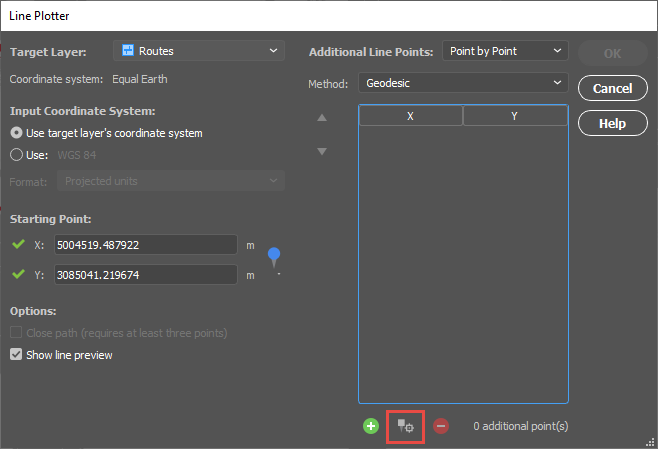
I targeted a new Line layer called “Routes” and set my start point using the MAP Locations selector. I was sure to change the Method to Geodesic.
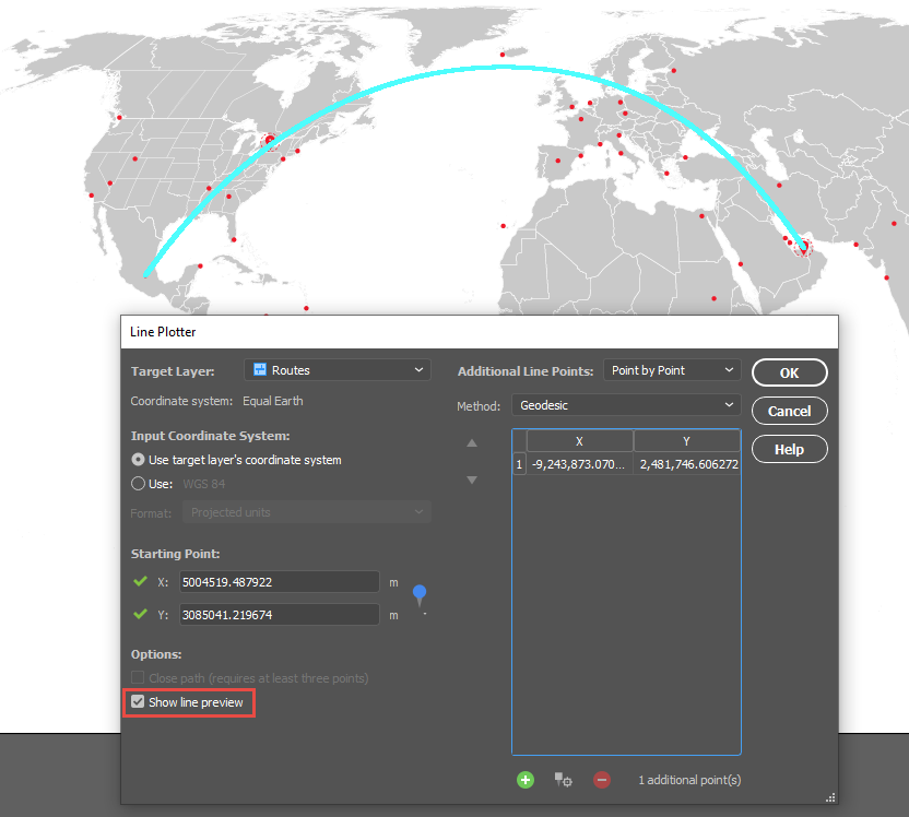
I started adding cities using the “Add Point from MAP Location” control shown here. Once you select your point, a preview will be drawn onto the artboard if your “Show line preview” option is checked.
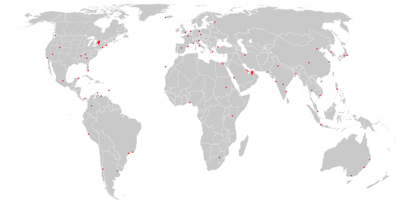
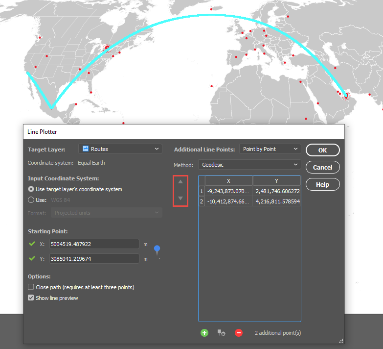
The route above is from Abu Dhabi to Mexico City. You can select multiple destinations to account for layovers. You can also change the order of the points once they are in the list using the arrows highlighted below.
Once all of the routes have been plotted, the points were labelled with MAP Label Pro and a customized graticule was added. Here’s the final map in two projection styles to show how a map projection can change the look of the routes and the overall look of the map.
Both Windows (64-bit) and Mac users can explore the exciting new and improved features MAPublisher 10.6 offers with the latest version of Adobe Illustrator. Talk about a power duo — upgrade today (it’s free for maintenance users)!
Spatial Join
In our line of work, spatial relationships are really important and can be complicated, but working with them shouldn’t be. MAPublisher 10.6 delivers the brand-new Spatial Join feature and we’re ecstatic to be sharing it with you. With Spatial Join, you can:
copy attributes from one layer to another based on their spatial relationship
use relationships including Near, Closest, Identical To, Contains, Within, Has Centre In, and Intersects
adjust the Precision and Tolerance
Spatial Join tool
Features joined based on spatial relationship
Improved Line Plotter
The Earth isn’t flat, and your plotted lines shouldn’t be either! The improved Line Plotter tool will accurately plot lines with the Geodesic and Rhumb line methods, taking your projection into consideration (or calculation if we’re getting technical) and is available for both Point by Point and Course & Distance plotting styles.
The Rhumb line method will create either straight or curved lines, depending on the projection used. Still want to plot straight lines? The Cartesian method is sticking around and will work just as you remember it. A preview option is now available, so you can take a look at the three different methods on your map before plotting the line (or simply turn it off if your line has too many points).
Geodesic Method: Shortest distance between points
Rhumb lines: Constant bearing, curved or straight depending on the map projection.
Cartesian lines: straight lines from destination to destination.
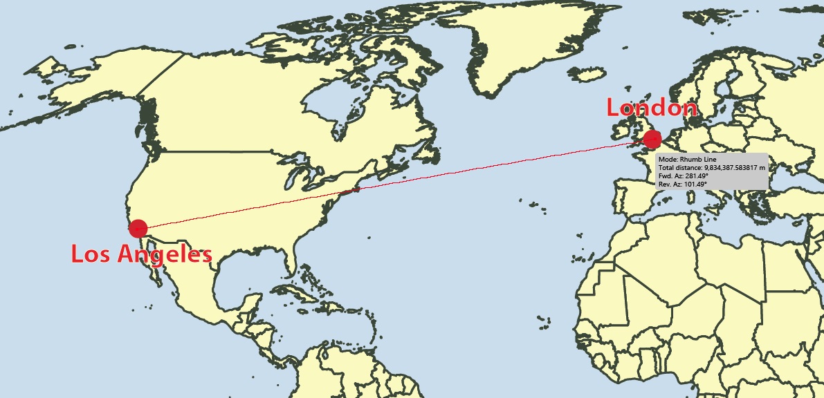
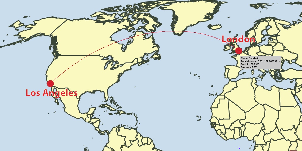
Improved Map Measurement Tool
With the addition of the Geodesic and Rhumb methods for plotting lines, we’ve made sure you can accurately measure the distance between points with these methods as well, whether they’re curved or straight lines.
Measure distances between points using Geodesic, Cartesian and Rhumb line methods
Like the Line Plotter, Geodesic and Rhumb measurement lines can be curved or straight, depending on the map projection
A combination of keyboard presses (Shift + Click) will add the measurement line as an object on your layer
Rhumb Measurement Line
Geodesic measurement line
Cartesian Measurement Line
Installer Will Uninstall Previous Versions
We’ve made some improvements to the installer. You’ll notice that the MAPublisher 10.6 installer will prompt you to uninstall previous versions of MAPublisher. We’ve designed the installer to guide you through this process. You can also uninstall older versions through the Control Panel (Windows) or as usually on macOS.
Export Document to Image
Colours on a map can make important information pop or sometimes they just make the map look nice. Whichever way, we’ve made sure your colour profiles stick around when exporting your document to an image. ICC profiles (the data that characterizes a coloured input or output device) will be embedded when documents are exported as TIFF files. If an Adobe Illustrator document is in the CMYK colour space, its colour profile will be embedded in the TIFF if the exported TIFF’s colour mode is also set to CMYK.
Map Data Links
We’ve made it easier to keep your workspace clean. Previously, when a layer is deleted, data links were not removed. In MAPublisher 10.6, data links are now removed when a layer is deleted and is the new default behaviour.
To tell the complete story, we added insets of the major urban areas around the country, to make the additional detail there more readily accessible. Making the insets was easy using MAPublisher’s Copy Map Objects tool in Adobe Illustrator.
Maps are powerful story-telling tools that can provide additional context and a deeper understanding of an issue. In a highly visual way, they can summarize complex data in an engaging presentation. Maps can sometimes contain very large amounts of data, compressing it into an easy to read the overview. Maps can also drill down into the data to offer more depth, and sometimes a very different story than the overarching one.
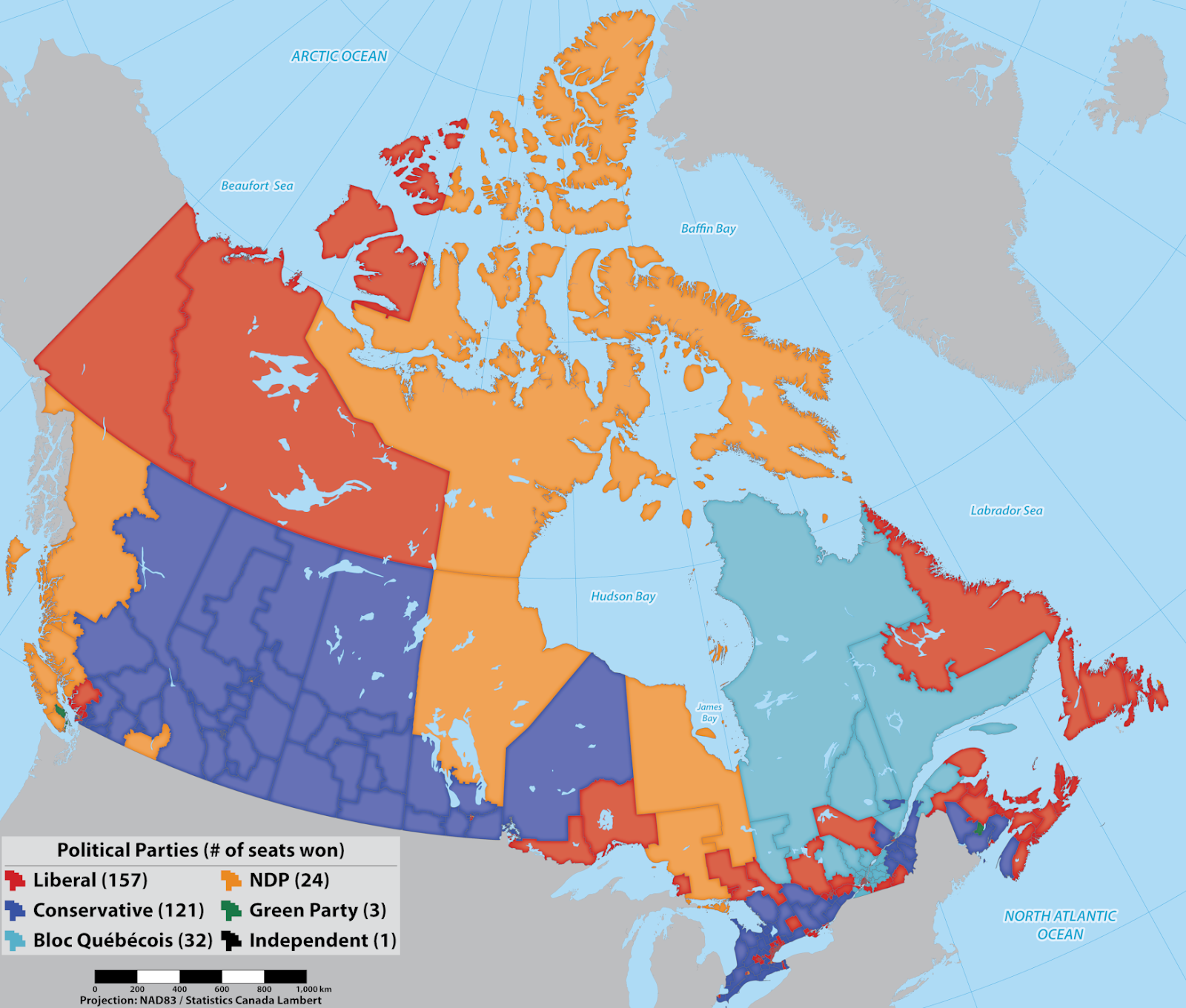
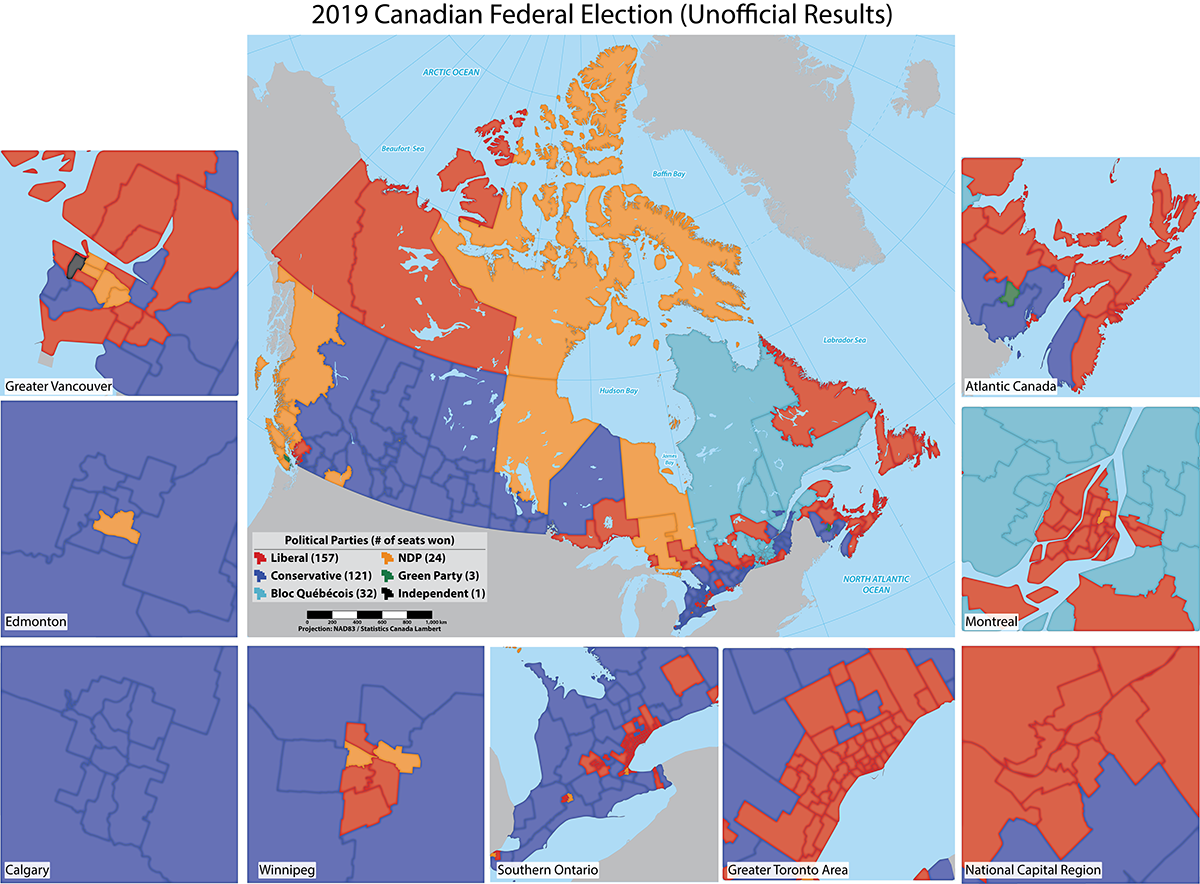
One way to do that is by using insets. Insets on a map can be used to bring faraway places closer together, erasing expanses of water or land that aren’t relevant to the map. They are also a way to focus on map data that cannot be easily distinguished at a different scale. For example, after the most recent Federal Election in Canada, we made a map showing the election results in each of the ridings across the country.
If you’re not familiar with the Canadian system, the country is divided into geographic areas, called ridings, based at least in part on population density, so that each riding represents a certain number of voters. In each riding, a representative is elected to hold a seat in Parliament. In the 2019 election, there was a total of 338 seats. The government is formed by the political party that wins in the majority of ridings.
So the morning after election day the political map of Canada, at the federal level looked like this. We made map importing publicly available data on the riding boundaries and election results.
Clearly, our political leanings (at the federal level, at least) are influenced by our geography. Or are they? There is, in fact much more data on the map than can be seen at this scale.
Canada is the second-largest country in the world, by landmass, with a relatively small population of just under 38 Million people. Combine that with the fact that 80 percent of the population lives in urban areas. That means that in order to fairly represent the population with representatives in Parliament, urban areas will contain many, smaller electoral ridings while the rural ones will be much larger in area. Does the map at this scale then really tell us what’s really going on with politics in Canada? Can you tell which party was the victor with this view?
To tell the complete story, we added insets of the major urban areas around the country, to make the additional detail there more readily accessible. Making the insets was easy using MAPublisher’s Copy Map Objects tool in Adobe Illustrator.
First, create a new document, which will be used as a temporary working space. Using the Copy MAP Objects tool, copy the required data layers from the original document into the new one. Zoom in to an area of interest and draw a box around it. With the box selected, use the Crop to Shape tool to remove data outside of the area of interest. In the original document, create a new artboard where you want the inset to be located. Then use the Copy Map Objects tool once again to bring the cropped data back into the original document and scale it to the new inset artboard. Draw a box around the pasted bits to indicate the inset, and add labels. Return to the temporary document, undo the data crop and repeat the process for as many insets as you need. Easy!
With the insets added we get the full extent of the election picture, and a better sense of what the results actually were. The map together with the insets also highlights the impact of population density and regional population distribution on political representation. It’s valuable information for future campaigns, but also raises interesting questions about the fairness of the current electoral system. For now, we’ll leave election reform to the experts and stick to making maps. ^_^
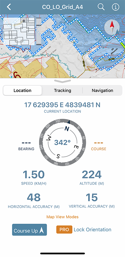
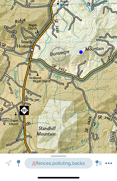
Avenza Maps version 3.9 is now available for users on iOS and Android devices! We have added features for both our recreational and Pro subscription users and made some improvements based on user feedback. This update of Avenza Maps includes some great features including the integration of what3words. Now anyone can identify their location by simply using three words. This is a very useful feature for recreational and outdoor enthusiasts as well as professionals who use Avenza Maps in remote locations. You can find the what3words for any 3m square in the world on any map. Here are more new features in this release:
GPX Import (Pro and Plus)
Hurray! Pro and Plus users can now import GPX files. Our users have been asking for it and now GPX files containing tracks, routes, and waypoints can be imported onto any map.
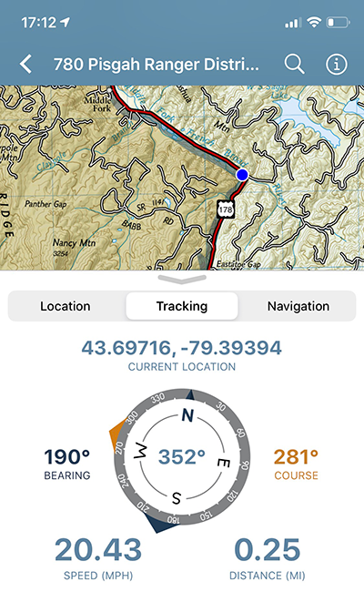
Course-Up Map View Mode
When Course-up is enabled on the Location tab, the map view automatically rotates in accordance with your direction of travel.
Registration Links (Pro)
Avenza Maps Pro admins can distribute Registration Links to field users who can interact with them to automatically register for Avenza Maps Pro with their organization.
New Coordinate Display Formats
Several new coordinate formats are now available in Avenza Maps, including what3words, British National Grid (a Pro feature with a limited preview for all users), and Universal Transverse Mercator.
what3words is live in Avenza Maps and has given every 3m square in the world a unique 3 word address, making it easier for people to communicate precise locations. With the new what3words feature you can set accurate waypoints, plot your favourite points along hiking trails or cycling routes and identify your own location – using just three words. supply.founders.outreach, for example, is the 3-word address for the front entrance to Avenza Systems’ head office in Midtown, Toronto. The what3words location is included in every placemark dropped on a map and can be copied and shared.
There are some big changes and improvements in this version of the app and we’re very excited about it. Our goal is always to ensure that Avenza Maps users can navigate safely, track efficiently, and collect data even more precisely in the app.
Many of our MAPublisher clients are cartographers and GIS professionals, but a growing number are graphic designers who are tired of the tedious work of making maps without specialized tools. Making a map is part art and part science and while we help bridge the gap between Geographic Information Systems (the science) and graphic design (the art), as a graphic designer, you may not be familiar with the wonderful world of GIS.
So on this GIS Day, we have compiled the definitions to a few common GIS terms that you may encounter; GIS Day, celebrated each year, in November to help educate non-GIS professionals about the importance of geospatial information systems and the benefits that GIS brings to our lives.
1. Spatial Analysis
Any good and useful design involves analysis. This process of stacking layers, inspecting and interpreting model results seeks to solve complex location-oriented problems. This can be used for predictive analysis, estimating the level of suitability and for further understanding of the geographic location.
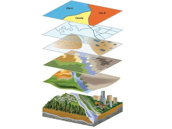
2. Layer
Maps contain several layers, each representing a set of spatial features. Layers are laid atop one another for viewing or spatial analysis. This lends itself to working with the map layers in Illustrator, as they can be treated similarly to a layer containing artwork.
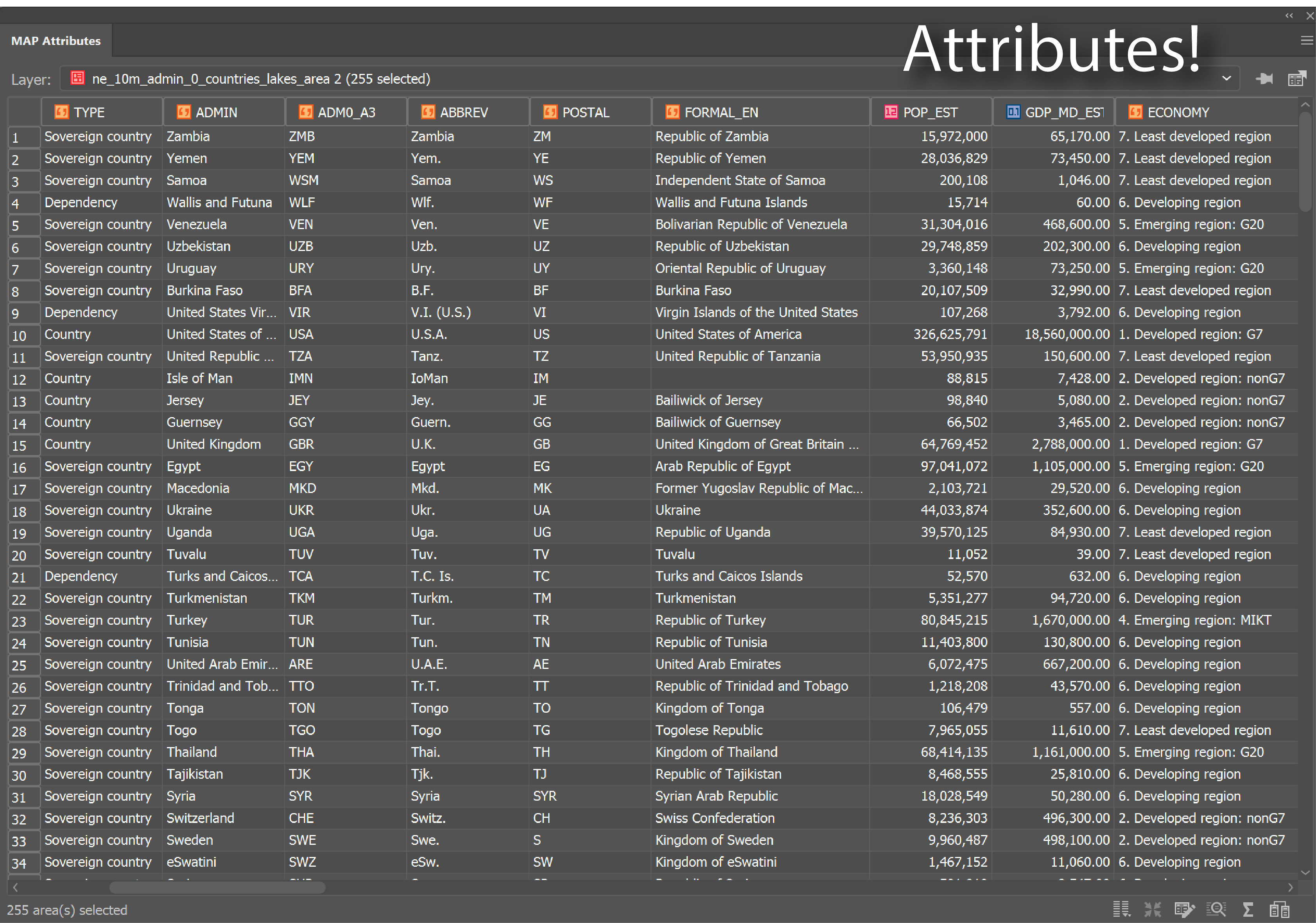
3. Attributes
Attributes denote a geographic feature on a map. The information is typically stored in a tabular format that is linked to the feature. For instance, the attributes of a well-represented point along a river may include the name, the course of the river/ length, sediment load, etc.
When you are familiar with the attributes associated with the map data, you can do things like applying rules to style your map according to attributes in the table.
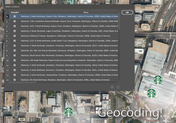
4.Geocoding
The process identifies a location by its geographic coordinates (latitude and longitude). This is used to position places and features on a map as well as to reference the map itself.
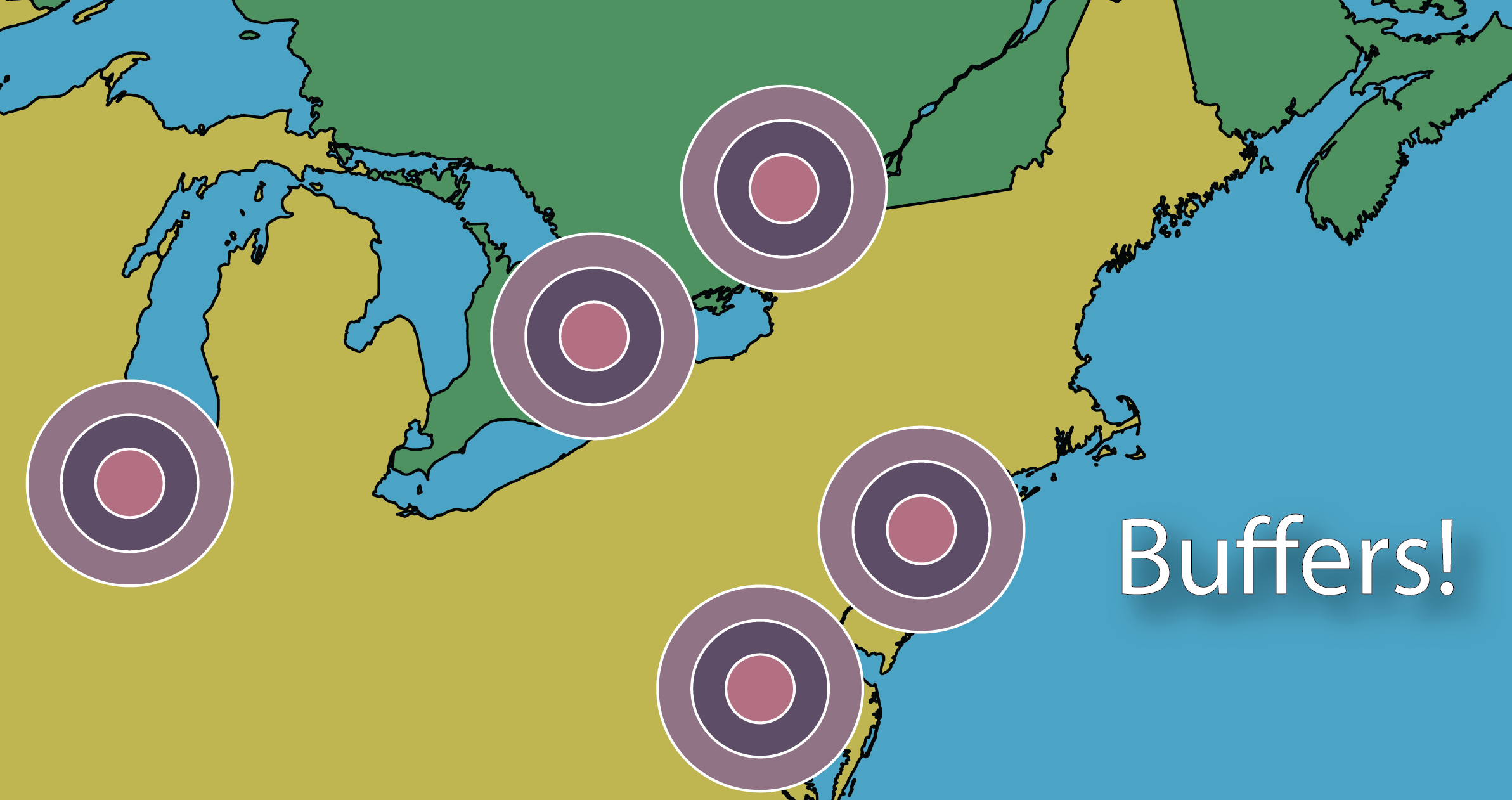
5. Buffers
A buffer isa zone around a specific map feature, that is measured in units of time or distance. A buffer is useful for proximity analysis or visualizing the areas that are within a certain distance from another feature (i.e. within school zones, or floodplains)
6. Polygons/Areas
Enclosed Polygons on a map are often referred to as areas. Polygons can have attributes associated with them to represent a particular real-world entity such as postal code, economic identifiers, population demographics, environmental factors, or social behaviors.
The image above depicts areas on a map.
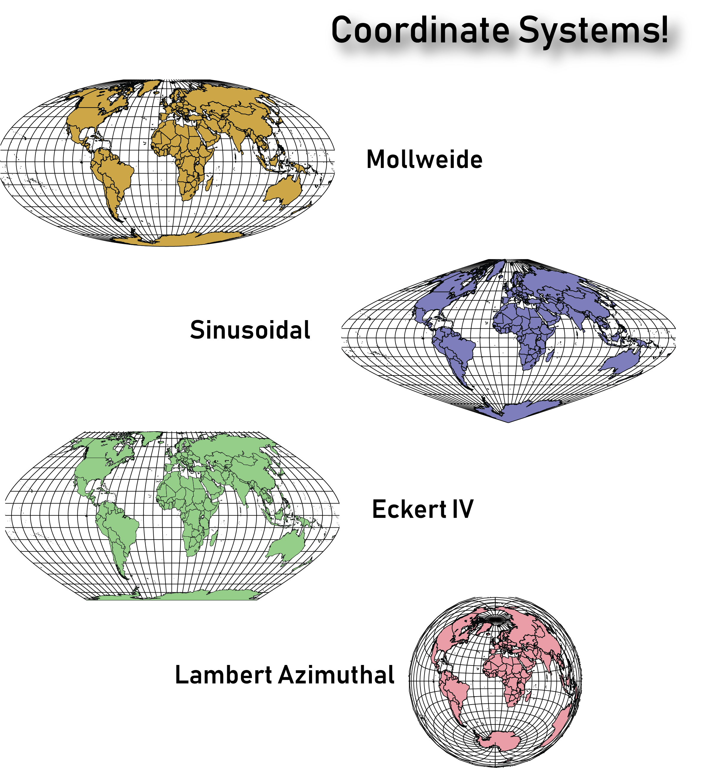
7. Coordinate systems
The planet is not flat, however, we routinely try to represent it in 2 dimensions on paper and screens. The Coordinate systems act as a reference framework that helps position features in order to make a map more useful for the purpose desired.
It is important to note that there are thousands of coordinate systems, so it’s important to take the time to figure out which would work best for the type of map you intend on creating. Sometimes you’ll need to change the coordinate system from the one defined in the underlying map data, to help the map make more sense to the end-user.
They say an artist is one who gives people something they didn’t know they were missing. If you happen to be an artist or know an artist (graphic designer) who seeks to give people direction – literally ‘direction’ – you’ve landed in the right place. Go ahead and share this article with like-minded map enthusiasts to begin learning and delivering high-quality maps the easy way.
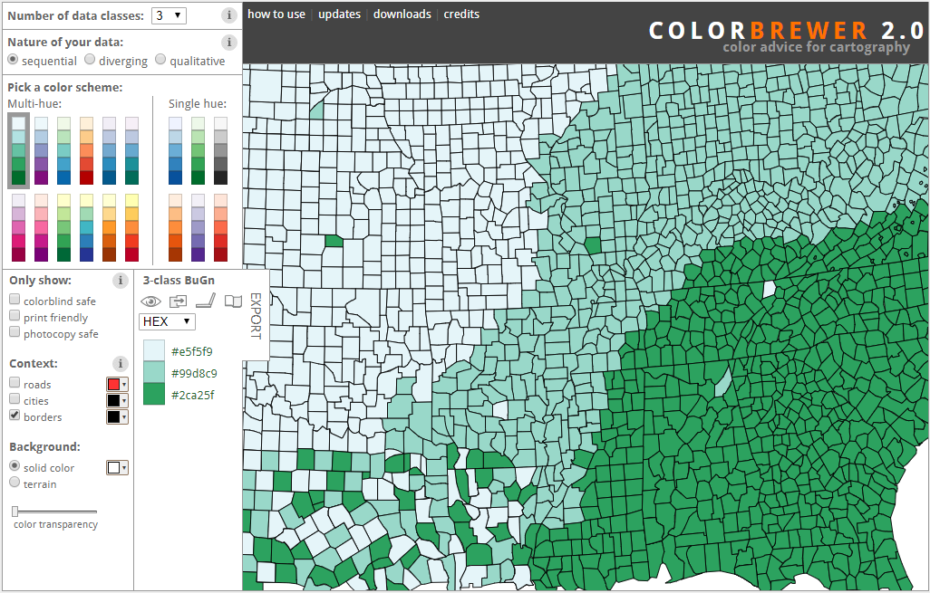
One of the most difficult steps in map design is choosing an appropriate colour scheme that helps the viewer to visualize data. The colour scheme should also contribute to the esthetic of the map. It can be a delicate balance. However, if you’ve worked in the realm of data visualization at any time during the past 20 years, whether it’s creating graphs, infographics or maps, there’s a good chance that you’ve used the ColorBrewer Color Advice tool to make colour selection easier.
The ColorBrewer Color Advice tool was created in 2001 by Cynthia Brewer, an American professor of Geography. The tool was updated in 2013 by Brewer and contributors from Penn State University and Axis Maps. It’s an online tool for cartographers that suggests various colour schemes and previews what a map using those colours might look like. Change up the colour schemes to see how easy it is to distinguish the colours from one another on a map. The tool also makes it easier to see how outlier colours stand out against the rest of the colour scheme.
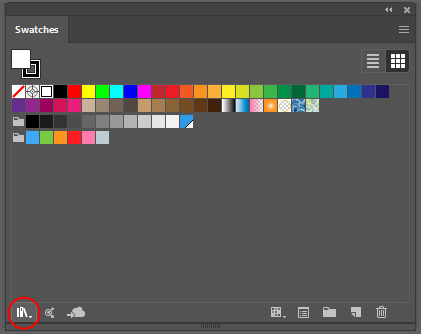
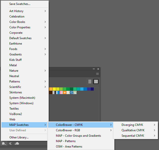
Since the ColorBrewer Color Advice tool is so useful for cartographers, we made it easily accessible in MAPublisher so that you can experiment with colour schemes while styling your maps in Adobe Illustrator. All the color ramps are available directly from the Illustrator Swatch Library. To access the colour ramps, go to the Swatches panel, then Swatch Library > MAP Swatches > ColorBrewer RBG or ColorBrewer CMYK.
Check out the ColorBrewer colour ramps next time you’re styling a map in Adobe Illustrator, using the MAPublisher plug-in, and see what a difference the right colour scheme can make to the readability and esthetic of your map!
MAP Themes are a great tool for stylizing your data quickly and easily. Since we all love to make our workload easier, did you know that you can batch generate rules for your MAP Theme Stylesheets instead of creating them all individually? Batch generate rules allows you to easily categorize your data and stylize it as you see fit.
Check out this short video that demonstrates how to use the batch generate rules tool in MAP Theme Stylesheets in MAPublisher!
For more How It’s Done in MAPublisher videos, check out our YouTube channel!
Adding a north arrow to your map allows your map reader to better understand the direction of the map, and is a key tool for navigation. North arrows can be configured to a custom coordinate, such as magnetic north as well as true north.
Check out this short video that demonstrates how to create and configure north arrows in MAPublisher!
For more How It’s Done in MAPublisher videos, check out our YouTube channel!