Since 2019, each November has been host to the annual #30DayMapChallenge. The challenge was started by Topi Tjukanov as a way to get the cartography and GIS communities to come together and share maps, exchange ideas, and start conversations about mapping and spatial data. Since then, this friendly competition has grown, with thousands of maps being made and shared by map-makers from all over the world, and from a wide range of experience levels.
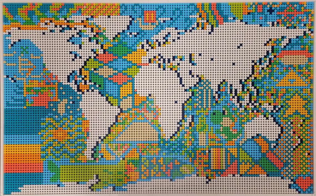
Kate B created this map entirely out of lego pieces (1500 total!) She shared this map on Day 15 – “Map made without using a computer”. See if you can spot the different shapes, symbols, and even video game characters that are hidden in the ocean sections of the piece.
The rules are simple: A specific theme is assigned to each day of November and the goal is to create a map each day that matches that day’s specific theme. Most important of all, this is a friendly challenge! The idea is to have fun, share maps with the carto-community, and hopefully learn something in the process! Here at Avenza, the challenge meant an opportunity to get together as a team and challenge ourselves to try something new. We have map-makers from all experience levels try their hand at making some maps, and we shared our favorites on the Avenza Twitter feed.
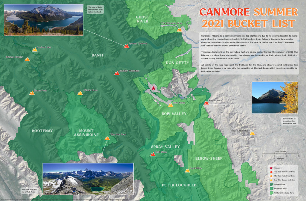
Erik shared this beautiful map of Mountains and parks he plans to visit on an upcoming trip to the Canadian Rockies. He shared this map for Day 21 – “Elevation”
Today marks Day 30, and the end of this year’s challenge. The theme for today is “Metamapping”, with the objective being to reflect on the overall experience and discuss what we mapped, what we enjoyed, and most importantly, what we learned. We’ve collected some thoughts from a few Avenza Team members who participated by asking them a simple question: “What did the #30DayMapChallenge mean to you?”
***
“An opportunity to get creative” – Rebecca B
I love making maps, and when the #30DayMapChallenge came around this year. I knew I had to participate in some way. I’ve spent a lot of time making maps with Avenza software, and some of my favorites were turned into tutorial articles on the Avenza Resources blog. You can see a handful of them here and here.
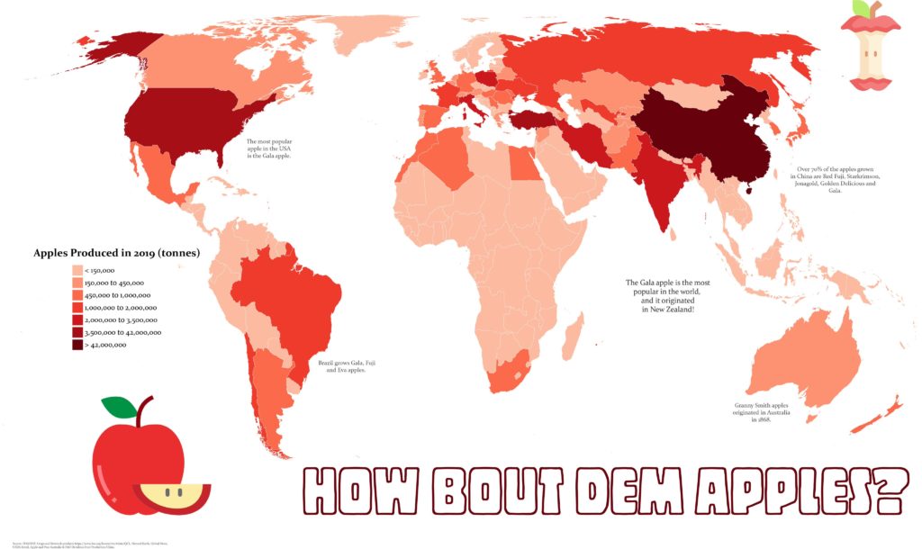
My first challenge was to create a map that fit the “red” theme. Of the three color-based themes in this year’s challenge, red spoke to me the most. Perhaps it’s because it’s a color not prevalent in nature (blue and green make me think of water and vegetation), meaning I could create something that stands out a bit more. For me at least, red immediately makes me think of apples, so I set out to create a map showing apple production worldwide. As is so common with map-making projects, oftentimes the hardest part is finding good-quality data. Luckily for me, the UN Food and Agriculture Organization houses some fantastic datasets on global food production. Using the Join Table tool in MAPublisher, I could link this tabular data to a polygon layer of countries I had imported into Adobe Illustrator. Finally, I used MAP Themes to create an appropriate red stylesheet to visualize my data, and just like that, I was done!
Rebecca B created this fantastic map showing global apple production for Day 6 – “Red”
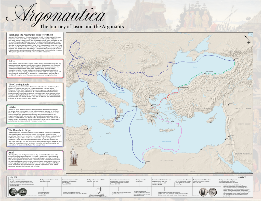
Next up, I took a shot at making a historical-themed map for Day 24 of the challenge. Now as a self-proclaimed history buff, I’ll never turn down an opportunity to do some research on the ancient world. For this theme, I chose to map out the mythical route of Jason and the Argonauts. If you’re from Toronto and you think “Argos” you probably think about the football team, but these are the original Argos. I actually started this map long ago for another project, but the #30DayMapChallenge got me inspired to revisit it and see it to completion. The route was all hand-drawn in Adobe Illustrator after meticulously cataloging and plotting the different locations in the legend. I was able to easily create map labels using MAPublisher LabelPro and overlaid the map layers onto a Natural Earth shaded relief base layer. While the map is physically the biggest part of the artboard, the story is what really drove me to create the map.
Looking back on this challenge, it’s a wonderful opportunity to get back into map-making. The #30DayMapChallenge is a great outlet to reignite that spark of love for cartography.
Rebecca B manually digitized the path of Jason and the Argonauts for her Day 24 – “Historical” map
***
“A chance to learn a new skill”– Chelsey
Not all of us at Avenza are experienced map-makers! In fact, even though I often use maps in my everyday life, I haven’t had many opportunities to make a map myself. For me, the #30DayMapChallenge was an opportunity to learn, try new things, and (hopefully) create my first map!
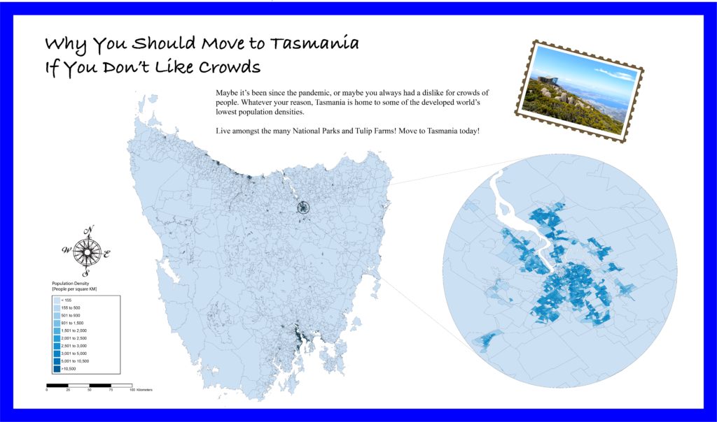
I was fortunate that the Avenza team included several experienced map-makers who were willing to sit down with me and teach me the basics of cartography. After a short crash course on “projections”, “coordinate systems” and the “fundamentals of working with spatial data”, I felt confident I could take my first steps in the world of cartography. Using some of the great tutorial workflows in the Avenza support center, I was able to get my first map dataset imported with MAPublisher. With a bit of help from my Avenza teammates, I was able to get a population dataset showing population counts for Tasmania. Something I quickly learned is that population data needs to be adjusted to account for variation in the size of each area of measure. I used the attribute expressions tutorial to create an expression that calculated the population density for each region rather than the raw population value. Finally, apply a MAP Theme to give the map some color, and add a few remaining stylistic elements with the native Adobe tools, and voila! My very first map is complete!
For me, the #30dayMapChallenge offered me a chance to learn some great new tools, and take a crack at making my very first map. I learned that making maps doesn’t have to be hard, and in fact can be quite fun! Being able to go from never made a map to “I made a real map!” in a matter of hours was incredible, and I can’t wait to try out these newfound skills on some other map projects!
Chelsey got a crash course in beginner map-making with MAPublisher, allowing her to create this neat map of population density in Tasmania for Day 12 – Population
***
“Not all maps have to be serious”– Spencer
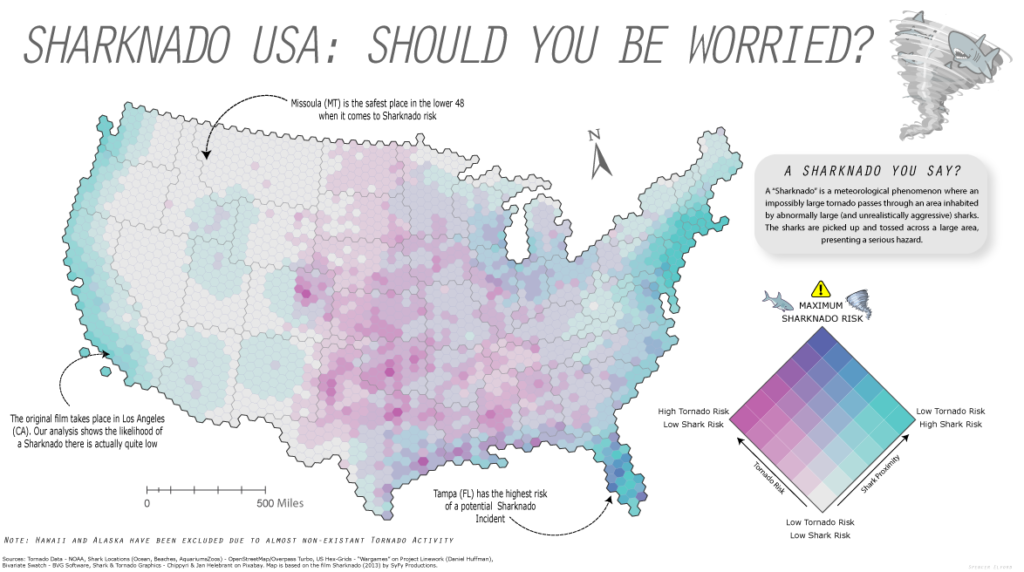
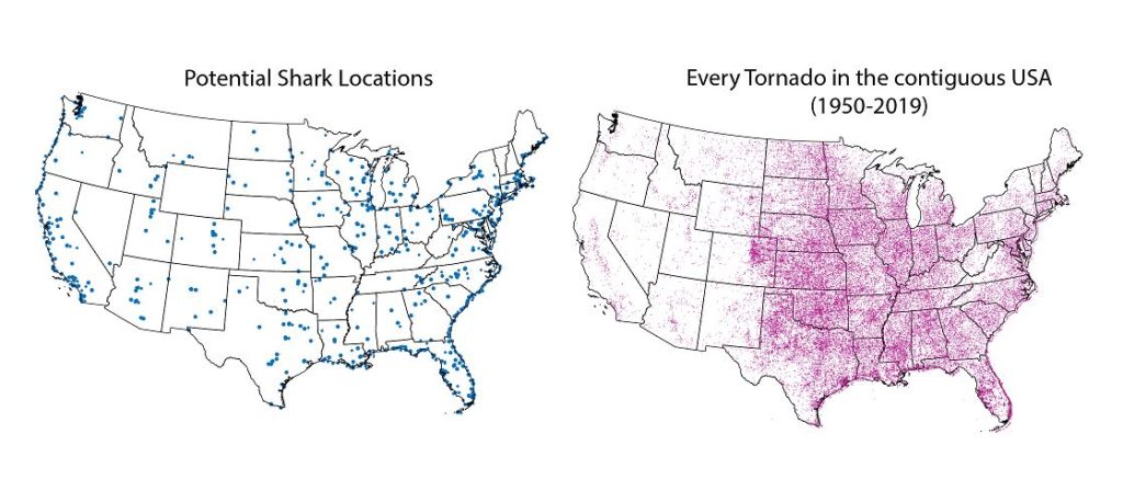
This year was my second time participating in the #30DayMapChallenge and once again, it was incredible to see the map-making community come together to share some really cool maps. I enjoy these types of challenges because they encourage new and experienced map-makers alike to try out new tools, learn some new techniques, and work on maps in a friendly, non-intimidating environment. For me at least, it was an opportunity to just have fun and try out some maps that were less serious in nature. Too often maps are only the result of intensive analytical processes or a product of complex data visualization. While these types of rigid workflows are still quite interesting to work on, it’s also good to step back and just have fun with the process instead of focusing on every detail in the workflow. For Day 4 – “Hexagons”, I did just that and put together a simple map documenting the “Sharknado Risk” across the US. I even wrote a tutorial blog about how I did it!
Spencer made this not-so-serious map of Sharknado risk by creating a custom Bivariate-risk index in MAPublisher. He shared this map for Day 4 – “Hexagons”
What I enjoy most about open-ended map challenges like #30DayMapChallenge is that they allow one to explore topics or datasets that they might not use in their normal day-to-day work. As many cartography and GIS folks know, the most challenging part of ‘making a map” often comes from deciding on a theme, and finding good data. This is especially true when you are restricted to a very specific mapping result or must adhere to strict design considerations. The #30DayMapChallenge removes some of these obstacles and provides an environment that encourages creativity and gets back to the real reason so many of us got into the industry – because we enjoy making maps.
***
Some of the Map created by the Avenza Team for #30DayMapChallenge
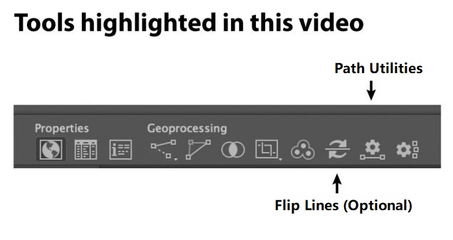
Welcome back to this month’s edition of Mapping Class. The Mapping Class tutorial series curates video tutorials and workflows created by experienced cartographers and Avenza software users. With us today is Steve Spindler, a MAPublisher expert, and professional cartographer. Steve is back with a quick demo showing how he uses MAPublisher path utility tools and a custom Adobe script produced by Nathaniel Kelso to create unique mile marker symbols. The Avenza team has produced video notes adapted from the original article found on Steve’s personal blog.
***
Create Distance Marker Symbols in MAPublisher using Scripts by Steve Spindler (Notes adapted from the original)
MAPublisher used within Adobe Illustrator enables us to create mile markers or other points along a line. I’m using this tool while working on the Genesee Valley Greenway map, and this video walks through the process.
Not shown in the video is how I set the direction of the line. Reversing the line direction is done using the MAPublisher Flip Lines tool. I just didn’t need to do this.
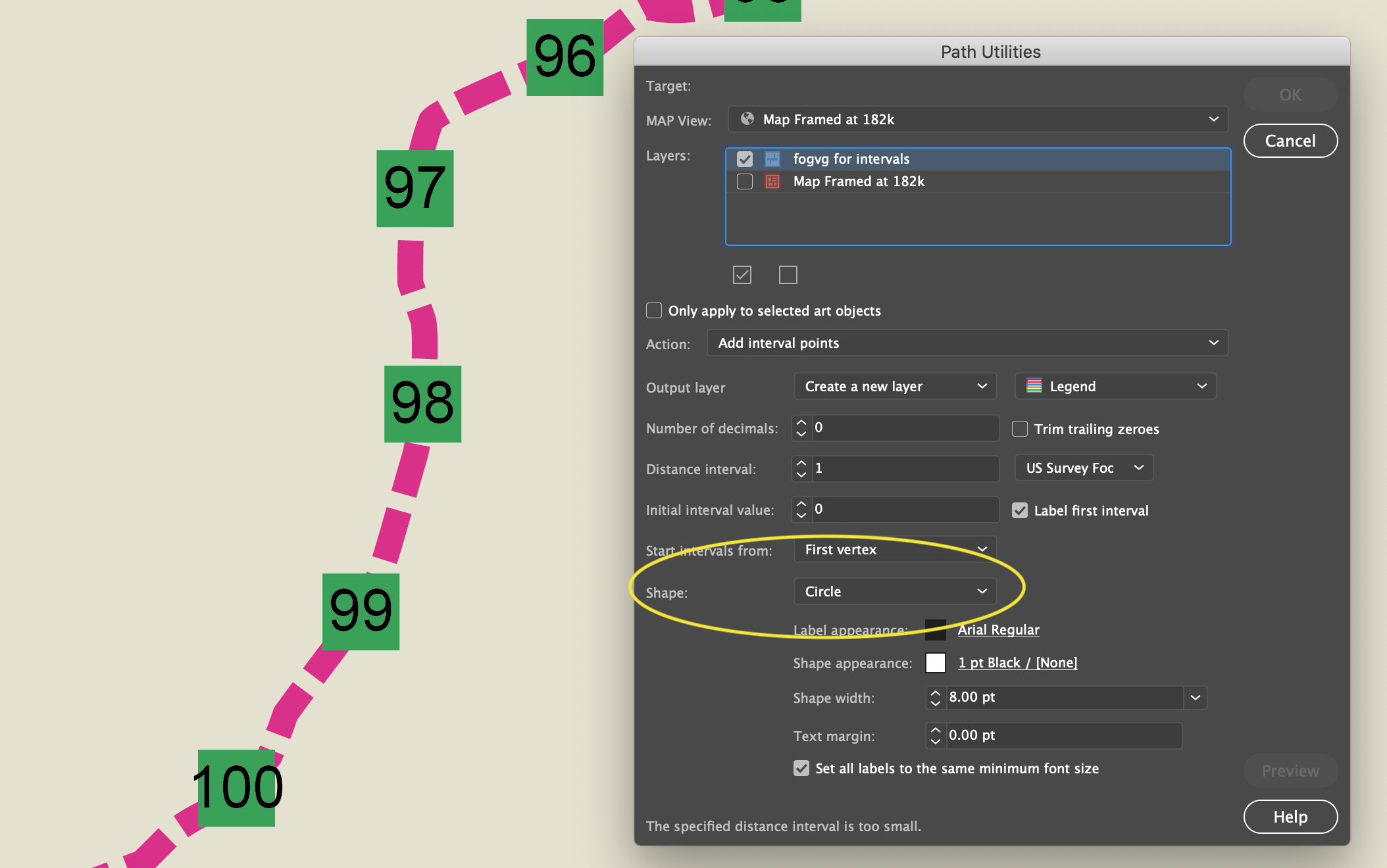
To set the mile marker preferences, we can use the Add Path Intervals in the Path Utilities tool.
This is pretty good, but if you want to customize the circle or square, it helps to convert the polygon objects into symbols.
Find and Replace Symbols Script
The script is called “Find and Replace Graphics” and can be found on Nathaniel Kelso’s website here. Save the script into the appropriate Adobe Illustrator Scripts folder. If you prefer, you can save the script elsewhere and navigate to the script manually using “File>Script>Other Script…”
Note: Save the script with the “.js” extension
To use it, I select all of the current objects that I want to replace and make sure they are on the same layer. I lock other layers. Then I add place a symbol on the same layer (ensure the symbol you want to use is the top-most object in the layer).
With the objects selected, run the script here.
All of the selected objects will be changed to the top-most object, which I set to be a symbol.
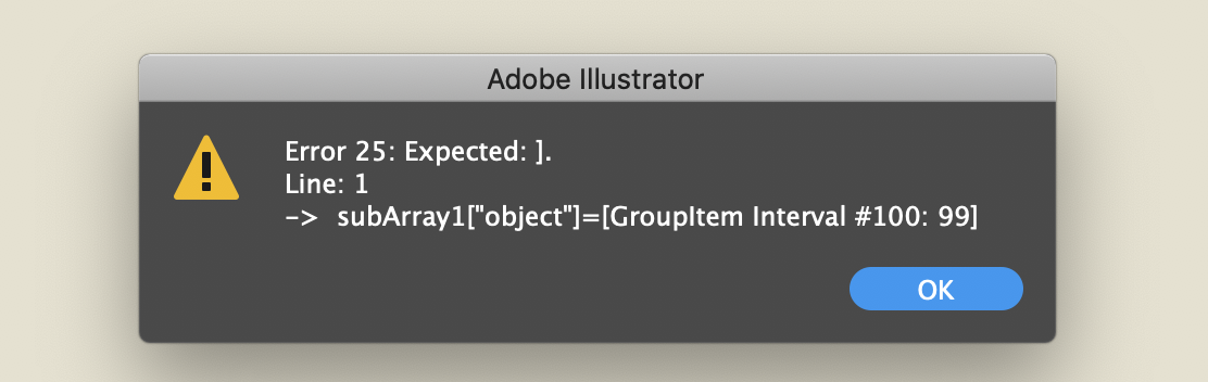
Select only the polygons, not the text. Otherwise, you will get this error.
***
About the Author
Steve Spindler has been designing compelling cartographic pieces for over 20 years. His company, Steve Spindler Cartography, has developed map products for governments, city planning organizations, and non-profits from across the country. He also manages wikimapping.com, a public engagement tool that allows city planners to connect and receive input from their community using maps. To learn more about Steve Spindler’s spectacular cartography work, visit his personal website. To view Steve’s other mapping demonstrations, visit cartographyclass.com
For Day 12 of the #30DayMapChallenge, the challenge topic is population. Our Teammate Chelsey from Marketing, a true beginner when it comes to map-making, steps up to the plate. With lots of help from cartography and gis experts, her focus was on finding simple population data and doing basic data manipulations to learn how to use Avenza MAPublisher.
Finding Data
This was one of the most difficult parts for a completely new map maker. Having absolutely no idea where to start Chelsey turned to her team. Here are a few of the tips she learned on how to source data.
Have an idea
Chelsey loves Australia and has always wanted to visit.
Google is your best friend
We started searching for data by searching broad terms “Population Data Australia”.
Open Street Maps
Sourcing Census Data is a good place to start
This data is often easier to access and is verified.
Break the data down
Data can be overwhelming, we decided to focus on Tasmania, a province of Australia.
Play around with data
Working with digital data is non destructive and doesn’t take too long. Don’t be afriad to try different data sets or play around with things.
Software
Having access to incredible map-making software like MAPublisher and Geographic Imager really made this next part simple.
With MAPublisher you’re able to open and manipulate spatially referenced data… RIGHT IN ADOBE ILLUSTRATOR! Chelsey was impressed with how easy it really was to open the data sets, set projections, and even create a legend in less than five clicks!
“It’s easy to get intimidated by all the rows and rows of data. MAPublisher put it all in the Adobe environment I’m already familier with, that helped make it all easier to understand and work with.”
Chelsey Harasym – Avenza Marketing
Fun Fact: Not all maps or infographics need to be serious, check out this great map about Sharknados!
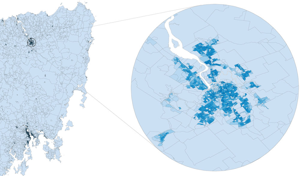
Map Insets
Sometimes, like in our example shown above, you really need to zoom in to see the detail of a map. This is often down using Map Insets. Chelsey used a map inset to showcase the more populated areas of Tasmania. If you’re interested in learning how to create map insets with MAPublisher, learn how here.
Ready to Try?
Download your own free trial of either MAPublisher (Adobe Illustrator) or Geographic Imager (Adobe Photoshop) today to start making your very own beginner maps!
Yesterday was Day 4 of the #30DayMapChallenge, with the goal being to create a map using “Hexagons”. In the spirit of the challenge, we took a not-so-serious approach to create a fun map of “Sharknado Risk” based on the 2013 film “Sharknado” using MAPublisher tools and a really neat hexbin dataset for the United States. This map was in part created for NACIS 2021, and you can see how we created the map by watching the full video presentation included below. This blog also includes a few supplementary notes if you wish to follow along.
What exactly is a Sharknado?
A sharknado is a fictional meteorological phenomenon that occurs when a large tornado scoops up some sharks, transports them some distance, and finally disperses across a populated area. Generally speaking, if a given area is close to potential shark habitats (be it an aquarium, a zoo, or even the ocean) and has a high frequency of tornadoes, the area is more “at-risk” of experiencing a sharknado. To that end, we gathered some great open datasets to help us map this risk. We collected a shapefile documenting point locations for every single tornado in the country dating back to 1950. With this dataset, we can determine the relative frequency of tornadoes for a given area. From OpenStreetMap, we estimated potential locations for sharks by collecting point coordinates for every aquarium, marine park, aquatic zoo, and ocean-facing beach. We used Overpass Turbo to query and extract these points to a spatial dataset and imported them into Illustrator using MAPublisher. Check out this great tutorial (produced by Steve Spindler!) that covers techniques for importing Overpass Turbo data into MAPublisher. The tutorial was part of our ongoing Mapping Class series, a video-focused series that provides helpful tips, techniques, and workflows from real-world cartographers.
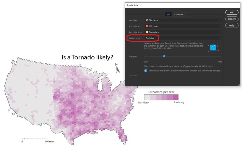
Aggregate data with Spatial Join
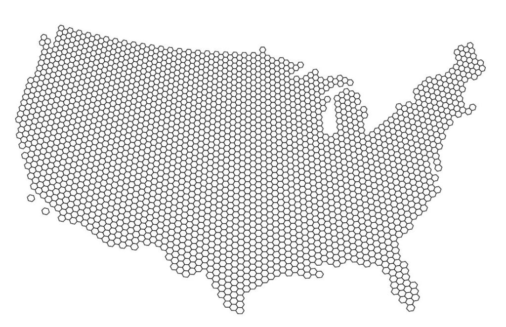
Since the challenge of the day is hexagons, we needed a way to get our messy point data into our clean “hexbin” format. The Spatial Join tool allows us to aggregate our point data (Tornado and Shark Locations) into a single hex-grid polygon dataset.
Credits to Daniel Huffman’s projectlinework.org for making this dataset available!
The Spatial Join tool includes several different options for “spatial relationships” that will determine how our point data is joined to the new hex-grid. We can also specify how the tool will aggregate the attribute information for our joined data. In this case, we join our Tornado point data based on a “contains” spatial relationship. This will aggregate all tornado points that are “contained” within a given hexbin. We also specify that the tool should aggregate the attribute information for all “contained” tornados by tallying up the number of tornado points within each hex. Since we know the dataset spans a 69-yr period, we can easily calculate the average annual tornado frequency for each hexagon.
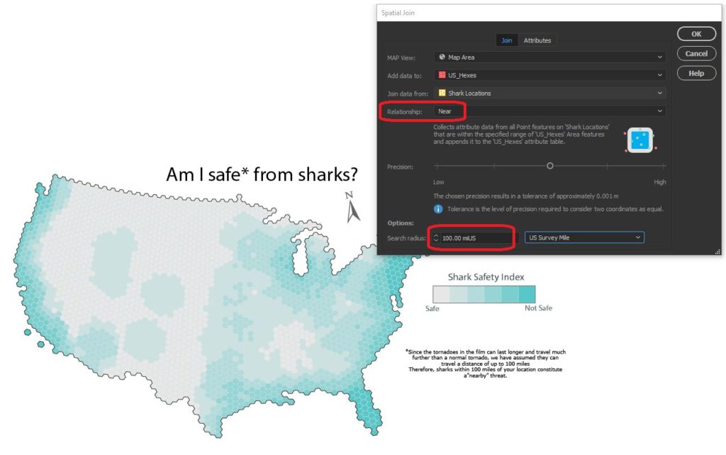
We apply a similar technique to our shark location data, this time specifying a “near” spatial relationship. We used some back-of-the-envelope math to estimate that a Sharknado (as it appears in the film) lasts substantially longer and travels farther than a normal tornado, meaning sharks as far away as 150 miles still present a potential risk. We can specify a search range of 150 miles and this will be applied to our spatial relationship as a cut-off distance.
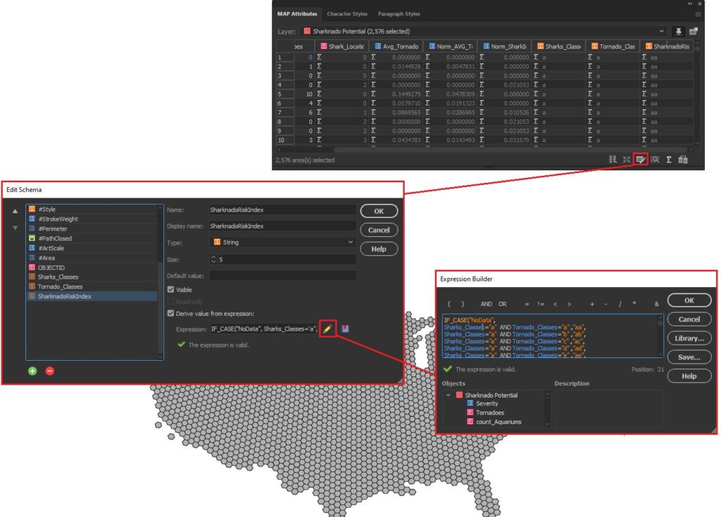
Edit attributes with expressions
We assumed that Sharknado risk is highest when a given area is prone to tornadoes and also has a high concentration of potential shark locations. Given this, we came up with a basic equally-weighted, bi-variate risk index to assign a “Sharknado Risk” score based on these two variables. To calculate this score for each hexagon in our hexbin grid, we applied some custom expressions using MAP Attributes. First, we assigned a Tornado risk score from 1 to 6 based on the low to high frequency of tornadoes. We assigned a similar score for “Shark proximity” based on the concentration of potential shark locations. Finally, we combined these values into 36 unique scores to evaluate sharknado risk.
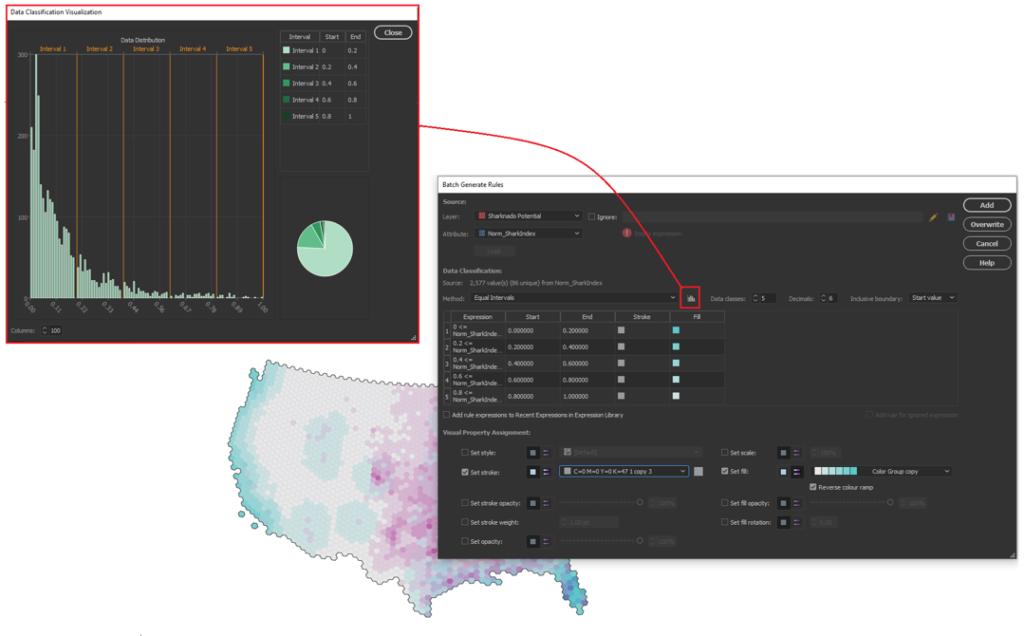
Stylize maps easily with MAP Themes
The final step is to stylize our map and create a layout. With MAP Themes, we can create rules-based stylesheets to easily stylize our map data in no time. MAPublisher comes with a great selection of built-in MAP Swatches, including several color brewer-based swatches that work great for choropleth-style maps like this. We used these swatches to create a custom, bi-variate swatch group to visualize each score of our “Sharknado Risk Index”. The MAP Themes tool also provided a neat data distribution viewer, which also allows us to inspect a histogram of our dataset. Although we used discrete categories for each of our risk scores, the data distribution viewer is very useful when working with continuous datasets since it allows you to see how your bin-widths will affect the display of colour on your choropleth.
The final touches
With stylization complete, Day 4 of the #30DayMapChallenge is almost in the bag. We can create a north arrow, and a scale bar and create a custom legend to facilitate easy interpretation. Since we are still within an Illustrator environment, we can use all the powerful native illustrator tools to add graphical design elements, text, and artwork to create a fun, infographic-style map. Although we were happy to call the map finished at this point, the great thing about making maps is there is also room to add more. For example, we might try using LabelPro to create custom labels that mark high and low-risk areas, or we could create insets to highlight specific regions of interest. The possibilities are endless!
We had a great time putting together this fun map for the #30DayMapChallenge, and we are excited to see what we can do for the remaining themes on the calendar! For those of you who are also making maps for the challenge, a reminder that the Avenza Map Competition is still accepting submissions. Share your map, compete with other map-makers in the community, and win some great prizes!
We are very excited to announce the release of MAPublisher 10.9, our latest version of the MAPublisher extension for Adobe Illustrator.
With MAPublisher 10.9, we are bringing forward full compatibility with Adobe Illustrator 2022, Windows 11, macOS 12, support for Vector GeoPackages and TopoJSON data formats, improvements to the Buffer Art tool, and several bug fixes.
Here’s what you can expect with the latest MAPublisher 10.9 release:
Compatibility with Adobe Illustrator 2022, Windows 11, and macOS 12
We want to ensure our users enjoy a truly seamless experience with the Adobe Illustrator workspace. Our team has worked to ensure that MAPublisher 10.9 is fully compatible with Adobe Illustrator 2022 that was announced at Adobe Max last week.
MAPublisher 10.9 is also fully compatible with the newly released Windows 11, as well as macOS 12 Monterey.
Import TopoJSON data
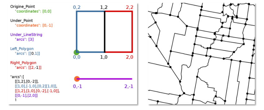
New to MAPublisher 10.9 is the ability to import TopoJSON type data formats directly into Adobe Illustrator. A TopoJSON is built off the GeoJSON data format in a way that encodes topology. Geometries in TopoJSON files are collected together from shared line segments called arcs. In this way, TopoJSON data formats can reduce redundancies and improve storage efficiency for spatial data.
Import and Export Vector GeoPackages
Many of our users have requested the ability to import and export vector GeoPackage data. We are happy to announce the full support of vector GeoPackages is now offered with MAPublisher 10.9. Vector GeoPackages are based on SQLite databases and offer an open-source, compact, lightweight, and flexible data format for easy and efficient storage or geoprocessing of spatial data.
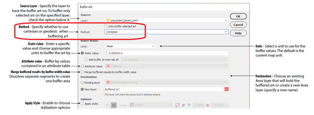
Geodesic Options for the Buffer Art Tool
Geodesic options are now available for the Buffer Art tool. This functionality will provide more accurate distance buffers for point data when working on features distant from lines of true scale. Find this option in the “method” section of the Buffer Art tool.
Default Data filters and Styles on import
MAPublisher 10.9 users can create unique data filters and style settings that can be automatically applied to newly imported data in MAPublisher.
Changes to Compatibility
Avenza announces that compatibility support is changing for its desktop mapping software. Starting with MAPublisher 10.9, both Windows 7 and Adobe CS6 will no longer be supported. Users will require a valid Adobe Creative Cloud subscription and a compatible operating system to utilize the improvements and enhancements offered in MAPublisher 10.9. For questions and more information on how these changes around compatibility may affect your organization, please contact our Support Centre.
MAPublisher 10.9 is immediately available today, free of charge to all current MAPublisher users with active maintenance subscriptions and as an upgrade for non-maintenance users.
Enter the Avenza Map Competition!
The Avenza Map Competition is live! Enter our map competition for a chance to showcase your favourite maps with the Avenza community and win prizes! The competition consists of two categories: “Open” and “Student”, with two sets of exciting prizes.Submit your Map today!
Welcome back to Mapping Class! The Mapping Class tutorial series curates demonstrations and workflows created by professional cartographers and expert Avenza software users. Today Tom Patterson is sharing with us part two of his demonstration of editing Sentinel-2 Imagery Data using Geographic Imager and Adobe Photoshop. Continued from Part One, Tom shows how to take his newly crafted true-color image to make water regions really pop! He will show you how you can use the mosaic tool in Geographic Imager to work with elevation data to create layer masks that make adjusting water areas easy.
If you missed last month’s edition of Mapping Class, check out Part One of Tom’s demonstration.
We have also compiled supplementary video notes below.
***
Work with Sentinel-2 Imagery in Geographic Imager: Part Two by Tom Patterson (Video notes adapted from original)
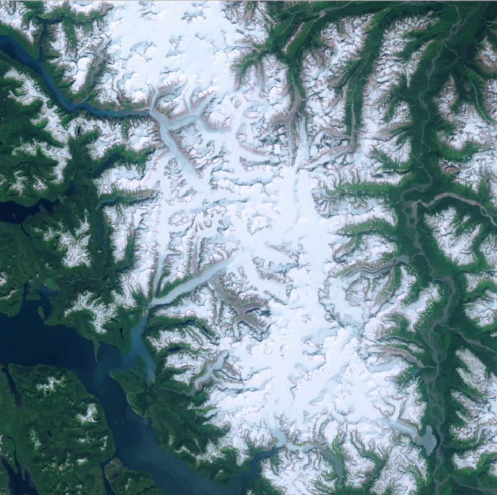
The vegetation brightening technique from part one also influences the color of water bodies. In part two, we will shift water bodies to a more attractive blue and diminish reflections, wind riffles, and sediment plumes. The technique involves adding a flat blue layer with an accompanying water layer mask in Photoshop.
Create a Water-Layer Mask
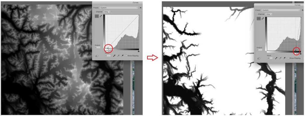
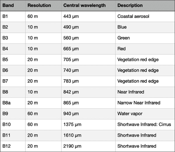
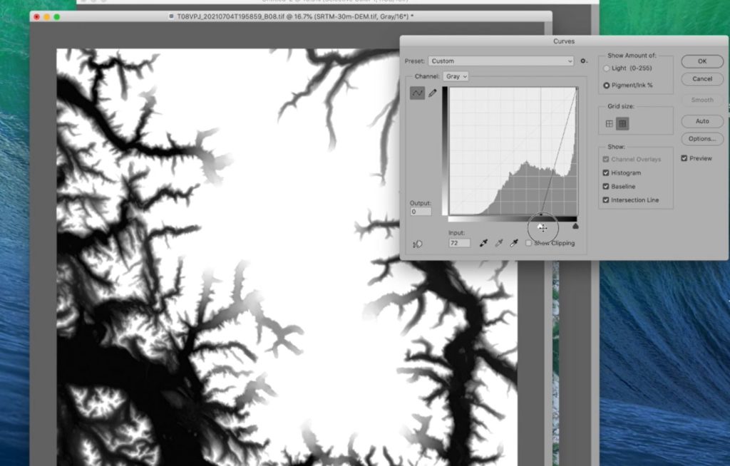
We will create the water layer mask from band 8. It contains data from the near-infrared section of the spectrum that clearly delineates water and land areas. Applying a steep curves adjustment to band 8 will compress the tonal range, which when inverted, results in a high-contrast land-water mask.
The trick is to adjust the curve in such a way so that it minimizes blemishes in the water and shadows on the land. Unfortunately, with this dataset, mountain cast shadows can still be seen as noise, even with the strong curve adjustment. Obviously, this would create challenges if we were to use this as our water mask, so we need to do a few more steps to get rid of that “noise”.
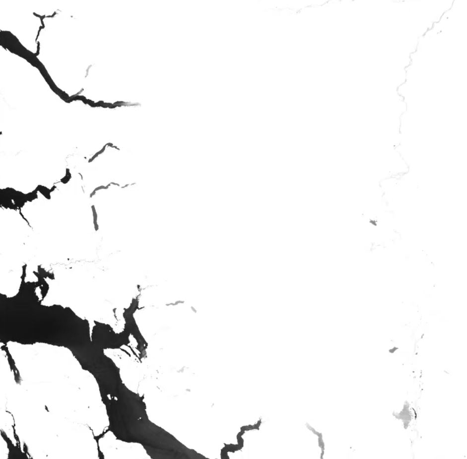
Clean-up the Water Layer Mask
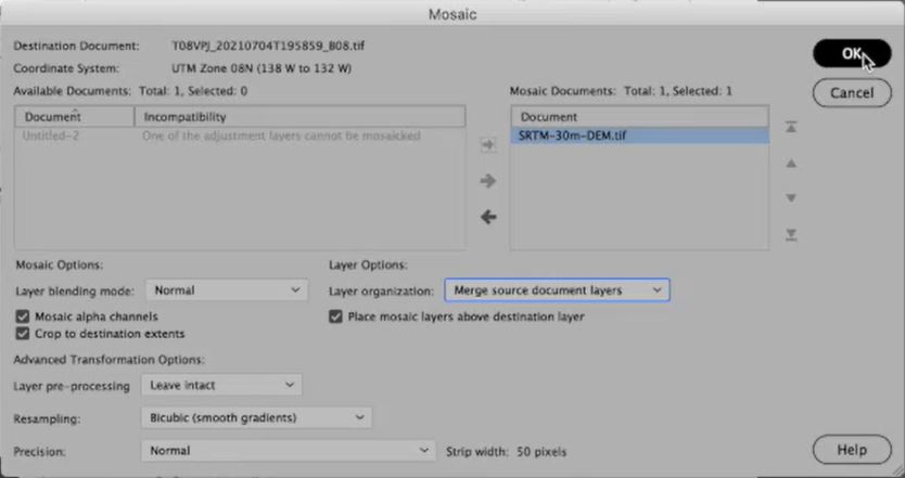
I’ve grabbed a 30m SRTM DEM for this area. I can use this as a mask to get rid of those pesky mountain shadows. The tricky part is that we are now working with mixed projections and different datasets.
I can use the nifty Mosaic tool in Geographic Imager to bring these two datasets together. The really important part is to specify the “crop to destination extents” option. Doing this will not only apply an on-the-fly projection transformation but also crop the large DEM dataset automatically down to match my water mask layer. Also, be sure to select the “merge source document layers” option – this really helps clean up the layer management, while still keeping the important stuff separate.
To get rid of those mountain shadows, we apply another linear curves adjustment. Similar to before, the idea is to compress that tonal range until only the regions at or near sea level are visible (most of the water in our image is at sea level).
Select the layer, apply the “Screen” blending mode, and then “flatten” the image to create the final water mask layer (now with removed mountain shadows!).
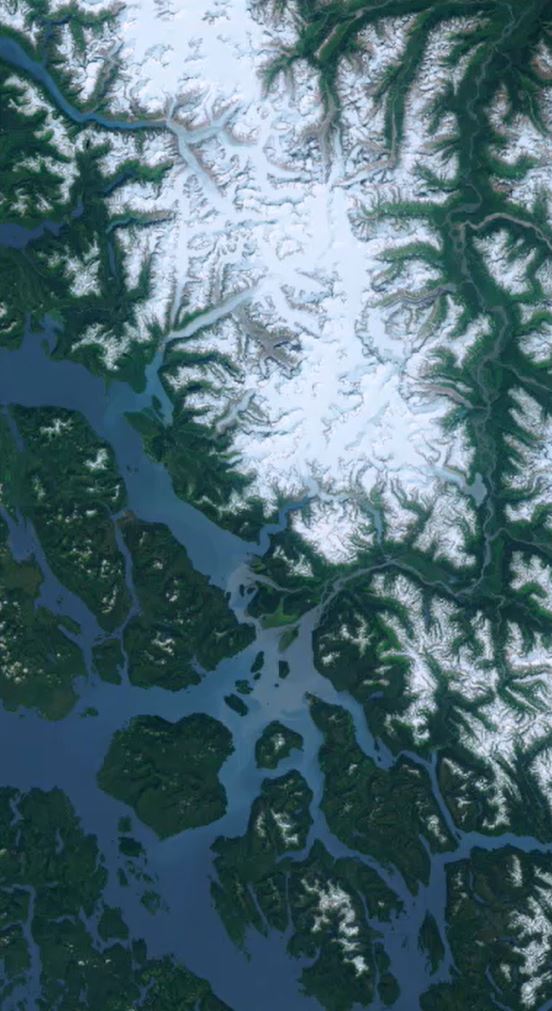
Apply the Water-mask layer
When the water mask is ready, copy it to the computer clipboard. Next, go back to the true color image and create a new topmost layer and add a layer mask. Then paste this into the layer mask (be sure to invert it!). You can then fill the water layer with whichever flat blue that you like. Finally, partially decrease the opacity of the flat blue layer to reveal any sediments or reflections that may exist in the satellite images. You might need to do a bit of manual touch-up with the brush tool on your mask layer to completely remove all mountain shadows.
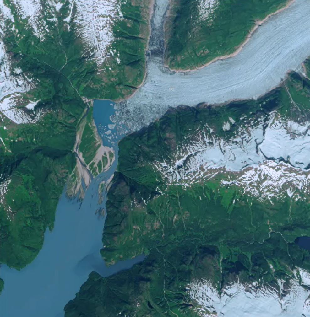
Mosaic Multiple Images
I did almost the exact same technique on another image directly south of this one, and I’ve decided I would like to mosaic both of these images together into a single composite. Again, I use the mosaic tool (this time uncheck the “crop” option), and voila! Both images are mosaiced together in less than a second!
Finishing Touches
A few more touch-ups with the gradient tool to blend the images at their border, and some final adjustment layers to boost the saturation a bit and we are basically done.
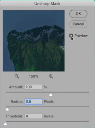
The very last thing that I do is to apply sharpening, which is irreversible. You will need to experiment to determine the amount that is best. As a starting point, try these settings (Filter/Sharpen/Unsharp Mask). Amount = 100%, Radius = 0.5 pixels, Threshold = 0 levels
That’s it! We took some really nice multispectral Sentinel-2 Imagery, some great tools in Geographic Imager, and used some of the nice native Photoshop tools to create a really vibrant, true-color image that’s ready to be draped over some 3D relief or used to create another nice map!
A note on Exporting Images…
Before exporting the final image as a GeoTIFF using Geographic Imager, go to Image/Mode and reduce the bit depth from 16 to 8 bits per channel, and then flatten the image. This will significantly reduce the file size.
***
About the Author
Tom Patterson worked as a cartographer at the U.S. National Park Service, Harpers Ferry Center until retiring in 2018. He has an M.A. in Geography from the University of Hawai‘i at Mānoa. Presenting terrain on maps is Tom’s passion. He publishes his work on shadedrelief.com and is the co-developer of the Natural Earth dataset and the Equal Earth projection. Tom has served as President and Executive Director of the NACIS. He is now Vice-Chair of the International Cartographic Association, Commission on Mountain Cartography.
Captured largely by satellites, planes, or unmanned aerial vehicles (i.e., drones), imagery data reveals interesting patterns and important information on Earth’s surface processes. This information can tell us not only about the natural world around us but also how we are changing it. From deforestation, snowmelt, desertification, and water resources management, to urban development, agriculture, forestry, and national defence, the stories we can tell with imagery data have become more important than ever. With hundreds of active earth observation satellites orbiting the Earth, never before has there been more data available to work with, and entire professions have been developed to learn from the vast troves of imagery data now available.
Although the world of imagery analysis is full of complex techniques and analytical workflows, learning the basics doesn’t have to be intimidating. We’ll show you in today’s blog, where we are looking at one of the simplest, yet most effective techniques for examining imagery data: usingband-combinations to createfalse colour composites. With the Geographic Imager plugin for Adobe Photoshop, we will explore how you can access, import, and process multispectral imagery data to visualize some interesting patterns on Earth’s surface.
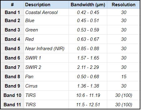
Bands and the corresponding wavelength ranges for the Landsat 8 Earth Observation Satellite. Are a variety of “visible” and “invisible” bands are captured by the sensors on-board.
When we think of satellite imagery data, we often imagine something similar to the view out the window of a plane. To our eyes from high above, the Earth’s surface is very much dominated by “natural” colours such as blue and green. This is due to our eyes having evolved to observe what we call the “visible” part of the electromagnetic spectrum. This visible component is in fact only a small part of the greater spectrum as a whole, and many satellites are designed to capture wavelengths far beyond what we can see with the unaided eye. This so-called “invisible” part of the spectrum includes ultraviolet, infrared, and near-infrared wavelengths that can be extremely important for scientists studying Earth’s surface processes. Satellites will often capture individual images at a wide range of different wavelengths and combine these in something called “multispectral imagery”. Landsat 8 is an Earth observation satellite active since 2013 and is one of the best sources of high-quality multispectral imagery data available to date. Better yet, through USGS Earth Explorer web app, users can download high-quality Landsat 8 imagery for almost anywhere on Earth.
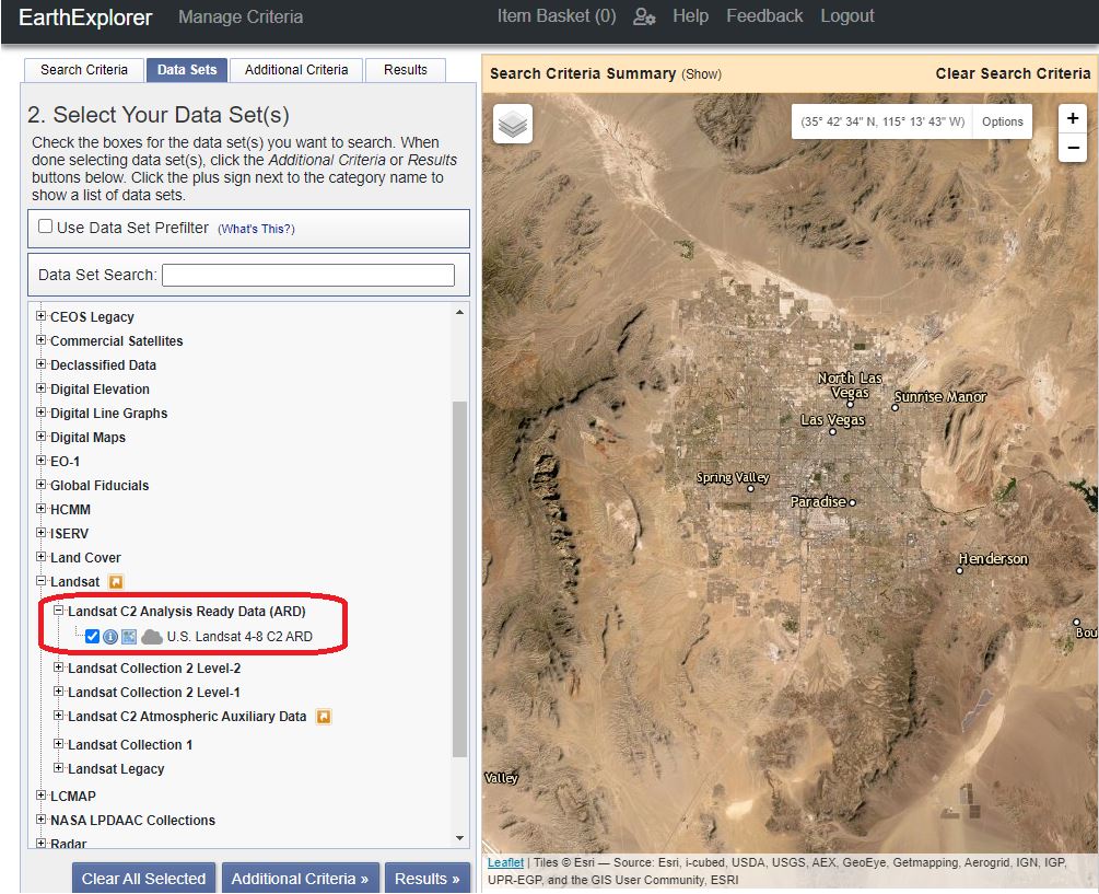
After creating a free account on Earth Explorer, we can start looking for some data. Use the search criteria panel to specify a region of interest (you can also manually draw a search area using the map panel). In this section, we can also specify a date range, which is very useful if you wish to view a particular region at a specific date or want to see how a region may have changed over time. For this example, we are going to be looking at the area of Las Vegas, Nevada. Often referred to as an “oasis”, we want to take a look at vegetation growth in this desert city, and see just how accurate this term may be.
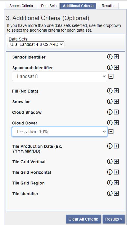
In the Datasets window, we can access different data providers for our imagery. For our needs, we want to select the Landsat C2 Analysis Ready Data (ARD). This will contain the prepared multispectral imagery we need to create a false colour composite. In the “additional criteria” section, we can specify the spacecraft (Landsat 8) and Cloud cover tolerance for our imagery data. For false colour composites, it is important to get a clear unobstructed view of the Earth’s surface, so we should aim for as little cloud cover as possible (<10%).
The Results panel now presents us with a great selection of imagery datasets for our area. We recommend examining the available datasets, and ensuring the data covers the area of interest by using the footprint icon next to each data product. With the right dataset selected, we can download the dataset we will import in Geographic Imager (choose the “Surface Reflectance Bundle” option from the download options).
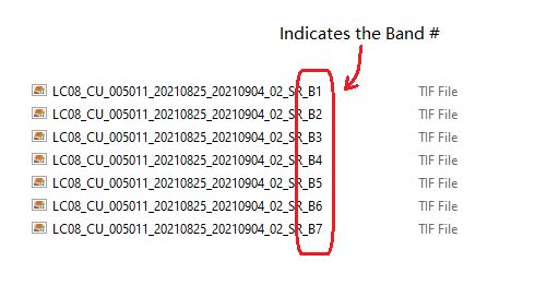
Looking at the downloaded files, you will see that several files end in a suffix indicating the “band” captured in that image (i.e suffix “_B1”, “_B2”, “_B3”, etc). These bands correspond to the specific ranges of wavelengths we discussed earlier. We will be combining several of these different images to create our composite.
Now that we have the data, Geographic Imager will make it easy to import, and edit multispectral imagery data, all while retaining accurate spatial referencing. In addition, being seamlessly integrated into Adobe Photoshop, it gives us access to powerful Photoshop tools such as adjustment layers and curves (check out this great Mapping Class tutorial by Tom Patterson on using adjustment layers to improve imagery data). We start by opening the image files corresponding to Bands 1 through 7 (files ending in suffixes “_B1” to “_B7”).
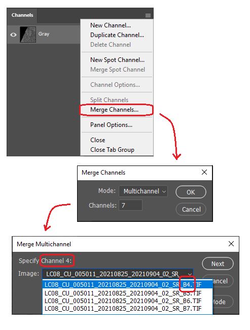
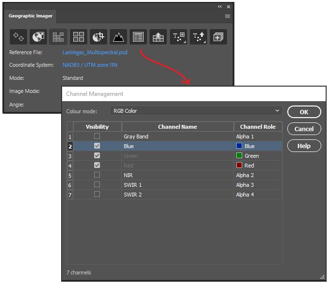
Go to Window > Channel to open the Channels panel From the Channel panel options menu, select “Merge channels” to combine the separate images into a single composite with different bands. Set the Merge Mode to “Multichannel” and specify each channel by assigning it to its corresponding image (i.e., Channel 2> Band 2, Channel 3> Band 3, etc.). Complete this for all channels.
To work with our new multi-channel image, ensure the Image mode is set to Grayscale (Image> Mode> Grayscale). You may also want to rename the channels to match their spectrum component (i.e., rename “Alpha Channel 2” to “Band 2 – Blue” and so on.)
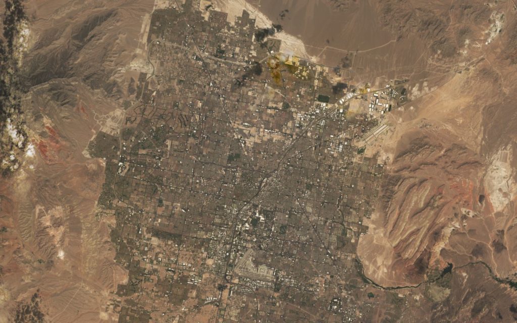
Next, open the Channel Management tool on the Geographic Imager Panel. Here we can easily modify channels to create different colour composites that match our needs. Specify the colour mode at the top of the panel to be “RGB Colour”. Next, specify the channel roles that will be used to display the image. To start, let’s go with the obvious choice. For “Band 4 – Red”, select the “Red” channel role. For “Band 3 – Green”, specify the “Green” channel role, and for “Band 2 – Blue”, select the “Blue” colour role. We call this band combination 4-3-2, referring to the bands we assign to Red, Green, and Blue respectively. This is also what is called the “natural colour” image, and will show us a view of the Las Vegas area as it would appear to our eyes (we’ve used some adjustment layers to brighten the image before displaying it).
Natural Colour (4-3-2) Image of Las Vegas
Being in the middle of the desert, it’s unsurprising that our image is a mix of drab browns and greys, reflecting the mix of concrete structures, sandstone, and small shrubbery that permeate the landscape. If you look very closely, you might notice a few dark green patches, which indicate some of the many golf courses and parks that are interspersed throughout the city. In the natural colour band combination, however, only the larger areas of vegetation are easily visible, and others are generally washed out by their surroundings. If we want to get a better idea of the vegetation that persists in this desert “oasis”, we will need to apply some modifications to our imagery to create a false colour composite.
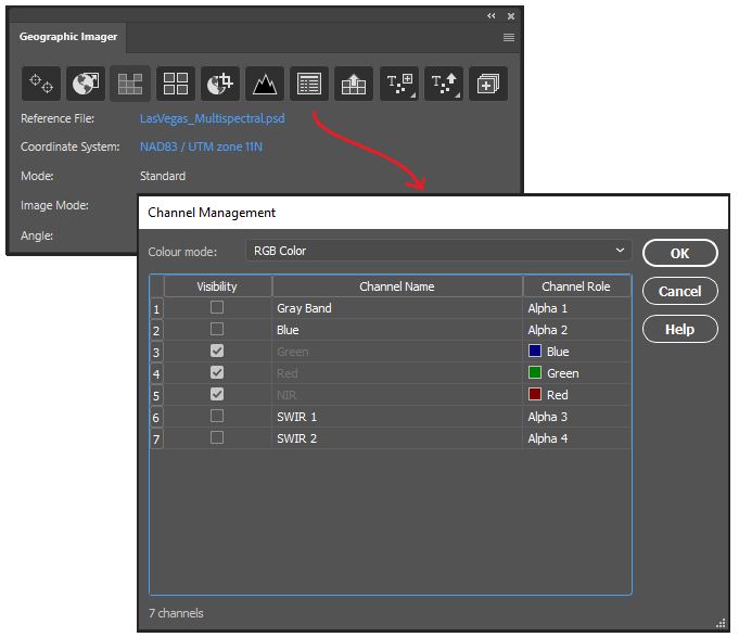
Opening the channel management tool again, this time we are going to create the band combination 5-4-3. This combination is one example of a “false colour” image and will help us to highlight the presence of vegetation in the area.
False Colour (5-4-3) Image. Note that vegetation appears as bright red.
Looking at this new image, you might see how vegetation stands out clearly as bright red in colour. Irrigated vegetation, such as that found on golf courses, parks, lawns, and crop fields stands out even more prominently. Compared to the natural colour settings, this image makes it much easier to identify vegetated areas, even small ones. Presenting the image in this way is not only more informative but also tells a story of how human intervention affects our environment. The highly structured shape and location of most of these vegetated areas indicate a high level of human involvement, especially when compared to the more “natural” areas outside the city. This provides strong hints at the massive role water management and irrigation have in overcoming an otherwise arid, harsh, growing environment.
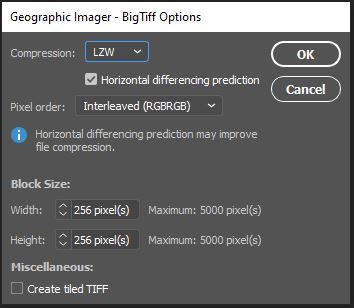
ou may want to save the file as a Photoshop document (PSD/PSB) in order to work with the image again later or explore different band combinations on another machine. Starting with Geographic Imager 6.4, internal georeferencing is now embedded directly within a saved Photoshop document. This reduces the need to retain an external spatial referencing file when the project is re-opened at a later date. Alternatively, we can also Export to one of several different spatial image formats. To demonstrate, we’ve exported to a GeoTIFF format, which will also retain internal georeferencing. When selecting “Save As.. -> “Geographic Imager – BigTIFF”, a dialogue window will open that allows us to configure compression, pixel order and block size for our exported image. Note that GeoTIFF formats allow us to retain our Image Channels if we wish (but this will increase the file size). Click OK and the image is now exported for future use.
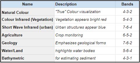
There are many different band combinations you can use to explore and analyze different patterns on Earth’s surface. We only examined two very specific types in this demonstration, but below we have provided a list of several other common Landsat 8 band combinations, as well as their use-cases.
The above band combinations are specific to Landsat 8 Imagery. Different satellites will have alternative band combinations.
Try out a few combinations and see what types of interesting patterns you can observe. With the Channel Management tool in the Geographic Imager plugin for Adobe Photoshop, exploring band combinations and false-colour composites with imagery data is a breeze!
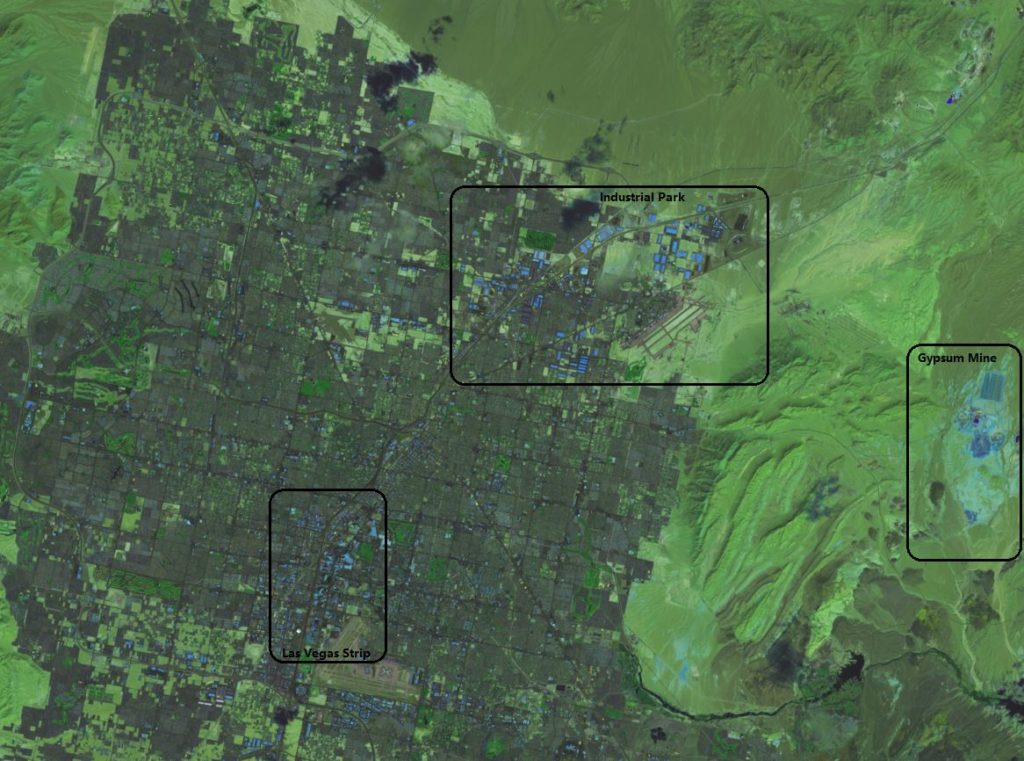
The above false colour composite uses Band Combination 7-6-4. This combo works best for highlighting human-made developments and structures. Urban areas, buildings and structures will appear as bright purple to blue in this combination.
Avenza is pleased to announce the release of Geographic Imager® 6.4 for Adobe Photoshop®. This version is fully compatible with the latest version of Adobe Photoshop 2021. The release also introduces the ability to retain embedded georeferencing within saved Photoshop documents. We are also excited to provide scripting support for the export of point, text, and vector layers, updated map store upload options, new coordinate system support, and a host of bug fixes and engine enhancements.
Here is what you can expect with the latest Geographic Imager 6.4 release:
Georeferenced Photoshop Documents and Photoshop BIG files
We know that easily and efficiently importing and processing georeferenced imagery data directly within Adobe Photoshop make Geographic Imager the go-to platform for your imagery editing needs. With the release of Geographic Imager 6.4, working with georeferenced imagery is now simpler than ever. We have introduced the ability to retain embedded georeferencing information directly within a saved Photoshop Document (PSD). Geographic Imager will now store, and automatically read georeferencing specifications upon opening Photoshop documents. This reduces the need to retain an external reference file and means users will not have to specify this source reference information upon opening the file. Embedded georeferencing now works with all support images contained in Photoshop Documents, as well as very large georeferenced images contained in Photoshop BIG (PSB) files.
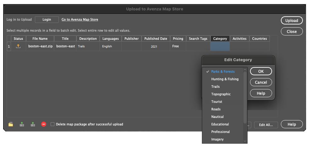
Upload Options: Avenza Map Store Categories
For users wishing to share or sell their maps on the Avenza Map Store, we have updated the “Upload to the Avenza Map Store” options to include the new Map Store categories. Map Store categories such as Parks & Forests, Trails, and Topographic are organized to enhance the search experience on the Map Store and ensure your high-quality map products reach the right users. When exporting from Geographic Imager to the Avenza Map Store, users will be provided an option to select one of 13 specific categories.
Scripting Support for Exporting Vector Layers
For handling repetitive imagery processing tasks, our users often employ the already powerful automation and scripting tools available in Adobe Photoshop. With Geographic Imager 6.4, we have introduced scripting capabilities for exporting vector layers. This means exporting vector points, lines, polygons, and text within Geographic Imager can now be recorded in the Adobe Photoshop Action panel. This new functionality allows users to script and automate export processes for their geospatial imagery.
Improved Coordinate System Library
For this release, we worked to improve the Geographic Imager engine that ensures our users can continue their work in a truly seamless, powerful, efficient, geospatial image-editing environment. This release includes performance enhancements, user interface improvements, and a host of bug fixes. Additionally, we have built on our existing coordinate system catalog with the addition of several new and updated projection and coordinate systems. These exciting additions include the Natural Earth and Natural Earth 2 Projections created by Tom Patterson.
Get it today!
All active maintenance subscribers can upgrade to Geographic Imager 6.4 today for free. Users who don’t have active maintenance or are on a previous Geographic Imager version can still upgrade.
Welcome to the latest edition of Mapping Class! The Mapping Class tutorial series curates demonstrations and workflows created by professional cartographers and expert Avenza software users. In this month’s edition, we welcome Tom Patterson, a map-maker extraordinaire and a true household name in the cartography world. Today Tom is sharing with us a demonstration showing how he works with Sentinel-2 Imagery Data using Geographic Imager and Adobe Photoshop. Tom uses a new dataset that that represents a “pretty difficult” image to process and offers an excellent look at how to create beautiful natural colour images from satellite data.
Part One of this exciting walkthrough covers the techniques Tom uses for accessing and importing satellite imagery data, as well as his approach to colour correction using some of the powerful built-in image editing tools in Adobe Photoshop. Tom has produced video notes below to help you follow along! Look out for Part Two, coming in next months edition of Mapping Class!
***
Work with Sentinel-2 Imagery in Geographic Imager: Part One by Tom Patterson (Video notes adapted from original)
This tutorial explains how to process Sentinel-2 satellite data, released by the European Space Agency for free, into natural colour images. Beautification is the goal—nature often can use a little help when using satellite images for maps and graphical presentations.
To do this tutorial you will need Adobe Photoshop and Avenza Geographic Imager. Trial versions for geographic imager can be found here. For this tutorial, you should also have intermediate Photoshop skills, a good internet connection, and a computer with plenty of RAM.
Getting the data
The US Geological Survey distributes Sentinel-2 data on the EarthExplorer data portal. You can also download Sentinel-2 on the Copernicus Open Access Hub, although I find EarthExplorer easier to use.
1) Downloading data from EarthExplorer requires that you first sign in as a registered user.
2) After you sign in, use the “Search Criteria” tab in the upper left to specify a point of interest. You can also draw a polygon on the map to specify a larger search area.
3) Click the “Data Sets” tab next. From the long list of data types, select “Sentinel-2.”
4) The EarthExplorer portal offers useful tools for narrowing your search. For example, you can filter by acquisition date and cloud cover. Sentinel-2 image extents are viewable as transparent map overlays.
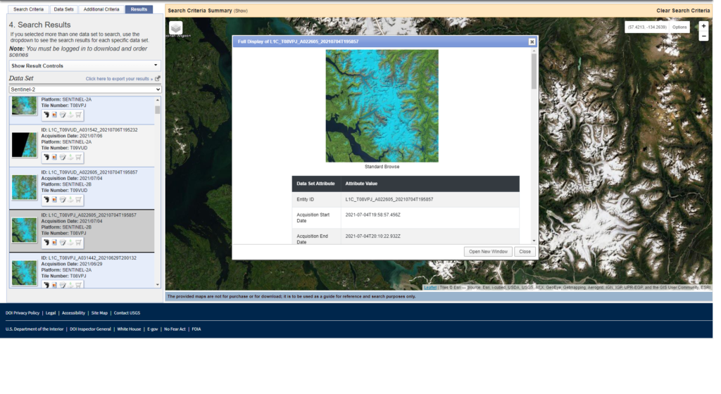
5) Click the “Results” tab to peruse the available images. Then click the image thumbnails to see larger image previews in false color. Scrolling down from the image previews reveals additional metadata
To download a scene from the search results list, click the “Download Options” icon. You will then see these two download options:
● L1C Tile in JPEG2000 format (XX MB)
● Full Resolution Browse in GeoTIFF format (XX MB)
Download both.
7) The Full Resolution Browse in GeoTIFF format is a false-color image (bands 11, 8A, and 4) at 20-meter resolution.
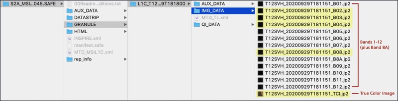
8) Decompress the L1C Tile in JPEG2000 format archive. It contains the raw Sentinel-2 bands and a true-color image. You will need to drill through multiple folders to get to these data
Importing the data
Because Photoshop does not natively import JPEG2000 files, you will need to use a Geographic Imager to import the Sentinel-2 data. The advantage of Geographic Imager over other plugins is that it preserves georeferencing and allows you to export manipulated Sentinel-2 images as GeoTIFFs.
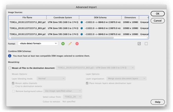
1) In the Photoshop drop menu, go to File/Import/GI: Advanced Import…
2) Select one or more Sentinel-2 bands to import (in this case, we want Bands 4, 3, and 2 which correspond to our Red, Green, and Blue bands) and click OK. Importing could take a minute or two to complete. Each Sentinel-2 band will open as a separate Photoshop file. That’s it.
Colour Correction
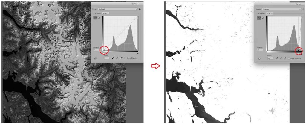
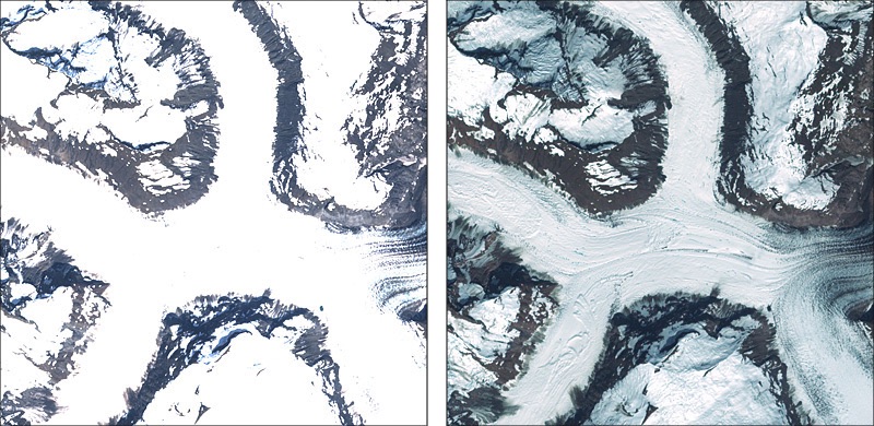
The premade True Color Images are convenient to obtain, and you can easily adjust them to create acceptable results. However, they have an Achilles heel: snow- and ice-covered landscapes. Automated processing removes the very lightest tones, rendering them as empty white (below, left). In order to depict subtle details in snowy terrain, one must build the satellite image from scratch using the raw data in bands 4, 3, and 2 (below, right).
1) Use Geographic Imager to open bands 4, 3, and 2 (File/Import/GI: Advanced Import…). The import will take a couple of minutes to complete, and the three bands will open as separate Photoshop files.
2) With one of the Photoshop files active, go to the flyout menu in the upper right corner of the Channels window. Select Merge Channels…
3) In the Merge Channels window, change the mode to RGB Color and specify 3 channels.
4) Another window will pop up. Make sure that band 4 is the red channel, band 3 is the green channel, and band 2 is the blue channel. Then click okay.
5) Photoshop will then ask whether you want to save each of the three bands. Don’t save them. You will then see the merged 16-bit RGB image, which is mostly gray
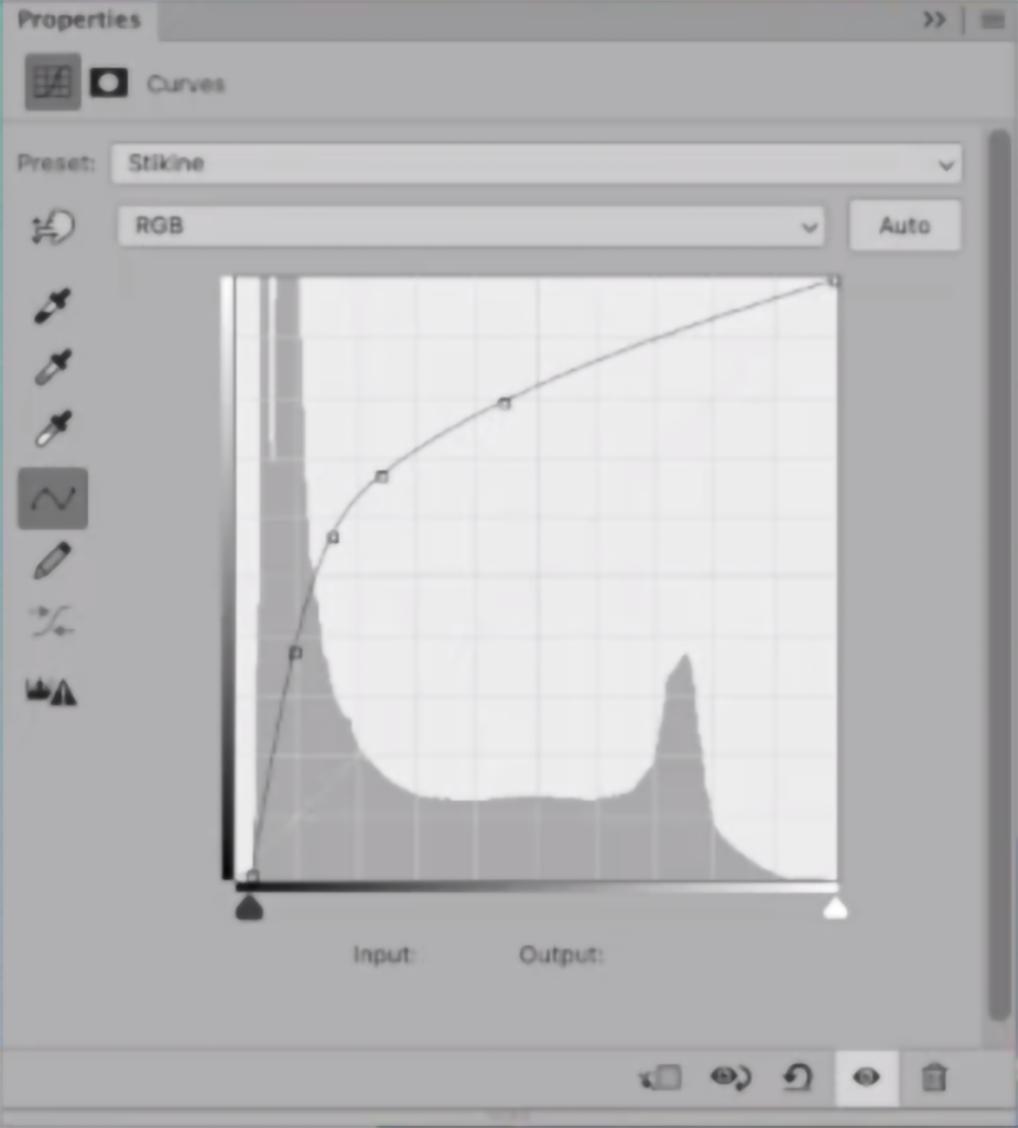
Using Curves
Now the fun begins. Compared to Levels adjustments that are linear, Curves adjustments are non-linear, giving you more control over discrete portions of the tonal range in an image. They are a little tricky to use at first, but the precise results that you can achieve with this command make learning it very worthwhile.
1) Apply a Curves adjustment layer and adjust the tonal range of the image taking care to leave some value in the snow patches. I often apply two or more Curves adjustment layers, one on top of the other, to fine-tune the tonal balance. With 16-bit images, you can stretch the tonal range without worrying about banding artifacts.
2) Save your applied curves as adjustment layers so you can save and re-use them for later. This is especially important when you start mosaicing imagery data (coming in part two!) and need to ensure curves are applied consistently across multiple images.
Below is the curve that I used to adjust the image. The histogram shows the distribution of light and dark values. Moving the lower-left end of the curve to the right lightened dark trees. Moving the top-right end down added a slight amount of tone to the white snow. Both of these moves decreased overall contrast.
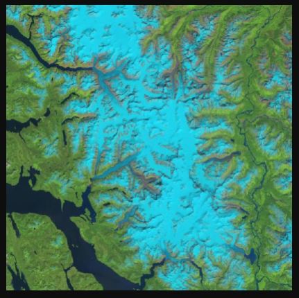
Touch-up with the False Colour Image
We want to add a bit more eye-catching vibrance to our image. We can do that by utilizing the included false colour imagery and using the colour properties and blending tools to really make the mountainous terrain pop.
1) Since we need the false colour imagery to match the resolution of our RGB image, we need to upscale it. This can be done using the image sizing properties and resampling using the “Preserve Details” setting.
2) Overlay this upscaled false colour image over top of the RGB layer. You can then adjust the blending modes to create a nice vibrant image. In this case, I use the “Soft Light” blending mode, which is great for making the alpine terrain really stand out.
3) Create a selective colour adjustment layer to touch out individual colour tones in the image. For example, I try to remove much of the yellow tones in the image, as yellow tones are atypical for the “cold” alpine-like terrain we find in this image.
Coming up in Part Two:
The land areas in this image now stand out quite well. They look quite a bit more vibrant than the raw data and offer a bit better tonality than what we find in the automatically generated true-colour image included in the download. What we can do next is work on making the water areas stand out as well. I’ll show you how you can use the mosaic tool in Geographic Imager to work with elevation data to create layer masks that make adjusting water areas easy.
***
About the Author
Tom Patterson worked as a cartographer at the U.S. National Park Service, Harpers Ferry Center until retiring in 2018. He has an M.A. in Geography from the University of Hawai‘i at Mānoa. Presenting terrain on maps is Tom’s passion. He publishes his work on ShadedRelief.com and is the co-developer of the Natural Earth dataset and the Equal Earth projection. Tom has served as President and Executive Director of the NACIS. He is now Vice-Chair of the International Cartographic Association, Commission on Mountain Cartography.
When it comes to map-making, Dan Cole is a true master. A passionate academic, Dan has designed maps for research and academia for over 40 years. As the GIS Coordinator and Chief Cartographer of the Smithsonian Institution in Washington, DC., Dan has created maps and cartographic pieces for museum exhibits enjoyed by hundreds of thousands of visitors every year. As a researcher, Dan has authored scholarly publications in several renowned academic journals, and co-edited the book “Mapping Native America: Cartographic Interactions between Indigenous Peoples, Government, and Academia.”
For Dan, his interest in maps began when he was a child. He often enjoyed being the “navigator” on family vacations and building off a natural fondness for exploration he developed hiking trails as a Boy Scout. In his freshman year at the University at Albany – State University of New York, Dan first became interested in a career in cartography while studying under esteemed cartographer Dr. Michael Dobson. The opportunity to turn a genuine interest into a full-fledged career was too good to pass up, and Dan soon found himself enrolling in every cartography, geography, and remote sensing course he could. In the final year of his Bachelor of Geography degree, Dan became a cartography teaching assistant, providing him his first opportunity to act in a teaching role.
Immediately after graduating, Dan was recruited to an assistantship position at Michigan State University (MSU). Here he published his first research paper, which was co-authored alongside Richard Groop, now a professor emeritus in Geography at MSU. Completing a Masters degree in Geography in 1979, Dan moved to Oregon State University (OSU) and began collaborating with cartography professor Jon Kimerling, first as a TA, and later to run the Cartographic Lab there.
Leaving OSU in 1981, Dan took on a variety of roles at several recognizable institutions across the country. Some of these roles included; leading the Cartographic Lab at the University of Maryland, working as a cartographic technician for the National Oceanic and Atmospheric Administration (NOAA), contract cartography work for the Woods Hole Oceanographic Institute, and taking on a course instructor position at Montgomery College. In 1986, Dan began working at the Smithsonian Institution (SI) and was able to pursue his passion for research full-time. Some of his earliest mapping pieces with SI became an integral part of the “Handbook of North American Indians”, a series of scholarly reference volumes documenting the culture, language, and history of all indigenous peoples in North America. Through a cooperative arrangement, he was also responsible for researching the changes to the Bureau of Indian Affair’s “Indian Land Areas”map in 1987 and 1989.
“My first five years there mostly involved cartographic research, doing both manual and computer-based mapping for the Handbook of North American Indians—at the time we used Adobe Illustrator 88!”
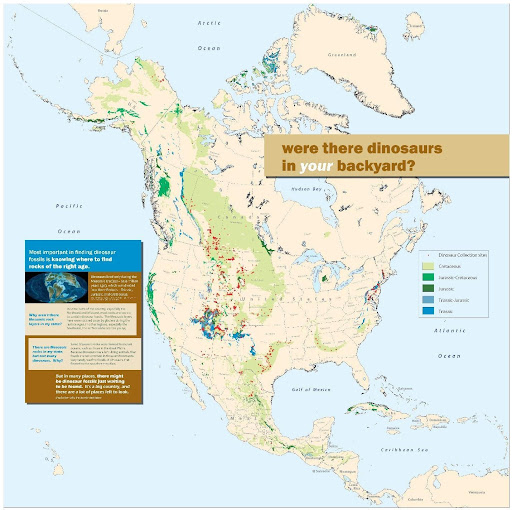
Later, Dan moved to a role as the GIS Coordinator with the Smithsonian’s IT Department. There, he was exposed to the entire breadth of cartographic projects spanning the Smithsonian’s impressive list of research disciplines. He worked on projects related to biodiversity and species ranges, created maps documenting climate change, and contributed to interactive map exhibits showing the impacts humans have on the environment. From volcanology and mineralogy to prehistoric studies and even the study of dinosaurs, Dan became involved in most of the Smithsonian’s major subject areas. Several of Dan’s map creations even feature in the permanent exhibits at the Smithsonian National Museum of Natural History.
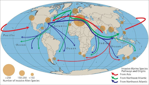
Pathways and origins of invasive marine species, one of 40 maps created for the Ocean Hall exhibit at the Smithsonian National Museum of Natural History
Although each unique exhibit and area of study came with its own specific objectives, from a cartographic standpoint, he found that most still shared a few key concerns. He noted that one of the biggest challenges for almost all museum researchers is to geo-reference the vast number of artifacts and biological specimens that are contained in the museum’s collections. Such a process is crucial to analyze where specimens were found in the past and to provide insights on where they could be found in the future based on changes to the environment.
“Collections for nearly all museums around the world, including the Smithsonian, have environmental characteristics documented with the collection site. But most, by far, do not have coordinate locations for artifacts and specimens collected before the GPS era; rather, the majority of their collections have descriptive locations. So we must use Natural Language Processing—a computer science-based technique—to process coordinates from the written descriptions.”
By the mid-1990s, digital mapping processes had become an integral component of map creation. Dan became one of the first adopters of MAPublisher, using the first version of the software to work with maps and geographic data in the Adobe Illustrator environment. Today, MAPublisher continues to play a crucial role in map production at SI, and Dan still uses MAPublisher to produce maps for some of the museum’s most popular exhibits.
“Since obtaining MAPublisher in the 1990s, I have been involved with over 20 different exhibits and multiple publications. All of these required importing shapefiles to Adobe Illustrator, PDF, or EPS formats so that publishers or exhibit staff could work with them. While other digital mapping software has improved over the years, I find the placement of typography is still handled more elegantly with MAPublisher.”
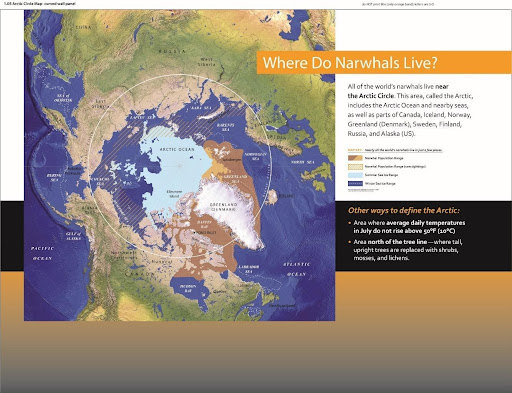
One of five maps that form part of the “Narwhals: Revealing an Arctic Legend” exhibit at the Smithsonian National Museum of Natural History (now a travelling exhibit!)
The museum environment presents some unique challenges for a cartographer. In a museum setting, maps need to be designed to communicate with the general public, synthesizing and presenting complex information for an audience that may be unfamiliar with the subject matter. This differs from research-focused work, which typically requires static printed maps that adhere to the strict guidelines of academic journal and book publications, and is typically viewed by experts in that particular field of study. For museum exhibits, cartographers need to employ careful design techniques to make maps informative and engaging to diverse audiences of all ages. These techniques result in maps that vary widely in format, from traditional static poster maps to animated and interactive maps that tell dramatic stories or serve as learning tools. Commenting on some of the unique challenges in today’s “pandemic era”, Dan notes that virtual online exhibits have made the use of web-mapping and interactive maps more commonplace.
“For the immediate and long-range future, I see greater use of static, animated and interactive maps online for public education on a variety of topics, with less interactivity in-person.”
Dan continues to oversee GIS support and teaching for staff at SI. He greatly enjoys the opportunity to work on diverse projects from a variety of interesting areas of study. As the GIS Coordinator at SI, he now covers over 400 GIS and satellite image processing users, plus over 500 story map writers and developers, including staff with very little knowledge of geography, cartography, or GIS. His passion for map-making remains to this day, and his maps continue to be enjoyed by visitors from around the world. An educator at heart, Dan has some parting advice for any students or young professionals seeking to break into the wonderful world of cartography;
“The advice that I give to nearly everyone interested in a cartography or GIS career is: while you’re still in school, plan to get a minor or double major in the field that interests you. Get a broad-based education that enables you to serve your clients in any field and join professional and academic organizations to expose yourself to others’ work. Most importantly, even once you are employed, never stop learning!”