Today we are shifting the spotlight to Geographic Imager, our plugin for Adobe Photoshop. This blog features the usage of the Terrain Shader tool, which was featured in our promotional video at the Adobe MAX conference last week!
Terrain Shader is great for adding dimension to your maps. It is commonly used to perform shaded relief, a method for representing topography on maps in a natural and intuitive way. The tool provides options to apply colourization schema and shaded relief to supported elevation data formats, such as DEM or SRTM files. Terrain Shader has several different settings that users can customize to create a shaded relief that best suits their needs.
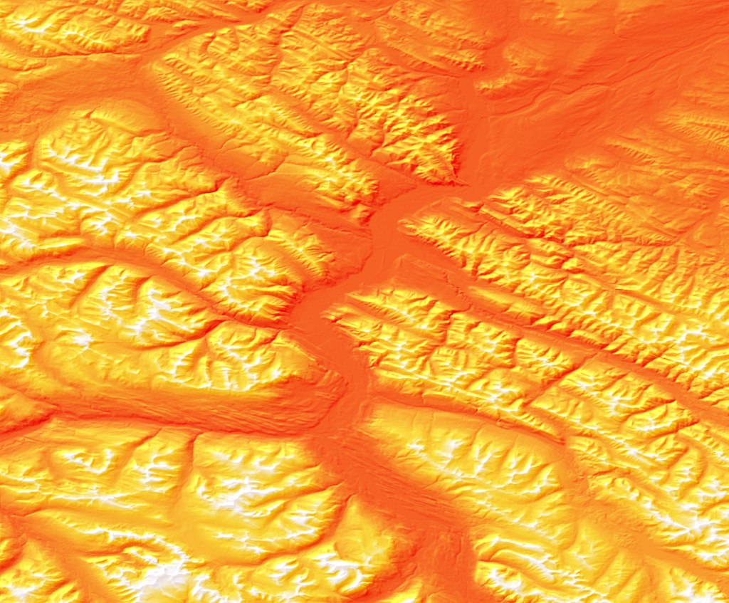
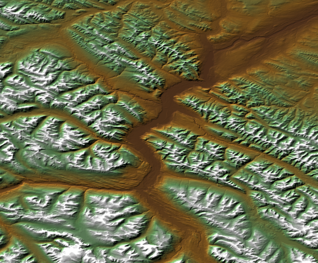
In the spirit of Halloween, we’ve decided to show off the Terrain Shader tool by creating a fun shaded relief using a colourization schema that resembles candy corn!
I’m starting with a DEM file covering a portion of Jasper National Park in Alberta. DEMs are imported by default using a black-white gradient, with black representing the lowest elevation and white representing the highest.
Next, you can open the Geographic Imager panel and select the Terrain Shader button.
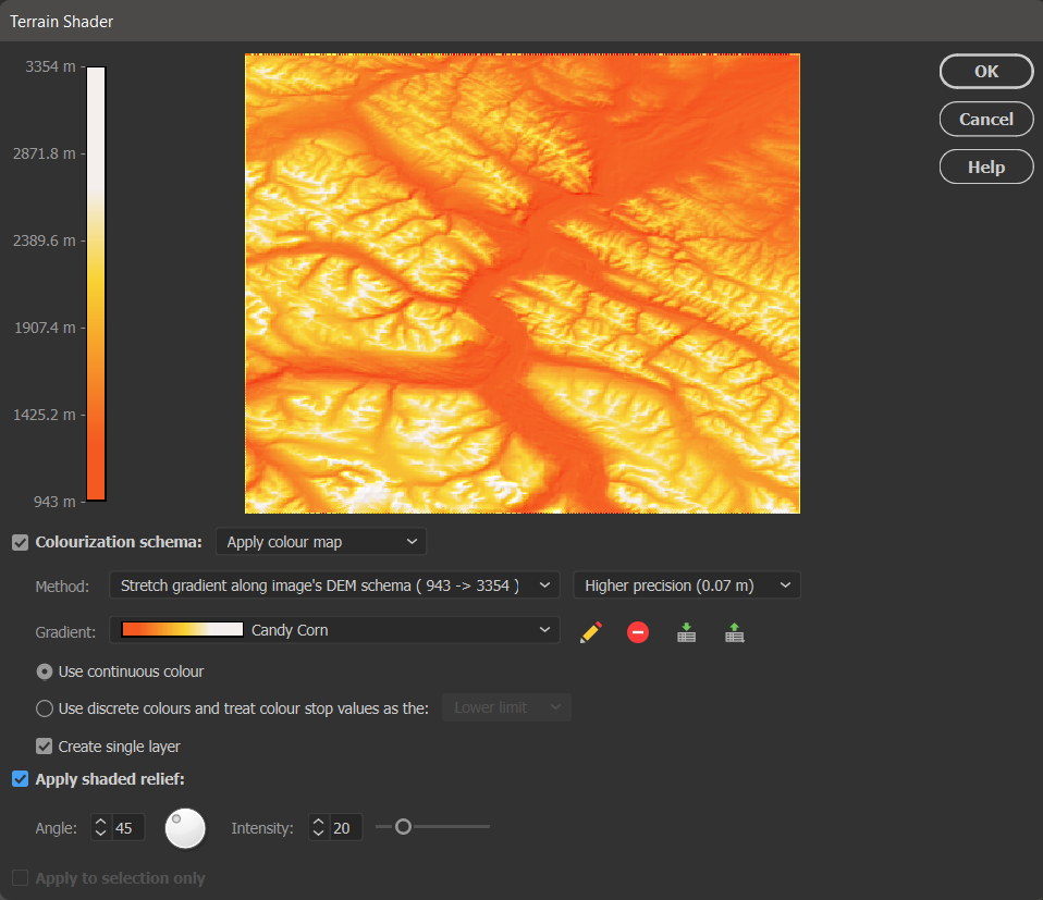
There are many different settings available in the Terrain Shader tool to customize your design. First, ensure the Colourization schema option is checked and set to “Apply colour map” which enables you to apply colour to your DEM. You can also choose the Method to stretch the colour map over a preset group of values or simply apply your colour ramp from the highest and lowest point on the DEM.
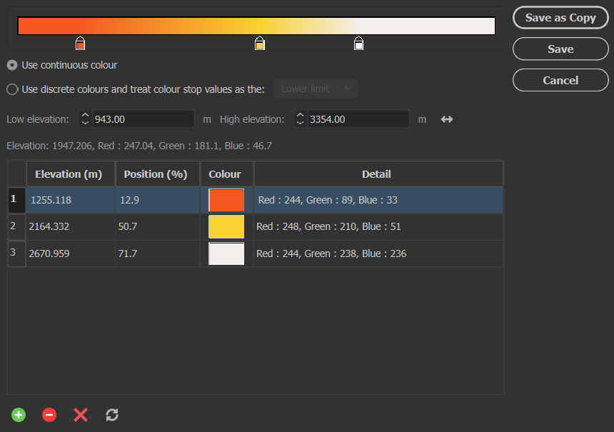
Next, you want to select any Gradient from the list and press the pencil icon to open the Colour Map editor window. From this window, you can set and adjust three different colour stops to represent the three candy corn colours you wish to apply to your map.
When you are finished, be sure to click Save and save it as a new colour map, titled appropriately (in my case, it was “Candy Corn”).
Finally, select Apply shaded relief and adjust the light source angle and intensity if desired. Shaded relief is what adds texture to your DEM to make it look like terrain.
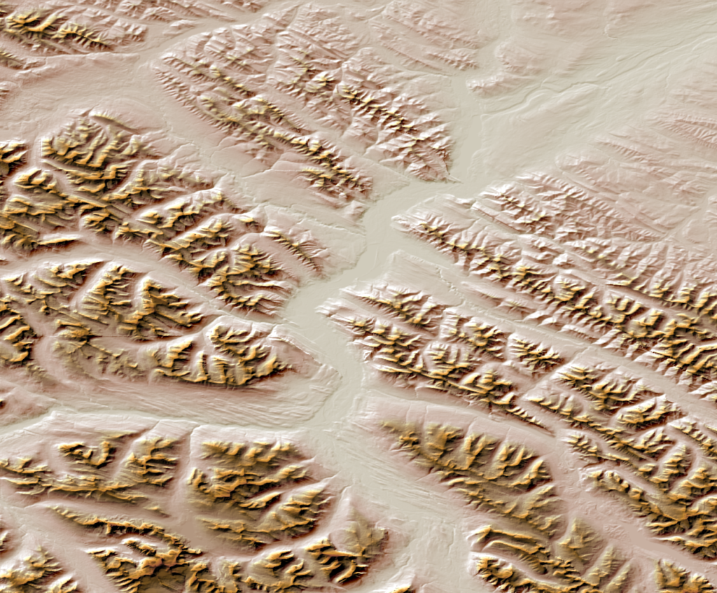
Click OK, and you have successfully created your very own candy corn mountains! This is just one fun way to make use of the terrain shader to add a personal touch to your map. See the final result below, as well as a few other examples of colourization schemas that can be used to add a more realistic feel to your terrain.
For more information about the Terrain Shader tool, check out our related Support Centre articles and tutorial!
We’re excited to announce that the 2023 Avenza Student Map Contest has now concluded. Submissions for the contest were accepted from December 1st, 2022 to April 30th, 2023. Over the last month we have selected the winner. As such, congratulations are in order for the grand prize winner!
Grand Prize Winner
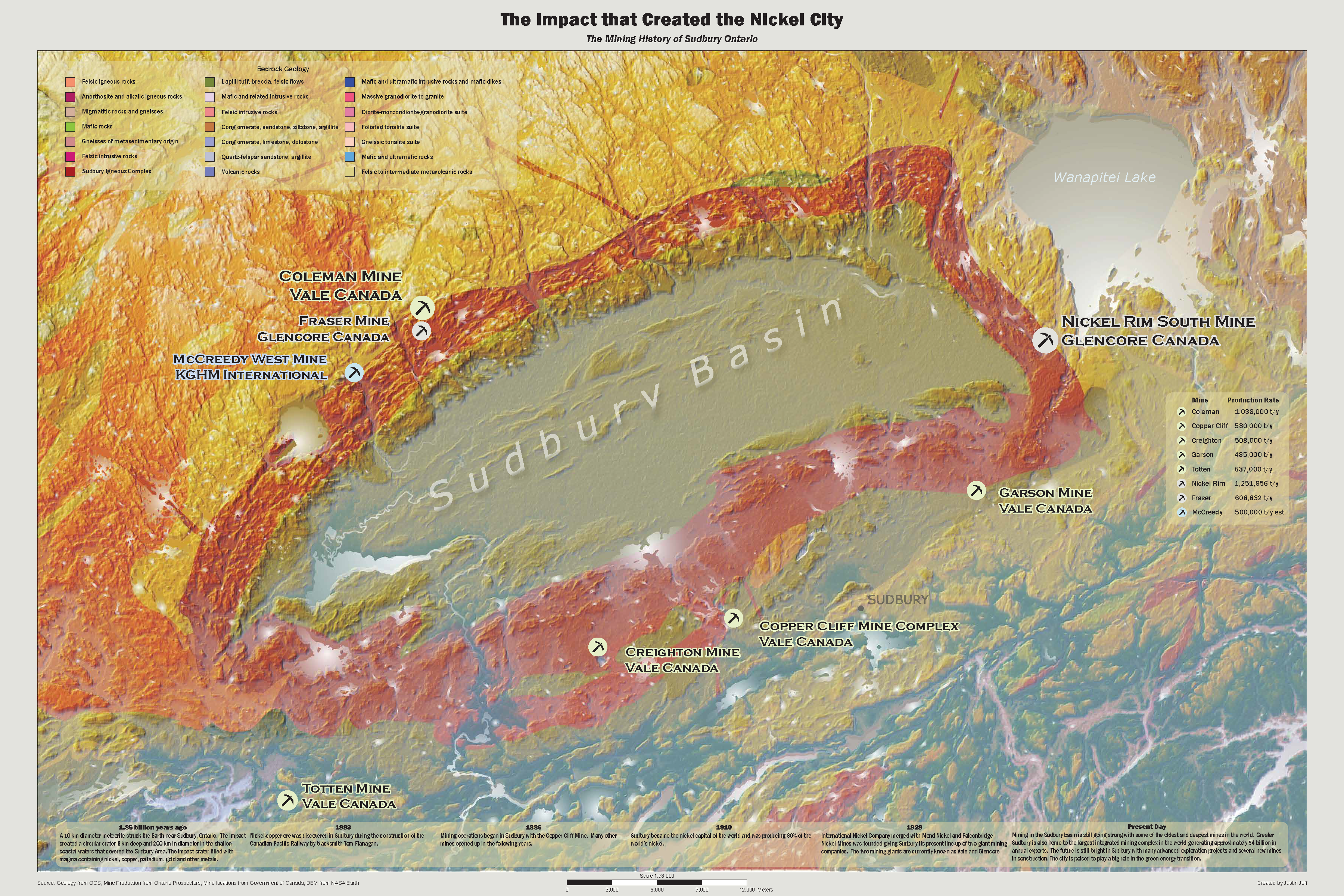
The Impact that Created the Nickel City Justin Jeff Fleming College
From the creator: “My map displays the terrain and geology around the Sudbury Basin that was created by a meteorite impact. Furthermore, it shows the active mines around the Sudbury Basin using a proportional dot technique based on the mines production. Also it shows a timeline of the mining history in the Sudbury area. It will be used to gain insight and understand the significance of the Sudbury Basin.”
Justin used the MAPublisher import tools to import prepared data from other sources for the terrain and mine locations. The MAP Themes tool was used to create proportional dot symbols for the active mines and the MAP LabelPro add-on was used to label and style the active mines. Finally, Justin used the Layout tools to add and style the scale bar.
Congratulations again to Justin! Stayed tuned for the open version of the Avenza Map Contest starting soon…
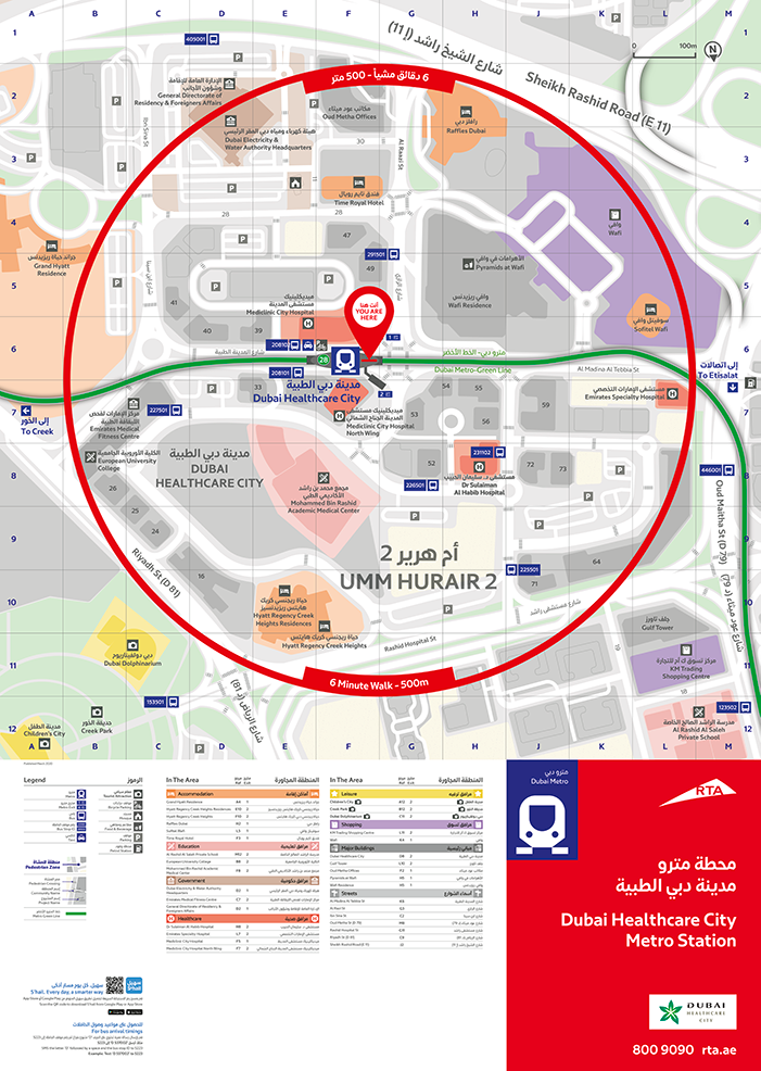
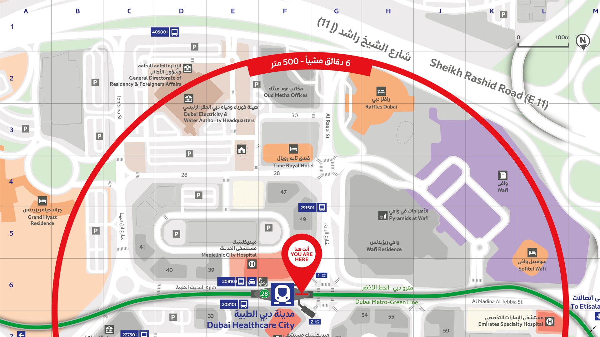
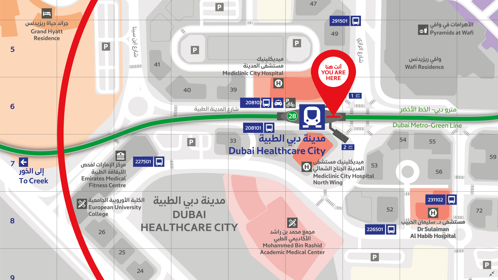
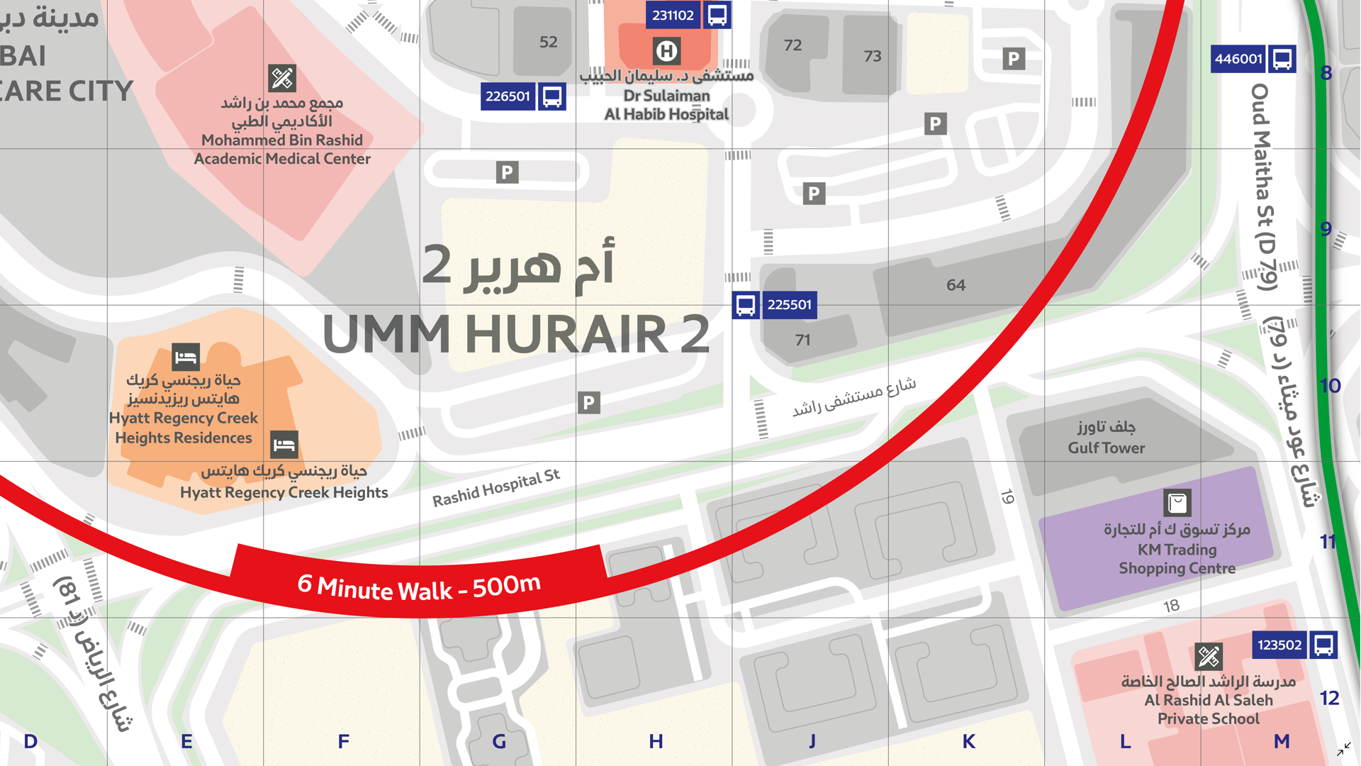
In this Map Gallery Spotlight, we are highlighting another submission from the 2021 Avenza Map Competition. This bilingual map of the area around the Dubai Healthcare City Metro Station was created by Zain Madathil for Explorer Publishing. It is one of nearly 4,000 individual maps he has created for the Dubai Public Transport Map project.
The map is easy-to-use and informative, providing information in both English and Arabic, and is accompanied by a detailed map index to categorize and highlight important points of interest and nearby attractions surrounding the station. The map utilizes careful design elements to make interpretation easy, including colour-coded icons and building footprints, platform-based direction markers, and a 500m radius walking distance indicator.
Select the images below to see a detailed look at Zain’s map
Making the Map
Madathil received data from his client in the form of points, lines, and polygons, and used the Avenza MAPublisher plugin for Adobe Illustrator to design the map. He used the Multiple Data Import tool to easily get all of his data into MAPublisher with a single import process. MAPublisher maintains the georeferencing of the data imported from almost any source, which allowed Madathil to focus on customization rather than data placement.
With nearly 4,000 maps in the series, the MAP Themes tool was important for Madathil to maintain consistent labelling across all maps in the series. After creating a custom branding MAP Theme stylization, Madathil was able to apply this to each map in the series as necessary. He also used the Map Attributes Panel to aid with customization of the attribute data associated with his map features.
Madathil simplified his labelling process by using our MAPublisher LabelPro add-on, which also allowed him to ensure consistency across the map series. LabelPro allowed Madathil to customize the style of his labels and apply rules to ensure they did not overlap important features or other labels. It also eased his application of both Arabic and English labels on the map.Finally, Adrain added an Index Grid and created an index and legend to complete the reference guide for the map using the Layout Tools.
For more information on using the MAPublisher LabelPro add-on, please visit our Support Centre section for this tool.Check out our other Map Gallery Spotlight blogs here!
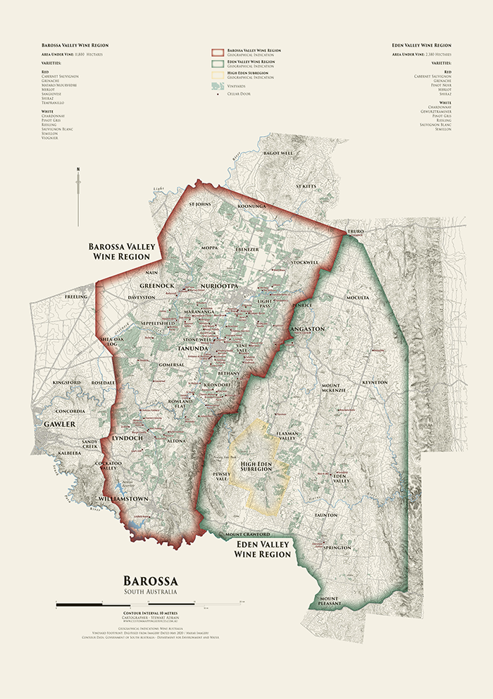
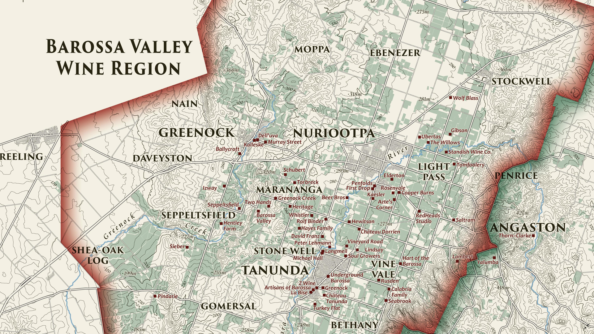
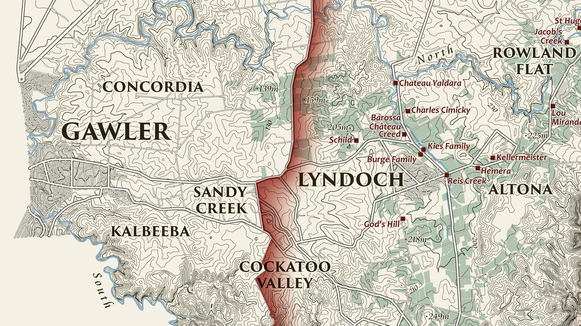
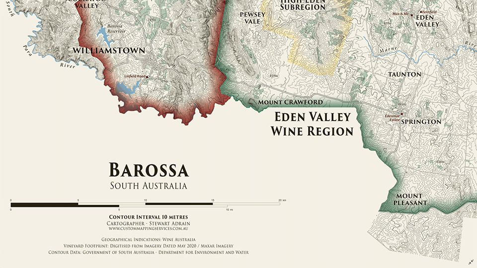
We are showcasing another great submission from the 2021 Avenza Map Competition. This heritage-style decorative map of the Barossa Region of South Australia was created by Stewart Adrain of Custom Mapping Services. The map shows the wine regions, vineyards, cellar doors, and topography of the area. It is the final map in a series of heritage-style cellar wall maps Adrain has created of the wine-growing regions of South Australia. The Barossa Valley wine region is particularly notable for its Shiraz variety.
Adrain’s map uses 10-meter contours to display the topography of the Barossa region. Regional wineries are named and indicated on the map, with their locations shown by a point representing their cellar doors. The various localities of the Barossa region are also labelled, and the two main wine regions as well as the High Eden Subregion are displayed using colourful borders. The supplemental text of the map features the total area of vineyards in each wine region, as well as the wine varieties they produce. This map as well as the others in Adrain’s Cellar Wall map series can be purchased for print from Meridian Maps.
Select the images below to see a detailed look at Stewart’s map
Making the Map
Adrain completed his data processing with QGIS and then used the Avenza MAPublisher plugin for Adobe Illustrator as a finishing tool to design the final map product. He used the Multiple Data Import tool to easily get all of his data into MAPublisher with a single import process. MAPublisher maintains the georeferencing of the data imported from other GIS software, so he could quickly turn his focus to the map’s stylization rather than data placement. Adrain used MAP Themes to easily achieve his stylization, which allowed him to automate much of the design process of the map, keeping the theme of this map in line with the other maps in the series.
Adrain simplified his labelling process by using our MAPublisher LabelPro add-on. This allowed him to create label themes based on the layer they were being applied to. Since this map was the last in the series, these themes were already created so he could simply import his settings from his previous maps to save time. The LabelPro feature is convenient for both time-saving purposes and ensuring consistency across maps in a series.
Finally, Adrain added a scale bar using MAPublisher and completed the finishing touches to his map with native Adobe Illustrator tools.
For more information on using the MAPublisher LabelPro add-on, please visit our Support Centre section for this tool.Check out our other Map Gallery Spotlight blogs here!
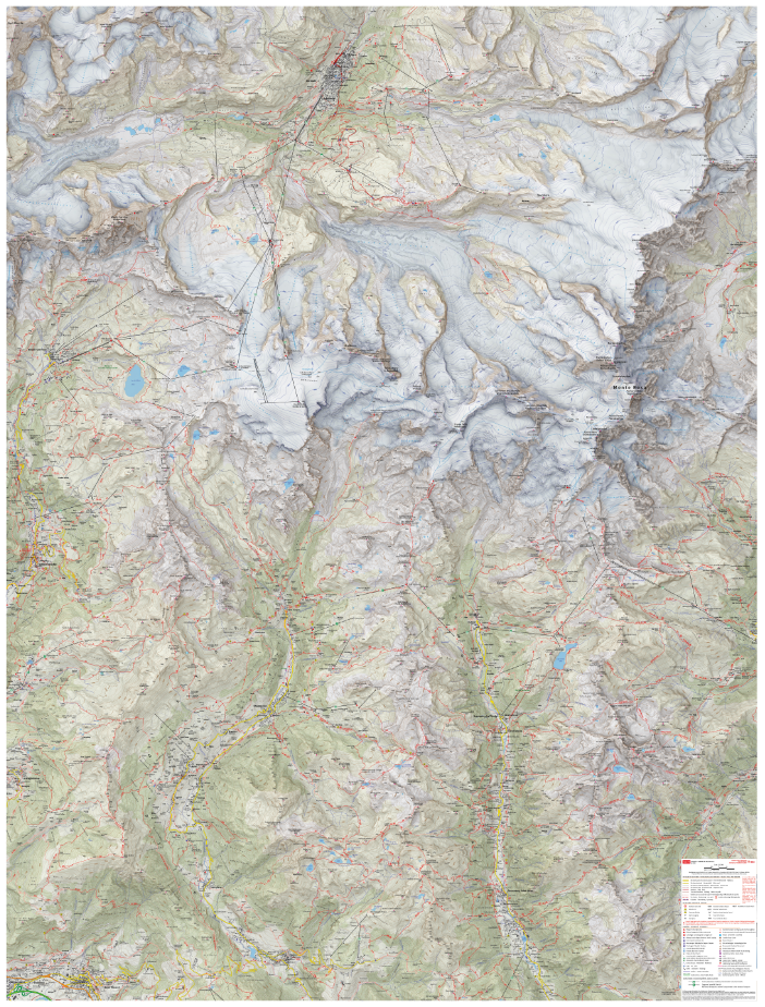
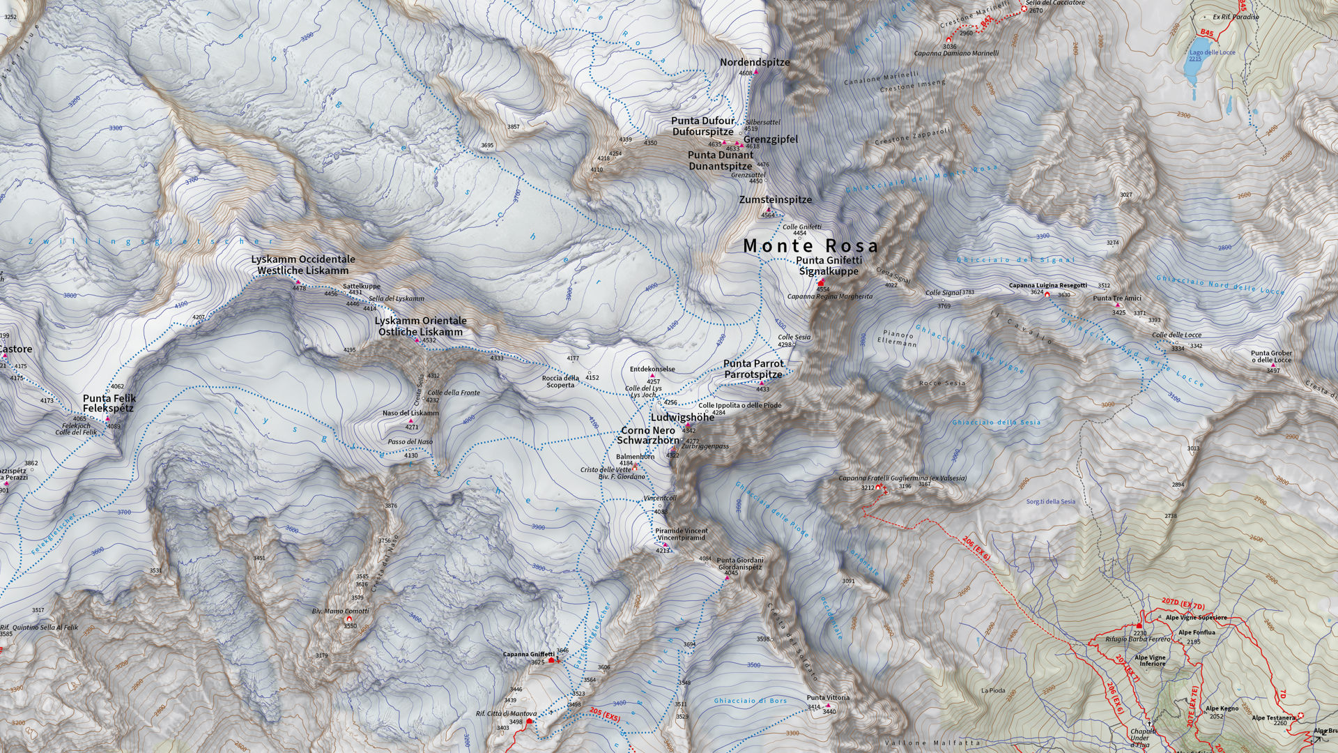
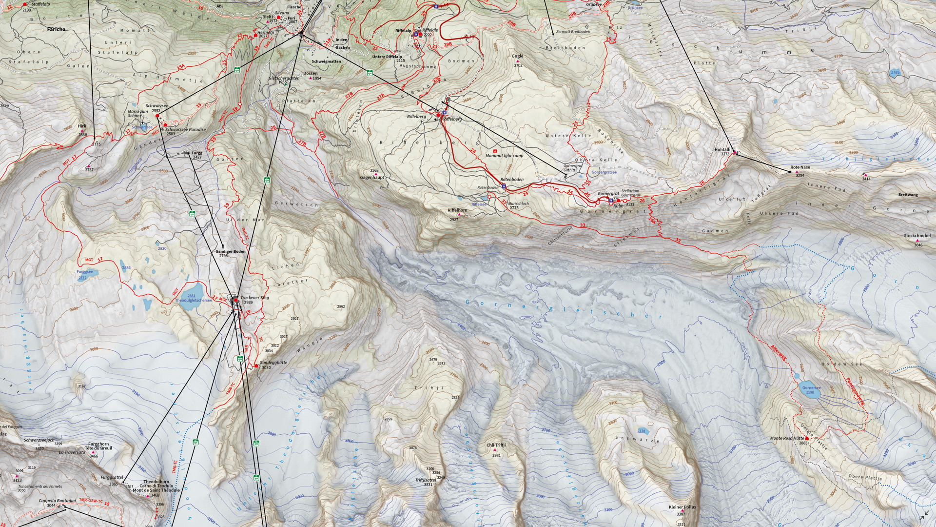
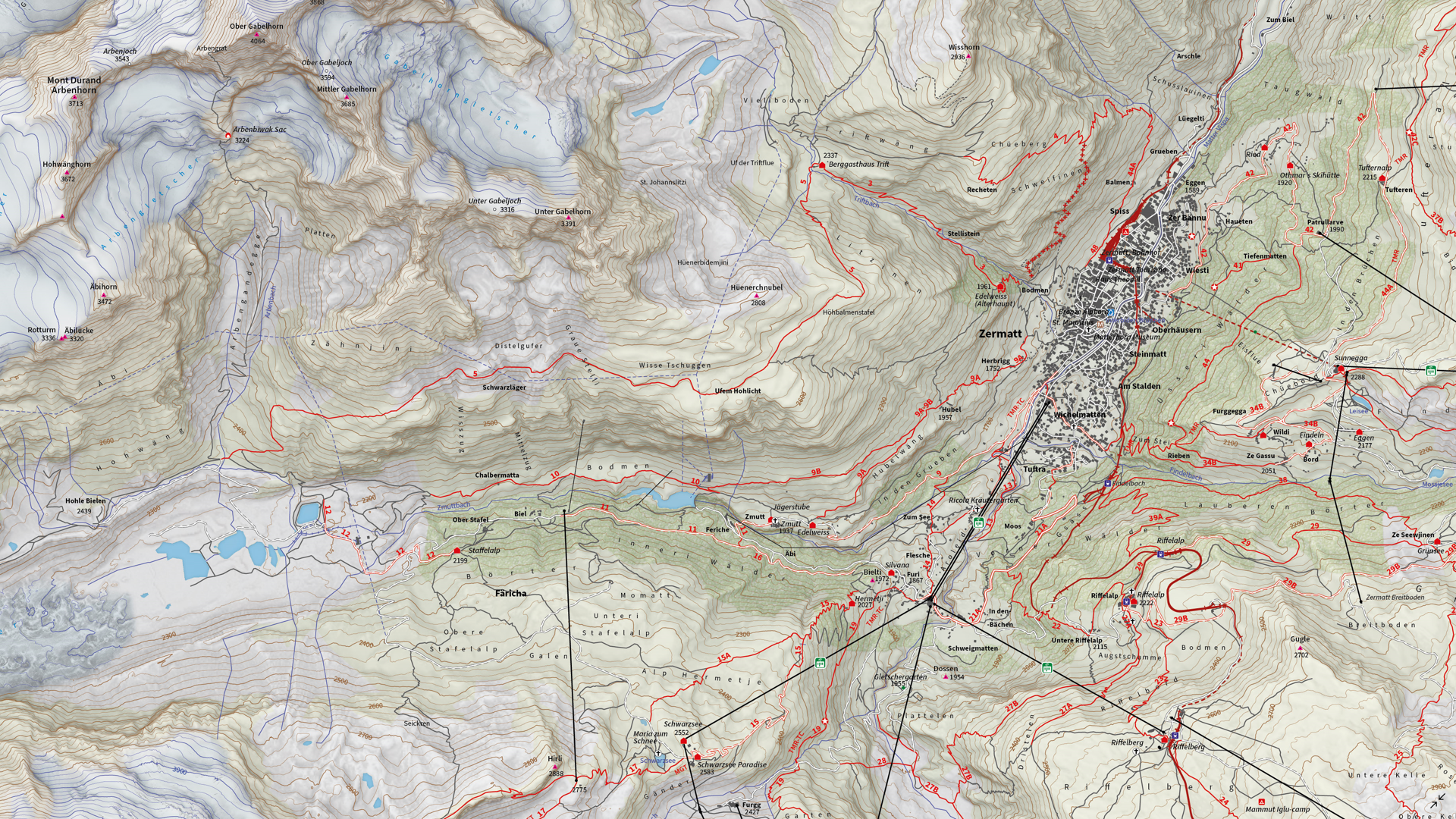
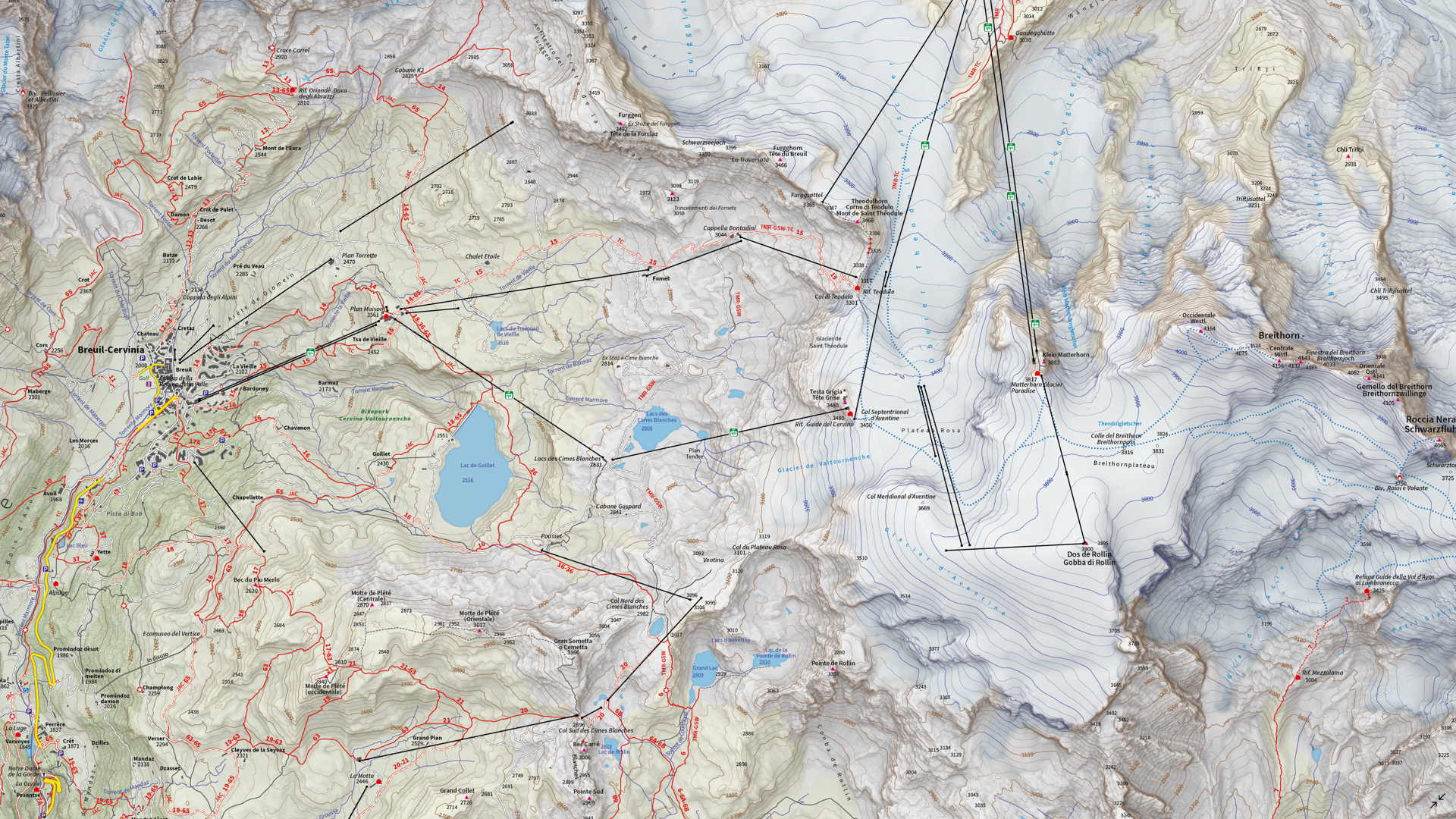
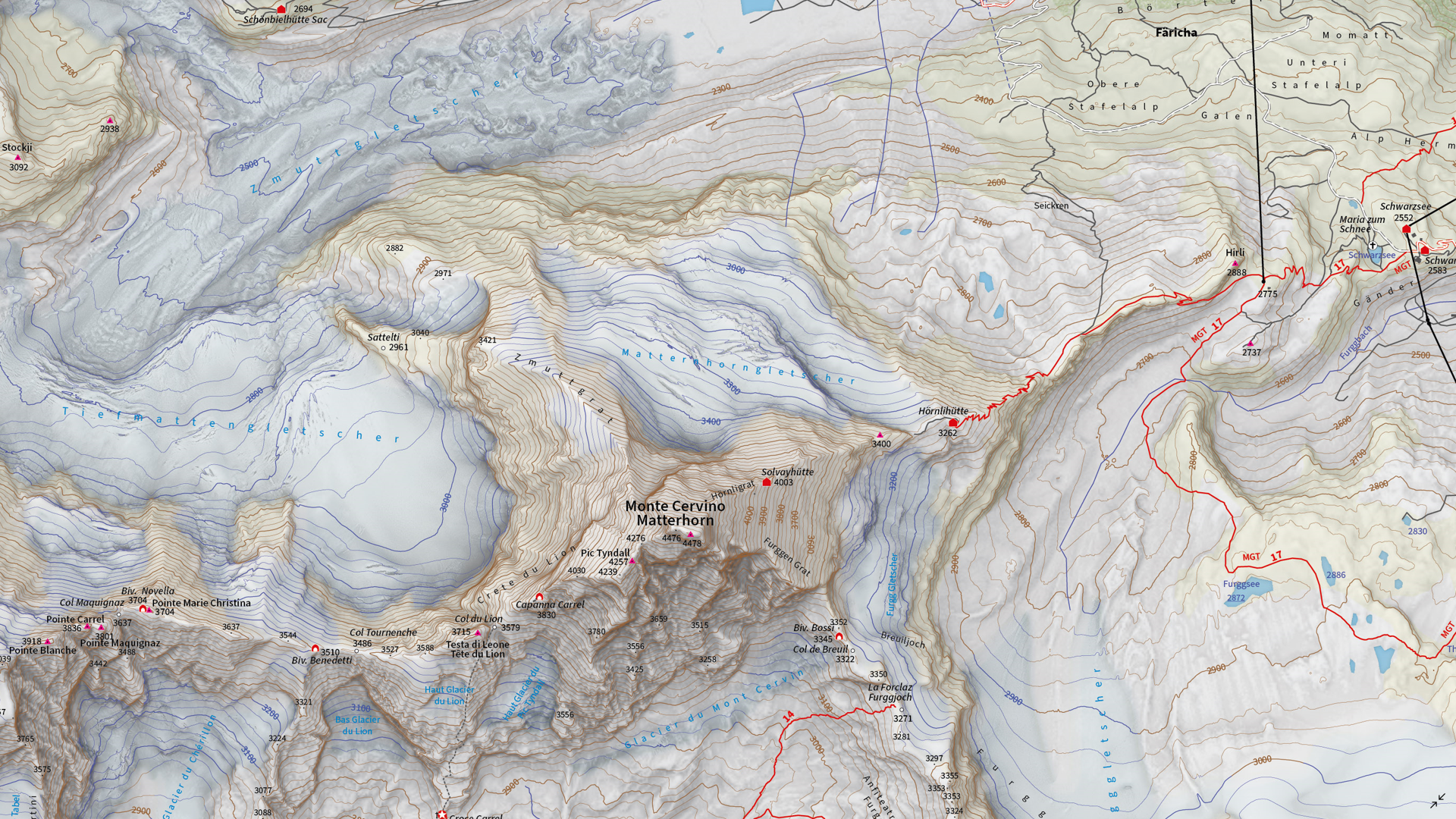
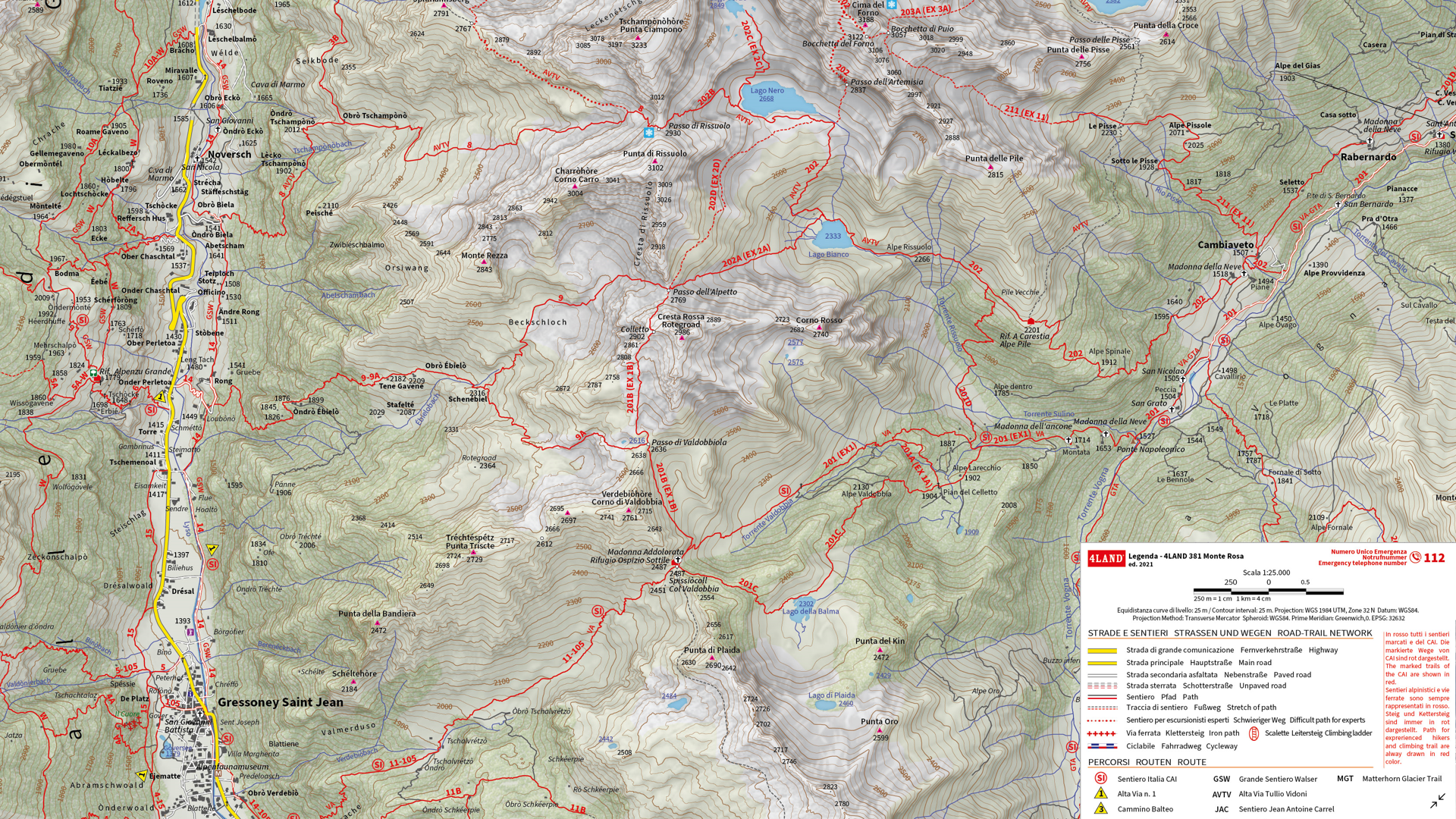
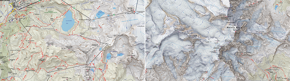
We are showcasing the Runner-Up of the 2021 Avenza Map Competition. This impressive topographic reference map of the Monte Rosa area was a collaborative effort between Remo Nardini, Founder and Chief Technical Officer, and the whole 4LAND team. The map is centered on two of the most renowned mountains of the Alps: Monte Rosa and Monte Cervino (commonly referred to as the Matterhorn). The map encompasses a massive and diverse area. From the glaciers and valleys crossed by the Alta Via n.1 highway in the Aosta valley to the panoramic snow-capped peaks that the Alps are known for. The high valleys of the Monte Rosa area emanate a particular charm, with its woods and pastures making it stand out among other areas in the Aosta Valley.
Remo and his team manually collected trail information and point-of-interest data directly in the field with the Avenza Maps App and combined this with carefully crafted shaded relief techniques to bring the mountainous terrain of this rugged area to life. The map itself is designed for print at 1:25000 scale and is meant to offer a high-quality, waterproof, and tearproof map for use on the trails. The map provides an abundance of useful information for hiking, camping, mountain biking, and a host of other summer and winter outdoor activities. Smart label placement means this map is not only impressive to look at but highly functional when out on the trails.
Select the images below to see a detailed look at 4LAND’s map
Making the Map
The 4LAND team is known for ground-truthing and manually collecting the data that goes into their map products. Trails, placemarks, and other important data were collected directly on the ground using the Avenza Maps App. Supplementing this with pre-existing and custom-developed cartographic datasets meant the map could provide a substantial amount of valuable information to its users.
Using the Geographic Imager Plugin for Adobe Photoshop, the team could elaborate on a custom elevation product to create the enhanced shaded relief basemap that gives the map its gorgeous look. They then crafted the details of the map in Illustrator using MAPublisher. After importing all map datasets, the team used MAP views to align, scale, and project map data layers onto an Illustrator artboard. The team made use of the Vector Crop and MAP Selection tools to filter and process the data down to their specific area of interest.
The 4LAND team applied a custom stylesheet using MAP Themes to create the beautiful textures and colours that make each part of the map stand out. MAP Themes applies rule-based styles that are based on MAP Attribute data contained in each map data layer. This careful work ensures each region is distinct and eye-catching. Every glacier crevasse and serac is carefully shaded to create depth, and woodlands are textured to reflect the irregular patterns of foliage.
One of the most impressive features of this map is the wonderfully detailed labels. This was achieved using the LabelPro add-on, and enabled Remo and his team to perform rules-based, collision-free label placement using a comprehensive suite of user-defined labelling parameters. With LabelPro, they could specify how each label should be stylized (to give each label type a unique look and feel) and also define how the labeling engine would handle label placement to avoid overlap, crowding, or mislabelling.
Lastly, stylistic elements of the map were touched up using native Illustrator tools, MAP Layout tools, and grids and graticules. The map itself is available in digital form for use with the Avenza Maps app. Visit the Avenza Map Store to see other fantastic maps by 4LAND or check out their website to learn more about their other high-quality mapping products.
We’re excited to announce that the 2021 Avenza Map Competition has now concluded. This past year’s competition saw map-makers and cartographers from around the world submit their best and most impressive work. We had some truly impressive displays of cartographic design this year, with competitors demonstrating how they use Avenza mapping software to make eye-catching and impactful cartographic products. After multiple rounds of judging, discussions, and time spent reviewing our scorecards, the Avenza team would like to congratulate this year’s prize winners!
Over the next few weeks, keep an eye out for our Winner’s Spotlight articles. Each article will provide an in-depth look at the winning map entries, with insights from their creators, and an overview of tools and techniques used to develop their prize-winning maps.
The winner’s maps and a selection of honourable mentions will also be showcased in the new Map Gallery, coming soon!
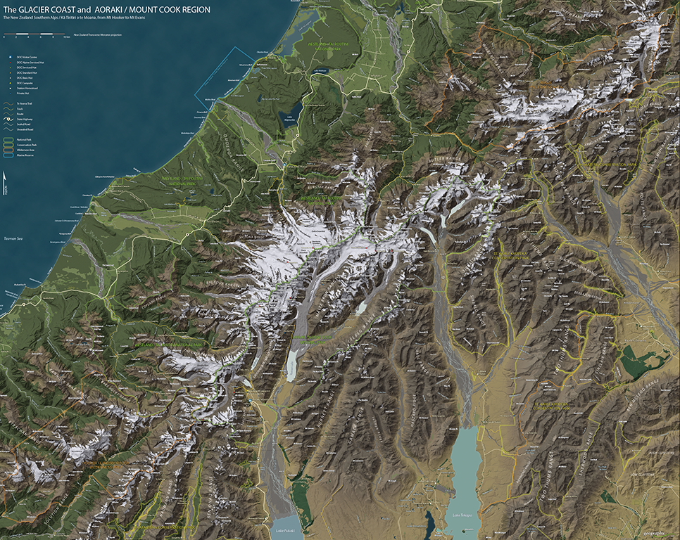
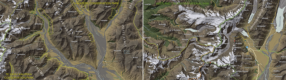
Grand Prize Winner (Open Category)
The Glacier Coast and Aoraki/Mount Cook Region Roger Smith Geographx Wellington, New Zealand
The judges would also like to offer special recognition to a number of other incredible entries. A selection of winners, honourable mentions, and notable map entries will be showcased on the upcoming Map Gallery page.
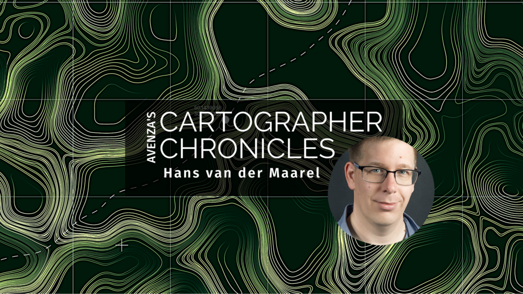
Hans van der Maarel has been a passionate cartographer for over 20 years. He works out of Zevenbergen, Netherlands where he operates his company, Red Geographics. To Hans, cartography is a passion that extends beyond the office, becoming more than just a career path. Through this passion, Hans has developed a level of expertise found only in the most dedicated of map-making professionals. As an expert MAPublisher user, Hans has been a frequent contributor to the Avenza Resources Blog. You can see some of his latest work through his Georeferencing Techniques Video tutorials released as part of Avenza’s Mapping Class blog series. To read more about Red Geographics, and see more of Hans’s work, visit redgeographics.com.
From a young age, Hans always had a keen interest in maps. His found himself drawn to old atlasses, spending hours looking at old maps, and geography was always his favourite subject in school. This interest persisted into high school, where at a job fair he found out you could actually study map-making as a career.
Continuing his studies, Hans pursued a program in Geo-Informatics at Hogeschool Utrecht (a four-year bachelor’s level course offering a mix of geodesy, GIS, and cartography). There he was introduced to various kinds of mapping and surveying, learning the techniques necessary to plan and design meaningful effective maps. During an internship at the National Spatial Planning Agency, he was first introduced to the MAPublisher plug-in for Adobe Illustrator. After graduation he started working for his local Avenza partner, doing tech support, training, consultancy, and commercial map production processes. This is also where he was introduced to Safe Software and their product for data transformation, also known as Feature Manipulation Engine (FME).
Hans developed a niche within the Dutch cartographic community that leveraged FME to prepare raw source data before using MAPublisher to visualize and create the final high-quality map products. This type of workflow, combining a mix of both FME and MAPublisher functionalities is now fully realized by the FME Auto add-on for MAPublisher.
“I was doing my first internship and was tasked to produce a poster-sized map of The Netherlands in Adobe Illustrator, but all the base data was in Shapefiles or ArcInfo coverages. Gathering base data and generalizing it was done in a traditional GIS, but getting that data into Illustrator and making a finished map required MAPublisher.”
In September 2004, Hans decided to continue on his own and founded Red Geographics. Working largely with Avenza products, two years later, he became an official Avenza partner and reseller. As his customer base expanded and more projects came in, Red Geographics developed a reputation of being “the one for the difficult projects”. Reflecting on the early years of Red Geographic’s operation, Hans mentioned some of his more memorable, fun, and eye-catching projects.
“There was the Oolaalaa Globe, a 5 ft diameter “beanbag” globe with beautiful maps printed on spandex. We received several custom orders of the globe map from other clients, including ones for Air France-KLM with the complete route networks of all their partners, and another from National Geographic Benelux and the City of Amsterdam, with a map of the city projected onto the globe.”
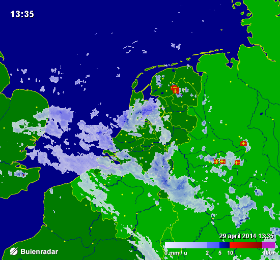
Also eye-catching, but for a completely different reason, were a series of simple basemaps created for Buienradar, the most popular Dutch weather website, and app. Millions of people have seen Hans’s maps when they checked the weather.
In the early years of Red Geographics, Hans became involved with the Cartotalk forum, first as an enthusiastic user, later on as a moderator, and finally an admin. Through Cartotalk, he also got involved with NACIS, the North American Cartographic Information Society. He attended their meeting in Salt Lake City in 2005 and he’s been to every meeting since. When NACIS took over Cartotalk, Hans became an ex-officio board member for several years before being formally elected a board member at large. He still serves on the board to this day and is currently in his 2nd term as secretary. Through NACIS, Hans was able to expand his network of international contacts, allowing him to contribute to several large-scale mapping and atlas projects. He created island maps that can be found in the Millennium House “Earth” atlas and more recently, several full-page maps for the 11th Edition National Geographic World Atlas released in 2019.
Building on the success of his earlier globe projects, Hans then created a new map whose design is displayed prominently on a new product called BalancePlanet, a globe-themed, fully functional yoga-ball that Hans considers a spiritual successor to the Oolaalaa globe bean bag chair.
In 2019, Hans expanded his team, adding two members to become a team of three. With more resources now available, Hans and his team can now tackle larger, more complex (mapping) projects. His team took on the momentous task of producing a nationwide 1:20,000 scale topographic base map of the entire country of Luxembourg. The finished results were used as a cartographic base for tourist maps showing hiking and cycling routes all over the country.
“The Avenza products have been a major factor in my development as a cartographer, as well as the development of my company,” says Hans. Many of his projects use a combination of FME and MAPublisher, and Hans has utilized the interoperability between these two programs to implement significant workflow automation. With a single base dataset, multiple maps can be made with the same style, and automating this process means he can produce a high volume of maps in just seconds, without needing to manually configure shared thematic elements.
“With automating some of the map production processes, I now only have to focus on the parts where my cartographic skills are most needed. MAPublisher allows me to do that. I want to find the right balance between quality and speed when it comes to producing maps, and with automating the data processes I have found just that.”
Aside from the traditional mapping products Hans has become known for, he enjoys working on smaller projects with interesting stories around them. “The maps I get the most joy out of these days are, interestingly enough, not those big ones. Over the past ten years or so I’ve been asked to produce greyscale maps for several academic publications, a lot of them focusing on the Arctic and Antarctic regions. Limited in terms of visual variables and often a need to show a lot of information on a small surface area, these kinds of maps are a very interesting challenge. One thing led to another, word-of-mouth is a great promotion tool, and we now find ourselves in the middle of producing about 30 maps for an upcoming publication by Cambridge University Press, chronicling the state of research in those areas. Wonderfully esoteric subjects which often lead me down a Wikipedia rabbit hole!”
Hans continues to use his cartography skill set to explore new ways of making maps more prominent in everyday life. Hans began introducing his colleague, Inge van Daelen, to the concepts of satellite imagery and Photoshop (using Tom Patterson’s great tutorial on how to process Landsat data). Branching off of this, they founded Blue Geographics, which originally started as a fun side-project but quickly grew into a full-fledged business. Through Blue Geographics, Hans designs and produces a range of sportswear and lifestyle items displaying beautiful satellite images derived from Landsat and Sentinel data.
“Looking ahead, I just want to make beautiful things,” says Hans, “One of my hobbies is photography, specifically cycling and cosplay. A few years ago, when I did a photoshoot with two cosplayers, I saw a sticker with that text in their workshop and it struck a chord with me. I’ve long had ‘doing awesome work for people I like’ as one of my goals and I want to keep on doing that. I also want to keep on challenging myself by trying out new techniques and new ways to map things. There’s still a lot to learn and I am very happy to know a lot of people in the cartographic community who are happy to share their knowledge and experiences.”
Steve Spindler has cultivated a passion for cartography that has continued for more than 25 years. He operates Steve Spindler Cartography, which develops custom-designed cartographic pieces that can be seen in map products utilized by governments, city planning organizations, and nonprofits from across the country. He also manages wikimapping.com, a public engagement tool that allows city planners to connect and receive input from their community using digital maps. A passionate cartographer at heart, Steve considers map-making both a hobby and career. He strives to share his ideas, techniques, and truly captivating cartographic style with others, either through his previous teaching at Temple University or through his tutorials hosted on his personal website cartographyclass.com
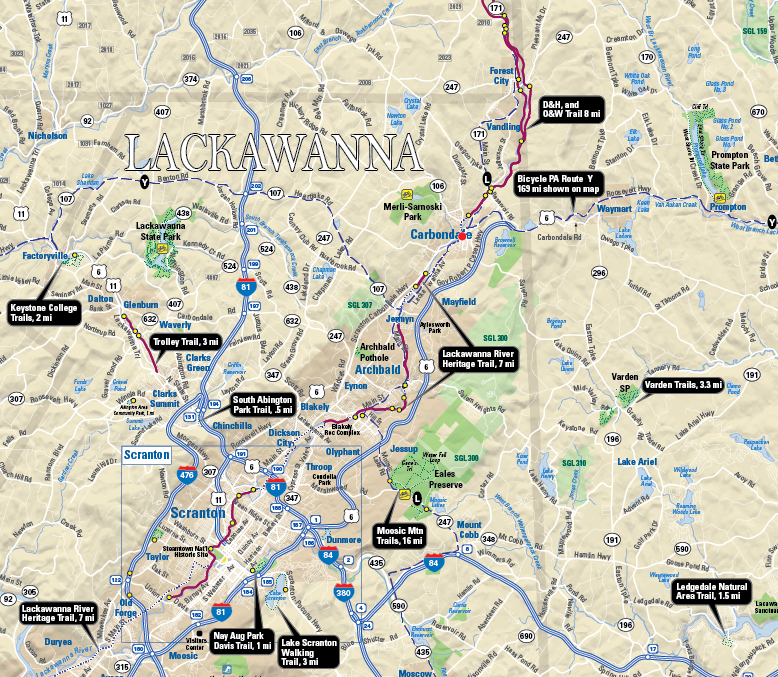
Steve first began designing maps in the early 1990’s while at Temple University for graduate school. Pursuing a Master’s degree in Urban Studies, Steve found that the cartography lab at Temple was his favourite place to be. Before the widespread accessibility of digital maps, Steve recalls spending time at the Philadelphia Library, exploring map catalogues and manually tracing topographic maps before faxing them to his own computer. Later into his graduate studies, Steve joined a mailing list for digital cartography enthusiasts, and this is where he first learned about Avenza and MAPublisher for Adobe Illustrator. He quickly adopted the software into his map-making process, leveraging its suite of cartography tools to easily create maps within a design-focused environment. He continues to use MAPublisher for much of his work, and some examples, such as the Northeastern Pennsylvania trail system map shown below, are even available digitally on the Avenza Map Store for use in the Avenza Maps app.
After graduating, Steve combined his passion for cycling with his love of map-making. He started designing maps that promoted bicycle transportation. His list of clients grew, and so too did his reputation in the cartography community. Soon his maps were published and shared over a wide range of platforms across the country.
“It was nice to see my maps posted in public places – in office cubicles, in a Congressional office, being waved around by a US Secretary of Transportation, in a Mac OS X keynote, in the subway, on TV shows, in newspapers – I was using MAPublisher to help create them all.”
After several years of high-paced freelance cartography work, Steve chose to revise his business approach to allow him to be more selective in how he engaged with potential projects. “I created an archetype that I wanted to serve, and put energy into solutions that would help this archetype”. Steve mentioned how he prefers to let a client place a value on what they want, first spending time with the client to conceptualize a problem and then delivering a proposed solution, only sending an invoice once it is appropriate. In his words, this requires a knowledgeable client that really understands what they need.
Some years later, he returned to Temple University, this time as an instructor. He taught cartography to students within Temple’s Professional Masters of GIS program and stressed the importance of creating a balance between teaching concepts and teaching software.
“Cartography is really about communicating with an audience, it’s not just about specific software. I think that teaching cartography using a single program (Illustrator with MAPublisher) would allow me to focus more on design concepts and communication. MAPublisher can still access large data sets, and the data is ultimately contained within the Illustrator file.”
His passion for teaching has continued beyond the classroom as well. In the last year, he has taken up a mentorship role for an up-and-coming cartographer. He provides direction and feedback on real-world map projects in what he describes as “learning with purpose”.
Steve also believes it is important to take learning into one’s own hands. To help him evaluate and improve his mapping processes, he often records his work sessions, carefully documenting and annotating many hours of recorded work such that he can revisit and recall specific mapping steps later on. Many of these sessions are edited down into videos that Steve posts on cartographyclass.com, a personal website for sharing his thoughts, ideas, and techniques on creating maps. He regularly shares maps that he creates for fun in his spare time, drawing inspiration from nature, photography, and artwork to create elegant visually engaging map pieces that exemplify the balance of art and science that is cartography. His recent work has explored the use of graphic styles and MAP Themes to create artistic map pieces that mimic the effect of watercolour paintings. Other posts show his use of the elevation profile tool to create unique maps of recent cycling trips.
In addition to the many MAPublisher focused tutorials hosted on his personal website, Steve is also an active contributor to the Mapping Class tutorial video series hosted on the Avenza Resource Blog. His contributions demonstrate unique and innovative workflows that leverage a wide range of MAPublisher tools.
These days Steve continues to take on map-related projects. His approach has allowed him to develop a career that leverages a personal passion and directs it into a successful business. He continues to learn and explore new techniques in cartography in his free time, sharing his thoughts and processes with readers of his blog. After more than 25 years of freelance cartography work, Steve feels his perspective on mapping and business has changed, “Cartography and business are not the same things for me. I want to make maps and don’t need a contract to do this. It’s just a matter of practicing daily. When the right client comes along, I can help out. I like to be helpful.”
We are back with another exciting addition to our Mapping Class tutorial series. The Mapping Class tutorial series curates demonstrations and workflows created by cartographers and Avenza software users. For this article, we are welcoming back Steve Spindler, a longtime MAPublisher user, and expert cartographer. He has shared with us an excellent tutorial on creating a map from scratch using openly available geographic data from OpenStreetMap, and accessed through Overpass turbo. Steve shows how you can create query statements to filter and export the data, and demonstrates how you can import the data into MAPublisher before using a selection of cartographic styling tools to create a visually appealing map.
Steve has produced a short video walkthrough detailing his map-making process. The Avenza team has produced video notes (below) to help you follow along.
***
Importing OpenStreetMap data using Overpass Turbo by Steve Spindler (video notes by the Avenza team)
Finding and accessing good quality data is often the first challenge for any cartography project. OpenStreetMap (OSM) can be an excellent source of open vector data describing land cover features (roads, parks, rivers, buildings, trails, infrastructure, boundaries). Once collected, cartographers can use OSM data to create highly detailed maps using the MAPublisher plug-in for Adobe Illustrator. Steve will demonstrate his process of collecting raw data from OSM and using it to craft a beautiful map of the Niagara Falls Area. The following video notes summarize Steve’s approach.
First, you will need to extract some data from the OSM database. Since OSM is a massive repository of geographic data, you’ll need a way to filter through and extract only the data needed for your specific map project. Overpass turbo is a web-based data mining tool that can make querying and exporting OpenStreetMap datasets easy. The tool allows users to apply query statements that filter the OSM database based on attribute and location information. Using the Overpass turbo “Wizard”, a user can enter simple queries (i.e. “water”) and automatically filter and select all features that match the query statement, making it easy to export specific data for your map.
Steve uses a simple query to obtain all map features that are considered “water”. This includes both natural and man-made features
The tool allows the user to export the filtered datasets into geoJSON format, an open standard format for storing and representing geographic data and attributes.
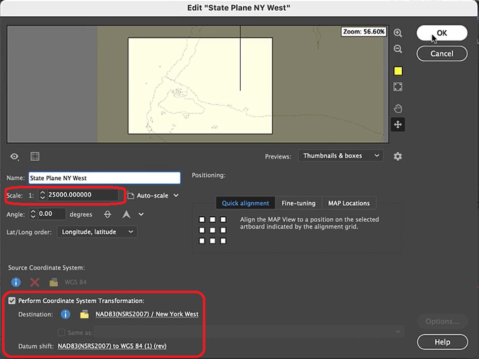
The geoJSON datasets collected from Overpass turbo can then be imported directly into MAPublisher for styling into a finished map. Use the Import tool to load the data onto an Adobe Illustrator artboard. From here, you can open the MAP View editor to adjust the scale and projection information for each map data layer. For this map, reproject the data into State Plane NAD 83 to preserve an accurate spatial scale. Set the scale option to 25,000 and customize the position of the map data on the artboard.
If needed, use the Vector Crop tool to trim the map data down to a specific area of interest, and simplify the layer to create smoother lines by removing excess vertices.
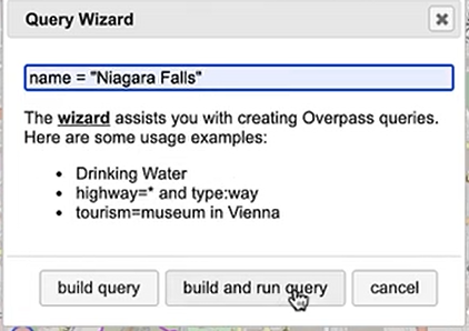
Back in Overpass turbo, you can build more specific query statements to extract individual features from larger data categories. Use the statement: name = “Niagara Falls”, to select polygon features specific to the waterfalls in that area.
Import this new data into MAPublisher, and drag and drop it into the same MAP View as the water layer. The data will be automatically scaled and projected to align with the water layer. Apply a graphic style fill for the water bodies and waterfall area.
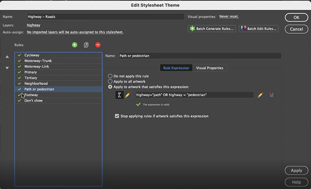
Next, we can go back to Overpass Turbo and extract road and highway data. You can build out more complex query statements using basic database operators (i.e. and/or). For longer, complex query statements it helps to create saved queries that you can re-use. This map uses a saved query statement called “selected roads with residential” to extract line features covering most road types:
(highway=primary or highway=secondary or highway=cycleway or highway=path or
 highway=motorway or highway=trunk or highway=tertiary or
 highway=neighborhood or highway=footway or highway=service)
Import the roads data into the same MAP View as the other datasets. If you look at the MAP attributes you can see the road data is split into several different types. Steve use’s MAP Themes to create rules-based stylesheets to visualize the different road lines based on their road-type attributes. Steve designed a rule-set that made minor roads more subtle in appearance, while major roads and highways became more prominent. He also used colour to distinguish between pedestrian and vehicle network links.
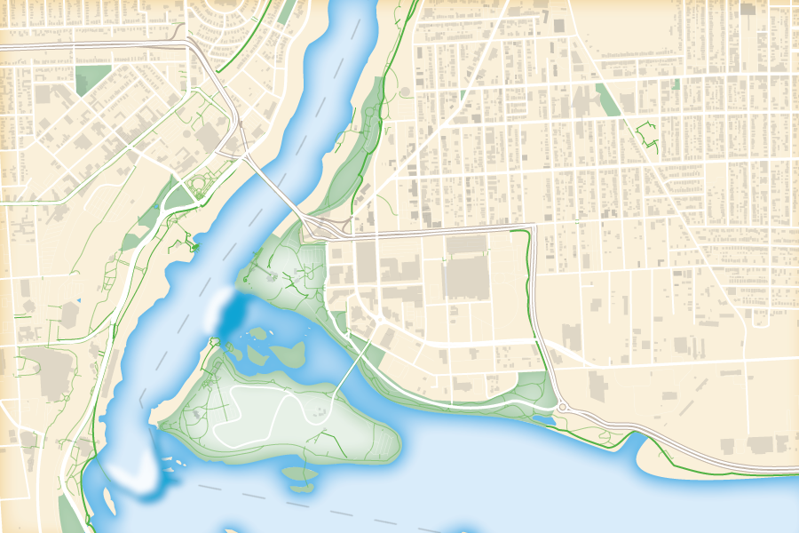
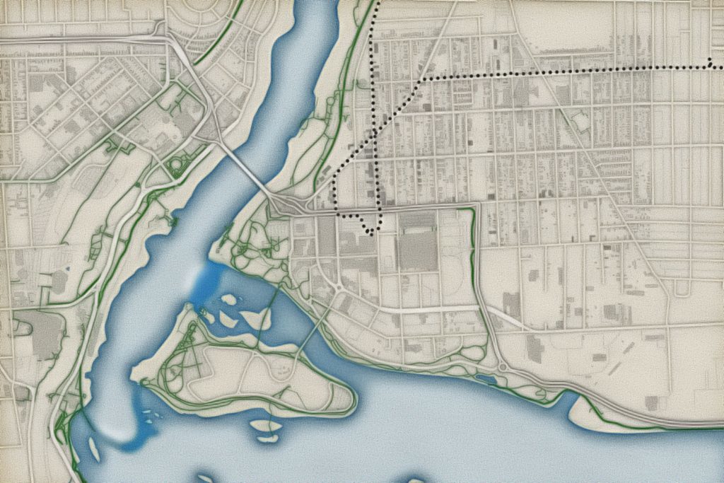
Repeat this process with a building footprint layer and crop all layers in the final map to the artboard extent. The finished product is shown below (top). Some final touch-ups in photo editing software can be used to create a more stylized appearance (bottom).
Exported map from Illustrator
Stylized version modified with Photo editing software
***
About the Author
Steve Spindler has been designing compelling cartographic pieces for over 20 years. His company, Steve Spindler Cartography, has developed map products for governments, city planning organizations, and non-profits from across the country. He also manages wikimapping.com, a public engagement tool that allows city planners to connect and receive input from their community using maps. To learn more about Steve Spindler’s spectacular cartography work, visit his personal website. To view Steve’s other mapping demonstrations, visit cartographyclass.com
Maps are a fusion of art and science, presenting complex geographical data in a way that is both visually appealing and informative. Cartographers use maps to convey a story, drawing attention to important information using carefully crafted design choices and curated map elements that engage the viewer. Although cartographers employ a variety of specialised techniques to present this meaningful information on a map, one of the simplest, yet most effective methods is through map labels.
Quite simply, map labels are symbols or texts strategically placed at specific locations on a map to identify important geographical features, locations, or areas of interest. To a map viewer, labels are a quick and easy way to know exactly what is shown on a map. To a map maker, however, the task of creating labels is not often quick and generally isn’t easy. This is especially true when there are a large number of labels that need to be placed, or when labels need to follow complex paths such as roadways, rivers, or trails. Map-makers must also consider the issue of label crowding and collisions, ensuring labels are not overlapping each other, covering or distracting from other important features of the map. Combined, these challenges can be a significant time-sink in the map-making process, requiring both time and effort on the part of the cartographer.
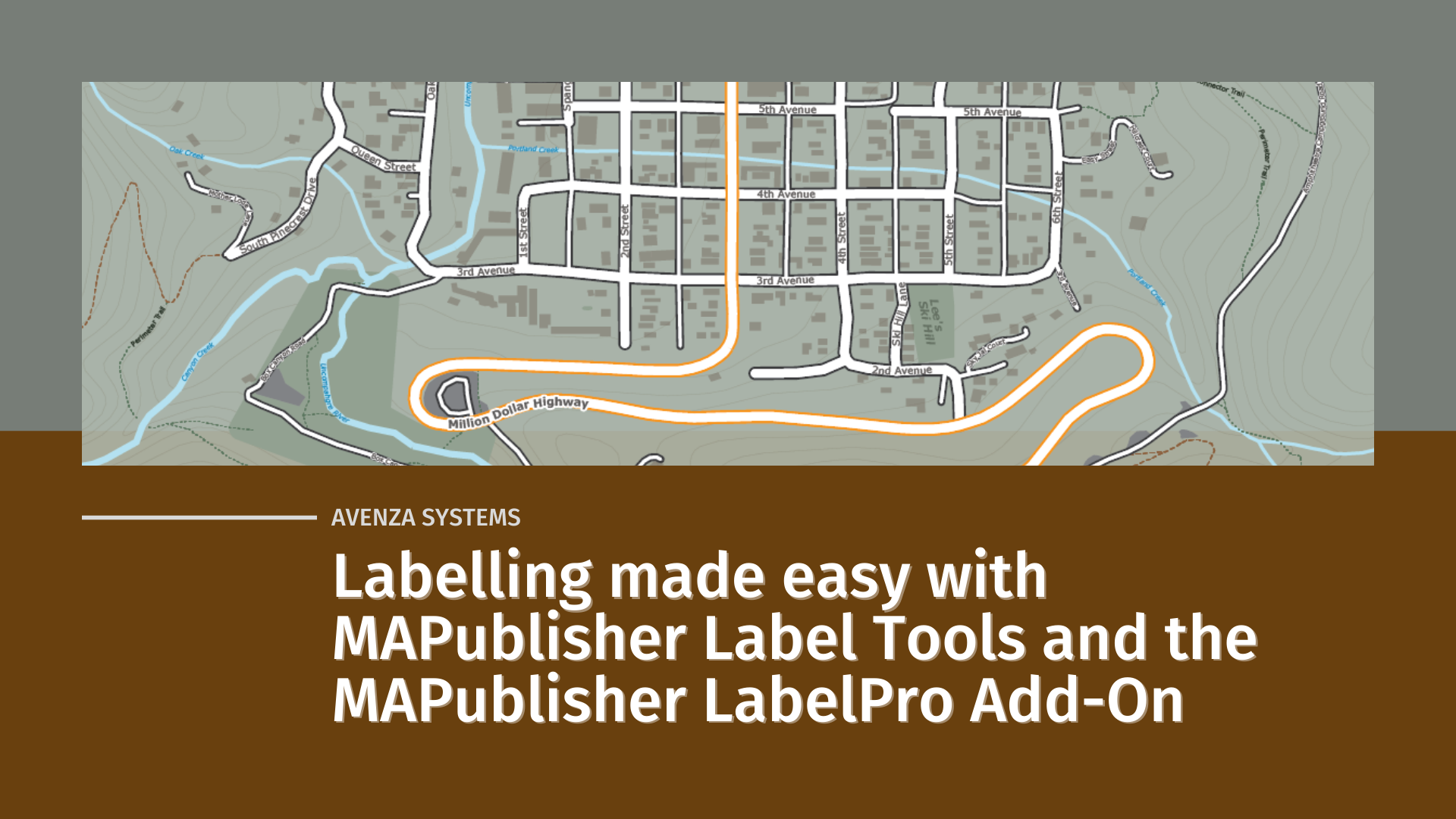
Labelling doesn’t have to be difficult though, and in this blog, we will show you how built-in MAPublisher label tools and the MAPublisher LabelPro add-on can make labelling simple.
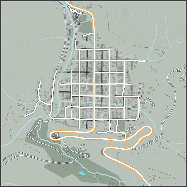
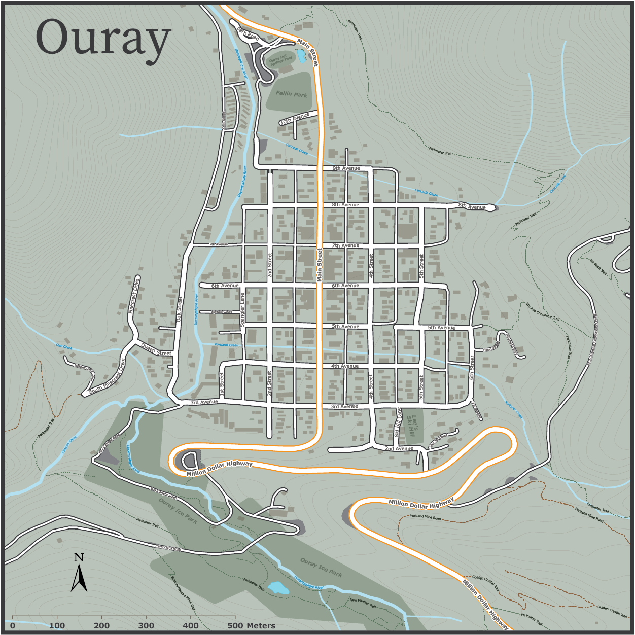
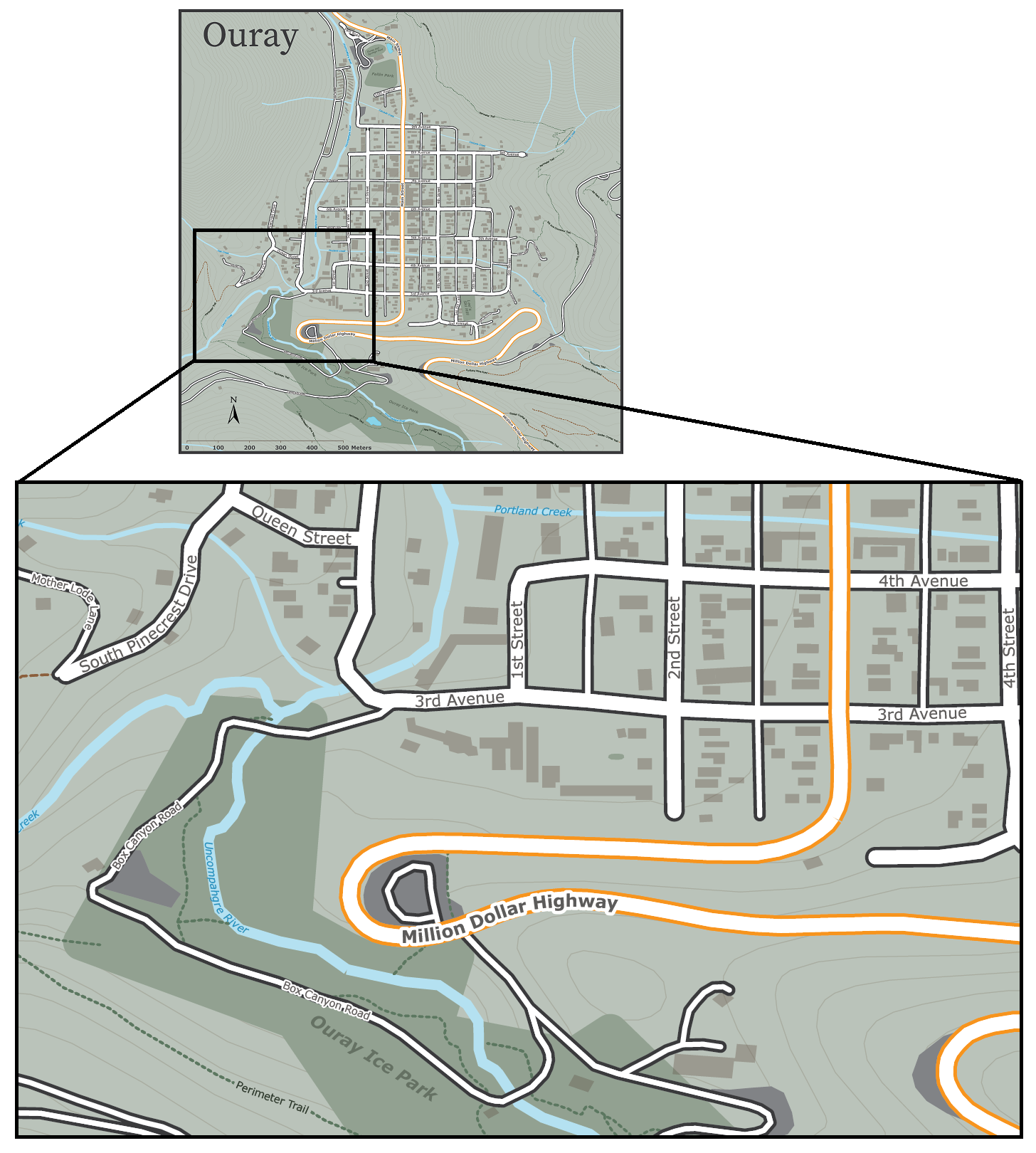
Let’s start with our unlabelled map. We have taken a collection of openly available geo-data depicting the small mountain town of Ouray, Colorado (home of National Geographic Cartographer and last month’s Avenza Cartographer Chronicles feature, Mike Boruta). We have stylized the data to show rivers, parks, streets and trails all throughout the town, but we feel labels would help a user to better understand the information being shown. We are going to approach the labelling process in a few different ways.
Manual Label Placement with the MAP Tagger Tool
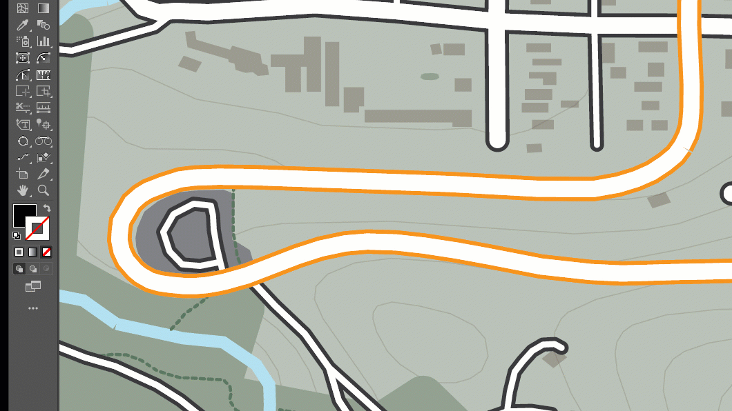
For small labelling tasks, where a map maker might need to place only a handful of precisely located labels, the MAP Tagger tool is perfect for the job. MAP Tagger allows us to configure a basic set of options that control the character style of our label as well as general label placement rules. From there, we can simply click on a map feature and have the tool automatically detect and apply a label from attribute information contained in the selected layer. As we have direct control over the placement of every individual label, we can be extremely precise in choosing label placements that work for our map. Best of all, the tool automatically detects and applies text pathing for line features, meaning text labels can follow the form of any road, river, trail in your map!
When working with a small number of map features, the MAP Tagger tool is often just what you need to add well-placed labels to your map. For larger labelling tasks, such as our Ouray map, where there are many layers and several different features to be labelled, a manual approach such as this would be very time-consuming. Instead, we need to implement a more automated, batch labelling technique to speed-up the map-making process.
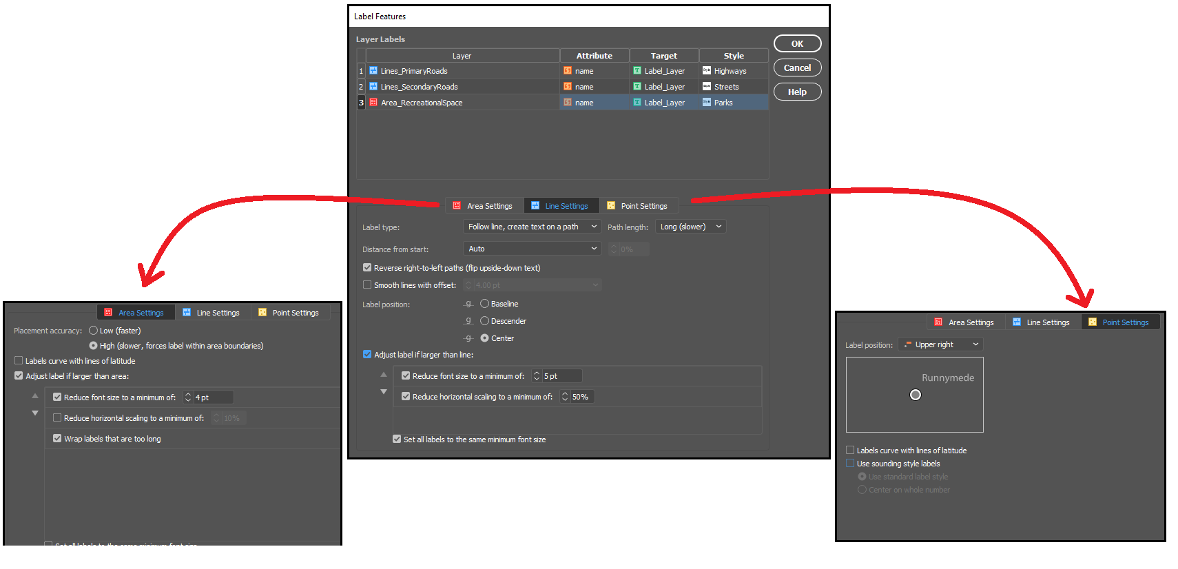
Batch label placement with the Label Features Tool
When you are working with several map layers, or have a large number of geographic features that each need to be labelled, it can be more efficient to create your labels all at once. The Label Features tool comes built-in with MAPublisher, and can handle batch labelling of map features with only a few clicks. The tool is designed similarly to MAP tagger, and automatically populates the map with precise, path-aligned labels, while offering the flexibility to define unique character styles for each map layer.
Taking a look at the tool, we were able to quickly generate over a hundred labels, for every road, trail, river, and park layer in our Ouray map. By nature, the tool will present you with a large number of labels for each feature, allowing us to examine and choose the labels we wish to retain and remove those that we don’t. With a little bit of clean-up to remove those extra or unwanted labels (see the animation below), we can already see our labelled map is coming together!
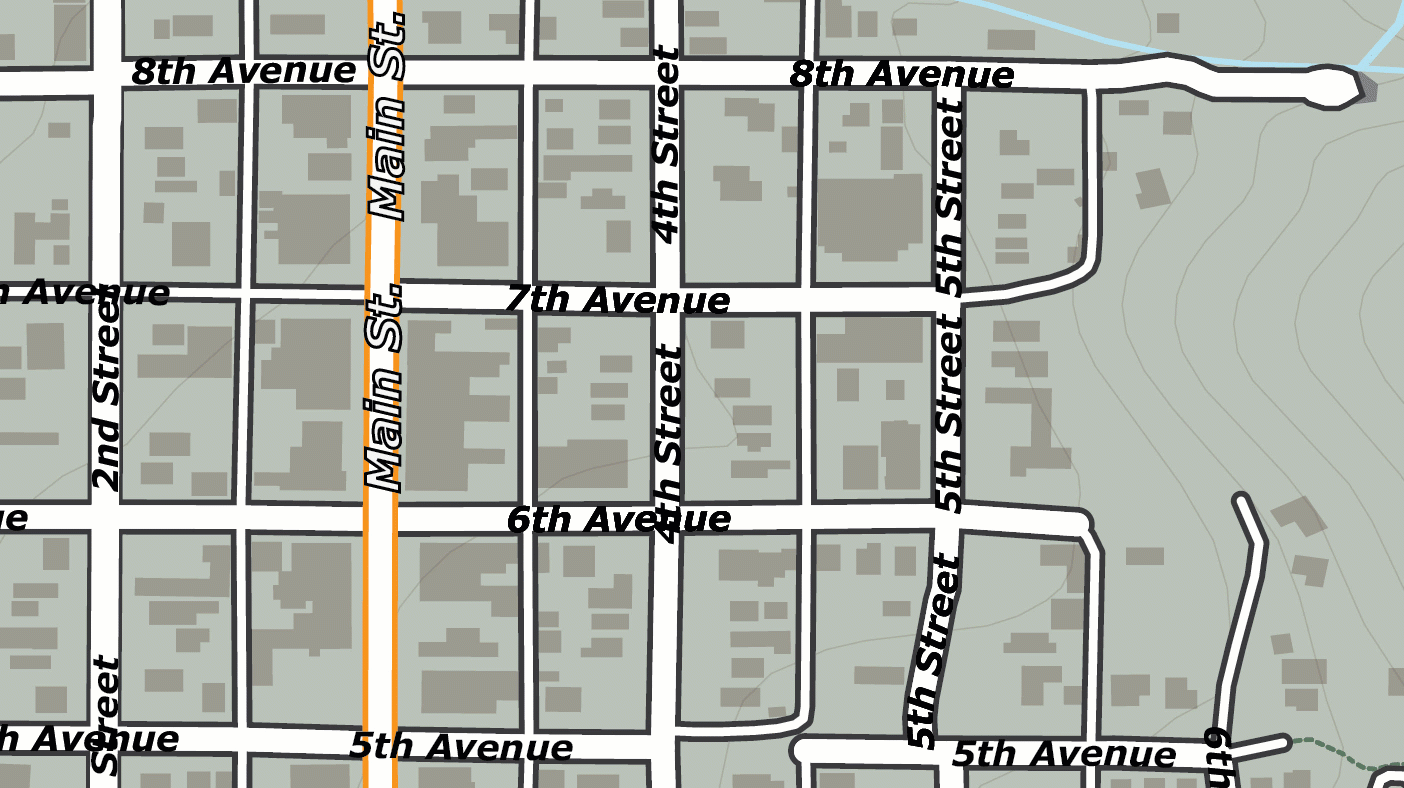
The Label Features tool is great for getting a head start on large labelling projects, but you might notice that the output of the labelling tool still requires some manual intervention to clean-up the output. For example, notice how “4th Street” and “5th Street” labels are repeated several times over the length of the street, with some labels colliding with others to create an overlap. This is a common problem in many labelling tasks and is due to the way our input data is structured. The dataset we obtained presents each road in the town as a line, but rather than present each road as a single continuous feature, it breaks up each street into several linked segments. Although this can be corrected with manual editing, it can still be time-consuming when working with a high number of labelled features. To avoid this, we need a method of achieving smarter batch label placement that can detect and reduce instances of label collision or redundancy.
Fortunately, we have one last trick up our sleeves that makes even the most complex labelling tasks a breeze. We can use MAPublisher LabelPro for collision-free, rules-based label placement.
Better Labelling with MAPublisher LabelPro
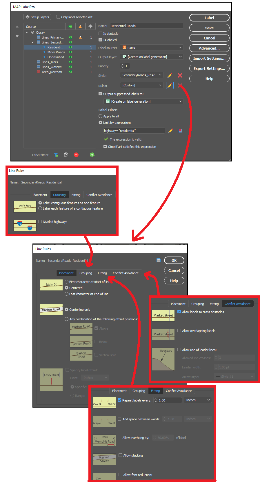
The MAPublisher LabelPro add-on allows the user to customize a wide variety of enhanced labelling options that result in smarter, more efficient label placement. LabelPro comes with a powerful purpose-built labelling engine that handles not only label placement, styling, and pathing, but also optimizes the grouping, fitting, and collision avoidance of labels to reduce crowding, avoid label overlap, and eliminate label redundancies.
Remember those overlapping labels we ran into with the Ouray map? With LabelPro we can set rules that treat street segments as contiguous features in a single line, meaning the labelling engine will efficiently place labels that are representative of the entire street, rather than just for each segment. The intelligent collision and fitting rules mean we can also prevent labels from overlapping each other or crowding the map, saving us time and effort by letting the tool handle precise label placement with minimal clean-up. By setting layer priorities designating certain layers as obstacles we can make sure our important labels are unobstructed, and other labels do not cross other features in a way that would confuse the map viewer.
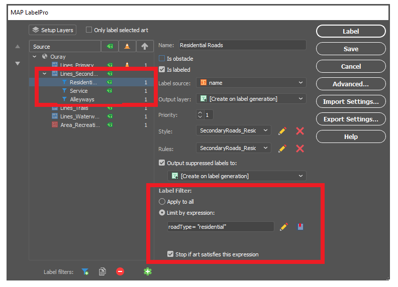
With LabelPro, we can also create expressions to apply conditional character styles and rules based on attribute values in the data. In our map, we created label filters for “Residential Roads”, “Service Roads”, and “Alleyways”, allowing us to label (or not label) certain road types differently, even though they are all contained in the same “secondary roads” map layer. These are only a few examples of the robust collection of configurable rules and smart labelling options available to tackle even the most complex labelling tasks.
With our rules set up and all character styles defined, in very short order we could automatically generate labels for all rivers, roads, highways, parks and trails in our Ouray map. The smart placement with LabelPro means we spend less time manually correcting label placement and allows us to produce maps more efficiently and easily. If you want to read a more in-depth, tutorial style article that shows you the exact steps we used to easily create our simple map of Ouray, check out this great workflow article produced by our support team – Here!
Data sources: All datasets were obtained from OpenStreetMap and the Ouray County Open Data portal.