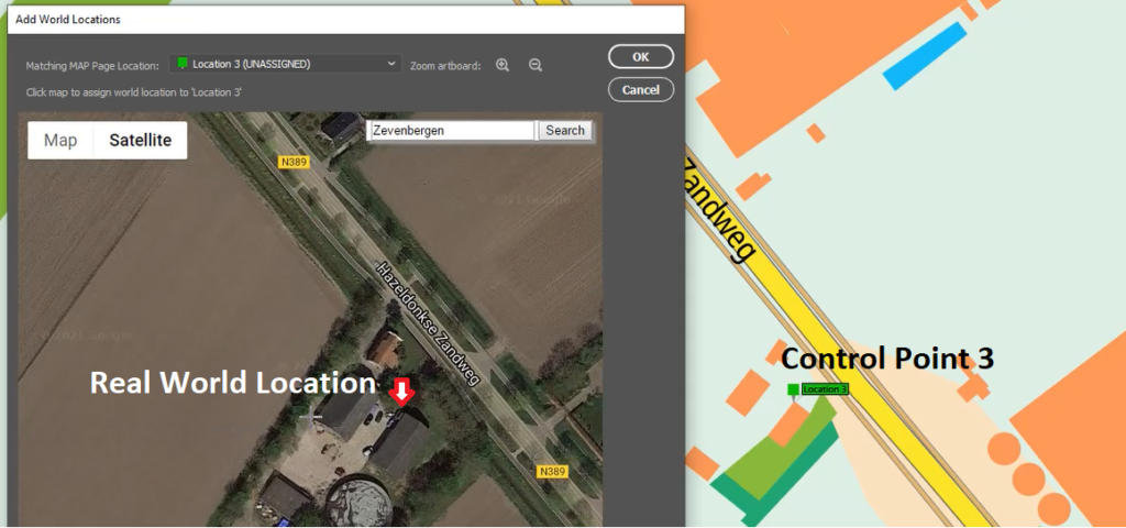
Hans van der Maarel has been a passionate cartographer for over 20 years. He works out of Zevenbergen, Netherlands where he operates his company, Red Geographics. To Hans, cartography is a passion that extends beyond the office, becoming more than just a career path. Through this passion, Hans has developed a level of expertise found only in the most dedicated of map-making professionals. As an expert MAPublisher user, Hans has been a frequent contributor to the Avenza Resources Blog. You can see some of his latest work through his Georeferencing Techniques Video tutorials released as part of Avenza’s Mapping Class blog series. To read more about Red Geographics, and see more of Hans’s work, visit redgeographics.com.
From a young age, Hans always had a keen interest in maps. His found himself drawn to old atlasses, spending hours looking at old maps, and geography was always his favourite subject in school. This interest persisted into high school, where at a job fair he found out you could actually study map-making as a career.
Continuing his studies, Hans pursued a program in Geo-Informatics at Hogeschool Utrecht (a four-year bachelor’s level course offering a mix of geodesy, GIS, and cartography). There he was introduced to various kinds of mapping and surveying, learning the techniques necessary to plan and design meaningful effective maps. During an internship at the National Spatial Planning Agency, he was first introduced to the MAPublisher plug-in for Adobe Illustrator. After graduation he started working for his local Avenza partner, doing tech support, training, consultancy, and commercial map production processes. This is also where he was introduced to Safe Software and their product for data transformation, also known as Feature Manipulation Engine (FME).
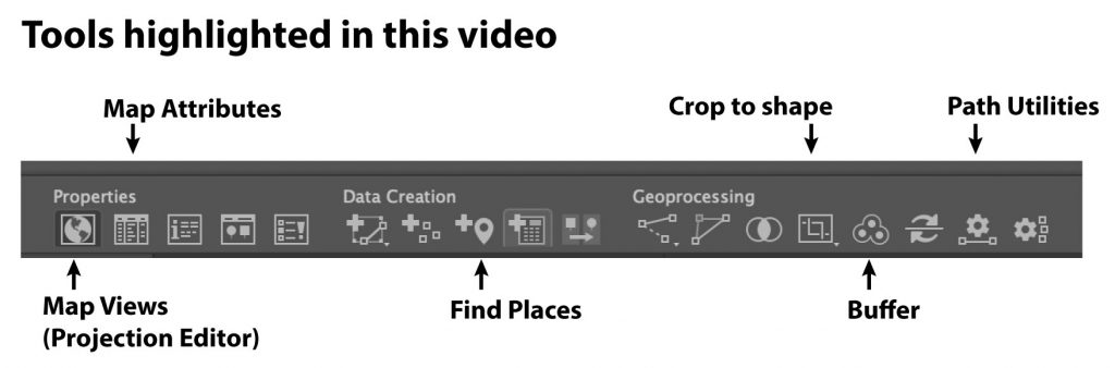
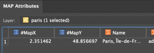
Hans developed a niche within the Dutch cartographic community that leveraged FME to prepare raw source data before using MAPublisher to visualize and create the final high-quality map products. This type of workflow, combining a mix of both FME and MAPublisher functionalities is now fully realized by the FME Auto add-on for MAPublisher.
“I was doing my first internship and was tasked to produce a poster-sized map of The Netherlands in Adobe Illustrator, but all the base data was in Shapefiles or ArcInfo coverages. Gathering base data and generalizing it was done in a traditional GIS, but getting that data into Illustrator and making a finished map required MAPublisher.”
In September 2004, Hans decided to continue on his own and founded Red Geographics. Working largely with Avenza products, two years later, he became an official Avenza partner and reseller. As his customer base expanded and more projects came in, Red Geographics developed a reputation of being “the one for the difficult projects”. Reflecting on the early years of Red Geographic’s operation, Hans mentioned some of his more memorable, fun, and eye-catching projects.
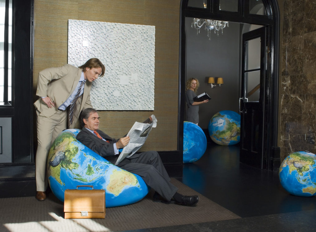
“There was the Oolaalaa Globe, a 5 ft diameter “beanbag” globe with beautiful maps printed on spandex. We received several custom orders of the globe map from other clients, including ones for Air France-KLM with the complete route networks of all their partners, and another from National Geographic Benelux and the City of Amsterdam, with a map of the city projected onto the globe.”
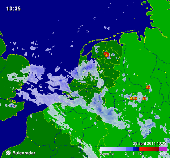
Also eye-catching, but for a completely different reason, were a series of simple basemaps created for Buienradar, the most popular Dutch weather website, and app. Millions of people have seen Hans’s maps when they checked the weather.
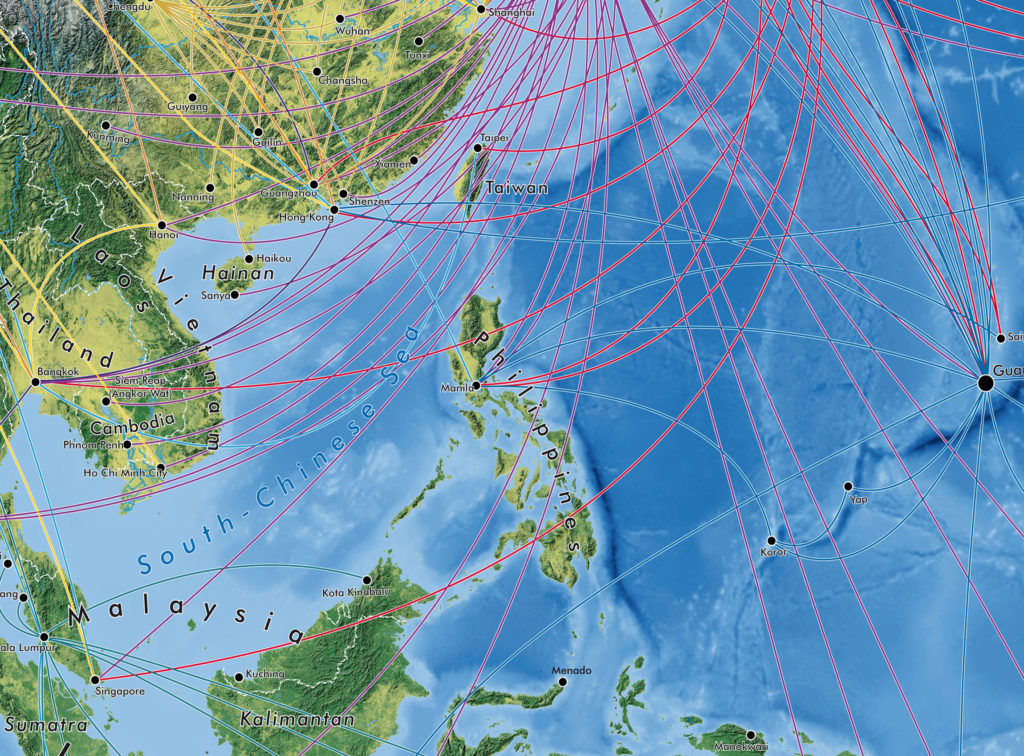
In the early years of Red Geographics, Hans became involved with the Cartotalk forum, first as an enthusiastic user, later on as a moderator, and finally an admin. Through Cartotalk, he also got involved with NACIS, the North American Cartographic Information Society. He attended their meeting in Salt Lake City in 2005 and he’s been to every meeting since. When NACIS took over Cartotalk, Hans became an ex-officio board member for several years before being formally elected a board member at large. He still serves on the board to this day and is currently in his 2nd term as secretary. Through NACIS, Hans was able to expand his network of international contacts, allowing him to contribute to several large-scale mapping and atlas projects. He created island maps that can be found in the Millennium House “Earth” atlas and more recently, several full-page maps for the 11th Edition National Geographic World Atlas released in 2019.
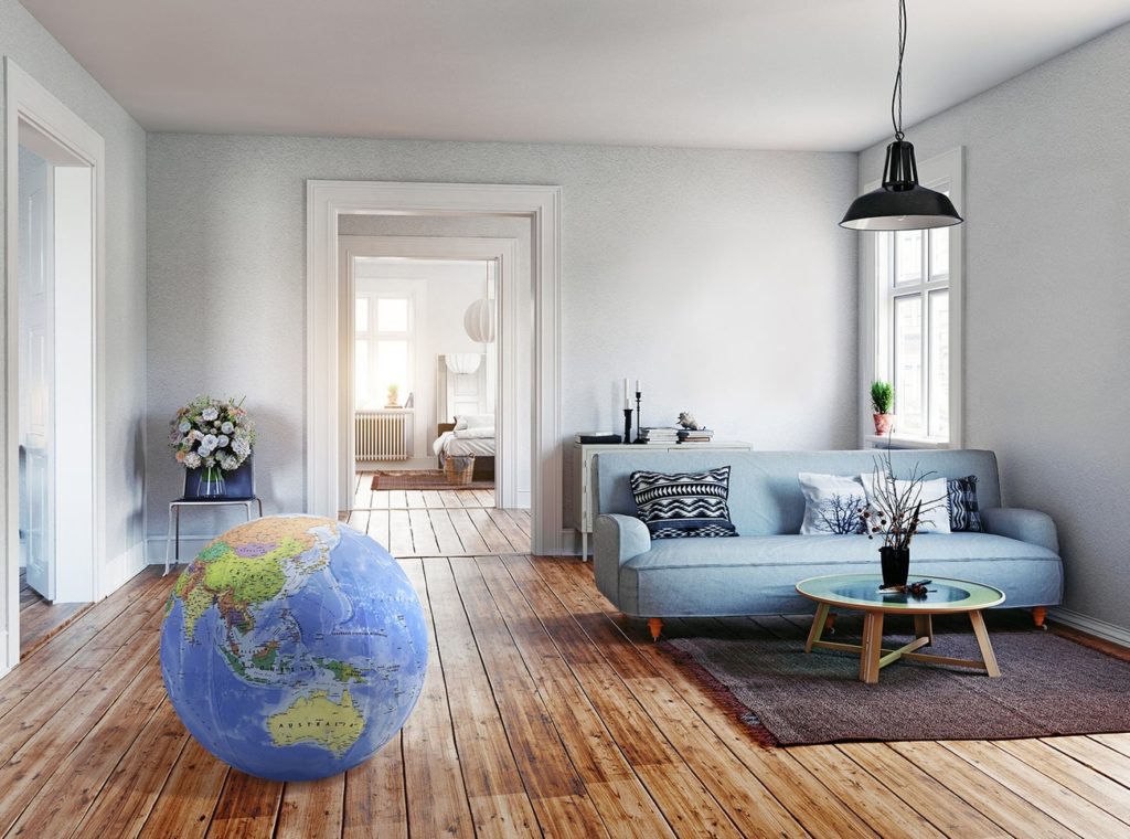
Building on the success of his earlier globe projects, Hans then created a new map whose design is displayed prominently on a new product called BalancePlanet, a globe-themed, fully functional yoga-ball that Hans considers a spiritual successor to the Oolaalaa globe bean bag chair.
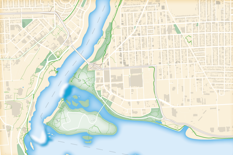
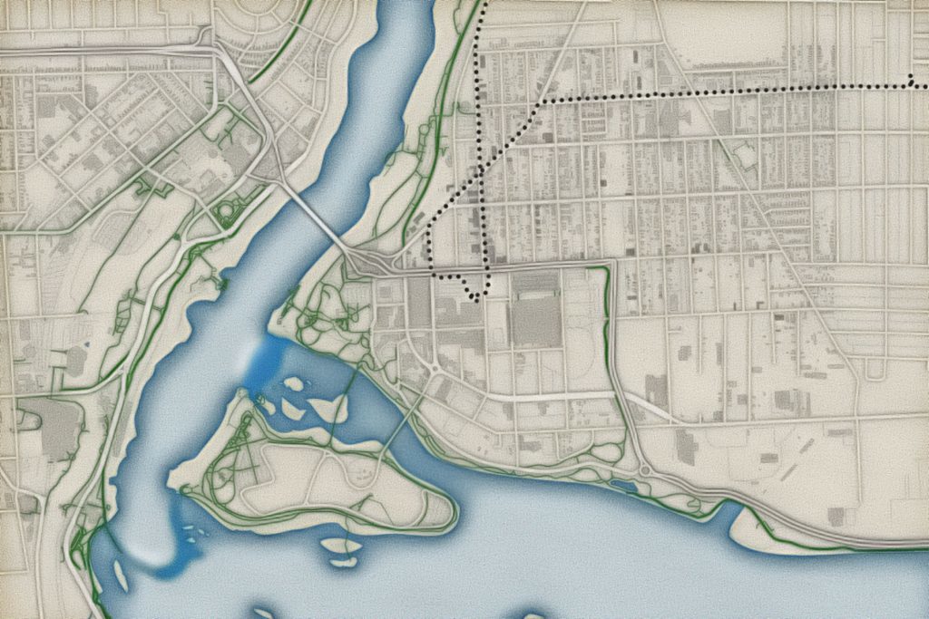
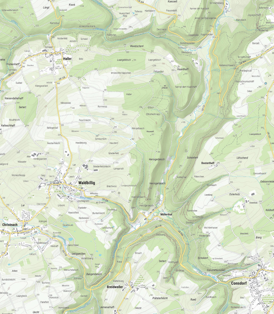
In 2019, Hans expanded his team, adding two members to become a team of three. With more resources now available, Hans and his team can now tackle larger, more complex (mapping) projects. His team took on the momentous task of producing a nationwide 1:20,000 scale topographic base map of the entire country of Luxembourg. The finished results were used as a cartographic base for tourist maps showing hiking and cycling routes all over the country.
“The Avenza products have been a major factor in my development as a cartographer, as well as the development of my company,” says Hans. Many of his projects use a combination of FME and MAPublisher, and Hans has utilized the interoperability between these two programs to implement significant workflow automation. With a single base dataset, multiple maps can be made with the same style, and automating this process means he can produce a high volume of maps in just seconds, without needing to manually configure shared thematic elements.
“With automating some of the map production processes, I now only have to focus on the parts where my cartographic skills are most needed. MAPublisher allows me to do that. I want to find the right balance between quality and speed when it comes to producing maps, and with automating the data processes I have found just that.”
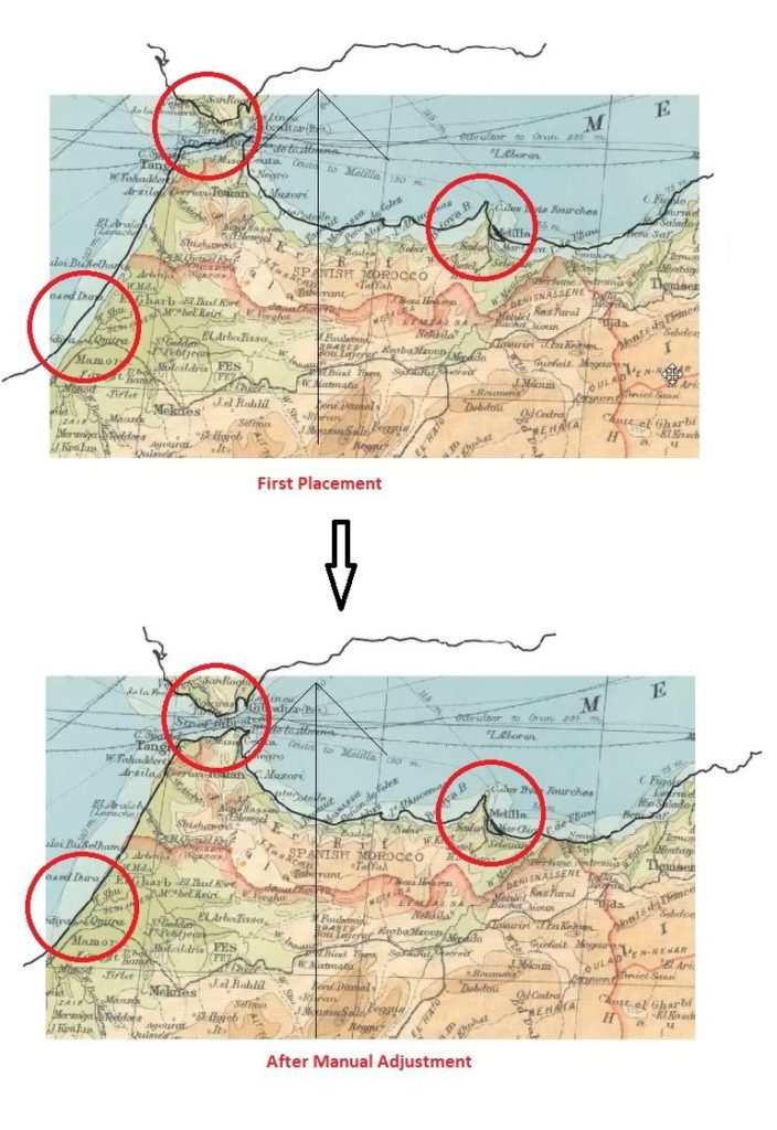
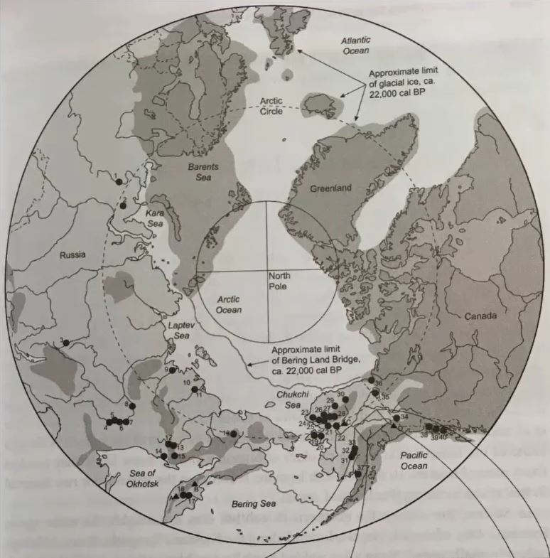
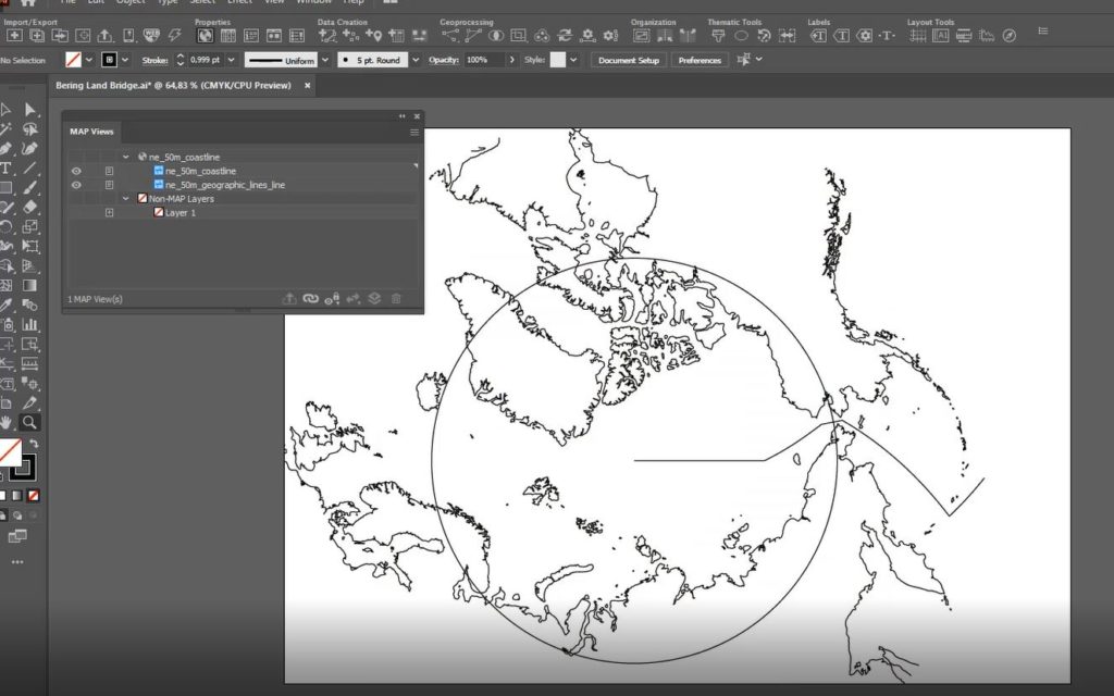
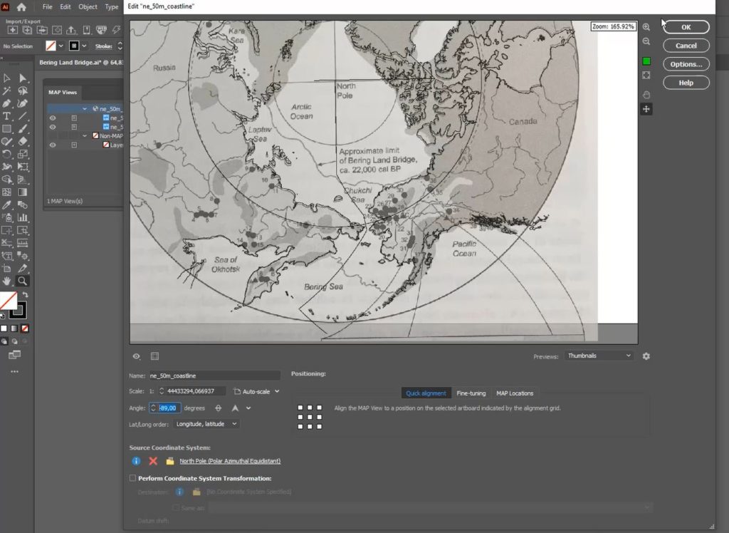
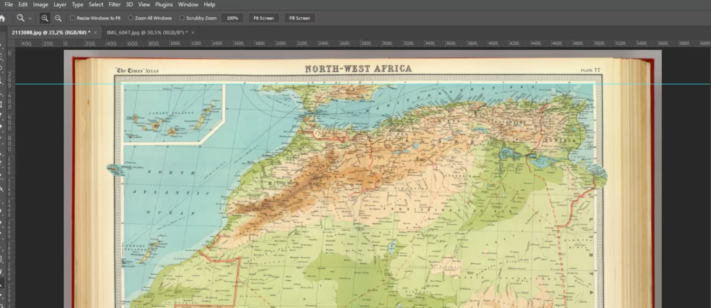
Aside from the traditional mapping products Hans has become known for, he enjoys working on smaller projects with interesting stories around them. “The maps I get the most joy out of these days are, interestingly enough, not those big ones. Over the past ten years or so I’ve been asked to produce greyscale maps for several academic publications, a lot of them focusing on the Arctic and Antarctic regions. Limited in terms of visual variables and often a need to show a lot of information on a small surface area, these kinds of maps are a very interesting challenge. One thing led to another, word-of-mouth is a great promotion tool, and we now find ourselves in the middle of producing about 30 maps for an upcoming publication by Cambridge University Press, chronicling the state of research in those areas. Wonderfully esoteric subjects which often lead me down a Wikipedia rabbit hole!”
Hans continues to use his cartography skill set to explore new ways of making maps more prominent in everyday life. Hans began introducing his colleague, Inge van Daelen, to the concepts of satellite imagery and Photoshop (using Tom Patterson’s great tutorial on how to process Landsat data). Branching off of this, they founded Blue Geographics, which originally started as a fun side-project but quickly grew into a full-fledged business. Through Blue Geographics, Hans designs and produces a range of sportswear and lifestyle items displaying beautiful satellite images derived from Landsat and Sentinel data.

“Looking ahead, I just want to make beautiful things,” says Hans, “One of my hobbies is photography, specifically cycling and cosplay. A few years ago, when I did a photoshoot with two cosplayers, I saw a sticker with that text in their workshop and it struck a chord with me. I’ve long had ‘doing awesome work for people I like’ as one of my goals and I want to keep on doing that. I also want to keep on challenging myself by trying out new techniques and new ways to map things. There’s still a lot to learn and I am very happy to know a lot of people in the cartographic community who are happy to share their knowledge and experiences.”