


Whether you’re new to MAPublisher®, an experienced user, or simply thinking about a purchase, Avenza software training is a worthwhile experience. Get hands-on training from Avenza product specialists at one of our training courses around North America or virtually from anywhere.
Archives
MAPublisher Virtual Training: March 18-20, 2025
Whether you’re new to MAPublisher®, an experienced user, or simply thinking about a purchase, Avenza software training is a worthwhile experience. Get hands-on training from Avenza product specialists at one of our training courses around North America or virtually from anywhere.
Formation en ligne inter-entreprise sur MAPublisher: 19-23 mai 2025
Que vous soyez un professionnel des SIG ou que vous débutiez tout juste dans le domaine, cette formation vous propose de prendre en main MAPublisher® de manière approfondie! Rejoignez nos amis de Géom@tique du 19 au 23 mai pour cette formation en ligne! Les inscriptions et plus d’informations sont disponibles sur leur site web.
Whether you’re new to GIS or an experienced user, this course will give you an in-depth introduction to MAPublisher® in French! Join our friends at Géom@tique from May 19th to 23rd for this online training! Sign ups and more information are available on their website.

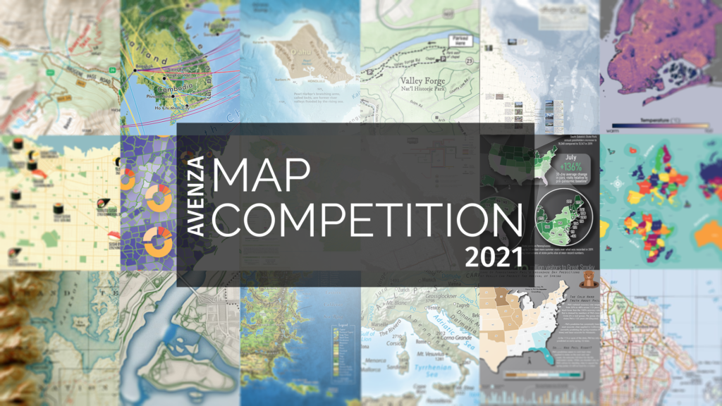
Announcing the Avenza Map Competition 2021 Winners
We’re excited to announce that the 2021 Avenza Map Competition has now concluded. This past year’s competition saw map-makers and cartographers from around the world submit their best and most impressive work. We had some truly impressive displays of cartographic design this year, with competitors demonstrating how they use Avenza mapping software to make eye-catching and impactful cartographic products. After multiple rounds of judging, discussions, and time spent reviewing our scorecards, the Avenza team would like to congratulate this year’s prize winners!
Over the next few weeks, keep an eye out for our Winner’s Spotlight articles. Each article will provide an in-depth look at the winning map entries, with insights from their creators, and an overview of tools and techniques used to develop their prize-winning maps.
The winner’s maps and a selection of honourable mentions will also be showcased in the new Map Gallery, coming soon!
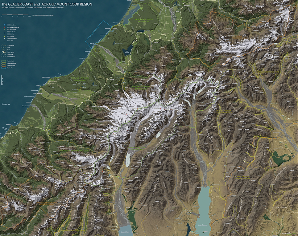
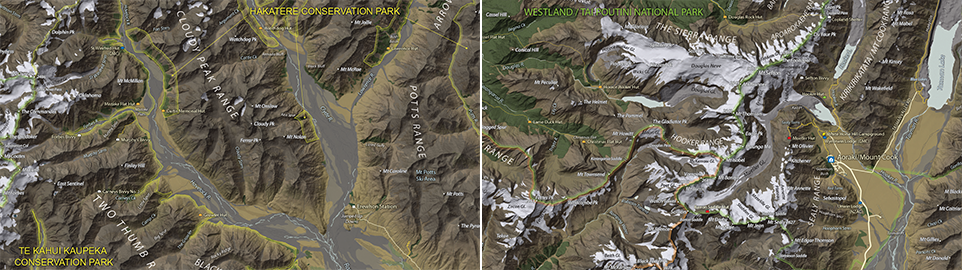
Grand Prize Winner (Open Category)
The Glacier Coast and Aoraki/Mount Cook Region
Roger Smith
Geographx
Wellington, New Zealand
Learn more about Roger’s winning map entry in the Winners Spotlight Article
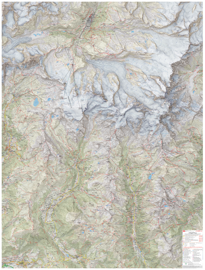
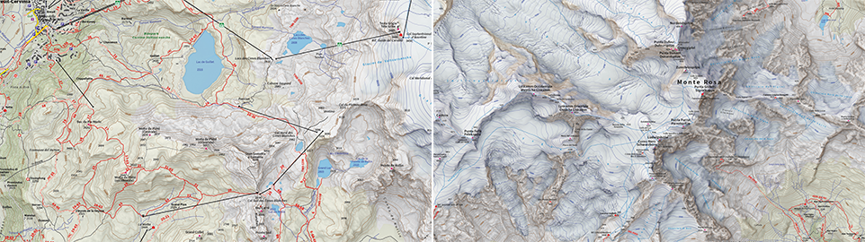
Runner-Up (Open Category)
A Topographic Reference Map of the Monte Rosa Area
Remo Nardini and the 4LAND Team
4LAND
Bolzano, Italy
Learn more about 4LAND’s winning map entry in their Winners Spotlight Article
Coming Soon: Avenza Map Competition Gallery
The judges would also like to offer special recognition to a number of other incredible entries. A selection of winners, honourable mentions, and notable map entries will be showcased on the upcoming Map Gallery page.
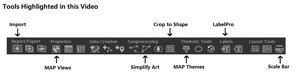
What’s New in MAPublisher 11.0 for Adobe Illustrator?
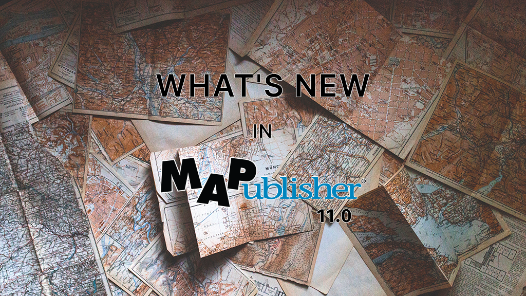
We are very excited to announce the release of MAPublisher 11, the latest version of our MAPublisher extension for Adobe Illustrator.
With MAPublisher 11, we are bringing forward full compatibility with the Apple Silicon processor, enhancements to the MAP Attributes panel, a revamped welcome screen, the ability to import OpenStreetMap file formats, a brand new set of MAP Erase tools, and several performance and bug fixes.
Here’s what you can expect with the latest MAPublisher 11 release:
Compatibility with the Apple Silicon Processor
We want to ensure our users enjoy a truly seamless experience whether they are using a PC or Mac computer. Our team has worked to ensure that MAPublisher 11 is fully compatible with the Apple Silicon chip, and as such we can declare that MAPublisher is officially supporting this processor.
MAP Attributes Panel Enhancements
An exciting feature for MAPublisher 11 is a number of enhancements made to the MAP Attributes panel. Users are no longer required to select all objects on a layer for them to appear in the MAP Attribute panel. Instead, all features appear by default, and users can toggle between showing all features or just their selected features at the bottom left corner of the panel. When all features are shown, selected features will appear highlighted in the attribute table.

Welcome Screen Revamp
MAPublisher 11 comes with a brand new welcome screen that appears upon opening the program. This window is equipped with visually appealing refreshed graphics, while maintaining access to the License Management window. It also features several new sections that increase discoverability for you, such as new features, help and tutorials, and other Avenza news or events. There is also a Get Inspired section to help inspire you as a mapmaker, which features articles from our website which highlight the excellent maps and stories of some of our most proficient users.

Importing OpenStreetMap File Formats
We are thrilled to announce that importing OpenStreetMap (OSM) file formats is now a possibility with MAPublisher 11! Whether you are importing a single file, or using the Multiple Data Import tool you can now select OSM and PBF file formats from the list of supported formats. The rest of the import process remains unchanged from the other file formats users are familiar working with in MAPublisher.
MAP Erase Tools
Many of our users have requested the ability to quickly erase unwanted or sensitive data from their maps. Thus, we are happy to introduce the new MAP Vector Erase and MAP Erase by Shape tools that come along with MAPublisher 11!
MAP Vector Erase Tool
With the new release of MAPublisher 11 comes a new tool known as the MAP Vector Erase tool. Functioning as an inverse version of the MAP Vector Crop tool, the Erase tool removes all data within a specified rectangle or ellipse shape.

MAP Erase by Shape Tool
The new MAP Erase by Shape tool functions similarly to the MAP Vector Erase tool, but it allows users to easily erase portions of MAP Layers using shapes other than rectangles and ellipses. Users can simply select the shape object they wish to use as the erase boundaries, and then select the MAP Erase by Shape tool from the MAP Toolbar.
Both tools share the same customizable settings and advanced options. Like the MAP Crop tools, the MAP Erase tools can be applied to all layers within the document, all layers within a single MAP View, or just a single layer.
If you would like to learn more about the new MAPublisher 11 features or have any questions, please check out our Support Centre.
MAPublisher 11 is immediately available today, free of charge to all current MAPublisher users with active maintenance subscriptions and as an upgrade for non-maintenance users.
Avenza Releases MAPublisher 11.0 for Adobe Illustrator
Toronto, ON, August 31, 2022 – Avenza Systems Inc., producers of the Avenza Maps® app for mobile devices and geospatial extensions for Adobe Creative Cloud®, including Geographic Imager® for Adobe Photoshop®, is pleased to announce the release of MAPublisher® 11.0 for Adobe Illustrator®. This version offers full compatibility with the Apple Silicon processor, enhancements to the MAP Attributes panel, a revamped welcome screen, the ability to import OpenStreetMap file formats, a brand new set of MAP Erase tools, and several performance improvements and bug fixes.
MAPublisher cartography software seamlessly integrates more than seventy GIS mapping tools into Adobe Illustrator to help you create beautiful maps from geospatial data. Import industry-standard GIS data formats and make crisp, clean maps with all attributes and georeferencing intact using the Adobe Illustrator design environment.
New major features of the MAPublisher 11.0 extension for Adobe Illustrator include:
- Apple Silicon Processor compatibility
- MAP Attributes Panel enhancements: Users no longer need to select all attributes for them to appear by default in the features list, with show all/show only selected features toggle buttons
- Welcome Screen revamp: Improved discoverability for users with more content to aid in getting started or inspired with MAPublisher
- OpenStreetMap file format support: Import OpenStreetMap OSM and PBF file formats
- MAP Erase tools: Quickly remove sensitive or unwanted data from maps with the MAP Vector Erase or MAP Erase by Shape tools
Users require a valid Adobe Creative Cloud subscription and a compatible operating system to utilize the improvements and enhancements offered in MAPublisher 11.0. For questions and information on how compatibility requirements may affect your organization, please contact our Support Centre.
MAPublisher 11.0 is immediately available free of charge to all current MAPublisher users with active maintenance and as an upgrade for non-maintenance users starting at US$649. New licenses are available from US$1499. MAPublisher FME-Auto and MAPublisher LabelPro are also available as add-ons starting at US$499. Academic, floating, and volume licenses are also available. Prices include one year of full maintenance. Read more about MAPublisher 11.0 in the release blog, or visit www.avenza.com/mapublisher for more details.
More about Avenza Systems Inc.
Avenza Systems Inc. is an award-winning, privately held corporation that provides cartographers and GIS professionals with powerful software tools to make better maps. Avenza also offers the mobile Avenza Maps app to sell, purchase, distribute, and use maps on iOS and Android devices.
For further information contact: 416-487-5116 – info@avenza.com – www.avenza.com
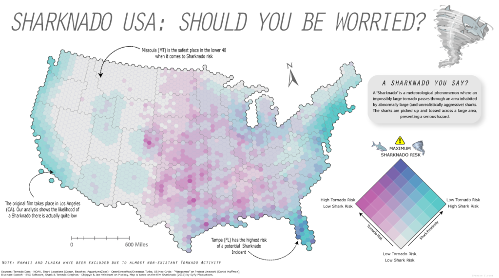
Map-making for the #30DayMapChallenge: Day 4 – Hexagons

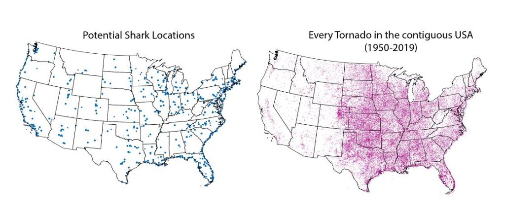
Yesterday was Day 4 of the #30DayMapChallenge, with the goal being to create a map using “Hexagons”. In the spirit of the challenge, we took a not-so-serious approach to create a fun map of “Sharknado Risk” based on the 2013 film “Sharknado” using MAPublisher tools and a really neat hexbin dataset for the United States. This map was in part created for NACIS 2021, and you can see how we created the map by watching the full video presentation included below. This blog also includes a few supplementary notes if you wish to follow along.
What exactly is a Sharknado?
A sharknado is a fictional meteorological phenomenon that occurs when a large tornado scoops up some sharks, transports them some distance, and finally disperses across a populated area. Generally speaking, if a given area is close to potential shark habitats (be it an aquarium, a zoo, or even the ocean) and has a high frequency of tornadoes, the area is more “at-risk” of experiencing a sharknado. To that end, we gathered some great open datasets to help us map this risk. We collected a shapefile documenting point locations for every single tornado in the country dating back to 1950. With this dataset, we can determine the relative frequency of tornadoes for a given area. From OpenStreetMap, we estimated potential locations for sharks by collecting point coordinates for every aquarium, marine park, aquatic zoo, and ocean-facing beach. We used Overpass Turbo to query and extract these points to a spatial dataset and imported them into Illustrator using MAPublisher. Check out this great tutorial (produced by Steve Spindler!) that covers techniques for importing Overpass Turbo data into MAPublisher. The tutorial was part of our ongoing Mapping Class series, a video-focused series that provides helpful tips, techniques, and workflows from real-world cartographers.
Aggregate data with Spatial Join
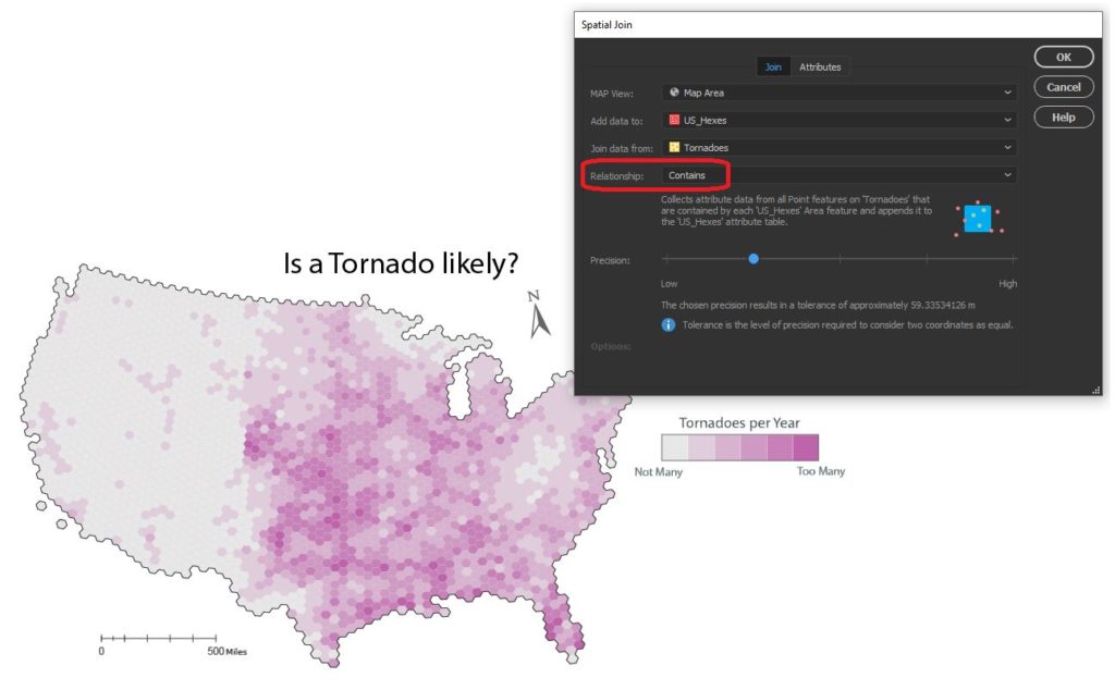
Since the challenge of the day is hexagons, we needed a way to get our messy point data into our clean “hexbin” format. The Spatial Join tool allows us to aggregate our point data (Tornado and Shark Locations) into a single hex-grid polygon dataset.
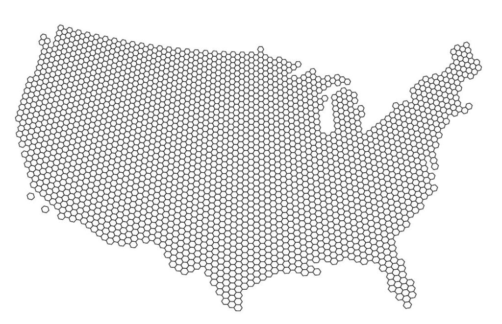
The Spatial Join tool includes several different options for “spatial relationships” that will determine how our point data is joined to the new hex-grid. We can also specify how the tool will aggregate the attribute information for our joined data. In this case, we join our Tornado point data based on a “contains” spatial relationship. This will aggregate all tornado points that are “contained” within a given hexbin. We also specify that the tool should aggregate the attribute information for all “contained” tornados by tallying up the number of tornado points within each hex. Since we know the dataset spans a 69-yr period, we can easily calculate the average annual tornado frequency for each hexagon.
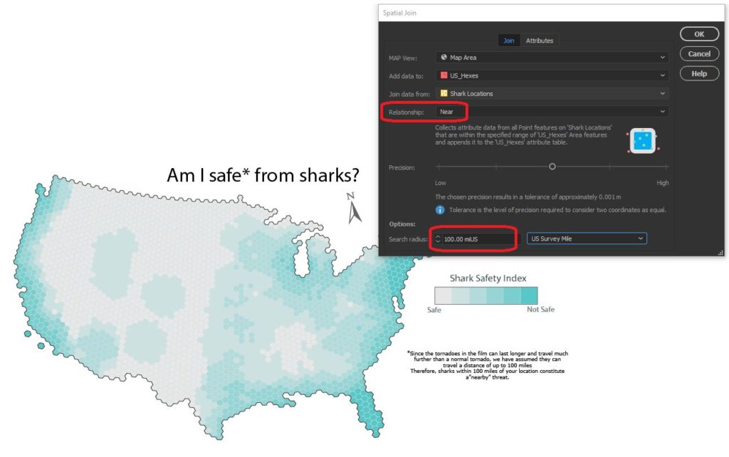
We apply a similar technique to our shark location data, this time specifying a “near” spatial relationship. We used some back-of-the-envelope math to estimate that a Sharknado (as it appears in the film) lasts substantially longer and travels farther than a normal tornado, meaning sharks as far away as 150 miles still present a potential risk. We can specify a search range of 150 miles and this will be applied to our spatial relationship as a cut-off distance.
Edit attributes with expressions
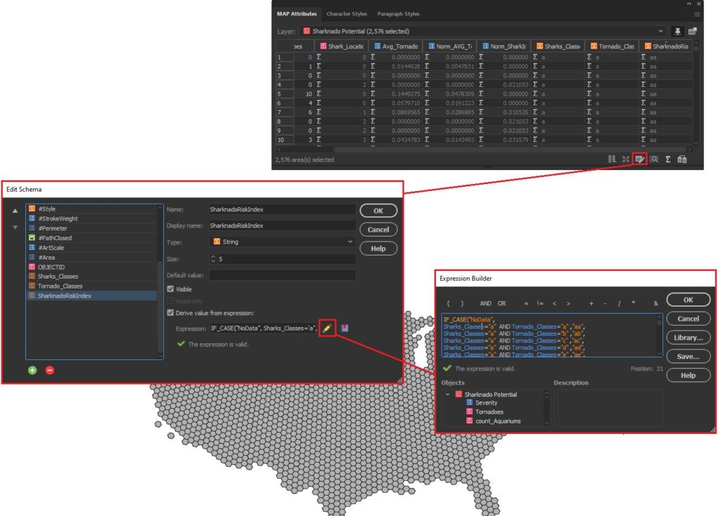
We assumed that Sharknado risk is highest when a given area is prone to tornadoes and also has a high concentration of potential shark locations. Given this, we came up with a basic equally-weighted, bi-variate risk index to assign a “Sharknado Risk” score based on these two variables. To calculate this score for each hexagon in our hexbin grid, we applied some custom expressions using MAP Attributes. First, we assigned a Tornado risk score from 1 to 6 based on the low to high frequency of tornadoes. We assigned a similar score for “Shark proximity” based on the concentration of potential shark locations. Finally, we combined these values into 36 unique scores to evaluate sharknado risk.
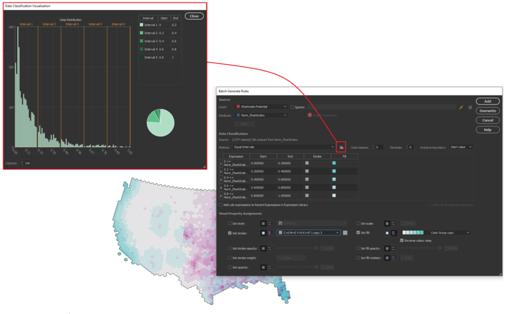
Stylize maps easily with MAP Themes
The final step is to stylize our map and create a layout. With MAP Themes, we can create rules-based stylesheets to easily stylize our map data in no time. MAPublisher comes with a great selection of built-in MAP Swatches, including several color brewer-based swatches that work great for choropleth-style maps like this. We used these swatches to create a custom, bi-variate swatch group to visualize each score of our “Sharknado Risk Index”. The MAP Themes tool also provided a neat data distribution viewer, which also allows us to inspect a histogram of our dataset. Although we used discrete categories for each of our risk scores, the data distribution viewer is very useful when working with continuous datasets since it allows you to see how your bin-widths will affect the display of colour on your choropleth.
The final touches
With stylization complete, Day 4 of the #30DayMapChallenge is almost in the bag. We can create a north arrow, and a scale bar and create a custom legend to facilitate easy interpretation. Since we are still within an Illustrator environment, we can use all the powerful native illustrator tools to add graphical design elements, text, and artwork to create a fun, infographic-style map. Although we were happy to call the map finished at this point, the great thing about making maps is there is also room to add more. For example, we might try using LabelPro to create custom labels that mark high and low-risk areas, or we could create insets to highlight specific regions of interest. The possibilities are endless!
We had a great time putting together this fun map for the #30DayMapChallenge, and we are excited to see what we can do for the remaining themes on the calendar! For those of you who are also making maps for the challenge, a reminder that the Avenza Map Competition is still accepting submissions. Share your map, compete with other map-makers in the community, and win some great prizes!
See a PDF version of the map here.
What’s New in MAPublisher 10.9 for Adobe Illustrator?
We are very excited to announce the release of MAPublisher 10.9, our latest version of the MAPublisher extension for Adobe Illustrator.
With MAPublisher 10.9, we are bringing forward full compatibility with Adobe Illustrator 2022, Windows 11, macOS 12, support for Vector GeoPackages and TopoJSON data formats, improvements to the Buffer Art tool, and several bug fixes.
Here’s what you can expect with the latest MAPublisher 10.9 release:
Compatibility with Adobe Illustrator 2022, Windows 11, and macOS 12
We want to ensure our users enjoy a truly seamless experience with the Adobe Illustrator workspace. Our team has worked to ensure that MAPublisher 10.9 is fully compatible with Adobe Illustrator 2022 that was announced at Adobe Max last week.
MAPublisher 10.9 is also fully compatible with the newly released Windows 11, as well as macOS 12 Monterey.
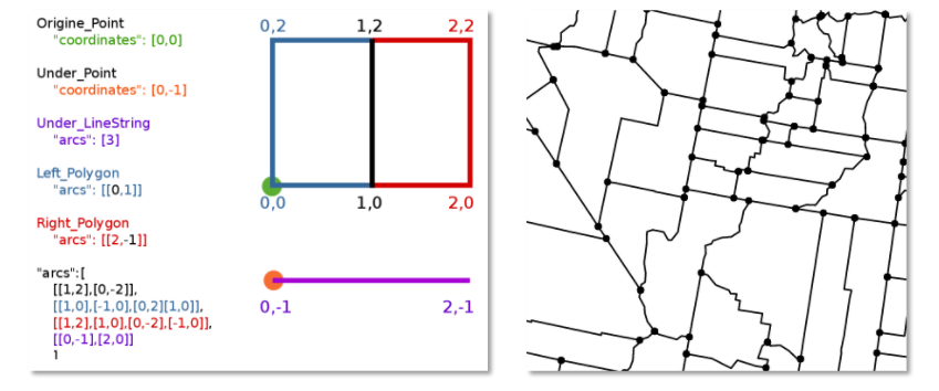
Import TopoJSON data
New to MAPublisher 10.9 is the ability to import TopoJSON type data formats directly into Adobe Illustrator. A TopoJSON is built off the GeoJSON data format in a way that encodes topology. Geometries in TopoJSON files are collected together from shared line segments called arcs. In this way, TopoJSON data formats can reduce redundancies and improve storage efficiency for spatial data.
Import and Export Vector GeoPackages
Many of our users have requested the ability to import and export vector GeoPackage data. We are happy to announce the full support of vector GeoPackages is now offered with MAPublisher 10.9. Vector GeoPackages are based on SQLite databases and offer an open-source, compact, lightweight, and flexible data format for easy and efficient storage or geoprocessing of spatial data.
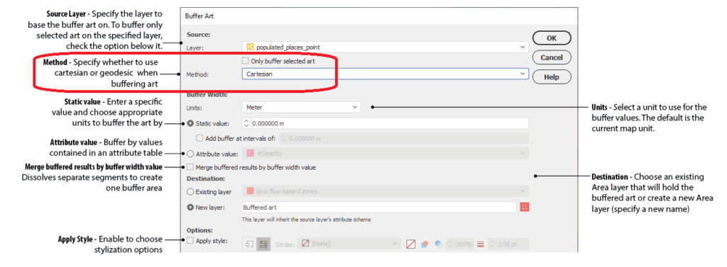
Geodesic Options for the Buffer Art Tool
Geodesic options are now available for the Buffer Art tool. This functionality will provide more accurate distance buffers for point data when working on features distant from lines of true scale. Find this option in the “method” section of the Buffer Art tool.
Default Data filters and Styles on import
MAPublisher 10.9 users can create unique data filters and style settings that can be automatically applied to newly imported data in MAPublisher.
Changes to Compatibility
Avenza announces that compatibility support is changing for its desktop mapping software. Starting with MAPublisher 10.9, both Windows 7 and Adobe CS6 will no longer be supported. Users will require a valid Adobe Creative Cloud subscription and a compatible operating system to utilize the improvements and enhancements offered in MAPublisher 10.9. For questions and more information on how these changes around compatibility may affect your organization, please contact our Support Centre.
MAPublisher 10.9 is immediately available today, free of charge to all current MAPublisher users with active maintenance subscriptions and as an upgrade for non-maintenance users.
Enter the Avenza Map Competition!
The Avenza Map Competition is live! Enter our map competition for a chance to showcase your favourite maps with the Avenza community and win prizes! The competition consists of two categories: “Open” and “Student”, with two sets of exciting prizes. Submit your Map today!
Avenza Releases MAPublisher 10.9 for Adobe Illustrator
Toronto, ON, November 9, 2021 – Avenza Systems Inc., producers of the Avenza Maps® app for mobile devices and geospatial extensions for Adobe Creative Cloud®, including Geographic Imager® for Adobe Photoshop®, is pleased to announce the release of MAPublisher® 10.9 for Adobe Illustrator®. This version offers compatibility with Adobe Illustrator 2022, Windows 11, and macOS 12. It also provides a variety of feature updates including the widely requested support for the vector GeoPackage and TopoJSON data formats, new Geodesic options for the Buffer Art tool, default filter on import and style on import options, and several performance improvements and bug fixes.
MAPublisher cartography software seamlessly integrates more than seventy GIS mapping tools into Adobe Illustrator to help you create beautiful maps from geospatial data. Import industry-standard GIS data formats and make crisp, clean maps with all attributes and georeferencing intact using the Adobe Illustrator design environment.
New major features of the MAPublisher 10.9 extension for Adobe Illustrator include:
- Adobe Illustrator 2022 compatibility
- Windows 11 and macOS 12 Monterey compatibility
- TopoJSON support: Import TopoJSON data
- GeoPackage support: Import and export vector GeoPackage data
- Geodesic Buffer settings: Provides more accurate distance buffers on point data when working on features distant from lines of true scale
- Default import filters and styles: Specify default options for filtering and displaying data that is imported into MAPublisher
Avenza announces that compatibility support is changing for its desktop mapping software. Starting with MAPublisher 10.9, both Windows 7 and Adobe CS6 will no longer be supported. Users will require a valid Adobe Creative Cloud subscription and a compatible operating system to utilize the improvements and enhancements offered in MAPublisher 10.9. For questions and more information on how these changes around compatibility may affect your organization, please contact our Support Centre.
MAPublisher 10.9 is immediately available free of charge to all current MAPublisher users with active maintenance and as an upgrade for non-maintenance users starting at US$649. New licenses are available from US$1499. MAPublisher FME-Auto and MAPublisher LabelPro are also available as add-ons starting at US$499. Academic, floating, and volume licenses are also available. Prices include one year of full maintenance. Read more about MAPublisher 10.9 in the release blog, or visit www.avenza.com/mapublisher for more details.
More about Avenza Systems Inc.
Avenza Systems Inc. is an award-winning, privately held corporation that provides cartographers and GIS professionals with powerful software tools to make better maps. Avenza also offers the mobile Avenza Maps app to sell, purchase, distribute, and use maps on iOS and Android devices.
For further information contact: 416-487-5116 – info@avenza.com – www.avenza.com
Mapping Class: Efficient Map-making using Templates and Stylesheets, with Steve Spindler
Welcome back to another edition of Mapping Class! The Mapping Class tutorial series curates demonstrations and workflows created by professional cartographers and expert Avenza software users. Today we have Steve Spindler, a longtime MAPublisher user, and expert cartographer. Steve has put together a 15-minute masterclass on creating maps from start to finish using templates and stylesheets. This video is jam-packed with useful tips and tricks that show how Steve uses templates, stylesheets, and a host of MAPublisher tools to design a beautiful map in minutes.
Steve has produced a video to show the complete, un-cut, map-making process. The Avenza team has produced video notes (below) to help you follow along.
***
Efficient Map-making using Templates and Stylesheets
by Steve Spindler (video notes by the Avenza team)
Readers of the Avenza resources blog will recognize Steve Spindler as a recent feature of our Cartographer Chronicles spotlight article. Steve has also been a frequent contributor to the Mapping Class blog series, where he has shared his tips for using MAPublisher to make eye-catching maps. Some of his recent contributions cover his techniques for using attribute expressions to edit street labels and working with OSM data in MAPublisher.
Today, Steve is doing something a little different. Instead of focusing on a specific tool or technique, he has put together a complete 15-minute masterclass showing how he creates a map from start to finish. In this uncut demonstration, Steve discusses his tips for importing data, using MAP views, applying stylesheets, and even labelling. Steve shows how using templates and preconfigured MAP themes can make map creation a breeze.
Using a Template
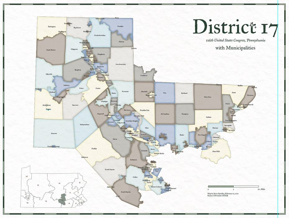
In this demonstration, Steve will be creating a congressional district map showing the municipalities of Pennsylvania District 17. Steve discusses how using a template to create your map can significantly improve the speed of map creation. Templates can be used to configure standardized design elements that can be recycled across several different map projects. Templates are especially useful in situations where different maps form part of a series with shared design components and colour schemes.
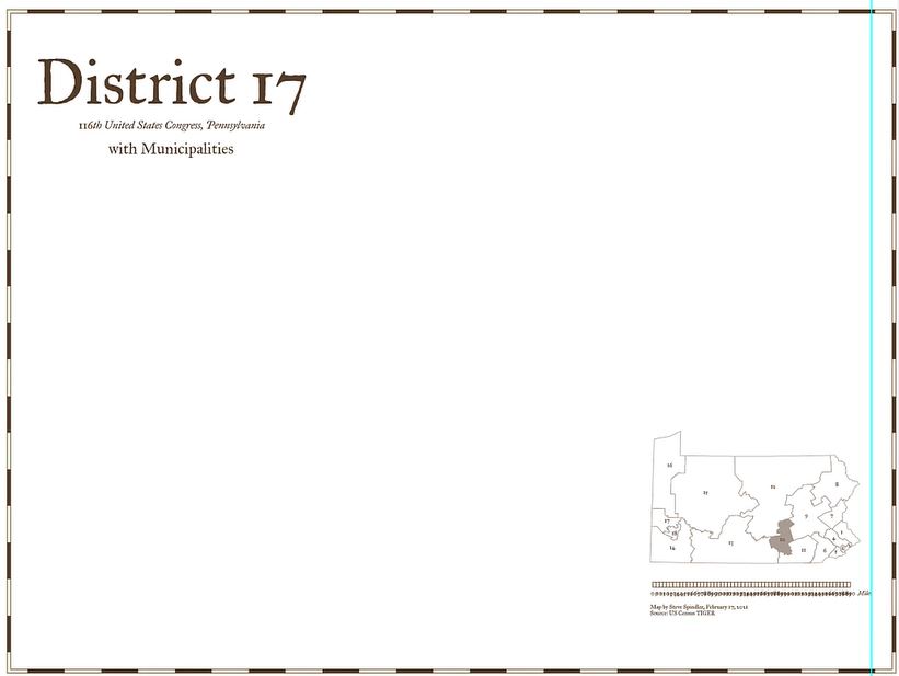
For this tutorial, Steve uses a template that includes some basic stylistic elements he typically includes in all his congressional district maps. The template comes preloaded with custom borders, Titles, subtitles, an inset map, and a scale bar. His template is already configured with custom fonts and colours that will give some uniformity across his different map projects.
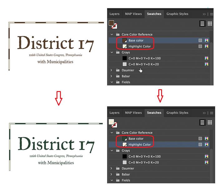
Steve has also set up swatch groups for his template. This ensures each map created with the template uses the same colour groups. Setting up swatches in the template also makes it easy to swap out or change the colour of different map elements. As an example, Steve uses the drag and drop functionality of the swatch panel to automatically adjust the “core colours” of his map template (text, border, and scale bar colours) from brown to green.
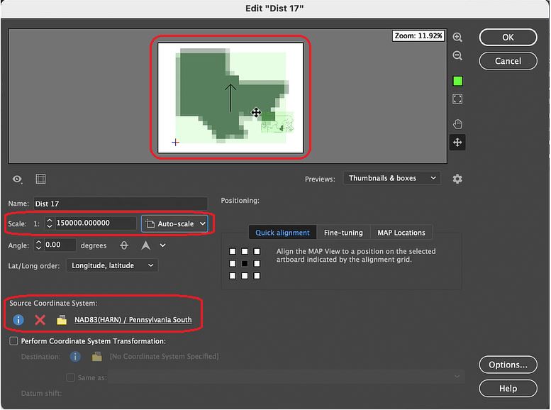
Steve’s template comes preloaded with an inset map containing all the congressional district boundaries for Pennsylvania. Using the drag-and-drop functionality of MAP Views, he can place a “District 17” data layer into a new MAP View that will contain the main body of his map project. Using the MAP View editor, Steve can assign a custom scale and choose an appropriate projection. This will ensure any new data layers he brings into the MAP view will be correctly aligned and accurately projected.
Import and Prepare the Map Data
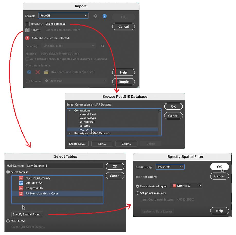
With his template configured, Steve now brings in some new data. He wants to access municipal boundary polygon data found on a PostGIS database stored locally. You can specify the specific data table within the database he wishes to add using the Import tool. More importantly, shows how he uses spatial filtering options to specify the region of interest. The spatial filter means that only the data relevant to the map extent is loaded in (very useful when using large datasets).
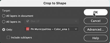
Using the Crop to Shape tool, Steve cleans up the imported data layer by removing any polygons that fall outside his district boundaries. Next, he uses the Simplify tool to remove extraneous vertices, with that his data is ready for stylization!
Apply Styles with MAP Themes
MAP themes are one of the most powerful tools in the MAPublisher toolset. MAP Themes allow you to configure rules-based stylesheets that work with attribute information stored in map data layers. Using pre-coded attribute values in his municipal boundary layer, Steve can assign colour fills to each municipality. Using colour in this way is a bit more eye-catching than using generic boundary lines, and makes it easy to see the shapes of each municipality.
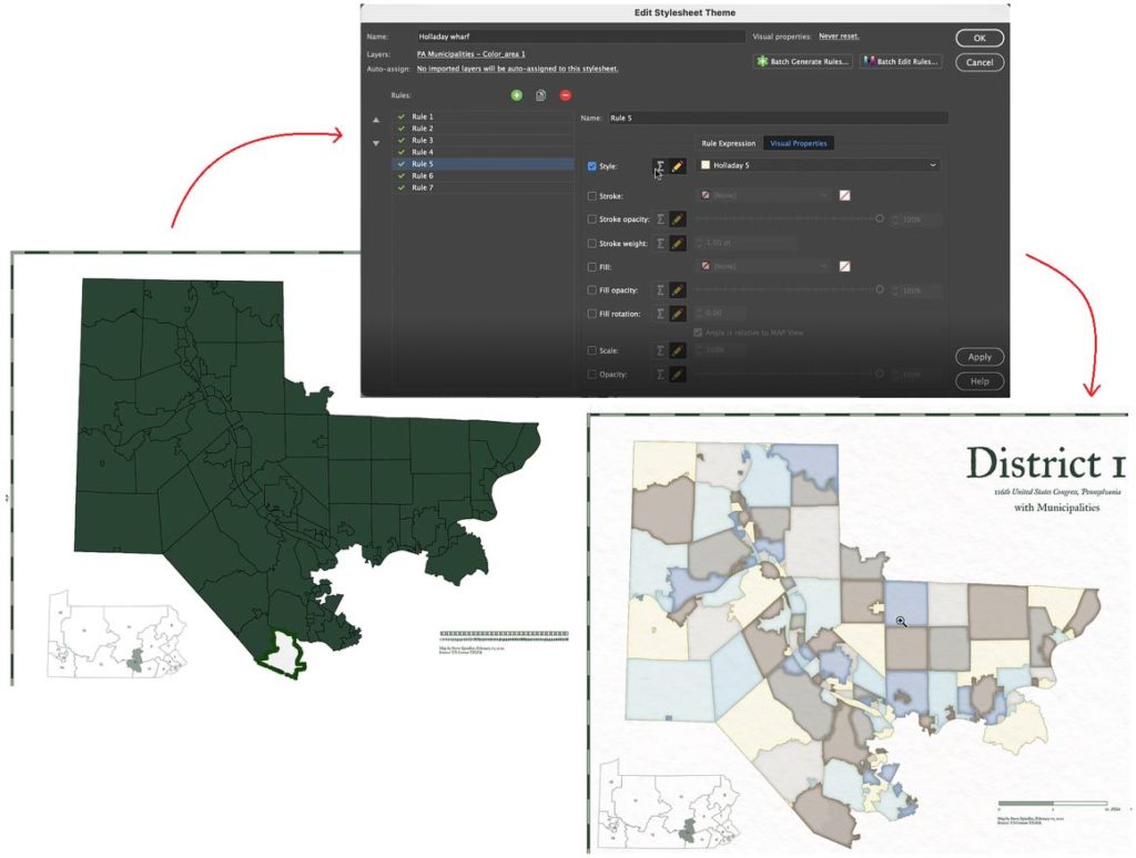
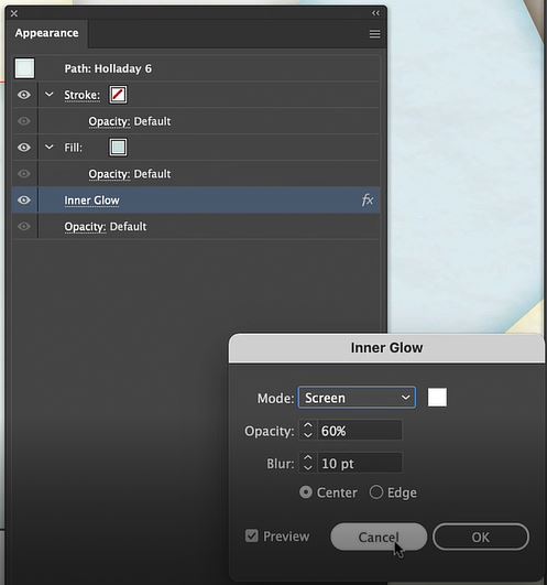
MAP Themes can not only set the stroke and fill for each polygon, but also apply graphic style effects such as “inner glow” to give each shape a more defined appearance. Since MAP Themes are entirely rules-based, it’s easy to modify and apply styles across the entire map without needing to adjust appearance settings for each vector layer individually.
Labels and Details
With his MAP Themes applied, Steve needs to finalize the scale bar that appears in the bottom right corner of the map. Since the template he uses comes pre-configured with a MAPublisher cale bar, it’s only a matter of dragging and dropping the scale bar layer into the appropriate MAP View. If you recall from earlier, Steve set up this new map-view with its own map scale and projection, meaning the scale bar will automatically be adjusted to fit the map data once it is placed in the new MAP view, creating an accurate and informative scale for viewers.
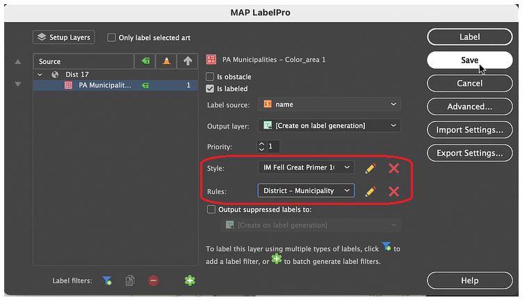
Lastly, Steve uses the MAPublisher LabelPro add-on to apply labels to each of the municipalities in his map. Similar to MAP Themes, the LabelPro tool allows Steve to configure rules-based label layers that manage label placement and style. The labelling engine ensures that labels are placed to avoid collisions, eliminate label overlap, and reduce label clutter. Finishing the map with a few minor touch-ups and voila!, Steve has finished his Pennsylvania District 17 Map in less than 15 minutes!
***
About the Author
Steve Spindler has been designing compelling cartographic pieces for over 20 years. His company, Steve Spindler Cartography, has developed map products for governments, city planning organizations, and non-profits from across the country. He also manages wikimapping.com, a public engagement tool that allows city planners to connect and receive input from their community using maps. To learn more about Steve Spindler’s spectacular cartography work, visit his personal website. To view Steve’s other mapping demonstrations, visit cartographyclass.com