Infographics are a great way to transform less than exciting data into a visualization that is both digestible and fun to look at. Adobe Illustrator and MAPublisher work perfectly together to make infographics simple like the one I made for National Spumoni Day.
You might have noticed, we like to celebrate national food days here at Avenza Systems. Instead of making just a map to celebrate this layered frozen delight, I made an infographic, containing not just one but two maps! Using a combination of Adobe Illustrator and MAPublisher tools, this infographic has graphs and two maps teaching you fun facts all about spumoni, gelato, and ice cream. Curious about how I made it? Keep reading!
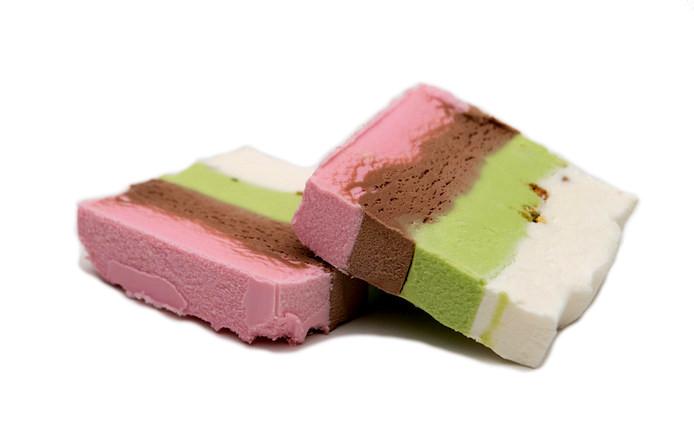
What is spumoni you may ask? Spumoni is a molded gelato with different layers and, usually containing nuts and fruit! Spumoni is usually 3-4 flavours. Cherry, pistachio, and chocolate or vanilla are the most common.
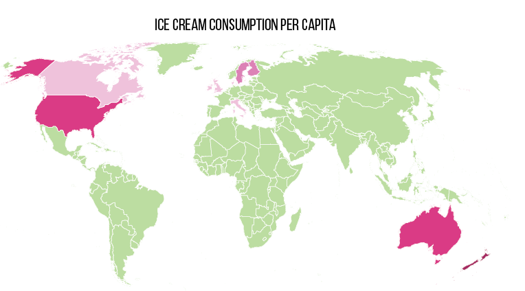
The infographic consists of two different maps; one showing the amount of ice cream eaten per capita around the world, and another showing the amount of milk produced per year by country.
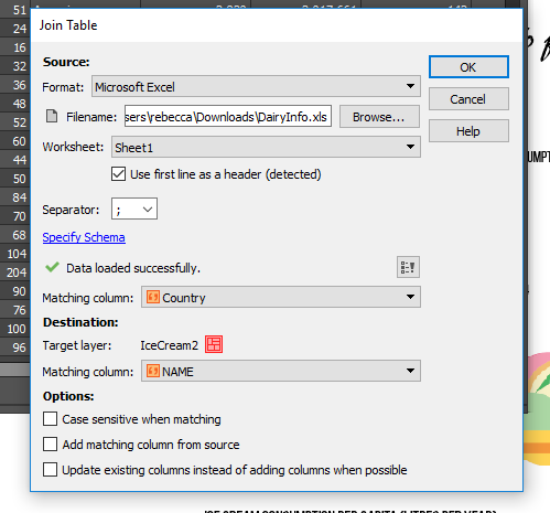
To create each map, an Excel spreadsheet was created with information about the countries milk production, as well as the average amount of ice cream eaten. Once the spreadsheet was created, I joined the tables in the MAP Attributes.
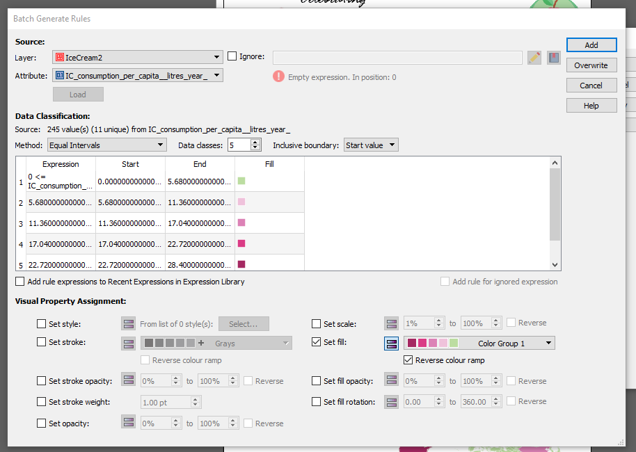
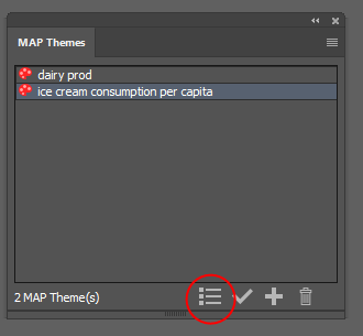
Once the tables were joined, I used MAP Themes to stylize the maps. MAP Themes are an easy way to stylize areas, lines, and points. I created a MAP Theme for each map, based on the attributes I created. One MAP Theme for the dairy production, and one for ice cream consumption. I used the ‘Batch Generate Rules’ option and chose 5 classes. I then chose the fill colour to be a custom colour group I created with spumoni-inspired colours.
Once I’d generated my rules, I applied my MAP Theme. I then followed the same steps for the dairy production map.
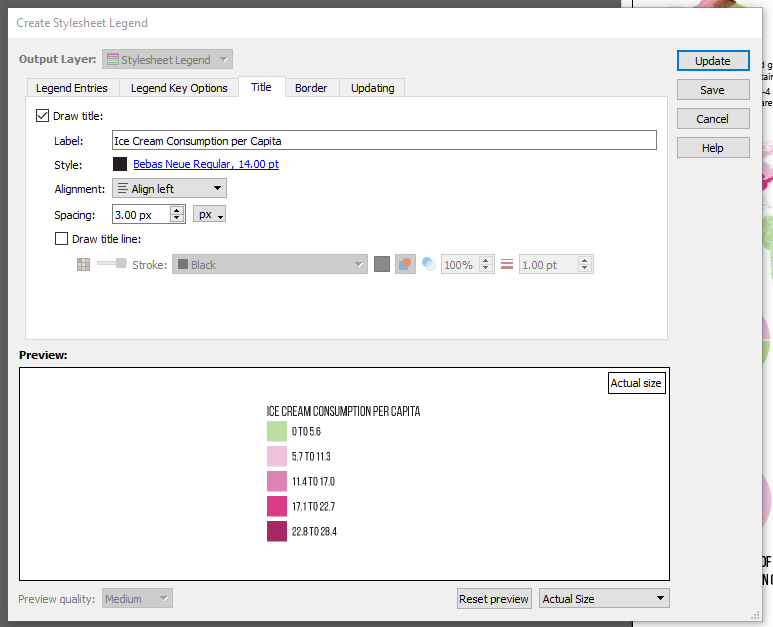
My favourite part of MAP Themes is that it’s super easy to create a MAP Theme legend after. To create a MAP Theme legend, select your MAP Theme Stylesheet and click the Legend button at the bottom of the window.
There are lots of options for customization when creating the legend. You can change the legend entries size, and the legend key font, size, colour, as well as details about the title, and the border.
Once the legend was created, I created the graphs using Adobe Illustrator’s Graph Tool. The graphs use the same colours as the maps, and for finishing touches I added the ice cream symbols and fun facts. Click below to see the finished infographic. Have fun celebrating National Spumoni Day, and have fun making your own infographics!
Rebecca Bennett is a member of the Support team at Avenza Systems and loves ice cream almost as much as she loves making creative and visually appealing maps.
The Copy MAP Objects From tool is used to copy MAP objects such as MAP Views, MAP Layers, MAP Themes, MAP Locations, and MAP Selections from one open document to another in Adobe Illustrator.
It’s super quick and easy to copy elements from one map project to another, as illustrated in this one-minute video.
For more How It’s Done videos subscribe to our YouTube Channel
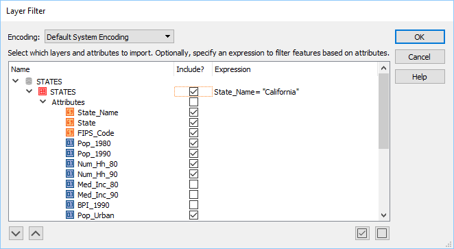
Importing map data into MAPublisher can be a time-consuming process if the data set is very large. You can reduce the time it takes to import by filtering the data first, isolating only the layers that you need.
This quick video shows you how to create layer filters by selecting attributes, and also using expressions.
For more How It’s Done videos subscribe to our YouTube Channel
We’re excited to announce the release of MAPublisher 10.2 for Adobe Illustrator. The MAPublisher product team has been working closely with our customers to build these features to improve map design productivity.
MAPublisher 10.2
This update contains new features and performance improvements as well as fixes for reported issues. Some highlights are mentioned below, for the full release notes see below.
Filter layers and attributes with expressions on import. This feature that has been requested by many users in the past and we’re happy to say it’s finally here! While filtering attributes and geometry has been available since MAPublisher 10.0, the ability to filter specific layers and attributes using an expression was not available until now. This let’s you fine-tune your layer and attribute filter to only include (or exclude) specific data at the attribute value level. This improves Adobe Illustrator performance by reducing the number of map features and attributes being imported. The Filter Geometry feature has been renamed Spatial Filter and it retains the same functionality. In addition, these filtering and simplification tools reside together in an improved user interface.
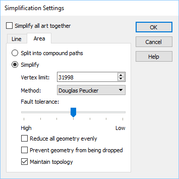
Simplify complex art on import. Another new import feature that reduces the amount of data is Simplification. It allows for the simplification or generalization of vector line and area data during data import instead of after. Using simplification during import reduces the number of map features and attributes being imported and improves overall performance. Simplification can be applied to all art together or applied separately to lines or areas and use either the Douglas-Peucker or Visvalingam-Whyatt method for removing nodes and vertices.
New support for WFS 2.0, AutoCAD 2018, and OGR formats. Several new formats are supported and updated in MAPublisher 10.2. The WFS 2.0 specification improves on a number of functionalities including response paging. More than 1,000 features can be loaded from a WFS server now. The AutoCAD 2018 format allows you to import and export version 22.0 DXF, DWG and DGN files. Read and write capabilities have been improved by updating OGR import formats (GML and PostGIS) and OGR export formats (GML and GeoJSON).
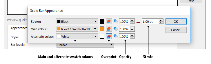
Overprint option for MAP Legend art. Overprint is essential in print production and reduces unsightly edges that could appear if printing plates are not perfectly aligned. MAPublisher generated art from Scale Bar, Grids and Graticules, and MAP Theme legends now have an overprint setting to ensure that art can be maintained as MAPublisher objects without having to expand art as separate objects, strokes, and fills.
MAPublisher 10.2 Release Notes
Filter layers and attributes with expressions on import
Simplify complex art on import
Import support for WFS 2.0 and AutoCAD 2018
Export support for GeoJSON and AutoCAD 2018
Introduces MAPublisher with a Simplified Chinese interface option
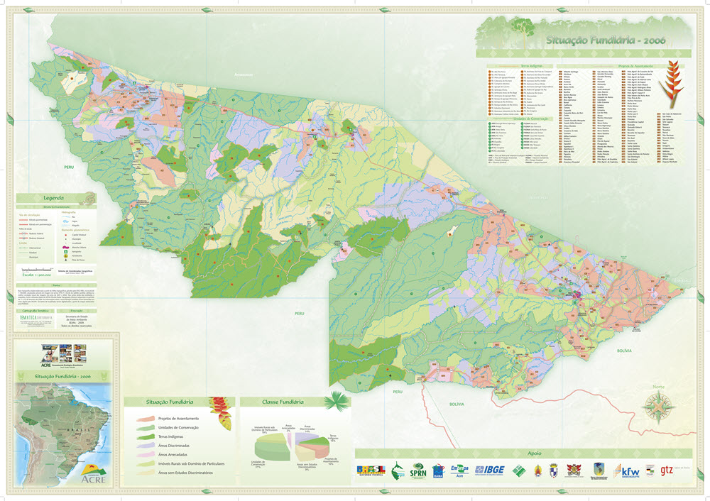
Brazilian-based cartographer, Mirian Isabel Say, has two passions: making maps and traveling. Lucky enough to live in a large, diverse, and beautiful country as Brazil, she has extensively traveled through it to gain inspiration for personal growth and to find influences for her map designs. As an idealist, Mirian considers maps as works of art, not merely used to perform a singular function. Especially in a natural resource-rich country like Brazil, she believes that maps can help change the lives of its users, transcending the use of maps from a purely commercial purpose to a purpose that is appreciated and acknowledged.
For Mirian, the map design process is a huge personal journey, and having the right tools can be the difference between a published map and a map left unfinished on the computer. When Mirian began her cartography career in 1992, her choice of existing graphic design software was limited and didn’t include suitable tools specific to mapping. Even as the software improved, it didn’t support any of the commonly used geographic data file formats and she was limited to importing data that was not spatially referenced. For example, to accurately create a map scale by hand is very complicated—as any well-trained cartographer knows—and the functionality to do it digitally wasn’t available. Exporting to other cartography formats was not feasible since maps were not georeferenced. Symbols and labels were placed individually, often taking many hours of labour.
By 2004, graphic design and GIS software had become more advanced. Mirian learned about MAPublisher in-person at a GIS and mapping trade show and immediately liked how the many cartography and GIS tools were seamlessly integrated into Adobe Illustrator. She believed she finally found a cartography product that would be an all-in solution. When she returned home, she continued working in her existing graphic design environment, but continued to experience the many shortfalls of it. After some careful planning, she decided to take the leap and jump in headfirst to acquire MAPublisher and Adobe Illustrator.
Any major changes to a workflow including one that involves new software can be difficult at the beginning. Mirian began to adapt from her older graphic design software and learned the new MAPublisher toolsets through Avenza resources and working with the Avenza Support team directly with questions about workflows and best practices. “My type of work is not very common in Brazil and there are few engineers and cartographers who do it. Many years ago, I received professional critiques that my maps were beautiful but not accurate enough. Today, I’m very glad to say that I can create maps just as beautifully and more importantly keep them accurate.”
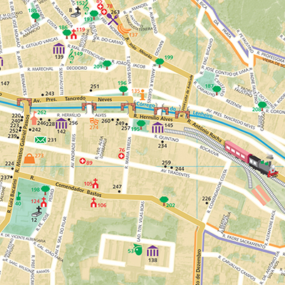
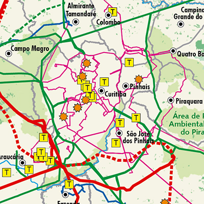
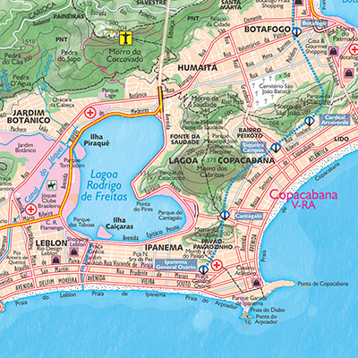
Mirian’s style of mapping is an immersive experience. When hired to produce indigenous and environmental maps for the Brazilian state of Acre government, she researched the region’s geography, read about its natural resources, and made a trip to visit to explore the culture, people, and food. She says she hopes that others can also see the human side of geographic space as she portrays it in her maps and that maps can provide not just information, but social change. She believes that her connection to and experiences of places make her a better cartographer. When she created the official tourism map for the City of Rio de Janeiro, her home city, she wanted to be “in the present” and decided to explore areas of the city intimately by foot to visit museums, beaches, and landmarks. The City also helped her understand the scale of the area by helicopter – a definite highlight in her career. The result was an appreciation of the city’s colour palette expressed on her map. “The sea was light blue, the green forests were intense, and the rock formations were magnificent. Rio de Janeiro is a very sunny and cheerful city so I used cheerful yellowish-green colors.”
Mirian continues to produce maps for many clients and has had her maps featured in several publications. She has also taught several post-graduate cartography courses at universities and lectures on cartography techniques and the importance of using the best cartography tools available.
In a previous post, we shared ideas about key elements that make great maps according to our friends atMap the Xperience. They presented awebinar on the subject, so we poached their ideas forPart 1 of this blog discussing the importance of map quality and connecting with the user. In Part 2 we’ll expand on the other two elements, Presentation & Design, and Accuracy.
After identifying the target audience and deciding on the level of detail required, putting all of the relevant data on a map while keeping it readable is a challenge. Good maps document what the reader needs to know at a basic level to prevent getting lost. Great maps highlights what the reader needs to know to fully experience the mapped area. It all starts with map accuracy and the readability imparted by the presentation and design of the information.
Presentation & Design
A map quickly becomes cluttered as additional layers of data are added so how do you present all of that in a way that doesn’t make people’s eye’s pop out? It pays to have some knowledge of design, or get some advice from someone who does. Can you use colour to convey any of the information on the map, and is the colour scheme pleasing to look at? Do the symbols make sense to anyone but you? Are they simple and not open to interpretation? Can shading or patterns be used to highlight map features? Map The Xperience takes the design process very seriously and highlights their 3D hillshading asone of the features that make their maps unique.
An equally important part of the discussion about presentation includes thinking about how and where readers will use the map. Is it in paper format or digital? Will they be reading it thousands of feet in the air in a hot air balloon, at a table studying the map with a group, or on a tablet in the middle of a forest? Anticipating how a map will be used helps to make design decisions such font and symbol sizes, label placement, and the use of legends.
Accuracy
What’s the point of a map that isn’t accurate? This is obvious and yet still worth mentioning. While lots of lovely art is made by taking liberties with the accuracy of map elements (that’s another blog post) maps for specific activities need to be accurate – spatially and in the supporting information. This can mean field testing maps in the way thatMapsynergy tests its ski resort maps by actually skiing the hills, andNew York-New Jersey Trail Conference constantly updates maps according to data collected by its members and staff. It can also mean augmenting physical data with local knowledge.Rhonda Lerner visits each of the businesses listed on her tourist map to verify that the the are tourist-friendly and current.Pixmap Cartografia Digital researches the local names for locations on their maps of Argentina and Chile, because in the end, who can knows a place better than the people who live there.
In summary, good maps are functional while great maps add to the experience of visiting a place by being, all at once, informative, accurate, easy-to-use and pretty to look at. It’s no easy feat to meet all of those criteria. Perhaps the pursuit of the perfect map is the reason why cartographers are so passionate and dedicated to their craft.
The Channel Management tool in Geographic Imager is excellent for quickly making false-color composites from multispectral images in Adobe Photoshop. In this blog, we’ll take a look at Channel Management and see how it can be used on LandSat 8 imagery.
Most satellite providers supply a tile or scene as several images while each image captures a different wavelength of the satellite’s electromagnetic spectrum. The LandSat 8 satellite instruments measure in the visible, near-infrared and shortwave infrared portions of the spectrum. Its images have 15-metre panchromatic and 30-metre multi-spectral spatial resolutions. Here is a list of all LandSat 8 band names, bandwidth, and resolution.
Band # | Type Bandwidth (µm) | Resolution (m)
Band 1 Coastal Aerosol | 0.43 – 0.45 | 30
Band 2 Blue | 0.45 – 0.51 | 30
Band 3 Green | 0.53 – 0.59 | 30
Band 4 Red | 0.63 – 0.67 | 30
Band 5 Near Infrared (NIR) | 0.85 – 0.88 | 30
Band 6 SWIR 1 | 1.57 – 1.65 | 30
Band 7 SWIR 2 | 2.11 – 2.29 | 30
Band 8 Pan | 0.50 – 0.68 | 15
Band 9 Cirrus | 1.36 – 1.38 | 30
Band 10 TIRS 1 | 10.6 – 11.19 | 30 (100)
Band 11 TIRS 2 | 11.5 – 12.51 | 30 (100)
Before starting, you can download some sample LandSat 8 imagery here and follow this tutorial.
To create different band combinations, we’ll first need to combine images into one image and then use Channel Management to assign band combinations.
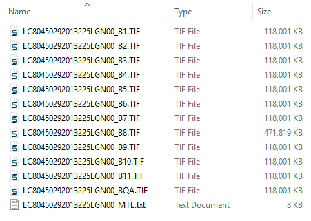
1. In Adobe Photoshop, open all of the 30-metre resolution images:
Band 1 – Coastal Aerosol
Band 2 – Blue
Band 3 – Green
Band 4 – Red
Band 5 – Near Infrared (NIR)
Band 6 – SWIR 1
Band 7 – SWIR 2
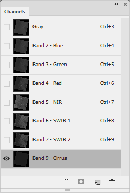
Band 9 – Cirrus
When using Landsat 8 imagery, file names have a _B and the band number as a suffix (e.g. LC80450292013225LGN00_B1.TIF). Note that Band 8 wsa not used because it is has a different resolution.
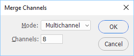
Now that the band images are open, we can continue to combine the images into a single image using the Adobe Photoshop Merge Channels feature to store the spectral information. Each channel is grayscale which can be used to store different information.
2. Go to View > Channels to open the Channels panel. In the panel options menu, select Merge Channels. In the Merge Channels dialog box, the Mode will automatically default to Multichannel because there are eight channels. Click OK.
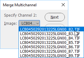
The Merge Multichannel dialog box will immediately appear. In this dialog box, we’ll specify each image to use for each channel. It’s very important to assign a channel to the according image. In this case, the naming convention of the images makes it easy because the images are in the correct order. In addition, when combining multiple images, it is good practice to ensure that all the images have the exact same image size and are georeferenced the same.
3. Notice the “Specify Channel 1” text, you’ll assign the Band 1 image to it. Click the Image drop-down to display all the images that are compatible to be merged. Select the first image which ends in _B1.tif and click the Next button. For “Specify Channel 2”, select the image ending with _B2.tif and click Next.
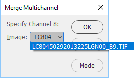
4. Repeat the steps for the remaining images until all eight channels have been assigned an image, ensuring the channel number matches the image band number. The only exception will be Channel 8 which uses Band 9 – Cirrus (_B9.tif) because we didn’t include the panchromatic band 8 which has a higher resolution and different georeference.
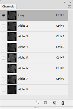
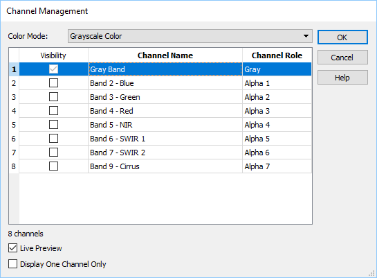
The images are now merged into a single image in Multichannel mode. Since an image in Multichannel mode is not compatible with Geographic Imager, it will have to be converted to Grayscale mode.
5. Go to Image > Mode > Grayscale. This will assign the first alpha channel (Band 1 – Coastal Aerosol) to use the Grayscale colour space.
6. In the Channels panel, rename all the channels to their corresponding bands.
Alpha 2 -> Band 2 – Blue
Alpha 3 -> Band 3 – Green
Alpha 4 -> Band 4 – Red
Alpha 5 -> Band 5 – NIR
Alpha 6 -> Band 6 – SWIR 1
Alpha 7 -> Band 7 – SWIR 2
Alpha 8 -> Band 9 – Cirrus
Renaming channels makes assigning band combinations easier in later steps. It is recommended to save this image as the source for all band combinations and use Save As to create a new images when saving band combinations.
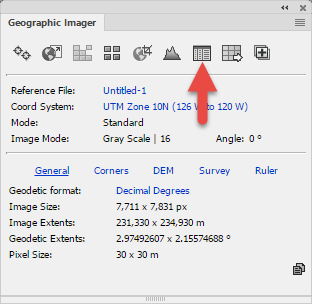
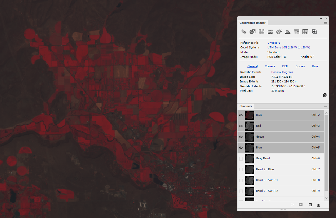
7. In the Geographic Imager panel, click the Channel Management button.
The Channel Management dialog box shows the current colour mode is Grayscale.
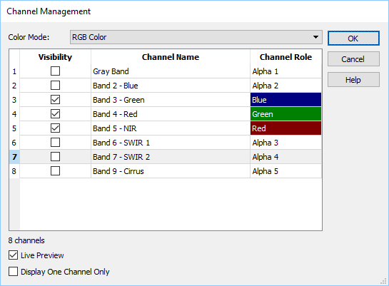
8. Change the Color Mode to RGB Color.
Now the fun begins, we can easily create any band combination. A traditional color infrared image (CIR) is band combination 5-4-3. This refers to what band is assigned to the RGB channels, respectively. CIR is good at determining the health of vegetation; the cell structure of leaves strongly reflects near-infrared light and the stronger the light sensed, the healthier the plants are.
8. Assign Band 5 as the Red channel, Band 4 as the Green channel, and Band 3 as the Blue channel.
9. Click OK to complete the process.
We now have a image which can be used to determine healthy vegetation which is shown in bright red. This makes it easier to determine different types of vegetation making it easier to identify crops and wetland.
Some other common Landsat band combinations are:
Natural Color: 4-3-2
False Color (urban): 7-6-4
Color Infrared (vegetation): 5-4-3
Agriculture: 6-5-2
Atmospheric Penetration: 7-6-5
Healthy Vegetation: 5-6-2
Land/Water: 5-6-4
Natural With Atmospheric Removal: 7-5-3
Shortwave Infrared: 7-5-4
Vegetation Analysis: 6-5-4
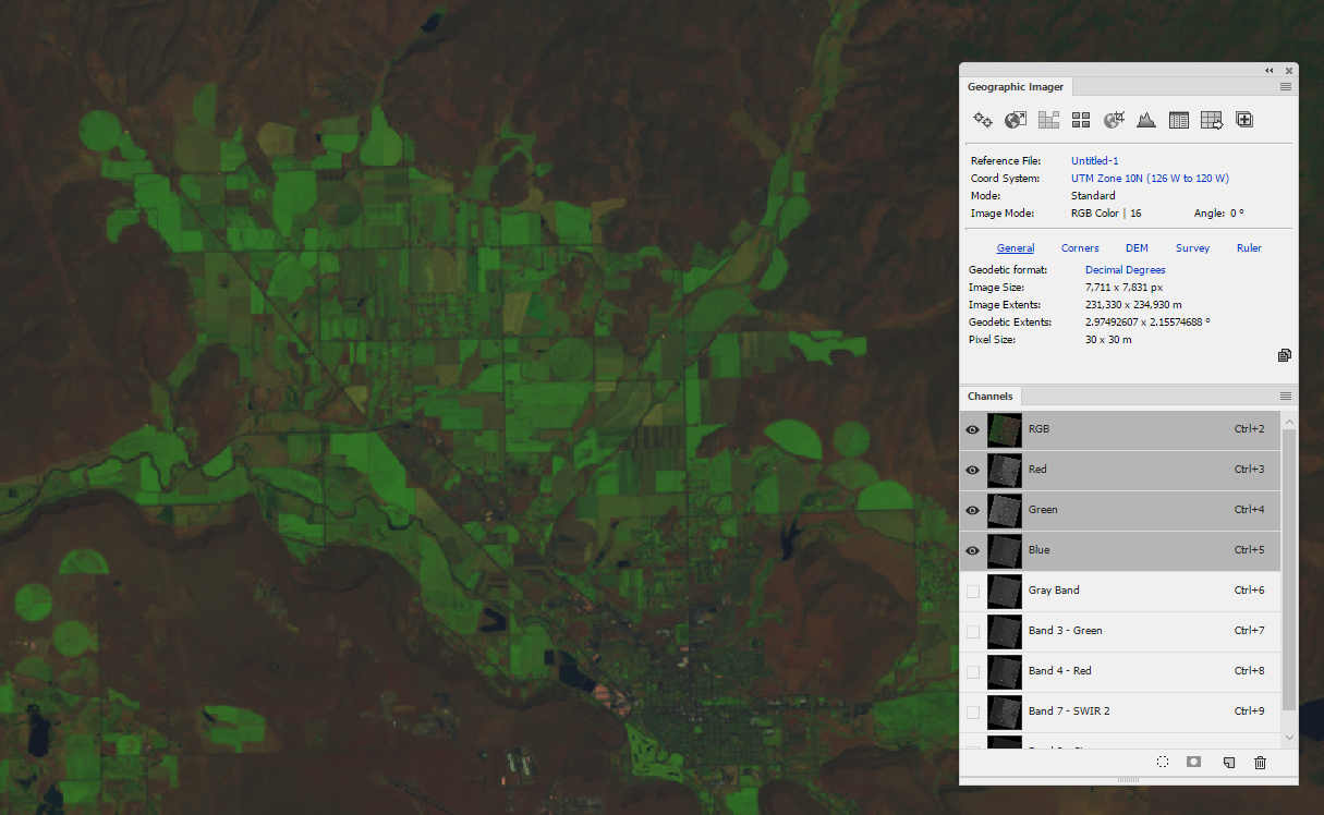
Another band combination of 6-5-2 can show how healthy vegetation is.
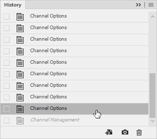
10. Use the History panel to go to the previous step.
This will reset the Channels so that another band combination can be configured easily.
Another great way to make non-destructive edits is to use Adobe Photoshop adjustment layers. Adjustment layers layer can be used individually or in combination to adjust settings such as levels, exposure, contrast, brightness, hue, and saturation to make it easier for the human eye to identify features. It is not recommended to alter an images resolution if it is going to be used in third-party remote sensing software.
There are several options when saving an image like this and it depends on whether you want to maintain the channels or not. When the channels aren’t needed, GeoTIFF is a popular format and is compatible with most spatial software applications. In the TIFF save options, you can uncheck the option for Alpha Channel and Spot, which will prevent saving the alpha channels and will create a saved copy. You can also simply save it as a PSD file (a default reference file will be created) and with all the alpha channels intact. Note that including channels will increase the size of the file.
June 18th is #InternationalSushiDay, and as they say “You can’t buy happiness, but you can buy sushi, which is kind of the same thing.” Sushi has become so mainstream that you can find a sushi restaurant almost anywhere. With the wide variety of ingredients and flavours available in maki rolls, sashimi and sushi, no wonder it’s such a popular meal. To celebrate, we made a map! Instead of focusing on Toronto this time, we went to the west coast to highlight some restaurants in Vancouver that have ‘Bucket List’ sushi. These restaurants were chosen from this Narcity article. While not all of them are featured on the map, the 12 restaurants shown are still serving bucket list sushi items! If you try any of these, please leave a comment! Interested in how we made our sushi map? Keep reading!
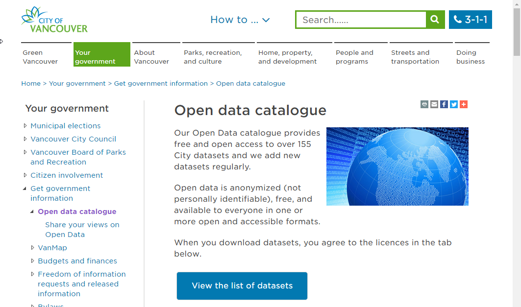
The City of Vancouver has a great open data portal, which is where we pulled the part of our data.
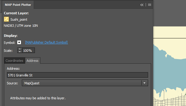
We got our street and park files from the portal, and created the sushi points using the MAP Point Plotter (one of my favourite tools!). Using the restaurant addresses provided in the article, we plotted each of the points on the map.
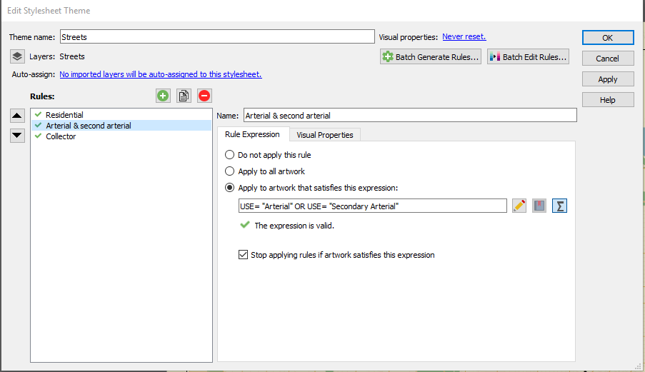
Once all of our points were in, we used a MAP Theme to style the streets. Ours looked like this:
Once the streets were styled, and colours were chosen it was time to style the rest of the map. We put a land mass file in to give boundaries, and show the coast line.
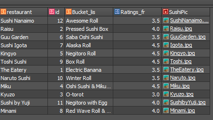
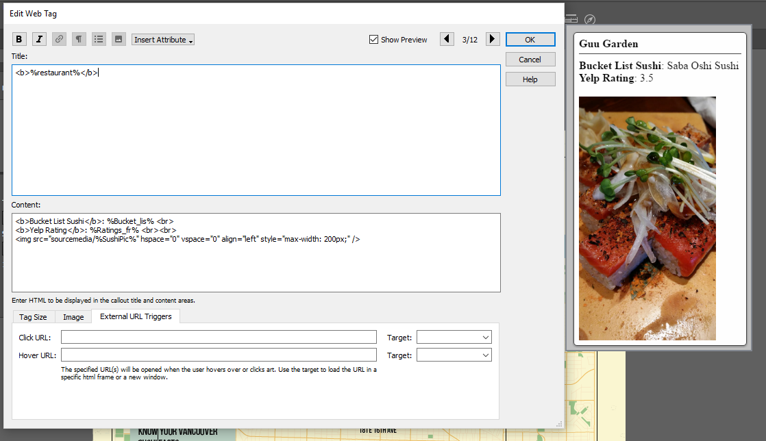
We styled the restaurants with different pieces of sushi, and included their addresses for easy reading. But, the most important feature and point of this map, were the bucket list sushi items that each of these restaurants serve. To show those featured menu items, we added them to the MAP Attributes (and included their Yelp rating, along with a photo of food from their restaurant).
Once those were in, we used the MAP Web Author tool to make the map interactive! When you view the map and click on the sushi icon for each of the restaurants, you’ll see the restaurant name, the bucket list sushi item, the Yelp rating, and a picture of their food. Here’s what our Web Tags look like.
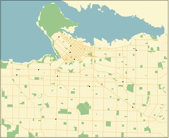
Here’s what the final map looks like! If you click on the sushi pieces, you’ll see the tags we created in MAP Web Author. Interested in the PDF? It’s also linked below. We’ve put the Adobe Illustrator file up as well, if you’d like to take a look or play with the map itself! Happy #InternationalSushiDay!
The field of cartography is filled with jargon and terminology that can pose a challenge for newcomers learning to use mapping software such as MAPublisher to make beautiful maps, and those who don’t have a formal background in cartography. It also doesn’t make it easier when different software packages have their own variations on certain terms. To help the cause, we have compiled a short list of common cartography terms or “carto-jargon” that you may encounter while using MAPublisher or Geographic Imager.
Basemap
A basemap is a background image which can include aerial imagery, topography, terrain and streets and other fundamental layers and is used as a starting point to create a new map. The basemap is georeferenced and is usually the most accurate source of spatial information within the data system that makes up the finished map. Additional layers of data such as labels, symbols and paths are then added to the basemap to create the final product.
Feature
Any real-world object that is represented on a map is a feature. Features can encompass large areas of a map, such as bodies of water and mountain ranges, or they can be discreet objects like parking areas, public washrooms or fire hydrants.
Attribute
Attribute data is information about spatial features and is stored in tables. It is also the information that specifies the appearance and labeling of features on a map. For example, the graphic attributes of a river might include the thickness of the line, line length, color, and the name used for labeling.
Control Point
A control point is a location on the map with known pixel (x,y) coordinates. Control points are used in georeferencing to allow for extrapolation of the relative location of other points whose exact coordinates may not be known.
Coordinate System
A coordinate system is a reference system used to represent the locations of geographic features on a map. It provides the basis for identifying locations on the earth’s surface. There are thousands of different coordinate systems, most of which are limited in use to highly specialized purposes.
Projection
The earth is not flat and so imagining that it is for the purpose of putting it on a 2-dimensional map results in some distortion. A projection is a method by which the curved surface of the earth is portrayed on a flat surface and is based on a mathematical transformation of the earth’s lines of longitude and latitude onto a plane. There are many different projections, each of which distorts distance, area, shape, and direction is some way, therefore no projection can result in a perfectly accurate flat map. Check out theAvenza Projections Guide for a more detailed information.
Georeferencing
Georeferencing involves aligning geographic data to a known coordinate system so it can be viewed, queried, and analyzed relative to other geographic data on the same map. Georeferencing may involve shifting, rotating, scaling, skewing, and in some cases warping, rubber sheeting, or orthorectifying the data to improve accuracy.
Graticules and grids
Graticules are the network of longitude and latitude lines on a map or chart that relates points on a map to their true locations on the earth. You can think of this a grid system – in fact, the terms are sometimes used interchangeably, but there is a subtle difference. Graticules are derived from 3-dimensional ellipsoidal shape of the earth and are formed by the the lines of latitude (parallel lines circling the earth), and lines of longitude (non-parallel lines converging at the earth’s poles). A grid system is comprised of a set of parallel and perpendicular lines that are superimposed on a flat projection of the earth, creating an x,y coordinate system. An example of a grid system is the Universal Transverse Mercator (UTM) system.
Themes
In MAPublisher, MAP Themes are a collection of thematic cartography tools designed to automate how styles and symbols are applied, charts are produced, and data is plotted. There are three themes which you can be customized to suit your needs: Stylesheet, Chart, and Dot Density. MAP Themes offer a lot of flexibility as they can be edited, applied, duplicated, automated, exported, and cleared without affecting the spatial referencing of map features.
This is just a small sampling of the more robust glossary of terms available in the ourMAPublisher andGeographic Imager documentation packages.
MAPublisher has been simplifying the process of making maps beautiful for cartographers for more than 20 years. We are always adding new features and improving others, some of which have impacted the overall workflow and affect a majority of users. Other are more ‘niche’ in their application and the functions they perform. Here are a few favourite features that you may, or may not be aware of, as identified by the people who helped design and build them.
MAP Tagger ToolMichael L. – Product Marketing
I like the MAP Tagger Tool because it’s incredibly fast to create labels by clicking features on the artboard. Labels are created using attribute data as a source for the labels. In dense areas, the Map Tagger has flexibility to style and attach leader lines according to placement rules.
MAP Web AuthorWill H. – Sales
The MAPublisher users I speak with are usually impressed with Web Author and are surprised that it is included in the MAPublisher package. MAP Web Author lets Adobe Illustrator documents with GIS attributes be exported to interactive HTML5 web maps complete with callouts, rollovers, layer control, search, pan and zoom controls. With a little bit of knowledge of CSS (Cascading Style Sheets) and JavaScript you can embed interactive maps into any web page. The map below was created by the National Park Service.
Scale and Rotate by AttributeAndrew P. – Software Architect
We added this for a customer who had an interesting use case involving a pattern fill for lava flow. The map broke down an area into sub-areas by lava flow (direction, intensity, etc.). He wanted a way to use the attribute data he had in his map to automatically do a bunch of things he would otherwise have to do by hand, very carefully. In particular, he used the feature’s ability to rotate the pattern of area to match the lava flow direction, which sounded very cool (no pun intended) to us!
MAP Locations ToolMichael L. – Product Marketing
Most users don’t know what MAP Locations does (allows you to define real world coordinates for a location in a document) and how it’s actually useful. It sounds complicated, but it’s actually simple and far reaching throughout the product. MAP Locations can be used in several MAPublisher tools as references for georeferencing, for corners, for locations to draw lines, and locations to plot points. They can also be used to identify map and page anchors.
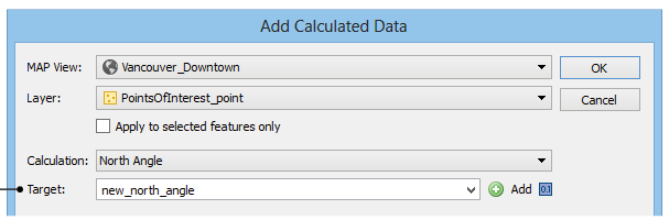
Add Calculated DataAndrew P. – Software Architect
Add Calculated Data is essentially a tool to update or add attribute data, but it allows users to feed in things that a user would find difficult to calculate themselves such as centroids, north angles, and art bounds. It also lets you pull in and store data like stroke or fill colours, in case you need to export them to a format that doesn’t support colours natively. You can even have it pull in elevation data!


