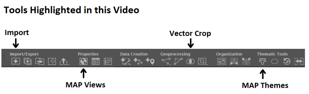
We are back with another exciting addition to our Mapping Class tutorial series. The Mapping Class tutorial series curates demonstrations and workflows created by cartographers and Avenza software users. For this article, we are welcoming back Steve Spindler, a longtime MAPublisher user, and expert cartographer. He has shared with us an excellent tutorial on creating a map from scratch using openly available geographic data from OpenStreetMap, and accessed through Overpass turbo. Steve shows how you can create query statements to filter and export the data, and demonstrates how you can import the data into MAPublisher before using a selection of cartographic styling tools to create a visually appealing map.
Steve has produced a short video walkthrough detailing his map-making process. The Avenza team has produced video notes (below) to help you follow along.
***
Importing OpenStreetMap data using Overpass Turbo by Steve Spindler (video notes by the Avenza team)
Finding and accessing good quality data is often the first challenge for any cartography project. OpenStreetMap (OSM) can be an excellent source of open vector data describing land cover features (roads, parks, rivers, buildings, trails, infrastructure, boundaries). Once collected, cartographers can use OSM data to create highly detailed maps using the MAPublisher plug-in for Adobe Illustrator. Steve will demonstrate his process of collecting raw data from OSM and using it to craft a beautiful map of the Niagara Falls Area. The following video notes summarize Steve’s approach.
First, you will need to extract some data from the OSM database. Since OSM is a massive repository of geographic data, you’ll need a way to filter through and extract only the data needed for your specific map project. Overpass turbo is a web-based data mining tool that can make querying and exporting OpenStreetMap datasets easy. The tool allows users to apply query statements that filter the OSM database based on attribute and location information. Using the Overpass turbo “Wizard”, a user can enter simple queries (i.e. “water”) and automatically filter and select all features that match the query statement, making it easy to export specific data for your map.
Steve uses a simple query to obtain all map features that are considered “water”. This includes both natural and man-made features
The tool allows the user to export the filtered datasets into geoJSON format, an open standard format for storing and representing geographic data and attributes.
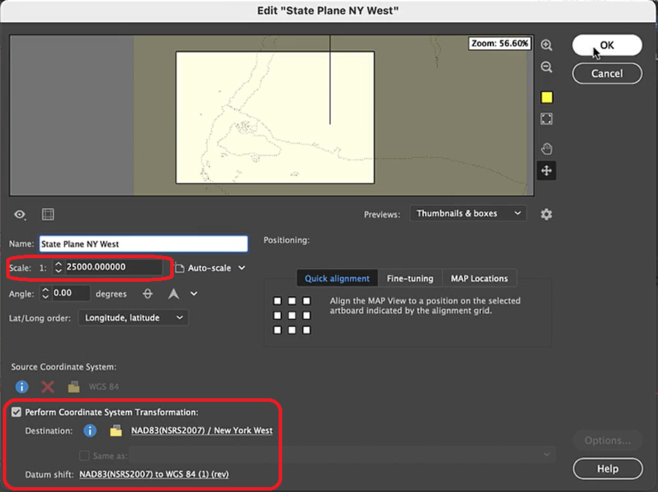
The geoJSON datasets collected from Overpass turbo can then be imported directly into MAPublisher for styling into a finished map. Use the Import tool to load the data onto an Adobe Illustrator artboard. From here, you can open the MAP View editor to adjust the scale and projection information for each map data layer. For this map, reproject the data into State Plane NAD 83 to preserve an accurate spatial scale. Set the scale option to 25,000 and customize the position of the map data on the artboard.
If needed, use the Vector Crop tool to trim the map data down to a specific area of interest, and simplify the layer to create smoother lines by removing excess vertices.
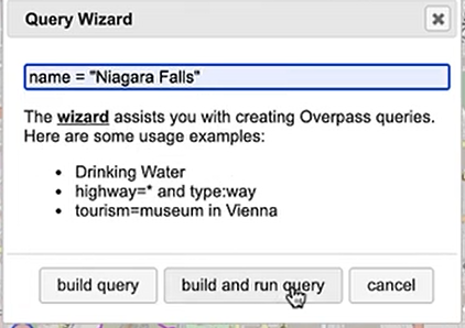
Back in Overpass turbo, you can build more specific query statements to extract individual features from larger data categories. Use the statement: name = “Niagara Falls”, to select polygon features specific to the waterfalls in that area.
Import this new data into MAPublisher, and drag and drop it into the same MAP View as the water layer. The data will be automatically scaled and projected to align with the water layer. Apply a graphic style fill for the water bodies and waterfall area.
Next, we can go back to Overpass Turbo and extract road and highway data. You can build out more complex query statements using basic database operators (i.e. and/or). For longer, complex query statements it helps to create saved queries that you can re-use. This map uses a saved query statement called “selected roads with residential” to extract line features covering most road types:
(highway=primary or highway=secondary or highway=cycleway or highway=path or
 highway=motorway or highway=trunk or highway=tertiary or
 highway=neighborhood or highway=footway or highway=service)
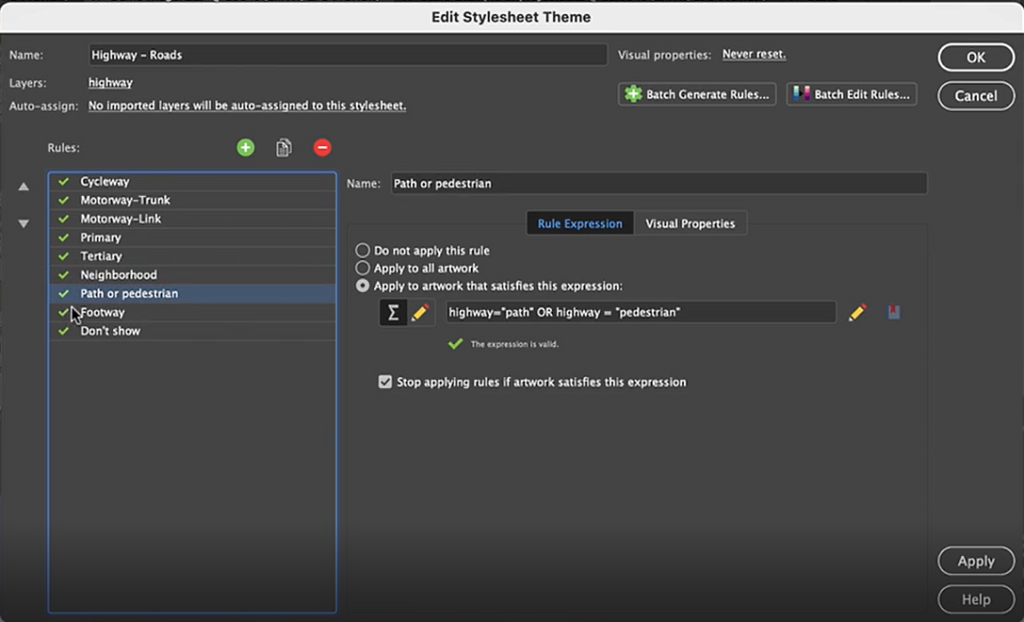
Import the roads data into the same MAP View as the other datasets. If you look at the MAP attributes you can see the road data is split into several different types. Steve use’s MAP Themes to create rules-based stylesheets to visualize the different road lines based on their road-type attributes. Steve designed a rule-set that made minor roads more subtle in appearance, while major roads and highways became more prominent. He also used colour to distinguish between pedestrian and vehicle network links.
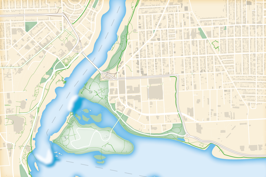
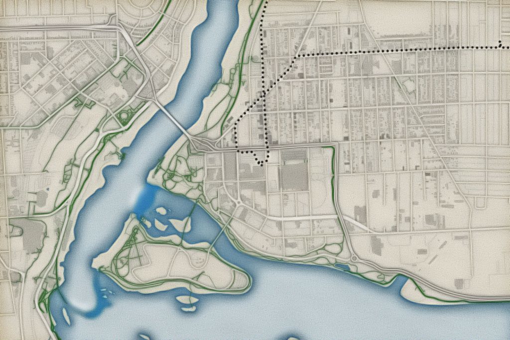
Repeat this process with a building footprint layer and crop all layers in the final map to the artboard extent. The finished product is shown below (top). Some final touch-ups in photo editing software can be used to create a more stylized appearance (bottom).
Exported map from Illustrator
Stylized version modified with Photo editing software
***
About the Author
Steve Spindler has been designing compelling cartographic pieces for over 20 years. His company, Steve Spindler Cartography, has developed map products for governments, city planning organizations, and non-profits from across the country. He also manages wikimapping.com, a public engagement tool that allows city planners to connect and receive input from their community using maps. To learn more about Steve Spindler’s spectacular cartography work, visit his personal website. To view Steve’s other mapping demonstrations, visit cartographyclass.com
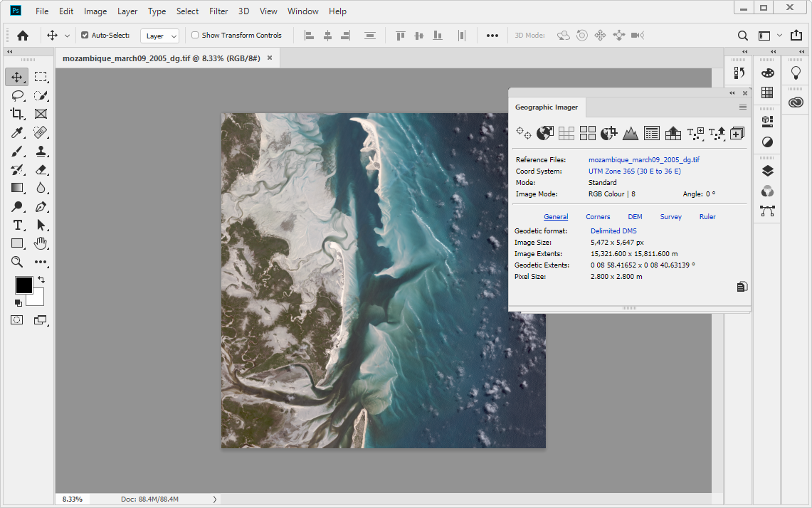
PLEASE NOTE: As of Photoshop 22.5, Adobe has discontinued support for the program’s 3D features. This may affect some or all elements of this blog. For more information, see Adobe’s FAQ page about this change and the Geographic Imager compatibility information page.
In the world of map-making, shaded relief refers to a visual technique that gives the illusion of three-dimensional terrain on an otherwise flat map. Cartographers use shaded relief to draw the viewer’s eye to prominent topographic features such as mountains, valleys and canyons. Using imaginary illumination sources and digital elevation data to cast directional light on a map, the cartographer can give the illusion of depth, casting shadows into valleys and lowlands, and highlighting ridgelines and peaks as if they are bathed in sunlight.
Historically, this technique was achieved entirely by hand and was extremely labour intensive. Now, with modern graphical software and digital mapping technologies, relief shading can be accomplished right on the desktop.
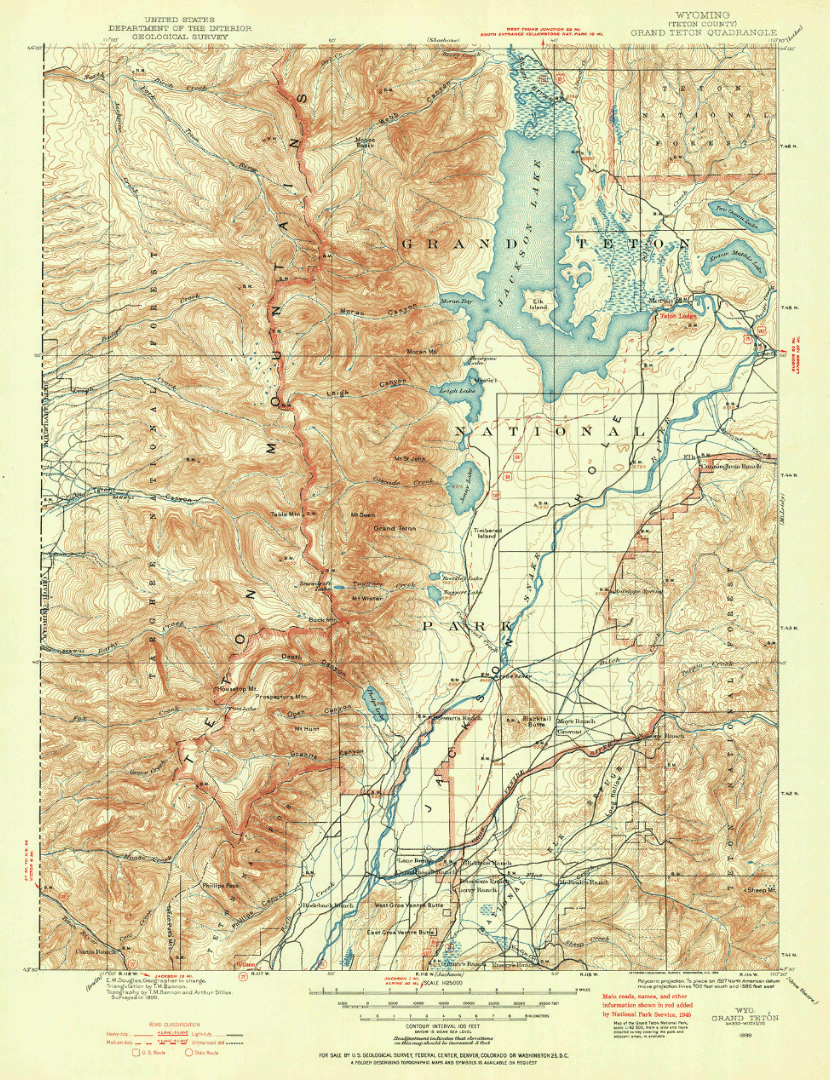
To demonstrate this, we are going to use the powerful spatial imagery tools and graphical design capabilities of the Geographic Imager plug-in for Adobe Photoshop to explore relief shading using a really interesting 19th-century historical map. Here is a sneak peek to show what the final product will look like.
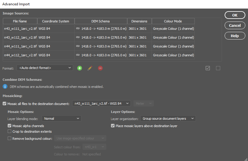
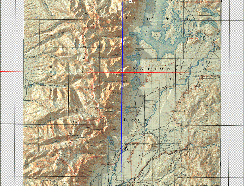
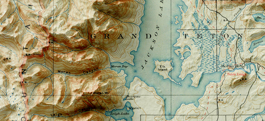
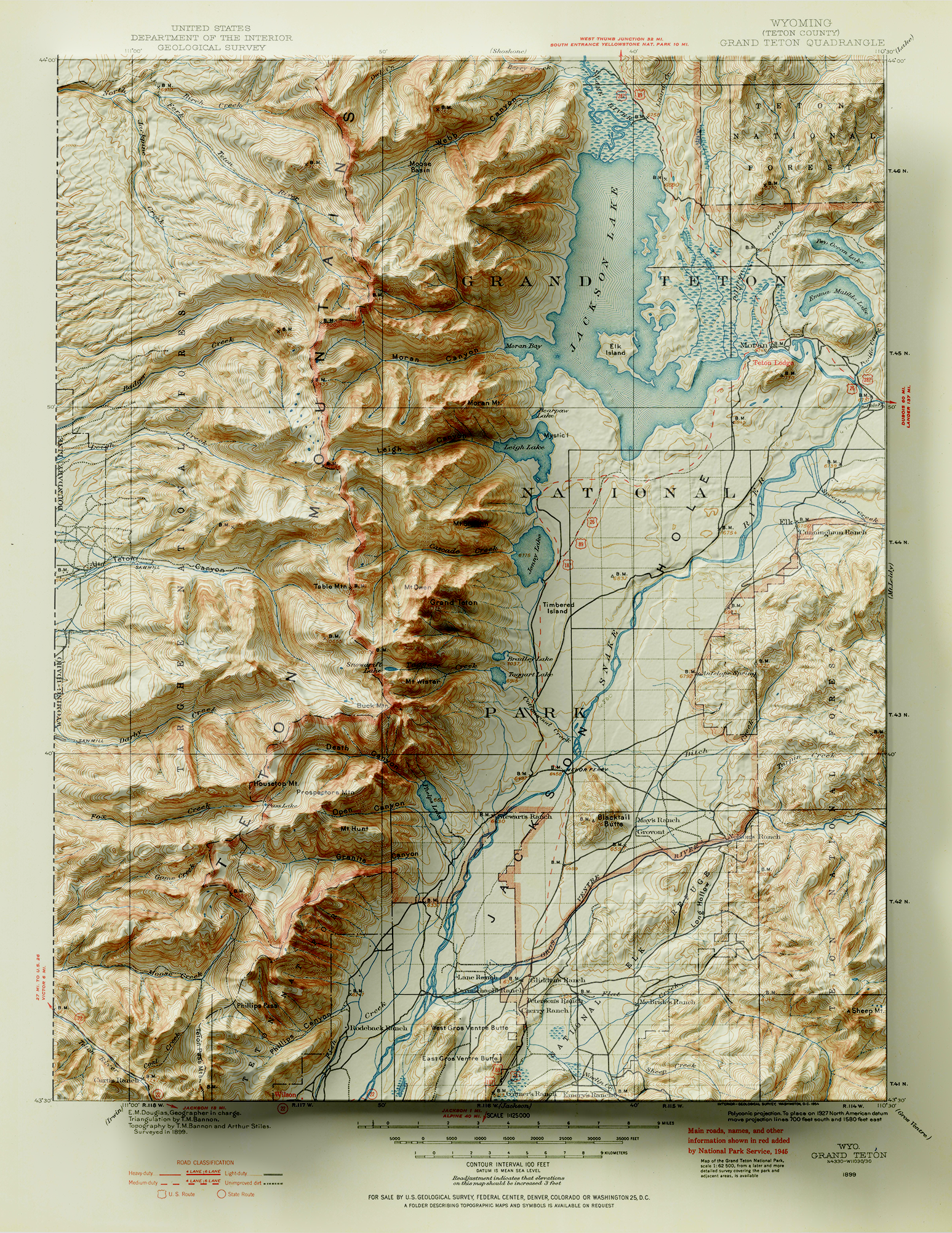
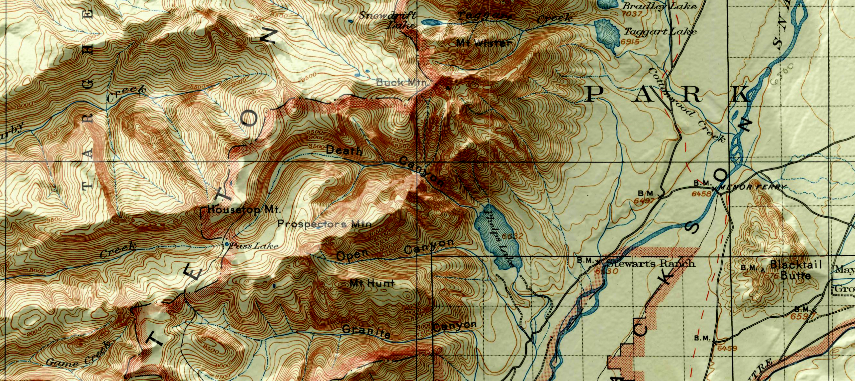
Let’s start with our original map. We have taken an absolutely stunning United States Geological Survey Map of the world-renowned Grand Teton National Park in Wyoming. Originally drafted by hand in the year 1899, the map features beautifully drawn contour lines and colour work showing the mountainous topography of the park and its surrounding area. The map, and thousands of others like it, are available in full-resolution on the USGS Historical Map Catalogue. Our goal will be to bring the map to life using three-dimensional (3D) relief shading techniques available with Geographic Imager and Adobe Photoshop.
First, we need to bring in some elevation data. Elevation data is critical for creating shaded relief, as it determines how light and shadows will behave in different parts of the map. We can obtain high-resolution digital elevation models (DEM) for our region from the USGS EarthExplorer.
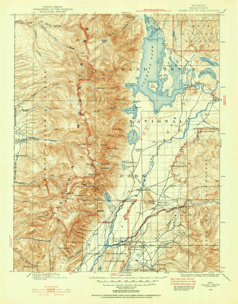
Those of your familiar with spatial imagery data and DEMs will know that our first challenge will be working with tiled (discontinuous) imagery data products. In its raw form, DEMs are often stored as identically sized tiles, with each tile representing a specific indexed region of the earth’s surface. It is an unfortunate reality that many times the spatial extent of each DEM tile rarely matches the exact extent of the area you are interested in mapping. As a result, map-makers and spatial imagery specialists need to implement tools to import, merge, and crop these tiles to a more useful format and size.
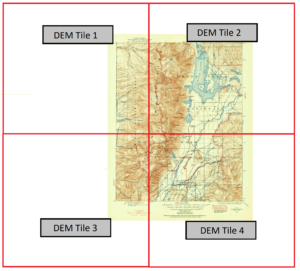
In our case, the elevation data for the area shown by the original 1899 topo-map is now represented by four separate DEM tiles, with roughly one tile for each quadrant of the map. To handle this problem, we can use the powerful Advanced Import tool within the Geographic Imager toolbar. The tool is a one-stop solution to easily import and mosaic our DEM datasets directly into Photoshop, all while retaining the spatial awareness we need to georeference or transform our data layers.
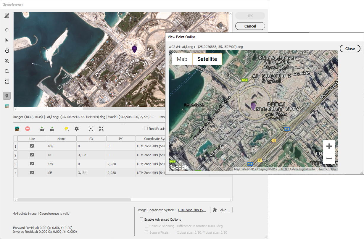
By combining each of the four raw DEM datasets, the tool will mosaic the tiles into a single merged, continuous, and geographically accurate elevation layer covering the entire extent of the map. Even more impressive is that Geographic Imager can use the spatial referencing information in the data to automatically align and overlay the original 1899 topo map onto the elevation layer, removing the need to perform manual georeferencing. (If the imagery data you are using does not have spatial referencing information already, don’t worry – our support team has crafted some excellent, easy to follow georeferencing in Geographic Imager tutorials).
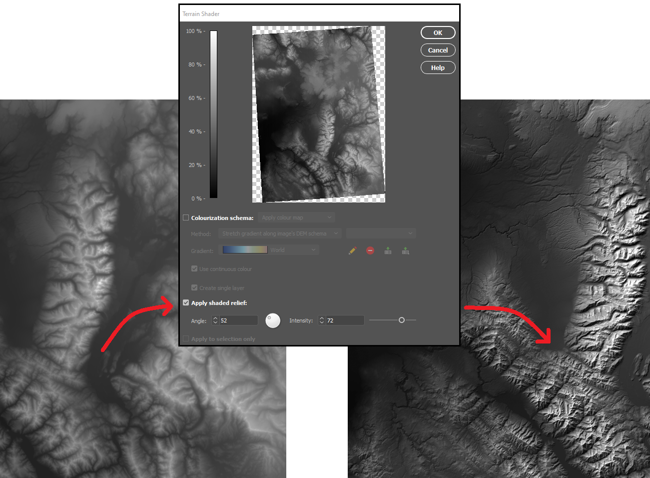
With our DEM data imported into Photoshop, we can start to explore different techniques for creating shaded relief. We will start by using the Terrain Shader tool located on the Geographic Imager toolbar. Terrain shader is a one-click technique to create simple shaded relief instantly. It allows you to configure the angle and intensity of the simulated illumination source to control the prominence and direction of casted shadows. Additionally, you can apply customized colour gradients to easily produce stylized elevation maps or apply hypsometric tints.
In many situations, the Terrain Shader tool is an all-in-one, quick and easy way to create shaded relief. The output of the tool makes it easy to distinguish topographic features and can be used to quickly produce a shaded-relief backdrop for your map.
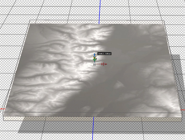
One of the greatest benefits of using Geographic Imager is that we retain all the imagery manipulation and spatial referencing capabilities of a GIS while still having access to the massive inventory of powerful image editing tools provided by Photoshop. This allows us to take our shaded relief technique up a notch by incorporating the advanced 3D rendering and lighting tools of Photoshop 3D to truly bring our 1899 Grand Teton survey map to life.
To start, we first need to trim the DEM layer down to our specific area of interest. We used the GeoCrop tool to crop our mosaiced DEM layer down to the exact extent of our topo map (it is important that both layers are the exact same extent – you’ll see why later). Next, we can open up the Photoshop 3D toolbar, and convert our flat DEM into an extruded 3D “Depth Map”.
To enhance the shaded relief effect, we need to apply a vertical exaggeration to the model. In 3D mode, we can drag the z-axis scaling slider to exaggerate the prominence of the topographical features in our map. By creating vertical exaggeration, we can create more pronounced shaded relief, as canyons and lowlands will capture shadows more effectively.
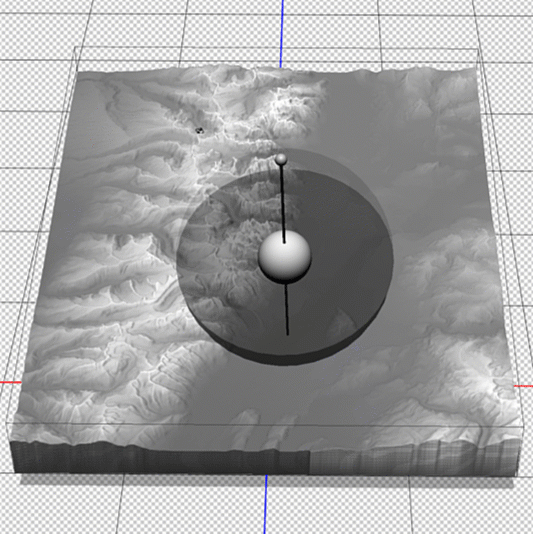
In 3D mode, we can use the mouse cursor to pan and rotate our “camera” to get different perspectives of our elevation model. This can be useful for creating orthographic or oblique perspective map styles.
Now that we have a configured 3D model of our map area, we can apply our simulated illumination source. Much like the Terrain Shader tool, we can control the illumination intensity and angle of approach. Since we are working in a 3D environment however, we now have three different axes that control where our light is coming from. Notice how the angle is important for affecting the length and intensity of shadows in our relief map. This includes the prominent mountain silhouettes that can be created when we set the light source to approach from a low angle on the horizon.
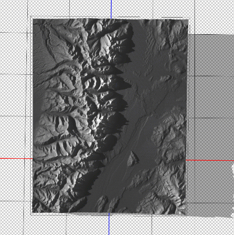
Next, we can configure the surface properties and apply a texture overlay to our 3D model. Experimenting with these settings changes how light interacts with the surface and can be refined to produce different relief shading effects. Using these surface properties, we can also drape the original 1899 Topo map onto our surface model (this is why it is important for both the DEM and the topo-map to share the exact same extent, otherwise the topo map will be distorted once it is draped over the surface).
Fine-tuning the map at this stage can take some time and experimentation. We can add some additional light sources with different casting angles and intensity to help create a multi-directional hillshade effect. We can also configure the light settings to produce softer, less pronounced shadows that look more realistic. After spending some time adjusting the lighting and surface settings, as well as configuring the camera view angle, we can hit the “render” button and sit back while it creates a full-resolution rendering of our 3D model (this part can be very computationally intensive, and may require a high-performance machine to process efficiently).
Since we are still creating our map entirely within the Photoshop environment, we can immediately fine-tune the brightness, contrast, and colour of our map before exporting the final product.
You can see some renders of the final map below. Thanks to the powerful spatial import and manipulation tools of Geographic Imager, and the ability to work entirely within the advanced image editing environment of Photoshop, we were able to create a dramatic 3D shaded relief effect that brings our 1899 USGS Grand Teton Survey map to life.
We are proud to announce the start of a new video-focused blog series called Mapping Class. This blog series will curate tutorials and workflows created by cartographers and Avenza software users from around the world. We begin with a mapping workflow from Steve Spindler, a longtime MAPublisher user, and expert cartographer. He has shared with us his own take on creating Orthographic locator maps by applying some neat design tricks and utilizing MAPublisher’s powerful projection tools to create a simple, yet effective map.
Steve has produced a short video walkthrough demonstrating his process and has summarized the technique in the written article below.
***
Creating Orthographic Locator Maps by Steve Spindler
An orthographic map is like a view from space. It’s useful for directing attention to someplace on the planet.
This video shows how an orthographic locator map is made in Illustrator using MAPublisher. The template illustrator file I use in the video is here.
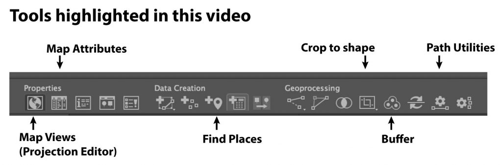
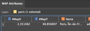
We’ll start off by locating Paris on the map using Find Places. We need the latitude and longitude to create two projections.
Next, get the Latitude and Longitude from Map Attributes. You’ll have to turn MapX and MapY fields on. MapX is longitude. MapY is Latitude.
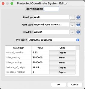
In Map Views, click on the projection, (ne_110m_land), and then select “Perform Coordinate System Projection”.
Select Projected Coordinate Systems and search for Azimuthal Equal Area. Duplicate, rename and set the definitions for the central meridian and the latitude of origin. There might be more than one. Pick one.
Select Projected Coordinate Systems and search for Orthographic. Duplicate, rename and set the definitions for the central meridian and the latitude of origin. There might be more than one. Pick one.
Select the new azimuthal projection, the one you created, and click OK to use it.
We use the azimuthal projection to crop data before creating the orthographic projection. Otherwise, there will be overlapping imagery. Next, create a buffer for the Paris point that is 10002.5 km around the point. This will be located on a new layer.
Use the path utilities tool to convert the bezier circle into polylines. Then reproject the map to the orthographic projection. Once completed, crop again with your circular buffer layer and delete the water layer. It will be replaced with a gradient.
Finally, add a radial gradient to the circular buffer layer and move the circle below the other layers.
Now you have an orthographic locator map that you can continue to style and label for your purposes.
***
About the Author
Steve Spindler has been designing compelling cartographic pieces for over 20 years. His company, Steve Spindler Cartography, has developed map products for governments, city planning organizations, and non-profits from across the country. He also manages wikimapping.com, a public engagement tool that allows city-planners to connect and receive input from their community using maps. To learn more about Steve Spindler’s spectacular cartography work, visit his personal website. To see the original tutorial article, or view Steve’s other mapping demonstrations, visit cartographyclass.com
Maps are a fusion of art and science, presenting complex geographical data in a way that is both visually appealing and informative. Cartographers use maps to convey a story, drawing attention to important information using carefully crafted design choices and curated map elements that engage the viewer. Although cartographers employ a variety of specialised techniques to present this meaningful information on a map, one of the simplest, yet most effective methods is through map labels.
Quite simply, map labels are symbols or texts strategically placed at specific locations on a map to identify important geographical features, locations, or areas of interest. To a map viewer, labels are a quick and easy way to know exactly what is shown on a map. To a map maker, however, the task of creating labels is not often quick and generally isn’t easy. This is especially true when there are a large number of labels that need to be placed, or when labels need to follow complex paths such as roadways, rivers, or trails. Map-makers must also consider the issue of label crowding and collisions, ensuring labels are not overlapping each other, covering or distracting from other important features of the map. Combined, these challenges can be a significant time-sink in the map-making process, requiring both time and effort on the part of the cartographer.
Labelling doesn’t have to be difficult though, and in this blog, we will show you how built-in MAPublisher label tools and the MAPublisher LabelPro add-on can make labelling simple.
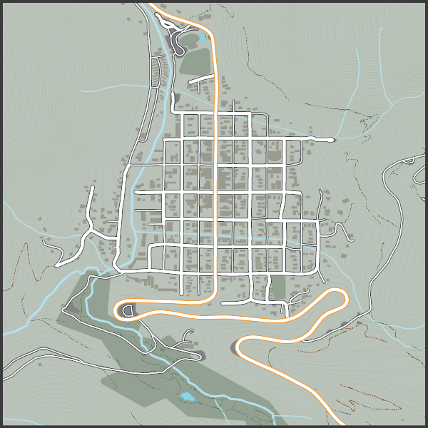
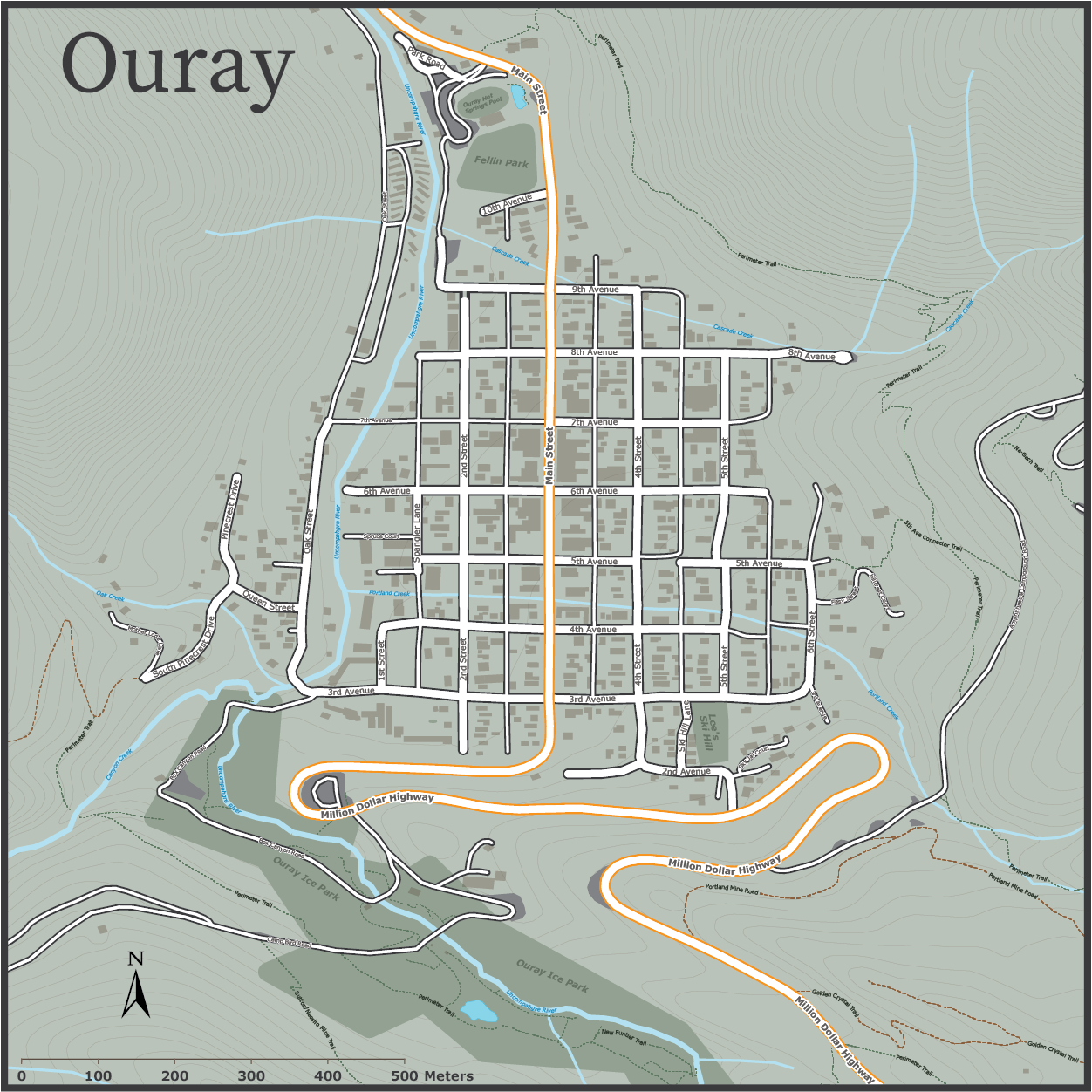
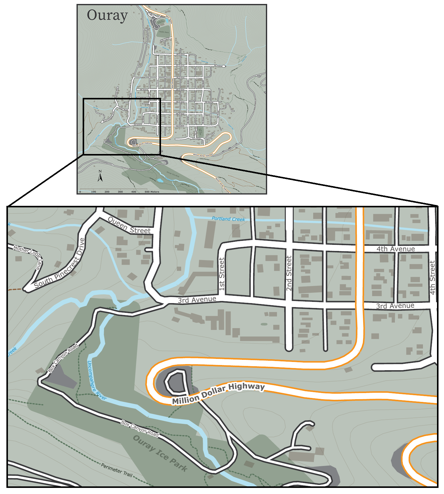
Let’s start with our unlabelled map. We have taken a collection of openly available geo-data depicting the small mountain town of Ouray, Colorado (home of National Geographic Cartographer and last month’s Avenza Cartographer Chronicles feature, Mike Boruta). We have stylized the data to show rivers, parks, streets and trails all throughout the town, but we feel labels would help a user to better understand the information being shown. We are going to approach the labelling process in a few different ways.
Manual Label Placement with the MAP Tagger Tool
For small labelling tasks, where a map maker might need to place only a handful of precisely located labels, the MAP Tagger tool is perfect for the job. MAP Tagger allows us to configure a basic set of options that control the character style of our label as well as general label placement rules. From there, we can simply click on a map feature and have the tool automatically detect and apply a label from attribute information contained in the selected layer. As we have direct control over the placement of every individual label, we can be extremely precise in choosing label placements that work for our map. Best of all, the tool automatically detects and applies text pathing for line features, meaning text labels can follow the form of any road, river, trail in your map!
When working with a small number of map features, the MAP Tagger tool is often just what you need to add well-placed labels to your map. For larger labelling tasks, such as our Ouray map, where there are many layers and several different features to be labelled, a manual approach such as this would be very time-consuming. Instead, we need to implement a more automated, batch labelling technique to speed-up the map-making process.
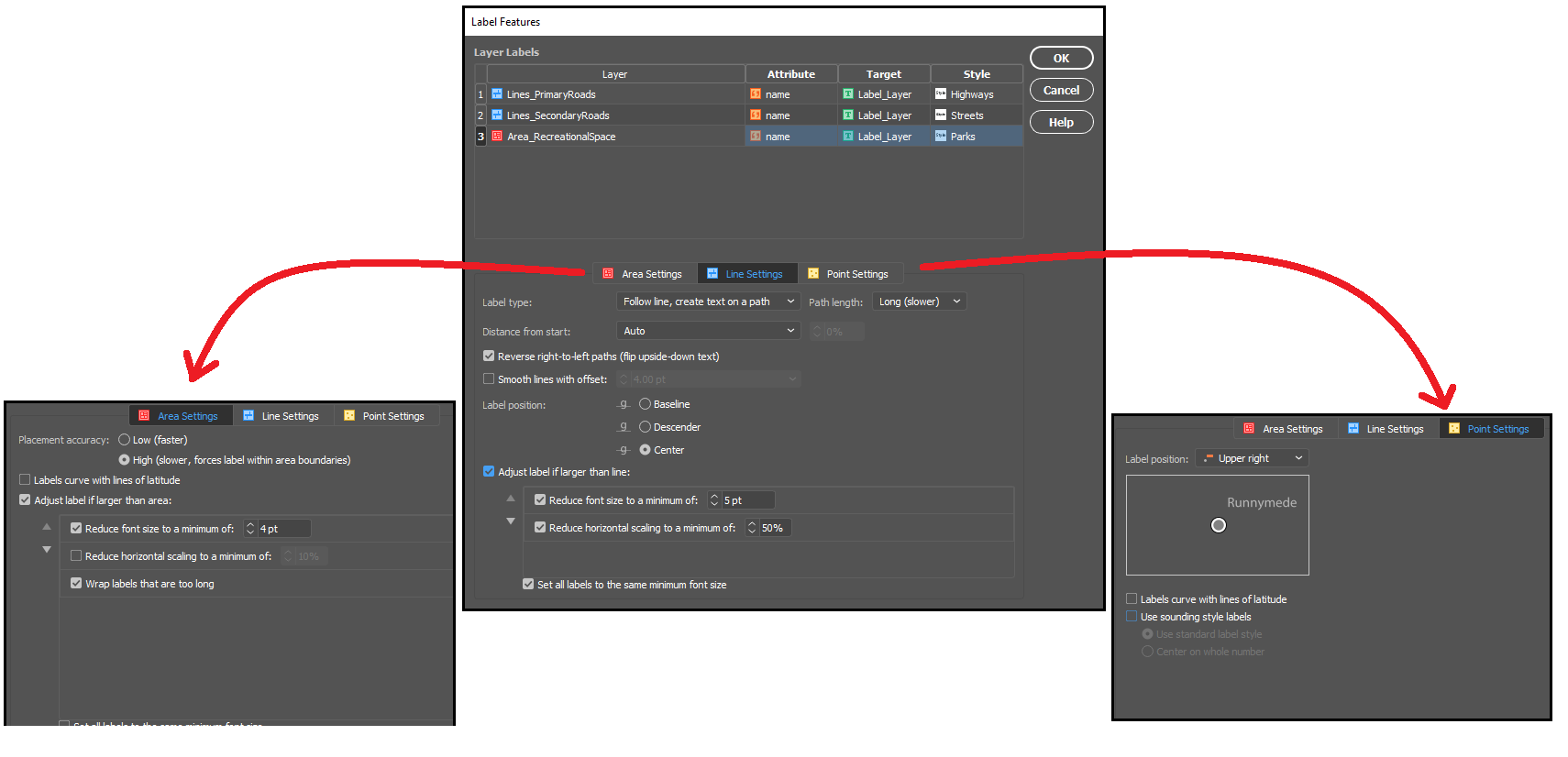
Batch label placement with the Label Features Tool
When you are working with several map layers, or have a large number of geographic features that each need to be labelled, it can be more efficient to create your labels all at once. The Label Features tool comes built-in with MAPublisher, and can handle batch labelling of map features with only a few clicks. The tool is designed similarly to MAP tagger, and automatically populates the map with precise, path-aligned labels, while offering the flexibility to define unique character styles for each map layer.
Taking a look at the tool, we were able to quickly generate over a hundred labels, for every road, trail, river, and park layer in our Ouray map. By nature, the tool will present you with a large number of labels for each feature, allowing us to examine and choose the labels we wish to retain and remove those that we don’t. With a little bit of clean-up to remove those extra or unwanted labels (see the animation below), we can already see our labelled map is coming together!
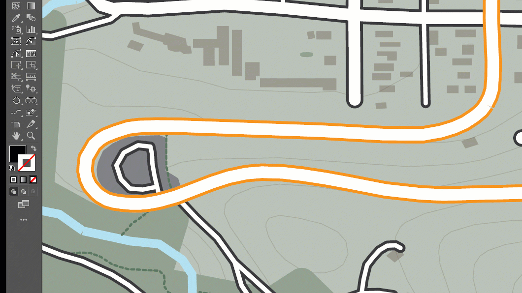
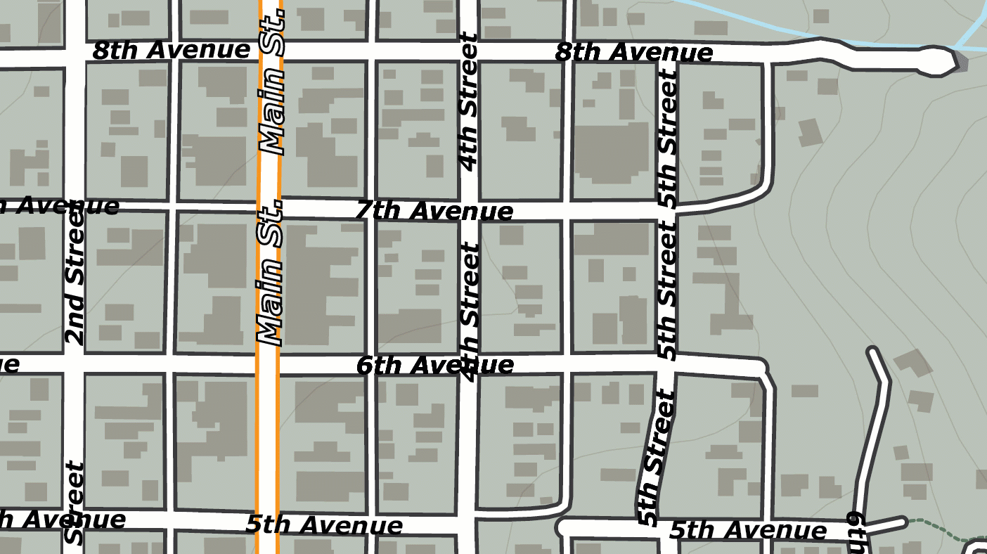
The Label Features tool is great for getting a head start on large labelling projects, but you might notice that the output of the labelling tool still requires some manual intervention to clean-up the output. For example, notice how “4th Street” and “5th Street” labels are repeated several times over the length of the street, with some labels colliding with others to create an overlap. This is a common problem in many labelling tasks and is due to the way our input data is structured. The dataset we obtained presents each road in the town as a line, but rather than present each road as a single continuous feature, it breaks up each street into several linked segments. Although this can be corrected with manual editing, it can still be time-consuming when working with a high number of labelled features. To avoid this, we need a method of achieving smarter batch label placement that can detect and reduce instances of label collision or redundancy.
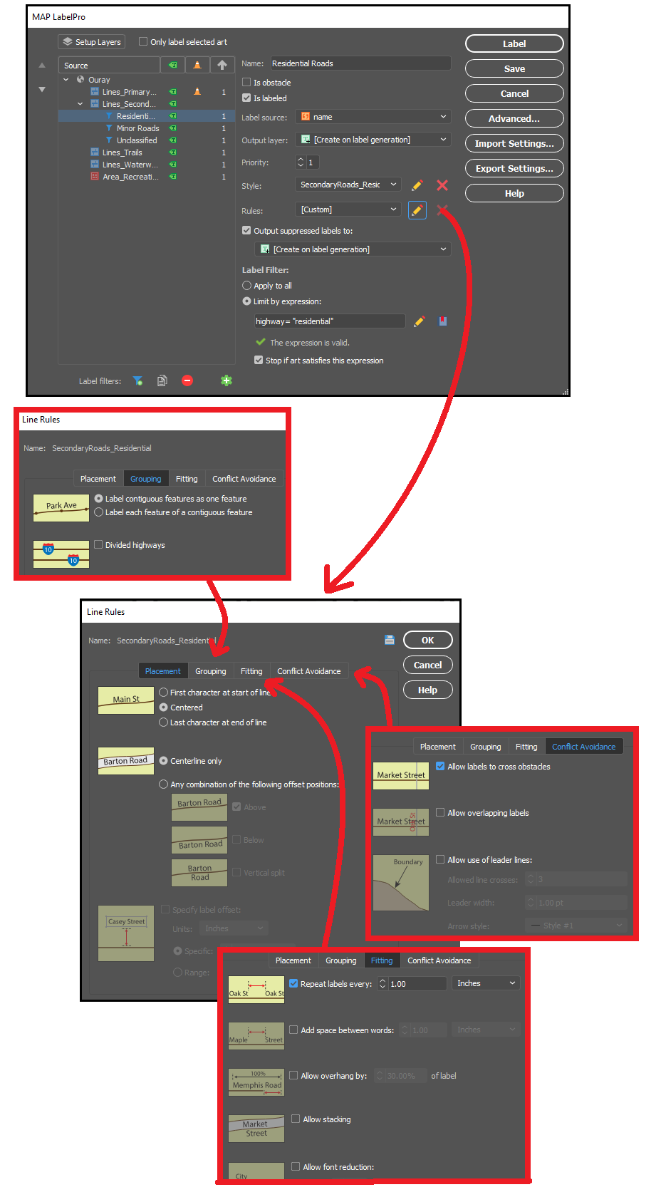
Fortunately, we have one last trick up our sleeves that makes even the most complex labelling tasks a breeze. We can use MAPublisher LabelPro for collision-free, rules-based label placement.
Better Labelling with MAPublisher LabelPro
The MAPublisher LabelPro add-on allows the user to customize a wide variety of enhanced labelling options that result in smarter, more efficient label placement. LabelPro comes with a powerful purpose-built labelling engine that handles not only label placement, styling, and pathing, but also optimizes the grouping, fitting, and collision avoidance of labels to reduce crowding, avoid label overlap, and eliminate label redundancies.
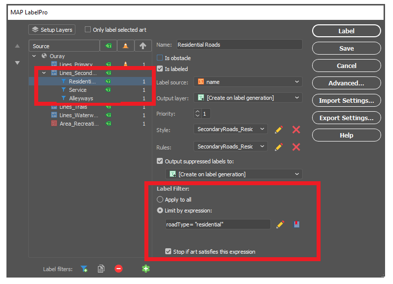
Remember those overlapping labels we ran into with the Ouray map? With LabelPro we can set rules that treat street segments as contiguous features in a single line, meaning the labelling engine will efficiently place labels that are representative of the entire street, rather than just for each segment. The intelligent collision and fitting rules mean we can also prevent labels from overlapping each other or crowding the map, saving us time and effort by letting the tool handle precise label placement with minimal clean-up. By setting layer priorities designating certain layers as obstacles we can make sure our important labels are unobstructed, and other labels do not cross other features in a way that would confuse the map viewer.
With LabelPro, we can also create expressions to apply conditional character styles and rules based on attribute values in the data. In our map, we created label filters for “Residential Roads”, “Service Roads”, and “Alleyways”, allowing us to label (or not label) certain road types differently, even though they are all contained in the same “secondary roads” map layer. These are only a few examples of the robust collection of configurable rules and smart labelling options available to tackle even the most complex labelling tasks.
With our rules set up and all character styles defined, in very short order we could automatically generate labels for all rivers, roads, highways, parks and trails in our Ouray map. The smart placement with LabelPro means we spend less time manually correcting label placement and allows us to produce maps more efficiently and easily. If you want to read a more in-depth, tutorial style article that shows you the exact steps we used to easily create our simple map of Ouray, check out this great workflow article produced by our support team – Here!
Data sources: All datasets were obtained from OpenStreetMap and the Ouray County Open Data portal.
We are happy to announce that MAPublisher 10.8, the latest update to the MAPublisher plug-in for Adobe Illustrator, is now available. With this release, we are excited to bring forward new usability enhancements for several MAPublisher tools. We are also thrilled to confirm that MAPublisher now supports raster files in the enhanced compression wavelet (ECW) format. Alongside these enhancements, we have also implemented improvements and added expanded support to our coordinate system library.
Here is what you can expect with the latest MAPublisher 10.8 release:
Usability Improvements for MAPublisher Tools
The Avenza team is always working to improve the capabilities of our vast suite of cartography tools. We work with our users to implement improvements to our tool catalog that truly meet the needs of actual mapping professionals. In this release we are introducing several enhancements to some of our existing tools:
Multi-Column selections in the Attribute Table Editing Schema
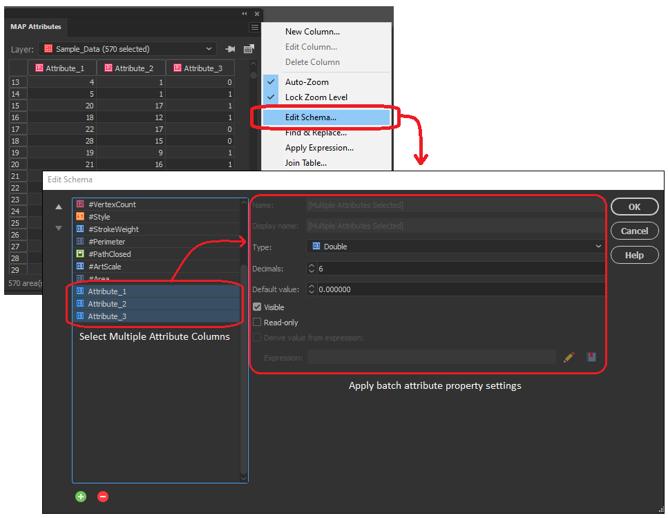
In the early versions of MAPublisher 10, we added the ability to select multiple columns within the Edit Schema window of the MAP attributes panel, allowing users to toggle visibility settings on multiple attribute columns at the same time. Now with 10.8, we are delighted to build on this by implementing the ability to configure data properties across multiple selected attribute columns. Users can not only toggle visibility or remove multiple attribute columns at once, but can now also edit default values, attribute size, and read-only settings for all selected values. Additionally, users can now change the data type (i.e string, integer, boolean, etc) for multiple selected attribute columns all at once, as long as each column shares the same starting data type.
Select and add multiple MAP Locations in Line Plotter
We continue to bring improvements to the Line Plotter tool, this time by introducing the ability to select multiple MAP locations and add them to the line vertices (node) list. For users familiar with the Point-by-point plotting method in Line Plotter, this will be especially useful for adding a large collection of sequential MAP locations, as previously each point needed to be entered one at a time.
Document Summary Panel now includes “Last Saved with” Version Info
For users working with MAPublisher projects across different versions of the software, you will be delighted to know that the document summary dialogue now includes information indicating the version of MAPublisher the project was last saved with. This information will help users that frequently share MAPublisher projects with colleagues, allowing them to better establish version standards across collaborative projects.
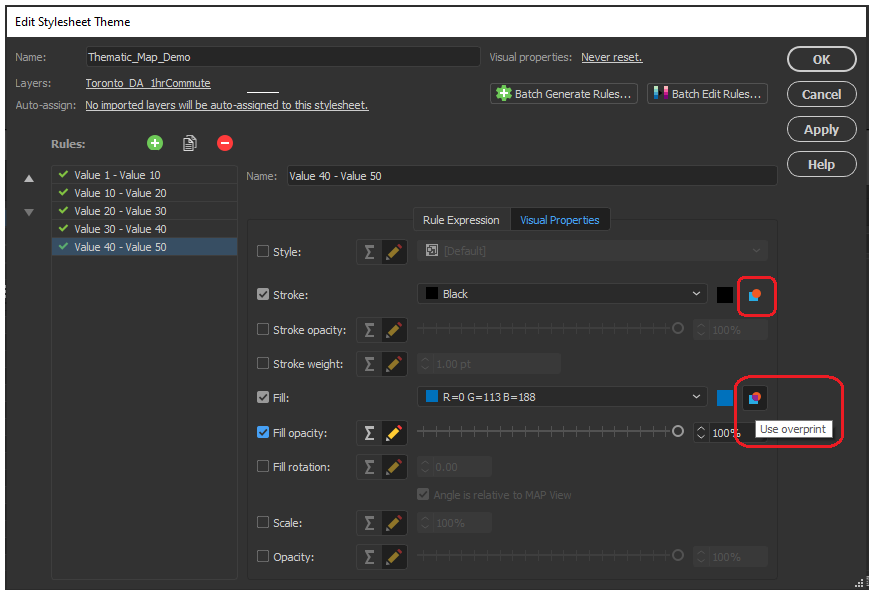
Overprint Options in MAP Themes
Previous versions of MAPublisher required a user to navigate the Illustrator attributes panel to configure overprint options for each map element individually and refer to these options separately using MAP Themes. Now with MAPublisher 10.8, an overprint option has been implemented directly within the MAP Themes panel, allowing users to configure overprint settings for fills and strokes within each stylesheet in the MAP Themes tool.
Scale bar, Create Legend, and Elevation Profile tool previews with Background Colours
We have added a small improvement to the scale bar, create legend, and elevation profile tool panel. The preview window for these tools, which allows users to adjust and edit their visual properties before adding them to the map, now has the option to configure a preview background colour. This option is helpful when configuring light, or white-coloured map elements which were previously difficult to see against the default white preview background.
Support for Raster ECW file formats
New to MAPublisher 10.8, we now include Enhanced Compression Wavelet raster files to our growing lists of supported data formats. Users can now import and work with ECW files directly within the MAPublisher environment of Adobe Illustrator, all while retaining necessary spatial integrity, and without needing to convert your data.
Engine Improvements and Updated Coordinate system catalogue
We are working continuously to improve the back-end MAPublisher engine to ensure our users can continue their work in an optimized, seamless, design-focused cartographic environment. Along with improvements to our engine and bug fixes, we have built on our current coordinate system catalogue with updates to the coordinate system and projection library. This means our list of supported projections has grown, with new additions including the Natural Earth and Natural Earth 2 Projections created by Tom Patterson. For a full list of our expanded coordinate systems library please check the projections guide in the Avenza Support center.
MAPublisher 10.8 is immediately available today, free of charge to all current MAPublisher users with active maintenance subscriptions and as an upgrade for non-maintenance users.
Find out more at the Avenza User Conference!
Want to learn more about MAPublisher? Want to see how industry professionals are using Avenza Products in their organizations? Join us on May 12th, 11am – 5pm (EST) for the first-ever Avenza User Conference. Registration is Free!
The event will feature a full day of speaker presentations from the Mapping and Geospatial communities. The Avenza Product teams will also be on hand to answer questions and give you a sneak peek of upcoming developments to the Avenza Platform. Sign up for free at avenza.com/user-conference
We are happy to announce that Geographic Imager 6.3 is now available. This release brings continued improvements to compatibility with Adobe Photoshop 2021, and now offers full compatibility with the latest Mac OS 11 Big Sur release. We are also excited to introduce a brand new and easy way to access floating licenses directly from the cloud!
Here is what you can expect with the latest Geographic Imager 6.3 release:
macOS 11 Big Sur Compatibility
Users will be delighted to see that Geographic Imager 6.3 is now fully compatible with macOS 11 Big Sur. This means new and existing users can transition to the latest macOS without any interruption in their Geographic Imager capabilities.
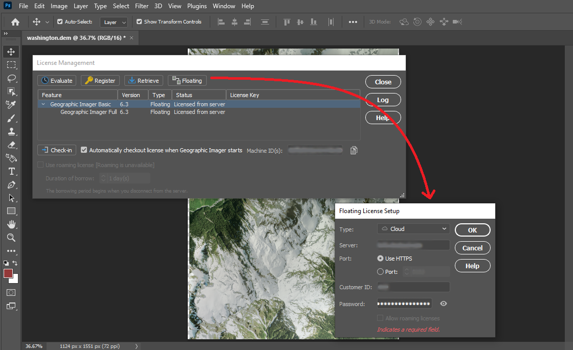
Cloud Floating Licenses: A Better Way to Manage and Checkout Licenses
We have worked hard to deliver a newly improved floating license management system as part of Geographic Imager 6.3. This new license management system greatly improves on previous versions and allows users and administrators within an organization to efficiently and seamlessly access floating licenses directly from the cloud. The new licensing system is built on the RLM Cloud platform and means floating licenses can be implemented without the challenges of setting up, deploying, and managing a local server. Contact our Sales team to learn how you can set up your cloud floating licensing.
See the new cloud licensing options by accessing the license management panel within Geographic Imager 6.3
UXP Implementation for Chinese Versions of Geographic Imager 6.3
The Chinese version of Geographic Imager 6.3 now implements Adobe’s new powerful Unified Extensibility Platform. Which provides user interface improvements and flexibility to develop new tools in the future.
Geographic Imager Available Now
All active maintenance subscribers can upgrade to Geographic Imager 6.3 today for free. Users without an active maintenance subscription or on a previous Geographic Imager version can still upgrade.
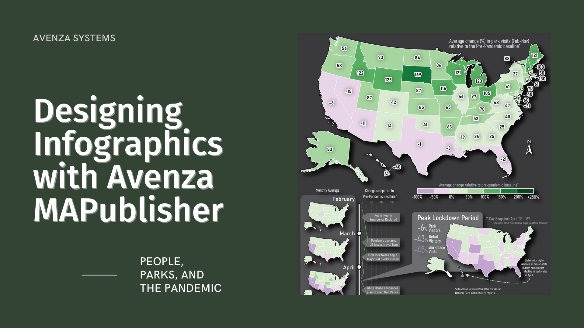
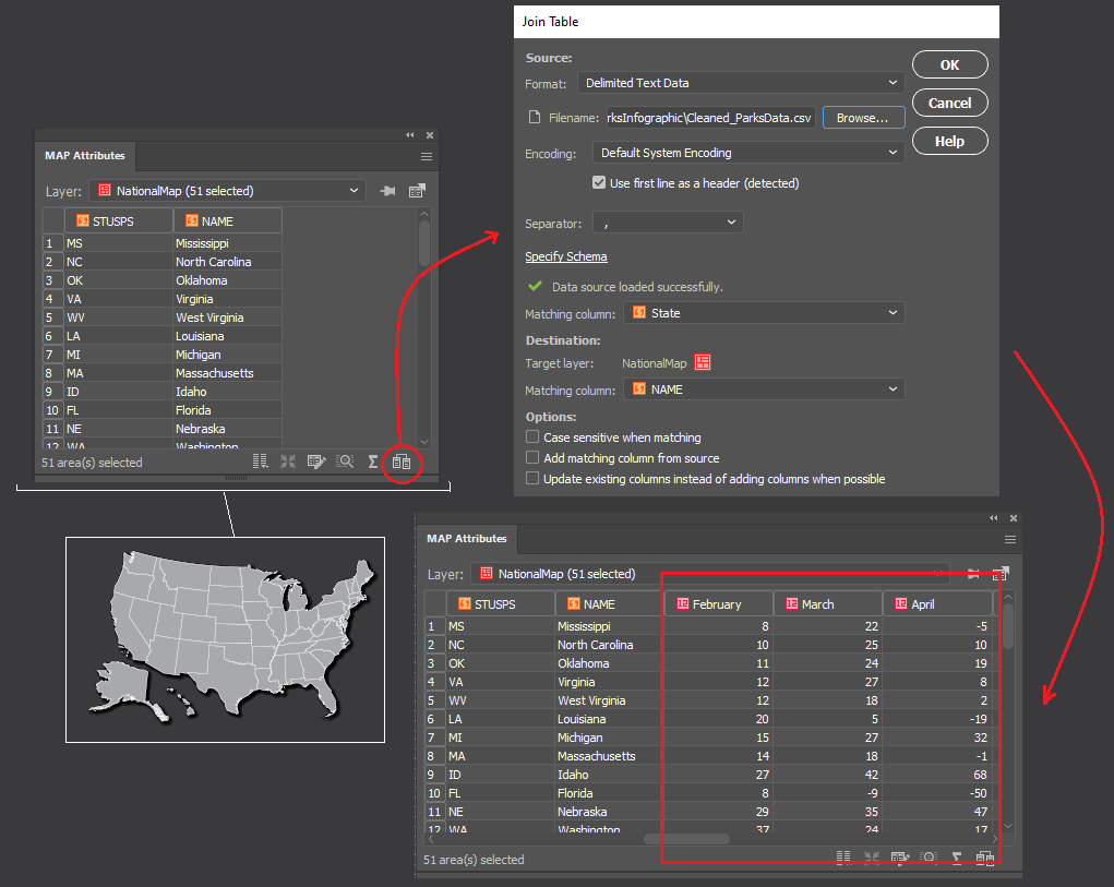
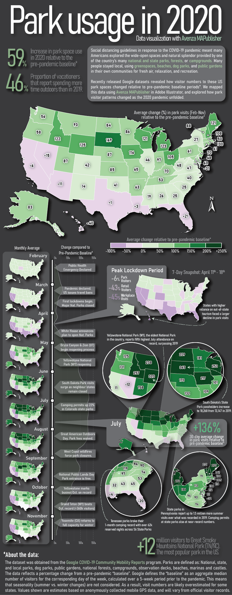
Here at Avenza, we love finding interesting data and using it to create engaging maps. In this blog, we show you how we used the powerful spatial data manipulation and cartographic styling tools found in MAPublisher for Adobe Illustrator to create an infographic exploring how park visitor patterns changed in the United States in 2020 using a truly interesting openly available dataset.
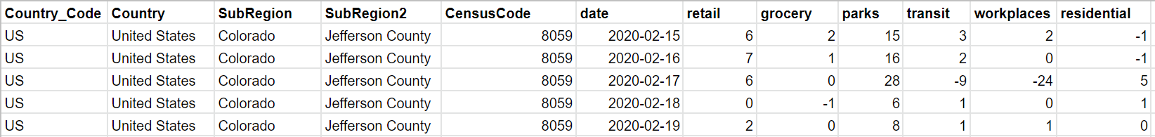
Recently, Google made its COVID-19 Community Mobility Reports public. These reports use aggregated anonymous mobile GPS data to explore how global human activity patterns in specific location categories (parks, retail, transit, residential, workplaces, and grocery) changed as a result of the ongoing pandemic. The U.S. dataset is massive, containing estimates of daily visitor activity for each location category in every county. Each data point provides an estimate of that day’s percentage increase or decrease in visitors relative to a pre-pandemic baseline period, meaning the data reflects how pandemic restrictions on that day may have impacted park space usage in that specific location. Below shows a sample of the raw dataset, listing five data points covering Feb 15-19th activity patterns in a single Colorado county.
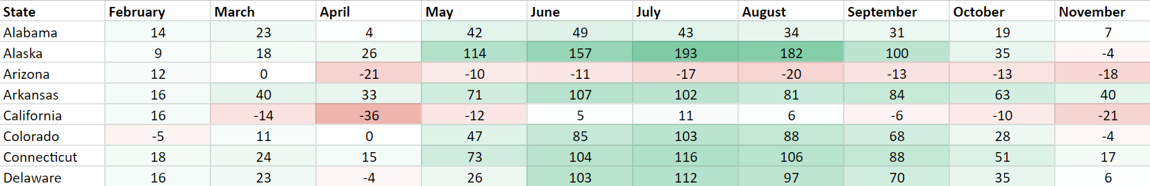
We downloaded the complete dataset (February to November 2020) from Google’s mobility reports data portal. The dataset contains nearly 900,000 records of all 3,143 counties in the U.S. We wanted our infographic to focus on the parks category, which includes every national, state, and local park, as well as public forests, campgrounds, beaches, marinas, dog parks, and gardens. Using the open-source statistical programming language R, we were able to aggregate the dataset into a more manageable size. Below, you can see how some basic filtering of these “cleaned” datasets already shows evidence of some interesting patterns, but we felt that mapping the dataset would be much more engaging.
Maps are powerful story-telling tools, and we felt this data would be more interesting if you could see how park visitor patterns changed not only with time but also with geography. To make working with map data in Adobe Illustrator easier, we used the MAPublisher Import tool to load in a shapefile of U.S. state boundaries. The tool allows us to treat our dataset as a fully functional graphic element in Illustrator while still retaining all geographic properties integral to spatial data (attributes, topology, and coordinate systems).
To visualize the data as a map, we needed a way to associate each record in our tabular dataset to a specific location (in this case, a State). To do this, we used the Join tool, which takes our “cleaned” tabular parks dataset (stored as a CSV file), and links it to our mapped states shapefile using the shared State names column.
We started to think about how to design the layout of the infographic (this is where having a mapping environment in Illustrator really shines). We wanted it to consist of three main parts: a large labelled map showing the average change in park visits over the entire year; a vertical series of maps showing how park visits varied month to month; and a handful of pop-out maps with insets highlighting specific points in the year and specific regions of the country.
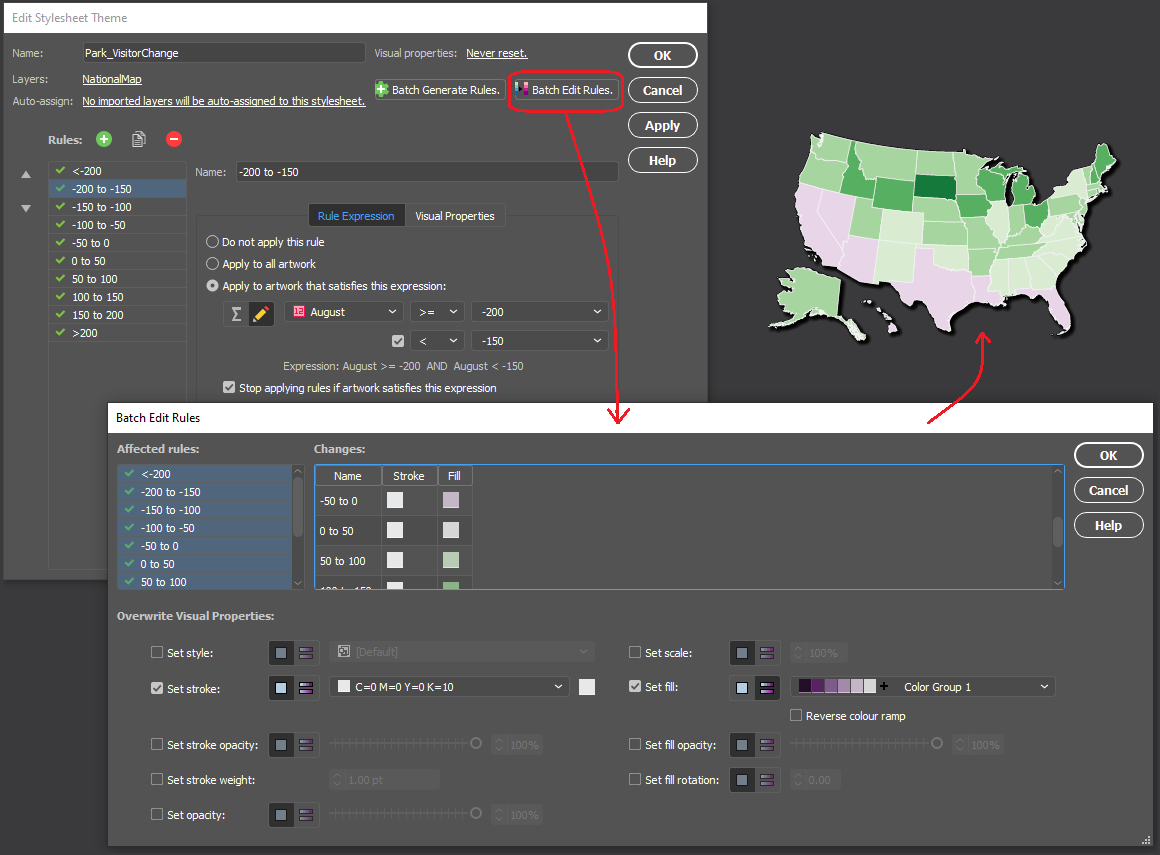
We chose to stylize the data into thematic maps, which use colour to represent specific values in the data at different locations. Instead of tediously configuring individual colour fills, we used MAP Themes to establish a rules-based stylesheet that applies a colour automatically to each State based on the monthly park visitor columns stored in the map layer’s attribute table. We chose a “thematic map” colour group from the included ColorBrewer 2 swatch library to best show positive and negative changes in park usage.
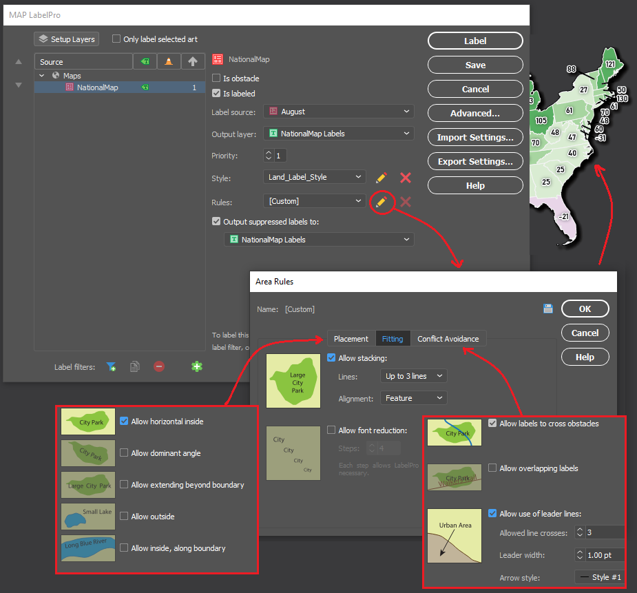
Next, we populated our main map with labels showing the percentage change in park use for each state. As many cartographers know, placing and configuring labels can be a significant time sink. Fortunately, we could use the MAPublisher LabelPro add-on to provide collision-free, rules-based label placement. We could configure the label rules to automatically handle collisions, alignment, and placement of labels for each state. Using the leader lines option in the LabelPro Rules panel, we were even able to create offset labels that prevent crowding the map.
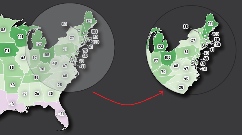
Finally, we decided that to create some insets to highlight specific parts of the country. From a “master” map, we used the Crop to Shape tool to crop the map data to our desired inset extents. Using Crop to Shape is quick, and also retains the styling elements (colours, labels, strokes), topology, and attribute integrity of the cropped map layers.
With most of the maps completed, all that was left was to populate the infographic with text and graphics. Using the MAPublisher layout tools, we added a functional North Arrow and customized the automatically generated legend layer to suit our infographic’s design. Lastly, we used an Illustrator graph tool to create a vertical line graph of park activity along the left side of the infographic.
Presenting the dataset in this way makes it much easier to extract insights and craft a story from the data. Some patterns are immediately noticeable, such as the overall increase in park space usage that is observed for most of the US during the pandemic period. This isn’t exactly unexpected, as parks were one of the most accessible forms of leisure activity and recreation amid widespread social distancing and retail/entertainment closures. We also see how state-specific factors may have affected park usage in different regions of the country at different times. Some states, such as South Dakota, had eased restrictions on out-of-state visitors to their park systems, resulting in a spring season surge in park usage earlier than their neighbours. Conversely, states which typically draw a high proportion of international tourists, such as California, Hawaii, and Florida, saw more of a decrease in average park usage as a result of global air travel decline. These patterns and stories are one of many that can be identified, providing compelling examples of why maps are such powerful tools for visualizing data.
The beauty of working with MAPublisher to create this map-heavy infographic is that we were able to implement the powerful mapping and data manipulation tools of a dedicated GIS while seamlessly integrating the advanced art and design tools offered by the Adobe Illustrator graphical environment. Together, these tools turned what would have been a complex workflow of importing and exporting data between different software, and allowed us to create the entire infographic in a single mapping and design-focused fully integrated workspace.
The visual portrayal of quantitative and qualitative data is a process that requires the right tools. You want your audience to be able to make sense of the data you are sharing and be able to weave that data into a compelling and inspiring story. Here is how Avenza MAPublisher and Geographic Imager assisted Robert Simmon, Senior Data Visualization Engineer at Planet.
Robert isn’t your typical data visualization engineer who had formal training in scientific graphic design or cartography. His passion and interest in computer graphics and a master’s degree in materials science gave him the technical skills to start turning numbers into pictures that eventually helped him communicate with research scientists in his professional career.
Robert’s stepping stone into the fields of cartography, design, and data visualization happened during his work at NASA, where one of his first projects was creating a CD-ROM that would allow students and the interested public to explore a global ozone dataset. During his work there, he began to realize that the graphics published and used by NASA were made more for other scientists than for a broad audience. He also realized that good design was a powerful tool to improve communication. So, he tried to re-create scientific graphics in a more user-friendly form, with mixed success. “It wasn’t until I attended a talk by a popular lecturer on visualization that I learned there was a theory behind good design, and a big lightbulb went off in my head,” says Robert. “I began to read everything I could get my hands on about design, data visualization, and cartography—particularly map projections and the use of colour to encode information, since so much visualization at NASA revolved around satellite remote sensing data, which is quantitative and inherently geospatial.”
Eventually, Robert went on to found the Earth Observatory to share the breadth of NASA’s Earth science research with the interested public. After more than a decade with NASA, he received the chance to join the exciting startup—Planet—and work with an unprecedented, high-resolution, global dataset.
Robert developed a fairly unconventional workflow centred around Adobe design tools rather than GIS or scientific visualization software. This is where the Geographic Imager plugin for Adobe Photoshop and MAPublisher plugin for Adobe Illustrator proved invaluable to bridge the gap between data and visualization.
Today, Robert’s day-to-day work largely revolves around processing visible and near-infrared imagery. Every image he works with gets imported into Photoshop with Geographic Imager. Creating maps in Adobe has proven to be effective and highly efficient as software like Adobe Photoshop possess powerful colour-correction tools, fast previews, layers, high bit-depth support, and undo history options.
This aids highly competent visualizers to work seamlessly and flexibly until an image is made perfect. Robert uses Geographic Imager to merge multiple adjacent image scenes or align a time series to make an animation (even if they’re in different projections), all with a single “import” step. He then exports the file as a GeoTIFF, so the image can later be combined with other, complementary data.
Although Robert enjoys working with imagery, he has had the most fun combining multiple data sources, especially raster and vector. Delving into his design workflow a bit deeper, he involves both Adobe Photoshop and Illustrator together. In Adobe Photoshop/Geographic Imager he works on the initial colour work and crops his desired map extents, then imports it into Illustrator/MAPublisher to overlay with vector data and create masks. “It’s particularly useful to be able to crop the imported vector data to match the area of interest, rather than having to manually select and delete objects that lie outside the Illustrator artboard,” says Robert. After setting up his vector layers, he then exports them as a layered Photoshop file and re-combines them with the original raster imagery, to ensure pixel-perfect accuracy.
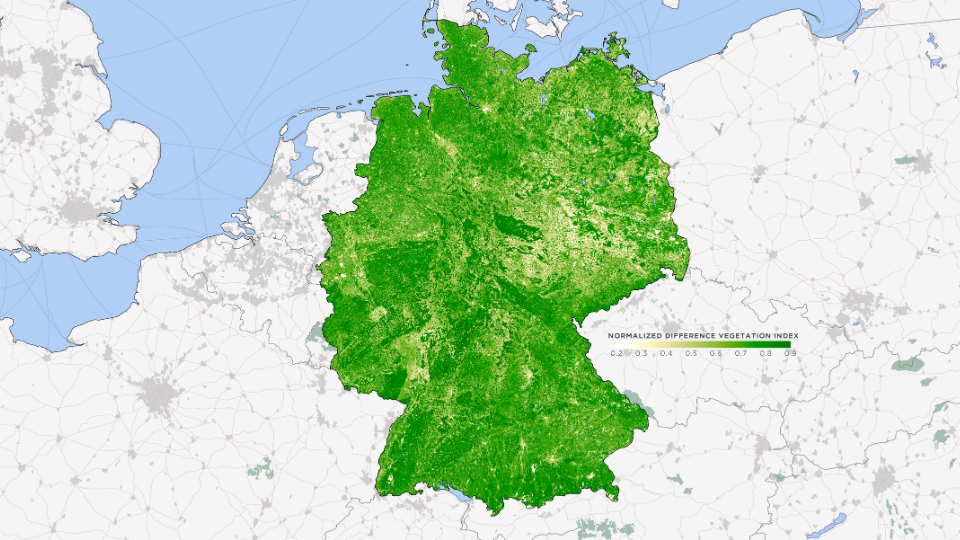
Robert’s love for MAPublisher goes back to 2006 when he first used it to make maps with Landsat data. He used MAPublisher to create a water mask with ZIP code data, which was the only data source he could find with high enough resolution to accurately capture the jutting piers of lower Manhattan. Robert also used MAPublisher to create a map of Amazonia (one of his personal favourites from his portfolio) with the help of MAPublisher’s powerful attribute tools, which allowed him to select and merge data vector data of Amazon biome, distinct from the Political Amazon, for which data is readily available. He continued to create variations on this theme at Planet, including a map of the vegetation of Germany. It was derived from a Planet Surface Reflectance Basemap and given context with Natural Earth boundary, urban area, and transportation data.
Robert continues to tweak his colour palette for his vegetation maps since just being ‘good enough’ has never really been his forte.
_______
In collaboration with Robert Simmon, Senior Data Visualization Engineer at Planet.
Editing geospatial imagery like aerial photos or images taken from satellites is usually a difficult task and requires a certain level of technical knowledge. However, the Geographic Imager plugin for Adobe Photoshop makes GIS accessible to a growing group of graphics professionals who can quickly and easily edit geospatial images. Cartographers, design-focused users and image editors can combine the geospatial editing tools of Geographic Imager with the Adobe Photoshop design environment.
With the Geographic Imager plugin for Adobe Photoshop, you gain access to all the tools and spatial information related to the image quickly and easily through a seamlessly integrated panel. Easily and quickly import various data formats, transform coordinate systems, and crop, mosaic or tile images. Save images to several industry-standard geospatial formats or export as web tiles to use in web applications.
The latest Geographic Imager plugin release provides tremendous performance and user interface improvements as it was built on Adobe’s Unified Extensibility Platform (UXP) in Photoshop. This platform offers more flexibility and opens up opportunities to develop new tools.
Geographic Imager features include:
Extensive geospatial image support
True spatial-awareness by georeferencing images
Extensive support for thousands of geographic and projected coordinate systems, maintaining accurate map projections during image editing
Mosaic individual images to create a seamless image
Tile an image into multiple images by tile size or count and automatically save them using sequential naming
Import digital elevation models (DEM) and create shaded relief maps using the Terrain Shader tool
Save spatial images to many industry-standard formats, including GeoTIFF
Export to web tiles to generate images that are compatible with Google Maps, OpenStreetMap, MapBox and more
Ability to use Geographic Imager tools with Adobe Photoshop scripting
How to get Geographic Imager for Adobe Photoshop
Geographic Imager for Adobe Photoshop is now available in the Adobe Marketplace for both Mac and Windows. Alternatively, you can try Geographic Imager by registering for a free trial.
Users ready to purchase can use the code AVENZAMAX10 at checkout on www.avenza.com for a 10% discount.
For additional information about the Geographic Imager plugin for Adobe Photoshop, please refer to the following resources:
Unless you are a GIS professional or a professional cartographer, finding the raw data to make a map may seem like a rather large barrier to success. However, there is plenty of publically available free map data out there to be used by graphic designers, and any cartographer that doesn’t have the means to generate their own data. Free map data is a great place to start when making a map, using MAPublisher and Adobe Illustrator to make it your own.
First, You Have to Find It
Depending on what kind of map you want to make, and for what region or country, finding map data can be easy. There are plenty of governments and other agencies that make their geospatial data available for free. You just have to know where to look for it. Here is a list of the five that, in our opinion, are among the most useful.
USGS Earth Explorer
The USGS Earth Explorer is an amazing resource for free satellite and aerial imagery. You can download imagery simply by creating a free account. The available imagery covers most of the globe and is often updated. The Earth Explorer user interface is relatively user-friendly so you can find what you need without too much effort. Among other sources, Earth Explorer includes high-quality Landsat and Sentinel 2 imagery.
FreeGISData
By far the most complete compilation of free map data, FreeGISData contains links to over 500 data sets, categorized for easy browsing by data type and country. The list is maintained by Dr. Robin Wilson, an expert in remote sensing and GIS. This website is a great place to start if you don’t know exactly what you need or want to see what options are available to you in a particular region.
Open Street Maps
Open Street Maps (OSM) is a crowdsourcing platform for GIS data meaning that all of the data is created by the public, so the accuracy can vary based on who created it and how. However, as with most crowdsourcing efforts, the quality is generally pretty good for most use cases, and the amount of data available is impressive.
Natural Earth Data
Natural Earth Data offers vector and raster datasets that are in the public domain so you can modify them, use them and distribute them in any way you want without worrying about infringing copyrights or attribution. This is a great place to look if you simply want a base map to start your project. The available data spans the globe and includes the key cultural and physical data you may need for your map. The raster datasets also provide hillshade relief for aesthetically pleasing maps.
NASA’s Socioeconomic Data and Applications Center (SEDAC)
SEDAC is a data center in NASA’s Earth Observing System Data and Information System (EOSDIS). Its mission is to support the integration of socioeconomic and earth science data and to serve as an ‘Information Gateway’ between earth sciences and social sciences. In addition to the gallery of downloadable maps, which includes a gridded population of the world, SEDAC offers a variety of data sets of socioeconomic data. You can search the available data sets by theme such as agriculture, climate, infrastructure, population, poverty, etc., or choose to data sets that include historical data, reaching back to the 18th century and that look ahead to a century from now. Neat!
Join Data Sets to Make Your Map
Often cartographers and GIS analysts use open-source or publically available map data as a starting point then add some other data or additional insight. For example, you downloaded population data obtained from SEDAC but you want to add in some national sales data generated by your company. It’s possible to do it when all datasets are in the same format. GIS platforms like qGIS or use a conversion tool like this one can do the trick.
Import Data Into Illustrator Using MAPublisher
Once you have your data is in order, it is time to get down to the business of making your map! Import the data into Adobe Illustrator to manipulate the design elements that will make the map interesting and informative. MAPublisher makes it possible to import map data in almost any format into Illustrator, and also enables a plethora of cartography specific tools right in the Illustrator environment. With all of your data arranged in layers in Illustrator, it is easy to work with, turning on and off the data you don’t want.
Pro Tip: MAPublisher uses import filters to limit the amount of data that you bring into Illustrator to a manageable amount before you start working with it.
Design Your Map Without Losing Geospatial Integrity
You now have layers and layers of lovely map data in Adobe Illustrator but it doesn’t yet look the way you want it to. MAPublisher’s cartography tools can change all that!
Reproject or change the coordinate systems to change the appearance of the map
Crop or edit the data on the artboard
Add/remove layers
Style features by creating rules for the attributes
Add more data as new layers
Add labels and symbols based on rules
Create North Arrows and accurate scale bars with just a few clicks.
Each of these could be the subject of its own blog, however, lots of helpful resources on how to use MAPublisher tools including tutorials and how-to videos are available on our website and YouTube channel.
Make Your Vision Come to Life
One of the best things about the MAPublisher plug-in for Adobe Illustrator is that it supports hundreds of data formats, allowing you to import almost any map data you can find into Adobe Illustrator. Happily, there is plenty of publically available, open-source map data available on the internet. Whether you are a professional cartographer, a hobbyist, or a graphic designer under the gun to design a map, you can use free map data as a starting point for your own map. Download a trial of MAPublisher today and find a data set to experiment with and make something amazing!