Georeferencing is the process of adding spatial information to a physical map or raster image. Geographic Imager includes a georeferencing tool and also includes two methods of validating georeferencing so that your imagery is not only beautiful but also spatially aware (that’s two of the four keys to great maps!).
Use the Georeference feature in Geographic Imager to reference an image by establishing ground control points, choosing a transformation method, and specifying a coordinate system. It can also be used to rectify—transform or warp—an image to match the image coordinate system specified. The Validate and Show Image Extents Online tools are used to test georeferencing accuracy.
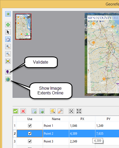
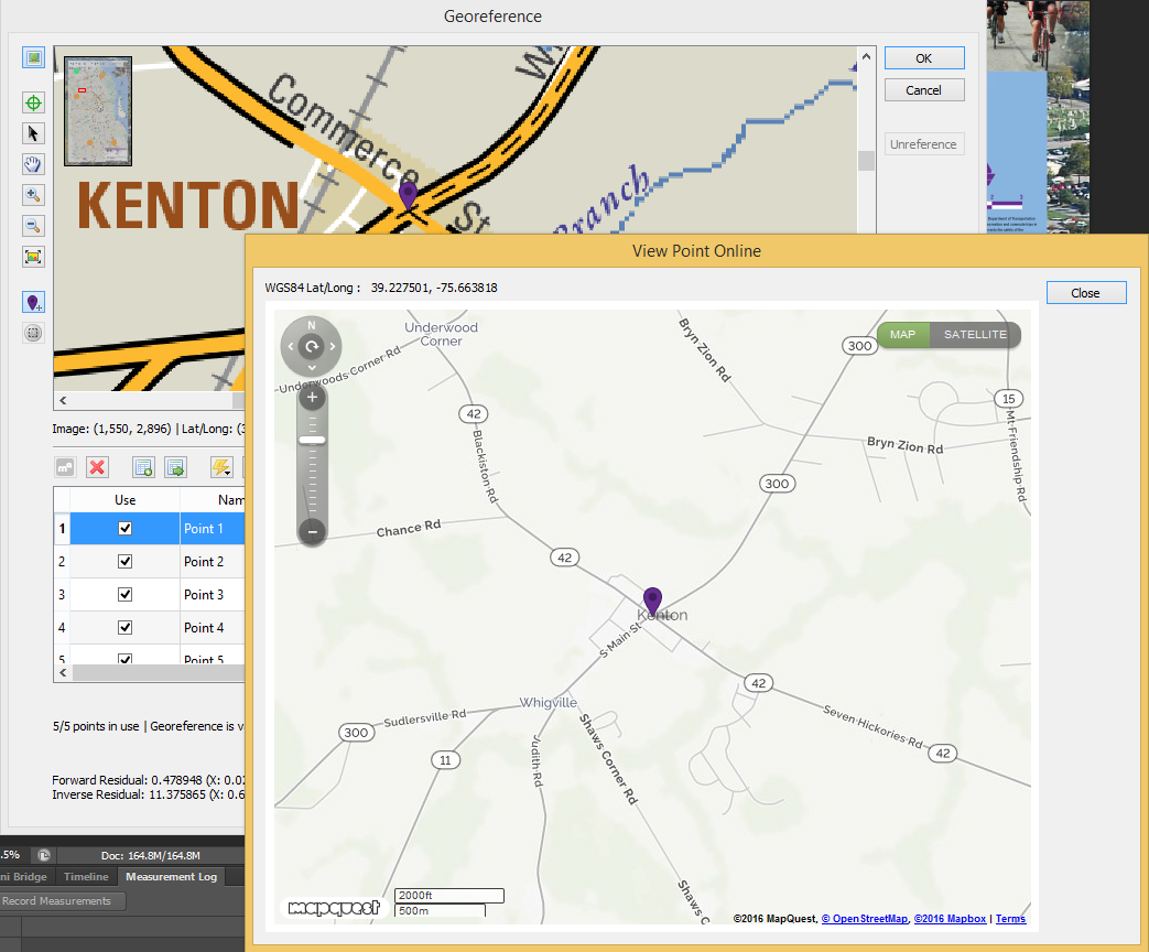
The Validate tool provides a visual comparison of the accuracy of your image to the real world. Use the Validate tool by clicking a point on the image to see the corresponding location on a web map.
The image below shows the Validate tool in action. Select the tool and click on a road intersection to open the web map with the same intersection identified. If the two don’t match, consider georeferencing again. It is good practice to test several known points on the image to ensure overall accuracy. Choose features that will be easy to identify on the web map such as road intersections, coastlines, buildings, and landmarks.
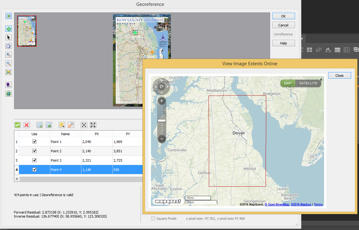
The Show Image Extents Online tool displays a rectangle representing the spatial extent of the image on the web map. Use this tool to verify that the full area covered by the image is accurate. Note that the rectangle shown on the web map will include the non-map areas of the image including the borders, legend, etc.
It’s that simple! Using Geographic Imager, you can manipulate imagery in Adobe Photoshop while now ensuring spatial integrity!
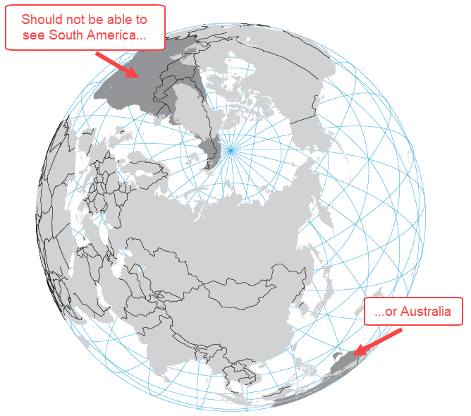
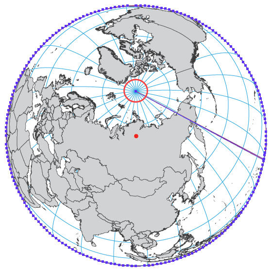
The Orthographic projection is a commonly used projection by cartographers because it closely resembles the world as we know it exists – a three-dimensional sphere (sorry “Flat Earthers”). However, when MAPublisher displays the world in the Orthographic projection, it will still draw any points, lines or polygons that fall beyond the perspective’s horizon. This can create a “hollow Earth” or see-through effect that would cause confusion to the map reader.
Further confusion may arise depending on the order of the artwork within the layers, as some features that should be on the far side of the Earth may appear on top of features on the near side of the Earth. In order to prevent these inaccuracies, we need to remove the data beyond the horizon before transforming the data to the Orthographic projection. The following workflow is one example of how to overcome this limitation. It can be easily adapted for any orthographic projection with a custom latitude of origin and/or central meridian.
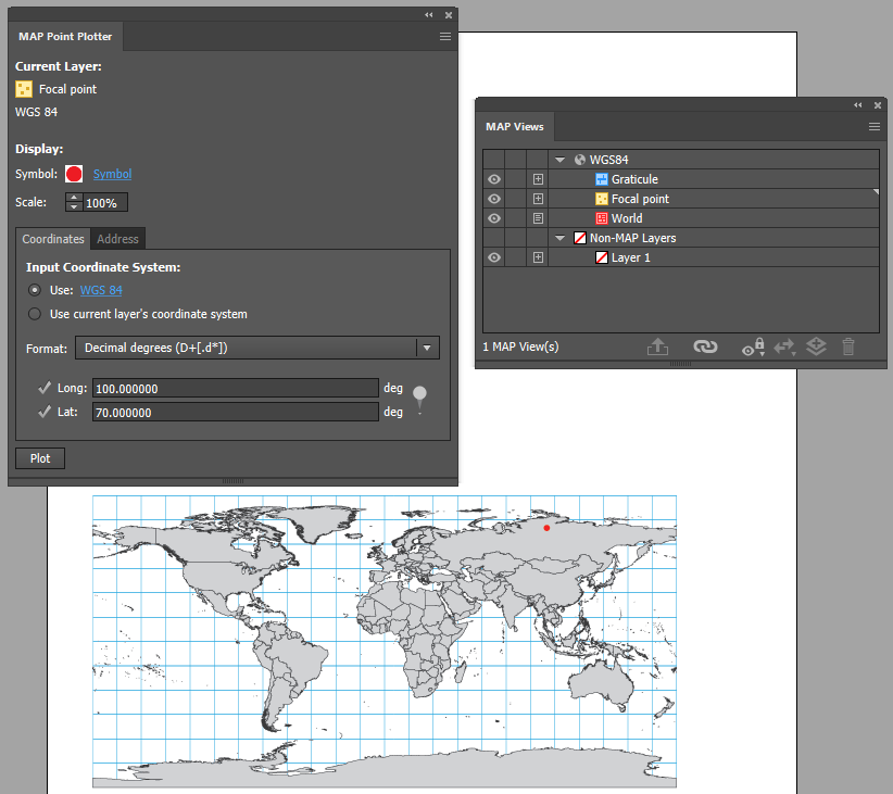
Step 1: Plot Your Centre Point
Import your world dataset and ensure the MAP View is in WGS84 (or you can use the world.mif file from the MAPublisher Tutorial Data folder).
Next, decide where you want the final orthographic map to be focused on. In this example, our focal point is 70°N, 100°E. Create a point layer, and plot your centre point using the MAP Point Plotter tool.
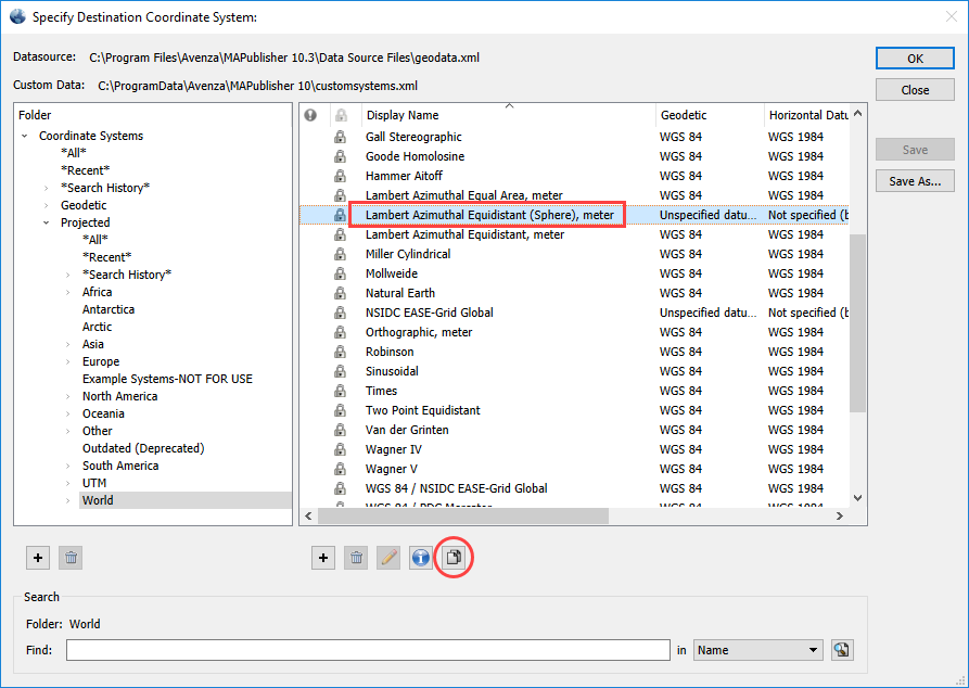
Step 2: Project to Azimuthal Equidistant Projection
Reproject the map to Azimuthal Equidistant (with a sphere-based datum). To do so, go to the MAP Views panel > Edit Map View. Enable Perform Coordinate System Transformation and click the No Coordinate System Specified hyperlink.
Under the Projected>World category, find Lambert Azimuthal Equidistant (Sphere), meter and click the Copy Object button to begin editing a copy of the existing Lambert Azimuthal Equidistant (Sphere), meter coordinate system.
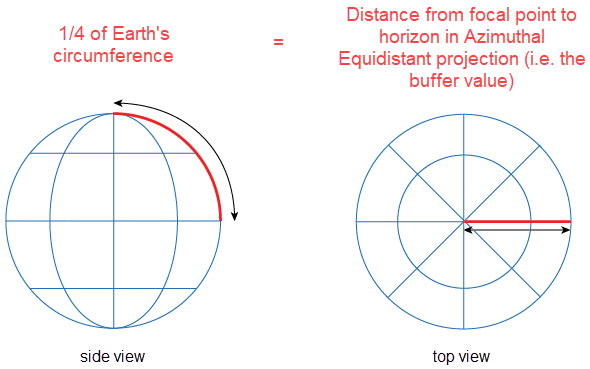
Side Note – Why start with the Azimuthal Equidistant projection?
The straight-line distance between the central point on the map to any other point is the same as the straight-line distance between the two points along the earth’s surface.
Furthermore, you must use the ‘Sphere’ version of the Lambert Azimuthal Equidistant projection, because the radius is equal in all directions. The other version of the projection uses an ellipsoid datum which would require more complex formulas to solve the buffer distance in Step 3.
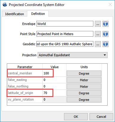
Next On the Definition tab, set the Central Meridian to 100, and the Latitude of Origin to 70. You may rename the custom projection on the Identification tab if you wish to reuse it later. Click OK and apply the projection.
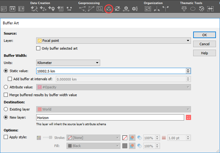
Step 3: Create the Horizon Line
Create the horizon line from your custom centre point. Next, add a buffer of 10,002.5 km (see note below) around your focal point.
Curious about where the buffer value comes from?
Given that we know:
Earth’s radius using Authalic Sphere is 6,371,007m
The formula for the circumference of a sphere = 2πr
The distance from the focal point to the horizon in the Azimuthal Equidistant projection = 1/4 of Earth’s circumference = C × 1/4
We can first determine the circumference by:
= 2πr
= 2 × π × 6,371,007
= 40,010,000 m
Now that we know Earth’s circumference, we can determine the distance to the horizon by:
= C × 1/4
= 40,010,000 × 1/4
= 10,002,500 m or 10,002.5 km
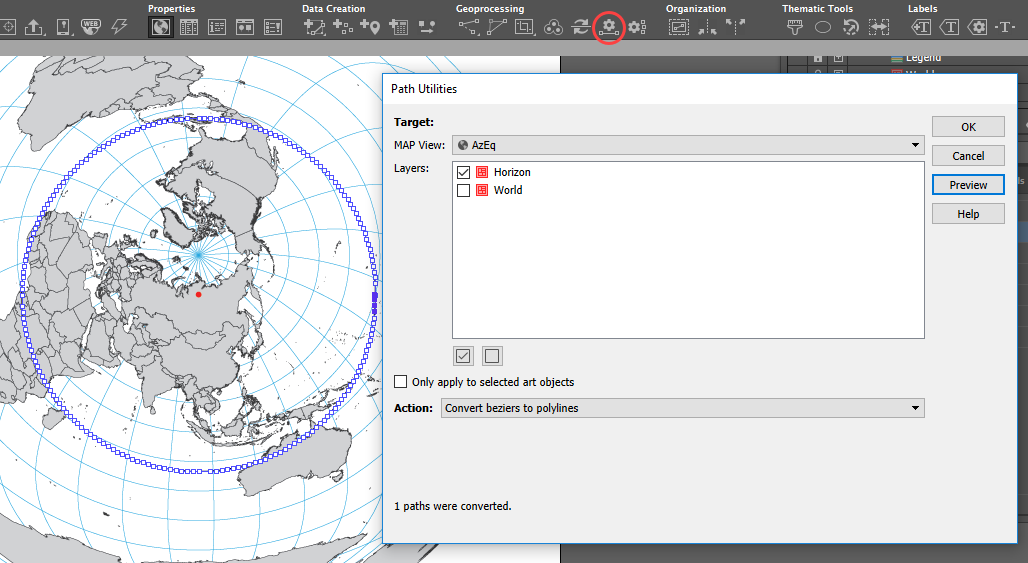
Step 4: Convert Your Custom Horizon Line
Convert the resulting circle with four Bezier curve points to polylines using MAPublisher’s path utilities tool Convert Beziers to polylines. This is your horizon line.
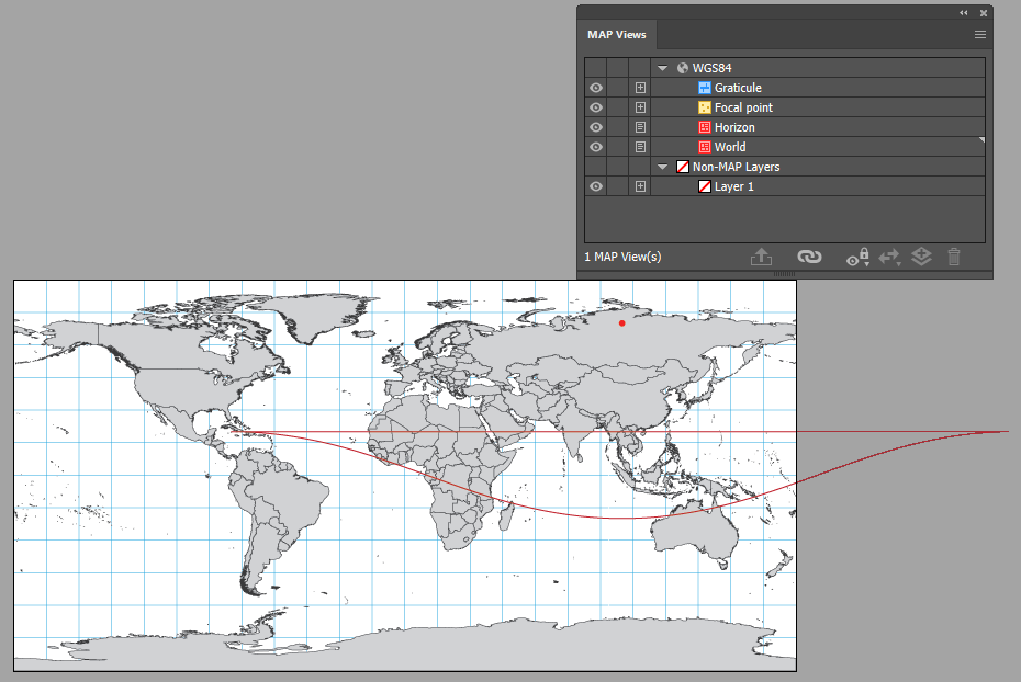
Step 5: Back to WGS84 and Editing the Horizon line
Import another copy of your world file. If necessary, transform it to WGS84 and drag your horizon line into this MAP View. You can also hide or remove the Lambert Azimuthal Equidistant MAP View.
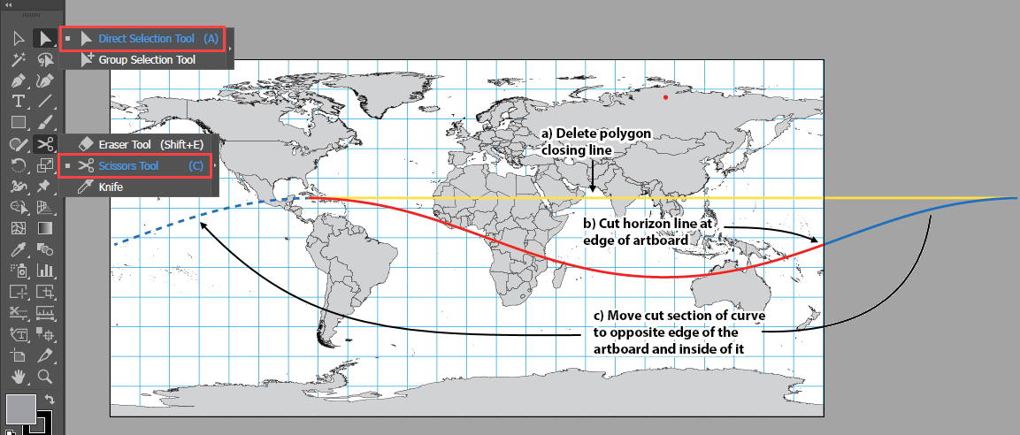
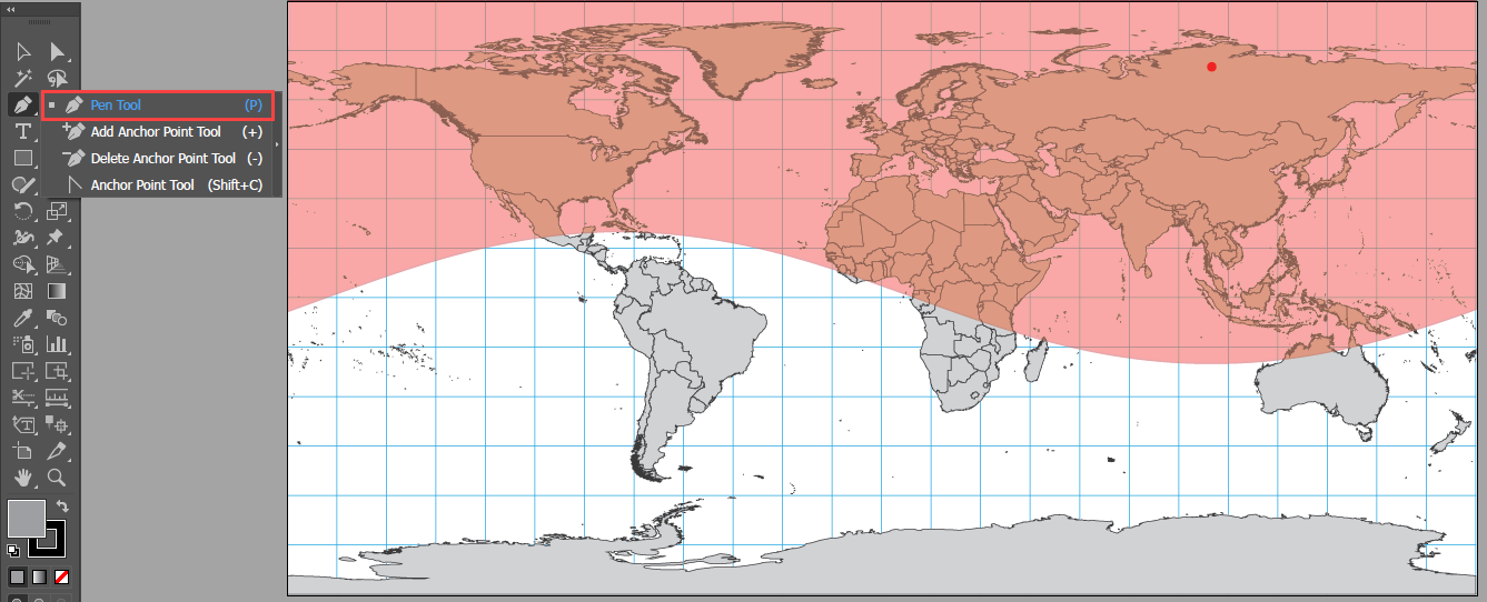
Use Illustrator’s Direct Selection Tool to select and delete the horizontal portion of the horizon polygon.
Next, use Illustrator’s Scissors Tool to cut the polyline at the artboard edge
Move the section of the curve remaining outside the artboard inside and to the opposite edge.
Resize the artboard to match the extents of the WGS84 MAP View. Use Illustrator’s Pen Tool rejoin the two lines into one. Continue using the Pen Tool to close the polygon by following along the edge of the artboard (result should look similar to the image below). Export the polygon area in case you need to add additional data at a later date.
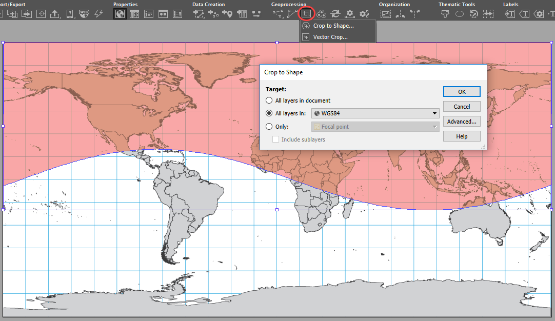
Step 6: Crop Beyond the Horizon
Use the Crop to Shape tool to remove the features outside of the polygon.
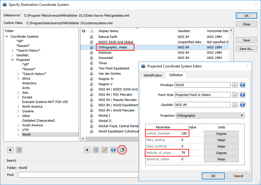
Step 7: Reproject the Remaining Data
After cropping, go to the MAP View and Perform Coordinate System Transformation. Choose the Orthographic, meter projection, click Copy Object to begin editing the coordinate system and put in the custom central meridian and latitude of origin you chose back at the beginning of the workflow. Once the custom Orthographic coordinate system is created, complete the MAP View transformation.
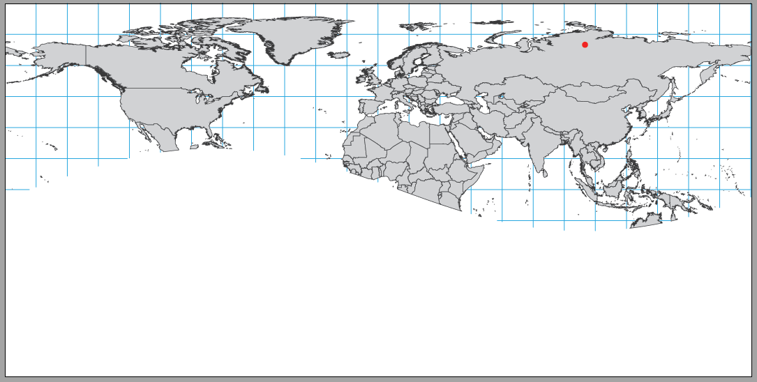
Step 8: Remove Lingering Polar Points
If there are any lingering polar points, you can delete them from the horizon line manually using the Direct Selection Tool.
You’ve successfully projected your data into a custom orthographic projection without any overlapping features from the other side of the Earth.
The best part is, all of the map features retain their attributes, so you are free to continue applying MAP Themes, generating labels, and any of the other design tools at your disposal to make your map project a work of art.
About the Author
Jeff Cable is the Quality Assurance Lead for Avenza’s desktop applications. While he primarily focuses on MAPublisher, Jeff’s formal education is in remote sensing. He hopes to utilize this knowledge in the near future to help develop Geographic Imager into a more powerful geospatial image processing suite.
Maybe you already know that MAPublisher has the ability to let you import shared data layers from your ArcGIS Online organizational account and to connect to publicly available map servers from various online sources. Once GIS data is imported, you can use Adobe Illustrator’s powerful design tools to style and edit your map into a thing of beauty. The ability to import from ArcGIS has been available for a while, however, it’s still a question that people ask our Support Team frequently. So, here’s a reprise of a blog post, from a while ago, that illustrates how to import layers directly from ArcGIS Online or an ArcGIS web service into Adobe Illustrator, using MAPublisher.
Esri’s ArcGIS Online is a collaborative web geographic information system (GIS) that allows you to store and share GIS data using Esri’s secure cloud. Use MAPublisher to import Feature, Map Image, and Tile layers into Illustrator without losing any georeferencing, features, or attributes. MAPublisher does not currently support the use of Map Image or Tile services that use Dynamic layers.
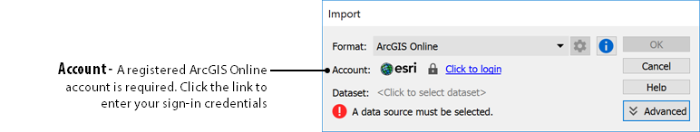
Importing from ArcGIS Online
To load a layer, use the MAPublisher Import tool as you would with any data type and select ArcGIS Online from the Format drop-down menu. Click the login link to enter your ArcGIS Online credentials to access your organization’s web portal.
Feature Layers contain vector data that will import as artwork into Adobe Illustrator. You can reduce the time it takes to import by filtering the data first, isolating only the layers that you need.
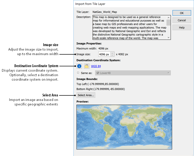
Map Image Layers and Tile Layers are raster data layers that can be added by selecting the geographic extents.
Importing from a Web Service
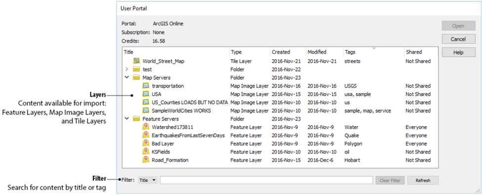
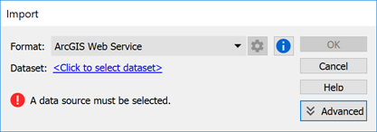
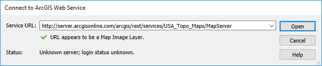
In addition to using your organization’s data, you can get publicly available data by connecting to an ArcGIS Web Service. To connect to a web service, use MAPublisher Import and select ArcGIS Web Service from the Format drop-down menu. Click to select the dataset and enter the URL for the service. This is a great option when searching for data from open data portals created by government agencies.
Import from ArcGIS Web Service
MAPublisher bridges the gap that exists between Esri’s Online services and the full-featured design environment of Adobe Illustrator. You can leverage Illustrator’s tools on GIS data shared within your organization, or from a publicly available source to make better, more beautiful maps.
In the latest release of MAPublisher, version 10.3, we added some great new features including the ability to create elevation profiles. The new Elevation Profile tool allows you to create an elevation plot using elevation information from anchors (vertices) of a line as long as there is a single path in a MAP View, with a coordinate system. You can also use the Elevation Profile tool to easily make changes to an existing MAPublisher elevation profile.
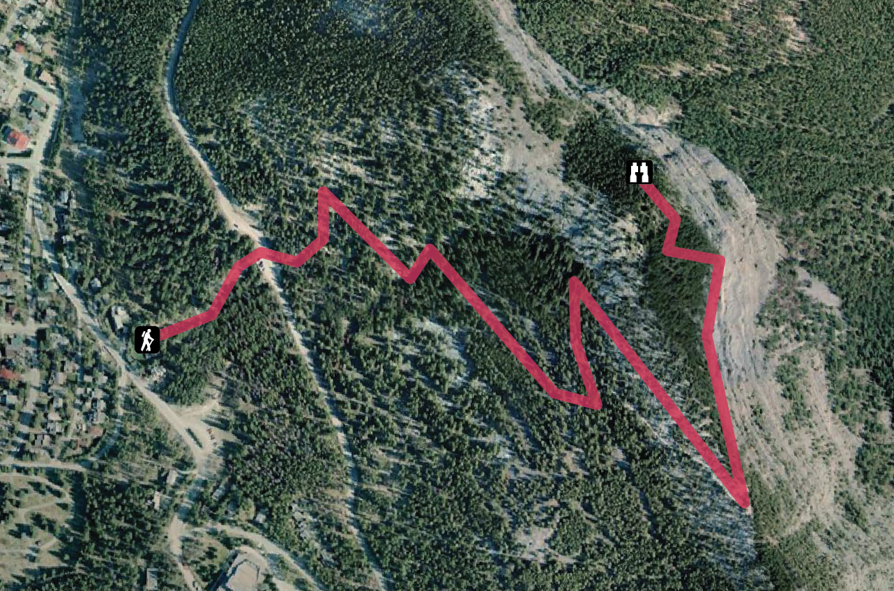
Example 1 – Trail Elevation
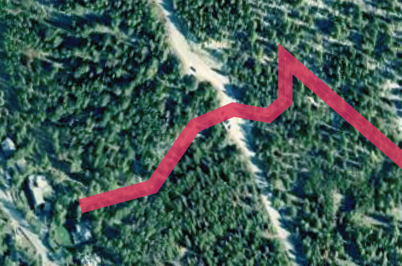
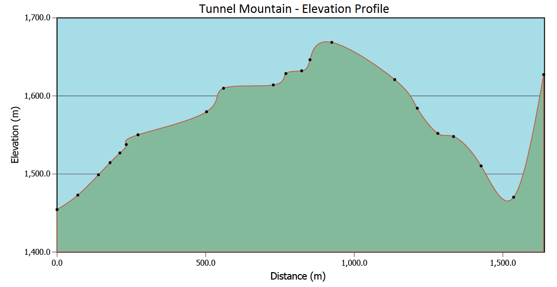
For the first example – take a satellite image of Tunnel Mountain in Banff, Alberta. I gave the image a coordinate system and georeferenced it in Geographic Imager then imported into MAPublisher as a GeoTIFF. Using the pen tool, I replicated the trail system for Tunnel Mountain while adding anchor points (vertices) throughout the line feature. These anchor points are the source of the elevation information in the resulting profile. Alternatively, you can import the trail data from another source and add your own additional anchor points using the Add Anchor tool. The screenshot below shows the anchor points indicating each line vertex.
These anchor points correspond with the points on the elevation profile below. Once finished, select the line feature to access the Elevation Profiles tool.
Editing Profile Options
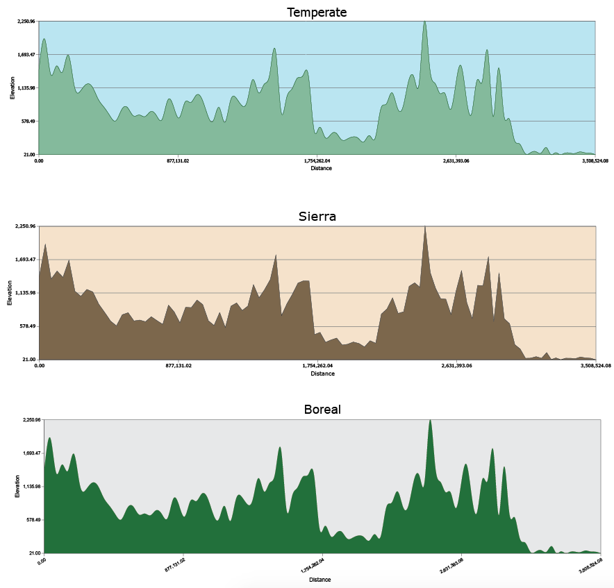
The Edit Elevation Profile window lets you customize your profile manually with advanced customization tools or using a simplified built-in MAPublisher style. The advanced tools allow you to alter the size of the profile, intervals, axes, colour scheme, units of measurement and plenty more to ensure that you can make your profile unique and convey the desired information. For example, select “Edit series appearance” as shown in the screenshot, to choose whether you want your series to be a smooth line, or to display your individual anchor points. Additionally, select “Edit axis appearance” to customize the colour of your grid or change the appearance of your labels. Customize the look of your profile with the built-in stylized templates.
I chose the “Temperate” style, for the example profile below, to stay true to the land cover as you can see above.
Now, in addition to making great trail maps in MAPublisher, the Elevation Profile tool allows you to create a valuable extra feature which could be exceptionally beneficial for hikers!
Try experimenting with the additional built-in styles that reflect the appearance of other land types available as well, such as Sierra, Arid, Boreal, and Fluvial which is featured in our next example.
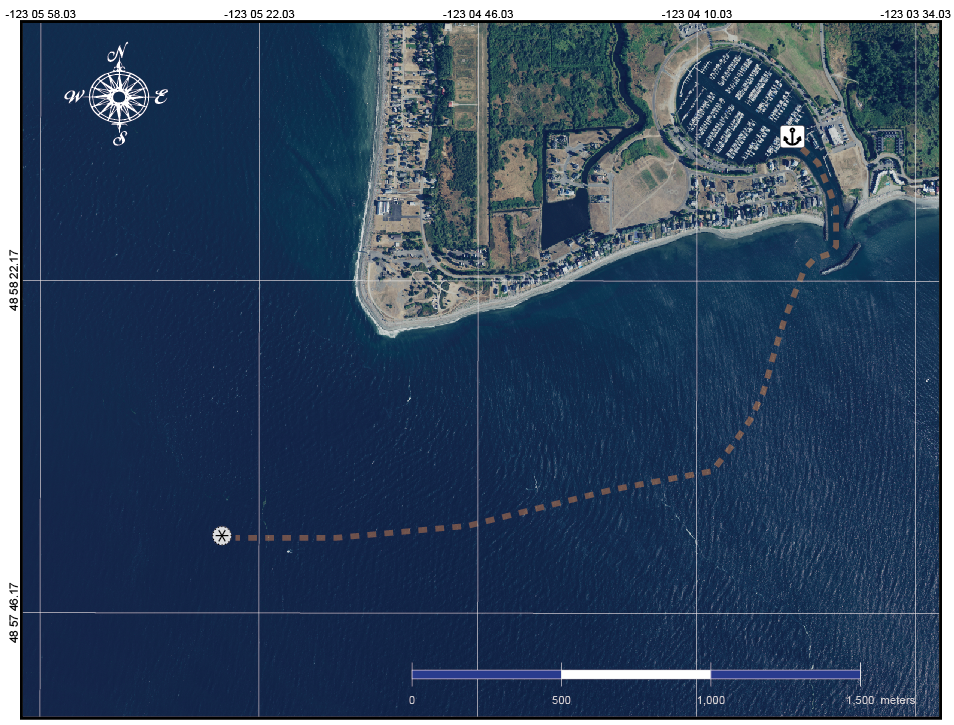
Example 2 – Fluvial Depth Profile
The nautical map below takes aerial imagery from the National Agriculture Imagery Program (NAIP). Depth data is extracted from the line feature that extends from the marina into the Strait of Georgia in Washington, USA.
The fluvial depth profile shows the increase in depth the deeper into the Strait.
If you import track data into MAPublisher and add your own anchor points, you can see the elevation or depth reached on your excursion by creating an elevation profile from your track.
Depending on where you drop your anchor points, you can convey everything from coastal change by creating elevation profiles for a temporal series of aerial photos of the same area, to elevation or depth change of a hiking trail on a mountain in one of Canada’s most popular destinations or a sailing trip off the west coast.
Summing Up
With the release of MAPublisher 10.3, you can now make beautiful maps that also communicate elevation information with ease. The new Elevation Profiles tool will help make your maps that much better!
About the Author
Andrea Becker is a member of the Support team at Avenza Systems. She helps clients take their cartography to new heights with MAPublisher design tools.
In a previous blog post, we defined a few common cartography terms that you might be likely to encounter while using MAPublisher and Geographic Imager; however, that was just the tip of the iceberg when it comes to cartography and GIS jargon. Here, in no particular order, are several additional terms used by cartographers, GIS professionals and people who work with spatial imagery.
Topology
Topology is a key principle in GIS for data management and integrity, ensuring the data quality of spatial relationships is maintained. In general, a topological data model defines how spatial objects (point, line, and area features) are represented, and defines and enforces data integrity rules (for example, there should be no gaps between polygons).
Azimuth
The horizontal angle, measured in degrees, between a baseline drawn from a center point and another line drawn from the same point. Normally, the baseline points true north and the angle is measured clockwise from the baseline.
Neatline
All 2-dimensionally rendered maps have to compromise somewhat on accuracy, even if only just a little by moving or scaling features to improve readability. However, the neatline is never adjusted, making it the most accurate element on a map.
The neatline is the border defining the extent of geographic data on a map and separating the body of the map from the map margin. It demarcates map units such as meridians and parallels, and depending on the map projection and the units selected, the neatline may not have 90-degree corners.
Geodatabase
A Geodatabase, a database or file structure used primarily to store, query, and manipulate spatial data,stores geometry, a spatial reference system, attributes, and behavioral rules for data. An advantage of geodatabases over shapefiles is that various types of geographic datasets can be collected within a geodatabase, including feature classes, attribute tables, raster datasets, network datasets, topologies, and many others.
Geoprocessing
Geoprocessing is an operation used to manipulate a GIS data resulting in a new set of data. Common geoprocessing operations include geographic feature overlay, feature selection and analysis, topology processing, raster processing, and data conversion. Geoprocessing allows for the definition, management, and analysis of information used to make decisions based on patterns within the GIS data.
Shapefile
An Esri Shapefile is a vector data storage format for storing the location, shape, and attributes of geographic features. A shapefile is stored as a set of related files and contains one feature class. An alternative to using shapefiles to store GIS data is a geodatabase, however, shapefiles have some advantages in terms of relative simplicity and wide-ranging compatibility with many applications. Related files contain additional information that is read by the shapefile when opening/importing in GIS applications, as long as these related files have the same name and reside in the same directory – the *.dbf (database) file contains attribute information, and the *.prj (projection) file contains coordinate system information. Shapefiles also have limitations such as the inability to support raster files, and large file sizes.
Buffer
A zone around a map feature measured in units of distance or time is called a buffer. Buffers are useful for proximity analysis.
Geodesy
Geodesy is the science concerned with the measurement and mathematical description of the size and shape of the earth and its gravitational fields. Geodesy includes the large-scale, extended surveys for determining positions and elevations of points, in which the size and shape of the earth must be taken into account to achieve accuracy.
Vector vs Raster
The terms vector and raster are encountered often in cartography though they are not often defined. In a nutshell,
Raster data is made up of pixels (sometimes referred to as grid cells). Each pixel can have a range of values used to represent data points. For example, in a satellite image, every pixel has a red, green and blue value.
Vector data is not made up of a grid of pixels. Instead, vector graphics are comprised of vertices and paths where the vertices are x,y coordinates. In GIS systems, they are a latitude and longitude with a spatial reference frame.
Mosaic
A Mosaic is a single raster dataset composed of two or more merged raster datasets—for example, one image can be created by assembling multiple aerial photographs whose edges usually have been torn or cut selectively and matched to the imagery on adjoining images to form a continuous representation of a portion of the Earth’s surface.
Orthorectification
The process of correcting the geometry of an image so that it appears as though each pixel were acquired from directly overhead. Orthorectification is used to correct terrain distortion in aerial or satellite imagery.
It’s no secret that we believe digital is the future of maps because of the many advantages that digital maps and mobile map readers offer. But we also recognize that there is still and always will be demand for paper maps. They go together like peanut butter and jelly, pizza and beer or fish and chips. In today’s digital marketplace, the trick will be for map publishers find ways to serve up these tasty combinations to map consumers in a commercially viable way.
While this seems trivial, in fact, there are challenges for publishers to efficiently provide maps in both paper and digital formats. For most established map publishers, the paper distribution channel is well characterized. With the right relationships, publishers can get their maps onto the market through websites, brick-and-mortar retail stores, at events and through other business partnerships. On the other hand, selling digital maps requires an e-commerce platform capable of handling digital products and an application on which to view and use the maps effectively.
To address the challenge, we have partnered with print on demand and publisher MapSherpa.
While our vision is to have all of your maps on your phone or tablet, theirs is to have maps in your pocket, or on your wall. Together we can make both of those scenarios a reality.
Our joint pilot project will allow map consumers to easily get maps in both digital and printed formats. Now, when view selected maps in the Avenza Map Store you’ll have the option to also purchase a paper copy in a variety of sizes, and printed on a variety of different materials from MapSherpa’s map store, MapTrove. Find one of the selected maps on the MapSherpa site, in paper format, and choose to purchase the digital version for use on your mobile device from the Avenza Map Store.
We see this as a model for the future of map publishing and distribution, and a winning solution for publishers and consumers alike.
What does one do when a passion for historical people and events takes you to places you’ve never been only to find that there are no accurate maps to get you there? If you’re Billy Roberts you channel your expertise in spatial analysis, cartography, and passion for the Wild West into a nearly year-long research project that culminates in writing a book and launching your own map publishing company.
By day, Roberts is a is a member of the Geospatial Data Science team within the Systems Modeling & Geospatial Data Science Group at the National Renewable Energy Laboratory (NREL). In his spare time, he is an avid fan of Billy the Kid and other notable personas of the Wild West.
‘After a lot of reading about Billy the Kid, I decided that I wanted to visit some of the places that I had just read about.’ says Roberts. ‘But I quickly found that there were really no good maps out there. Tourist maps are not hard to find but they tend to be less than accurate, incomplete, and feature covered wagons and stuff that isn’t really relevant to the story that the map is telling.’ he adds.
So, I went to New Mexico, talked to local historians and spent nine months researching locations that are part of the narrative of Billy the Kid and the Lincoln County War. Some of the locations I visited are on private ranches and sometimes the land-owners didn’t even know about them. I used historical maps as a reference and was able to verify that the places, buildings, or artifacts were there. Then I georeferenced everything and mapped it all out using MAPublisher.
Roberts has been using the MAPublisher plug-in for Adobe Illustrator for more than 8 years. ‘The combination of MAPublisher and Illustrator lets you do things you can’t do with other mapping software, and once you get past the initial learning curve, it’s easy to use.
Making maps of the Wild West presents some design challenges that Roberts is able to overcome with MAPublisher. ‘I work almost exclusively in MAPublisher. I use Geographic Imager to combine hillshades with digital old paper textures to get the background effects I want, then use MAPublisher for all the mapping and digitizing.’ For his Billy the Kid map, Roberts imported data sets stored as shapefiles into MAPublisher and used Illustrator to add fonts that were typically used on maps in the 1700s and 1800s to give them maps a realistic, authentic look. ‘I could not make maps the way I do with ArcGIS.’ says Roberts. ‘I can do so much more with the design in MAPublisher, and it lets me work quickly and efficiently. If at any time I have a problem or questions, I can contact Avenza and someone always gets back to me. I know that they have fixed bugs and implemented solutions based on my suggestions.’ he adds. ‘It feels like Avenza is on my team.’
Roberts has now published three maps based on the Lincoln County War which are distributed mainly through Roberts’ website. His Billy the Kid wall map, which in addition to being aesthetically pleasing, is also educational. The map has become extremely popular at festivals and in the museums of the historic town of Lincoln, New Mexico, even earning a spot in the visitor’s center. Up next for Roberts are more maps and a detailed book about Billy the Kid. ‘I want to tell his story from a geographic perspective because for me, seeing how things fit together spatially helps to make the story much more real.’
See more of Billy Roberts’ maps on his website www.newmapsoftheoldwest.com and coming soon to the Avenza Maps Store.
Alison DeGraff Ollivierre caught the geo/carto-bug from an introductory geography course in her first semester at Middlebury College, quickly realizing that the discipline was the perfect combination of her diverse interests in global affairs, conservation, history, and sociology. Now a cartographer at National Geographic Maps, Ollivierre works on the Trails Illustrated topographic outdoor recreation map products from an office in Colorado, making it easy for her to always be planning her next hike or trip to a National Park.
Ollivierre began her professional career as a Geography Intern at National Geographic in 2011, working with NatGeo Live and the Giant Traveling Maps. During her internship, she had the opportunity to make maps for a few NatGeo Explorer lectures and Giant Traveling Map fact cards, but what really stuck with her was how the incredible breadth of geography was used every day at NatGeo (and meeting Sylvia Earle—she thought that was pretty cool!). Since then she has gone on to win multiple awards for her cartography and was recently recognized by xyHt Magazine as a 40 Under 40 Remarkable Geospatial Professional for 2018.
As a certified GIS Professional, with a master’s degree in Geoinformatics from the University of the West Indies, Ollivierre knows geospatial data and how to handle it but also understands that—while the data is important—there is more that goes into making a good map than just the data. ‘I believe strongly in the importance of great design.’ explains Ollivierre. ‘It has the power to make geospatial data more engaging, interesting, and accessible to its audience.’
Ollivierre started using MAPublisher—a cartography plug-in for Adobe Illustrator—in 2016 when she returned to work at NatGeo after facilitating a participatory mapping project in the Eastern Caribbean, working as a cartographer and GIS specialist in Maine, and conducting freelance cartographic work for organizations across the globe. ‘I had played briefly around with a trial version of MAPublisher before that and heard a lot of great things about the software, so I was excited to learn how to use it at NatGeo Maps.’ says Ollivierre. ‘We complete 99% of our daily tasks in Illustrator + MAPublisher so its power is clearly evident in our workflow.’
Making quality maps that bring to life complex geospatial data requires a mix of science, art, and specialized tools to get it right. ‘I love the process of turning raw data into a map that clearly (and attractively!) gets its point across.’ says Ollivierre. ‘For me, MAPublisher is the obvious choice to bridge that gap between GIS and cartography.’
Avenza Maps v3.6 is now available for iOS and Android devices! This latest update includes new features and improvements based on user feedback.
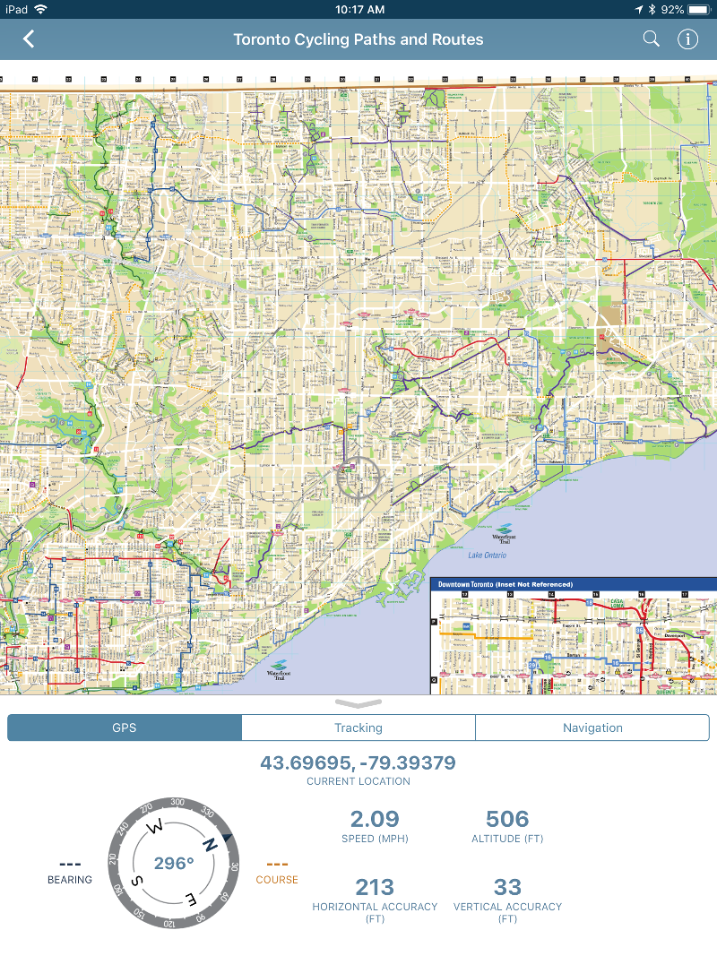
A major theme for this release is navigation, as it introduces a suite of features in the new navigation tool set accessible in the new Map View toolbar. We have enhanced the app’s usability by adding the GPS and Tracking features to the new toolbar. The toolbar is easily accessible by swiping up in the Map View to reveal three options; GPS, Tracking and Navigation.
GPS
We’ve added some basic GPS location data to the toolbar including altitude information (frequently requested by users!) as well as bearing and accuracy information. Heading in a specific direction? Your course will change based on your average bearing to help keep you orientated!
Tracking
What was previously the Record GPS Tracks feature has found a new home as the Tracking feature on the Map View toolbar (but it can still be accessed through the Map Tools in the bottom right). This tab includes some of the features from the GPS tab, and also allows you to track distance travelled, average speed and the duration of your tracks. Once you start tracking, swipe the toolbar down to reveal more of your map but keep those valuable tracking statistics viewable at the bottom of the screen.
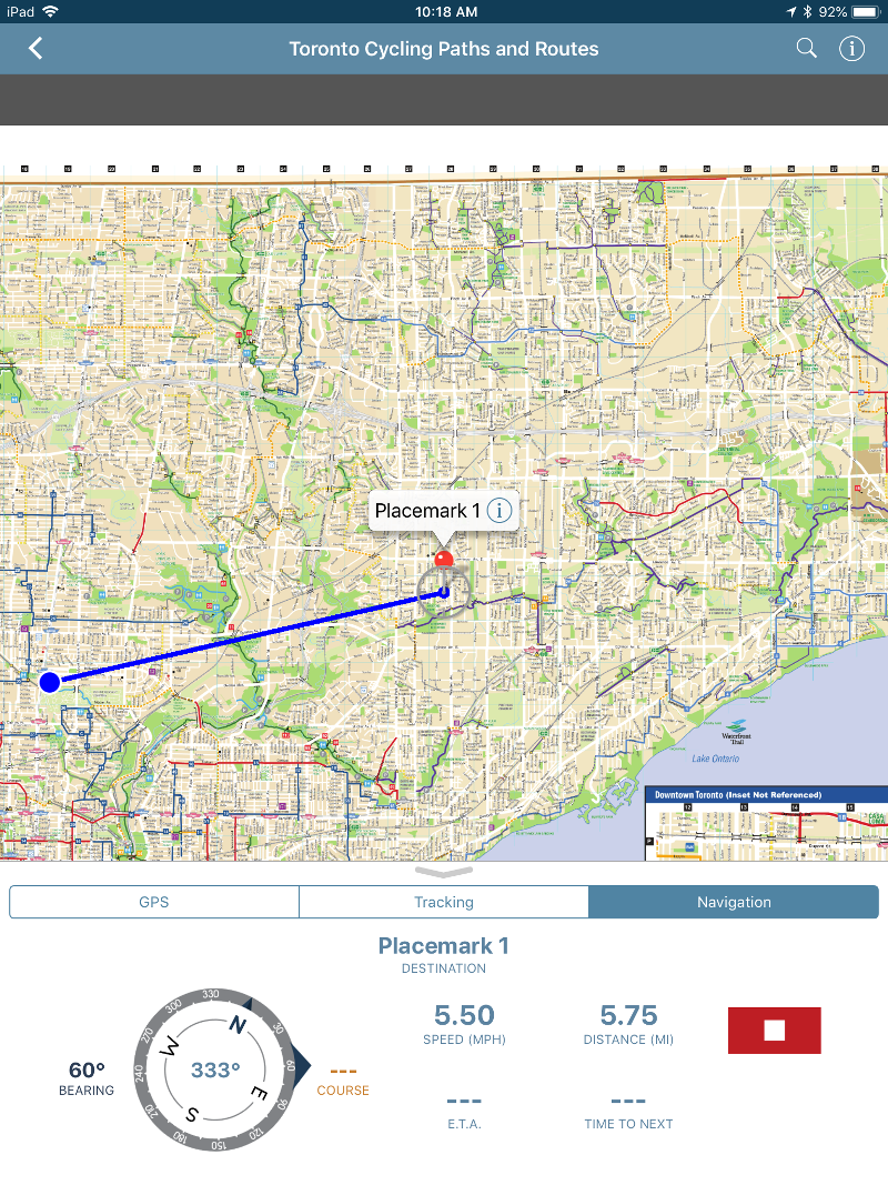
Navigation within the app is intended to be a direct route to the destination (point-to-point). Navigation can be accessed in the new Map View toolbar but is also quickly available in the Map Tools (three dots)at the bottom-right of the screen.
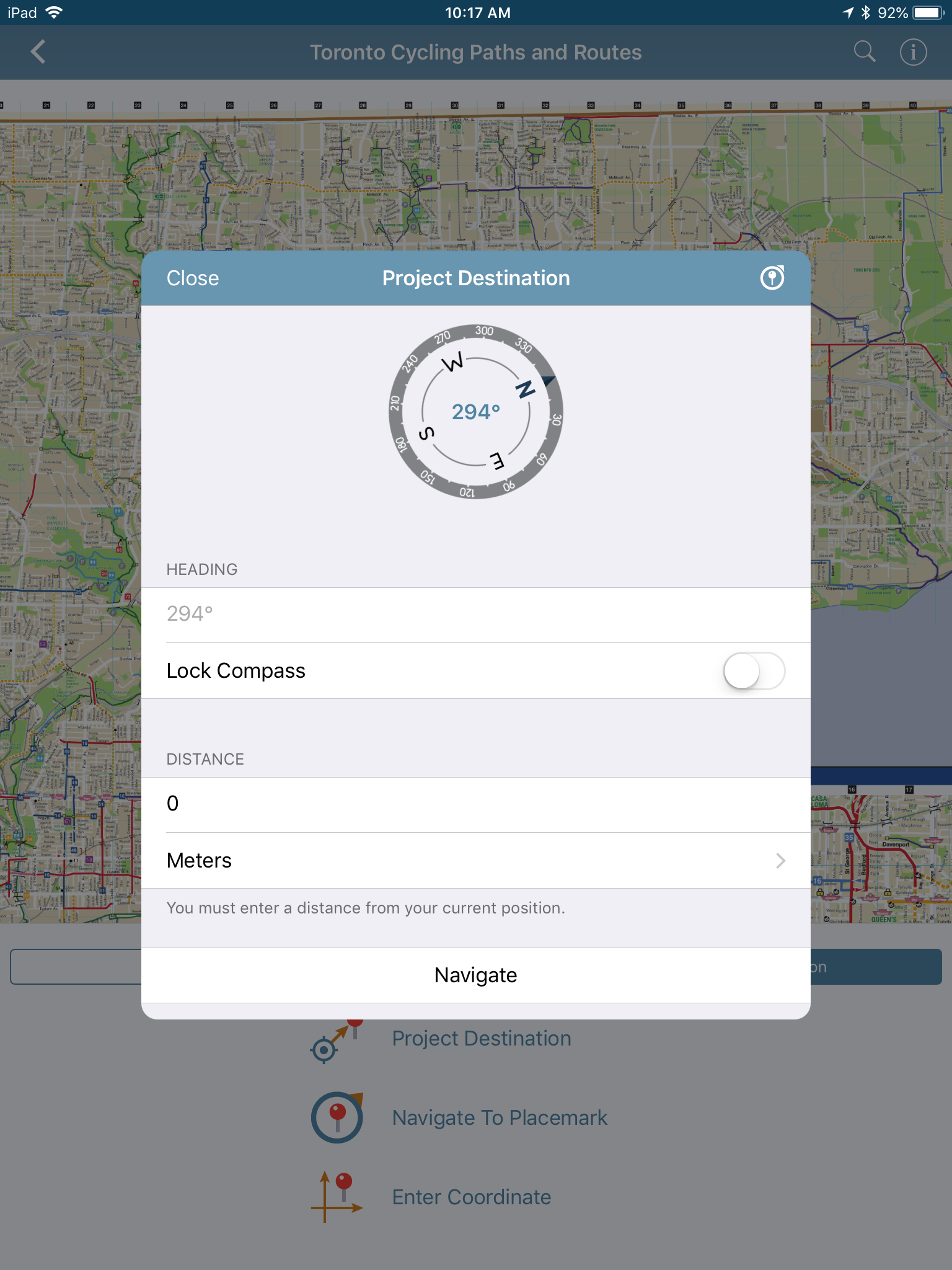
Project Destination
Do you know the direction and distance to a particular location? Set the bearing and distance to your destination, and the app will place a placemark on the map as a guide. You can choose the bearing by either pointing your device in a direction (the heading will automatically be entered) or lock the compass and type in your own bearing. Select from different units of measurement for your distance like meters, yards, or even minutes by walking!
Navigate to Placemark
There are a few ways to navigate to an existing placemark on the map. Of course, you can select Navigate to a placemark in the navigation tab or you can elect to edit one of your previously placed placemarks on the map by tapping the Navigation button.
Enter Destination Coordinates
Know the specific coordinates of a destination you want to navigate to? We’ve got you covered! If you receive a set of coordinates you want to navigate to, use the Enter destination coordinates option which will place a placemark on the map, create a path between your location and the placemark as a guide, and bring up the navigation features to help lead you to your coordinates.
Once a navigation option is chosen, details such as speed, distance, and estimated time of arrival are shown in the navigation panel and can be accessed for the duration of your course by swiping the toolbar down. This will hide the compass, thereby allowing you to have a full view of the map and the course to your destination while still showing key statistics like speed, distance and the estimated time of arrival to your destination.
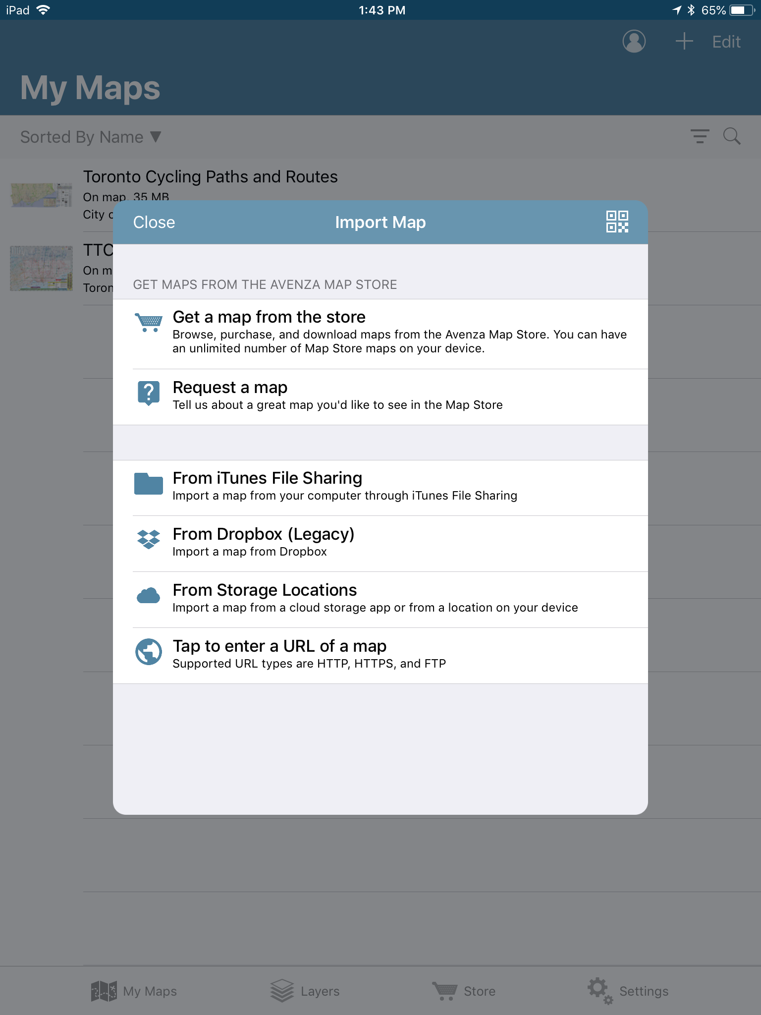
Cloud Import and Export Options
We’ve added more opitons for importing and exporting map features with support for cloud storage apps. When importing map features, and choose From Storage Locations to pull up every possible file storage option on your device. New options include Google Drive, OneDrive, Box and other third-party cloud storage applications.
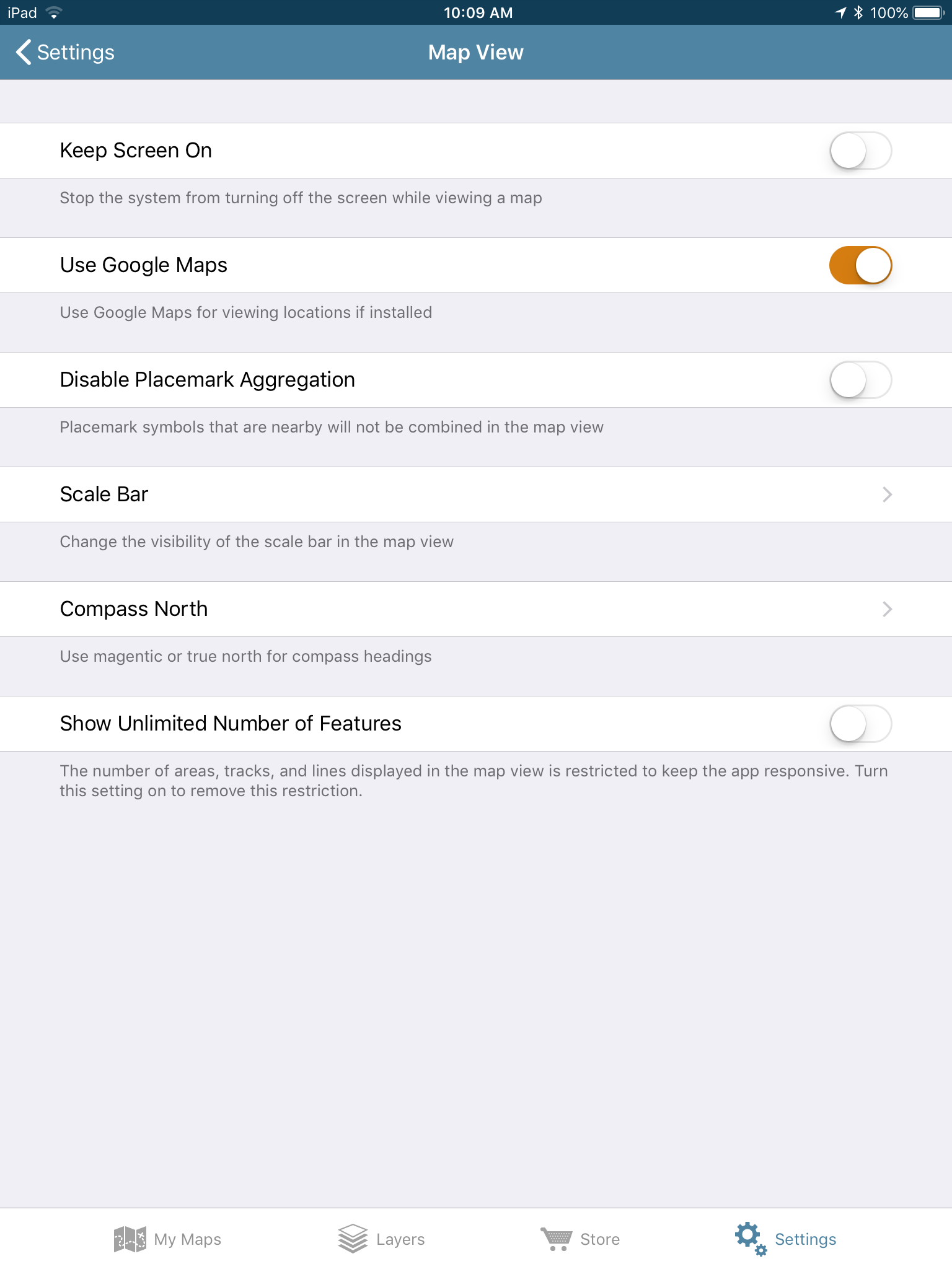
Magnetic North
You can now choose the declination for the app’s built-in compass as it now supports magnetic declination and magnetic north. Users can opt to switch to magnetic north in the Map View settings in the app.
About the Author
Andrea Becker is a member of the Support team at Avenza Systems and is excited to help navigate users through all of the wonderful new features in version 3.6!
Infographics are a great way to transform less than exciting data into a visualization that is both digestible and fun to look at. Adobe Illustrator and MAPublisher work perfectly together to make infographics simple like the one I made for National Spumoni Day.
You might have noticed, we like to celebrate national food days here at Avenza Systems. Instead of making just a map to celebrate this layered frozen delight, I made an infographic, containing not just one but two maps! Using a combination of Adobe Illustrator and MAPublisher tools, this infographic has graphs and two maps teaching you fun facts all about spumoni, gelato, and ice cream. Curious about how I made it? Keep reading!
What is spumoni you may ask? Spumoni is a molded gelato with different layers and, usually containing nuts and fruit! Spumoni is usually 3-4 flavours. Cherry, pistachio, and chocolate or vanilla are the most common.
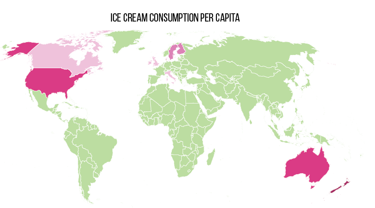
The infographic consists of two different maps; one showing the amount of ice cream eaten per capita around the world, and another showing the amount of milk produced per year by country.
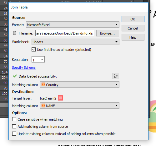
To create each map, an Excel spreadsheet was created with information about the countries milk production, as well as the average amount of ice cream eaten. Once the spreadsheet was created, I joined the tables in the MAP Attributes.
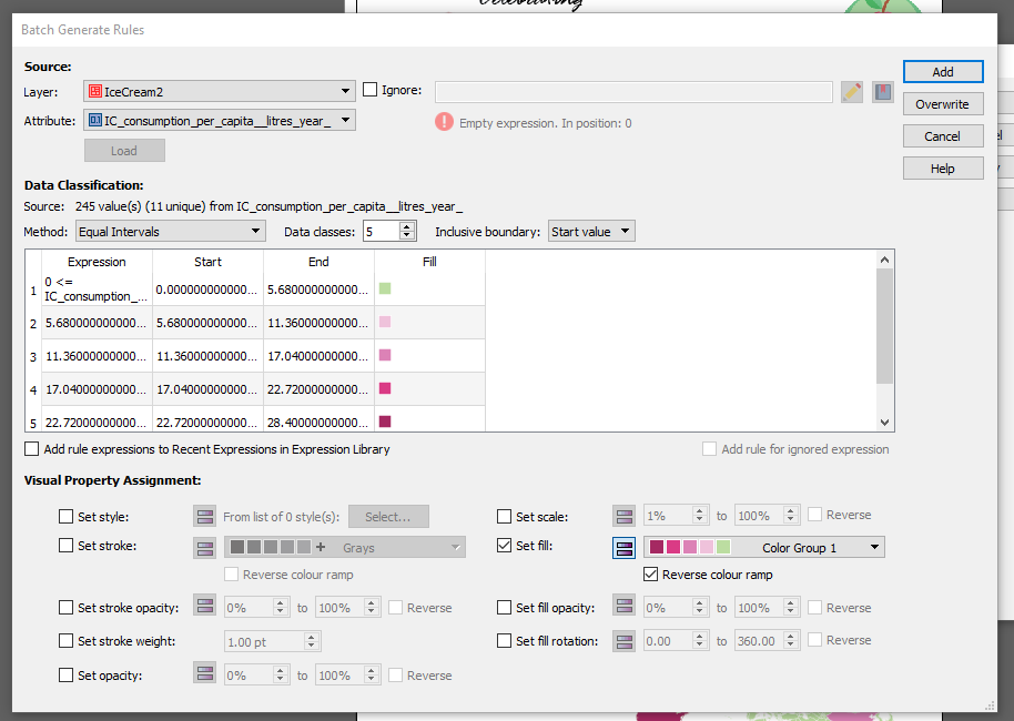
Once the tables were joined, I used MAP Themes to stylize the maps. MAP Themes are an easy way to stylize areas, lines, and points. I created a MAP Theme for each map, based on the attributes I created. One MAP Theme for the dairy production, and one for ice cream consumption. I used the ‘Batch Generate Rules’ option and chose 5 classes. I then chose the fill colour to be a custom colour group I created with spumoni-inspired colours.
Once I’d generated my rules, I applied my MAP Theme. I then followed the same steps for the dairy production map.
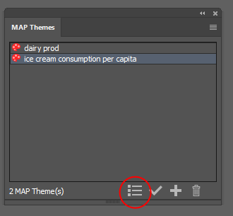
My favourite part of MAP Themes is that it’s super easy to create a MAP Theme legend after. To create a MAP Theme legend, select your MAP Theme Stylesheet and click the Legend button at the bottom of the window.
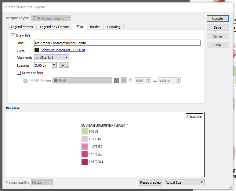
There are lots of options for customization when creating the legend. You can change the legend entries size, and the legend key font, size, colour, as well as details about the title, and the border.
Once the legend was created, I created the graphs using Adobe Illustrator’s Graph Tool. The graphs use the same colours as the maps, and for finishing touches I added the ice cream symbols and fun facts. Click below to see the finished infographic. Have fun celebrating National Spumoni Day, and have fun making your own infographics!
Rebecca Bennett is a member of the Support team at Avenza Systems and loves ice cream almost as much as she loves making creative and visually appealing maps.


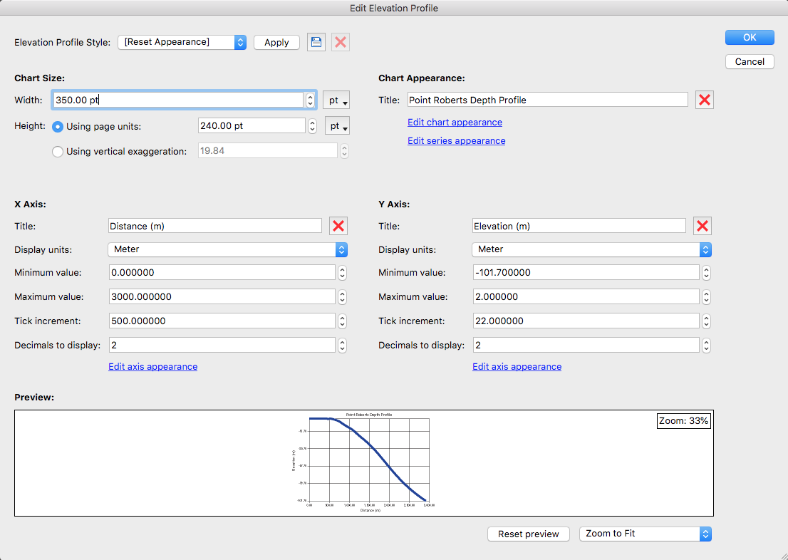
 The fluvial depth profile shows the increase in depth the deeper into the Strait.


